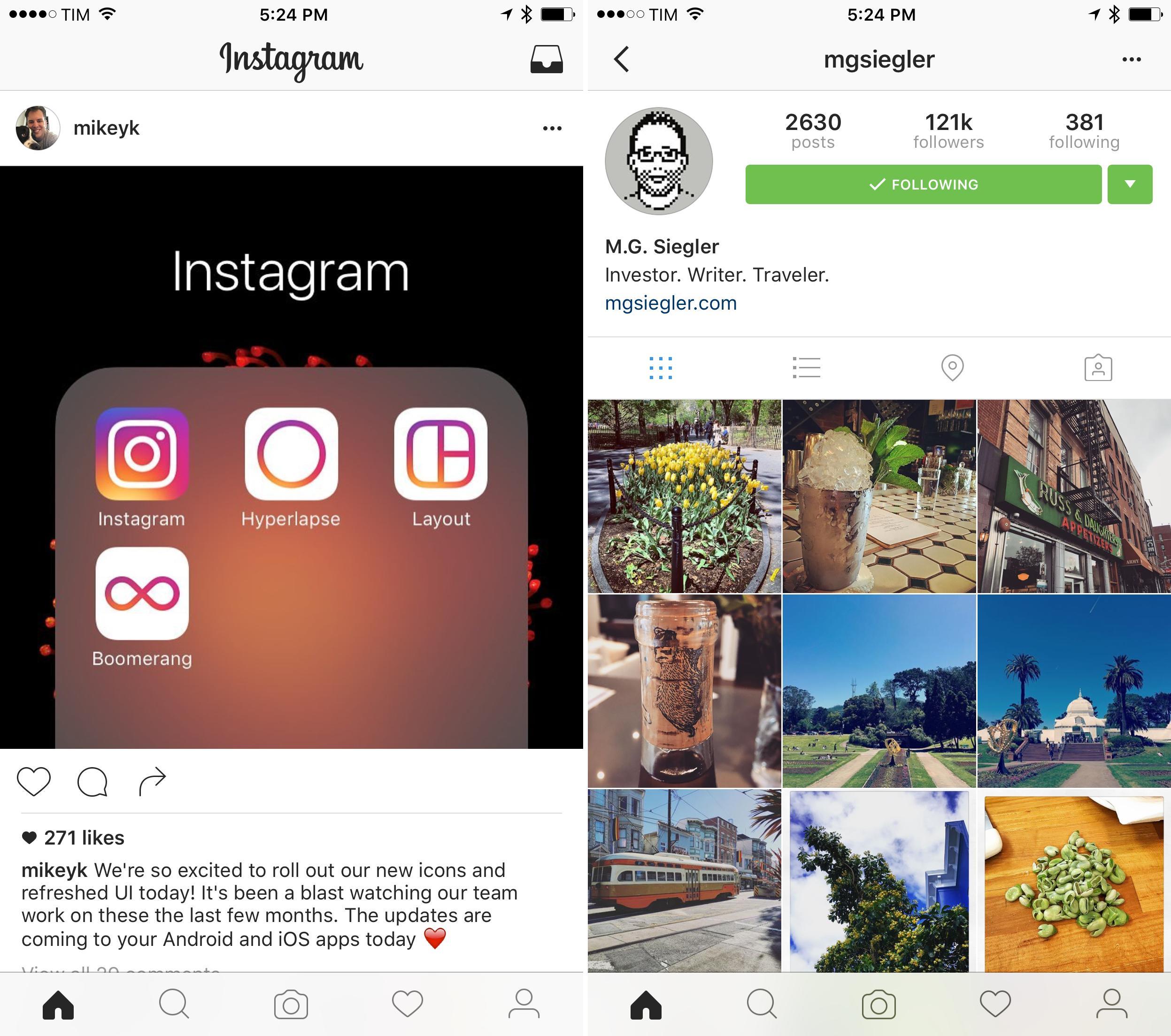
Long after Apple abandoned skeuomorphism with the introduction of iOS 7, Instagram held onto the past with its Kodak Instamatic-inspired icon. It had been so long since Instagram’s icon was updated that you could count on a flurry of snarky jokes on Twitter every time the app was updated without an icon redesign.
Today, nearly three years since iOS 7 was introduced at WWDC in 2013, Instagram has unveiled a redesigned icon, not only for its flagship app, but also for Layout, Boomerang, and Hyperlapse.
Instagram announced its icon redesign and interface refresh on the Instagram blog with a fascinating video (embedded below) called The Evolution of the Instagram Logo that depicts the iterative process of redesigning its icon, including what are presumably many discarded prototypes.
Instagram’s video shows a bunch of other option they considered. https://t.co/c2ET9aBHnv
— Ryan Jones (@rjonesy) May 11, 2016
Overall I like the new icons – they each retain the distinctiveness of the originals, move the icons into line with current design sensibilities, and have a cohesive familiar feel. After so much time has passed, it also makes a lot of sense that Instagram didn’t stop at redesigning its own icon and instead redesigned its entire family of icons.


