At yesterday morning’s keynote event in the Bill Graham Civic Auditorium, Apple took the wraps off of the latest revision of their mobile operating system. The tenth version of iOS opens up the system to a bold new world of integrations, APIs, and surprising customizability. It modernizes core apps that were growing long in the tooth, takes ambitious leaps forward with computer vision and contextual predictions, and enriches the user experience of such system tentpoles as notifications and the lock screen.
iOS 10 marks the beginning of a new era of iOS in many different ways. With a solid, mature core to build on, Apple is now feeling free to reach out into new areas that it has never before explored with its most popular operating system. We’ll have to wait for real world testing and future betas to see if they’ve truly delivered, but the promises of iOS 10 are some of the most ambitious Apple has ever pursued with “the world’s most advanced mobile operating system.”
So let’s take a look at the features Apple has planned for hundreds of millions of users next Fall.
User Experience
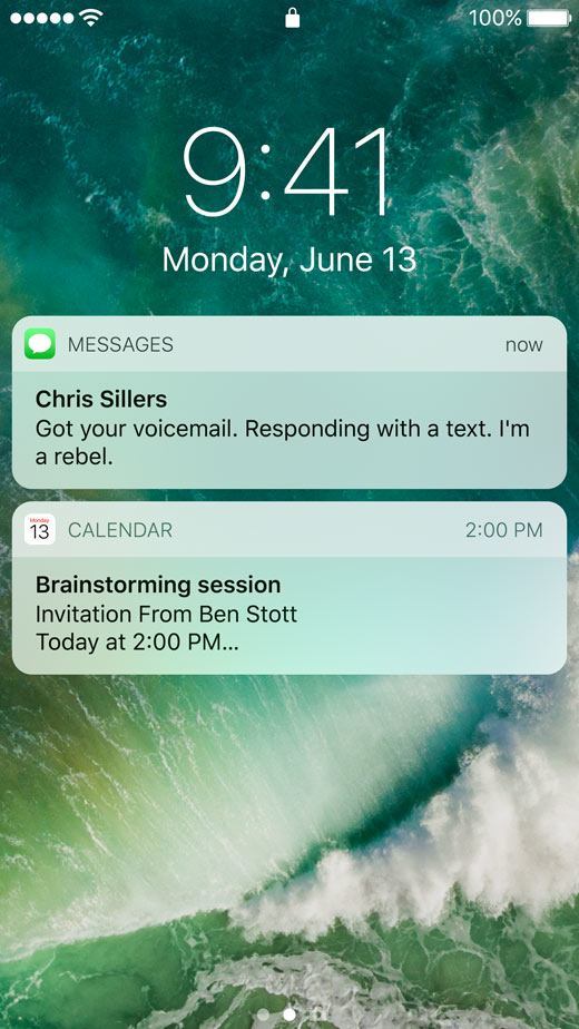
Some of the most core features to the experience of using iOS include the lock screen and notifications. The combination of the two is arguably the most important way in which information is disseminated from the tens or even hundreds of apps on users’ phones to the users themselves. With iOS 10, Apple has overhauled the interface of notifications, putting a particular emphasis on notifications on the lock screen of an iOS device.
The new notifications have taken on a bigger and lighter design. They no longer dim the background of the lock screen, but simply float above it. These new notifications can be a bit more expansive than the old ones, but their biggest secrets are revealed by 3D Touching them. 3D Touch on a lock screen notification on iOS 10 to see it expand to show the full extent of the information it contains, and allow advanced user interaction such as picking between several buttons provided as options, inputting and sending text with the keyboard, and more. 3D touching these notifications can basically open up a single window interface into the app itself, and hitting send does not necessarily dismiss this interface. After 3D touching a Messages notification, for instance, you see the conversation right in front of you and can send multiple responses in a row, as well as wait for and see responses from the recipient when they message you back, all without leaving the lock screen interface that you 3D Touched into initially.
This isn’t the only improvement to the iOS lock screen. You can now just raise your phone to wake it from sleep, showing the lock screen without having to tap any buttons. This is a great new way of avoiding the issue of TouchID working so fast that it unlocks your phone when you turn it on by tapping the home button, thus not allowing you to see the lock screen at all before it is cleared away.
Speaking of tapping the home button, this is now a required action to unlock an iOS device. In iOS 10, the lock screen will not dismiss unless you deliberately press the home button. If you just lay your finger on the TouchID sensor (which in iOS 9 immediately unlocks the device and dismisses the lock screen) then it will authenticate you, but it will not open the phone from the lock screen. While this change is going to take some getting used to, I think it’s a good idea with all of the new features being packed into the lock screen. Apple is now creating a distinction between authenticating with TouchID (which can enable various notifications and widgets to show more information or allow certain different actions than they can when they are “locked”), and actually dismissing the lock screen to enter the device. Of course, if you turn the device on by pressing the home button with your finger directly on it, then you can still trigger both the unlock and the authentication at the same time, effectively getting the behavior you are used to.
The lock screen’s swipe gestures have also been shaken up: you now swipe left to access the Camera interface, or swipe right to slide to a screen with all of your widgets (the evolution of the Today view, it seems). Since the widgets now live where the iOS 9 passcode entry view used to be, that view is now only accessible by pressing the home button and not authenticating with TouchID at the same time.
Notification Center can still be accessed by pulling down from the top, but with the widgets moved to the left side of the lock screen, Notification Center has returned to its original form of a single column of notifications, no longer allowing you to swipe right to access the page of widgets. One great new feature for Notification Center is the ability to 3D Touch the “x” button and get a “Clear All Notifications” option, just like we’ve had on the Apple Watch since day one. You can also, of course, 3D Touch any notifications to expand them in the same way that they can be expanded from the lock screen, and interact with them from there.
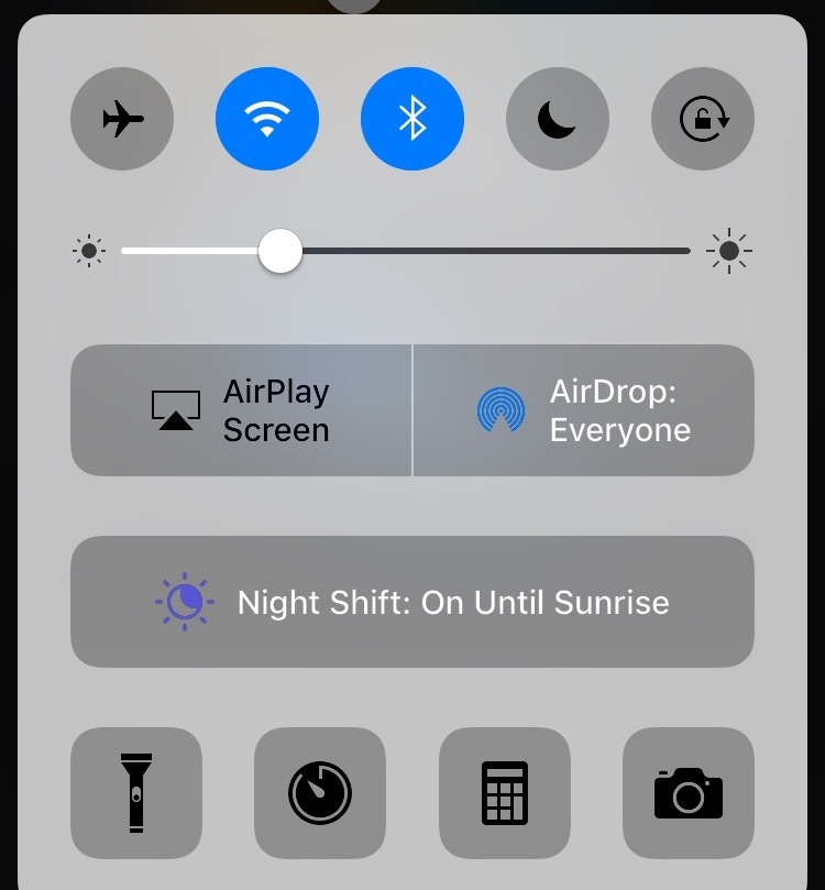
On the opposite end of Notification Center, accessed by swiping up from the bottom of the screen anywhere in iOS, is Control Center. This feature has also received a design refresh, granting it bigger buttons, and moving the music control settings to a second pane (swipe to the left from the first Control Center pane to get there). The main new functionality in Control Center for iOS 10 is the addition of 3D Touch actions to the bottom row of shortcuts. 3D Touch on the flashlight and you get options to turn it on at low, medium, or high intensity. The Clock app shortcut can be 3D Touched to activate a timer at several common intervals. The Calculator shortcut allows copying the last result via 3D Touch, and the Camera shortcut allows opening the Camera app in different shooting modes (all of these are the same 3D Touch actions available by 3D Touching their actual app icons, except Flashlight which doesn’t have an app icon).
It strikes me as odd that despite the added customizability the system in general seems to be getting, Control Center is still frozen as exactly what Apple wants it to be, for seemingly arbitrary reasoning. The small changes it has received currently only tempt me to want even more, since they’ve clearly shown that 3D Touch is not something they’re afraid to add to Control Center (and the Flashlight shortcut proves that they aren’t even afraid of adding 3D Touch shortcuts to Control Center functions that aren’t actual apps themselves). I would love to 3D Touch the top row of icons for added functionality as well, and even to change which icons show up.
Perhaps we’ll see improvements in future betas, but if not then this will become frustrating. This is Control Center, it’s time Apple gave us some control.
The Spotlight page (the page to the left of your main home screen on iOS) is now a duplicate of the widget view accessible from the lock screen. This view exists to give users access to the widget view without locking the phone to get back to the lock screen, a problem that wasn’t there when the view lived in Notification Center, which is accessible whether the phone is unlocked or not.
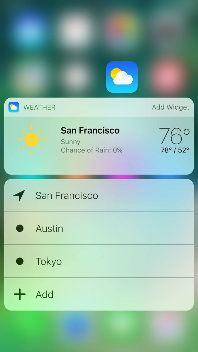
There are also new capabilities for 3D Touching app icons on the home screen. Mainly, apps can now provide information to be available in a miniature graphical view that expands above the standard textual options when an app icon is 3D Touched. For instance, 3D Touching the icon of the Weather app on iPhone in iOS 10 will show the current whether forecast above the options to open the app to a specific section.
Siri
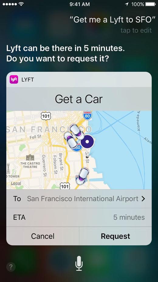
Apple started the Siri portion of the keynote by mentioning that Siri handles over 2 billion requests every week, which sounds pretty impressive for an assistant that most tech minded people seem to think pretty lowly of. Perhaps though, today’s changes might sway us to use the assistant more often, as Apple has finally opened up a Siri API to developers. The API is limited to only a handful of particular types of apps, including messaging apps, ride sharing apps, workout apps, and payment apps, but at least the doors have been opened. I have little doubt that in the years to come we will see those doors grow wider and wider, similar to how multitasking on iOS was once limited to a very specific set of apps, but after a few years to mature has now been opened for all.
The new Siri API seems very similar to Apple’s Extension architecture, and will allow installed third-party apps to be triggered when their name is invoked in a query (for instance, “get me a Lyft to SFO” will send for a Lyft car rather than an Uber). We’ll have to wait and see what third-party developers start cooking up before we know the true power and usefulness (or lack thereof) of these new integrations.
QuickType
The next new feature announced about iOS 10 was an upgrade to Apple’s QuickType typing suggestions. These appear in the pane directly above the iOS keyboard while typing, and in the past have not proven to be particularly useful (my only use for them currently is that the first one will always cancel a pending autocorrect without me needing to try to tap the tiny x button in the autocorrect bubble). In iOS 10, Apple claims that QuickType will be using deep learning to come up with truly more intelligent suggestions. It is also now capable of suggesting things other than simple text, such as emoji, sending your location, sending contact info, pasting a recent address that you looked at in a different app previously, or making suggestions in different languages from that of the keyboard you are typing into. The latter of those means you should now be able to switch back and forth between two languages while using the same keyboard, and not have autocorrect start changing every single word that you type.
I’m always interested in clever deep learning techniques, but I’ve rarely been impressed with them, so I’ll believe in the power of this new QuickType when I’ve seen and used it for myself.
Photos
The new features in Photos for iOS (as well as macOS and tvOS) are some of Apple’s most ambitious. Apple claims to be using computer vision technology to run powerful object and scene recognition on your photo library, directly on your device. After the device has finished scanning your library (which it will do after you initially download iOS 10 as soon as it is plugged into power, or if it is “sufficiently charged”), it will use everything that it has learned from the scan to enable several core new features of Photos.
The first of these features is called Memories, and its goal is to cluster photos together based on people involved, dates, locations and other data, in order to remind you of old memories in a poignant and meaningful way. The feature will not only gather the photos and videos together for you in a collection, but will actually automatically create a video for you using that collection. The video can be adjusted for length and tempo, but overall the output is almost completely controlled by the Photos app itself.
The next feature is powerful searching, which has the goal of allowing users to search for things such as objects or places, and have iOS automatically surface relevant photos even if they’ve never been tagged or provided other metadata to suggest a match. If you search for “horse”, for instance, the system should show you all the pictures in your photo library of horses. You should also be able to make searches like “on the beach”, or other similar context-involved queries, and get accurate results.
Next, a new Places album groups your photos based on the locations in which they were taken, providing a nice way to find photos from certain locations, or just relive trips or other events, etc. by reviewing photos from a particular place. The photos are displayed on a map, and you can pan and zoom around to look into different locations on that interface.
Finally, a new People album will compile photos of the same people together into groups, allowing you to look at all photos of a particular person at once. This is basically the same feature that the Mac version of Photos has always had, but is now being brought over to iOS.
Maps
The Apple Maps app has seen some love in iOS 10 as well, getting its most major redesign since it replaced Google Maps in iOS 6. The main view of maps is similar, but the pulsing blue dot representing your current location now has an extra little arrow showing the direction you’re facing at all times. Two floating buttons in the top right allow you to center the view on yourself, or to open the Map Settings page. There is also a new box in the bottom right of the view which displays the current temperature at whichever location you are looking at on the map, so you can actually see the temperature anywhere in the world simply by moving the the Maps viewport over the location.
At the bottom is a search box with “where do you want to go” inside. You can pull it up to see “suggestions” that iOS thinks you might want to navigate to, which may include common places that you go, places tied to upcoming calendar events, or recent locations you’ve looked at. Tapping places on the map will bring up a slightly redesigned information view with a directions button, pictures, hours of business, reviews, and other data from Yelp. My favorite little addition here is that you can now expand a business’s full hours within Maps rather than getting kicked over to Yelp if you want to see more hours than just the current day.
Maps has also seen improvements in its turn-by-turn navigation interface, including bigger buttons and text and the ability to move the viewport around while actually in turn by turn direction mode. Apple says that Maps will be able to monitor traffic as you go and alert you of hold ups somewhere on your route. You can even ask Siri to direct you to some group of places along the route you’re on, such as asking to be shown gas stations or restaurants along your route.
Finally, there is now a Maps API being released to developers. The API is only available to certain types of apps, such as ride sharing services, reservation booking apps, and a few others. The API will allow apps to place interface elements directly inside of Maps, such as showing you the live location of an Uber or Lyft that you called to pick you up.
Music
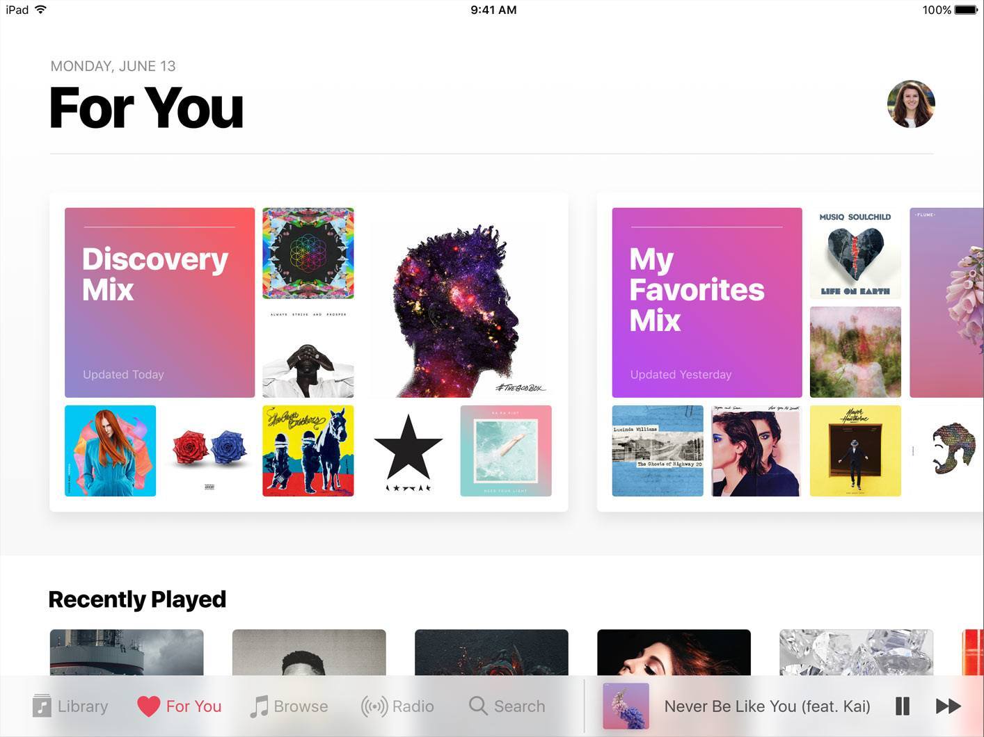
The Music app is getting a design refresh as well in iOS 10. The goal seems to be to try to simplify the app, which more or less exploded in complexity after Apple Music was grafted onto the old Music app last year. The new design features very bold headers at the top of each tab, a Library tab devoted entirely to your own personal library of music, a new Browse tab meant to help you discover new music, and redesigned For You and Radio tabs. Everything is bigger and there’s lots of white space, which could be a good thing or a bad thing.
One notable omission is the apparent end of another short-lived attempt at a music-themed social network from Apple. Yes, the Connect tab is nowhere to be seen in iOS 10’s Music app, and unless they plan to add it back in a later beta, the service that was such a big portion of Apple’s music announcements last year may have already been deemed a failure. I don’t think anyone is going to miss it.
Beyond the new design, the Music app is also now gaining native support for lyrics, a great addition if it can compile a database as big as the likes of Musixmatch. The new lyrics feature is also being added to the updated iTunes in macOS Sierra.
Apple News
Apple News hasn’t been left out this year either, receiving its own update and redesign. Major new features include a new featured stories section, the ability to subscribe to magazines or websites that offer paid subscriptions, and new breaking news notifications.
HomeKit
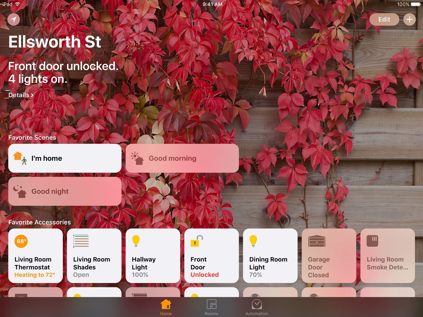
In iOS 10, Apple is finally bringing its own first party app to its HomeKit home automation service. The new app will allow users to turn on lights, unlock doors, raise or lower window shades, and more. Of course, all of these functions require a new Apple TV and HomeKit capable smart home devices
The new HomeKit features can also all be used through Siri, so you can send commands to your home via voice if you’d prefer that way too.
Finally, if you have HomeKit devices set up, Control Center will actually gain a third page of controls: swipe right again from the Music control page and you will see new HomeKit controls. These only show up if you have HomeKit devices set up, which is interesting to note for other possible additions to Control Center in the future.
Phone
The phone app remains mostly unchanged in iOS 10, but does pick up one interesting new feature for voicemail: Voicemail Transcription. Now Apple says your iPhone will be able to automatically transcribe voicemails for you so that you can review them textually rather than listening to them.
There are also two new Phone-related APIs. A new extension API for spam filtering will allow you to connect incoming numbers to third party spam databases, which can in turn identify whether or not an unknown number you’re getting a call from is known to be spam. The information will be displayed on the incoming phone call screen.
The second new API is for Voice over IP. This integrates directly into the lock screen and other parts of the system to allow incoming VoIP calls to show up full screen with the exact same interface that standard phone calls use. This sounds like a much better way to make sure you don’t miss important calls from services such as Skype or Slack, because the incoming call will look like an actual call rather than just a standard notification.
Messages
Finally, we have Messages. The iOS 10 Messages app has received the most massive update of all, getting a huge new set of features to elevate Messages from a glorified MMS app to a real messaging platform.
The app now supports rich links, which will expand small previews of links that you are sent inline in the Messages app. Links to YouTube videos will actually expand the videos themselves and let you watch them without leaving Messages. As of now the previews do not load automatically, but require being tapped on to load. That could change down the line in future betas, though.
The other big improvements come for sending new types of messages. The message box has now been shrunken down to half size to make room for two new icons besides the camera and dictation icons that have already been on either side of the box in the past. The interface for picking photos after tapping the camera icon has been tweaked slightly, now showing a live camera view that you can tap to immediately take a photo without the camera taking over the entire screen. You can also now use photo extensions on pictures directly after taking them and before sending them. This now includes the iOS Markup extension (which used to only live inside of Mail), so you can take a photo from Messages, mark it up, and then send the marked up version in your message.
Next to the camera icon is a new Digital Touch icon. This brings all the features to the iPhone that were previously only a part of the Apple Watch’s Digital Touch drawing/heartbeat recording features. Tapping this icon will replace the iOS keyboard with a screen full of Digital Touch controls. You can choose colors on the left and then tap or sketch in the middle to send drawings, or you can hold down two fingers to send a heartbeat. I’m assuming that this heartbeat is purely artificial, since the iPhone doesn’t have a way to know your actual heartbeat. (Maybe if you’re an Apple Watch user it could get it from there?) You can also swipe up on the Digital Touch interface to expand it to fill the screen, and at this point you get the added option of recording a video or taking a picture and then drawing with Digital Touch on top of those media files.
The third new button brings up iMessage apps, which is a new extensions API for Messages that allows developers to create mini apps that run inside of Messages. These apps are limited to certain types for now, such as content sharing apps (like GIF searching apps), payment apps (like Square Cash), and more. This drawer will also contain sticker packs, from which you can either send stickers as your own messages, or tap and drag them to stick them onto incoming messages from your friends. They will then show up for your friend in their Messages app as well.
Speaking of putting things on friends’ messages, you can also tap and hold on a received messages to react to it with six different icons: a heart, a thumbs up or down, a “HA HA” icon, a double exclamation mark, or a question mark. I don’t really know why Apple didn’t just open that feature up and let you react with any emoji, but for now it is limited to just these six. If you just want to send an emoji on its own without any added text, that will now result in the emoji showing up as much bigger than the regular text size. Both of these last two features are straight out of the Slack team messaging app, but I’m happy to see them come to Messages as well for use in my more personal conversations. One last emoji related addition is the “emojification” of words in your messages. When you switch to the emoji keyboard in iOS 10 after already typing something in the text box, any words that match with possible emoji will be highlighted. You can then tap on these words to replace them with emoji that have the same or similar meaning. I can’t wait to start using this feature regularly, and can’t help but notice that it could be used as a way to get around the continued lack of textual search in Apple’s emoji keyboard. To search for an emoji, just type in the search word and then switch to the emoji keyboard. If the word has matched anything then it will be highlighted and you can just tap it to substitute in the corresponding emoji.
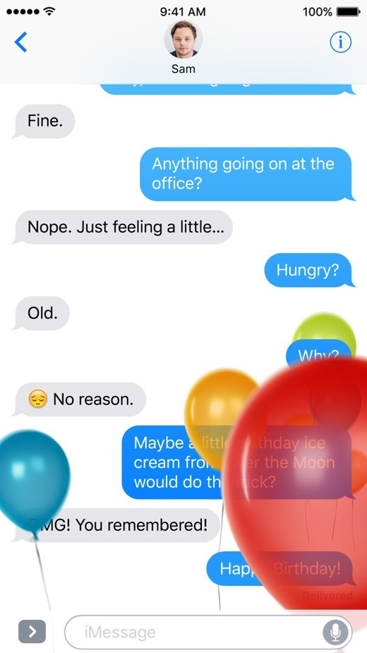
The final new feature for sending messages in the new Messages app for iOS 10 is called “send with effect”. Effect options can be accessed by 3D Touching the send button (which is now a blue up arrow instead of the word “Send”), and from there you can choose between bubble effects or screen effects. Bubble effects will affect the way your message animates onto the screen when you send it. Of the options here, Slam will make the bubble come in from above and shake all other bubbles on the screen, as if it were slamming down. Loud will make the bubble come in with huge text, and Gentle will make it come in with small text. Finally, invisible ink will cause the message to come in obscured, and the recipient will have to swipe on it to reveal the content. The best part about all of these effects is that the bubble being sent with them will transition back to normal size after the effect has finished. That way, even if someone “shouts” every one of their messages, you won’t end up with just a few bubbles consuming your entire screen in the conversation.
Screen effects are even more in-your-face than bubble effects are. There are five different options to choose from: balloons, confetti, lasers, fireworks, and shooting star. Each will cause the corresponding animation to show in the background of the entire conversation view in the recipient’s messaging app.
There’s no question that the new features of messages, while perhaps a bit too cheesy in some places, are going to liven up the experience of conversing in the app. We’ll have to wait and see for the public release to gauge how much people will like the new additions, but with apps like Snapchat, and messenger services with stickers getting so popular, I bet the new Messages app will be a big hit.
Miscellany
I’ve gone over all the big new features, but here are some small ones that I’ve noticed while playing with the initial iOS 10 beta. Keep in mind that any of these could be subject to change before the initial release.
The first thing I noticed was that Apple has changed the sounds that key taps make. Now the taps sound a bit softer and less clicky, and I actually love the change. I think it’s a far better sound than the old clicks were, and actually am not bothered when I accidentally leave the sounds on and start typing.
Next, the animations for opening and closing apps have been refreshed as well. It looks like the background of other apps around the closing app zooms back into view faster than the closing app icon itself does. I’m not sure if I’m just imagining it, but the animation feels quicker than the old iOS 9 version did too. In fact, all of the animations throughout the new OS feel quicker. I can see this most clearly in the iMessage send animation, where the bubble shoots up out of the text box and onto the screen far faster than it did in iOS 9.
A change that I’m very pleased with is increased text size and contrast on the now playing screen on the lock screen. Now I can more clearly read the song title and album and artist information. Even more significantly, the timestamps for time elapsed and time remaining on the top left and right are now bright white instead of the gray of iOS 9. This greatly increases the contrast, and I can actually easily read those timestamps in iOS 10, something I always struggled to do in iOS 9 (mainly in bright sunlight or when wearing sunglasses).
The last thing I’ll mention is the clear pivot away from the thin text and lines pioneered by iOS 7. Apps in iOS 10 now feature bolder design language all around, sometimes strikingly so (like in Music). It feels like Apple may not yet have settled on a clear system-wide choice, because different apps have very different levels of boldness and thickness. On the other hand, maybe it’s alright that different apps differentiate themselves in some more fundamental ways of design, rather than all Apple apps looking almost exactly the same except for different core colors. We’ll keep watching this throughout the beta period to see what changes and what doesn’t.
Wrap Up
iOS 10 is a massive update to Apple’s biggest operating system. It brings fundamental design changes throughout the system, and shows that Apple isn’t afraid to stray from the cookie cutter designs that their apps have started to fall into over the last few years since iOS 7. The new iOS is beginning to show a new level of maturity, expanding to unprecedented areas and opening itself to third parties in ways that iOS has never done before.
iOS has always been known as Apple’s closed-off, walled-garden operating system which allows little customizability. With iOS 10, Apple is starting to break down these walls (even if only by a little bit) and open their operating system to the outside world.
Changes in Messages show that Apple is not prepared to let its most-used app fade into obscurity, but instead still plans to play a big part of the future of messaging clients. Even if this future seems more playful, silly, and a bit un-Apple-y, the company is prepared to do what needs to be done to stay modern and interesting.
Ambitious new features based on “deep learning” and “computer vision” may be taking advantage of industry buzz words to catch attention, but they also show that Apple isn’t afraid to fight against the mindset that its privacy-minded approach does not prevent it from the impressive features that Google and other tech companies are pursuing through user data mining. We’ll wait to see how well these features work in practice before we declare Apple any victories in the areas.
I think the story told by iOS 10 is exciting, and gives me hope that Apple is not faltering or falling behind the pace of other companies in the industry. I can’t wait to watch iOS 10 as it grows more polished over the coming weeks and months, and see how it goes when it finally gets into the hands of hundreds of millions of users.
The developer preview of iOS 10 is available now on Apple’s developer portal, and the final version will be released to all iOS users as a free update this Fall.
You can follow @MacStoriesNet on Twitter or our WWDC 2016 news hub for updates.


