We’ve seen what it’s possible to achieve with CSS before: the Opera logo, a Safari window built inside Safari itself, a Kinetic Type video. What about Apple-related stuff though? Now we have an iPhone and some iOS icons made entirely with CSS.
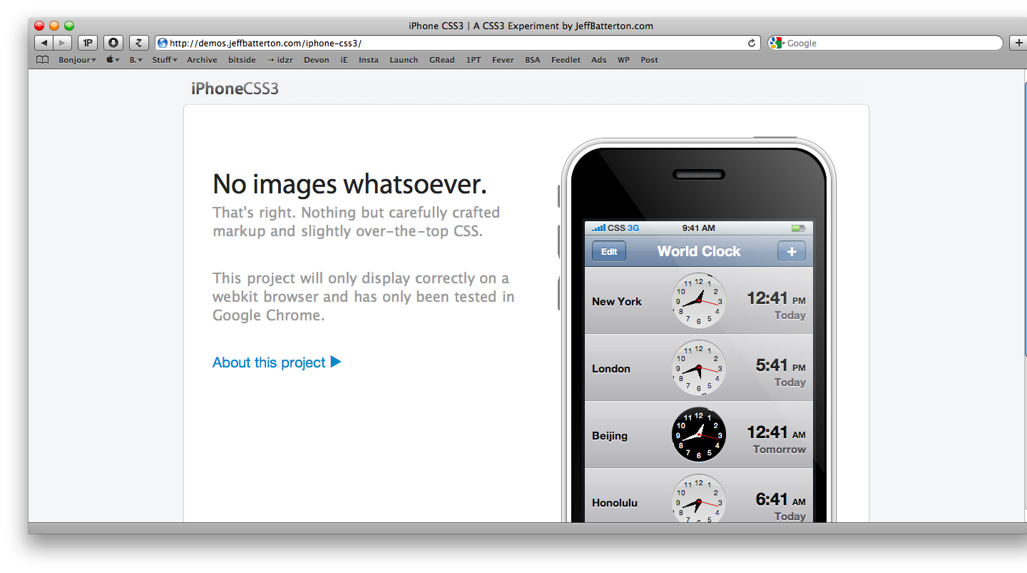
Jeff Batterton created an iPhone template using CSS3. Take a look here.
“I decided to make an all-CSS clock. I began to work on it and when it was nearly complete, I came across another all-CSS clock. I wanted my idea to be original so I put the project on hold for a while until I could come up with a new approach.
Sometime later, I decided to skin my clock like the iPhone world clock. But that wasn’t quite enough. I decided to recreate the entire iPhone world clock app with CSS. I decided to take it one step further and go with the entire iPhone - sans images!
Most of the methods and properties I used are pretty simple and straightforward (border-radius, box-shadow, gradient), and some of them are a little more complicated (transform, box-reflect). All together, I was/am pretty pleased with the final product. While it’s not perfect, I think it’s about as close as one can get without using images.”
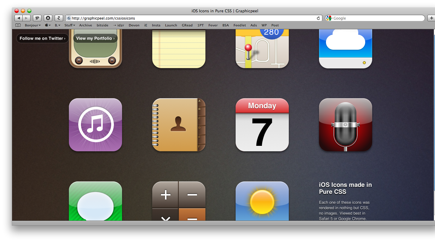
Louis Harboe took a different approach, and decided to try to render standard iOS icons such as Mail and Weather (the stock iPhone apps) with CSS. The result is stunning and available for your pleasure here.
“The following demo was made using a variety of CSS techniques. Rounded corners, shadows, gradients, rgba, pseudo-elements, and transforms are just some of them. A lot of these were generated by helpful tools, such as westciv’s tools and Border Radius. By combining these techniques, you can create rich graphics with just a few lines of code. Here are a few examples.
In the contacts icon, I used 5 different shapes for the silhouette icon. The head is a rectangle with rounded corners, followed by another rectangle for the neck and a distorted semi-circle for the body. In order to get the curve of the shoulders to the neck, I placed two circles on top of the shapes.
The weather icon has several rays of light shooting from behind the sun. Each one of these rays is actually a long rectangle with a gradient that fades to transparent on either end. I used -webkit-transform:rotate to rotate each rectangle to a different angle. The same effect was used for the iTunes icon.”
To get the cloud icon on the iDisk icon, I used two circles layered on top of each other, above a rounded rectangle. The larger circle has a gradient that cuts off just before the rectangle.”
Impressive.