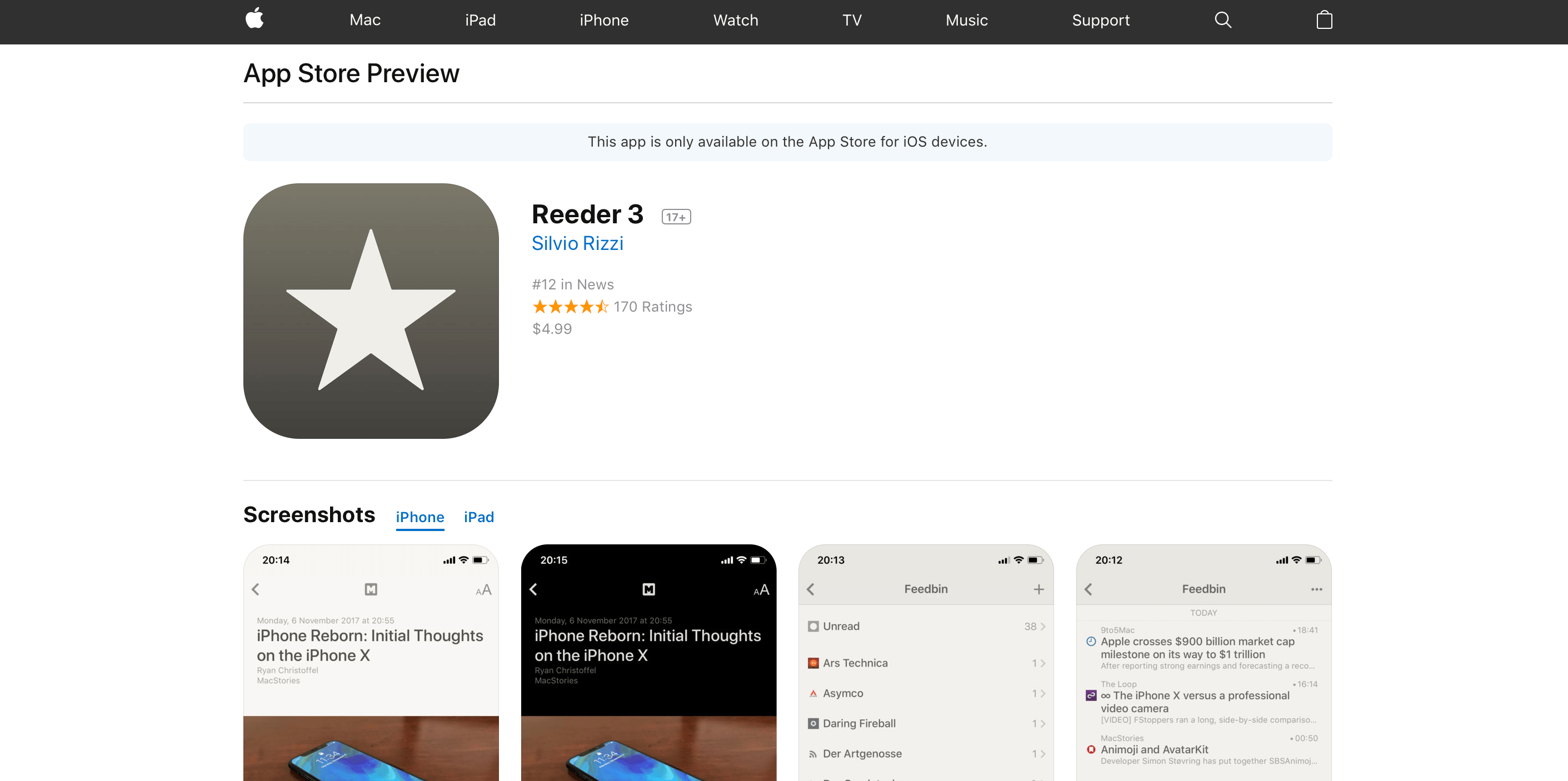
Apple has introduced new web preview pages for the App Store and Mac App Store. The new design more closely tracks the App Store changes debuted as part of iOS 11. Interestingly, the web previews for Mac apps share the same refreshed design despite the fact that the Mac App Store has barely changed since its introduction in 2011.
The new design features bigger images and more white space. Reviews are laid out horizontally as cards near the bottom of the page. Longer reviews open in a pop-over card that hovers above the page when the ‘more’ link is clicked. Mac apps include a ‘View in Mac App Store’ button near the top of the page too.
The new web previews are only accessible from search results loaded in the desktop version of Safari or another desktop browser. The mobile version of the browser offers to take you to the App Store when a link is tapped, even if you long press the refresh button and pick ‘Request Desktop Site.’ In my tests, the desktop search results that load in mobile Safari look more like their desktop counterparts, but DuckDuckGo and Bing still offer to open the App Store, whereas Google’s links are simply unresponsive.
I like the look of the new preview pages. The old ones were too closely tied to the design of the iTunes App Store, which was eliminated last fall.
The inclusion of Mac app previews is intriguing. It makes sense for both Stores to share a common design language, but the Mac App Store is in desperate need of love and attention for many reasons that extend beyond its design. Whether this is a sign that the Mac App Store will get that attention soon, Mac apps will be thrown in with iOS apps on the App Store, or something else will be interesting to watch.


