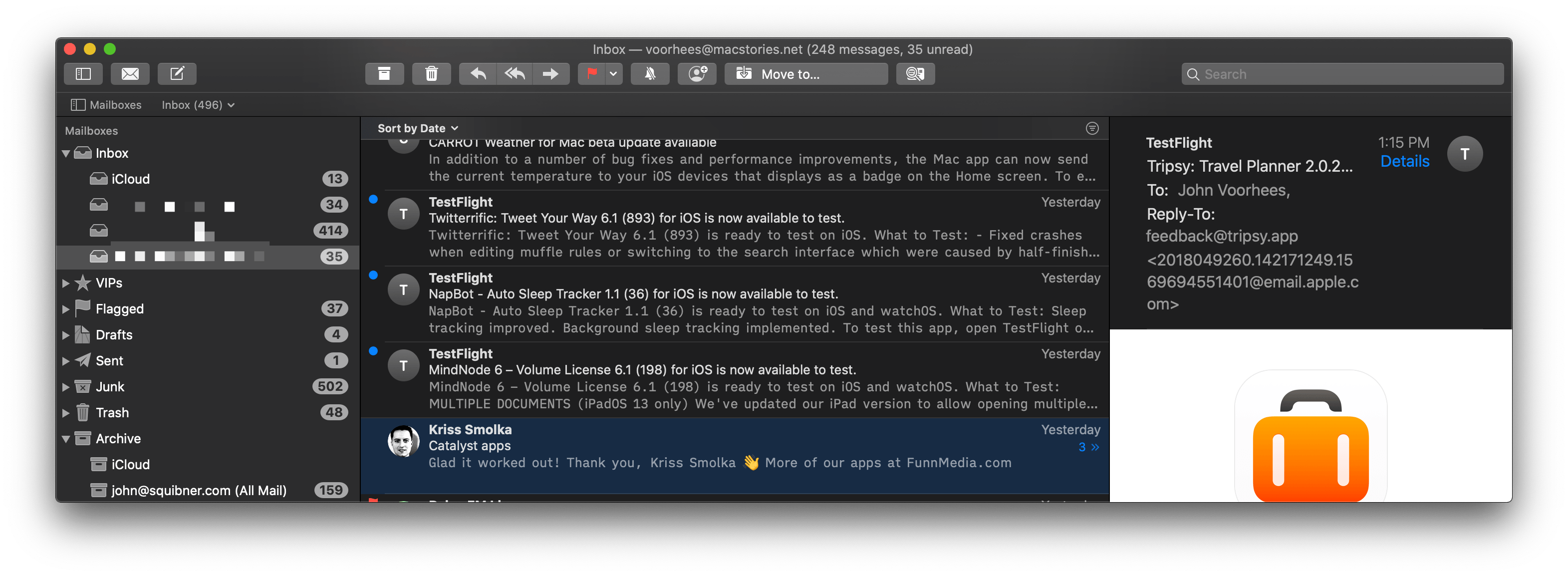
Unsubscribe links are often buried in tiny print at the bottom of an email message, which requires scrolling and makes them hard to find. I love that Mail now surfaces the Unsubscribe link at the top of the message where it’s easy to click. It’s a small touch, but the kind of thing where the saved time and aggravation avoided adds up over time, especially if you dive into your mailbox to unsubscribe to a bunch of mailing lists at once.
One of my favorite features of the Sanebox web service is the ability to bar messages from certain senders from my inbox. Apple has added a similar feature to Mail that lets you block certain senders, sending their messages directly to the Trash. I expect to use this feature a lot for misdirected messages and mailing lists that don’t honor my unsubscribe requests. Between VIPs whose messages can be viewed in a special Smart Folder and blocked senders, Mail now has both ends of the spectrum covered well.
Another excellent quality-of-life feature added to Mail with Catalina is the ability to mute message threads, so you no longer receive response notifications. Handy for group emails with lots of back and forth about which you don’t want to be notified, the feature can be enabled by going to the Message menu and selecting Mute, using the keyboard shortcut ⌃⇧M, or clicking the mute button in Mail’s toolbar. A bell icon with a line through it appears next to any muted threads in Mail.
Mail has added new view options too. Perhaps my favorite is the ability to highlight conversations in the message preview column. It’s a quick way to visually identify messages where you’ve received a response and may need to follow up further. You can also show and hide additional information in the preview column like message size, contact photos, and more as well as display message previews at the bottom of the window instead of to the side. I prefer Mail’s default settings, but it’s nice to have more options for users to make Mail suit the way they work better.
Safari
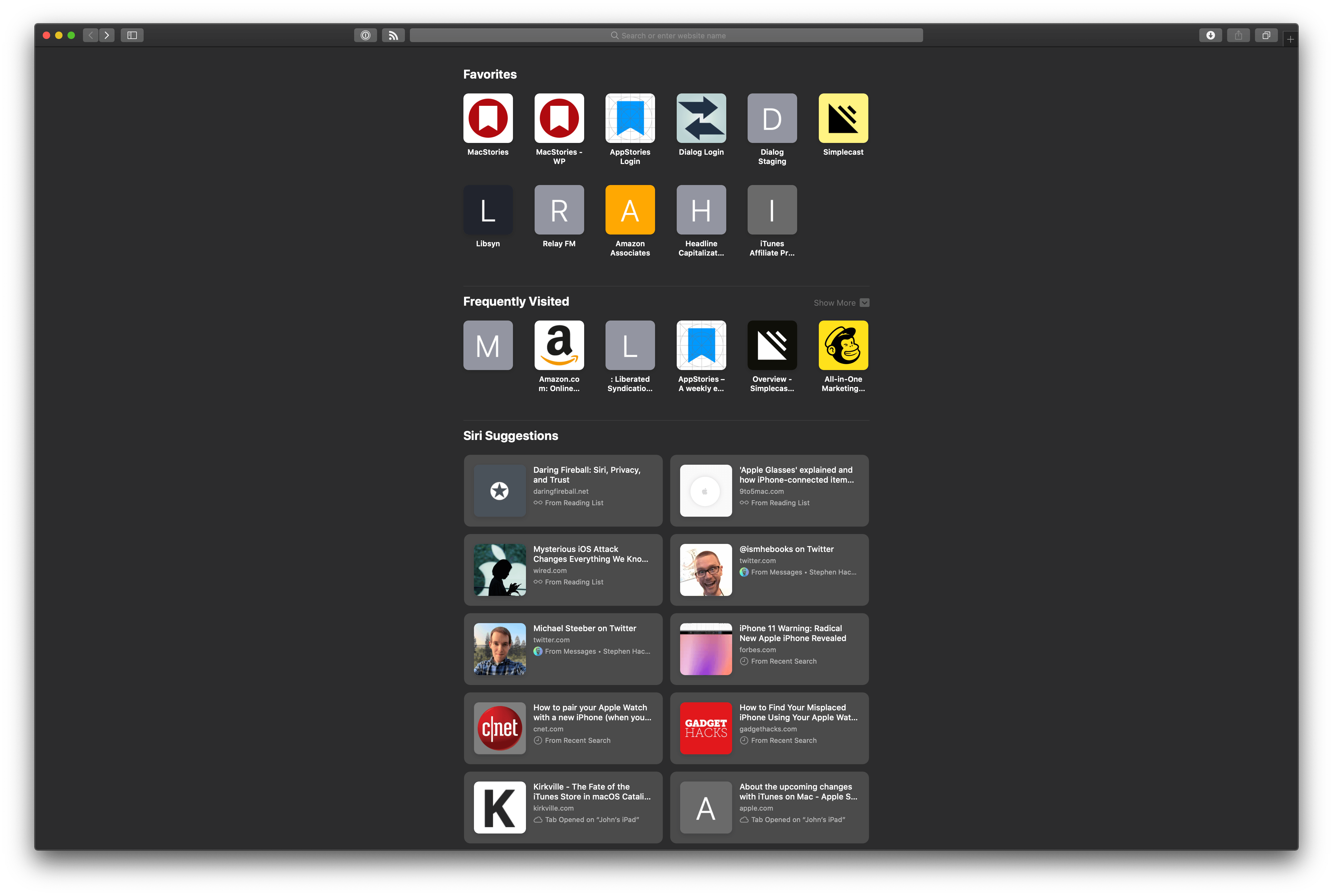
Siri Suggestions in Safari pull link suggestions from apps, other devices, your search history, and other sources.
The changes to Safari in Catalina are relatively minor compared to iOS and iPadOS. Still, there are a handful of helpful new features. You’ll notice the first as soon as you open a new tab. Beneath any Favorites you’ve saved and your frequently visited sites are Siri Suggestions, which are a collection of links gathered from multiple sources. I’ve seen links pulled from my Reading List, Bookmarks, tabs that are open on other devices, my search history, and the Messages app. I haven’t used the Siri Suggestions a lot, but especially with the links pulled from my Reading List and Messages, they’ve served as a reminder of things I want to read, even if I don’t end up reading them that moment on my Mac.
There are a few other conveniences as well. When a video is playing in Safari, you can click and hold on the audio icon in the page’s tab, which will give you the option to enter Picture in Picture mode. I’m not sure entering PiP mode this way is any easier than using the icon next to the playback controls for a video, but it’s nice to have another option.
As you type a URL or search into Safari’s address bar, in addition to suggesting search engine terms and sites from your bookmarks and history, the app now suggests any matching tabs you have open on your Mac or other devices. Also, Safari does more to encourage good password habits by warning you if you pick a weak password.
Apple has closed the Safari Extension Gallery too. Extensions are still available, but only through the Mac App Store. Behind the scenes, this means that the creators of Safari extensions need to have an Apple developer account, use AppKit to build their extensions, and deal with the Mac App Store as a distribution channel. The practical effect is that there are likely to be far fewer extensions available for Safari than in the past. The lack of options going forward will be a shame. However, I’m not surprised Apple wants extensions to be subject to App Review. I stopped using all but a couple of trusted extensions long ago because of the security risk they can pose and the drag many are on Safari’s performance.
Photos
Photos has seen a lot of change in recent years as Apple has seemingly struggled to find a better way of displaying large photo collections. This year, the company has redesigned the Photos tab of the app on the Mac and iOS, aided by machine learning, with impressive results. Not only does Photos look better than ever, but it’s easier than ever to move between the iOS and Mac versions of the app.
The lion’s share of the Catalina changes to Photos are found in its redesigned Photos tab. Photos shares the general window design that has become popular in Apple’s media apps and other system apps with a lefthand sidebar and a content viewing area that dominates most of the rest of the window. In Catalina, Photos’ sidebar is exactly the same as it was in Mojave. What has changed is the way photos are presented in the Photos tab.
The Photos tab is at the top of the Library section of the sidebar. It’s the tab that opens by default when you first launch the app, and for good reason; it’s the main view into all of your photos. At the same time, the Photos tab has been the one that Apple has struggled to find an effective way to present, especially for users with large photo collections.
This year though, Apple has nailed it. The difference is striking from the first moment you open Photos. In Mojave, the Photos tab opened into what was effectively an ‘all photos’ view that included every image whether it was a duplicate, strikingly similar, or a screenshot, for example. Great shots that you’d like to revisit and share were easily lost among the junk. Be warned though, the first time you launch Photos, the process of analyzing your photos to generate the app’s beautiful layouts takes time. I’ve got a library of 45,000 photos, and it took days to analyze my library the first time. I don’t know if it was a beta bug or not, but after a couple of days, I stopped checking on the progress, and it finished.
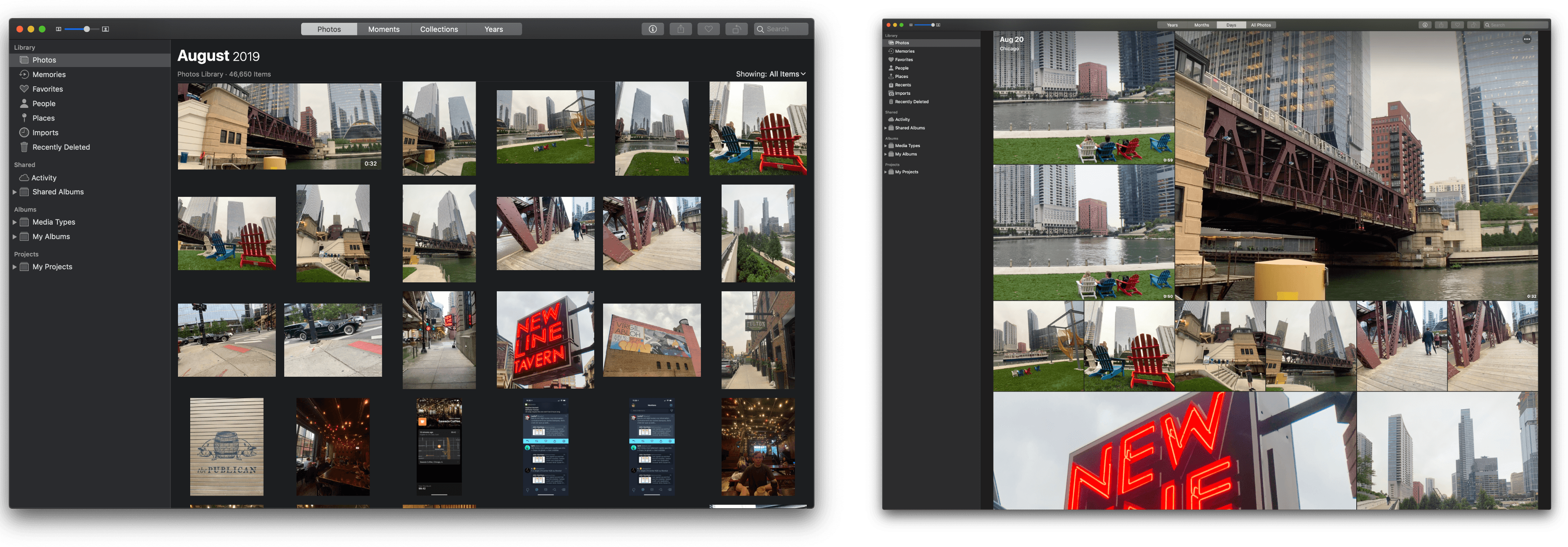
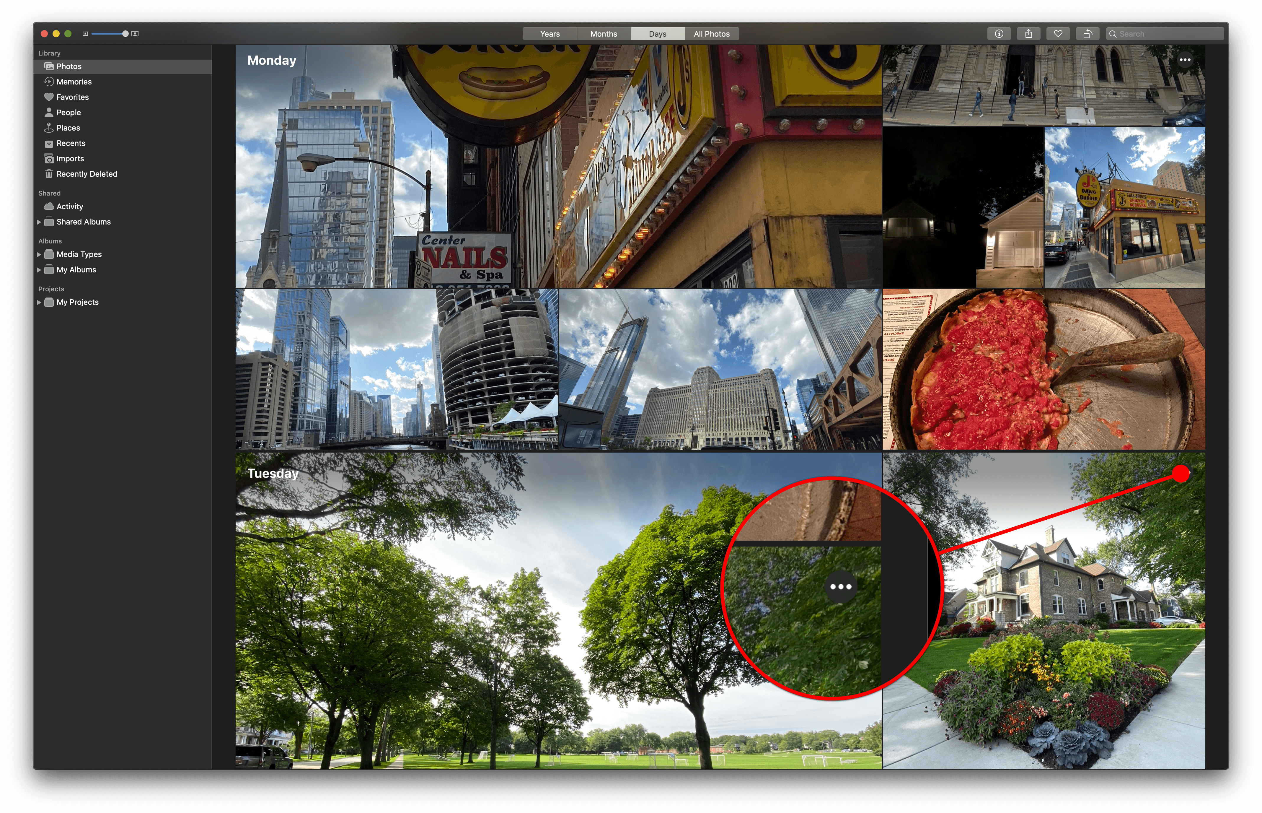
Catalina brings machine learning to bear on your photo library to present you with only your best shots. The results aren’t perfect, but they are far better than previous efforts. By way of example, check out the screenshots below that capture a small portion of my photo library from an August day I spent in Chicago. The screenshot of Photos from Mojave shows small versions of each photo in chronological order in the aspect ratios they were taken.
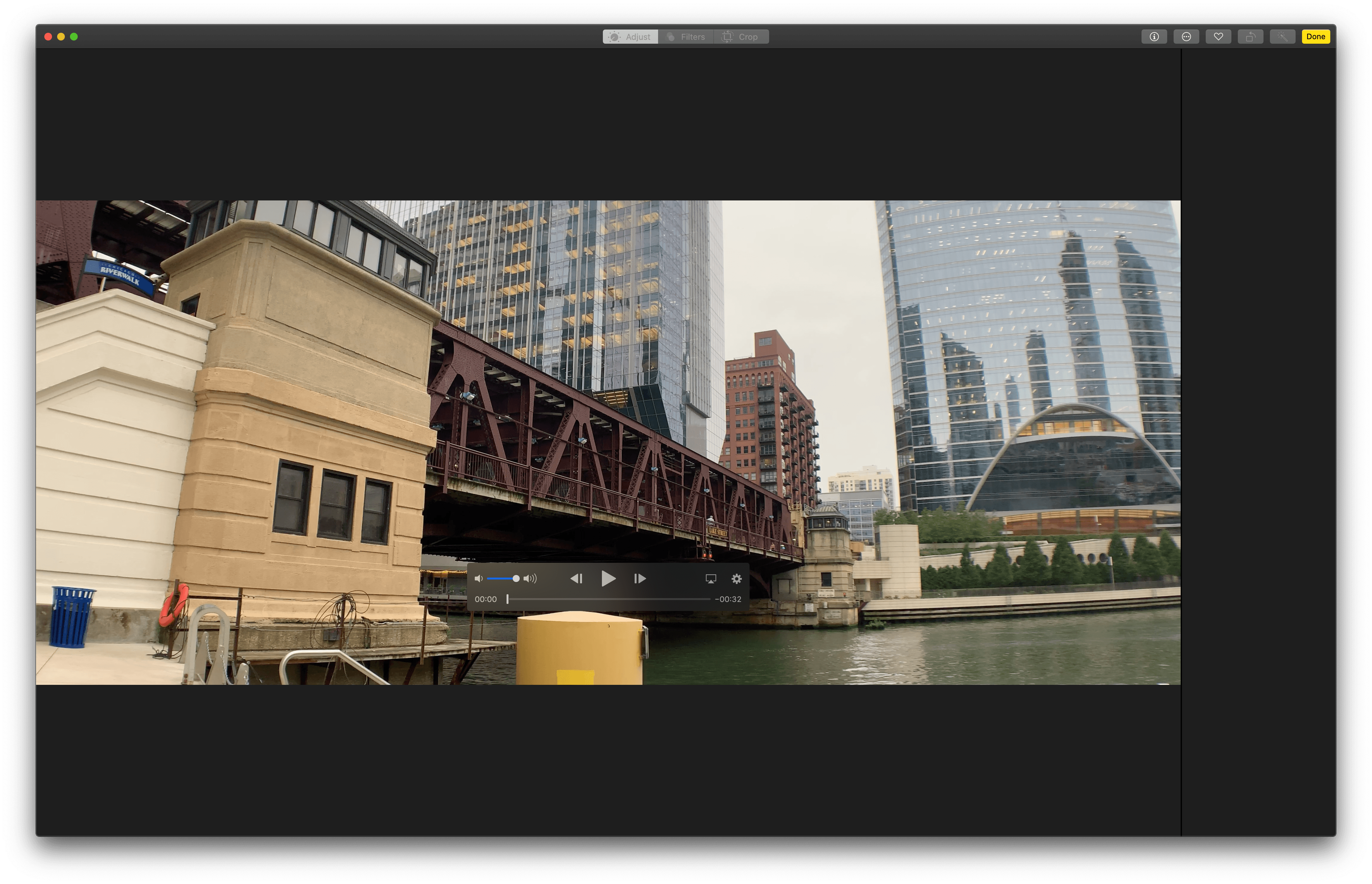
In contrast, Photos running on Catalina has created a much more compelling collage of my best photos, zooming in and framing the subjects of some of them using machine learning. Photos in Catalina has also reserved the most space for a short movie of an L train crossing the Chicago River, which auto-plays without sound, and hid three screenshots I took in the midst of scenes of the city.
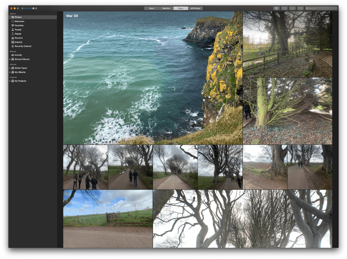
The view in the Catalina screenshot above is from the Days section of the Photos tab. Images can be browsed by Months and Years sections too. To provide a sense of place, moving from one section to another animates to the same spot in the newly-opened section.
For example, if I’m viewing Thanksgiving Day 2017 and click the Months section along the top of Photos’ window, I’ll be taken to a view of November 2017. Clicking the Years section takes me to 2017. Clicking back into Months or Days brings me right back to the same place I was previously viewing. Also, no matter how far back you are in your photo library, you can always click on the button for the section you’re viewing to be taken to the current date.
The Years section is a simple grid of square thumbnails with one photo representing the entire collection for that year. The thumbnail chosen feels randomly selected, but because it’s so hard to capture an entire year in one photo, it’s hard to be sure. Unfortunately, there’s no way that I can tell to switch the cover photo for a year.
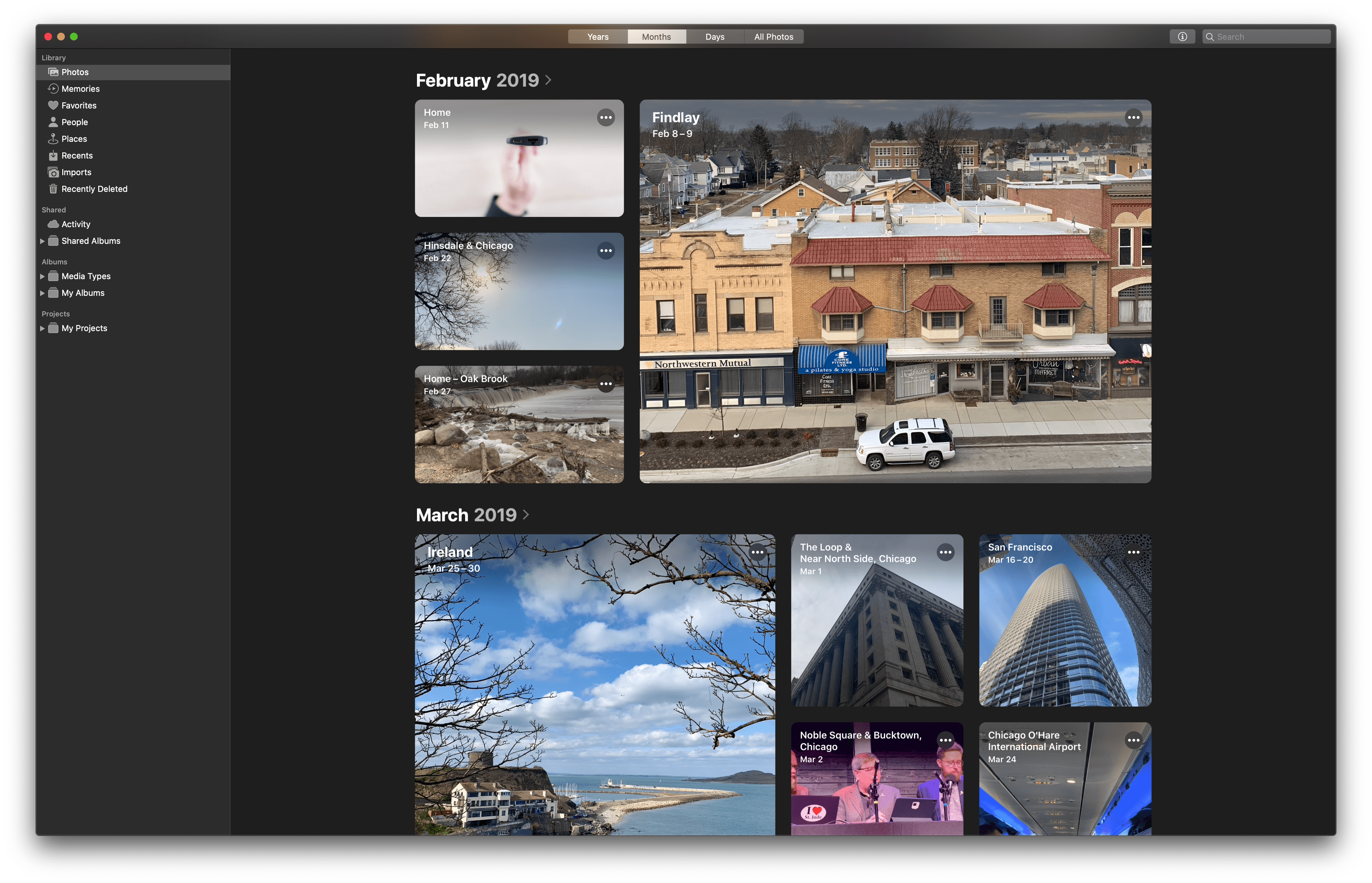
Months are displayed as rectangular collages of several photos per month that do a much better job of providing a sense for what happened in that time frame than Mojave did. The collages aren’t as big as they are in the Days section, but the layout, along with location information, serves as an excellent way to browse within a particular year.
The biggest collages of photos are reserved for the Days section, which shows off a collection of square and rectangular still images and movies by day. Movies and Live Photos play without sound as they scroll into view. The Days section also intelligently groups collections of photos by events like birthdays, holidays, and locations.
Machine learning also aids in framing each image spotlighted in a collection, centering the primary subject of the image and hiding what it concludes are duplicates or screenshots. As you scroll through a date that has more than one screenful of photos, the date and location scroll along at the top of the window to help maintain your sense of place.
The fourth section in the Photos tab is All Photos, which is very close in design to the Photos tab in Mojave. I don’t expect to spend a lot of time in this section of Photos going forward, but it’s good to have when I’m looking for something that isn’t highlighted elsewhere.
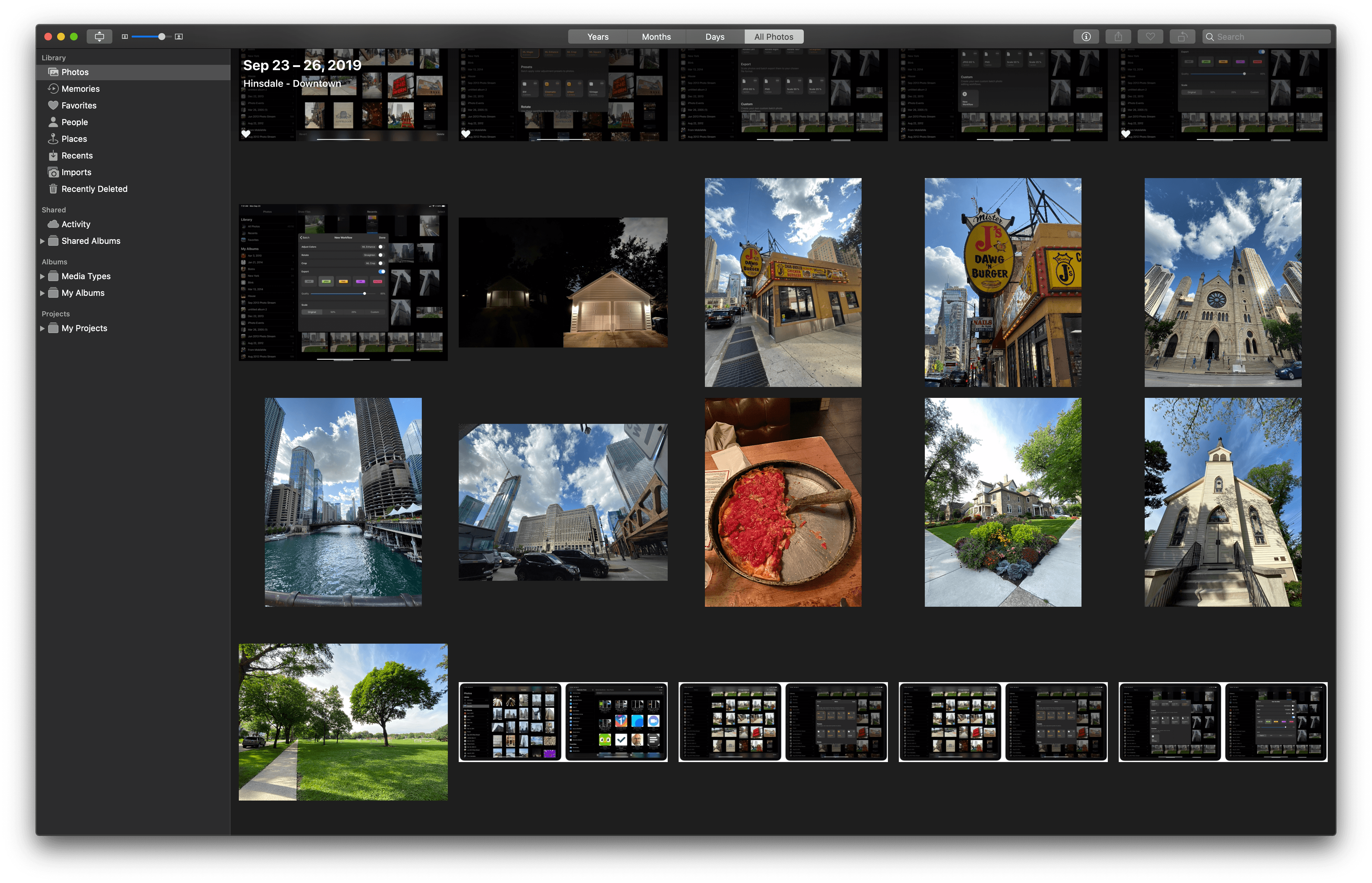
The All Photos tab of Photos hasn’t changed much, displaying thumbnails of every image in their original aspect ratios.
The Months and Days views have an ellipsis button in the top-right corner of each collage of photos. Clicking it gives you options to Play Movie and/or Show Map depending on what information is available for that collection of photos. Play Movie starts an automatically-generated Memory Movie of the day, while Show Map switches to a map view of where that day’s photos were taken.
Memory Movies are a new addition to the Mac, which were previously only available on iOS. The feature generates a slideshow of images and movies from an event with background music. When a movie is playing, you can adjust its length and background music from the gear icon next to the playback controls. In the Days view where the images for a particular day can extend beyond the available view of a window, the ellipsis button scrolls along the top of the view with the date and location information.
The ellipsis buttons in Photos are an interesting addition that I don’t think everyone will like. They’re a design element borrowed from iOS to reveal a menu of multiple options not unlike macOS’ right-click context menu. The button has the advantage of being more discoverable than a right-click or option-click, but it is only implemented in some system apps and not always consistently.
I’m not surprised by the occasional design inconsistencies between apps that have adopted Catalina’s new design language. Other system apps don’t adopt the ellipsis button at all because they weren’t updated this year. There’s a design shift occurring that’s going to take time to permeate macOS completely and consistently. That said, I like the addition of the ellipsis button to Photos because it’s more discoverable than right-clicking and familiar to iPadOS and iOS users.
I also expect that the ellipsis button won’t be the last UI element that migrates to the Mac. SwiftUI promises to streamline UI development across all of Apple’s hardware and one way to deliver on that goal is to unify UI elements where it makes sense. For example, I can imagine a scenario where the ellipsis button ends up dedicated to actions available across iOS, iPadOS, and the Mac, while the Mac retains right-click menus for Mac-specific actions and things like system Services.
Although the iOS and Mac versions of Photos are similar, iOS got new video editing tools that I wish were available in Catalina too. On iOS, you can make the same sort of edits to videos that you can to photos such as cropping and rotating, adding filters, and adjusting variables like exposure, brightness, and contrast. Currently, only clip trimming is available on both platforms. Still, Photos for the Mac outshines its iOS counterpart in some ways, including by having tools to retouch photos and adjust color curves, which iOS cannot do.
I have 45,000 images and movies in my Photos library, and it’s always felt like a chore to navigate it. The UI in Mojave worked, but it didn’t lend itself to browsing and discovery of the best photos in my library. Catalina changes that. Probably the hardest part of writing this section of the review was stumbling across past events in Photos as I tested its features and getting lost in browsing them.
So many apps are essentially front ends for databases. The trouble is that once a database reaches a certain size, column views and sorting aren’t enough. No two apps demonstrate this better than Photos and Music. By stripping away the ordinary, duplicates, and junk in Photos and surfacing related and favorite music in Music, Apple has moved away from a Finder-like list of files to something that is smarter and tailored to your tastes.
This is a big shift for Apple and one that won’t be easily accepted in some quarters. Sure, you can still access a long list of every song in your Music library and a grid of every photo you’ve ever saved, whether it’s an accidental screenshot or a family portrait, but those views have been rightly deemphasized.
For something like photos, it’s the difference between re-experiencing special moments of your life and managing files. As much as I’d like to edit and curate every photo I’ve ever taken carefully, I simply don’t have the time to do that. With the update to Photos, I no longer feel bad about that. Instead, I can simply enjoy my photos more easily than ever before.


