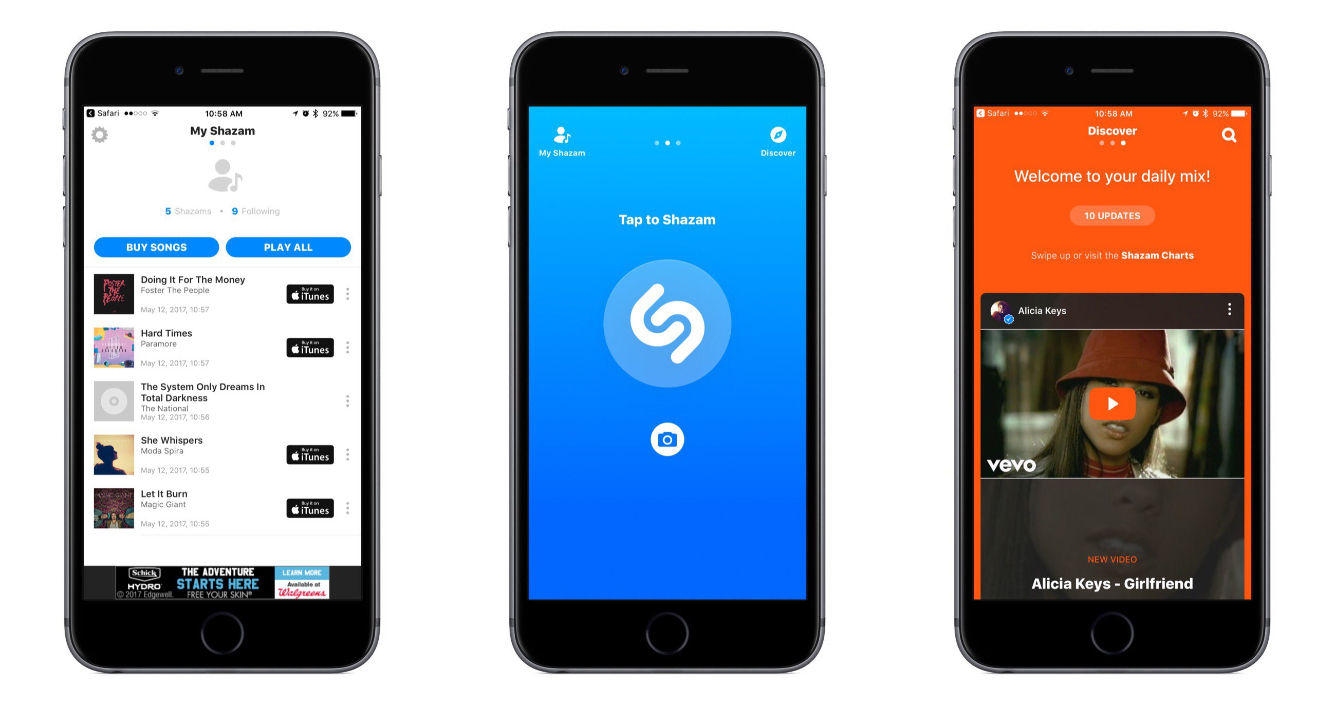
Shazam for iOS has introduced an update that makes app navigation more simple and streamlined. Gone are the traditional navigation tabs at the bottom of the screen; they have been replaced by a paginated layout where a swipe left or right is used to switch screens.
Launching Shazam lands you on the Home page, which is devoted almost entirely to the Shazam button. Tapping it will cause the app to start listening to what’s playing; one change to the Home page is that you now activate Auto Shazam with a long-press on the Shazam button. Auto Shazam allows the app to continue listening to what’s playing even after the app closes.
The top of the Home page indicates that there are three pages in total to navigate through. To the left of Home is My Shazam, to the right is Discover1, and swiping back and forth is the primary way to get where you want to go. This type of layout resembles that of apps like Snapchat, only Shazam pulls it off in a less confusing manner. Not only do you always see three navigation dots at the top of the screen to indicate your current place within the app, but the Home page also contains icons that show which pages are placed on the left and right – Snapchat could benefit from similar aids, for new users at least.
My Shazam hasn’t changed much from before, but in an effort to consolidate the total number of pages in the app, Discover now includes the contents formerly found in Trending as well. A Chart Update card is included with your daily mix, plus you’ll find a button at the top and bottom of your 10 daily updates that takes you straight to Trending.
I appreciate what Shazam has done to try simplifying its app, both in the number of pages to navigate through, and in adopting the swiping gesture to handle that navigation with ease. Not every app would benefit from such a streamlined interface, but it works well here.
- Unfortunately Discover has not yet made it to the iPad, so Trending stands in its place on that device. ↩︎


