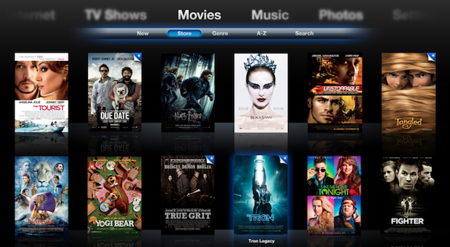
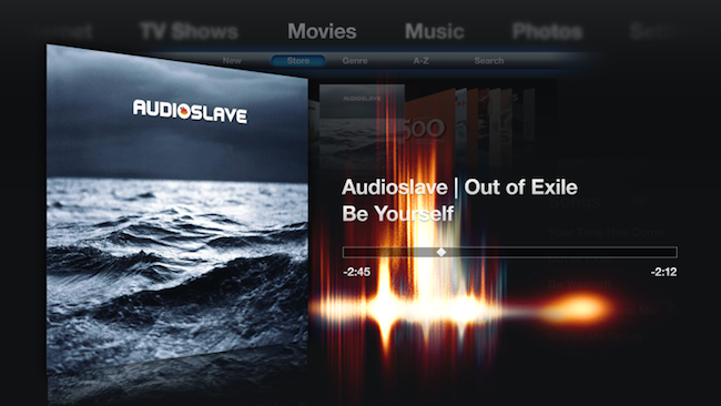
Designer Zach Forrester tried to imagine what would Front Row look like if Apple updated its interface with new shiny pixels, animations and a visualizer. The result, a series of mockups available here, is impressive: Zach took the basic concept underlying Front Row’s UI and the Apple TV’s browsing experience and re-imagined them with a bit of artistic sense and pixel perfection in mind.
I’m not sure about the keyboard as-you-type he designed, but everything else looks great: from the Movies view with larger poster art and slide-in animation for a single item, to the music player that includes a subtle visualizer on top of the Cover Flow navigation and next to the Now Playing album art.
More screenshots are available here, and there’s a limited web demo for you to play around as well. [via Beautiful Pixels]


