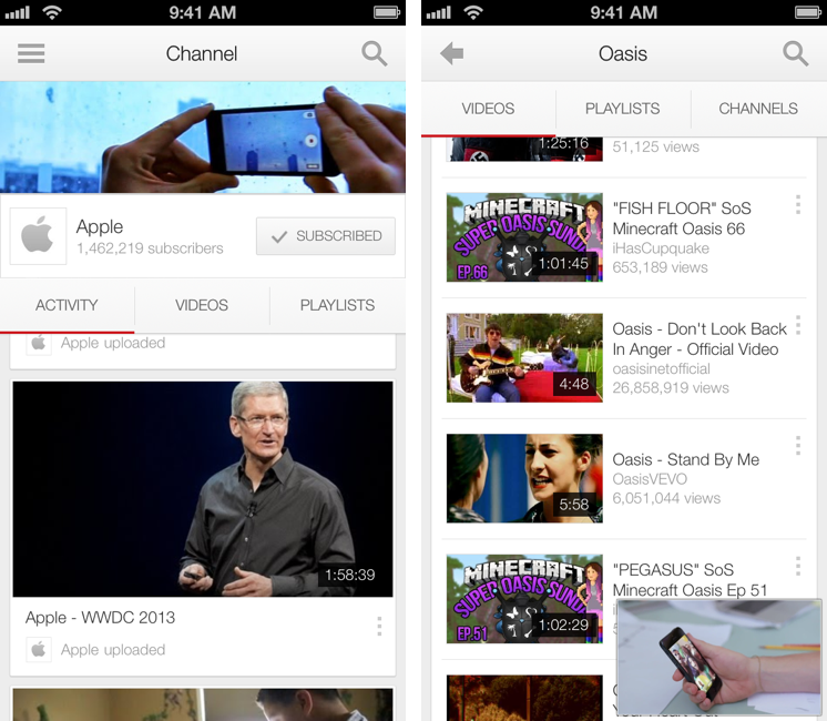
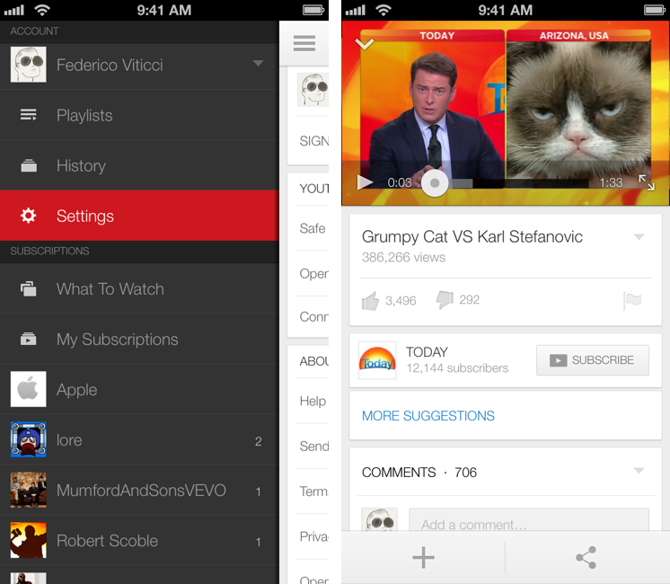
Today, Google has officially launched version 2.0 of its YouTube app on the App Store, bringing a tweaked user interface, new icon, and picture-in-picture to the mobile client.
The big new feature of this version is picture-in-picture for videos, which allows you to keep watching a video while browsing or searching. This has been a popular option of third-party clients such as FoxTube for quite a while, and, in Google’s implementation, the player can be dismissed with a tap on an arrow button or a swipe down directly on the video player. Both on the iPhone and iPad, dismissing the player reveals a delightful animation and transition that quickly sends the video down to the bottom of the screen, where you can tap again to enlarge it, or swipe it away to close it.
Overall, the improved animations of the app are much snappier and responsive than version 1.4, and there are dozens of new transitions, translucency effects, and subtle interface hints that contribute to making navigation faster and fluid.
More importantly, YouTube 2.0 packs a tweaked design – starting from the icon – that suggests Google has been getting its iOS apps ready for the major 7.0 update coming to iOS this Fall. The app gets rid of several textures and graphical elements for a more subdued design with a focus on colors (red for selections, gray for the sidebar, whitespace for navigation and search results), transparency, gestures, and animations. It wouldn’t be hard to imagine Google going one step further with this new design and enhancing with iOS 7-only APIs such as blurs and physics effects once iOS 7 is available. The new app doesn’t mimic the look of Apple’s iOS 7 apps, but it does look like Google’s way of easing users into iOS 7’s (fast-approaching) future.
Based on my initial tests, YouTube 2.0 seems to be a powerful and welcome improvement over the old version. The picture-in-picture player is a great addition, and the app has a cleaner, more responsive interface.
YouTube 2.0 is available on the App Store.


