Yours truly, back in September 2021:
In case I haven’t been clear enough above, I’ll be blunt: I don’t understand why the compact tab bar exists on iPad, and I think this design shouldn’t have shipped to customers.
My understanding is that Apple thought the benefit of removing a separate address bar, therefore saving a few vertical pixels on the page, would have made all the compromises we’ve seen so far worth the trade-offs in usability. I think that’s a wrong and mismanaged decision driven by an unmotivated pursuit of an iPhone-like design that has no place on iPad. If slightly increasing vertical space on webpages is Apple’s only argument here in favor of the compact tab bar, you tell me if it’s worth the trouble by judging from the screenshots below.
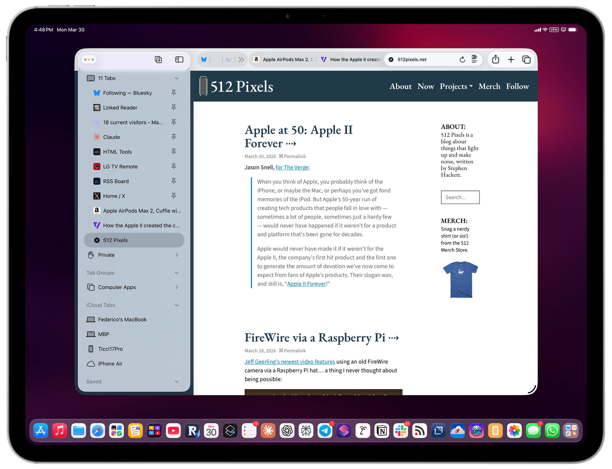
If, like me, you missed this in the release notes for the recently released iPadOS 26.4, the compact tab bar has returned to Safari for iPad after mysteriously disappearing in iPadOS 26.0. And I’m here to tell you that not only do I not despise it like I did five years ago, but I actually like this mode and have been working with Safari on my 13” iPad Pro like this for the past two weeks.
I believe there are two reasons behind this change of heart. The compact tab bar in iPadOS 26.4 has a slightly different design from the original version in iPadOS 15, but the underlying behavior is effectively the same: the address bar and current tab merge into the same element, and there’s an accordion-style animation to move across compacted tabs at the top of the screen. The two tab bar designs are very similar to each other, but I think the reason this design works now is that I’ve gotten used to Liquid Glass, for better or worse. The whole point of Apple’s latest design language is to minimize UI chrome when needed and, unlike many of my peers, I don’t hate it. Five years ago, I couldn’t stand the concept; now, with a 13” iPad Pro and being familiar with how Liquid Glass works, I don’t mind it.
The second reason is, however, functionally more important. We can fake our way around using Safari with vertical tabs now. I love using vertical tab bars in any web browser that supports them. Safari for iPad kind of does: if you show the left sidebar, then click the chevron next to the number of open tabs at the top, you’ll be able to see all your open tabs, including pinned ones (which were only introduced in iPadOS 16).
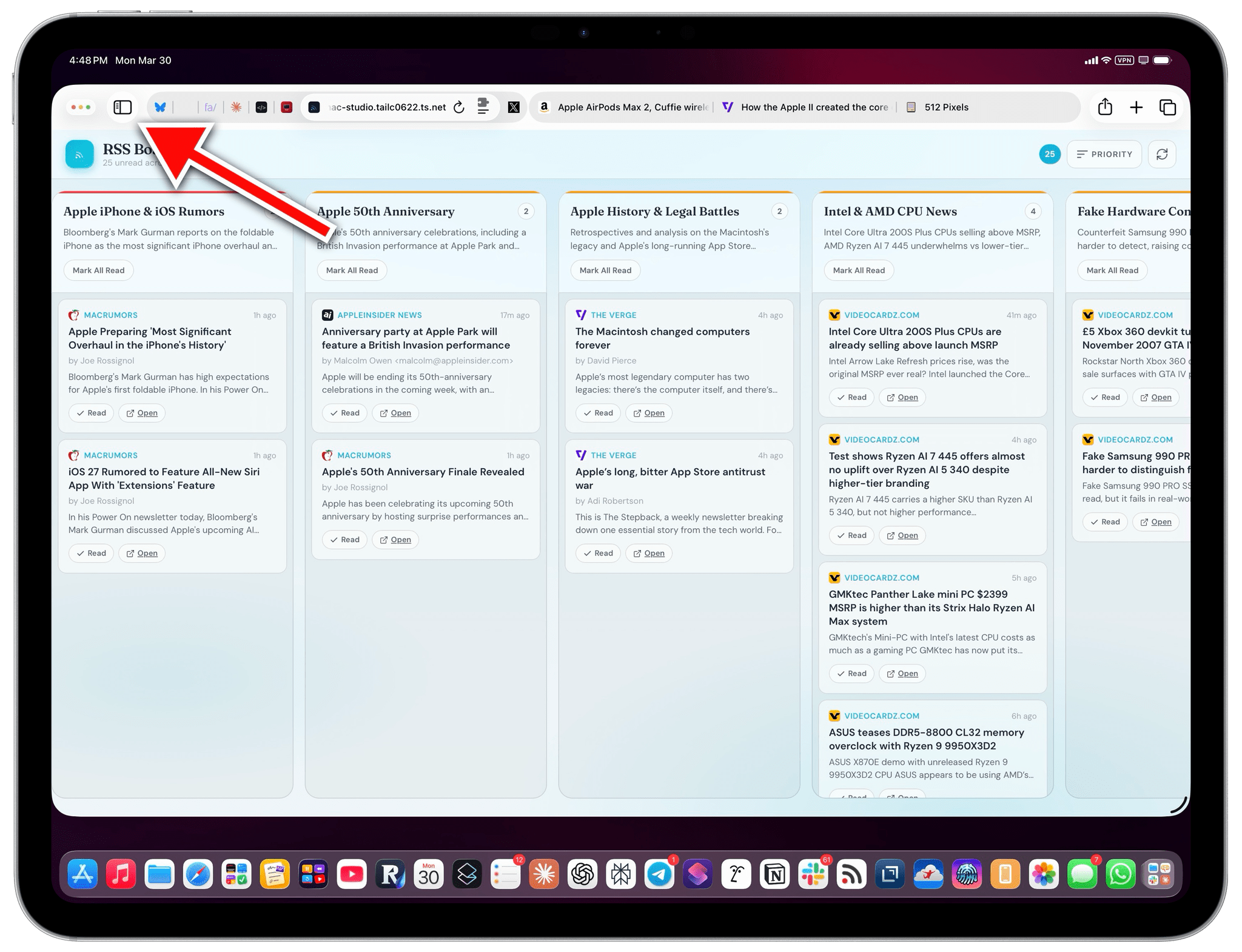
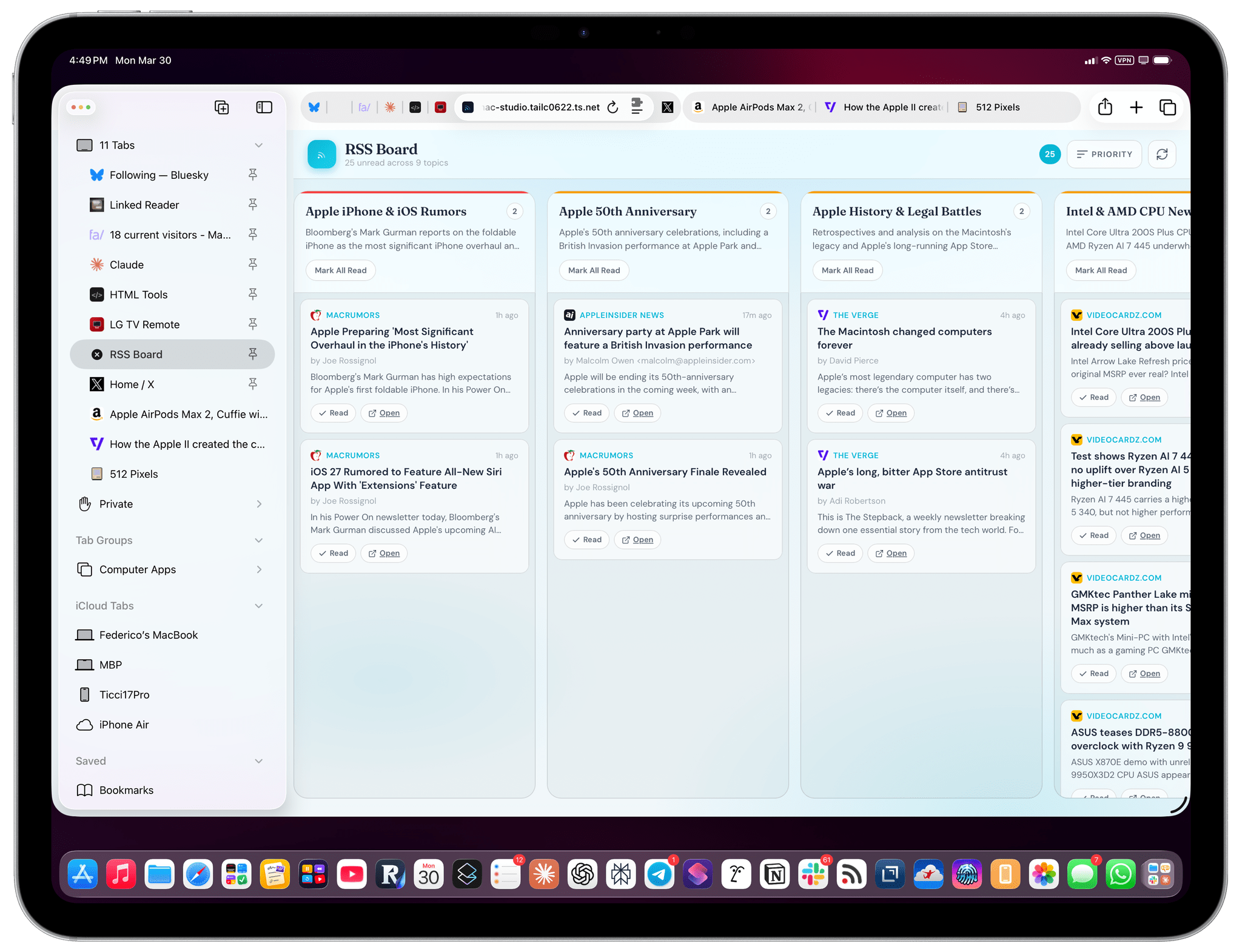
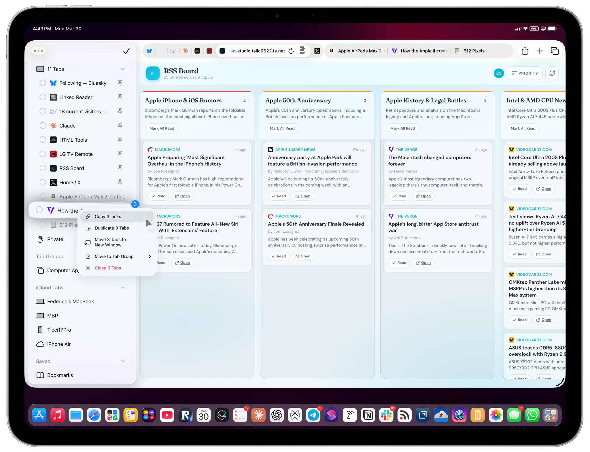
With this faux “vertical tab mode”, you can see longer titles for tabs (one of the limitations of the compact tab bar), close tabs, and easily right-click on them to perform contextual actions. You can even ⌘-select multiple tabs and then right-click them to see even more actions:
Since the Safari UI takes up more screen real estate with this fixed sidebar, it makes sense to enable the compact tab bar to at least have some vertical space back. I personally run Safari with compact tab bar mode and the Favorites Bar always hidden now since I mostly navigate to bookmarks by creating a new tab, and Safari is the only browser that (rightfully) displays my favorite sites when creating a tab.
I genuinely like this setup now. However, I’d like to see Apple copy from the best implementation of vertical tab bars (Arc, now Dia) and tweak sidebar tabs in some key ways:
- Allow me to rename tabs;
- Display pinned tabs in a grid using their favicons only;
- Let me rearrange pinned tabs with drag and drop.
If you haven’t tried the Safari sidebar, I highly recommend checking it out; and if you’re the kind of person who likes to give second chances, the compact tab bar mode in iPadOS and macOS 26.4 deserves one, too.