We’re back! Here are today’s @MacStoriesDeals on hardware, iOS, and Mac apps that are on sale for a limited time, so get them before they end!
Read more
#MacStoriesDeals - Tuesday
The Story Behind The “Steve Jobs as Franklin Delano Roosevelt” Video→
The Story Behind The “Steve Jobs as Franklin Delano Roosevelt” Video
Michael Markman has published an interesting blog post detailing the backstory behind the rare Apple video featuring Steve Jobs as President Franklin Delano Roosevelt.
I called Chris in L.A. to outline what we were thinking. War movie. Stock footage from the D-day landings. Chaplin as Adenoid Hynkel hanging on the wall. Mac marketing team in cameo roles. And the topper: Steve as FDR. He said he’d start looking for a director (or maybe he had one in mind).
Glenn, Mike, and I marched into Steve’s office to give him the pitch. Pretty much the way I outlined it in the previous paragraph. Steve’s eyes were sparkling through it all. By the time I got to, “and you as FDR,” I had made the sale. In the binary universe of Steve Jobs, something is either a zero or a one. This was a one. Instantly. Definitively.
The “1944″ video was aimed at rallying Apple’s sales troops and the Mac division against IBM, which was taking the majority of PC market shares back at the time. Check out the full story here, and the video on YouTube.
Archive Blood Pressure Results Easily With Bloodnote
Nobody likes being ill, but thanks to software, nowadays we have a series of better options and tools to ease the process of logging our health. When it comes to heart attacks and related issues, obviously the first thing to measure is the blood pressure. It lays out the overall situation of our body and is a good measure to compare the health over time. Most people who need to check their blood pressure over a longer period of time use paper notebooks or little post-its for that — at some point this method is doomed to result in chaos. To ease up this process of archiving blood pressure results and to allow for easy comparisons, Peter Bajtala and Matt Ludzen developed Bloodnote for iPhone.
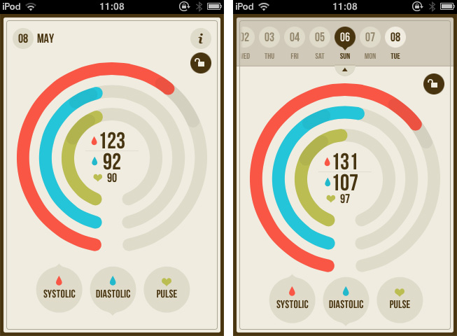
Bloodnote is designed as minimalist and simple as possible and does not need any big tutorial or explanation for its feature set. It saves your blood pressure results for later and you can fetch them again, whenever you like or need to. It features the standard division into systolic and diastolic pressure as well as the pulse frequency. You can flick through the past results and view them with a single tap. These are basically all features the app has to offer; they’re certainly useful, but when reviewing Bloodnote for a design series, it’s much more interesting to analyze how these features are embedded into the app’s UI.
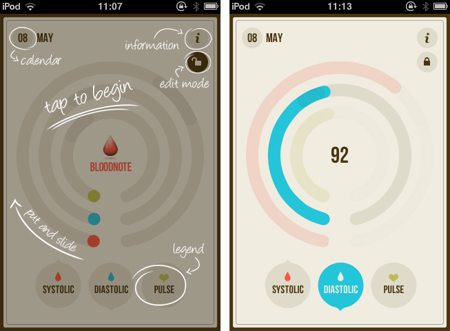
The three values are displayed using differently colored (red, blue and green), nearly full circles. The whole app is — besides the colored circles — designed in various shades of beige, and within the circle, a darker area is indicating optimal results as a benchmark. A legend at the bottom of the screen connects the color to their respective values (red for systolic, blue for diastolic pressure and green for pulse frequency). Tapping and holding one of them dims the colors of the other circles to focus on one specific value. To enter a new value, you just tap the respective circle, drag up or down until the indicator (which automatically pops up) shows the right value. The dragging interaction is sensitive and pretty smooth, and it’s very easy to get exactly your currently measured value. Tapping the date indicator at the top brings up a slide calendar to move to a specific date in the past and take a look at the respectively measured results.
Bloodnote is a really thought-out iPhone app. Its design just serves the functionality and makes it both simple and — if you can say that — fun to a certain extent as well. It makes recognizing the different values as well as changes over time very easy, and therefore is a very good and time-saving way to enter and archive blood pressure results. You can get Bloodnote for $1.99 on the App Store.
Review: TouchArcade for iPhone
Part of Arnold Kim’s other sites, AppShopper and MacRumors, TouchArcade is one of my favorite weblogs: I read it every day. Whether I’m reading about upcoming iOS games, news, or searching the forums, TouchArcade is simply one of the best resources for iOS gaming available. They’ve been around for 4 years, and for a website that’s a lifetime. I jumped when I was asked to help be part of the beta team for an iPhone version, and today, TouchArcade has released their very own iPhone app with the help of Flexibits and Bartelme Design.
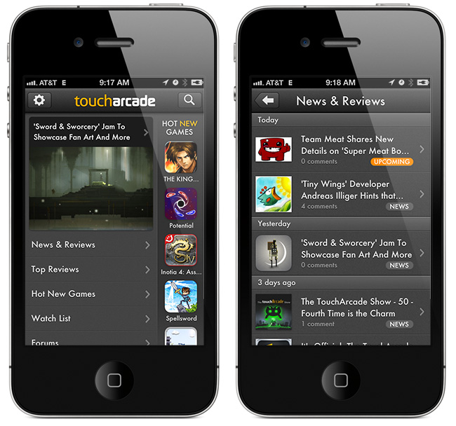
When you first launch the TouchArcade app you will see a featured story on top along with a navigation list below for News & Reviews, Top Reviews, Hot New Games, Watch List, and Forums. On the right is a flickable list of their Hot New Games section with icon previews, and this is one of my favorite features of the app. If you’re looking for a great game to purchase this is the first place to look, and the list is constantly being updated too.
Why My iPad Is Not My Laptop→
Why My iPad Is Not My Laptop
John Carey, who you might know from all the excellent photographs he posts on his (equally awesome) fiftyfoodshadows blog, today wrote a piece entitled “Why My iPad Is Not My Laptop”. It’s effectively a counter-argument from Carey on why the iPad just isn’t a laptop replacement for many people, particularly those in the professional creative community - yet.
I would say a good 90 percent of the debate on the iPads usefulness as a computer is coming from writers and casual users and this is where I find the debate getting a little one sided. Of course a writer would like the iPad. The tools most needed to get their work done are right there for the taking, you can hunt and gather all day long and it does make a fantastic, distraction free space to write in.
Carey doesn’t dispute that the iPad is a ‘personal computer’ - in fact he asks “what is there to even to debate” on that question and he says it’s all about the software, not the input device. For creatives, he says there are a number of nice apps for sketching, image editing and so on, but they don’t have anywhere near the “horsepower or precision that it takes to complete a finished product” - likewise for others such as web designers, coders, industrial designers and so on.
When it comes to many jobs within the professional creative community the iPad is still more or less incapable of handling any honest workload. At least as far as things stand at this point in time. There are no designers that I am aware of using it to create much outside of concepts.
Some might question Carey’s premise, is the iPad ever meant to replace a laptop for such professional tasks? Perhaps that is why the laptops (or trucks as you may call them) are going to stick around for the key purpose of satisfying these people. But I’m not so sure, I think the iPad can evolve to be a suitable PC for most of these tasks undertaken by creative professionals - I don’t think it will completely replace the need for a laptop or desktop, but I think it will eventually replace the laptops of these professionals. As Carey said, it’s all about the software and whilst we have made giant leaps and bounds in just over two years — we have a long way to go.
But when it comes to honest creative work I can not help but find the iPad as little more than a sidekick. I can say with certainty though, that this is far from the last word on this. I can clearly see a future where touch screen devices such as the iPad become more and more viable for the kind of things I have discussed here today. It is still new territory being explored and I for one can not wait to see where it takes us.
One particular point that Carey talks about quite a bit in his piece is about the filesystem - or rather lack thereof in iOS. His arguments resonate with me, particularly surrounding photo management on iOS which in some ways has gotten worse with iPhoto - “a black hole within a hole where edited photos from your “camera roll” somehow end up in limbo within the app and you have to send edited versions back to the photo roll to do anything else with them”.
For such a supposedly simple to use device the iPad it sure makes it complicated to move files around. In this case, Apple is entirely responsible with their rebellious idea to avoid traditional file structures. I can not fathom why it would be so difficult to have a system level file management area that is as convenient to use as the notification system they have so diligently been working on. Something which is not so flawed and cumbersome as the hidden data that lives within each app.
You may not agree with everything Carey says, but I encourage you to read his full article, I think he makes some very good points and the personal examples of where he has tried to use the iPad as a laptop are an excellent addition.
Ivy Bridge Macs→
Ivy Bridge Macs
Alex Brooks at World Of Apple has published an interesting and detailed analysis of Intel’s Ivy Bridge processors and Apple’s possible timeframe for Mac refreshes this year.
In 2012 Intel’s new architecture is named Ivy Bridge, on a technical level the architecture marks a huge leap from the previous Sandy Bridge taking advantage of a 22 nm die shrink process. Some other headline improvements over Sandy Bridge include PCI Express 3.0 support, integrated USB 3.0 and the use of tri-gate transistors (sometimes known as 3D transistors) which offer the same performance as their “2D” counterparts but are said to offer up to 50% less power consumption. Apple may choose not to be cutting edge with all the technologies available in Ivy Bridge as the company tends to enjoy setting its own trends.
Brooks’ post includes a list of candidates for the new CPUs in the Mac mini, iMac, Mac Pro, MacBook Air, and MacBook Pro product lines. Check it out here.
This year’s much rumored Mac hardware upgrade would be, according to ongoing speculation, a thinner, completely redesigned 15-inch MacBook Pro that was originally reported last year ahead of the iPad 2’s launch. The rumor of a 15-inch MacBook Air/redesigned MacBook Pro has constantly surfaced throughout 2011, with most recent rumors indicating such machine carrying an Ivy Bridge CPU was “inbound” for April. Meanwhile, tests performed on the Ivy Bridge processor likely to be used in the MacBook Pro family showed significant improvements.
For first impressions on Ivy Bridge, check out AnandTech’s review of Intel’s Core i7 3770K CPU.
Twitpic Releases iPhone App→
Twitpic Releases iPhone App
Popular Twitter photo sharing service Twitpic announced today the release of its first official iPhone app, available for free on the App Store. Unsurprisingly, the app comes with a dedicated “editing” interface to apply filters to photos.
The built-in photo editor allows you to craft your perfect photo with simple editing tools and photo filters.
I have tried the app, and it is very streamlined. Because a number of Twitter apps in the past used Twitpic by default, it is likely you already have several photos uploaded to Twitpic (which automatically connects to Twitter). In accessing Twitpic with iOS’ Twitter integration, Twitpic automatically pulled old photos I used to upload to the service years ago. Photos come with captions, comments (as tweets), and views. From the Timeline view, you can check out Twitpics from the people you follow on Twitter.
The shooting process is also simple, but somewhat custom in the way Twitpic implemented camera controls on screen. An “add effects” button hidden in the upper right corner of a photo (you can take photos or videos, or import them from the Camera Roll) lets you quickly crop, rotate, or enhance an image before posting, and it’s powered by Aviary.
Twitpic for iPhone is free on the App Store. [via The Next Web]
Invy Is An Iconic Date Planner For iPhone
What do you prefer when it comes to apps: functionality or ease of use? Most people would answer “a combination of both, a good compromise”. It might be true in many cases, but sometimes the balance between those two sides is not the right goal, and to meet a specific niche you need to move into more extreme directions. Invy, a new iPhone app by Bread & Pepper, helps you to set up meetings or dates and inviting friends, family or colleagues to them, and it’s a good example how such a hard decision can turn out pretty well.
Creating appointments and inviting other people to them is nothing new; it’s more or less integrated in any sophisticated calendar or even mail application. Because of this, often developers cannot focus on functionality while creating new apps in this area anymore; they either need to create a gorgeous design to convince users to buy their product, or they need to make one specific feature a must-have. Here lies the reason why I chose writing about Invy: it has got both.
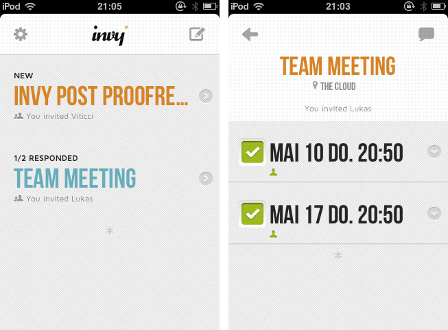
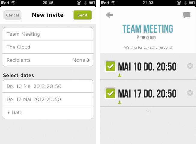
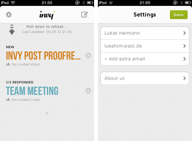
When firing up Invy for the first time, you’ll need to register your email address from which you’ll send out invites to other people. To create a new event, just tap the create button at the top, set the date’s description and location, invite recipients, set day and time and hit send. Within seconds, everyone you invited will get the same information in their inbox (emails are designed similarly to the app; see image below). Invitees can accept or refuse to participate: those who have Invy installed on their iPhone will be brought to the app, while everyone else can confirm the date via the Invy website.
All your set dates are displayed in a very elaborately designed list view in the app’s main window. By tapping one of them you can investigate all the attached details and how many people already answered the invite. If you set up the date, you can modify and fix it, and Invy automatically saves the appointment in iCal — and thus on every device with iCloud sync. Invy is intuitive and serves exactly one need: setting appointments and dates easily, and with style.
Responsible for Invys good UX is its clean and bright design, which is centered around the use of big, colored sans-serif typography and white background to automatically focus on the most important information: the dates you set. The big date descriptions change their color when they go through the process of sent invites, answered invites and fixed dates moving from a light blue (just sent) to red (fixed and saved date). This doesn’t just look good, it also ensures a fast recognition of whether a date already is important to you or not.
So Invy is a great date planning app, but nothing more. It has a really focused feature set, and serves those features in a fast, easy and good-looking way. I recommend Invy as a way to plan dates within small groups of people, like in businesses or families, especially when all members have got an iPhone and are likely willed to pay $1.99 for Invy on the App Store.
#MacStoriesDeals - Monday
We’re back! Here are today’s @MacStoriesDeals on hardware, iOS, and Mac apps that are on sale for a limited time, so get them before they end!
Read more


