Tweetbot 2.3 Adds New Gestures, Integrations, UI Refinements

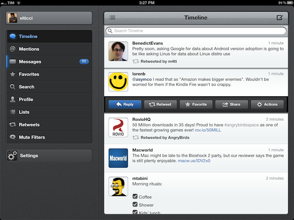
Less than a month after a major 2.2 update that added iCloud sync for timelines, DMs, and mute filters, Tweetbot is back today with a significant update on the iPhone and iPad that redefines some of the gestures and interactions introduced with the original version 1.0 (2.0 on the iPhone). Overhauling the standalone tweet detail and conversation views that, based on intuitive gestures, were two of Tweetbot’s hallmark features, Tweetbot 2.3 unifies single tweets, actions, replies, and conversations within redesigned screens that, with a bit of practice, I believe will ultimately help saving time and precious taps around the app.

New Tweet Detail View

Quick access: swipe right to left on a tweet.

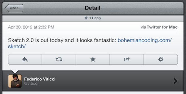
The single tweet view – the screen that displays a user’s single tweet alongside the action bar, geo-location and client info, and other data – has been redesigned to accomodate inline conversations and replies. Providing the usual context for author, buttons to reply, retweet, fave, share, and view, the new tweet detail view elegantly puts a banner-like notification up top to indicate how many replies a specific tweet received; if the tweet belongs to a conversation, Tweetbot 2.3 displays a “In reply to…” section at the bottom (down to the original tweet that started the conversation), with additional replies above.

The developers have managed to cram a lot of information and elements into a single screen without sacrificing usability and clarity – unlike other apps, it’s always clear which tweets belong to a conversation and which ones generated other replies.

To go back to the timeline from the tweet detail view, you can now quickly swipe with one finger from left to right. Here’s a recap of all the gestures and tap actions supported in Tweetbot from our review of the iPad version (interactions are mostly the same on iPhone).

New Conversation View & Sharing

Quick access: swipe left to right on a tweet.

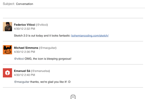
Similarly, the new conversation view of Tweetbot 2.3 displays both conversations and replies inline. Accessible with the usual swipe-to-reveal action, the conversation view loads replies in a neatly separated section just like the aforementioned tweet detail view.

New in 2.3, conversations can now be uploaded directly to social curation platform Storify for further sharing with the world; the uploading process is automatic and doesn’t require a dedicated login, meaning that Tweetbot will simply publish a conversation, such as this one, to Storify using your Twitter account. Whilst I hope for a future version of Tweetbot to let me save “all replies” to a specific tweet from the detail view (right now, it’s only enabled in the Conversation window), I think Tapbots did the right thing in simplifying the curation aspect of Storify and make it available as a direct option without additional configuration required.

Also new in the 2.3 conversation view (but enabled for single tweets and DMs as well): the app now has an improved email format when sending tweets to someone else via email.

More Features in 2.3

Several additional refinements and improvements went into the development of Tweetbot 2.3. First off, Droplr support: for URLs, images, and videos, users have now the option to choose Droplr as a sharing service in the Settings. When shared, videos now have a dedicated “play” thumbnail to differentiate them from images, and thumbnail support has been added for Vimeo links, too.

The app now correctly recognizes $stock links, allowing you to easily fire up a search for $AAPL or your favorite stock, and save it for future usage.

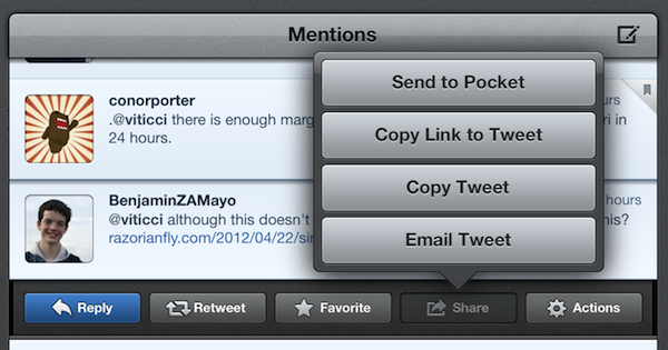
The tweet drawer has been reorganized, with the last two buttons gaining more order in the process.

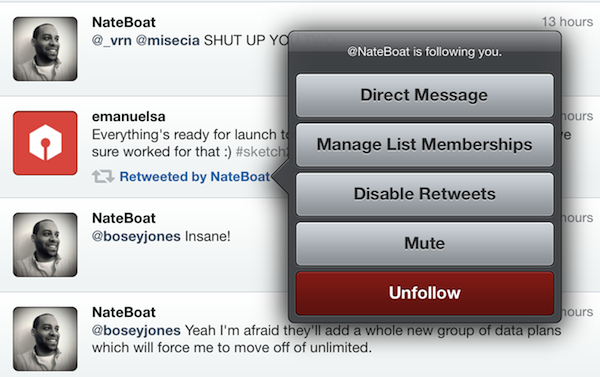
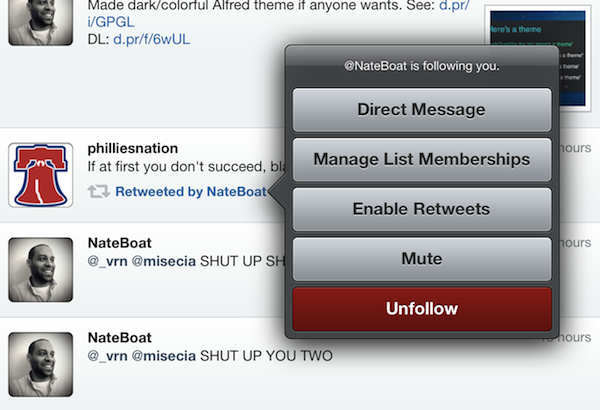
Last, some minor touches in version 2.3 will contribute to improving usability and to allowing users customize their timelines to their needs and tastes: retweets from specific users can now be disabled at any time, and it’s possible to quickly open the last saved draft by holding down the tweet compose button. The timeline sync bookmark icon is now an optional setting, and Tweetbot is capable of uploading high-res images when on WiFi.

With important improvements and UI refinements aimed at increasing the app’s ease of use and display of information, Tweetbot 2.3 is another solid and rich update that adds powerful functionality without compromising the app’s interaction and workflow. You can get Tweetbot 2.3 on the App Store today.

- Tweetbot for iPhone

- Tweetbot for iPad


DevRocket Is A Photoshop Plugin To Boost Your iOS Design Workflow

Just a few hours ago I wrote a bit about Screeshot Journal, an app to easily manage and investigate your iPhone and iPad screenshots in order to ease your design workflow. But to take pictures of an app which deserves to be viewed in such large resolutions, such app must have a solid UI design. To speed up and simplify the process of creating iOS UIs, developers at UI Parade — one of the greatest resources for UI inspiration by the way — just released their own Photoshop plugin called DevRocket.

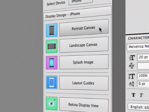
DevRocket is a sweeping blow of all design presets and saving possibilities iOS UI designers could need for their process of designing new apps. It supports designing for all devices (iPhone and iPad) and Retina resolution presets as well. With DevRocket, you can:

  • generate portrait, landscape and splash display canvases, which include the native iOS status and navigation bars
  • design the same interface for Retina and non-Retina devices at the same time
  • save those designs with one click cut down the complete UI to individual “UI snips” for Xcode
  • create icons out of preset canvases (with adjustable corner radius and correct naming for Xcode)

Besides all these features, DevRocket looks nice and easy to use. It is definitely worth a try for all iOS designers who use Photoshop to design their app UIs, and who are constantly after a nitro boost for their productivity and workflow. There’s also a little demo video on Vimeo (and embedded after the break) showing the plugin in action. You can get DevRocket for $10 (payment via PayPal).
Read more


Rovio: Angry Birds Space “Fastest Growing Mobile Game” with 50 Million Downloads in 35 Days

Angry Birds maker Rovio has today announced the impressive milestone that the latest entry in the Angry Birds franchise, Angry Birds Space, has become the “fastest growing mobile game yet” with 50 million downloads in 35 days.

Angry Birds Space hit 50 million downloads within 35 days, making it the fastest growing mobile game yet and breaking all our previous records. This has been simply amazing, and the whole Rovio team is thrilled to see such a fantastic reception for the game.

It’s unclear whether Rovio is counting desktop versions in the total number of downloads for the mobile game, but the figure is still impressive and substantial nevertheless of how iOS, Android, PC, and Mac downloads have been split so far. Considering Rovio’s previous numbers, it is safe to assume the majority of downloads are really coming from mobile platforms like iOS and Android.

Angry Birds Space was released on March 22. In the three days following the launch, the company announced users had already downloaded the game over 10 million times.


Organize And Investigate Your Mobile Screenshots with Screenshot Journal

The first thing I have to mention about Screenshot Journal is that the developers at UIForge who are responsible for this handy and beautiful iPhone and iPad app do a really fast and good support work. Otherwise, I would not have been able to write this review at all, because to my surprise, the app didn’t work at all when I installed it for the first time. Fortunately, I just had to re-activate the location option for my Camera Roll to allow Screenshot Journal to journal my screenshots and myself to finally test it.

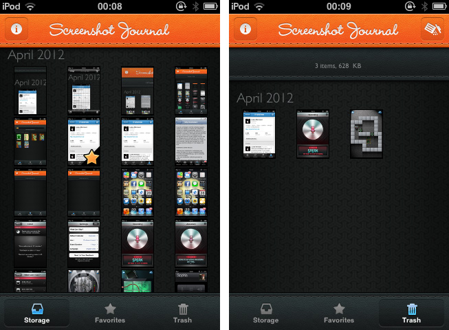
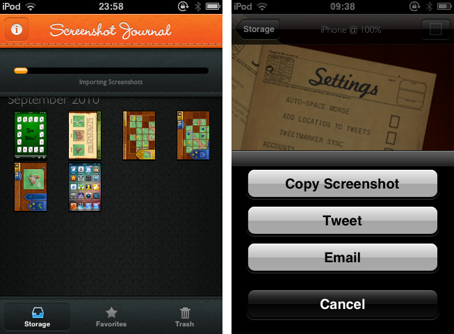
Screenshot Journal is a tool for UI designers, artists, and other pixel addicts who care a bit more about their iPhone (or iPad) screenshots than the integrated Camera Roll archive does. The app archives all your screenshots and organizes them chronologically or by marking favorites. After the first launch, Screenshot Journal imports all your existing screenshots within a few minutes, and new ones will immediately get imported after you took them and the app is running in the background. This way, it can handle an immense amount of images — the exact amount and overall data size is also displayed at the top — and you’ll never need to have a look into your Camera Roll again.

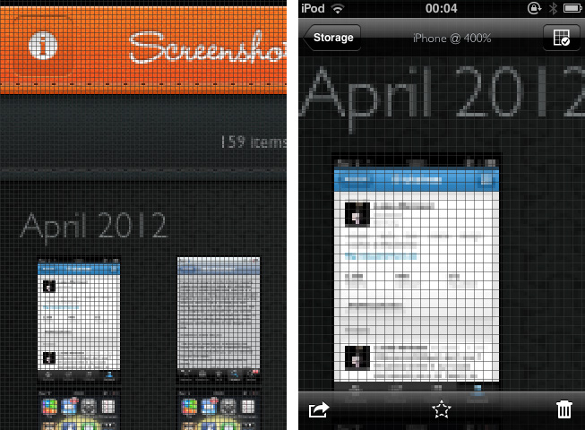
When selecting a screenshot, you’ll find the same interaction options as in the system Camera Roll, but all are slightly (one, in fact, immensely) improved. You can copy images, additionally send them via mail or Twitter to the world, and delete them, either individually or via a bulk delete in the trash window. But the real deal of Screenshot Journal is its zooming feature. You can zoom in an image until you can see (and optionally grid) single pixels, which equates an optical enlargement of up to 400 percent. Every detail of your screenshot becomes visible and analyzable; this feature is the reason why Screenshot Journal is a very handy companion utility for designers on the go: you can check any detail, flaws and bugs of beta designs, websites or other releases – wherever you are, almost instantly.

This powerful feature set is packed into a very beautiful UI, just as if Screenshot Journal itself wants to give an example of how such pixels should look like. For the first time, an app I test is that simple, I don’t consider the absence of preferences a drawback. Screenshot Journal doesn’t need preferences: its features are intuitive and arranged well within the app. Unfortunately, Screenshot Journal did not perform quite well on my 3rd-gen iPod running iOS 5. Changing from the main window to an image (and back) always took its 5 to 10 seconds and got pretty annoying after some time.

But nevertheless Screenshot Journal is a very good take on serving UI designers’ needs on the go. This app marks an important step forward in the area of mobile app and UI design, and I recommend it to anyone who needs to take and check a lot of screenshots on his iPhone or iPad.

Screenshot Journal is available as a universal app for $1.99 on the App Store.


The NYT Investigates How Apple Sidesteps Billions In Taxes

The NYT Investigates How Apple Sidesteps Billions In Taxes

The New York Times this weekend published an in-depth article about Apple’s tax practices and specifically, how they have been able to “sidestep” billions in taxes through carefully chosen office locations for certain financial activities. For example, a small office in Reno, Nevada (shown above) manages and invests some of the companies cash - in a state where corporate tax rate is zero - compared to California’s 8.84% where Apple’s headquarters are.

Setting up an office in Reno is just one of many legal methods Apple uses to reduce its worldwide tax bill by billions of dollars each year. As it has in Nevada, Apple has created subsidiaries in low-tax places like Ireland, the Netherlands, Luxembourg and the British Virgin Islands — some little more than a letterbox or an anonymous office — that help cut the taxes it pays around the world.

The New York Times doesn’t suggest that there is anything illegal about what Apple does, every company tries to minimise the taxes they owe. Rather, it paints a picture of how tech companies in particular have been taking advantage of tax codes “written for an industrial age and ill suited to today’s digital economy”.

Apple, for instance, was among the first tech companies to designate overseas salespeople in high-tax countries in a manner that allowed them to sell on behalf of low-tax subsidiaries on other continents, sidestepping income taxes, according to former executives. Apple was a pioneer of an accounting technique known as the “Double Irish With a Dutch Sandwich,” which reduces taxes by routing profits through Irish subsidiaries and the Netherlands and then to the Caribbean. Today, that tactic is used by hundreds of other corporations — some of which directly imitated Apple’s methods, say accountants at those companies.

A particularly stark is example is to compare Apple to Walmart, Apple paid $3.3 billion in taxes from profits of $34.2 billion compared to Walmart who paid $5.9 billion in taxes from their $24.4 billion in profits last year. Apple was able to achieve that because it’s much easier to move digital products to low-tax countries than it is for Walmart to do the same, with their physical products.

When someone in the United States buys an iPhone, iPad or other Apple product, a portion of the profits from that sale is often deposited into accounts controlled by Braeburn, and then invested in stocks, bonds or other financial instruments, say company executives. Then, when those investments turn a profit, some of it is shielded from tax authorities in California by virtue of Braeburn’s Nevada address.

In their response to the NYT’s request for a comment, Apple focused on their US job-creation activities, stressing that their innovation and growth was providing benefits that go beyond just paying taxes. You can read their full response here.

Over the past several years, we have created an incredible number of jobs in the United States. The vast majority of our global work force remains in the U.S., with more than 47,000 full-time employees in all 50 states. By focusing on innovation, we’ve created entirely new products and industries, and more than 500,000 jobs for U.S. workers — from the people who create components for our products to the people who deliver them to our customers.

Permalink

Typeli Is A Questionable OS X Note-Taking App

I really thought a long time about the question whether I should review Typeli by Lukasz Dmowski or not. When I looked at the app website for the first time, I was quite impressed by its design and feature set, but after trying it out for some time, most of the magic the website conveys is gone. What remains is just another note taking app with innovative, but very uncomfortable and unfinished styling and organizing features. Read more


Tip: Use Pocket’s Keyboard Shortcut In Google Chrome

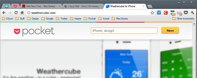
Earlier this week, Pocket updated its ultra-handy bookmarklet and Chrome extension by adding tags after you’ve saved something. Along with this, the Chrome extension also received a useful shortcut (OS X: CMD+Shift+P, Windows: Ctrl+Shift+P) for even quicker saving.

This morning as I was drinking my coffee and reading my RSS/Twitter news I updated the Chrome extension, and then tried the new key combo… and tried… and tried. The only thing Chrome was doing was bringing up the Print Preview dialog box. Upon searching some Google Groups pages, I found an easy fix to disable the Print Preview box and let Pocket use its new shortcut as intended.

Directions: Type ‘about:flags’ in Chrome’s address bar and locate the ‘Disable Print Preview’ option. Click the underlined ‘Enable’ to disable Chrome’s print preview, then restart Chrome. Now CMD+Shift+P (OS X) or Ctrl+Shift+P (Windows) should activate the Pocket key command. Personally, I’d love for Pocket to add user-customizable shortcuts, so that users will have the option to use something else besides the default command to avoid this problem entirely.

By the way, if you haven’t checked out Pocket yet, read our review.


My Dropbox Writing Workflow

Ever since I wrote about my new year’s resolutions to work smarter using better tools, compared my favorite iOS text editors, and shared some of my workflow techniques on Macdrifter, I thought it would be appropriate to share a bit more about the activity that takes up 80% of my work time: writing.

As I wrote in my comparison of iOS text editors:

Two months ago, I noted how there seemed to be a distinction between text editors focused on long-form writing, and the ones stemming from a note-taking approach. I think this difference is blurring with time, but there are still several apps that are clearly focused on distraction-free, long-form writing, like iA Writer and Byword, whereas the ones I tried for this article belong to the note-taking/Markdown/Dropbox generation of text editors. I like iA Writer and Byword, but I’m saving that kind of apps for another article.

In my workflow, there is a distinction between apps “for writing” and tools for quick “note-taking”, but in order to minimize the effort required to keep everything in sync and tied together, I set out to make sure the differences of such tasks could coexist within a single ecosystem.

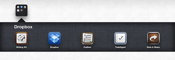
My writing ecosystem is powered by Dropbox. Read more


Assistant: Older iPhone Generations Just Got Their Own Siri

During the last years, dictation software has become more and more popular with the development of touchscreen devices. Many writers prefer to use mechanical keyboards for typing, because touchscreen keyboards are not suited for longer texts: they can get very uncomfortable for someone who is not used to them. So especially when you’re outside, dictating text or data can be a very comfortable and healthy alternative to touchscreen keyboards. Even Apple has shown a reaction to that development by introducing Siri, the mobile all-in-one voice assistant on the iPhone 4S. Although it works fine and has lots of features, there are still many independent competitors in this area of app development.. Assistant, developed by Appmosphere and designed by talented designer Michael Flarup, is one of the newer, yet slightly more interesting, efforts.

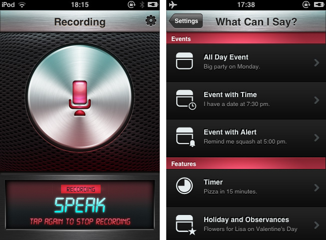
Assistant serves just one feature: setting calendar events and timers via voice recognition. I know, Siri does that as well, plus much more (and might be funnier too). So why mention a more or less obviously inferior competitor, for which you even have to invest extra money when you get Siri for free with your iPhone 4S? Well, first of all, because not everyone owns an iPhone 4S and Assistant works on 3G(s) and 4 models. And to a certain extent, because of Flarup and his UI work.
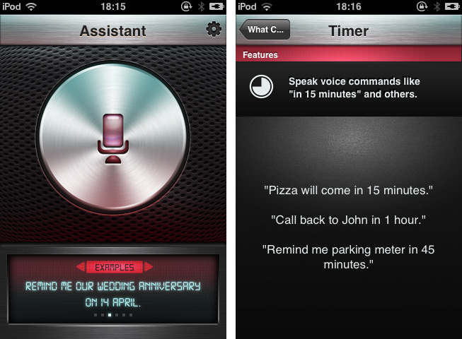
After firing up the app you’re greeted with that immensely huge and gloomy stainless steel recording button and some examples on how to use the features of Assistant. Tap it and the voice recording via the integrated or attached microphone starts; tap it again to stop it. The app processes your vocal input (using the well-founded technology of Nuance Communications) and shows up a date dialogue afterwards, titled with the dictated appointment content and enhanced by eventually mentioned reminders. That’s it: all these main windows are clean, simple and immediately understandable, and the voice processing is pretty accurate and efficient.

Besides its well-done demo video on the app’s website, Assistant also has many setting possibilities which make the app very flexible and useful. You can select the default calendar in which Assistant will deposit your appointments, and default alter time and event duration. The app currently supports only English language input: you can choose from Britain, American, and Australian English. In addition to that, the settings include examples as to which kind of formulations the voice recognition is able to process. It’s quite variable: for example to set an appointment to a special time you can use direct time spelling (12.00 AM) or prevalent paraphrases like noon.

So now let’s get into the UI. Although I like Michael Flarup’s style of digital design very much and, as I already pointed out, the main window and the dialogue panel look nice and polished, there are two things that made me feel a bit uncomfortable with the overall design of Assistant: the buttons and the (also stainless-steel-like) titlebar used within the settings. The latter might fit pretty well to the main window and the “What can I say?”-example list, since the recording button, the monospace screen at the bottom, and the gloomy red list elements correspond to it. But if you move into the settings and the standard iPhone listing UI used for selecting several options, it becomes a disturbing visual overkill. Secondly the buttons set on it do not have anything in common with the plastic and rather machinery look of the titlebar: in my opinion, they are too smooth and colored too dark to fit to the bright but still cold and “hard” atmosphere the title bar creates.

So, I have to say that giving an exact final statement or even a recommendation for buying Assistant is rather difficult. It definitely has some advantages and provides iPhone 3G(S) and 4 users the possibility of stripped-down voice dictation to quickly create calendar appointments. But its look is a bit uneven and therefore I think not good enough to be considered as a must-have — there are some hot spots in it, but to me it is not completely coherent and attractive to reasonably use because of the design. Still if you’re searching for a stable and quite enjoyable app to solve the problem of not having a Siri-like working robot on your phone, get Assistant for $1.99 to dictate calendar events on your older devices.