“Send to Kindle for Mac” Now Available

“Send to Kindle for Mac” Now Available

Jacqui Cheng, reporting for Ars Technica:

More than three months after releasing software for Windows-users to send documents to a Kindle, Amazon has now released the Mac version. Announced on Tuesday afternoon, the “Send to Kindle for Mac” application allows Mac users to wirelessly send personal documents to their Kindles via drag-and-drop in the Dock or within the app itself. Users can also send documents to the Kindle by printing from any Mac application.

I have tried the new Amazon desktop utility, and it also allows you to upload files to your Kindle library (devices and Kindle apps) with a contextual Finder menu. The app comes with options to select the Kindle device you want to upload files to, and gets rid of the old email-based “file forwarding” system by integrating a simple upload status indicator within the main interface. Documents can be archived in your Kindle Library (which was recently introduced on Kindle for iOS), and there is an option to convert PDFs to Kindle format. A Getting Started guide with a list of supported file formats is available on Amazon’s website.

Download the “Send to Kindle” Mac app here.

Permalink

Apple Q2 2012 Results: $39.2 Billion Revenue, 35.1 Million iPhones, 11.8 Million iPads Sold

Apple has just posted their Q2 2012 financial results for the quarter that ended on March 31, 2012. The company posted revenue of $39.2 billion, with 11.8 million iPads,  35.1 million iPhones and 4 million Macs sold. Apple sold 7.7 million iPods, a 15 percent unit decline from the year-ago quarter. The company posted quarterly net profit of $11.6 billion, or $12.30 per diluted share. iPhone represented a 88 percent unit growth over the year-ago quarter, while iPad reported a 151 percent unit increase over the year-ago quarter. International sales accounted for 64 percent of the quarter’s revenue.

We’re thrilled with sales of over 35 million iPhones and almost 12 million iPads in the March quarter,” said Tim Cook, Apple’s CEO. “The new iPad is off to a great start, and across the year you’re going to see a lot more of the kind of innovation that only Apple can deliver.”

“Our record March quarter results drove $14 billion in cash flow from operations,” said Peter Oppenheimer, Apple’s CFO. “Looking ahead to the third fiscal quarter, we expect revenue of about $34 billion and diluted earnings per share of about $8.68.

Estimates and Previous Quarters

For Q2 2012, Apple set its guidance at $32.5 billion revenue and diluted earnings per share of about $8.50.

The Street consensus’ estimate was earnings of $10.06 per share and revenue of $36.81 billion; on April 1, 2012, 16 independent analysts polled by Fortune forecasted earnings of $12.66 per share and revenue of $42.68 billion. On April 23, Philip Elmer-Dewitt put together an updated chart tracking predictions from 23 independent and 34 Wall Street analysts.

In Q1 2012 – the company’s biggest quarter to date – Apple posted record-breaking revenue of $46.33 billion, with 15.43 million iPads, 37.04 million iPhones and 5.2 million Macs sold. Apple sold 15.4 million iPods, a 21 percent unit decline from the year-ago quarter. The company posted quarterly net profit of $13.06 billion, or $13.87 per diluted share. iPhone represented a 128 percent unit growth over the year-ago quarter, while iPad reported a 111 percent unit increase over the year-ago quarter. In the year-go quarter, Apple posted revenue of $24.67 billion, with 4.69 million iPads, 18.65 million iPhones, and 3.76 million Macs sold.

As we reported in our Q1 2012 coverage:

Apple CEO Tim Cook remarked how the company was seeing China as “an extremely important market”, with “staggering demand” for iPhone. Cook also revealed that, in spite of the “bold bet” they took in terms of iPhone supply, Apple was short of iPhone supply throughout the quarter; the situation had improved by the time of the earnings call, but the company was still short in some areas. In the conference call, Cook also referred to iCloud as the company’s “big insight” for the next decade.

In his own estimates for the upcoming Q2 results, Asymco’s Horace Dediu had forecasted the following numbers:

  • iPhone units: 37.3 million (100%)
  • Macs: 4.7 million (25%)
  • iPads: 12.2 million (160%)
  • iPods: 7 million (-22%)
  • Music (incl. app) rev. growth: 40%
  • Peripherals rev. growth: 25%
  • Software rev. growth: 10%
  • Total revenues: $42.7 billion (growth: 73%)
  • GM: 44.7%
  • EPS: $12.0 (88%)

Apple will provide a live audio feed of its Q2 2012 conference call at 2:00 PM Pacific, and we’ll update this story with the conference highlights. You can find the full press release and a graphical visualization of Apple’s Q2 2012 after the break.

A recap of estimates and product releases happened during the quarter is available here. Read more


Google Officially Launches Google Drive

Rumored for years, Google has today officially taken the wraps off Google Drive, the company’s new solution to store, share, and collaborate on documents and files in the cloud. Available at drive.google.com, Google Drive allows users to open more than 30 file types (including video, Adobe Illustrator and Photoshop) directly in the browser even without desktop apps installed; Drive is connected to Google Docs for document editing and collaborative features, albeit Docs storage doesn’t count against Drive’s storage limits.

Today, we’re introducing Google Drive—a place where you can create, share, collaborate, and keep all of your stuff. Whether you’re working with a friend on a joint research project, planning a wedding with your fiancé or tracking a budget with roommates, you can do it in Drive. You can upload and access all of your files, including videos, photos, Google Docs, PDFs and beyond.

With a promised 99.9% uptime guarantee from Google, Drive starts for free at 5 GB of storage:

You can get started with 5GB of storage for free—that’s enough to store the high-res photos of your trip to the Mt. Everest, scanned copies of your grandparents’ love letters or a career’s worth of business proposals, and still have space for the novel you’re working on. You can choose to upgrade to 25GB for $2.49/month, 100GB for $4.99/month or even 1TB for $49.99/month. When you upgrade to a paid account, your Gmail account storage will also expand to 25GB.

Among the Drive features touted by Google, the company announced the service will support OCR (optical character recognition) for scanned documents, image recognition for uploaded pictures (for instance, you’ll be able to search for “Eiffel Tower” and have Drive find a picture of it in your files), and search. As with most Google products, great focus has been put on the search functionality, which will allow users to look for file names, content, activity, and owner information in the Drive accounts. Furthermore, Google says they have worked with a number of third-party developers to enable Drive integration with various online service starting today; similarly, Google Drive will work with other Google apps and services such as Google+ and Gmail to easily share files or attach documents to email messages.

The official Google Drive app for Android has gone live on Google Play, and the company says they are also “working hard” on a Drive app for iOS devices. ReadWriteWeb was provided with screenshots of the Drive iOS app directly from Google.

Check our more links, details, videos, and our first impressions with Google Drive after the break. Read more


Promoting Software

In the pre-PC era, we built dedicated tools to fit different purposes. In the PC era, we learnt how to shift some tasks over to a single, centralized tool called the “personal computer”; we started exploring the concept of “ecosystem” through “digital hubs”, although we didn’t see the PC – whether “desktop” or “portable” – as a meaningful replacement for objects we depended upon in our daily lives. With mobile devices from the Post-PC era, we’re seeing tremedous growth in one particular aspect: that software can do (almost) anything. We’re in the process of learning how to use a single tool to fit multiple purposes at once.

This is especially true with the iPad. Following yesterday’s news of Cargo-Bot, an iPad game made on the iPad using Codea, I had yet another example of how software is changing the way we think of the distinction between tools for “work” and “entertainment” – and how it’s blurring the difference between computers for “production” and devices for “consumption”. John Gruber calls it “a glimpse of the future”. He’s right: here we have a device that is now capable of programming a game for its own platform, and it seems totally obvious in retrospect.

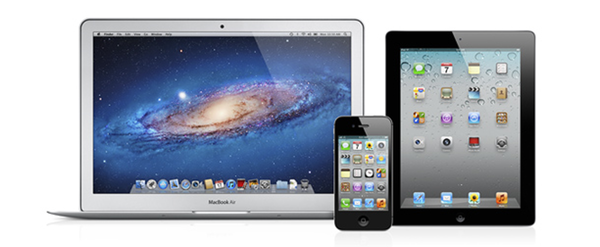
I never quite got the argument that devices like the iPhone and iPad were made for “consumption”. In the past five years, we have seen people making music on tablets, writing novels on them, and film-makers using iPhones as solid alternatives to their mobile capturing needs. The portability of the camera reinvented citizen journalism and revolutionized mobile photo sharing. I have seen doctors pulling out iPhones to do quick calculations and compare MRI images. I have been increasingly using my iPad as an “anything device”; on the other hand, I may have played no more than 4 games on my iMac since 2008.

It’s not just about “niches” or “bloggers” who want to find a way to do more on tablets than “normal people” would think is feasible. While the App Store has certainly seen a surge in popularity of text editors, Twitter clients, note-taking apps, and other kinds of apps writers and bloggers use on a daily basis, we shouldn’t forget about Final Draft, Procreate, Paper, the Business category, Apple’s Cards app, travel guides, books…just to name a few.

Software can do anything, but sometimes it is the combination of hardware and software that yields new, unexpected results that take advantage of the interplay of bits and guts. Apple based its mobile business on this. And third-party developers, too, understand that, in some areas, Post-PC hardware needs to be “extended” to address more specific needs. The Jawbone JAMBOX is a fantastic portable speaker that can augment your music listening or gaming sessions. The Nest thermostat is proving to be a hit among early adopters. Ten One Design is working on a Bluetooth-enabled pressure-sensitive stylus with an SDK for developers. Note how, even when extra hardware is needed, Post-PC devices leverage one thing to make these additions more natural, powerful, and connected: software.

It’s not just Apple. Other companies are making smartphones and tablets (and glasses), and some of them also recognize the importance of an ecosystem that fosters innovation and a stable business model for all the parties involved. It appears to me – and the numbers speak clearly for themselves – that only Apple, though, has so far acknowledged that a third-party software ecosystem needs to be nurtured, carefully encouraged, and educated about the latest technologies available to consumers and developers. And then again, Apple can do better.

The Times They Are a-Changin’. The multi-purpose, constantly evolving nature of software has changed us: most people don’t want to upgrade their devices every six months anymore, but they are always looking for new ways to unify the “things they have to do or want to do” into a single, intuitive, affordable experience capable of changing context and functionality with just a few taps.

In the Post-PC era, we are promoting software.


BangTidy2: A Beautifully Animated Growl Notification Theme


Growl has no plans of going away as we covered back in February, and it’s nice to see people still creating excellent notification styles.

Last Sunday, Daryl Ginn (@darylbro) published an update to his Growl notification theme called BangTidy. The new version 2.0 features a stunning 3D splash effect, while remaining simple, clear, and minimalist.  Your notifications are going to pop out as smooth as ever. I haven’t used Growl (the universal notification service for the OS X) for a while now, but with this new notification style, I will definitely consider using it again.

BangTidy2 is available for free on Daryl’s Dribbble stream, where he also attached a short demo video.


Adobe Announces Creative Cloud Subscription Service for CS6 Desktop Apps

Adobe has officially announced an exciting upcoming service they are calling Creative Cloud, which is designed to tie together their droves of design oriented applications. Creative Cloud is a self-proclaimed “digital hub” that not only allows users to sync multiple computers, but it will also keep mobile devices in sync with the help of Adobe’s already available suite of Touch Apps and the upcoming web service powered by Creative Cloud.

Creative Cloud is a large endeavor for Adobe and they are not satisfied with only providing a cloud based file management solution. In addition to the aforementioned sync feature, subscribers will also have access to an “App Store” of sorts that will host the entire set of CS6 desktop apps available for download at no additional charge. This “App Store” will also provide Adobe with a fast and convenient way to push out new features in between major software releases. Furthermore, there will be several new apps available for download related to HTML5 design, e.g., Adobe Muse for webpage creation and Adobe Edge for web animation design. These tools harness the power of web standards to create beautiful and compliant HTML5, CSS3, and JavaScript-based content. Along with the web creation tools are the new digital publishing options as well as online web hosting and even access to Adobe’s Typekit collection.

Creative Cloud is currently only available for pre-order, with an estimated availability of May 7th, 2012. The price point is perhaps the best part of this announcement as an entire year of this subscription service is only $49.99 a month. It is also available as a month-to-month option for $74.99. The compatible platforms include both Windows and Mac and will come in multiple languages. Be sure to check Adobe’s tech specs page to ensure the tools you intend to use are available in your language. Moreover, Adobe is providing a special introductory price for current Creative Suite users – allowing them an entire year of service for only $29 a month.

This is a great option for both personal users and businesses, as the price savings alone is a considerable value. The lower up-front cost to gain access to the CS6 desktop apps might even entice new customers to give professional tools a chance. Regardless, this will likely be a great success for design teams already using Adobe products but are looking for an easier way to handle shared files and online content publishing.

Check out the Adobe promotional video for more details below.
Read more


StockTouch: Monitoring Stock Values With Style

As a lover of great interfaces, I’m constantly searching for developers who are passionate about displaying common content in new, attractive ways. This is sometimes easier (when it comes to photography or written content for example) but in some cases it can be very difficult and exhausting. Over the years I recognized that this is especially true for stock information and data. There is not much less sexy than linear diagrams and percentage data. You need a very good taste and, even more importantly, a perfect sense for balancing information and design in data visualization to create a functional and exiting product in this area. The developers at Visible Market Inc. definitely meet these requirements when you look at their app StockTouch for iPad.

The app displays the stock value information of the Top 100 companies from 9 industrial sectors (e.g.: technology, energy or health care). You can display their percentaged price change, volume and price change relative to the S&P 500 or the average change of the sector they belong to. Additionally, you can search for specific stocks and set them as favorites, which are then subtly highlighted. To filter this information even more you are able to choose between their global or U.S. value and arrange them in 5 different ways (in a top/low spiral, largest to smallest market cap etc.) — which brings us straight to the app’s concept of data visualization.

All these features and filter possibilities are integrated into a sidebar and get visible via pop up windows if you touch the respective pictogram. The actual stock data occupies the rest of the screen. The app’s main window presents you all 9 sectors in commensurate rectangles, which are headlined with the sector description and its overall percentaged change. StockTouch works with visual layers. By pinching or tapping one of the sectors, it zooms in and you can take a look at the sector’s “member companies” and their overall change within the set timeframe — again presented in a field of rectangles containing the different companies and their current stock value or change.

To visually underline the current value and its position in the respective sector, positive change is signalized with different shades of green; more or less stagnating stock prices are black and those falling can be identified by their red background colors. This intelligent and subtle use of colors makes it very easy to quickly analyze the overall changes of a sector, the stock market in general and, to a certain extent, also encourages the user to dive deeper into the information StockTouch has to offer, embodied by the third layer: the line chart of a single company’s stock value, available by tapping on a single stock within a sector.

The style of displaying the course of a single stock shows the second immense quality of StockTouch: its perfect use of visual and especially typographic hierarchy. Again, the background color indicates the general direction of the stock value’s course; but the real innovative solution in this part of StockTouch is the way the related numbers and information are organized and presented. At the top, using white space and different font opacity, the relevant data like the current stock value or the company’s position within its sector are easy to identify and read. Below the chart you get a short description of the company’s profile and the possibility to check several current newspaper articles about it which can be opened in an integrated (not very beautiful) web browser. But overall, the whole interface is modern, unique and intuitive at the same time.

Concerning the overall UX of StockTouch I think there are some small lacks in intuitive use though. For example, it is not possible to swipe left or right to move to another sector or company: you always need to zoom out completely, and then select the information you want to check. Furthermore, although the search feature is performing very fast, the results are listed way too small and you often unintentionally tap the wrong stock (which definitely can be avoided on a screen that large). StockTouch also features unobtrusive sound design while browsing through the stock data, but although I personally like the sound effects very much, the developers should at least have provided the option to turn them off — which is not the case here. In fact, the app does not offer any preferences at all, a move which surprised me bit, to be honest.

But nevertheless I became a fan of StockTouch immediately after firing it up for the first time. It is the product of a deep love for good design and unique and interesting data visualization. I absolutely recommend it to anyone who seeks for an easy way to monitor the stock market and has a taste for good interface development. StockTouch is available on the App Store as an universal app for $4.99.


Clear 1.1: Refining the User Experience

Defined by its clever and unmistakable user interface, Clear 1.1 refines second nature concepts and acknowledges community feedback by introducing a friendly new gesture, UI refinements, some added inspiration, and a big list making improvement.

First up: shake to undo. Shake to undo works with lists in Clear, allowing one to backpedal on new todo items or undelete list items previously cleared. A couple flicks of the wrist will display an alert signaling the opportunity to undo, redo, or cancel the option of retrieving a list or completing an item. Additionally, you can shake up your themes to select a random theme (as noted in the screenshot below).

As seen with undo, Clear keeps the context of its user interface in mind with custom alerts that can be best examined in the tips & tricks section of the app. By tapping on a quick todo (in this case “Shaking Things Up”), Clear provides context on the action. There is no OK or cancel button, nor is there an X to tap. Only a necessary tap anywhere on the display dismisses the on screen prompt without any call for user action — tapping to dismiss shouldn’t require the cruft of a one way out prompt. It’s a minor functional change, yet still significant in idea.

Ideas in Clear are quite literally rewarding when one begins by creating a new list or clearing a list’s items from the display. Several new quotes have been added in the 1.1 update — users can look forward to additional phrases to mull over after pouring coffee or after completing a day’s worth of items.

Lastly, improving upon lists, list items in Clear no longer have a limited character count. If ideas are flowing that are bigger than the width of your iPhone’s display, feel free to continue typing so that no word will be forgotten and no item will be left undone. Don’t worry — the shades of color splashed across the screen still look terrific.

While there are other secrets to be uncovered in Clear, I’ll try not spoil the fun and let you discover how to unlock some of the newly added themes. I maintain that Clear’s intuitive and ultimately addictive take on the traditional todo list is a much needed breath of fresh air in realm of task management. The new features are welcome improvements, and I’m looking forward to seeing what will happen to Clear in future updates. Clear is available for $0.99 in the App Store.