This Week's Sponsor:

Textastic

The Powerful Code Editor for iPad and iPhone — Now Free to Try


Virtual: I Don’t Know How to Play This Game Anymore

This week Federico and Myke discuss Oculus Rift hardware requirements, Pokemon characters in Minecraft, the Volume level editor, Lifeline for iOS, and the Mario Kart 8 DLC.

Plenty of links in last week’s episode of Virtual. I’ll have more about the interesting Lifeline soon. You can listen here.

Sponsored by:

  • Harry’s: An exceptional shave at a fraction of the price. Use code VIRTUAL for $5 off your first purchase
Permalink

“For the Apple Watch, There’s No Place Like Home”

Imagine trying to explain this to your grandmother: if you want to get back home, press this button, unless you’re reading an email or listening to a voicemail, in which case you should press the same button three times, but slowly. (But not so slowly that you accidentally launch Siri, which is triggered by pressing and holding the Digital Crown button.) My hunch is that most of the confusion navigating the Watch comes from Apple’s decision to overload the Digital Crown with too much functionality. You press it if you want to check the time, launch an app, re-orient the app view, or go back in a nested set of screens. Once you get the hang of it, there is some logic to each action on its own, but as a group it’s far too muddied. The side button, by contrast, is the very picture of consistency: no matter where you are in the Watch interface, if you press it you launch the “friends view” where you can call or text your favorite contacts.

Good piece by Steven Johnson on the somewhat confusing Digital Crown options available on Apple Watch.

I was initially confused by the behavior of double-clicks and zooming to launch apps, but I got the hang of it relatively quickly. It’s undeniable, though, that the combination of click and zoom input in a single knob can be tricky to explain.

Compare that with the beautiful simplicity of the side button: it always brings up the Friends UI, even in views such as Notification Center and Glances. When these types of modal views are shown on the iPhone, for instance, not even the Home button can immediately go back to the Home screen (it’ll dismiss Notification Center and Control Center, but it’ll remain in the foreground app, requiring another click).

This says a lot about the importance of communication features in Watch OS 1.0: the hardware and software of the Friends interface can supersede everything else with a single click.

Permalink

The Discreet Watch

Your Apple Watch becomes the most discreet way to stay connected when at fancy events, or anywhere really. My wife and I no longer need to check if the babysitter is trying to reach us — our Apple Watch will tap us if she is. There’s essentially no reason to use our iPhones, and no anxiety felt for fear of missing something “important”.

Ben Brooks (via Shawn Blanc) makes a good point about the discreet nature of Apple Watch. While I have a bunch of first impressions I want to let simmer before rushing to write a “review”, one thing is already clear to me: not pulling out my iPhone every few minutes helps me be less rude to people around me.

It’s not that I’m shutting off notifications completely; rather, I’m letting the important ones come to me on a device that doesn’t block me from the outside world.

Permalink

Stephen Hackett on Apple Watch Faces

I’ve been wearing my Apple Watch for a couple of weeks, and while I’m still churning on my review, I wanted to share my thoughts on the ten watch faces that come with the device. While having so many options is great, many of the faces have frustrating limitations in the ways they can be customized or used.

Stephen Hackett has a nice rundown of the watch faces included in Watch OS 1.0. I’m still experimenting with my Apple Watch Sport (which I received a few days ago) and playing around with watch faces and complications.

Here’s Stephen’s take on the Modular face:

On the face of it (sigh), Modular seems like a huge winner. Why take up space faking being a real timepiece when the watch is digital?

Pros: Big, easy-to-read text with lots of flexibility.

Cons: The time is locked to the upper-right corner; I’d love to have it be the biggest thing on the Watch face. Having three complications across the bottom is nice, but can feel a bit cramped.

While I can read an analog watch, it still takes me a second of parsing, and I don’t want that on a device I’m supposed to quickly look at every day. Even if small, the cognitive load required to understand time on an analog face adds up over time, and, more importantly, I need a watch to show me the precise time (down to the minute) for work purposes.

That said, I do wish that Apple offered more personalization for the position of complications on the Modular face. It’d be nice to have time in the middle of the watch face and a smaller calendar complication in the upper right corner.

Permalink

Mobile First

Second, a smartphone knows much more than a PC did. There’s an old computer science saying that a computer should never ask you a question that it should be able to work out the answer to; a smartphone can work out much more. It can see who your friends are, where you spend your time, what photos you’ve taken, whether you’re walking or running and what your credit card is. The sensors, APIs and data that are available (with permission - mostly) to a service you want to use on a smartphone are vastly greater than for a website isolated within a web browser on a PC. Each of those sensors and APIs creates a new business, or many new businesses, that could not exist on a PC.

Benedict Evans has an interesting take on the growing divergence between the modern mobile landscape and the PC environment.

The quote above struck a chord with me as it’s something I notice on a weekly basis when I sit down to record podcasts at my Mac. After working on the iPad and relying on the iPhone 6 Plus as a companion device, the amount of information and workflows that I can’t have on OS X is striking. Beyond entire apps such as Health, Workflow, and Editorial or utilities like the Meet keyboard and Siri, the fact that a mobile OS does everything for me at this point makes the PC obsolete and a legacy model for what I need (with the exception of podcast recording over Skype, but I bet that will be solved on iOS eventually).

Permalink

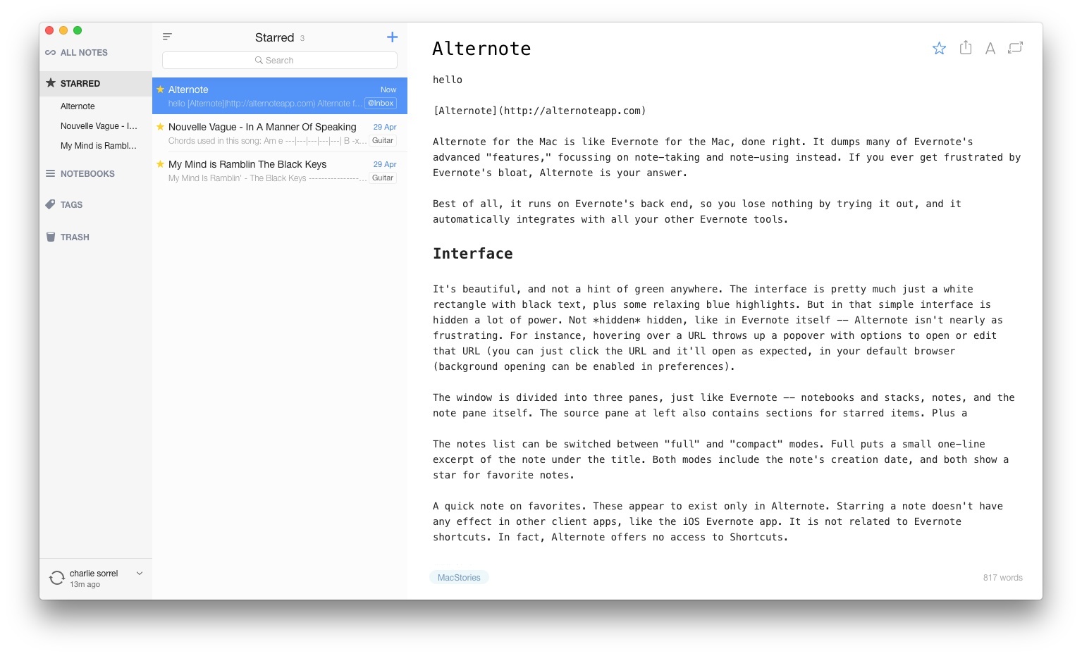
Alternote Review: Minimalist Markdown Evernote App for OS X

Alternote

Alternote for the Mac is like Evernote for the Mac, done right. It dumps many of Evernote’s advanced “features,” focusing on note-taking and note-using instead. If you ever get frustrated by Evernote’s bloat, Alternote is your answer.

Best of all, it runs on Evernote’s back end, so you lose nothing by trying it out, and it automatically integrates with all your other Evernote tools.
Read more


Facebook Instant Karma

MG Siegler on Instant Articles, Facebook’s initiative for native articles that was rolled out yesterday:

So rather than wait around for the web browsers to catch up, Facebook is taking action. And, by the way, they’re hardly the first to do this. Isn’t Facebook Instant essentially the same thing Flipboard and others have been doing for years? Yes, yes it is.

And again, it’s the right thing to do from a user experience perspective. Who wants to wait longer to load what they’re looking for, be it a game or an article? No one. While they’ll never admit it, even those with fears that this will lead to an end of the “open web” don’t want to wait.

As I tweeted, Instant Articles are so fast and smooth, comparing them to in-app web views isn’t even funny. There’s no contest – Facebook is offering a superior reading experience that, if you’re used to tapping links, waiting, and then reading, is just impressive and obvious (for the vast majority of news websites).

As a publisher, Instant Articles concern me: what if there’s an audience on Facebook that expects articles to be that fast and rich? What if, years down the road, each major social broadcasting service will offer a way to bundle together assets and text to produce native articles that are faster than web views? Will I still own 100% of my content? What happens to the open web and RSS feeds?

I guess there’s only one way to find out.

(I plan to experiment with Instant Articles as soon as possible.)

Permalink

Connected: All Fancy And 2.0

This week, the guys talk about the state of the Mac App Store and share their hopes and dreams for iOS 9.

On this week’s Connected, we talked about the Mac App Store following Sam Soffes’ experience with Redacted, and we used my iOS 9 wish list as a jumping point for what we’d like to see in the next version of iOS. You can listen here.

Sponsored by:

  • Harry’s: An exceptional shave at a fraction of the price. Use code CONNECTED for $5 off your first purchase.
  • Blink: Better affiliate links.
  • Squarespace: Build it Beautiful. Use code WORLD for 10% off.
Permalink

Inclusive Toolkit: Tools for iOS & OS X App Accessibility

Sally Shepard has launched a Kickstarter campaign for the Inclusive Toolkit, a set of tools to help developers make iOS & OS X apps inclusive and accessible.

From the project’s page:

The common difficulties around implementing inclusive concepts in apps are a lack of resources, knowledge and empathy. All of Apple’s products have features that enable inclusivity, and they make a huge difference to people’s lives. Anyone developing for their platforms has access to the APIs to make their app equally accessible.

So how can we fix this?

From a user point of view, I want the Inclusive Toolkit to help solve two problems: unusable elements and poor experiences. And from a developer/designer/QA point of view, I want it to speed up development and testing time, as well as build empathy. It’s great if you work in a company that already has specific resources and knowledge about accessibility—but for many developers, that isn’t the case. I want to provide ways of making it part of the development process instead of something tacked on at the end.

Make sure to check out Sally’s ideas for the Inclusive Toolkit, such as ‘Visual Voiceover’ and ways to simulate impairments in the app testing process. Too many developers still ignore inclusive design and features in their apps, and anything that could help them simplify implementing these frameworks is, I believe, welcome and necessary.

Permalink