This Week's Sponsor:

Textastic

The Powerful Code Editor for iPad and iPhone — Now Free to Try


Better Two-Factor Authentication with Authy for iOS and OS X

In my list of Must-Have iPad Apps for 2013, I mentioned Authy and two-factor authentication:

Authy. If you’re not using two-step authentication for online services that support it, you’re doing it wrong. And if you assume that the ugly Google Authenticator app is the only way to generate one-time security codes, well, let me tell you about Authy. Simple and well designed, Authy is “a Google Authenticator app” in that it can generate codes for services, like Evernote and Dropbox, that would normally ask you to use Google’s app. Authy is secure and fully compliant with the standards required by two-step authentication; it has a clean UI, it’s free and Universal, and it comes with a Mac utility to share codes locally over Bluetooth.

Because it’s an app that I use every day, I thought that Authy deserved a separate mention on the site; I replaced Google’s terrible Authenticator app with Authy, which provides a cleaner interface, support for multiple devices, and a Mac utility to share tokens using Bluetooth Low Energy. Read more


Launch Center Pro 2.1: Fleksy Keyboard, Lists, Photo Attachments, and Share Sheets

Launch Center Pro 2.1

Launch Center Pro 2.1

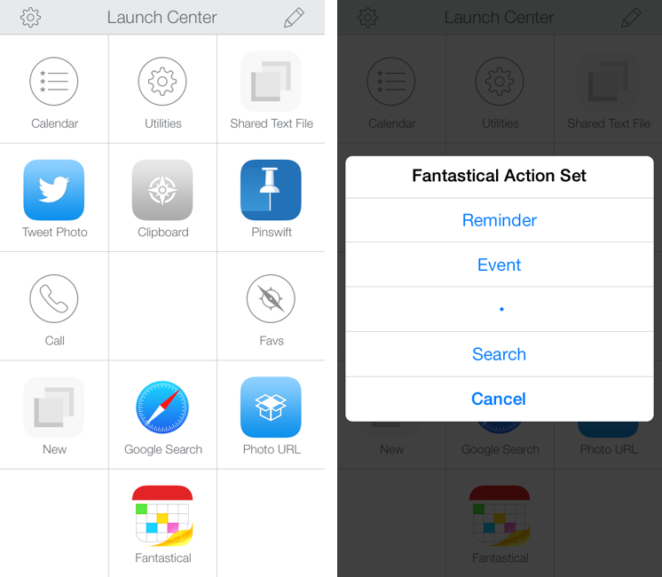
In October, Contrast released Launch Center Pro 2.0, a free update to their shortcut launcher and automation tool for iOS that brought a new interface for iOS 7 and, among other minor additions, Dropbox integration. Launch Center Pro is one of the three apps I keep in my dock[1], and I use it several times a day to create new tasks in Fantastical, launch Google searches, open my favorite websites, and more.

Today, Contrast is launching Launch Center Pro 2.1, a seemingly not-so-major update that, however, brings important changes to the app, including a new way to build visual actions and support for the new third-party Fleksy keyboard. I don’t think it’s an exaggeration to say that version 2.1 is just as important as 2.0 for heavy users of Launch Center Pro. Read more


Soulver for iOS 7 Updated with iPad Support

In late October, Aqualia’s Soulver was updated with iOS 7 support on the iPhone, and I noted how syntax highlighting ultimately made the app better than the iOS 6 version:

If you’ve used other iOS 7 apps like Byword, you know how syntax highlighting is beneficial to the user experience: numbers turn green, units are purple, operations are blue, and plain text is standard black. Syntax highlighting makes lines more scannable because operations and individual bits of text stand out more; furthermore, because Soulver allows you to type units manually (you can write “USD”, “usd”, “dollars”, etc) you’ll instantly know if what you typed has been recognized by the app thanks to color highlights. Besides being nice visually speaking, syntax highlighting — a simple addition in theory — makes the experience of using Soulver considerably better.

Today, Soulver 2.4 has been released with iPad support, making the app Universal. The iPad’s interface isn’t revolutionary – you still get a split layout but keys and number pads are larger on the iPad and you get easier access to some of the app’s features.

Soulver is a great app and on sale for a limited time at $1.99 on the App Store.

Permalink


On App Store Review Prompts and Rules for App Developers

Chris Gonzales hits the nail on the head with his “rules for App developers” concerning review prompts in apps (you know, the alerts that ask you to rate an app). All of the previous discussion is linked to in Chris’ piece so you can catch up there. As per Chris’ suggestions, I like this one in particular:

Respect the users’ wishes. If a customer chooses to opt out of leaving a review, your app had better not continue prompting them about it afterward. I can live with a one-time popup, but there are some apps that ignore opt-out requests and that is definitely not okay with me. It might even be a good idea to respect opt-outs across app updates, if possible. If I didn’t want to review your app two updates ago, I’m no more likely to do so today.

I personally don’t care for review prompts because they’re intrusive. They get in the way and I feel like a jerk every time I have to tap some variation of, “No thanks.”

An app that does it better is Twitch.tv’s iOS app, which instead of showing alerts[1], has a little translucent bar at the bottom of the screen that asks you to review the app if you like it. It doesn’t get in the way of what’s on the screen or make me stop what I’m doing, and it doesn’t pop-up very often. I think Twitch can use it for other things as well, such as making users aware of new features. The other nice thing about their version of a notification bar is that it can port nicely to other platforms, keeping that experience consistent across mobile devices.


  1. That app has other issues with alerts though as far as telling when you broadcasters come online, which should be banner notifications instead. ↩︎
Permalink

Castro, A New Podcast Player for iOS, Does Two Things Well

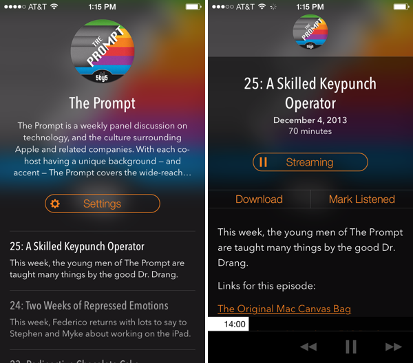
Castro, a new “high fidelity” (come on… I mean really?) podcast player for iOS, looks good and has a few clever ideas for podcast listening. Forget playlists: Castro presents podcasts in a day-to-day timeline that keeps the most recent shows at the forefront. I don’t know if I’m a fan of how text is overlaid on translucent show art since the app’s look is dependent on whether the podcast you listen to has appealing cover art, but I am a fan of the player’s decided simplicity when it comes to podcast controls. There are no timers, no speed settings and no share button. However, underneath the show notes and behind the basic forward, back, and pause/play buttons is a hidden scrubber, which lets you scrub to any position in the currently playing episode with surprising ease. I don’t think it’s discoverable, but it’s unique and surprisingly accurate. It was the thing that John Gruber pointed out and the first thing I showed Federico when discussing the app. Update: Also hidden is a playback speed setting if you tap and hold the play/pause button (thanks Twitter).

The biggest thing Castro has going for it, in my opinion, is its search feature. It’s fast. Like, it’s really fast as podcasts appear as you type. If you’re making a podcast app, I’m pretty sure Castro has set the new high bar here. It made subscribing to a bunch of shows for the first time pretty painless.

Grab it from the App Store for $2.99.


Discover The Meaning of Acronyms with Acronymph for iPhone

Acronymph

Acronymph

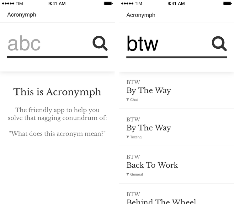
Acronymph, developed by Calvin Robertson, is an iPhone app to discover the meaning of acronyms.

With a variety of built-in categories that range from Internet slang and sports to music, economy, and goverment acronyms, Acronymph simply displays matches it finds in its built-in database. You can’t configure sources you want to see/hide because the app has no settings, but a recent update added a URL scheme that lets you send an acronym from apps like Launch Center Pro or Drafts directly to Acronymph without having to tap the app’s search box and type.

When results are found, you can tap on them to copy them, open a Google search, or share them to other apps. I’m nitpicking, but I don’t like how “@AcronymphApp” is appended to an acronym’s meaning when you’re sharing a result to Mail or Twitter.

Acronymph is simple and effective. I’ve looked up several acronyms in the past weeks and the app always found meanings in less than two seconds; it’s the kind of utility that you likely won’t need on a daily basis, but that will come in handy if you don’t need a full-featured dictionary app like Terminology. And, btw, Acronymph is $0.99 on the App Store.


Apple Adds Bloomberg, Local ABC News, Crackle, and KOR TV to Apple TV Channel Lineup

Less than a month ago Apple brought channels like Yahoo Screen and PBS to the Apple TV, and today they’re bringing over streaming news services like Bloomberg, ABC (for streaming local content from ABC news affiliates), Crackle for movies and TV shows, and Korean language channel KOR TV. Darrell Etherington of TechCrunch echoes what I suggested last month regarding the Apple TV as a viable alternative for cable cutters:

This launch is just the most recent in what’s been an increasingly fast-paced rollout of new content partners on Apple’s set-top box, but it brings some interesting ingredients to the mix, including local broadcast TV streaming and a 24-hour news channel, which are key ingredients to what many users would consider basic TV service. Apple TV didn’t start off as a really viable cord-cutting alternative for people looking to ditch their cable subscriptions, but it’s been building up a piecemeal library of a la carte content that begins to become a truly worthy option.

In a nutshell, the Apple TV now has a 24-hour news channels, multiple sports outlets, various channels for kids, and channels apps for watching TV shows and movies on demand.

For a listing of channels currently available on the Apple TV, check out the “Whats on Apple TV” page at Apple.com.

Permalink