Skitch for Mac Updated with Mavericks Compatibility, Redesigned Toolbar, New Icon

Following a major update for iOS that was released last month with a complete redesign and rewrite for annotations and sharing, Evernote updated Skitch for Mac today with a new icon, new branding, Mavericks fixes and a redesigned toolbar.

In a move that it’s in line with the company’s recent focus on Skitch as a standalone product and not an extension of Evernote apps, Skitch for Mac no longer launches with a login screen for users who don’t want to sync their image annotations to the service. Sync is still available, but all Evernote-related features have been grouped in a single area that doesn’t ask users to log into their accounts every time they launch the app. That alone was one of the biggest annoyances of the old Skitch for people who liked to keep it out of Evernote, and I’m glad it’s been improved.

In terms of using the app, Evernote has redesigned the toolbar to be more similar to the iOS counterpart in how it groups items and only shows more options when necessary. On the left side of the screen, you can click items as you’ve always done with Skitch, but now tools that have sub-menus for additional controls will navigate into a sub-view when clicked instead of showing a popup. This view can be pinned on screen to keep it visible by clicking the pin icon at the top, or you can click anywhere in the sidebar to go back to the main tool selection view. I’ve only been trying the new sidebar this morning, and it does seem to work better than the old UI for how I’m used to annotate images in Skitch (I either drag images onto the dock icon or use the menubar helper for crosshair snapshots).

The bottom section of the app has been redesigned as well. Zoom controls, file name, format, and “drag me” are more tightly integrated in a single toolbar, and I’ve noticed that you can click the filename to rename an image directly in Skitch before saving it to the Finder. Interestingly, file format options include both “PNG” and “Skitch PNG” – the only difference being that, in my tests, “Skitch PNG” set the Alpha Channel to “Yes” in the Finder’s image inspector.

I still miss the old app’s ability to snap webpages (I’ve been using Ember for that, and it’s a very nice app) but it’s good to see Evernote getting rid of cruft and polishing the design for users who don’t care about syncing their annotations to the main Evernote service. I don’t think that Skitch for Mac will ever be as simple as the new iOS version, and today’s update feels like a good one.

Skitch 2.7 is available on the Mac App Store.


Mixed AppleScript Signals

Dr. Drang:

As for spreadsheets and presentation software, the only competition I’m aware of is Excel and PowerPoint from the MS Office suite. I’ve never used PowerPoint and haven’t used Excel in almost 20 years, but David Sparks says their AppleScript support was better than iWork’s even before the purge. Now Apple is essentially pushing its power users toward Microsoft. It’s a funny world.

Permalink


Review: Automatic, Connecting Your Car to Your Smartphone

My daily drive should ideally be a twenty five minute drive with light traffic and usual stop lights. It’s not. It’s a route filled with heavy traffic, other drivers doing dumb things, and constant stop-and-go rigamarole. Until you start quantifying it with hard data, how much time we really spend in our vehicles doesn’t sink in. Tired, coffee fueled, and addled by our daily commutes, it also isn’t immediately apparent how much we forgo basic considerations that benefit our vehicles and other drivers.

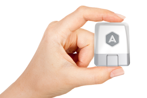
The Automatic Link, a white and silver dongle that plugs into the on-board diagnostics port of your vehicle, tries to make accessible driving data that’s otherwise reserved for black boxes. It turns any car into a smart car, which chimes when you commit various driving faults while gathering data during your commute.

What companies like Nest are doing for the home, Automatic is trying to do the for the car.

Read more


The State of Maps

Maps for iOS 6 wasn’t well received, prompting an apology from Apple and a brief App Store campaign that featured alternatives such as Google Maps. Apple’s core problem: they just didn’t have the data or the mapping prowess to compete with Google, the previous maps supplier and a popular provider for search, directions, and transit information. Apple’s strategy was to provide a core Maps experience, letting developers ship apps on the App Store that could take the spotlight for reviews and transit info.

For the past year, Apple has been trying to hire a number of “Ground Truth Experts” while acquiring companies like HopStop and Embark. They’ve made lots of improvements to Flyover, revisiting popular tourist spots to patch messy data. It’s a continual work in progress, but one year later, I expected to see more progress.

Read more


Hazel 3.2 Adds Mavericks Tagging Support

Hazel is the key element of my paperless workflow and several other automation scripts I run on my Mac, such as photo backups. One day, I will get around describing my paperless system (which I have tweaked and perfected over the past months), but, today, allow me to link to version 3.2 of the app, which adds support for tags in Mavericks.

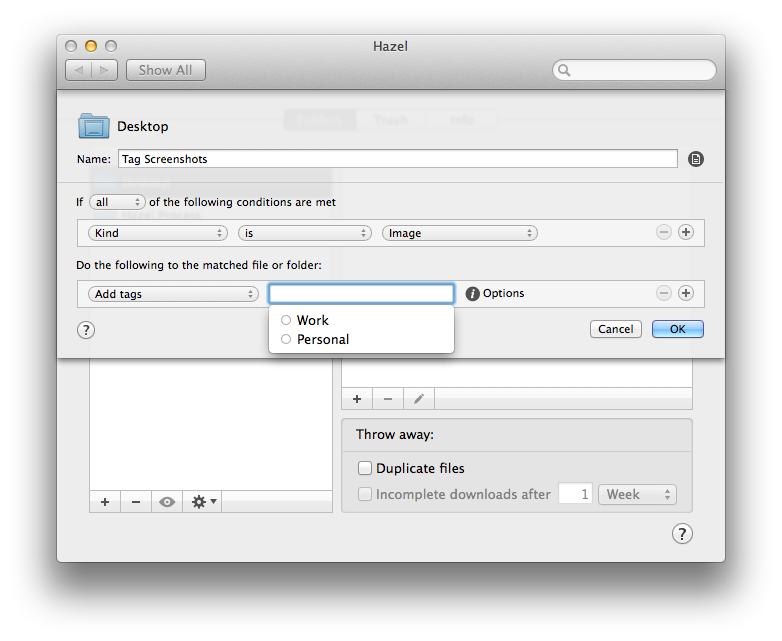
You can now create rules that check for tags in matched files and apply tags automatically. This is great if you want to process a bunch of files automatically and tag them instead of moving them into a folder. Hazel can pick up tags you’ve already created on your Mac, as well as create and replace existing tags if you want to type a tag’s name manually in Hazel.

Interestingly, Hazel can still set color labels (I assume for Mountain Lion users?) and it doesn’t show a tag’s color inline when editing an action – for me, it just displays a blue “token” for the tag with a white label. It’s really a minor issue –  I have been testing the public betas with Mavericks support and they’ve been working well for me.

You can get Hazel here, and check out our review of version 3.0 and some of my workflows.