This Week's Sponsor:

Textastic

The Powerful Code Editor for iPad and iPhone — Now Free to Try


Always Beaten

In thinking about the latest round of rumors of another company supposedly “beating” Apple to a market in which Apple hasn’t entered yet, I remembered how this sort of scenario happened many times in the past. I wanted to understand if “beating to the punch” is really the parameter we should be looking at.

Therefore I used Google to find evidence, and I was given plenty of it.

August 2009: Bloomberg Businessweek says Nokia beat Apple to the punch by unveiling a netbook.

January 2010: Electricpig wonders if a Microsoft Courier appearance could beat Apple to the punch.

January 2010: Tom’s Hardware believes the HP Slate will beat Apple to the tablet punch.

July 2011: Dvice says Motorola is preparing to beat Apple to the market with a Retina Display tablet.

December 2011: BGR says Samsung could beat Apple to the market with a Retina tablet.

April 2012: The Los Angeles Times asks whether IKEA has beaten Apple to an all-in-one television.

June 2012: WebProNews says a Google Maps announcement will beat Apple to the punch.

June 2012: AppleFanSite asks if Microsoft has beaten Apple to the 7-inch tablet market with an Xbox Surface tablet.

September 2012: Forbes asks if Nintendo has beaten Apple to an iTV.

October 2012: Gizmodo says Amazon beat Apple to the classroom.

January 2013: Business Insider says even Sony will beat Apple to making a giant phone.

February 2013: MacRumors says Samsung could beat Apple to market with an iWatch competitor.

How many of those races – “being first” – resulted (when true) in a subsequent return in terms of profit? And how many of those headlines were purposefully crafted for the sake of pageviews?

Two brief thoughts. First, for a company that’s been beaten like that, Apple is doing surprisingly well.

More importantly, I believe it’s clear that, in Apple’s case, the market didn’t care about who was first. But there are some aspects to consider.

People wanted – and I think they will continue wanting – the best products, not the ones that arrived first on the shelves. If the best product is also first, even better. But if the first product isn’t worth the money, I see a problem.

Apple was “beaten to the market” in many other occasions that I haven’t listed here: higher capacity portable music players; LCD color screens; digital marketplaces; video chat; and yes, even smartphones. I am not poking fun at the headlines – I am using them to point out a general “notion” that has been going on for years among tech companies, reporters, and consumers: that “beating someone else to the punch” is automatically synonymous of increased chances of success.

I wonder if Apple’s competitors believed they needed to “beat Apple to the punch”. Because from where I stand, I see one that underestimated the iPhone, one that is making billions, and another that is ridiculously late. Others aren’t doing very well, or they are taking entirely different approaches. Did they really want to beat Apple to the punch, or was it just a headline that told us they would?

Apple is a company, and like every company they want to make a profit. Unlike others – many others – they have been smart in investing resources not to beat HTC, Sony, or RIM to the punch – but to make the best products without being late to the point where people wouldn’t care anymore.1

Making sure that your product is good and that you’re not extremely late to the game. It’s overly simplified, but I’d say that, with such underlying philosophy, being second is generally a good position.2 It buys a company like Apple time to understand what the market wants and what is required to produce new products on a large scale for a profit. In other words: the Apple TV is still a hobby.

Or maybe I’m wrong, and Apple’s competitors were first and did have a superior product, but for some reason Apple convinced the masses to buy iOS devices instead even if they came “second” to the market. But I don’t think so.

Looking ahead at this (rumored) wave of new products – watches, televisions, game consoles – I think the real question is: who can beat others to the punch in delivering the best product?


  1. Apple was also second in other areas, and they’re struggling there. But that’s a different topic. Yes, Apple has problems↩︎

  2. The next obvious step to prove this theory will be the Apple television as opposed to, say, Samsung Smart TVs. ↩︎


Dropbox 2.1 With New PDF Viewer

Dropbox 2.1 With New PDF Viewer

Dropbox21

Dropbox21

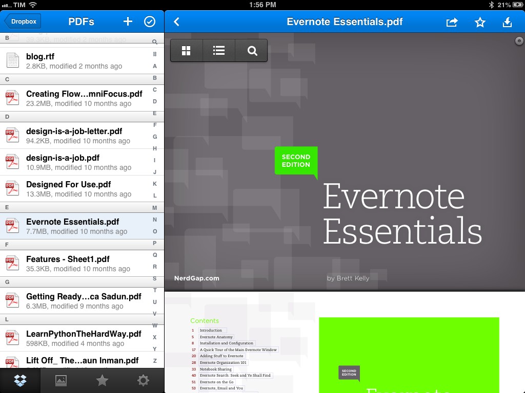
Dropbox has released an update to its iOS app that brings three new features for iPhone and iPad users: a redesigned PDF viewer, notifications for folders shared with you, and a new “sort by modified date” option.

The new PDF viewer is based on PSPDFKit and it now allows you to access the table of contents and page thumbnails for every PDF document in your Dropbox. A button in the top right corner of the title bar lets you switch from single page view to thumbnails, while a search icon in the bottom bar allows you to search for any word inside a document (with match highlighting). On the iPad, these buttons are available as floating controls (pictured above). As with the previous versions of the app, you can open a PDF in other apps and copy its Dropbox link to the clipboard.

Dropbox is now capable of sending push notifications when someone shares a folder with you – a feature that the company has slowly been bringing to its desktop and mobile applications. In my tests, however, I haven’t been able to receive any notification yet. The new “Newest - Oldest” sorting option is available at the top of any folder next to the search. The design is in line with Dropbox 2.0, released in December.

Dropbox 2.1 is available on the App Store.

Permalink

Tweet Library and the Twitter Archive

TweetLibrary

TweetLibrary

Like many others, I got access to my Twitter archive last night.

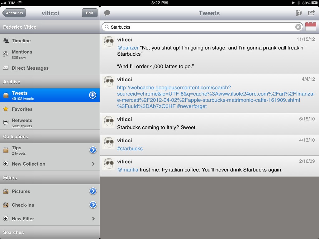
The option, launched a few months ago, enables you to download a complete archive of all your tweets and retweets inside a .zip file that contains CSV and JS archives with a nice HTML page you can browse. With over 50,000 tweets since February 15, 2009, my .zip file weighed at around 9 MB. Seeing tweets from four years ago has a strange effect in that it shows the ephemeral nature of 140 character-long status updates in better context. In other words, I used to tweet “good morning” and “goodnight”; with time, I lost my good Twitter manners.

The Twitter archive was a feature I had been anticipating for quite a while. As you know, I have been a strong proponent of solutions to archive and search your Twitter account – such as Manton Reece’s Tweet Library, Cue (formerly Greplin), and CloudMagic. Prior to the rollout of the Twitter archive, all these solutions allowed you to search your most recent tweets (Cue and CloudMagic) or download the past 3200 (Tweet Library); none of them could, per Twitter’s API limit, access your entire Twitter history.

Read more


Rdio 2.1

Rdio 2.1

Rdio has updated its iOS client to version 2.1 today, adding a number of design tweaks to improve the look and usability of the app.

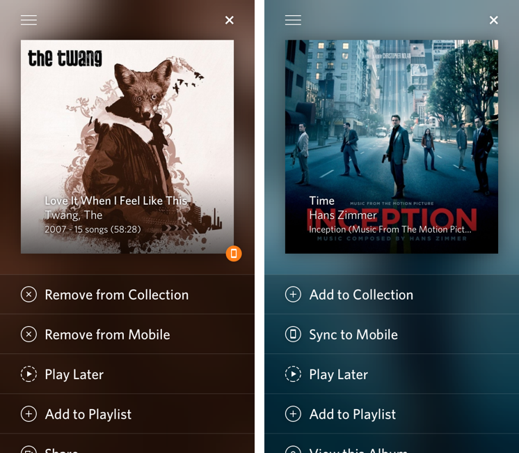
Notably, Rdio now comes with a “long press” gesture to tap & hold any item to bring up a new menu to sync, play, share, subscribe, and more. The new menu will “slide up” an item’s album artwork from the bottom, revealing a color-coded background that seems to be inspired by iTunes 11’s way of using the primary colors of an album to generate a background. Personally, I like how this allows each album to have a very unique sharing menu; I’m also a fan of this addition because the developers put a “More by…” link in the menu. Previously, the link to see more of an artist was only available inside the single album view – daily Rdio users will understand how this can be a welcome timesaver. Overall, I like the design changes with thinner fonts and lines, but I’m not sure about the readability of said thin/light fonts on non-Retina displays (such as the iPad mini).

More importantly, I keep disliking how the iPad app continues to be an afterthought for Rdio. From my original review:

Second, I’d like the iPad version of the app to always show the sidebar. Right now, several areas of the iPad client look like a blown-up iPhone app, whereas others show that the Rdio team took advantage of the larger screen with grid views and modal windows. However, in albums or playlists the interface is made by a vertical list that looks awfully similar to the Android tablet apps Tim Cook made fun of. There’s too much wasted space that could otherwise be used for the sidebar or, perhaps even better, the social ticker that is still exclusive to the Mac app and web player.

This hasn’t been improved in Rdio 2.1, and in this new version the “long press menu” is only available on the iPhone. On the iPad, long pressing gets you a standard popover with a bunch of buttons. In terms of care for a sufficiently unique iPad client, Spotify is still ahead of Rdio.

Rdio 2.1 is available on the App Store.

Permalink

Cloudier: A Detailed, Yet Minimal CloudApp Client for iPhone

URL shorteners – most of us use them to compact long URLS for sending files and links to friends, clients, and social networks. Although sites like Twitter have wrapped their t.co links around everything, people still want to have their own solution to share and track links that they share with the world. Droplr and CloudApp are two of the top services out there with free and paid subscriptions. Each are similar but each have their own caveats. While Droplr has an official iOS client, CloudApp still does not, but there are some great third-party apps out there like Cloud2go and Cloudette.

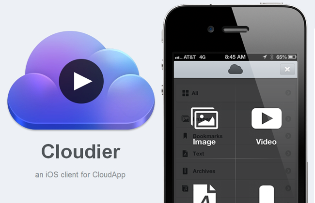
Designer Jackie Tran and developer Benjamin Mayo have teamed up to create their very own CloudApp iPhone client, Cloudier. Cloudier debuted on the App Store today and it’s a minimal yet feature-filled CloudApp iPhone client that I really have enjoyed using. Read more


Alex Guyot Chains 5 Apps with Drafts

Alex Guyot Chains 5 Apps with Drafts

As I expected, people have started experimenting with chaining apps and services using Drafts, and Alex Guyot quickly beat me in chaining 5 apps. From his explanation of the workflow:

Follow the bookmark in Chrome and it will take the URL of the webpage you are on, send it to Drafts as a draft, upload it to Dropbox, send it to Due (where you choose a reminder time for it to remind you), take you back to Drafts, send you to Instapaper (Where you choose to save the link to Instapaper), then send you back to Chrome.

He also posted a quick video showing the workflow in action on his iPad. I like how, unlike me, he chained each action as an x-success parameter of the previous one.

As I’ve argued on multiple occasions here on the site, URL schemes are certainly a stopgap solution to a problem – better inter-app communication on iOS – that I wish Apple will tackle in the near future. However, that doesn’t mean people can’t get real work done with URL schemes and apps today. Looking ahead, I can only imagine new possibilities of iOS automation based on URL schemes that, however, abstract the need of manually building URLs from the end user’s workflow – using a more Automator-like interface to visually represent actions. And, who knows, perhaps in a future version of iOS “switching” between apps won’t even be required anymore, as “parts” of other apps will be linked to each other using something like XPC.

Permalink

Today Weather 1.2 Goes Universal

Today Weather 1.2 Goes Universal

Today Weather

Today Weather

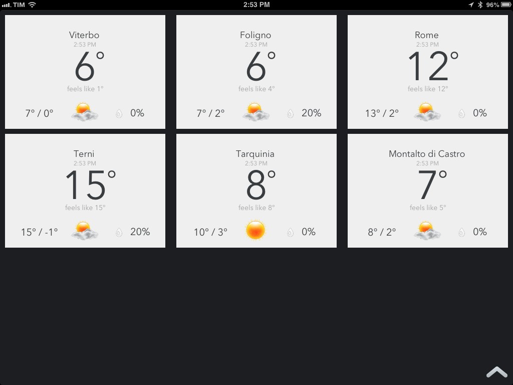
Today Weather is my go-to weather app for iPhone – the one I keep on my Home screen – and with the 1.2 version released today, the app has gone Universal adding iPad support.

Those coming from Today Weather for iPhone will instantly be familiar with the iPad app. All the features of the iPhone counterpart have been ported to the iPad, keeping the navigation consistent across versions, but using the iPad’s larger screen to offer more information. My favorite feature of Today Weather was the Forecast view:

What I like the most about Today Weather is the screen on the left. Called Forecast view, it comes with a normal and “geek” mode to visualize temperature and weather for the next week. Unsurprisingly, I like geek mode, which is enabled by tapping on the screen: with a set of vertical bars, the graph displays high and low temperatures for the week using the NOAA color gradients. Normal mode simply displays the highest value, and you can switch between the two with a tap. In doing so you’ll notice the nice animation that brings up the bars one after the other. It’s a fantastic touch. Forecast view is the screen I’ve been checking out every day because I like to know, in simple terms, “what the next days will be like”. Today Weather provides that kind of information in three ways: data (numbers), icons, and colors.

On the iPad, Forecast has two extra days, spanning more than a week worth of visual forecasts. It is, by far, my most used feature in Today Weather.

The initial screen has been reworked for the iPad. Instead of presenting multiple locations stacked on top of each other, Today Weather for iPad offers a Dashboard view that takes up the entire screen and lays out the same information with a design that feels more native to the iPad. I really like this idea as it lets me quickly fire up Today Weather and understand in a few seconds what the weather is going to be like in those 5-6 locations that I care about – without having to scroll or drilling down into their detailed views.

Today Weather is $0.99, Universal, and I highly recommend it.

Permalink

Apple Tweaks Prices and CPUs of MacBook Pro, MacBook Air Lines

Apple Tweaks Prices and CPUs of MacBook Pro, MacBook Air Lines

With a press release published this morning, Apple has announced they have updated the MacBook Pro and MacBook Air lines with new prices and faster processors.

Apple is making the MacBook Pro with Retina display faster and more affordable with updated processors and lower starting prices. The 13-inch MacBook Pro with Retina display now starts at $1,499 for 128GB of flash, and $1,699 for a new 2.6 GHz processor and 256GB of flash. The 15-inch MacBook Pro with Retina display now features a faster 2.4 GHz quad-core processor, and the top-of-the-line 15-inch notebook comes with a new 2.7 GHz quad-core processor and 16GB of memory. Apple today also announced that the 13-inch MacBook Air® with 256GB of flash has a new lower price of $1,399.

Thanks to @setteBIT, here’s a quick rundown of the changes: the 13” MacBook Pro with Retina Display is now $200 and $300 cheaper for the 128 GB and 256 GB (with SSD) models, respectively; the CPU has been bumped from 2.5 GHz to 2.6 GHz. The price difference in Euros is €250 and €350. The 13” MacBook Air with 256 GB SSD is now $100 cheaper (€150).

The 13” MacBook Pro with Retina Display was announced on October 23, 2012 – 113 days ago; the 15” MacBook Pro with Retina display was announced at WWDC ‘12 – 247 days ago.

In the first fiscal quarter of 2013, Apple sold 4.1 million Macs. It’s unclear whether Apple might have been able to lower the prices of Retina MacBook Pro (while offering faster performances) due to possible reductions of component prices (i.e. high-resolution displays), but the timing is interesting: just a few days ago, Apple and other tech companies (such as Adobe) were summoned to appear before the Federal Australian Parliamentary Committee that has been investigating IT pricing in Australia. In response to the inquiry, Adobe promptly dropped the price of its Creative Cloud service.

Permalink