Due’s Natural Language Input

Due’s Natural Language Input

I like Due. Both on the Mac and iOS, it’s a fast and easy-to-use reminder/alarm app with tons of options and iCloud/Dropbox sync. Due is simple yet powerful under the hood, as I’ve shown in my article on automating iOS.

I was playing around with Due again last night, and I noticed a nice detail worth its own mention here. Due supports natural language input for new reminders: you can write something like “Send email in 45 minutes” and Due will parse the “in 45 minutes” portion as a date input relative to your timezone. For instance, you can create a reminder on a Monday at 11 AM and write “in 2 weeks”, and Due will understand it’ll have to remind you after 14 days.

The way the developer got around parsing recognized language input is interesting. On iOS, if the app recognizes a date it will display it under “Set to…” in the title bar (a popover on iPad, as shown in the image above). Tapping that will set the date picker to your input. But there’s more: once set, you can tap again to remove the actual text from your reminder, because you don’t need the reminder’s name and date fields to say “in 2 days” at the same time.

Due for Mac comes with this subtle implementation as well. You can write something like “Meet Chris in 3 days”, hit Enter to accept the date, and the app will highlight the parsed text so you can hit backspace to delete it quickly.

It’s the little details that turn apps into great apps. Make sure to check out Due, and, if you’re geek enough, its powerful URL scheme.

Permalink

Predicting Apple’s Change

Predicting Apple’s Change

People have different opinions as to whether Apple should “change” or not. By “change” most people mean a “new hit product” or “changes to existing product lines”.

Here’s Michael Lopp, in November 2012:

Apple’s doom will start quietly and I doubt anyone can predict how it will actually begin. It will be historians who, decades from now, will easily pin its demise to a single event that will appear obvious given years of quantifiable insight. And it will only be “obvious” because the real details will have been twisted, clouded, or forgotten entirely, so it will all seem clearer, faster, and simpler. Their explanation will start with the passing of Steve Jobs, and they will draw a clear line to a subsequent event of significance and will say, “Here. This is it. This is when it began.”

John Gruber, last week:

Why just Apple? Why does no one argue that Samsung “needs” to unveil a major new disruption? What harm would Apple suffer if they spent the next five years refining and growing the products already in their stable? They’re already the most profitable technology company in the world, and their three major platforms — iPhone, iPad, and Mac — are all growing. They don’t need to change a damn thing.

John Siracusa, in our interview:

Apple needs to at least select its next big mountain to climb, even if it won’t be scaled for years to come. In 2012, Apple made louder rumbling noises about TV, but didn’t commit to anything. In 2013, Apple needs to put up or shut up about TV.

Apple also needs to start diversifying the iPhone line (as it did with the iPad mini this year), beyond just keeping old models around for sale.

Clark Goble, in response to John Gruber:

Here’s the thing. Not that long ago you could have said the same thing about Microsoft. However ten years ago I think the signs of their decline were already starting to be obvious. Fast forward to today and PC sales are stagnant, Win8 is a disappointment, their phone/tablet strategy failed, and Bing is still losing billions of dollars.

With Apple the signs are there too. Network services that still don’t work right and are unreliable. Design that seems to have lost that Apple strength of cutting out the unnecessary. They don’t “just work.” Important product lines that have gone ages without needed updates. (Numbers, Pages, Keynote, and arguably even iTunes since iTunes 11 was a disappointment to basically everyone) Even Apple’s famous ease of use and simplicity met its match with iOS’ system preferences.

I see both sides of the argument. For a company that was revolutionized by breakthroughs in innovation, it’s hard to imagine how they can avoid other major groundbreaking products for the next years. But on the other hand, with their three major platforms growing, why would Apple need to change anything now?

I think people have diverging opinions that are difficult to reconcile, both technically and philosophically. In the long term, perhaps Lopp is right – historians will look back at decades of Apple and understand what went wrong at some point in time. In the short term, perhaps Gruber is right – nothing needs to change.

I’d take a “the truth lies somewhere in the middle” approach. Apple is healthy, profitable, and still growing. But there are areas where they have shown they’re not infallible, such as services. They have problems that are far beyond leather textures and witty Siri jokes. I believe it’s fair to be concerned about Apple’s weakest areas, but I don’t think they spell doom for the near future. It would be silly to ignore those problems, just like it would be absurd to think Apple can go bankrupt next year. There are too many factors at play to ascribe today’s concerns as the single reason Apple “needs to change”. But it doesn’t mean we shouldn’t be criticizing Apple’s problems, or proposing better ways to solve them.

We can only wait.

Permalink

Dolphin Browser With Evernote Clipper

Dolphin Browser With Evernote Clipper

Dolphin, an alternative browser for iOS that I covered in 2011, has been updated today to version 6.0. Google Chrome is my go-to browser on iOS, but I had been testing this new version of Dolphin because of one feature: a native Evernote clipper.

Dolphin comes with lots of features and design choices, some of which I don’t like (case in point: the tap & hold popover menus). Given how Chrome keeps my tabs in sync across the iPhone, iPad, and Mac, I have no use for Dolphin’s Connect service and extensions. However, the built-in Evernote integration intrigued me as no major iOS browser to date has offered a native clipper for web content: some of them offered a bookmarklet-based clipper, but the experience of clipping URLs and text selection left much to be desired. Dolphin’s clipper is baked into the app, and it’s accessible from an action button in the toolbar.

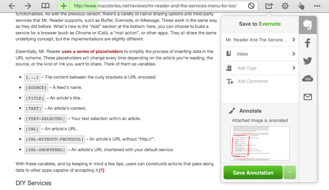
The Dolphin clipper automatically grabs a webpage’s title and current selection (if any). It uses your default notebook as destination, and it lets you add tags and comments to a clipped item. Like the desktop Evernote clipper, you can save a full page, or just an “article” if the app recognizes you’re trying to clip a blog post. One thing I’ve noticed is that, in spite of my attempt to clip rich text, web clips from selections were sent to Evernote in plain text; when I chose “save full article”, Dolphin saved the page as rich text into Evernote, and quite beautifully as well.

A feature I really like is the possibility to annotate webpages before sharing them. This works with other sharing services in Dolphin, not just Evernote. There’s only a red brush and an eraser to choose from, but it’s enough to draw attention to a portion of a page and save it as a 768x924 .jpeg file in Evernote.

If you’re an Evernote user and have been looking for a better iOS web clipper, check out the latest Dolphin Browser for iPhone and iPad.

Permalink

Mr. Reader And The Services Menu for iOS

A “services menu for iOS” is a chimera advanced users and developers have long been trying to hunt down. It all started with a mockup Chris Clark posted in 2010, showing how third-party iPhone apps could offer their “services” – just like OS X apps – to the user through a contextual menu. The concept became popular fairly quickly, but, eventually, Apple did nothing.

Fast forward to 2013, iOS users are still asking for better integration of third-party apps with each other. Developers have resorted to using URL schemes, a rather simple way to directly launch other apps and pass information to them – usually bits of text. App Cubby’s Launch Center Pro has become the de-facto solution to create a “Home screen of app shortcuts”, offering a series of tools (such as automatic encoding and different keyboards) to make the process of customizing URL schemes as user-friendly as possible. Launch Center Pro is, in fact, the utility behind many of my favorite iOS tricks.

Pythonista has also become a big part of my iOS automation workflow. Combining the power of Python with the possibility of launching URL schemes, I have created a series of scripts that help me get work done on iOS on a daily basis. Further leveraging Greg Pierce’s x-callback-url, I have ensured these scripts can take a set of data, send it to other apps, process it, then go back to the original app. You can read more about Pythonista in my original article, and I’ve been following updates from developers who implemented URL schemes as well with a dedicated tag on the site.

I concluded my Pythonista article saying:

I believe that, going forward, Pythonista and other similar apps will show a new kind of “scripting” and task automation built around the core strenghts of iOS. As we’ve seen, x-callback-url is a standard that leverages a part of iOS – URL schemes – to achieve simple, user-friendly and URL-based inter-app communication that can be used in a variety of ways. Looking ahead, there’s a chance rumored features such as XPC will bring more Mac-like functionalities to iOS, but developers will still find new ways to make iOS more powerful without giving up on positive aspects such as increased security and the simplicity of the app model.

Mr. Reader – a Google Reader client that I’ve covered on MacStories in the past, and my favorite RSS app – has today been updated to version 1.11, which introduces a generic solution for launching URL schemes that shows how iOS automation is a growing trend, albeit substantially different from what we’re used to see on OS X. Read more


Kaleidoscope 2

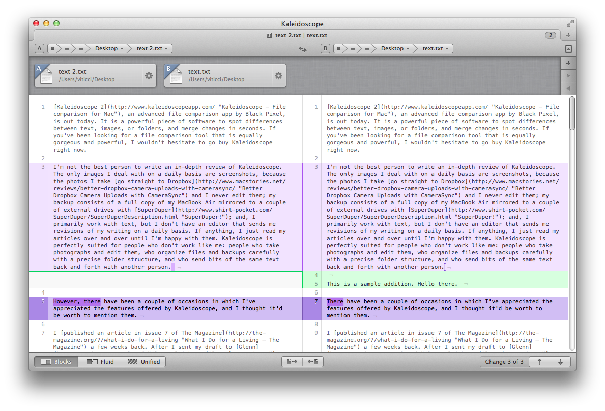
Kaleidoscope 2, an advanced file comparison app by Black Pixel, is out today. It is a powerful piece of software to spot differences between text, images, or folders, and merge changes in seconds. If you’ve been looking for a file comparison tool that is equally gorgeous and powerful, I wouldn’t hesitate to go buy Kaleidoscope right now.

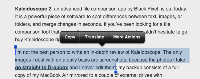
I’m not the best person to write an in-depth review of Kaleidoscope. The only images I deal with on a daily basis are screenshots, because the photos I take go straight to Dropbox and I never edit them; my backup consists of a full copy of my MacBook Air mirrored to a couple of external drives with SuperDuper; and, I primarily work with text, but I don’t have an editor that sends me revisions of my writing on a daily basis. If anything, I just read my articles over and over until I’m happy with them. Kaleidoscope is perfectly suited for people who don’t work like me: people who take photographs and edit them, who organize files and backups carefully with a precise folder structure, and who send bits of the same text back and forth with another person.

However, there have been a couple of occasions in which I’ve appreciated the features offered by Kaleidoscope, and I thought it’d be worth to mention them. Read more


MacStories Interviews: John Siracusa

In our ongoing series of interviews with developers and creators in the Apple community, I had the chance to talk with John Siracusa.

John is well known in the Apple community for his detailed OS X reviews and other articles published on Ars Technica. He co-hosted a podcast called Hypercritical for 100 (98) episodes with 5by5’s Dan Benjamin, and he also shares some of his thoughts on tech, games, and pasta on a blog with the same name. On Twitter, you can find John as @siracusa.

The interview below was conducted over email between January 3 and January 15, 2013.

Federico Viticci: Hey John, could you introduce yourself to the readers who haven’t heard about you before?

John Siracusa: Though I’ve spent my career as a web developer, I’m better known on the Internet for my articles at Ars Technica, especially my very long and detailed reviews of OS X going back 13 years, and for my podcast, Hypercritical, which just ended its two-year run. I’m also a regular guest on The Incomparable, a podcast about geeky books, movies, TV shows, comics, and video games. Read more


ReaddleDocs Relaunches As Documents

ReaddleDocs, Readdle’s file manager and document viewer for the iPad, has relaunched today as Documents, a free update for existing customers that introduces a refreshed interface and some new features.

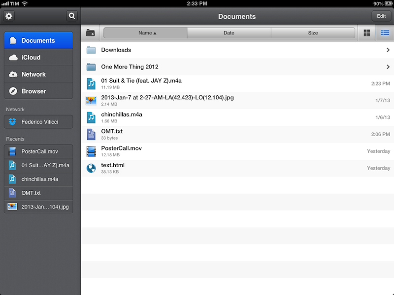
In terms of functionalities, Documents basically shares the same capabilities of ReaddleDocs. The app can open the same file types, it can organize items in folders, sort them, and display them in icon view or list view. Unlike the OS X Finder, sub-folders in List view aren’t opened in the same column, but they’ll require you to open a different view that will display a Back button with the name of first level. As with ReaddleDocs, buttons to create a new folder, sort by name/date/size, and change views are displayed in a bar at the top that you can reveal by swiping down. A shortcut to create a new text file has been placed in a sidebar that you can reveal by hitting the Edit button.

To understand what Documents does, you can read our original review of ReaddleDocs 3 for the iPad. There are a series of web services supported by the app (including Dropbox) that you can access in the Network tab on the left. In the sidebar, the app also offers access to iCloud storage (which doesn’t come with List view), a built-in browser (to download webpages or part of them just like ReaddleDocs 3), and “Recents”. This last section provides quick access to the last five opened documents: as you re-open one, it will go to the top of the list again. Read more