Poster 2.0

Tom Witkin’s Poster is my favorite WordPress blog editor for iOS. Poster comes with a clean interface, support for Markdown (the app can convert plain text Markdown to HTML before publishing), and full WordPress integration. The app’s excellent support for WordPress features like custom fields, drafts, slugs, and images means I don’t have to write on the iPad and later “adjust everything” on a Mac before publishing. Poster is, in fact, a core aspect of my iOS automation workflow.

Poster 2.0 is out today, and it’s another fantastic update that reassures me Tom is committed to making this app the best WordPress editor for iOS. The interface has been further refined, and it’s now easier on the eye with an even deeper focus on content rather than UI chrome. I don’t use these for MacStories, but Poster now supports WordPress custom post types and excerpts, alongside the “sticky” functionality that we use every once in a while to pin a post to the top of the site.

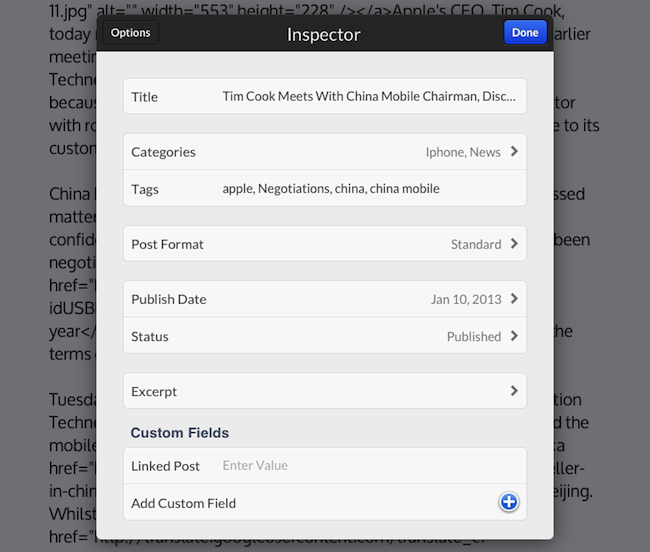
What I like about Poster 2.0 are the “minor” additions that make for a much better workflow. Custom fields can now be given a local label so that a friendlier name will be displayed in Poster instead of the actual name (e.g. “URLCustom_linked” becomes “Linked post”); the Markdown preview and HTML conversion now handles en and em dashes (something that annoyed me in the previous version of the app); if you edit a published post (as we usually do when we catch typos or make corrections), you can now save the edited draft locally before publishing. I also appreciate how the “Copy to Clipboard” action now only received a post’s URL (Poster 2.0 builds on the solid foundation of Poster 1.0 for post sharing), and the app is noticeably faster at syncing multiple posts at once.

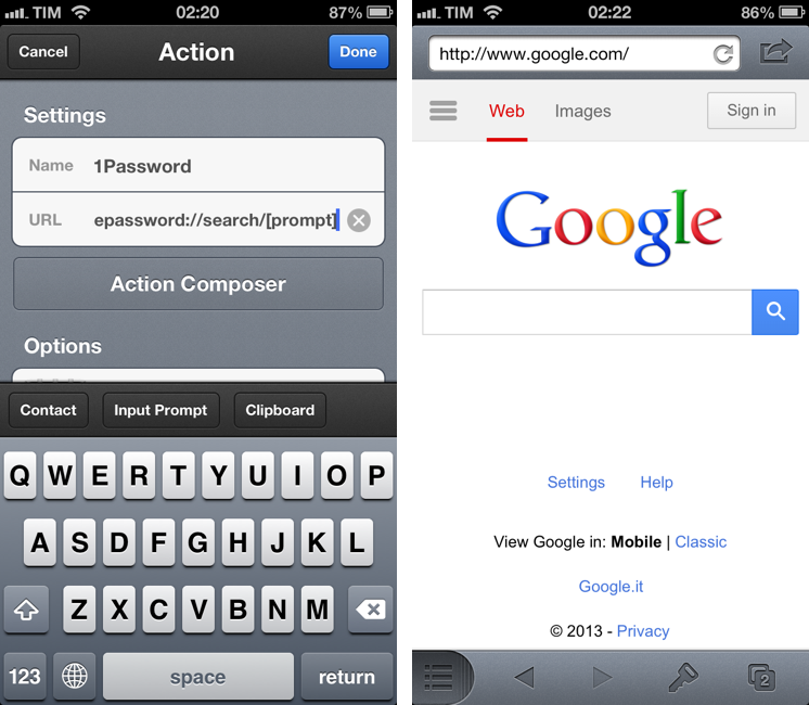
There are two more changes I want to mention. You can now insert images at any point in the editor by tapping & holding and selecting the “Insert Image” option from the popup menu; I tend to do all my image insertion beforehand, but this is a welcome addition for those times when I may forget about an image. And last, Poster now supports Greg Pierce’s x-callback-url to return to a specific URL after completion. Poster already had support for a URL scheme that allowed post creation from other apps, but now you’ll also be able to create a post and return to another app.

Here’s a bookmarklet I made to grab a browser’s selection and use it as text in Poster, get a webpage’s title and use it as post title, open Poster, and return to the browser. This kind of URL callback enables a streamlined workflow for, say, discovering links in Safari, quickly posting them to WordPress, and going back to Safari again.

javascript:window.location='posterapp:///create?text='+encodeURIComponent(window.getSelection())+'&title='+encodeURIComponent(document.title)+'&callback_url='+encodeURIComponent(location.href);

I also made a quick video showing the process in action. Unfortunately, getting the browser’s selection only works on the iPad.

Poster is a great app, and while not revolutionary, the 2.0 update refines several aspects of the previous version and adds more powerful functionality for WordPress users and iOS automation geeks. I highly recommend it.


Measuring iPhone 5 vs. iPhone 4S availability

Measuring iPhone 5 vs. iPhone 4S availability

Horace Dediu of Asymco today wrote and shared data on the availability of the iPhone 5 and iPhone 4S by potential buyers - measured by the subscriber counts of the carriers that sell the iPhone. It’s an important and valuable extension of an article I wrote last week, discussing the international rollout of each generation of iPhone and iPad. That analysis had a weakness in that I treated all countries as equal which isn’t necessarily true (depending on why you’re looking at the data).

Announcing availability in Mauritius is not nearly as important as announcing Madagascar. A better measure would be to track the countries’ populations being added, or, better still, the populations which subscribe to operators who have a distribution contract with Apple.

So instead, Dediu looked at which carriers held the iPhone in each country and what their approximate subscriber count was. By calculating the availability this way, you can now see the potential number of iPhone buyers, as seen in Horace’s graph here.

That’s a handy measure: the iPhone 5 was 30% more available than the iPhone 4S. The big contribution was having China and Indonesia available during the fourth quarter rather than in January 2011.

Make sure to head over to Asymco to read the full article and all of Horace’s observations, it’s an interesting read. If you didn’t catch my article last week, it’s also available to read here. Just note that if you are trying to compare Dediu’s graph with the one in my article (shown here), Dediu went with actual dates whereas I went with relative time. This is because I wanted to look at the first 110 days of every iPhone, Dediu was specifically looking at the fourth quarter availability.

Permalink

Apple Launches Back To School Promotion In Australia & New Zealand

Apple has once again launched a ‘Back to School’ promotion ahead of the start of the new school year in Australia and New Zealand. Students who purchase a Mac will receive a AU$100 (NZ$125) gift card and students who purchase an iPad with Retina display will receive a AU$50 (NZ$65) gift card - virtually identical to the ‘Back to School’ promotion held in North America and Europe last June.

The promotion is open to any student, parent or staff member of a K-12 or higher education school with any purchase made between January 15th and April 1st. Products included in the deal include any iMac, MacBook Pro, MacBook Air or Mac Pro (including refurbished models), but the only iPad that is valid with this promotion is the iPad with Retina display - refurbished iPads, the iPad 2 and iPad mini do not qualify.

Apple has also put together a short list of great Mac and iOS apps that might appeal to students - as well as a buying guide that includes various accessories, bags and software that is targeted towards students.


“Open In” and Mobile Safari

“Open In” and Mobile Safari

Continuing the discussion about the “Open In” menu for iOS, David Chartier proposes “Open In” for Safari URLs:

Finally, Document Sharing in Mobile Safari would further promote an app-centric workflow on iOS. Bookmarklets are often designed to open another web service in a new browser tab, and let’s face it, working on the web is a crummy experience. But even if they’re wired to open an app, bookmarklets are still a colossal pain to install which cuts off most attempts at the knees. This largely confines Mobile Safari and its content to an island, making iOS’s URL-to-app workflow needlessly tedious for anyone brave enough to try it.

In its current form, Mobile Safari only supports “Open In” for documents displayed in the browser, such as PDFs that Safari can render. The (new in iOS 6) share sheet doesn’t come with options to send a URL around, but only to copy it to the system clipboard.

Bookmarklets were never meant to take off among consumers, because they require a minimal amount of knowledge (or steps) that average users don’t want to deal with. However, developers had to resort to using bookmarklets because it was the only way to provide something that worked to pass a URL from Safari to a third-party app/web service. Some developers have gone out of their way to provide an “Install Bookmarklet” experience that wouldn’t scare off the majority of users.

Overall, “Open In” for links doesn’t sound like a bad idea. Imagine being able to quickly send a YouTube video to Facebook or a link to the Twitter app with an Apple-sanctioned menu and not some JavaScript hack. There are aspects I don’t know how I’d solve right now (How do supported apps appear in the iOS 6 share sheet? Are they available in a dedicated page, or can users re-arrange them? Could Siri be told to perform such actions?), but, generally speaking, providing better web-to-apps communication would be a good start.

Two years ago, Marco Arment offered some ideas on a possible “Send To” panel for Safari. This is absolutely still relevant today, because it hasn’t gotten better.

Obviously, that would be far from my envisioned iOS automation for power users. I’ve been trying the beta release of Alfred 2 lately, and I like how the developers created a workflow visualization that is both powerful and intuitive in the way it connects visually triggers to actions and outputs. Ideally, I’d love to see Apple considering an “Automator for iOS” – the kind of feature that most users don’t care about but that would likely make a subset of them reconsider iPads as “real work” machines. Apple could even go as far as making that kind of user automation look “cool” with the right interface decisions and a powerful inter-app communication layer that is not limited to Apple apps (read: with an API).

I hope this kind of stuff is in the cards for iOS 7.

Permalink

Sponsor: PDFpen for iPhone

My thanks to Smile for sponsoring MacStories this week with PDFpen for iPhone.

PDFpen for iPhone is the mobile version of Smile’s award-winning PDFpen for Mac. With PDFpen for iPhone, you’ll be able to make corrections and changes to PDFs, sign contracts and return them, or fill out an application – while you’re on the go.

I like PDFpen because it provides iCloud and Dropbox support, so you can edit your PDFs seamlessly on your Mac, iPad and iPhone. My friend David Sparks has created a series of screencasts for PDFpen, and the app is available at $4.99 on the App Store for a limited time.

Find out more about PDFpen for iPhone here.


“Open In” Is Not The Solution

“Open In” Is Not The Solution

Ben Brooks writes about iCloud and file management:

The only thing that iCloud really needs is an iOS style “open in” dialog for transporting files around. Add that dialog to all iCloud enabled apps and I can’t see any need for Dropbox if you stay within Apple’s “world”.

And this is yours truly, almost a year ago:

I think the same iTunes File Sharing feature would work a lot better as a dedicated, native iCloud app for iOS devices (and maybe the Mac too). After all, if Apple is providing an iTunes-based file management utility for Mac users, why couldn’t they build an app that enabled any third-party iOS app to save and import files from iCloud? This app would be built into the system and allow users to simply collect documents, like iTunes File Sharing. Developers could easily add options to their apps to import files from “iCloud File Sharing” and export files to it.

After a year of trying to rely on iCloud for document management, I’ve come to the conclusion that “Open In” is not the solution. The problem is still the same as September 2011: duplicates.

Decades of computing have shown that the filesystem is the single most complicated aspect of managing documents for the majority of users. People forget about “where they put stuff on the computer” all the time, and others keep simple levels of hierarchies because going deeper into the filesystem is, for them, annoying, “dangerous”, complex, or a combination of all these factors. In this regard, Apple’s “silo” model had a liberating effect: here are your documents, available in an app with a nice icon that you can immediately recognize.

However, the silo model – as opposed to the central “Finder” repository of files – has one big drawback: communication between silos. Therefore “Open In”: a menu that copies a file from Location A to Location B, getting from one document to two documents, now available in two different locations. And I would argue that the second most complicated aspect of managing documents is: figuring out the “right” version of a file.

Suppose you want to annotate a photo and save it in the Evernote app for iOS. You know that the iPhone’s Camera app sends photos with iCloud Photo Stream to the Mac, and they end up in iPhoto. From iPhoto, you know you can drag your photo out of Photo Stream and drop it into the Desktop, which creates a copy of the photo. Double-click it, and it launches Preview, which you know has the Annotate feature. There, you can add arrows and bold red text. Preview has this big iCloud library, but it doesn’t sync to the iPhone because there’s no Preview for iOS, otherwise you’d have used that instead. By the way, you’ve just saved the annotated image to the Desktop, but you can’t drag it back into Photo Stream on iPhoto because that’s read-only. Eventually you either give up and install Dropbox, start using the Evernote Mac app that you don’t like, or email the photo to yourself and use “Open In” or “Copy” from Mail for iOS to add another version of the file to Evernote.

You just used five apps and created four copies of a file (two of them are iOS Camera Roll + Photo Stream) to annotate a photo. Lather, rinse, repeat for note taking, PDF reading, electronic bill management, and assembling that nice slideshow of your vacation in Italy. Plus all those other things.

iCloud’s promise is powerful, and file management should be easier, but “Open In” is not the solution.

Permalink

1Password 4.1

1Password 4.1

A new version of 1Password for iOS has been released on the App Store, and it contains several fixes and improvements, including some that I suggested in my initial review of the app. Aside from sync improvements and Display settings (I can now set Inconsolata as my password font), I particularly appreciate the possibility to double-tap on a tab on the iPad to go back to root view, and search in portrait mode on iPad. It is no longer needed to tap & hold on rows on item view to show the popup menu, and tapping a secure note shouldn’t bring up the keyboard anymore (as I mentioned in my review, I found that behavior confusing). If you have attachments in secure notes, they’ll now be shown as well in version 4.1.

My favorite feature of 1Password 4.1 is the new URL scheme. There are two types of 1Password URLs: one for search, and another to quickly open a website into 1Password’s built-in browser. The search URL is: onepassword://search/ followed by your search string. You can easily configure this with Launch Center Pro’s keyboard prompt to automatically bring up a search for an item in 1Password starting from Launch Center Pro. If you launch 1Password via URL scheme while it’s locked, 1Password will obviously ask you for the master password first, then proceed to visualize results that match your search.

The URL scheme for opening websites is far more useful for me. You can prepend “op” to a normal Safari URL (so it’ll look something like “ophttp://”) to open it directly into 1Password. For instance, typing ophttp://google.com in Safari will launch Google in 1Password’s browser. Therefore, I made a bookmarklet that you can click in Safari to open the current website in 1Password even faster; simply create a bookmarklet with this code:

javascript:window.location='op'+(window.location.href);

…And 1Password will launch the website you’re currently viewing. I tested the bookmarklet in Safari and Chrome for iOS; it has become a huge timesaver to quickly log into websites that I access on a frequent basis.

There are many other improvements in 1Password 4.1 that make the app faster, more stable, and that fix some of the graphical glitches that I mentioned in my review. There are some subtle additions as well, such as different colors for digits and symbols in the password field when a cell is selected. 1Password is one of my must-have iOS apps, and make sure to check out the new 4.1 version on the App Store.

Permalink

App Store Screenshot Changes

App Store Screenshot Changes

Earlier this week, Apple announced a change in iTunes Connect for developers: app screenshots will be “locked” to an approved app, and developers may only change them upon submitting a binary for an update to an existing app (or new app). This has quickly been summarized as a way to slow down a popular tactic for App Store scammers; on the other hand, it also affects legitimate developers, who will now have to more carefully select app screenshots.

Craig Grannel comments on the change:

Users can now look at an App Store grab and be sure that’s the app they’re going to get. This means they will be more likely to trust the system and more likely to use it. That leads to increased income. The compromise: you can’t change your App Store grabs approximately every six seconds

This is one of those changes with consequences that are clearly visible and direct for those who follow development and App Store news, but more nuanced and indirect for the general consumer. Developers will find the change annoying, because it has become common practice to “tweak” screenshots even after an app has been released to highlight different features and/or include text overlays with quotes from positive reviews, and so forth. Now screenshots will perhaps be treated more like app icons, which have to be chosen and studied carefully upon submitting an app. Developers now have less chances to “get screenshots wrong”, unless they want to submit an app update to fix them.

On the flip side, this is the kind of news that average users won’t care about. The billions of App Store downloads are made by people who have no clue about scamming strategies and who definitely don’t read Apple’s developer news. They trust Apple to provide a quality App Store experience, they don’t know about the inner workings of iTunes Connect. This screenshot policy won’t be directly noticed by consumers, but it will help Apple provide a better experience by crippling a common trick scammers used to sell one app for another.

What’s the solution? Enabling a “trusted developer” tier could be an idea. But then again, how does Apple determine “trusted developers”? By making them pay more, or by manually selecting companies they know and trust? And if the latter solution is feasible, how can a kid with a legitimate idea become “trusted” if he has no connections at Apple? Should there be a “request verification” process? And so on.

As the App Store grows bigger and older, dealing with thousands of sellers will become harder for Apple; sooner or later, they’ll have to face the fact that the current App Store infrastructure wasn’t built for a million apps. That is already true for search and curation. Trusting more and more developers is just another consequence of growth.

Permalink

Empty States

Empty States

Craig Dennis on area of app design that gets often overlooked:

Empty states are places in apps that have no content or data. They are empty. A blank page. Traditionally empty states are overlooked as most designers focus on how best to display lots of content or data. It’s common for empty states to be dealt with by developers as they are often caused by exceptions (such as no internet connection). They often write the copy and as a result it can be a little difficult to understand or it is left with the basic styles. Not the best combination. It should be logged as something that needs designing but that doesn’t always happen.

It gets even worse with apps that deal with errors through text that isn’t localized. In fact, I’d argue that proper localization is another aspect of the app economy that shouldn’t be underestimated anymore (as if it ever could be): with apps available in more than 150 countries, designing for the US market alone is a foolish assumption (unless, of course, an app’s only market is in the US – which is the case with many online services these days).

Empty states can be useful and provide context. Whether it’s a way to instruct users on how to get articles into a read-later app or a cute illustration with a link to How-To pages, empty states should find a balance between their lack of content and presenting on-screen guides.

Permalink