
We have many great deals for #MacStoriesDeals today. You can find us as @MacStoriesDeals on Twitter. Happy Holidays from the MacStories Team!
#MacStoriesDeals - Wednesday
Gruber On AppleScript→
Gruber On AppleScript
John Gruber, in an AppleScript retrospective for Macworld:
To recap: Decidedly old-school-Apple/pre-NeXT technology. A programming language syntax that frustrated experts and failed to achieve its intended goal of empowering non-programmers to program. A technical mismatch with the Cocoa application framework. You need this historical context to understand how unlikely AppleScript’s long-term success was. Someone with access to a time machine could make a lot of money by going back to Apple’s Worldwide Developers Conference 1998 and accepting wagers that AppleScript would be alive and well in the year 2012.
But alive and well it is.
Just last night I tweeted that, while Apple may still support AppleScript, it doesn’t look like it holds a spot in the list of “top priorities” for Mac OS software. And that makes perfect sense, as the company has been focusing on other areas for the past few years: removing cruft and bringing consistency across its desktop and mobile devices.
The fact that AppleScript still works on Mountain Lion after the Gatekeeper and Sandboxing changes is, alone, quite remarkable. But there’s no denying that “supporting AppleScript” isn’t generally regarded as a feature that needs to be in version 1.0 of an app. Apple itself supports only one command for Reading List – a major feature of Safari 5 – a whole year after its introduction. Of all the new third-party apps I’ve tried in the past year, only a very few of them support AppleScript: Rdio, Fantastical, PopClip. And then again, they don’t have extensive AppleScript dictionaries. On the other hand, apps that already supported AppleScript continue to offer that kind of integration: I think of The Omni Group’s apps, Evernote, PDFpen, BBEdit, or Acorn as notable examples.
You may argue that “supporting AppleScript” was never in the list of features a Mac developer had to support when shipping version 1.0 of an app. That’s probably true, but, again, my point is different.
The OS X landscape has changed. In the past two years – especially after the release of the iPad – developers have prioritized cloud sync, consistency, and gestures over inter-app communication and scripting. Those have to be priorities because those qualities have created a stronger ecosystems for everyone. When it comes to scripting and inter-app communication, you know where I stand. I don’t know if AppleScript will ever be a “priority”, because maybe it really isn’t meant to be one.
Like Gruber, I’m just glad it’s still around. In fact, I look forward to finally releasing a little AppleScript project I’ve been working on since September.
Today Weather
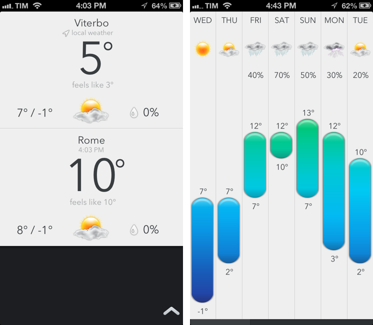
As I’ve written many times here on MacStories, I’m no weather expert. I’ve used Apple’s Weather app for years, until I figured that I wanted just a little more stats and a different interface to check on forecasts and current conditions. Still, I don’t need a complex weather app with terminology I would need a dictionary for. That’s why for the past few weeks I’ve been using Check The Weather and liked its simple approach to weather data presentation.
Today Weather is a new app by Savvy Apps – creators of some of our favorite iOS apps like Agenda and Buzz Contacts – that, while similar to Check The Weather on the surface, is actually more reminiscent of Agenda. Read more
Shazam 5.5 With Better Offline Support
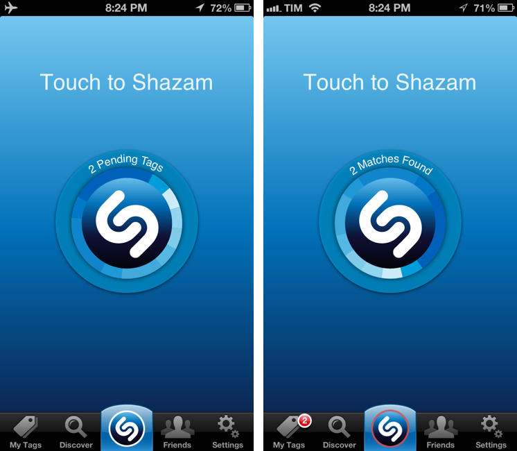
Shazam is, for me, one of those solutions made possible by our mobile era that, alongside Twitter and Rdio, I’d miss the most if I had to switch to a “dumbphone”. Shazam released today version 5.5 of their iPhone app, which I own in the Encore variation, and it’s got a few changes I really like.
The new icon was a bit of Home screen shock at first, but it plays nicely with the updated “listening dial” that animates and responds in real-time to audio captured by a device’s mic. It’s a nice touch. There are also other improvements such as better VoiceOver support, Google+ sharing (for Robert Scoble), and search for tagged songs. I don’t know exactly when this happened, but Shazam now properly opens tagged songs in the Rdio app, ready for listening.
The best feature of Shazam 5.5 is how the app handles offline devices or songs tagged in areas with poor reception. If unable to contact the Shazam servers, the app will queue tags, showing a count in the animated dial. When the Internet comes back, the app will automatically start tagging all previously queued item, display whether or not it has found matches, and highlight results in the My Tags screen and with a badge on the tab bar.
I’ve tagged songs using Shazam in the past, only to find out I didn’t have a 3G connection to get results immediately. This is a better solution, and judging from some first tests, it works as advertised. Shazam 5.5 is available on the App Store.
Rdio Launches Notifications For Your Artists→
Rdio Launches Notifications For Your Artists

On the latest episode of the Generational podcast, I have discussed the reasons why I’m using Rdio over Spotify; among various features and design choices, I mentioned how Rdio has, for me, a superior presentation of New Releases. Not only is the New Releases section of the website and apps easy to browse and filter by week, the Rdio team is also very precise and timely in updating it every Tuesday with new music. In my year as a Rdio user, there hasn’t been a single Tuesday that has gone by without new music. But still, you have to manually go to that section to find out about new music.
Today Rdio is introducing a new feature that is ideal for those who, like me, use the New Releases section on a weekly basis: Notifications.
Notifications will alert you to the latest jams through the web and desktop apps as well as email. You’ll never be out of tune with your favorite artists again.
Right now, notifications are only available on the website and Mac app, and I’ve already found out Queen have added A Night At The Opera to their Rdio catalogue earlier today. I look forward to having notifications on the iOS apps.
Angry Birds Turns 3.0→
Angry Birds Turns 3.0
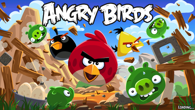
To celebrate the third anniversary of Angry Birds 1.0, which was released on December 10, 2009, Rovio has today released Angry Birds 3.0, a major update to the original game that, after three years, is still sold at $0.99 on the App Store.
Angry Birds 3.0 comes with a new “pink bird”, 15 new “Birdday levels” and other 15 Bad Piggies-themed levels. On top of that, Rovio has updated the game for the iPhone 5’s Retina display as well; the update is also available in the HD version for the iPad. Rovio isn’t new to releasing free updates to an existing game that users only purchased years ago; in fact, many have argued that one of the points of Rovio’s main strategy is creating “brand loyalty” through free updates that add new levels, features, and, for those interested, in-app purchases.
Just over a year ago we charted Angry Birds’ road to half a billion downloads; since then, Rovio has released a different game, Amazing Alex, and more entries in the Angry Birds franchise, including the popular Star Wars tie-in and a different take on the typical Angry Birds gameplay, Bad Piggies.
Angry Birds 3.0 is now available on the App Store.
Audiobus Inter-App Communication On iOS→
Audiobus Inter-App Communication On iOS
I’ve been on a personal “quest” to find examples of iOS inter-app communication. I’ve set up workflows with Pythonista and the apps I use, and I’ve searched for apps that have implemented x-callback-url in meaningful ways. I believe Apple will eventually have to address the need of letting iOS apps better communicate with each other with something more powerful than an Open In... menu.
Today I was sent a link to Audiobus. The developers call it an “inter-app audio routing system” – a way to bring music apps together to avoid sending files back and forth between different apps. It is, essentially, a way to record on an iPhone an iPad using the capabilities of multiple apps at once: with a system based on inputs, outputs, and effects, Audiobus routes audio through specific apps and keeps playing audio from different apps in the background. The videos are really the best way to understand the whole concept behind this solution, as it doesn’t look like anything that has been done on iOS before.
I would love to know the technical details behind this. From what I can gather, Audiobus provides an SDK that developers can use to register their apps as input and output sources, or effects. Once registered, Audiobus creates a “workflow” for these apps and displays a “panel” at the side of an iPhone or iPad, showing the apps that are playing in a single session. I don’t think there’s a time limit on background audio, and it appears the side-panel is also capable of stopping audio from specific apps and switching back to them.
I am intrigued by the possibilities offered by a third-party SDK for better iOS inter-app communication: right now, Audiobus already works with apps like Rebirth for iPad, Loopy HD, SoundPrism Pro, and MultiTrack DAW, and more developers will join the program soon. I’m not sure how the panel concept would translate to tasks that don’t involve audio; however, imagine, say, being able to copy a URL from your browser into your text editor without switching back and forth between them. Or getting a file from the Dropbox app embedded into a Pages document without a tedious variety of multitasking gestures and Copy & Paste menus.
Check out Audiobus here.
iPhone Settings Mind Map→
iPhone Settings Mind Map
Timotheus Wischniowski went through the effort of putting together a mind map of iPhone 5 settings on iOS 6.0.1. Using OmniOutliner and MindNode Pro, he collected every single menu of the iOS Settings app, with sub-menus, options, and switches.
I made an outline which contains all iPhone 5 iOS 6.0.1 settings from the iPhone itself and from the preinstalled apps. I did this with the iPhone setup with English as the OS language and German for time formats and so on. I tried to write everything down, but I couldn’t write down some things, like Japanese characters and such. So the mind-map competition should be about 98 % or more.
As I scrolled Timotheus’ image, I remembered this post by David Lanham from 2010 on redesigning Twitterrific, including its Settings:
The previous design ended up being overwhelming for normal users (and even some experienced ones) and became very confusing for people with multiple accounts since it was unclear which account was performing a search or looking at trending topics. There were also three different areas to set preferences and many of the options in the preferences were unnecessary and confusing to most users so they were avoided or left to defaults anyhow. So we took a leap and removed the preferences completely, only adding them back in when we found something that absolutely needed it.
I do have to admit sometimes I “get lost” in the iOS Settings app. I’m not sure there’s a need for a complete redesign – after all, there are options users have to set on an operating system – but I wonder if Apple could make browsing Settings easier, more “compact”, with less choices in the future.
Instagram 3.2 Brings Better Camera→
Instagram 3.2 Brings Better Camera
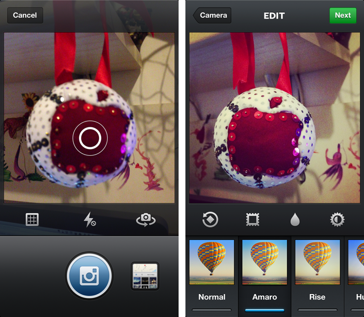
Following the recent launch of web profiles, Instagram has today updated its iPhone app to version 3.2, bringing a new camera experience, a new filter, better tilt-shift, and various UI improvements for filter selection and photo browsing. The Verge has a nice overview of the changes; the Instagram blog has detailed release notes, which include an explanation of tilt-shift:
In the past, there had been vast differences in the effective strength of the blur between the preview screen and the output in your feed and camera roll. With this update the blur you see is now the blur you’ll get! We’ve also completely overhauled the blur algorithm to increase quality and accuracy. Tilt-shift now gives a vastly more realistic rendering of depth of field because of these improvements and subtle tweaks to how we render the image.
I’m particularly fond of the UI changes brought by Tim Van Damme: aside from cleaner photo grids and infinite scrolling on pages, Instagram 3.2 comes with a gorgeous Welcome screen and a refreshed camera view that puts the focus on a large shutter button, while also giving access – to iPhone 5 owners – to a “last photo taken” button. I wouldn’t underestimate how Instagram is taking advantage of the taller screen: on the iPhone 4S, tapping the last-image selector opens a standard iOS photo picker; on the iPhone 5, the app gently slides over to an embedded Camera Roll view reminiscent of Facebook’s Camera app. On the iPhone 5, you can swipe up to reveal more Camera Roll photos without leaving the Scale & Crop view – essential to make sure your existing photos will look good on Instagram.
Mostly though, I believe Instagram 3.2 feels more polished thanks to various details implemented by Van Damme, Ryan Gomba, and team: the aforementioned animation to switch from Camera to Scale & Crop; the opening/closing animation of the custom shutter; the blue highlight on selected photos; the custom, animated tap to focus that is incredibly fun to look at and try out. I also like the shortcut to quickly access the Camera Roll: anywhere in the app, tap & hold the camera button in the tab bar to open the Camera Roll.
Instagram 3.2 is now available on the App Store.