
Instacast 3 is both iterative and something different. No longer divided into separate iPhone and iPad apps, Instacast 3 is universal, also eschewing the in-app purchase model introduced with Instacast 2. And at its core, iCloud sync has been gutted and replaced with Vemedio’s own syncing solution that’s faster and less error prone (an in-house solution that works with WebDAV.). On the iPad, Vemedio has completely redesigned their Twitter-for-iPad inspired interface in favor of a more parallel experience with the iPhone. Just as Apple makes small iterations to their hardware, Vemedio has made small iterations to their software.
Instacast 3 Review
Miro Video Converter 3.0→
Miro Video Converter 3.0
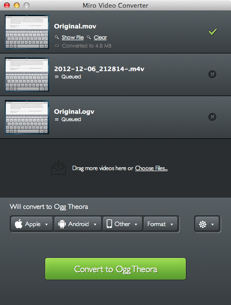
Nice update for Miro Video Converter:
Keeping with the original simplicity of Miro Video Converter that has made it popular with all of our users, the updated Miro Video Converter comes with a great new look. Just drag and drop or browse to your list of video files.
Free and open source, Miro Video Converter 3.0 notably introduces batch processing of videos (depending on the cores available on your computer), a new design, more devices and formats, thumbnail generation, and better control on aspect ratio and output sizes. It looks good; you can also add files to the queue while a conversion is in progress.
For MacStories, I usually take videos of iOS apps using Reflection Reflector and QuickTime on my Mac. In QuickTime, I export “for the web” (at broadband quality), and then use ffmpeg2theora to convert to Theora, so I can use two formats for the same HTML 5 video (it means both Chrome/Safari and Firefox users will get a native, Flash-free video player). The big downside of ffmpeg2theora is that you’ll need to run it from the command line: it doesn’t have a graphical user interface to go with. In that case, Miro is a good option, albeit slower: in my tests, a 49 MB .mov QuickTime file took 101 seconds to be converted to .ogv with ffmpeg2theora; it took 177 in Miro. The same file took 87 seconds to be converted to mp4 with Miro. Both tests were run on this MacBook Air.
If you need a GUI for video conversions that’s not the fastest option, but still should get the job done and it’s free, Miro is available here.
Behind The Scenes Of Twitterrific 5→
Behind The Scenes Of Twitterrific 5
The Iconfactory’s Craig Hockenberry has published a “behind the scenes” look at their most recent release, Twitterrific 5. I recommend reading it, as it doesn’t involve too many technical aspects of the software, but instead puts the decisions made by The Iconfactory in more context:
We are well aware that people are going to complain about missing features: push notifications and streaming are obvious examples. But so are trends, and video support, and in-line photos, and… well none of that matters. We believe in building opinionated software.
Our Cody Fink, in his review of Twitterrific 5 posted last night:
It may be completely redesigned, but the core tenets that Twitterrific were founded upon remain in 5. Twitterrific has always been opinionated, decidedly simple, and never wanted to compete for your attention. And at its heart, Twitterrific 5 is still a Twitter app built with the same passion The Iconfactory builds into all of their apps. Twitterrific 5 is simply a better Twitterrific.
Here’s my take on Twitterrific: it is the result of a very specific vision. The Iconfactory doesn’t prioritize notifications, filters, third-party service integration, or custom image uploads as much as they strive to build an extremely polished Twitter client meant for reading.
I am what you may call a “Twitter power user”. There’s truth to that: I use filters, custom uploads, web services, and I spend most of my day on Twitter. Twitterrific isn’t meant for me. Thinking to rely on it as my go-to Twitter client will probably make me frustrated in the end, leading me to “hate” an app that’s actually made by nice people. I don’t want to do that.
So I have a simple suggestion. If you don’t think Twitterrific 5 can be your main client, it doesn’t have to be. No one is forcing you to buy the thing everyone is talking about. You’re probably not “missing out”. But I will also say this: if you have three bucks and you’re genuinely interested in trying something new – a fresh experience – go get Twitterrific 5 and try it. I’m not saying it’ll become your favorite app, but if you care about quality handcrafted software, maybe you’ll take away something from it.
I’m glad I did, because even if Twitterrific won’t be in my dock, as someone whose job is to write about software, now I know that other things are possible.
Party Monster
Party Monster is a Universal iOS app to queue songs in a temporary playlist, perfect for parties, dinners with friends, or, generally, every time you want to listen to specific songs in a specific order. As you may know, I’m a passionate Rdio user, and local music with iTunes doesn’t really fit with my listening habits. I wouldn’t mention Party Monster, however, if it weren’t for its approach and attention to detail that made it stand out for me. Read more
Tim Cook Speaks With Businessweek In A Wide-Ranging Interview→
Tim Cook Speaks With Businessweek In A Wide-Ranging Interview

Josh Tyrangiel of Bloomberg’s Businessweek has a terrific and in-depth interview with Apple CEO Tim Cook. In it, Cook is asked a whole swathe of questions from transparency, to the recent executive changes, Apple’s competition, US manufacturing and a lot more. The whole article is available online and in the latest edition of Businessweek. NBC will also air an interview with Tim Cook today on it’s Rock Center program at 10pm/9c in the US.
Talking of Apple Maps, Cook is asked whether Apple took on an approach of doing something for strategic company purposes, rather than something that would make the product better. Cook rebuffs this suggestion and suggests that they wanted to enable certain features such as directions and voice integration and set upon accomplishing them.
We set on a course some years ago and began to do that. So it wasn’t a matter of saying, “Strategically it’s important that we not work with company X.” We set out to give the customer something to provide a better experience. And the truth is it didn’t live up to our expectations. We screwed up.
Asked about manufacturing and whether Apple might bring back some manufacturing efforts back to the US, Cook responds that they will begin to do so in 2013 for certain Mac products. It lines up with recent reports of the new iMacs arriving with “Assembled in USA” engravings. You can also see an excerpt of the Rock Center interview here in which he discusses this transition back to the US.
And next year we are going to bring some production to the U.S. on the Mac. We’ve been working on this for a long time, and we were getting closer to it. It will happen in 2013. We’re really proud of it. We could have quickly maybe done just assembly, but it’s broader because we wanted to do something more substantial. So we’ll literally invest over $100 million. This doesn’t mean that Apple will do it ourselves, but we’ll be working with people, and we’ll be investing our money
These are just a few snippets of the interview, be sure to read the entire interview over at Bloomberg Businessweek, it’s a must read.
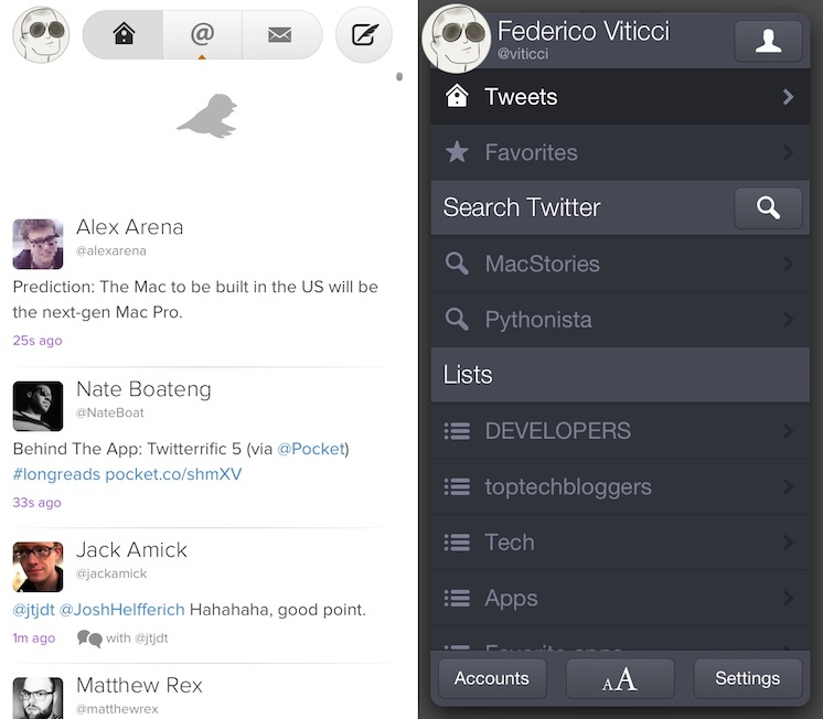
Twitterrific 5 Review

Twitterrific 5. It’s been fun to watch Twitter’s reaction to an app that I, and other writers, wanted to surprise the world with. Alas, it was bound to leak, unsurprisingly by Apple’s Japanese App Store. The Iconfactory’s latest iteration of their famed Twitter client is shockingly different isn’t it? The same gut reactions I watched unfold on Twitter could not better describe the same gut reactions I had when I first saw just how striking the new interface is.
Sharing the first pic of Twitterrific 5 with my coworkers resulted in an immediate, “Wow.” After a few more screenshots, “That looks like a Windows 8 app. Like Track 8.” It’s an absolutely fair assessment. And it’s one I’ve seen echoed on Twitter as I watched the tweets scroll by. Thankfully, Twitterrific 5 is as much of an iOS app as it ever was. No text hangs off the screen — no “CTURES” as Federico and I will joke.
Twitterrific 5 presents itself dressed in black with Helvetica accents and familiar shades of orange and blue for mentions and messages. It’s both instantly recognizable and obviously different. In contrast to colored entries and standard rectangular iOS elements, it is typography, floating buttons, and rounded corners that are pervasive in the new Twitterrific.
Reverse Engineering Penultimate→
Reverse Engineering Penultimate

Fascinating analysis by Alex Caithness of CCL-Forensics about Penultimate (thanks, Clark), a digital note-taking app that was acquired by Evernote earlier this year. Penultimate allows users to draw on screen, simulating virtual ink with smooth lines and curves drawn upon a notebook-like background. That’s what CCL-Forensics tried to reverse-engineer.
Opening one of the “page” files we find another “NSKeyedArchiver” property list. After unravelling the structure of the file we find a top-level object containing further metadata (including a “blankDate” which appears to match the “created” timestamp reported in the “notebookList” and the dimensions of the note) along with a list of “layers”. Each of the “layer” objects (again represented by dictionaries) have keys for the layer’s colour (more on that later) the layer’s dimensions and a list of “layerRects” – sections of the layer where the user has drawn their notes; and that’s where we finally find the image itself.
Sort of.
The description of how Alex got around understanding how Penultimate stores information inside its library is highly technical, but easy to follow with screenshots and Alex’s clear explanation. Essentially, Alex ended up using Python and XML to retrieve the user’s drawings, stored as coordinates – not as “images of the ink”, as one would initially assume.
If anything, it’s a great reminder that our data can usually be retrieved in a variety of ways using forensic tools (and intuition).
Disable Auto-Correct In Tweetbot for Mac→
Disable Auto-Correct In Tweetbot for Mac
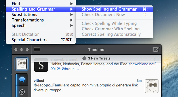
I write in English, but I live in Italy. Some of my Twitter followers are Italian, too, and I like to talk to them in my native language. In the past weeks, I noticed an annoying bug: Tweetbot for Mac, my Twitter client of choice, couldn’t disable auto-correct (Edit > Spelling and Grammar > Correct Spelling Automatically) permanently. The option is there, but it appears it “doesn’t stick” after you enable it to send a tweet without auto-correct. This led to an increasing number of misspelled Italian tweets with English words mixed in (as per my Mac’s system language).
Fortunately, I’ve found the solution here. With a simple Terminal command, you can override Tweetbot’s default setting and disable auto-correct (but not spell checking) automatically.
This is exactly what I was looking for, so make sure to hit the source link to check out the full command.
Pages For iOS and Change Tracking→
Pages For iOS and Change Tracking
Yesterday, Apple released an update for iWork on iOS that added, among changes to Numbers and Keynote, support for change tracking in Pages. I’m not a frequent user of this particular feature, but it could have come in handy when we edited my Mountain Lion review earlier this year. However, last night I noted how the way Apple implemented Change Tracking on iOS felt outdated and convoluted.
Jeff Richardson does use Pages on a regular basis and posted his thoughts on the new version (via David Sparks):
Track changes support has long been the Holy Grail for many litigators using an iPad or iPhone. For the most part, I really like the way that Apple implemented this feature in the latest version of Pages. I wish that the update included a better way to review each edit, but for the most part I suspect that I’ll just scroll through a document and look at the redline edits in the context of the document as a whole so this omission is not critical for me. The lack of support for Comments will sometimes be a problem (depending upon how often you work with people who use that feature), but as long as you know about it and have an app like Documents to Go, Office2 or Quickoffice Pro, you can work around the Comments omission when it becomes an issue.
I can see how lack of Comments and Review mode can be an issue for some users. Mostly though, I believe that the interaction of Change Tracking needs to be redesigned entirely. On Pages for Mac, you can simply click on a change to review it and accept it from a sidebar on the left; in fact, if you click on the blue boxes in the sidebar you can see the blue line connecting the change to the actual text being highlighted in real time. It’s a subtle visual hint, but it’s there.
I’m not sure why Apple decided to go with this simpler interface rather than cooking up a completely new one, but I have a couple of theories. My first thought is that text rendering and manipulation on iOS still doesn’t allow for fairly complex on-screen drawings such as the aforementioned blue lines; a second reason may be scrolling performances, especially on older devices (Pages still supports the iPhone 3GS). But I think that, overall, Apple decided to use this approach because is consistent with the current iOS text selection and because a major new version of iWork for iOS (possibly requiring iOS 6 or later, not iOS 5.1) could be on track for next year.
Apple has long touted iOS devices as heralds of the post-PC era, but iWork has been far behind its desktop counterpart (originally launched in 2009) for months. I expect iWork 2.0 for iOS to level the field in every area.