
With a press release published this morning, Apple confirmed the availability of the iPhone 5 in over 50 countries this December. The iPhone 5 will be released on December 7 in South Korea, and more additional countries – including Brazil and Russia – will be added later this month. Currently, the iPhone 5 is available in 47 countries. Read more
Apple Announces iPhone 5 Availability In Over 50 Countries In December
Tips For Releasing and Marketing Your New App→
Tips For Releasing and Marketing Your New App
Good list of tips by Brett Terpstra that new developers should keep in mind for their app releases. I especially recommend the “What To Include” section:
Bloggers like links. It saves time when doing a quick mention and provides the material for deeper research if they decide it’s worth it. Include all of the most relevant links. Link to screenshots (don’t embed them) and your homepage or a press page.
A surprising amount of developers often forget to even mention their app’s name in emails we receive on a daily basis. Others mention it, but they don’t include a direct link to the App Store. Even worse, some developers send promo codes without mentioning their app’s name or direct link, so we can’t be sure what we’re being given, exactly.
From personal experience, I can say that having links to videos is also a huge plus. I’m not saying you should prepare dedicated videos for each blogger you’d like to try your app: I would suggest picking a few, and making screencasts with voiceover and picture-in-picture where you can explain the app, show how it works, and establish a different kind of indirect “eye contact” with the person on the other side of email. It takes time, but it’s worth the effort – especially if it’s the first time you’re promoting an app.
Read Brett’s excellent list of tips here.
#MacStoriesDeals - Friday

We have many great deals for #MacStoriesDeals’s Cyber Week 2012. Be sure to check our Cyber Monday 2012 page for more ongoing deals!
You can find us as @MacStoriesDeals on Twitter. Happy Holidays from the MacStories Team!
Apple Testing Carrier LTE Networks Before Allowing iPhone Access→
Apple Testing Carrier LTE Networks Before Allowing iPhone Access
.jpg%20 "LTE") According to Telecoms.com
According to Telecoms.com, Apple has been running its own, independent, LTE tests before it allows carriers to offer the iPhone 5 as an LTE device. It’s somewhat of a reversal of how the carrier-handset maker relationship traditionally worked - where the carrier wouldn’t sell a device until the device was tested and met all the quality assurance requirements. Now Apple, infamous for their desire to control all ends of the user experience, is testing the carriers before it allows the iPhone access to their LTE networks.
Telecoms had initially heard of the tests in October but this week heard from an official Swisscom spokesperson that said “Apple only enables 4G access after testing their device on an operator’s live network”.
While extensive network testing of handsets has always been necessary, the focus has historically been on whether or not the handset functions on the network, with operators keen to protect their network assets and customer relationships against poor quality devices.
A handset vendor vetting networks on a technical basis before allowing its device to be used on them is a reversal of this situation, and one that Apple alone has the power to bring about.
Bengt Nordstrom, CEO of consultancy group NorthStream told Telecoms that he was “shocked” of hearing of the policy. Noting that it proved “who is running the industry” and that “Apple have put themselves in the driving seat; it’s really changing the game quite a lot.”
[via @BenedictEvans]
#MacStoriesDeals - Thursday
We have many great deals for #MacStoriesDeals’s Cyber Week 2012. Be sure to check our Cyber Monday 2012 page for more ongoing deals!
You can find us as @MacStoriesDeals on Twitter. Happy Holidays from the MacStories Team!
Apple Releases iTunes 11 (Update: Remote 3.0 Too)
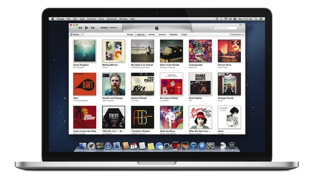
Officially announced at the iPhone 5 media event on September 12, Apple today released iTunes 11, the next major version of the media player/manager for OS X. At the end of October, Apple delayed the original release of the software, saying that it would come out “before the end of November”.
The new iTunes features a new edge-to-edge design that is reminiscent of the Music app for iPad. Album art flows across the display — clicking on an album expands album info as opening a folder does on iOS. iTunes also brings popovers that present a drop down of upcoming songs, and improved search results as you filter through music in your library. One of the big new features is expanded view, which lets users see all the songs of an album in place without opening a different view. The background of an album in expanded view is automatically generated by iTunes based on the item’s artwork.
The new MiniPlayer, unlike previous designs, shows album artwork and gives the option to manage playlists and see upcoming songs as well through the new Up Next feature. From the MiniPlayer, users can now also search for a song in their library by hitting the search button; and to go back to the main screen, all they have to do is click the “expand” icon next to the close button.
The built-in iTunes Store underwent a facelift, too. Inspired by iOS 6, the Store now comes with a cleaner look, carousel-like banners for featured items, and access to a Preview History to check out all media you’ve previewed in chronological order. iCloud integration makes sure purchases are available on every device, and, with iTunes 11, iCloud also syncs position for movies, TV shows, podcasts, iTunes U lessons, and audiobooks users are playing on a device.
iTunes 11 is available for download from Software Update. Our first impressions and screenshots directly below.
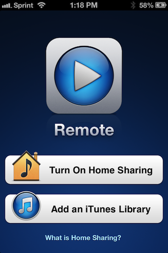
Update: Apple has also released Remote 3.0. The new app supports Up Next, it’s got new view options, and the iPad’s interface highly resembles iTunes for Mac with custom album backgrounds.
iStat Menus 4→
iStat Menus 4
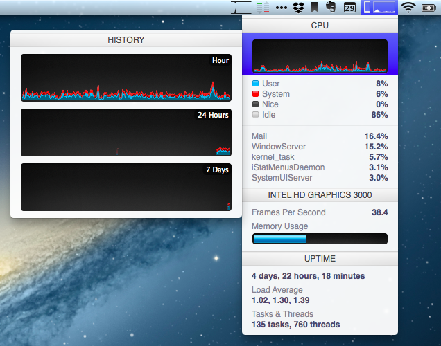
I often mention iStat Menus by Bjango here on MacStories: it is, in fact, one of my must-have apps for Mac. I have been using version 3.0 for years: iStat Menus 3 provided a complete, yet user-friendly and accessible way to keep an eye on your Mac’s hardware (CPU, fans, GPU, RAM, and so on) and other data (network, time zones, battery status) with a series of dropdown menubar windows.
Bjango has now come out with iStat Menus 4, and the new version has some interesting and, for me, welcome changes. Aside from the usual bug fixes, Retina support and better Mountain Lion compatibility, iStat Menus 4 introduces a refreshed look that brings consistency with Bjango’s other iStat app, iStat 2. iStat Menus now features the same style for graphs and charts as iStat 2, and, even better, it comes with the same History menu to view a component’s performance over time. For instance, you can mouse over the CPU’s main graph and check out a second menu with History for the past hour, 24 hours, and 7 days. There are more time-related view options available, and there’s more to customize in the app’s Preferences (which have also been redesigned, and it took me a while to get used to them at first). I appreciate the consistency with iStat 2, and I like History because it lets me easily check my network’s conditions over time.
There are several new features in iStat Menus 4, but I’d like to mention the ones I personally use. The Network widget has a new per-process section to quickly see which process is consuming bandwidth (think a mini version of Little Snitch); the Time widget still supports different time zones (I use this on a daily basis), but it’s now cleaner and it has support for calendar events to get a quick summary of what you need to do on a specific day. It’s no Fantastical, but it’s a nice and unobtrusive addition.
I’m sure there are more powerful ways to check on the status of a Mac’s hardware components and processes. But I just need to see “what’s going on”, and in that regard iStat Menus 4 fits perfectly with my needs. iStat Menus is $16 on Bjango’s website.
Fantastical for iPhone Review
I wouldn’t call myself a calendar power-user.
Ever since I started organizing the things I have to do with a system I can trust, I’ve faced a workflow conundrum: is this a task or a calendar event?
I know that there’s a difference between so-called “actionable items” and time-based events. Maybe I’m not hooked up right, but I’ve been looking for a way to immediately visualize, in a single interface, all the things that I have to do on a specific day. Independently from their actionable (“you need to do this”) or time-based (“you need to be here”) status, I want a software that, like a personal assistant, tells me exactly what I need to get done.
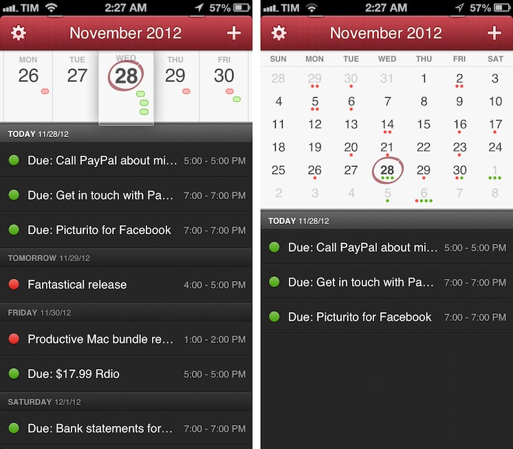
I have found such system in displaying my OmniFocus items inside my calendar. And now, the system has been enriched by the addition of Fantastical for iPhone.
I’ve been a fan of Fantastical for Mac since I first tried it in May 2011. Replacing iCal’s overly complicated interface with a simple menubar overview of your upcoming events, not only did Fantastical show that a simpler way to access your calendar was possible, it also profoundly changed the third-party OS X development scene with its use of natural language input. Futuristic as a concept, in practice Flexibits managed to bundle a powerful language parser within Fantastical that would recognize commands like “Coffee with Chris tomorrow from 6 to 7” and deconstruct them as specific values for a calendar event. It’s not a fancy gimmick: rather than clicking buttons and menus, I constantly find myself invoking Fantastical on a daily basis, typing away like I’d normally do in a blog post or note, saving events in just a few seconds.
Fantastical is one of my must-have apps for OS X. But how could Flexibits ensure its soul wouldn’t get lost in the transition to iOS? Read more
Expedia 2.0→
Expedia 2.0
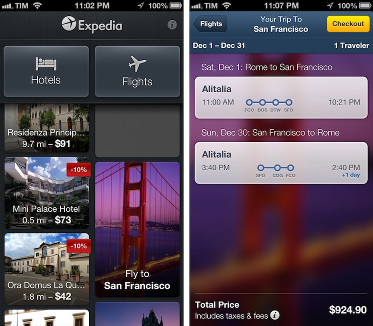
Sometimes innovation comes from unexpected places. Personally, I wouldn’t have thought Expedia would turn out to be one of the most well-designed, innovative, and fun apps I’ve tried on iOS lately. But it is. Released two weeks ago, Expedia 2.0 is a universal app developed by Mobiata, and it is an example of how a hotel-booking application should scale elegantly across different displays without providing a confusing and frustrating experience (a common thread of hotel-booking apps and software).
On the iPhone, the app starts with a gorgeous mosaic of deals for hotel rooms and flights. Photos are nice and compatible with the Retina display, and even the loading indicator has been designed with a hotel theme in mind: for flight search, the same indicator changes to another design, but I won’t spoil it here. Once you tap on a hotel, information is laid out elegantly with swipable galleries, green-colored icons for services offered by the hotel (WiFi, parking, etc), price tags, and an embedded Maps view. You can check out reviews, change the number of people requesting a room, and tweak the duration of your stay with a custom date picker that allows you to select multiple days with a single swipe. On the iPad, the same information is conveyed with a “stacked panel” UI that lets you switch at any time between map view and hotel information.
For flight search, the app is possibly even more pleasant to use. With blurred backgrounds and an Apple Store-like menu that progressively collapses as you confirm your choices, Mobiata managed to make the purchasing experience incredibly natural and good-looking in spite of the amount of data they need to present to the user.
The Expedia app is full of nice touches and details. Even if you’re not interested in hotel or flight booking, you should check it out for its design choices and interaction patterns. Free on the App Store.