This Week's Sponsor:

Textastic

The Powerful Code Editor for iPad and iPhone — Now Free to Try


Half Full Glass

Some people think Apple will eventually “dumb down” OS X and make it a “more casual” platform not suited for power users.

I disagree.

I covered this recurring theme in a section of my Mountain Lion review:

I think the Mac power user will be just fine using Mountain Lion. In practical terms, Mountain Lion’s new features and design choices haven’t hindered my ability to install the apps I want, run macros to automate tedious tasks, or fly through applications using keyboard shortcuts. I prefer Scrivener to Apple’s Notes app, I rely on Keyboard Maestro to be more efficient, and I keep my notes in Dropbox rather than iCloud. On the other hand, I can jot down a quick todo in Reminders knowing instantly that it will “just work”, and I can pick up any conversation I was having on my iPhone thanks to Messages on my Mac. Making the entire operating system more cohesive and refined hasn’t diminished the relevance and utility of third-party software on my Mac; if anything, it’s made the key apps and functionalities I rely on better.

The argument usually goes something like this: iOS is so successful, Apple will eventually make Macs more like it. Plus, Gatekeeper and Sandboxing are signs that this will happen.

Usually, this piece by Rands in Repose is cited as a somewhat obvious confirmation to the fact that Apple is not afraid of “cannibalizing itself”.

This argument needs to be deconstructed on multiple levels. Read more


Siri Vs. Google Voice Search

Clark Goble has posted an excellent review of Siri and Google Voice Search, taking into account the improvements Apple and Google made to their services in the past few weeks. His experience largely reflects mine: Siri is more useful to do stuff, Google is faster at transcribing dictated input and displaying search results.

That said Siri still has places it needs to improve. It really should speak far more results. For certain classes of queries Siri should display a large simple result and speak it rather than the stylized Wolfram result it now provides. Given that Siri already has started speaking more results, I suspect we’ll see that added over the next month. Siri also has a problem of not letting you speak over it. I’d like it to be able to let me answer before I have to listen to every part of the question she’s asking. Finally I think there are several types of queries Siri needs to be optimized for. Temperature conversions, forthcoming movie releases, television schedules, and time series sporting event statistics really are all things Siri needs to do better.

In October, I wrote:

Google Search for iOS doesn’t want to be Siri: after all, it can’t. It has some similar features (“Do I need a raincoat today?”), but it’s not an assistant. It couldn’t be per Apple’s restrictions, and Google isn’t even trying to posit it as a Siri replacement. It’s Voice Search.

I also agree with Clark in regards to the tests many people conduct to compare Siri to Google. I’m not interested in the funny and witty responses – for as much as they’re an entertaining demo – because, after all, I want to know how voice works in real life. I’m always around a computer or iOS device, and the only times when I can’t directly manipulate a UI with my hands is when I’m driving or cooking. I want to know how Siri compares to Google in letting me complete tasks such as converting pounds to grams and texting my girlfriend, not showing me pictures of the Eiffel Tower.

As an Italian user, I have to say Siri has still a long way to go with a language that’s full of variables such as conjugations and pronouns. Some Italian responses are poorly worded (see screenshot above), and sentences containing a “that” are still plainly transcribed. Sports results for Serie A lack player pictures and coach information, and results for the last match are displayed instead of rankings. Siri asks me if I mean “November 19th” or “November 20th” when I ask for “tomorrow” minutes after the midnight of November 19th, but simply replying “the 19th” doesn’t work.

Italian Siri has also been getting better, though. It presents more results for businesses open at night in my area if I ask after 11 PM, and it appears to accept a more variegate vocabulary for Reminders and Calendar integration. I can also attest reliability has improved recently, but it’s still far from perfect.

If you want a balanced and detailed take on the differences between Siri and Google, read Clark’s review here.

Permalink

Tweetbot 2.6.1 Tweaks UI

Tweetbot 2.6.1 Tweaks UI

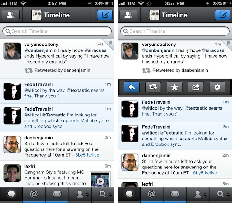
A minor update to Tweetbot has been released today by Tapbots: among bug fixes, version 2.6.1 introduces a slightly tweaked user interface with a different design for buttons and icons seen throughout the app. Unchanged since the first version, the new icons are similar to the old ones, yet somewhat more rounded and, in my opinion, peculiar.

Like I said, it is a very minor change. However, if you, like me, stare at Tweetbot for several hours a day, it is something you’ll quickly notice upon updating to 2.6.1. It certainly contributes to subtly differentiating Tweetbot from Netbot, which I appreciate.

Tweetbot 2.6.1 is available on the App Store.

Permalink

Weekend Sublime Text Links

Following my overview of Sublime Text for Markdown users, I have been collecting additional links of interest for plugins and tips I’ve fit into my workflow.

ReadmePlease: a plugin that allows you to easily read other plugins’ ReadMe files directly into Sublime Text. Easy to bring up with the Command Palette menu, and useful to remember what a package does and does not.

SublimeHighlight: fantastic package to export highlighted text as syntax-highlighted HTML or RTF code. Highlighted text can be converted, viewed in the browser, or copied to the clipboard; simply select some code in Sublime and hit Edit > Highlight to choose from various options. Syntax highlighting is done through Pygments, and you can customize it with custom settings and themes.

Ross Hunter’s “Configuring Sublime Text 2”. Nice roundup of some packages and custom Sublime settings I didn’t know about.

BracketHighlighter: interesting package to highlight brackets – (),[],<>,{} – or quotes where the cursor is in. It comes with a plethora of customizable settings and keybindings, and it’s really meant more for coding, but I found it useful to edit my Markdown text with inline links as well.

Permalink


The Magazine 1.1

The Magazine 1.1

Marco Arment shipped today version 1.1 of The Magazine, which I reviewed when it first came out in October:

Marco Arment’s The Magazine falls exactly under this aspect of writing. It’s about people who love technology, delivered as a curated collection of articles from great writers. In a way, it’s the opposite of Instapaper: while Marco’s more popular app is what you make of it, The Magazine is Marco’s own vision. So, yes – you’ll have to trust him on this one.

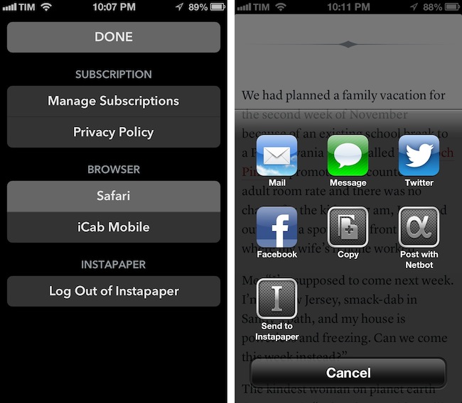
The Magazine has been growing in terms of quality of content and as an app. Version 1.1 adds new sharing options and a settings window to choose the default browser to open links with – a design decision that Marco has extensively discussed on his podcast Build and Analyze with Dan Benjamin. Fortunately, the added screen doesn’t make the app more complex: The Magazine 1.1 scans for installed third-party browsers and offers a popover (on the iPad) or a new view (on the iPhone) to set the default browser. Safari, Chrome, Opera Mini, iCab Mobile, Grazing, Mercury, Dolphin, and Terra are supported. In the same screen, Marco added buttons to manage subscriptions and read the privacy policy, as well as log out of Instapaper if you’ve enabled the service.

There are more improvements I like in The Magazine 1.1. The hyperlink popovers now have an icon to share and send an article to Instapaper, but you can also share selected text through the same method. It is a small addition, but I particularly appreciate support for posting to App.net using Netbot and its custom callback protocol: if you send a post to Netbot and hit Cancel in Netbot, you will automatically go back to The Magazine. This system is based on Tapbots’ custom protocol for URL callbacks, but it works similarly to x-callback-url, which I’m a big proponent of.

The Magazine 1.1 is now available on the App Store.

Permalink

Nintendo Launches First Paid iOS App with In-App Purchases

Nintendo Launches First Paid iOS App with In-App Purchases

Pokemon iOS

Pokemon iOS

As reported by Serebii (via Eurogamer), Nintendo has today launched its first paid iOS app: a universal version of its existing Pokédex app for the Nintendo 3DS.

Once downloaded you’ll find a version of the Pokémon encyclopaedia which covers all of the latest generation of critters (from DS games Pokémon Black and White). This costs 170 yen (about £1.30). Four extra packs with monsters from previous generations are then available to download for 500 yen (£3.90) each - meaning users will pay around £17 for the whole thing.

This is not the first iOS app for Nintendo (Pokémon Say Tap was available for a limited time last year), but it is the first time the Japanese videogame company is trying its hand at paid App Store downloads. The app is developed by creators of the main Pokémon series Creatures Inc., a studio owned by Nintendo.

Nintendo aficionados have long wished for the company to start bringing its most popular franchises such as Mario and Zelda to the iPhone and iPad. Historically devoted to creating games only for its own hardware (home consoles and portable), Nintendo has, in recent years, started allowing other platforms and devices to use its brands and characters. Aside from this new Pokémon app, it’s worth noting how the new edition of Tekken for the Wii U console features exclusive Nintendo-themed costumes and gadgets. It’s also worth noting how Japan alone represented 7% of Apple’s revenue in Q4 2012.

It’ll be interesting to see if Pokémon will remain an isolated experiment, or if Nintendo will consider more paid iOS apps in the future.


Permalink

Day One 1.9 with Tags, Search, MultiMarkdown Footnotes

Day One 1.9 with Tags, Search, MultiMarkdown Footnotes

Day One is one of my favorite apps of this year. I wrote extensively on the importance of software like Day One in my review of the app a few months ago:

At this point, it’s clear to me that Day One wants to be more than a journal. I see Day One as a variegate, yet elegant mix of thoughts, photos, and data that, in the end, define what we do, what think, and what we remember. It still isn’t perfect: I’d like to see support for videos (though that might be tricky for uploads), and integration with services we’re already using to share moments of our lives. The obvious one is Facebook – but wouldn’t it be great to have our Instagrams pulled into Day One, too? I think there’s plenty of room for growth in this regard: Day One could easily become a destination for many of the status updates and photos we’re already sharing elsewhere.

I often say that Day One is not an app, it’s an experience. I see going back through my log entries as a trip down a memory lane of facts, places, and faces that become blurry with time. But Day One can’t escape from its app nature, and that’s why when I compared the app’s Markdown support to other apps I made a note:

As an extra, I also previewed my text in Day One, as I think it’s got one of the nicest MMD previews on iOS. It’s based on Sundown, and it shares the design aesthetic that made Day One so popular. Unfortunately, in its current implementation, Day One doesn’t render footnotes and header levels correctly. More importantly, it doesn’t have a “Copy HTML” option. It looks very nice, though, and I believe the developers should consider adding better support for MMD previews.

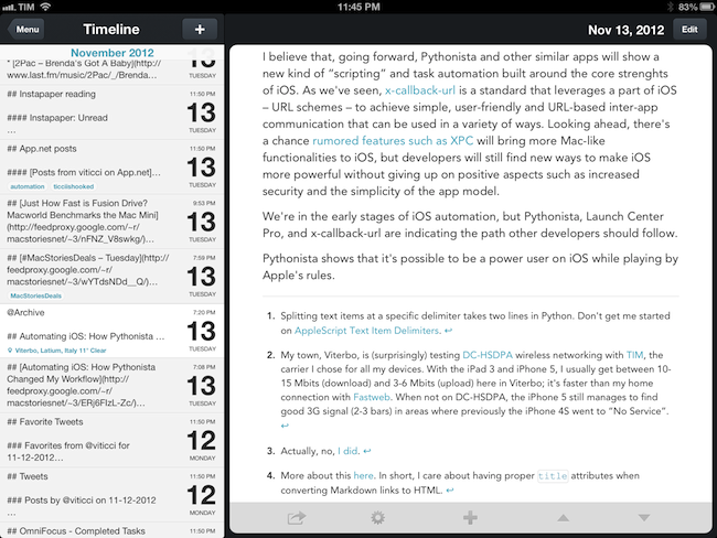
Day One 1.9, released today, brings support for MultiMarkdown footnotes, different styles for Markdown headers (such as H2 and H3, which I use), auto-hyphenation improvements, and a built-in web browser to open links directly in the app without Safari. I use Brett Terpstra’s excellent Slogger to save web content as Markdown entries in Day One, so I welcome the new features and I look forward to having more footnotes in my daily notes.

There’s more to Day One 1.9 than just Markdown improvements, though. The app now has a Search functionality, which makes sense considering users like me have been writing in Day One for over a year now. Search is located above the main timeline entries, and it allows you to quickly look for specific text, names, or anything you remember about an entry. It’s a terrific improvement, and it even supports advanced operators (documentation is available in the Search Tips).

The other big feature of Day One 1.9 is support for Tags. Long-awaited as a way to better organize entries by topic (rather than day or location), tags have been cleverly implemented: people who, like me, have been using hashtags in entries can now run a built-in converter to turn them into tags, which can be browsed in a dedicated menu with sorting options for name and usage. You can choose to automatically turn #hashtags into tags, or simply select the tags field when editing to enter some manually. I like how the Day One team thought of existing “unofficial” solutions for tags and is now offering support for making them work properly within the app.

I’m constantly impressed by the amount of polish and usefulness that Day One adds on each release. It is, by far, one of my favorite iOS apps – and, above all, a piece of software with far-reaching consenquences that go beyond simple note-taking. Day One 1.9 is available on the App Store.

Permalink

Facebook iOS App Updated with Share, Improved Tagging, News Feed Sorting

Revealed yesterday, the Facebook app for iOS has now been updated to version 5.2, which includes the long-awaited Share option. Notoriously missing from its mobile app, users have long been able to re-post interesting posts on their News Feeds using desktop browsers; with the latest Facebook for iOS update, they’ll now be able to share a post natively, using a dedicated menu that keeps the original link/status but allows for an additional comment.

Another notable missing feature of mobile Facebook has also been fixed in this version: you can now tag your friends in any post, comment, or photo by using a simple “@name” syntax for including friends’ names in messages. Like the desktop websites, tags included in a post will be highlighted in blue (but they’ll still remain regular text you can copy and select).

Last, emoji and sorting. Facebook says you can now include “smileys, hearts, and other emoji” in messages, and I indeed managed to send a message to a friend including standard iOS emoji, which showed up on her end (she’s still running the 5.1 version of Facebook for iOS though). Sorting is, perhaps, more interesting, as it “finally” lets you decide how to sort your news feed: by tapping on a gear icon next to News Feed in the left panel, you can “Show Top Stories” and “Show More Recent”. For me, this is a welcome option as I never want to show top stories but I like to check out plain, old-style posts in reverse chronological order.

Facebook 5.2 is available on the App Store.