Castro has long been one of the premier podcast clients on iOS, and its excellent version 2 – with an innovative triage system and delight-inducing design touches – helped solidify it as such. Those strengths in 2.0, however, were mitigated in part by the absence of a few key features that competing podcast apps tout. That changes with Castro 3.
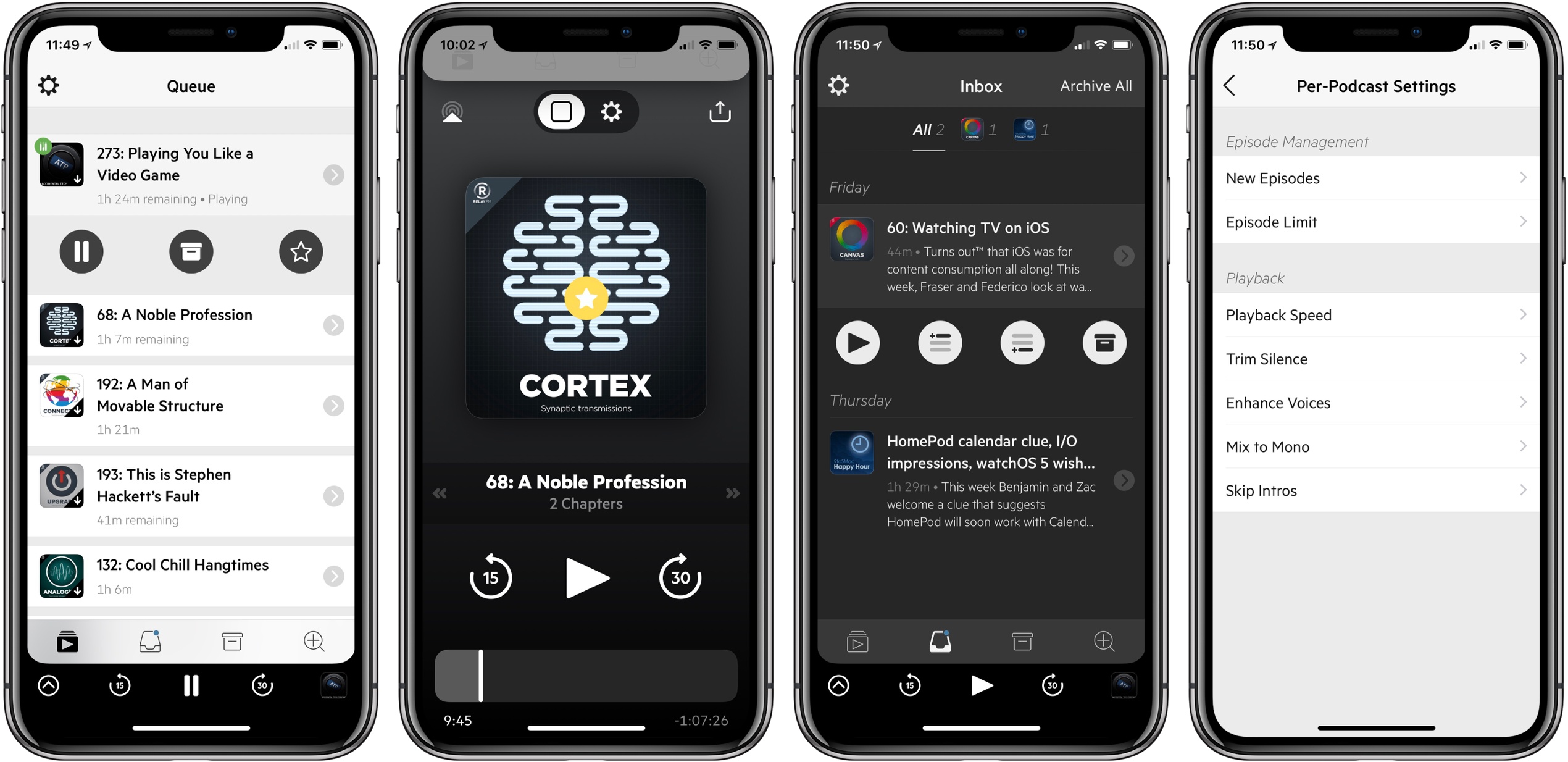
If you’re unfamiliar with the app, Castro’s centerpiece feature is a triage system involving an inbox and queue. The premise is that, with the rising popularity of podcasting, there are more great podcasts available than ever before. If you subscribe to lots of shows, the standard episode management tools found in competing apps likely aren’t sufficient. With Castro, by default new episodes of shows land in your inbox, and can then be sorted to the top or bottom of your queue and downloaded, or archived if they’re not of interest to you. It’s an elegant solution to the problem of podcast overload, and, thanks to customization options that allow you to make certain shows populate the top or bottom of the queue automatically, it’s a system that works for you, tailored to your listening preferences.
Castro’s triage system clicked with me the first time I tried it, and I used the app daily for nearly a year. Eventually though, I became more selective about the portions of podcasts I listened to, and Castro’s lack of chapter support sent me elsewhere. I’ve seen comments from other prospective Castro users who were similarly turned off from the app due to one missing feature – and often, this feature was different for different people.
If an absent feature ever kept you from sticking with Castro 2, that almost certainly won’t be a problem anymore. Castro 3 addresses nearly all of those “one missing feature” requests in a single release. Trim Silence is Castro’s take on Overcast’s Smart Speed; full chapter support is now present, as is a new Apple Watch app; the player screen has been fully redesigned; Mix to Mono improves stereo mixes that are hard to hear; and finally, there are excellent new per-podcast controls in a variety of areas. Perhaps the only thing still missing is an iPad app.
Castro 3 is everything Castro already was, but better. It’s the app that Castro fans have always wanted.
Trim Silence
That’s right, Castro now has an equivalent feature to Overcast’s Smart Speed, dubbed Trim Silence. Doing exactly what it sounds like, this feature intelligently removes unnecessary silences from whatever you’re listening to – saving you time, while still providing all the spoken content you came for. After testing it over the last few weeks, it works just as I’d expect. Voices still sound natural, they just never really slow down. If you want to save even more time, you can also combine Trim Silence with an adjusted playback speed of your choice.
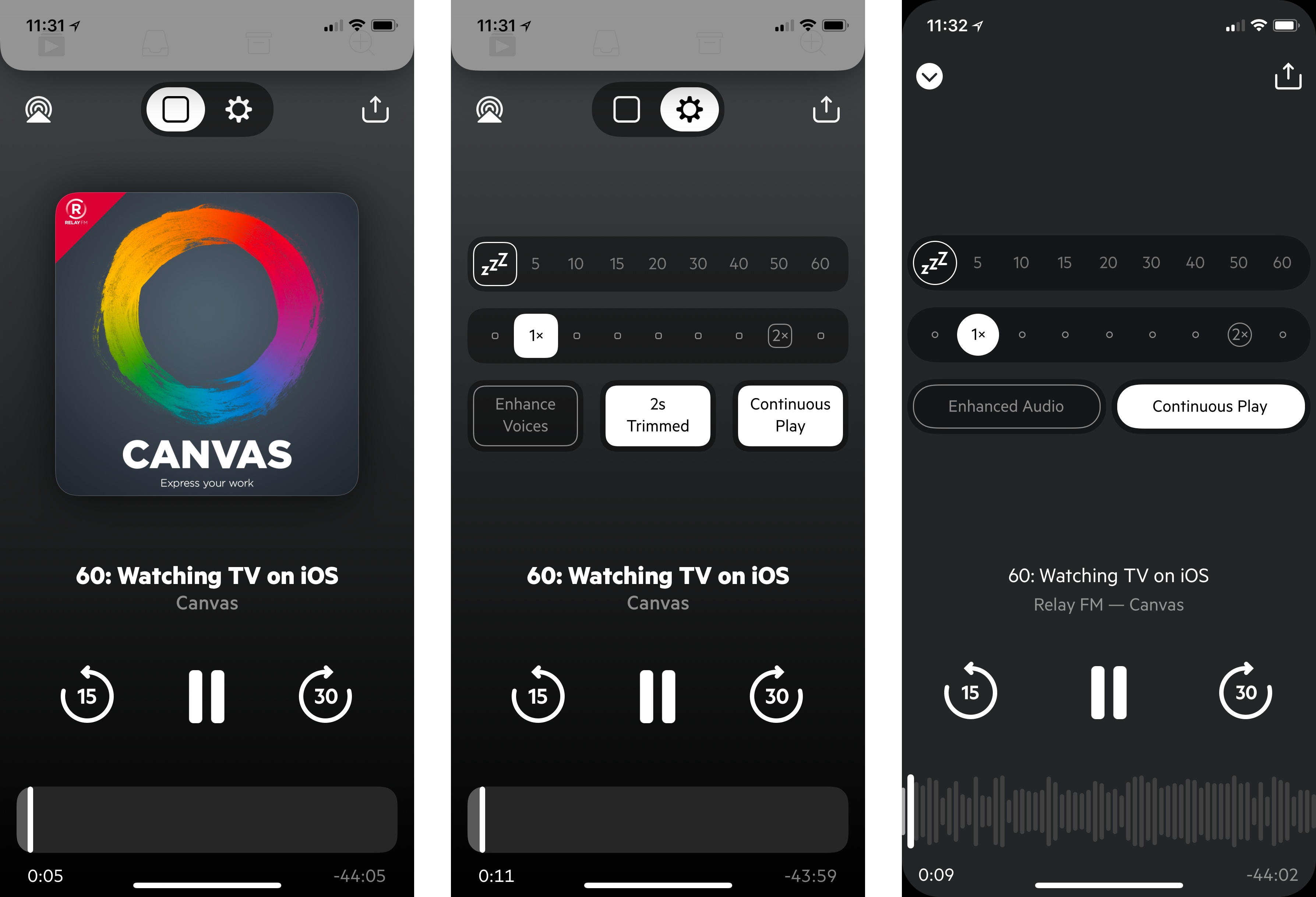
Trim Silence can either be activated for all shows at once, or you can use it on a per-show basis. Unlike in Overcast, there’s no single place you can visit to see how much time Trim Silence has saved you in total, but the savings for each single playback session is visible on the player screen.
Chapter Support
For many users, Trim Silence is the one new feature they needed to give Castro a shot; it’s tough to feel like you’re losing time because of an absent feature. For me though, that same angst is also present when using an app with no chapter support. Besides the simple fact that I prefer skipping over topical conversations that aren’t of interest to me, I also get great joy out of having a reference guide for exactly how my listening time will be spent. Give me the agenda, give me the plan, and I’ll be good. And now, Castro does that.
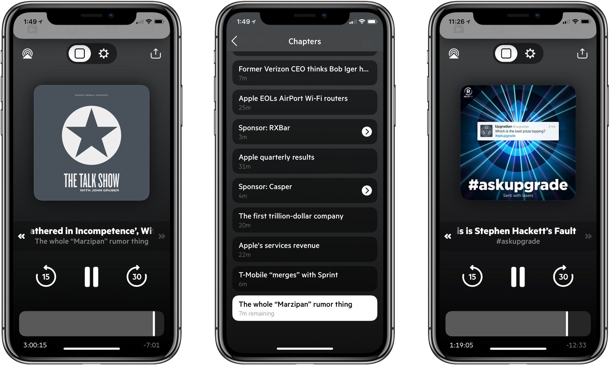
Chapters are accessed from the new player screen by tapping the title ticker underneath a podcast’s artwork. Here you’ll see a chronological listing of all chapters, complemented by an info tidbit I never knew I needed: running lengths for each individual chapter, so you’ll know up front exactly how long each chapter is. Another nice touch: the chapter you’re currently listening to displays a time remaining estimate. Tap on a chapter to immediately jump to that spot. And yes, chapter-specific artwork is now supported too.
Apple Watch App
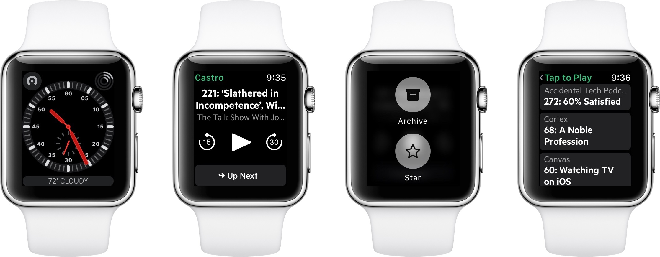
Castro now includes an Apple Watch app, the greatest benefit of which is selecting a new episode to start phone-free. The app is so simple and streamlined, it’s extremely easy to use. If a podcast is playing you’ll see play/pause and skip controls, while Force Touch uncovers additional options to Archive or Star the current episode. Tapping the ‘Up Next’ button at the bottom of the player screen will open your full queue, where another tap will initiate playback of the selected show. And that’s all there is to it. What it does, it does well, and without unnecessary complexity.
Due to limitations in WatchKit there’s no offline playback available here, nor volume control through the Digital Crown, but if Apple announces new APIs at WWDC to make those features feasible, I’m sure we’ll see them in a future update. Until then, Castro’s Watch app is nothing remarkable, but it offers a nice way to quickly choose what you’ll listen to.
Redesigned Player Screen
Castro’s player screen is entirely new, holding a lot of information without ever feeling over-crowded. This is largely because the top half of the screen can be changed into one of two modes with a horizontal swipe. The default state simply holds a show’s artwork, but swipe over and you get a variety of control options: sleep timer, playback speed, and toggles for Enhance Voices, Trim Silence, and Continuous Play. Objects that remain on-screen at all times in the player are AirPlay controls, a share button, an episode’s title and current chapter, play/pause and skip controls, and a playback scrubber. The latter few elements are all nice and big, reminding me a bit of Jared Sinclair’s ‘sodes app. There are also a couple of somewhat hidden elements to the player screen: though the top part of the screen is primarily dedicated to the two modes I mentioned, if you swipe and hold to the left or right of those two views, you’ll open an episode’s show notes or that show’s per-podcast settings screen, respectively. While these options are more hidden than I’d like, they’re not the only ways to access those two screens, so they serve as helpful optional shortcuts here. Speaking of hidden features, you can also star an episode by double-tapping the show’s artwork, similar to liking photos on Instagram.
Castro 2’s player screen was all about being functional, heavy on playback controls but light on anything visually appealing. Castro 3 strikes a better balance between form and function by adding show artwork and removing unsightly controls from view when they’re not needed. Because of its former blandness, I used to approach Castro’s player screen as a place to get out of as soon as I possibly could; now, I don’t mind leaving it up while listening. That is, if I’m not addictively opening and closing it to get another fix of the haptic feedback and animations built into that action.
Mix to Mono
If you’ve ever listened to a podcast that pans different speakers to different channels in a way that makes your brain hurt, Castro has you covered. Activating Mix to Mono from the app’s settings screen will automatically convert stereo mixes to mono for a more pleasant listening experience. You can turn the feature on by default for all shows, or only select offenders.
Per-Podcast Controls
Per-podcast settings are a strength of Castro 3 that podcast savants are bound to love. As I’ve already hinted, there are a lot of control settings in the app for tweaking playback to your preferences, and every single one can be adjusted just for certain podcasts. In the management category, you can simplify triage by sorting a show’s episodes automatically – to the inbox, beginning or end of the queue, or archives – and there are also five adjustable playback settings: Playback Speed, Trim Silence, Enhance Voices, Mix to Mono, and Skip Intros. The latter lets you start podcasts a certain number of seconds or minutes after their proper beginning, which can be helpful for shows with long-winded intros.
The last available per-podcast setting is one I’ve found particularly useful: Episode Limits. Perfect for the age of flash briefing shows, this feature lets you keep your total episode count under control by setting a max number of episodes to keep for a show. For example, if you subscribe to the New York Times’ The Daily, or Subnet by Relay FM, but have trouble keeping up with every episode and don’t want older shows clogging your queue, you can have Castro only keep from 1 to 5 episodes at a time. Whatever number you choose, Castro will automatically save that many of the show’s newest episodes, while archiving the episodes you don’t get to that fall outside that range. I tend not to subscribe to short, daily shows because I don’t want the burden of constantly cleaning out any episodes I never get to; Episode Limits removes that pressure and frees me up to just enjoy the latest news when I’m ready for it.
Castro Plus
Castro is undergoing a business model transition with version 3. Castro 2 was a paid up front app, while Castro 3 is a free download from the App Store. This should introduce the app and its unique triage system to a much wider base of users at no cost. For those who truly enjoy the app and want to take advantage of its full feature-set, there’s a new Castro Plus subscription available.
For $2.99 per quarter or $8.99 per year, a Castro Plus subscription unlocks Trim Silence, chapter support, Mix to Mono, per-podcast controls, Enhance Voices, and the app’s dark mode. Whichever subscription length you choose, there’s a 7-day free trial to take the new features for a test drive. If you’re an existing Castro 2 user, Enhance Voices and dark mode remain unlocked for you even without a subscription, since they were available previously.
Miscellaneous
Besides all the new features outlined above, Castro 3 also includes some under-the-hood revisions to make for a better, more reliable daily driver. The player engine has been rewritten from the ground up, leading to an improved Enhance Voices feature, faster streaming, and more responsive controls: core functions like play, pause, skip, and scrubbing now work faster than before.
Castro’s development history bears many parallels to that of an Apple product. I didn’t use 1.0 much, so I can’t comment on it, but 2.0 was a bold, beautifully made app that centered on a great core idea; however, compared to many competitors, it lacked several features people value. Over time, though, the app was continually iterated upon, adding thoughtful improvements like rich notifications and the first great drag and drop implementation on iPhone. Now, with 3.0, all of those quality improvements to a solid foundation are complemented by a suite of features that bring the app as close as ever to feature parity with its competitors.
Early adopters of Apple products value the care and attention to detail the company usually employs. A few key features may be missing from a 1.0, but they’re made up for over time thanks to constant iteration and improvement. Sometimes a device or app takes a few revisions before being fit for the mass market, but once it gets there, it’s something truly special. I believe that’s what we have with Castro 3.
Castro has always had its core attractions, and those remain what they were; Castro is still Castro, but better. Its main appeal was once to a select group of users with specific design preferences, but now Castro has truly come into its own: it’s become an app that serves nearly any podcast fan’s needs.
Castro is available as a free download on the App Store.


