Some apps deliver a certain joy that simply comes from swiping and swooshing through the interface, poking at various elements, and pinching things onscreen. Clear is delightful — it will make you smile. It makes you reconsider the necessity of navigation bars and tool bars and tab bars. We’re used to switching views by tapping at back buttons or icons, but what happens when you take away these common navigational tools? You end up relying on your own honesty and the customer’s intuition. And an honest interface can bring about some terrific ideas.
Clear isn’t for GTD. Well it is, but at least not by David Allen’s book. It’s not for Things converts or ex Hit List users. It’s definitely not for OmniFocus advocates. It’s for the paper-bred doers and the sticky note bound. It’s for guys and gals who want todo lists and not todo systems. But even note takers who are accustomed to writing things down are looking for new ways to both secure and make convenient their important reminders.
The touchscreen opens up new doors when working with text. You can reorder lists, correct misspellings, and delete unnecessary actions. Unlike paper, touch-screens offer the affordability of correcting mistakes and entering text onto a device that’s always in your pocket. However, instead of implementing traditional controls like edit buttons, the collaboration of developers behind Clear decided that you should be able to simply directly manipulate the text itself. That doesn’t necessarily seem like a novel idea, at least not until you get some hands-on time with the app.
Consider the todo app you’re using right now. Your actions are probably broken into a list view which might implement an edit mode for deleting, adding, and rearranging actions, and a swipe gesture to reveal a delete button. Clear challenges the notion that context or confirmations are necessary. Elements that traditionally guide users to perform a command are now commonplace and perhaps muscle memory. We have expectations for how iOS apps are supposed to work, and Clear takes advantage of our preconceived notions by applying gestural concepts to the entirety of the interface. Clear completely works, despite its distinct lack of any guides or prompts. There are certainly little cues that affirm what you’re doing, but they’re not revealed until you start interacting with the interface.
At first, Clear seems like an impressive tech demo. The spartan interface on the iPhone fills the display in wide bands of color that feel unfamiliar at first. Not even the status bar was spared. Watching the promo video or someone else give a demo is nothing like actually using the app. Clear almost seems like it’s the first true fullscreen app for the iPhone. It’s the quintessential example of sheer simplicity. That took me by surprise.
There is an introduction when you first launch the app to help orient you with the interface. Clear isn’t complicated, but there are surprisingly multiple paths you can take to navigate the interface despite the lack of it. As everything is controlled by gestures, I’m sure you can guess that swipes and taps are prominent in moving back and forth between lists and their actions. Don’t forget about the pinch gestures as they play an important role in how you interact with Clear.
Many people have been concerned that Clear is dependent on two hands to use. Take it from me in that you have nothing to worry about. Clear is perfectly useable with just your thumb, but you’ll have more options available to you if you use a second hand for pinch gestures.
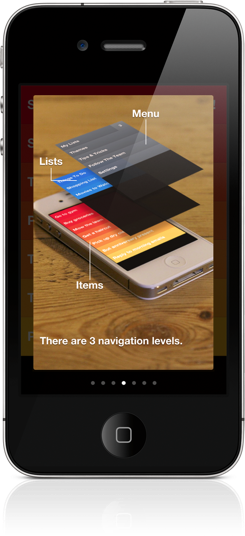
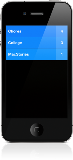
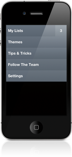
Clear has three levels to its interface. The top level is your settings (think of it as the executive suite at a bank). The second level is where you’ll find your lists. The third level is where you’ll find your todo items.
The basic way you get around clear is via a simple pull-to-refresh “extended” gesture. Clear builds upon the familiarity of the pull-down swipe by giving it two modes of interaction. If you pull down a little bit, you’ll either create a new item or a new list at the top of the current view. If you keep tugging, you’ll switch the next highest view. Think of it this way: if you pull down far enough while viewing your tasks, you’ll swipe back up. You can also swipe down with one caveat: as you’ll likely have multiple lists, you can only swipe down to the most recent set of items you’ve viewed. You’ll have to tap on a list to view those specific items. To return to a higher level, you can also pinch-in (instead of closing a photo, you’re closing a list).
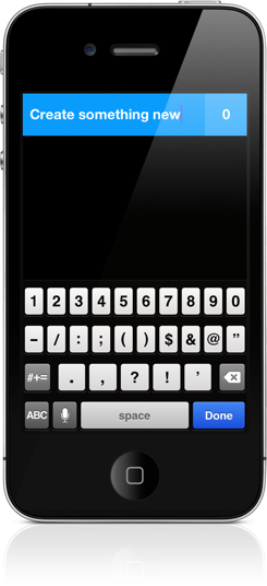
When you’re at the list or item levels, tapping on empty space adds an item to the bottom of the view. Tugging down adds an item to the top of the view. Pinching open between two items creates a new item between those items. The only problem I had with the pinch-open gesture was that sometimes you inadvertently trigger the Notification Center when adding items towards the top of the display. You simply tap on the text to edit an item, or tap in the colored space to view the contents of a list. If you tap and hold on an item, you can drag it to rearrange it on the display.
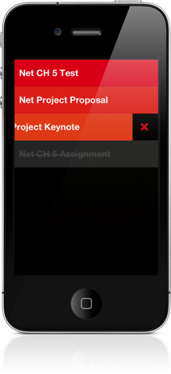
Canceling the creation of a list or an item is just as easy. Simply tap on the display to dismiss an empty item. To delete lists or items, simply swipe left off the display. To mark an item as done, swipe right. To clear your completed items, pull up from the bottom in your item view to mark them reviewed and to open up space for adding newer items.
It’s not just the gestures that make Clear interesting from the get go, it’s how you end up applying these gestures to onscreen elements that make you take a step back and evaluate just what the development teams have done to create this experience. While the entire feat is impressive, I’m not sure if gestures alone are attractive enough on their own to make the experience engaging enough for you to use something like Clear as your primary todo app. Hence the aside to, “An impressive tech demo.”
With the premise of how you interact with Clear in mind, there are various additional elements that make the experience whole. The emphasis on time and due dates melts away into color and sound. Priorities aren’t starred, but are rather measured by order of significance. Contexts, tags, and folders are decidedly outed for simple lists. While the focus is simply on the text, or rather the things you have to do, Clear wouldn’t be what it is without its hooks.
Those hooks are color and sound.
I mention color and sound as a replacement for time and due dates because there’s a distinct tradeoff in emotional impact. Setting duration and due dates can bring about feelings of anxiety. What I think Clear tries to do is reward its users for recognizing the need to successfully complete tasks. Colors play a distinct role in being both fun and tailored to the user’s personality (there are multiple themes to choose from). Sounds are rewarding and deliver a pleasant symphony of chimes when completing tasks. The combination of the two in addition to gestures make Clear engaging to use and solidifies the experience.
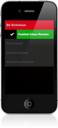
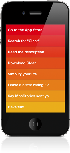
Colors are displayed in gradients in every view of the app, with topmost colors being the most prominent in order to convey a sense of priority. Lists of items are read from the top down so that you’re reminded to do the most important things first. The default color scheme is reminiscent of a heat map, where the hotter items are displayed in bright red with colder items being displayed in yellows. No matter what you use, you won’t see a rewarding green and strikethrough until you complete those tasks!
Sounds engineered from Josh Mobley are quite good, and the developers thought forward enough to remove any repetitiveness. There are different chimes associated with all of the various gestures. Even if you perform the same gesture twice, navigational sounds do a good job of slightly varying to keep the flow of Clear interesting. You don’t end up with a bland experience, but rather one that moves to the rhythm of how you’re using the app. For me, this is the kind of thoughtfulness that seals the deal on a remarkable experience. The developers have carefully considered every detail.
I don’t recommend it, but you can turn the sounds off by flipping the mute switch. The volume can be lowered by changing the ringer volume (either in the Settings or via the hardware buttons when no music is playing depending on your iPhone setup).
The components of Clear are very sharp. The interface is crisp, the experience is stellar, and everything is fluid. Despite the spartan interface, there is a certain richness that strictly dedicates Clear to Apple’s hardware. I do not think Clear would work on Android for example. As a mobile app, it requires the iPhone’s display (its rich blacks) and the familiarness of iOS to function and appear as a user would expect it to. It’s dependent on the iPhone.
I haven’t touched on Clear’s settings too much, but there’s not much else to see (wink). I’ll leave it to the readers to discover themes, easter eggs, and the various touches of detail that the developers painstakingly sprinkled throughout the app. No spoilers!
The collaboration between Realmac Software, Impending, Milen Dzhumerov, and Mobley leaves a stunning example of how you can completely run against the grain of traditional app trends yet produce something that’s out of this world. Even if you don’t end up using Clear as your todo app, I’d still recommend getting behind the wheel at least once to give it a test drive. It’s both a showcase for how touchscreen apps could evolve in the future and a functional app that cleverly removes the interface to show you only the things that matter. Clear isn’t just a presentation of wishful thinking or a demo aspiring to our vision of the future. It actually works, and it works by leveraging visuals and sound in ways that haven’t been completely explored. Clear is a multimedia experience — it’s not just about touch.
Any iPhone or iPod user should give Clear a try. Here’s the part you’ve been waiting for: pricing. Clear only costs a dollar to download. It gets my two thumbs up and I definitely recommend purchasing it from the App Store. It should be available worldwide as of this review, so have at it!


