Like Tweetbot, Clear for Mac is a good indication of what the future of mainstream OS X software will look like: consistent with iOS, and powered by iCloud.
I was given a preview of Clear for Mac last week; the app is launching today on the Mac App Store at $6.99 (depending on your time zone, Clear will be available after midnight). In my preview, I wrote:
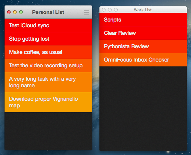
Clear for Mac works like Clear for iPhone: you can create lists, and tasks inside lists. Tasks are color-coded (according to the theme you’re using) to show a darker tone if they’re at the top of a list, and thus have higher priority. Gestures play an important role in Clear for Mac: you can swipe with two fingers to complete or delete a task, swipe up or down to move between “levels” of the interface, pinch to go back, and so forth. From what you can see in the first promo video (embedded below), almost everything that made Clear for iPhone simple and great has been ported to the Mac version, including sounds.
After trying Clear for over a week, I feel like there’s a distinction to be made about how the app works per se, and how the app works on a Mac.
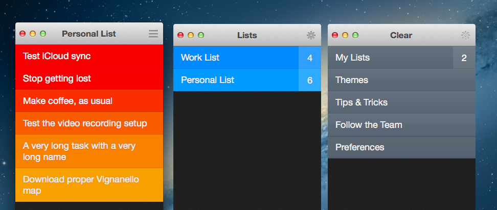
As part of the Clear experience, the desktop app is remarkably similar to its iOS counterpart (also updated today). Clear is a todo app organized in “levels of interface”: the main screen contains all your lists, but you can drill down to view individual tasks inside a list. You can also “go up” to the previous level all the way back to a first screen (the “Menu”) that gives you access to the Preferences, Themes, and other sections not related to the list-making workflow. Clear’s navigation and interaction is entirely gesture-based: you go back one level by pinching out with two fingers or swiping down; you can complete tasks by swiping over them with two fingers to the right, or you can delete them if you swipe in the opposite direction. With iCloud sync, Clear will make sure your tasks and lists are synced across devices.
Many “lightweight todo managers” have come and gone, but Clear has always been uniquely posited to offer a completely different take on the subject. And I believe it’s the very lack of any form of management that has made Clear so easy to pick up for several users.
Clear is fun. Managing the things you have to do shouldn’t be a chore – something you feel forced to do – and yet that’s exactly what many todo apps have become nowadays. Instead of providing a powerful system that gets out of the way, apps that aim at letting you organize your todos generally share a learning curve that may be steep or gentle depending on the amount of “features” you need.
Personally, I use OmniFocus because it lets me automate my workflow and, yes, because I do need some of the functionalities it comes with, but I won’t deny I’ve found myself wishing for something more like Clear: user-friendly and “human”, rather than occasionally intimidating and purposefully “digital”.
Make no mistake, everything about Clear is “digital”. What I’m trying to say here – and I don’t want to steal Samsung’s game – Clear feels like an app “made for humans”, for any kind of user.
Clear employs a series of different techniques to make todos feel familiar and natural. Mostly, it’s about subtle details that, cohesively, take a normally boring action – write the things you have to do – and use it as a starting point for something new and fresh. Cody already wrote about these aspects in our original review of Clear, and I don’t feel like repeating them here.
The essence of Clear didn’t get lost in its transition to the Mac platform. Not only is it completely intact, it has been cleverly tweaked to work properly for a different OS and hardware.
The changes between Clear for iOS and Clear for Mac are subtle, but they’re there. For one, Clear couldn’t be a simple floating collection of colored cells on the desktop – it had to present a top bar for “traffic lights” controls and the current view’s name. Placing the name of a view (Themes, My Lists, etc) in the title bar helps giving better context to the app as, unlike iOS, Mac users tend to leave multiple windows open all the time, sometimes for several hours, whereas an iOS app is only open when you use it. Naming the title bar with “what you’re doing” (are you viewing themes or tasks?) helps quickly remembering the context (the “state”) of the app when you come back to it.
Having the app “contained” inside standard OS X controls contributes to differentiating it from its iOS version. The title bar also hosts a dynamic icon that changes shape according to the level you’re in: it’ll be grayed out in the Menu, but it’ll become a Preferences icon if you drill down one level to indicate you can go back to the Menu. If you’re viewing tasks, it’ll become a list icon to suggest you can click it to go back to your Lists.
The concept of “mouse hovering” has also allowed Clear’s developers to come up with new ideas for the Mac app. As I’ve also mentioned in my Tweetbot articles, the idea of hovering with the cursor over interface elements is absent from iOS, as you’re directly manipulating elements with multi-touch. On the Mac, the extra dimension of hover allows for a new set of rules and interaction ideas that Clear explores nicely. Already color-coded to denote priority, Clear themes now highlight the element you’re hovering over and play a sound effect each time you select a todo. The sound changes according to the speed of the cursor, and I can’t overstate how much time I’ve spent playing “sounds of my todo lists” by quickly moving the cursor up and down. It’s such a small detail, and yet it makes perfect sense considering the nature of OS X.
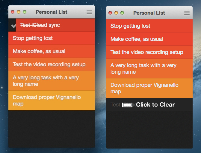
There’s more: you can mark a task as complete by swiping to the right with two fingers over it. As you swipe, a line begins striking through the task’s name; when it has struck through the entire name, the task will turn green, indicating that it’s been completed. This is obviously accompained by sound effects both when the checkmark icon appears next to a task (to suggest you can keep swiping to continue the action) and when the cell turns green; sounds in Clear are both fun and instrumental to communicating “success”, which in return gives a pleasant feeling of “mission accomplished” that’s always welcome.
In considering the strikethrough animation, at first I thought longer task names would take more time to swipe. I was wrong. As it turns out, the speed of the strikethrough animation is dynamically adjusted depending on the task name’s length; longer or shorter tasks take effectively the same time to complete because the animation has to finish within a certain threshold. It is the kind of detail that, as they would say on the Internet, you cannot unsee.[1]
The list of subtleties in Clear for Mac goes on. The checkmark and delete icons are progressively colored as you swipe across a task; once a task is complete, if you move over it with the cursor Clear will play a sound and show a “Click to Clear” visual hint. These actions can be done/redone with the usual CMD+Z and CMD+Shift+Z keyboard shortcuts.
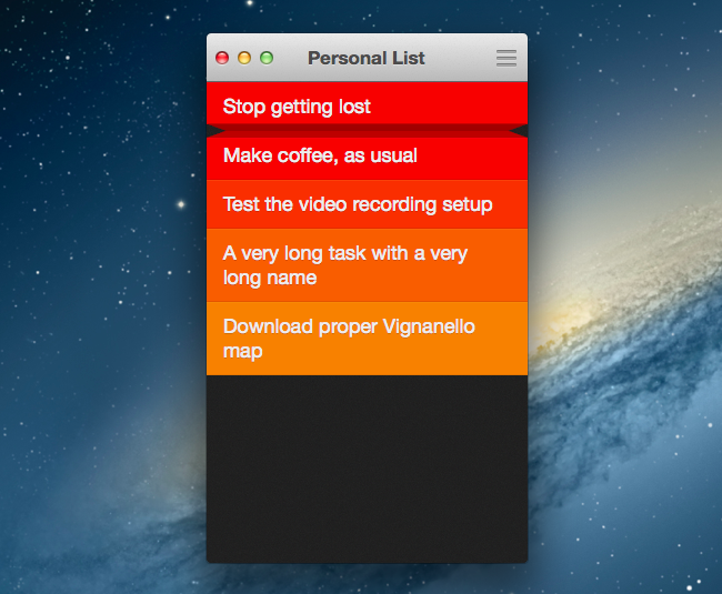
One of the pecularities of Clear for iOS is the pinch animation to grab two tasks and pinch them apart to create a new task in the middle. On the Mac, you can’t directly grab two distinct elements at once – there’s only one cursor – but Realmac has found a way to make it work. You can place the cursor between two tasks and the list will reveal an additional space in the middle to click and write down a new item. It’s nice, but I don’t think people will use it as much as the iOS version.
I’ve recorded a short QuickTime video showing the animations and levels of the Mac app. Note how the “folding” effect of the animations is different from Clear for iOS.
The big feature of Clear for Mac and Clear 1.2 is iCloud sync. In my tests, iCloud in Clear has been extremely reliable and speedy, not to mention perfectly implemented within Clear’s environment. There’s an extra theme unlocked with iCloud, and themes themselves are synced across machines; every time the app pulls a change from the cloud, it’ll play a “splash” sound. Overall, I’ve found iCloud support to be a fantastic addition to Clear: it’s fast and, once activated, invisible.[2]
Speaking of Clear 1.2, the iPhone app got other nice improvements. There’s a URL scheme to create tasks by separating them with a comma (say, in Launch Center Pro or Pythonista), and you can paste any text into a Clear list (shake the device). One minor change I really like is the possibility to quickly switch between lists by swiping from the edge of the screen.
Last, I’d like to mention keyboard shortcuts and other actions made possible by clicks and drag & drop. As I showed in a screenshot from my preview, you can display multiple lists at once: you can do so by hitting CMD+T or choosing File > New Window From List; alternatively, you can drag a list out of Clear’s main window.
There are more “hidden” tips and tricks you can discover in the settings; I am a fan of “type to create” (simply select a list, and start typing to create a task) and right-click to complete.
The New Era
Clear isn’t an iOS app ported to the Mac. Like Tweetbot, Due, Reeder, and many other iOS-first apps of this new software era, Clear is an app that, in its transition to OS X, has been reworked with consistency and familiarity in mind. Consistency with the app it originates from, so to make users familiar with the interface; consistency with native OS X elements, leveraging familiarity with the platform as a tool to bring users up to speed quickly.
Months ago, I would have recommended Clear to people interested in checking out a fresh take on todo apps for the iPhone. Today, with a Mac app and solid iCloud sync, I feel comfortable in recommending Clear to anyone who wants a simple and innovative todo/list-making app to use every day. I’d like to see Clear coming soon to the iPad, as iCloud justifies the existence of the app on any device.
Clear isn’t for everyone: OmniFocus users like me will probably be interested in trying it, but they won’t stick with it. And that’s fine. I recognize, however, that Clear is a piece of software very well-put together, with delightful animations, great iCloud sync, and, in a way, it own “soul”. It is the epitome of modern App Store apps.
If you’re looking for a simple and unique third-party list-making app that syncs with iCloud, my recommendation goes to Clear.
- The iOS app behaves differently. The strikethrough animation turns a task green only when the entire cell – not the task’s name – has been struck through. From this standpoint, the Mac’s animation is more precise. ↩︎
- I’ve tested iCloud by adding and deleting tasks on two devices open and running Clear simultaneously, and the app always received changes in a couple of seconds. If you leave the app open and make changes on another device, you’ll see tasks come in and go away with no manual interaction needed. ↩︎


