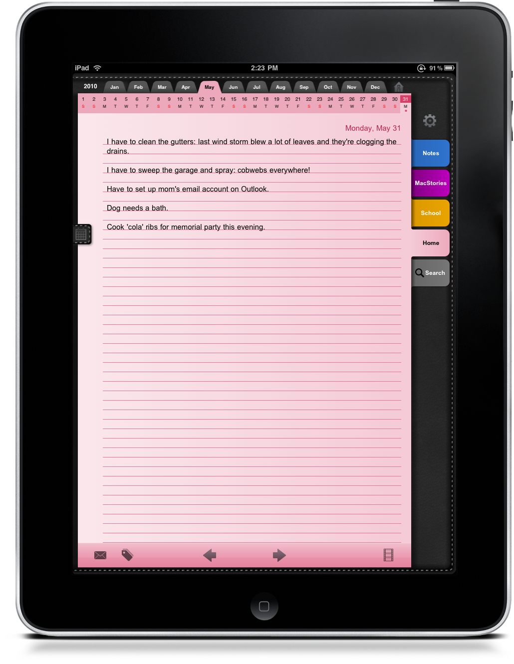
I’ve seen a few luxury notepads on store shelves that are deliciously leather bound, featuring organizational essentials such as a quick calendar and tabs. But if you’re digitally savvy, you may want to opt for a virtual version on the iPad, mainly, Daily Notes (iTunes Link) by Rama Krishna (@Daily_Notes).
Daily Notes is a more traditional styled notebook with lots of calendars built in. Seriously, you cannot miss a date wherever you turn. Asides from what could be overdoing it, Daily Notes has a couple great features built in, but also shows some odd design decisions that need ironing out. Despite some minor gripes, this is probably one of the best looking notepad applications currently available on the iTunes App Store, offering a fair level of organization, note tracking, privacy, and customization.
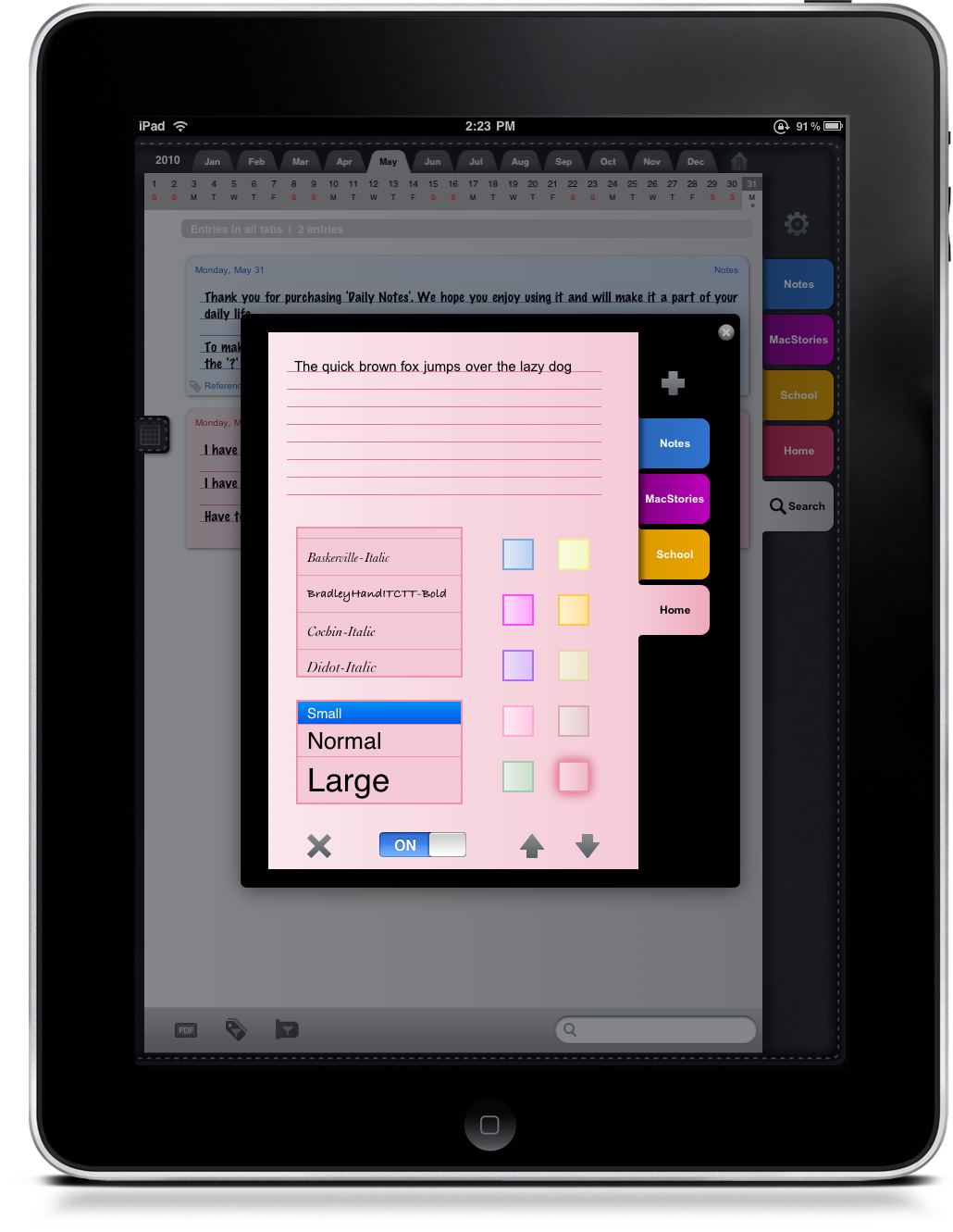
Your notes are organized through a series of tabs, which are essentially categories. This is a pretty standard feature in note taking applications, but that’s as deep as a hierarchy you can go. You can arrange these tabs however you wish, and set your own color per your preferences. Each tab can also contain its own font, but I wasn’t happy with the choices, mainly because all of the Serif fonts I wanted to used were italicized.
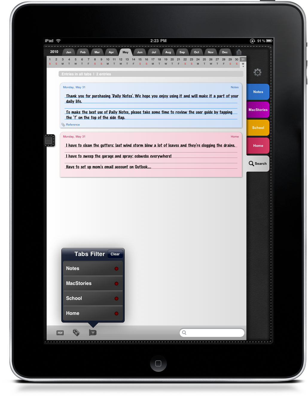
Individual notes can be tagged for easy searching/filtering as you return to find specific information, appropriately labeled at the bottom of every note. Also available is the ability to email notes; this gives you the ability to share your information with classmates and co-workers. But on the bottom right, there’s a video scroll I initially though was for embedding media. Turns out, this misleading icon takes you to a search within your current tab. That’s definitely not what I expected to happen.
While searching, however, you also have the ability to send results as a PDF in email. I think it’s odd that there are two different ways to send an email in this application, and I think the same format should be used across the application, or the PDF format should be selectable from settings instead. The last couple items you should be concerned about in search are tags and tab filters.
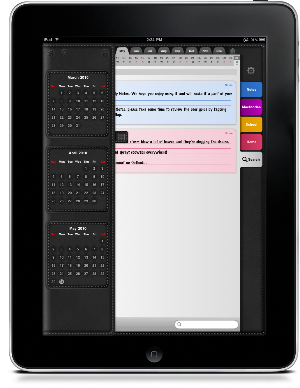
Neatly tucked into their own corners of Daily Notes are your various calendar tracking tools. Across the top of the application is a universal bar that resides as a quick use or visual reminder of recent notes for the past month (it’s easy enough to choose months and swipe across years however). Pulling the calendar tab on the left in portrait mode presents users with a fuller, scrollable calendar format. What I don’t understand is why two calendars are necessary, since they both offer the same functionality, but just display information differently. I think this is a rather redundant feature, and I feel that the two calendars should be combined into one.
But the vertical calendar does offer some additional features, such as the ability to quickly email the developer with problems or suggestions about the app, a quick help button, and a privacy lock feature. I feel these particular buttons (features) should be moved inside of the general settings panel that’s displayed to users when they wish to organize and create tabs, as that’d put everything in one, easy to find place.
Certainly there’s some organizational and usability issues to iron out, but as a young offering, Daily Notes does a good job of simply being a great repository for all of your notes. It has the potential of become a well focused and more polished application, and even now, it’s certainly usable by anyone looking for a leather folio. For $4.99 in the iTunes App Store, be sure to check it out if you’re still trying to find a notebook that suits you.


