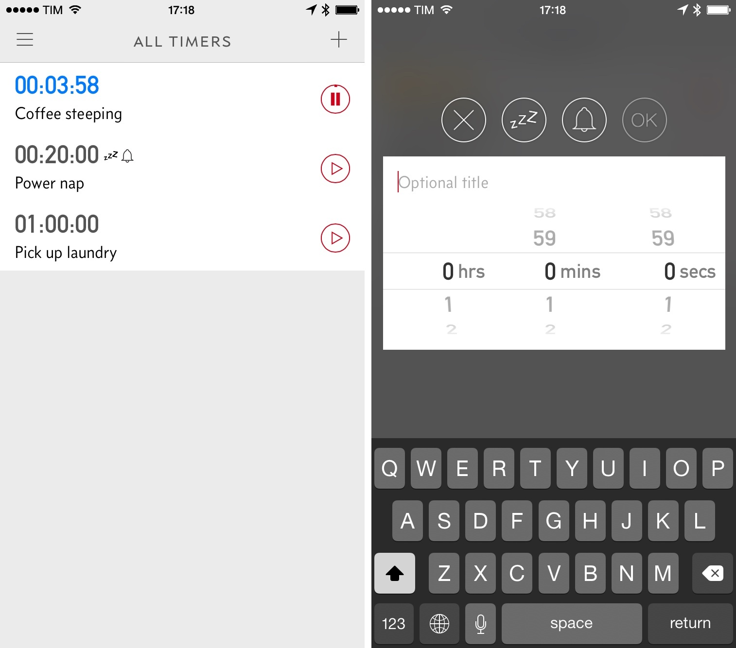
Due has been around for a long time. Created by independent developer Lin Junjie (who later went on to launch Dispatch and Clips with Hon Cheng), Due was launched in late 2010 as a simple reminder app for iPhone to never forget the things you had to do. Over the years, Due expanded to more platforms and received an iOS 7 redesign, but, at its core, it remained a streamlined utility to set reminders and always complete them. With a combination of clever design and thoughtful snooze settings, Due ensured you’d never ignore an alert (or pretend it wasn’t important).
The original Due was, however, a product of simpler times. In five years, thousands of reminder and timer apps have been released on the App Store. As widely documented by the indie iOS dev community, it’s hard to survive in a market driven by a tendency to lower prices and to add features atop features. People’s workflows change (often, from modest to more advanced needs) but, unlike others, Junjie has shown remarkable restraint in changing how Due works. He’s an exception. I can’t think of any other 1.0 app that lasted this long.
Four years after the original Due (which I discovered thanks to John Gruber), Due 2 launches today with a completely redesigned interface and interactions updated for the modern era of iOS 8 and larger phones. And yet, in spite of its new look, Due 2 is still unmistakably Due – a testament to the developer’s deliberate efforts to make a specific type of app that doesn’t compromise its nature.
This needs to be clear: Due 2 doesn’t turn Due into a project management app or substantially alter the scope of what it’s capable of. I’m not replacing Todoist with Due 2, even though some people may want to use Due as their only todo app. Due 2 is still focused on setting reminders and never forgetting them.
I pledged allegiance to Todoist last year, but there are still some activities that I don’t want to save in the app I’m using to track MacStories and Relay tasks. I don’t want to save “Call mom back” and “Wash dishes” in my project management software. I want a simple app that lets me quickly assign alerts to these time-sensitive reminders and get them out of the way. More importantly, I want an app that can bug me until I’ve done what I put into it. That’s how I use Due, and why I’m pleased with the changes that went into Due 2.
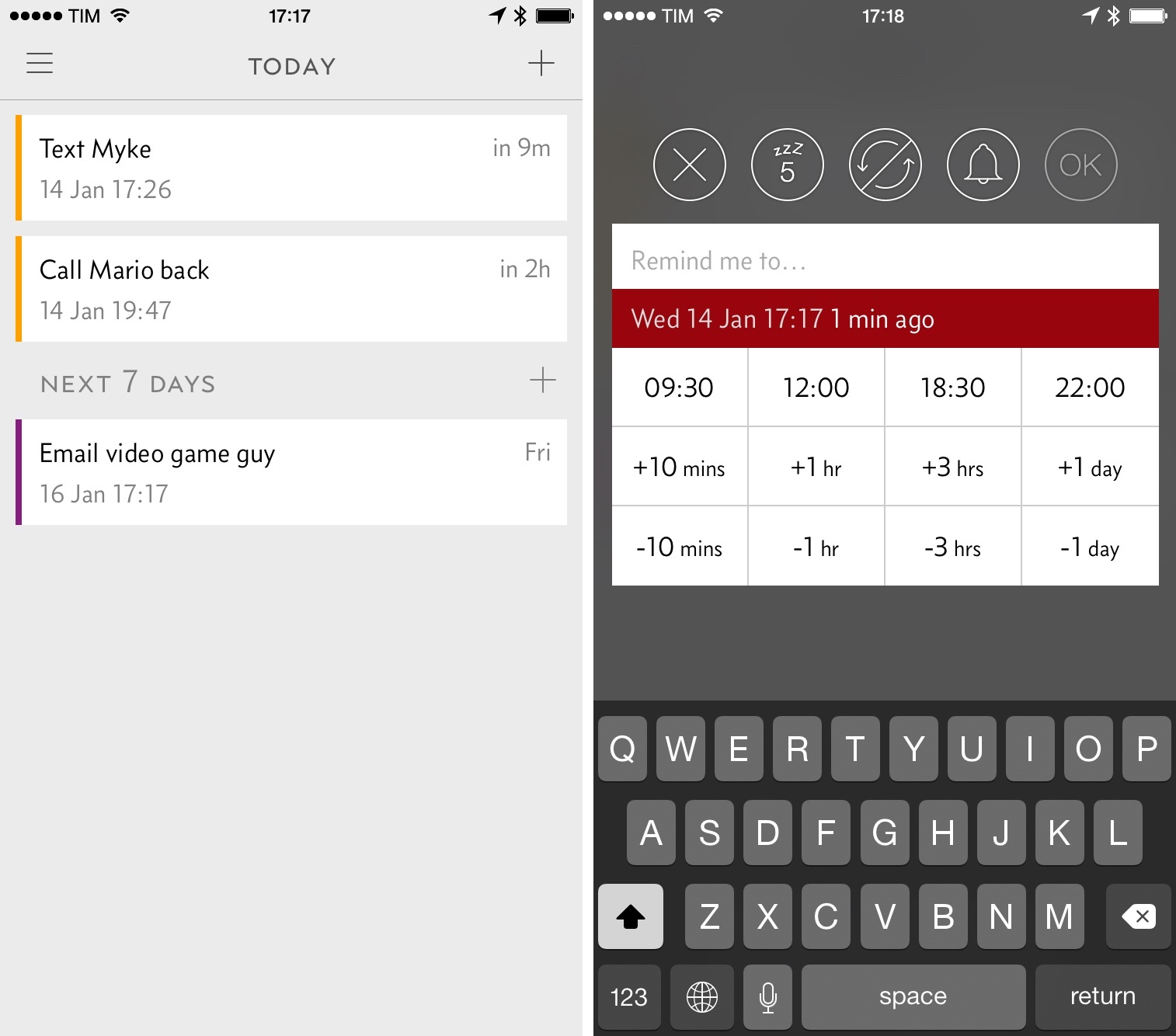
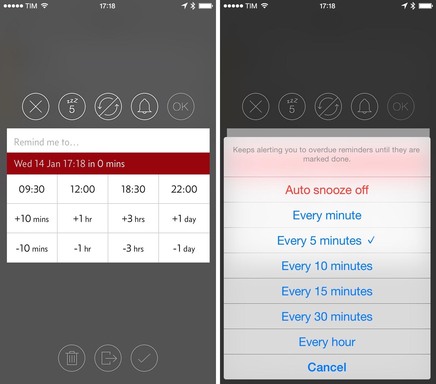
The app’s biggest change is the reminder creation screen. I’d guess that the typical Due user is a creature of habit: people tend to forget the same things over and over, so while a system to quickly parse dates and times is welcome, visual shortcuts that don’t require typing are better. Inspired by the app’s old buttons that sat on top of the system keyboard, Due’s new creation panel features a grid of quick access times that you can tap to add time to (or subtract it from) the reminder that you type on top.
Here’s what you do: you either tap the “+” button in the top right or swipe down on the main screen to search for an existing reminder or create a new one if no matches are found. The reminder panel takes over, and you can start tapping buttons in the grid to add minutes/hours/days to the time strip that is displayed under the reminder name. When you’re done, you can just swipe horizontally anywhere on the screen and in any direction to save the reminder with assigned alert. That’s it.
There’s something liberating about not caring about where you need to tap to confirm a reminder or carefully touching a slider or date selector1. The mix of sloppy swiping and time presets works well for Due, even more so because it’s customizable. In the settings, you can personalize the grid with your shortcuts, so if you find yourself constantly creating reminders for 10 minutes from now, you can have buttons that add or subtract 10 minutes.
It’s not easy to design screens like Due’s new editor. Quick access times, for instance, could have been placed on a bigger grid, but that would have come at the expense of showing the keyboard and grid simultaneously, which allowed the developer to avoid a button to explicitly dismiss the keyboard and, even better, scrolling. Options for snooze and repeat settings could have been placed in bars always visible in the editor, but that would have cluttered up the entire screen with text, making it less readable. Instead, they’re contained in popovers revealed by tapping icons placed on top of the editor (and I love that snooze is less obnoxious with options for 5, 10, 15, and 30 minutes).
Or, consider Due’s existing support for natural language input. Lin Junjie could have dropped the feature altogether in lieu of the new editor grid with customizable shortcuts. Instead, he chose to keep it as a non-obvious power user feature that, when used, adds a temporary row to the editor that you can tap to manually confirm what you just typed.
Due 2 is full of these seemingly invisible design choices that, however, bubble up for a great user experience.
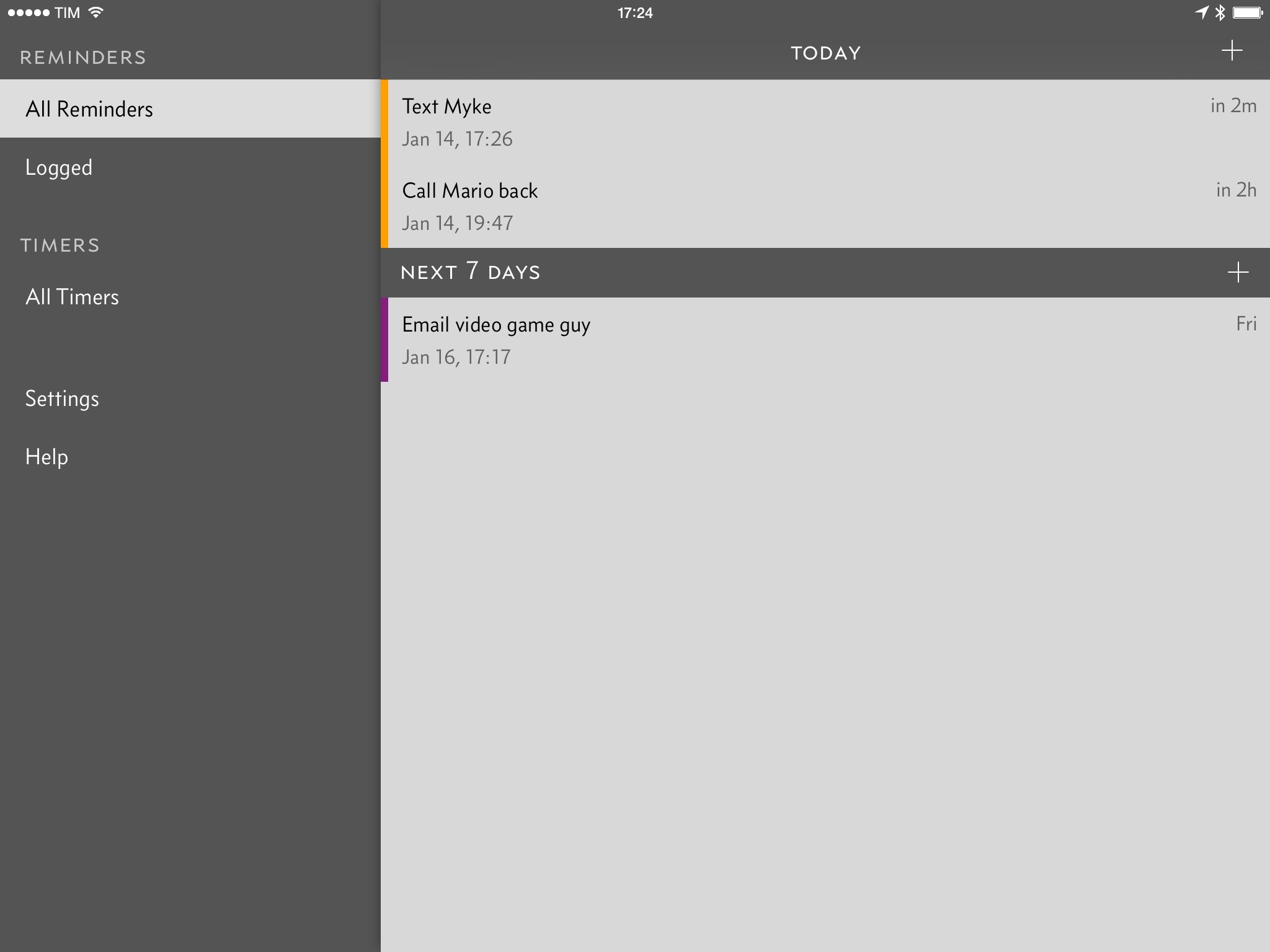
The All Reminders screen, for example, lists all items added to the app from upcoming to future ones. Days are separated by relative date headers (such as “tomorrow” and “next 7 days”), each of them carrying a “+” button on the right in the same vertical area of the main “+” button in the top right corner of the UI. When you’ll have a list of reminders to scroll through (they’ll be color-coded for increased visual recognition), you’ll be able to tap on those buttons to quickly create more reminders for that date. In the same list, you can also swipe on reminders to complete them (short swipe) or delete them (long swipe).
I’ve been using Due to create alerts for one-off tasks and other reminders that have too short of a lifespan to deserve to be saved in Todoist. I believe that each app should be used for what it’s good at, and I don’t want to save a timer for my pasta or a reminder to call my dad in the same service I use to keep track of articles and collaborative work projects. Due excels at maintaining simplicity for time-based reminders, and I appreciate that it doesn’t try to do more.
It makes sense, for instance, to lack a Due action extension. Due is meant to quickly create reminders with time-based alerts – you can even create alerts without a name – so, while it supports launching URLs included in reminders2, it doesn’t advertise itself as a utility to archive links from Safari or other apps.
Due 2 also features background sync and additional sounds. I find the selection of alert sounds for reminders and timers to be solid, with memorable tones that are loud and long enough. Due always catches my attention so I know I need to get something done otherwise it’ll keep bothering me (in a good way).
Background sync has worked fairly well in my tests. Due can sync with Dropbox and iCloud, but the ability to have items sync in the background is only available for Dropbox. In my experience, Due 2 is faster at syncing and it does bring up alerts from items I added on other devices most of the time, but not always (I’d say about 80% of the time based on my usage).
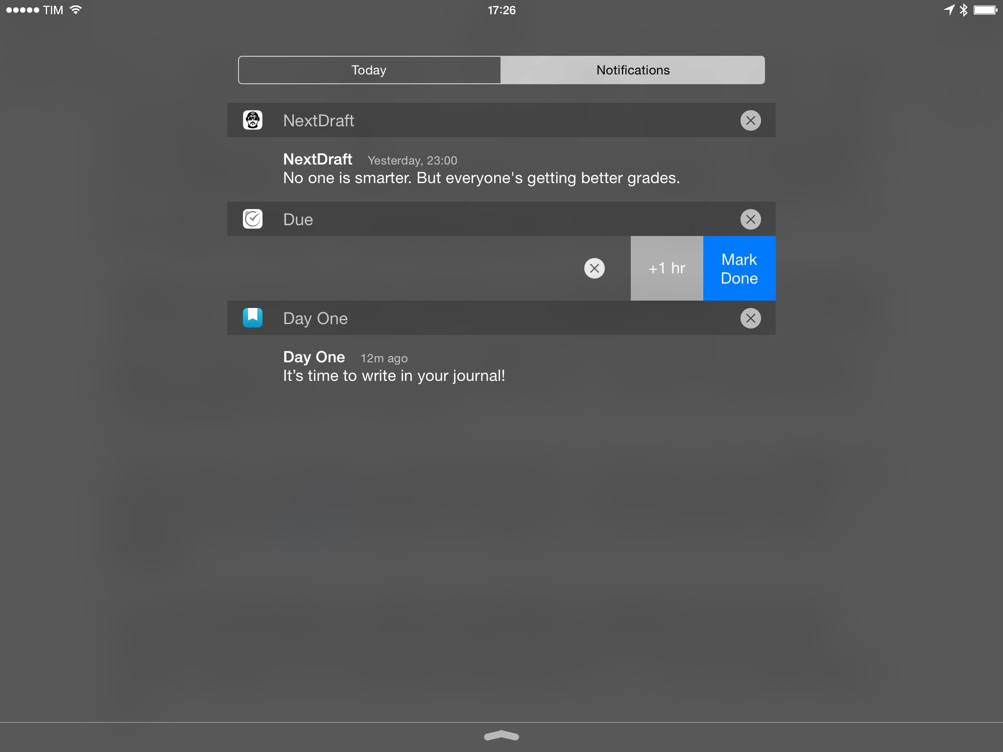
When it works, I find it nice to receive a notification on my iPad for something that I created on my iPhone, and vice versa. Actionable notifications, also new in Due 2, allow me to quickly mark a reminder as done without opening the app or snooze an alert for an hour if I’m busy.
The way Lin Junjie decided to release Due 2 is also worth a mention. Due 2 is a free update that replaces the old Due app on the App Store, bringing a new UI and the features mentioned above. For new customers, the app will be $4.99 as usual. For old customers only, four features will be locked with a $2.99 In-App Purchase: background sync, 45 new tones, auto snooze options, and the ability to pause timers. This is, effectively, a way to implement upgrade pricing on the App Store for an existing SKU – new customers won’t see the IAP and old owners of the app will automatically be brought into the new Due app with an option to pay for new functionality.
Due 2 is a great update that encapsulates what Due became known for with a modern design direction. Due is still a handy reminder and timer app, but its cleaner UI makes it easier to parse reminders and buttons; its new editor and comfortable gestures allow you to quickly assign time-based alerts and navigate in the app.
Due 2 doesn’t “pivot” or revolutionize the app. It’s a good indie product, expanded since its original version and aptly refreshed for bigger phones and iOS 8. My tasks and projects are safe in Todoist, but I know I can trust Due 2 for all those times when I should turn off the oven and call my parents back.
Due 2 is available on the App Store.


