What Apple’s Home app lacks in flexibility and power-user features, Mathias Hochgatterer makes up for with his similarly-named app Home+ 4. The app, which adds a ‘+’ in its name with this update to avoid confusion with Apple’s app, is as capable as ever, but with a reimagined design that adopts new iOS 13 features and adds even more flexibility for automating your HomeKit devices.
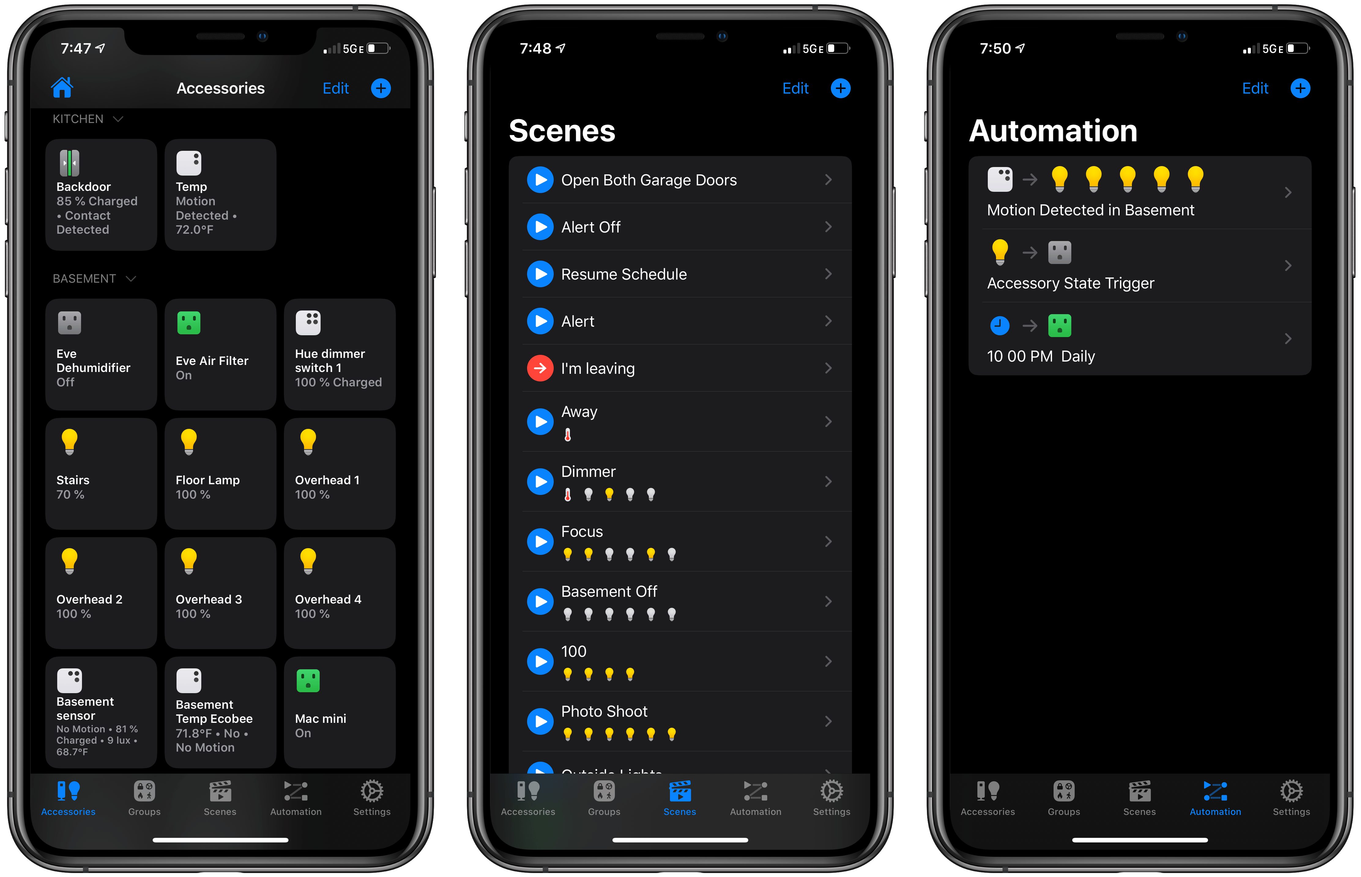
When I first opened Home+ 4, I was surprised to see very Apple-like square tiles in a new Accessories tab. I’m not a fan of the layout of Apple’s Home app because, especially if you have a lot of HomeKit devices, it’s hard to distinguish between the nearly uniform tiles, and it can require a lot of scrolling. As a result, I was initially skeptical of the change. However, Hochgatterer’s implementation has grown on me, showing that there’s a better way to implement a tiled UI.
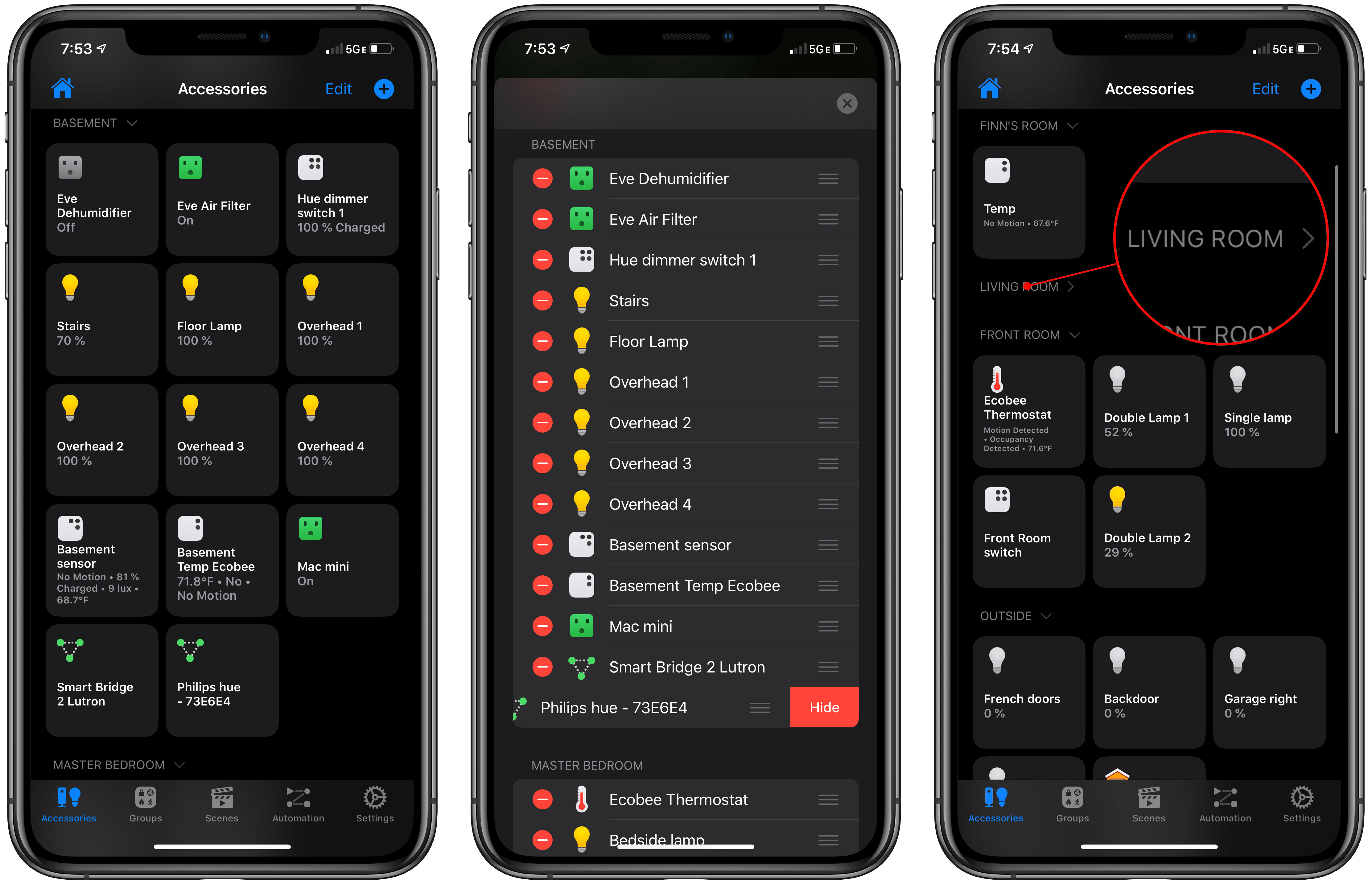
The tiles in the Accessories tab are grouped by room in your home. The benefit to the design is having all of your accessories in one place instead of having to swipe between rooms, as is required by Apple’s app. Of course, the downside is that it can also mean a lot of scrolling. However, Hochgatterer has done something Apple hasn’t: each room in the Accessories tab can be collapsed. It’s a small change that makes a big difference. For example, perhaps you don’t need to access the lights on the outside of your home or a bedside lamp during the day. Just collapse Home+ 4’s sections for those rooms, and suddenly you’ve got a much more compact view of only the relevant devices.
The Edit button at the top of the screen also makes it easy to customize the Accessories tab by hiding accessories you don’t need to access often, like bridges that control groups of devices. From the Edit view, you can also quickly rearrange your HomeKit accessories into an order that makes sense to you, and that’s faster than the tile wiggle mode used by Apple’s app. Finally, from the Edit view, you can customize the icon for each of your devices.
Home+ 4 makes better use of its tiles than Apple does. With iOS 13, Apple has hidden some sensor data, requiring a tap to expand the tile to see every detail. In contrast, Home+ 4 adds that information directly to the tile. So, for instance, my Ecobee 3 thermostat shows whether motion and occupancy are detected, plus the temperature, while Apple’s app only shows the temperature and a truncated version of the heating to cooling temperature range.
Home+ 4 has convinced me that Apple’s square-tile design isn’t inherently bad; it’s just not well-implemented in the company’s own app. With all of my accessories in one place, higher information density, and collapsible rooms, Home+ 4 has reimagined one of my least favorite UIs into something useable.

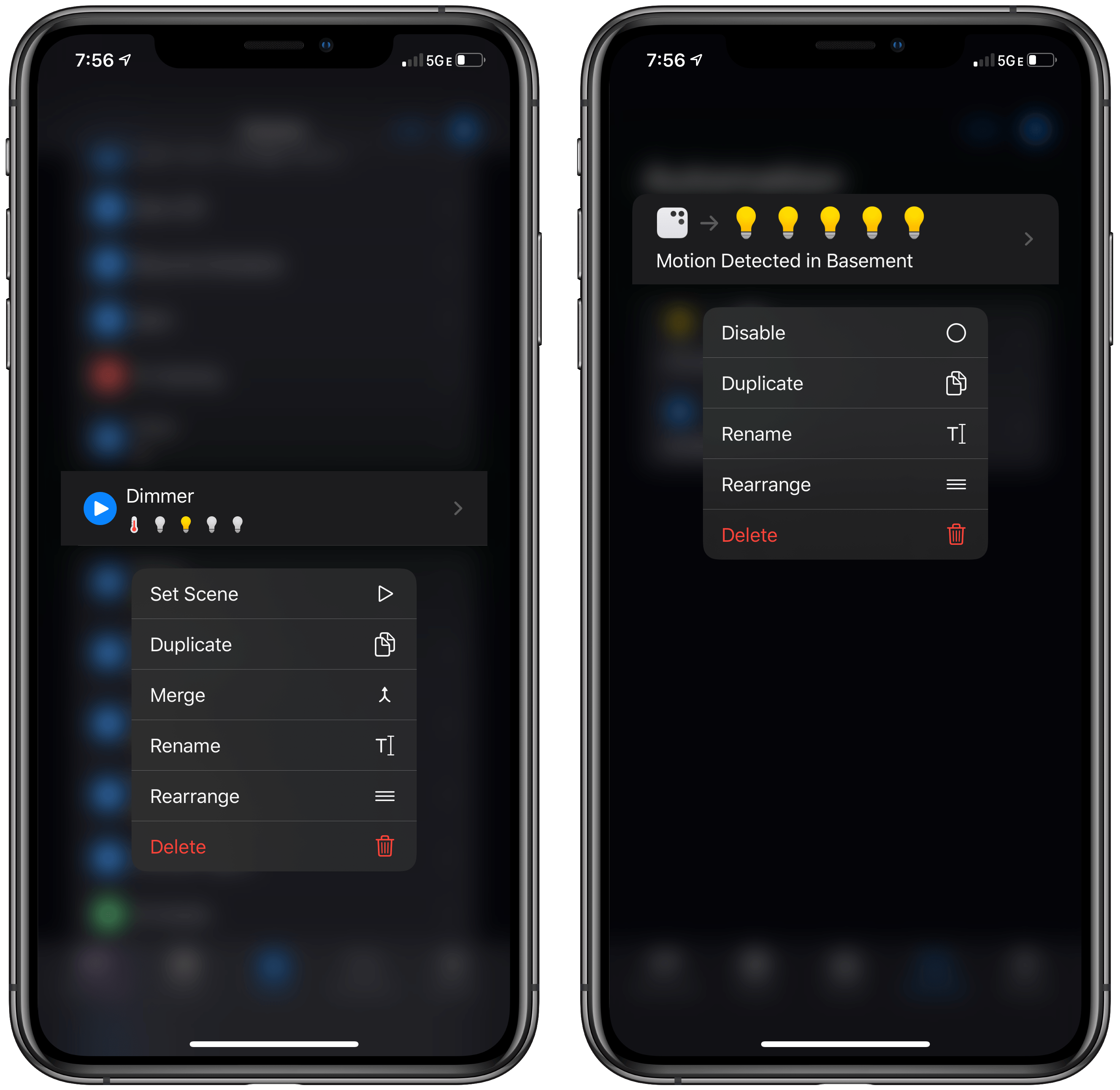
Scenes and automations both support context menus that include duplicating and merging for scenes and duplicating for automations.
Home+ 4 also simplifies the process of setting up complex scenes by including the ability to duplicate and merge them. If you’re setting up multiple scenes that are similar and use lots of devices, the ability to copy a scene to use as a starting point for others can save time. Instead of rebuilding each scene from scratch, you can duplicate a similar one and simply make a few adjustments. The same holds true for merging scenes. For complex scenes that trigger lots of different devices, you can build parts of a planned larger scene as individual smaller scenes, test that they work, and then merge them together at the end.
With version 4, Home+ has also added a dark mode that conforms to whatever the user has set in the Settings app. Context menus have been added too. For example, long-pressing on a scene provides options to trigger, duplicate, merge, rename, rearrange, or delete the scene. There’s also an all-new default app icon that I like a lot, plus six others to choose from.
Home+ 4 is another terrific update to my favorite alternative to Apple’s Home app. The latest update addresses many of the weaknesses of Apple’s app by providing greater customization and control to users. Coupled with automation options that we’ve covered in our past reviews, you can’t go wrong with Home+ 4 for more sophisticated control of your HomeKit accessories than is possible with the built-in Home app.
Home+ 4 from Matthias Hochgatterer is available on the App Store for $14.99.


