RSS readers for Mac have been ignored for too long. After an enormous, and maybe initially unexpected, success on the iPhone and iPad, developer Silvio Rizzi set out to create the best new desktop RSS reader. A very simple goal. Perhaps the most difficult to accomplish.
See, they say RSS is dead. Some claim saying “something is dead” is dead. Truth is, Twitter users, Instapaper lovers and Foursquare dwellers don’t know what “dead” means anymore. Especially when it comes down to apps and services, everything can be dead or excellent in a matter of a few weeks. Just take a look at Instragram’s numbers. RSS isn’t for my father or my average non-tech savvy friends, but it definitely isn’t dead. It was just looking for a new desktop house to spend his retirement days in.
Here comes Reeder for Mac to redefine the rules, conventions, UI decisions and navigation schemes of RSS on the desktop.
I don’t want to talk about what the past RSS readers for Mac gave us. NetNewsWire was great, thousands of users still refresh it every day for their daily Google Reader fix. Reeder for Mac, just like the iPhone and iPad versions before it, wants to be different. Fresh. Innovative. Rough, as it’s a first beta.
If we really want to keep playing with the dead / alive metaphor, we should consider the app that gave birth to this whole “Silvio Rizzi sets out to reinvent Google Reader clients” odyssey: Reeder for iPhone. If you’re not a fan, you can stop reading now. If you do love Reeder for iPhone and downloaded the tablet version as soon as it showed up in iTunes, this is the story you want to hear. So sit down, grab that coffee you’ve come to love in your late night Instapaper sessions, and follow me into a retrospection of Reeder, and what comes next with the Mac version.
This story is based on a single, undeniable and, looking forward, really important concept: Reeder for Mac is an iOS app that comes to the desktop. It’s so obvious even by looking at a couple of screenshots. Reeder for Mac (beta) screams “iOS” from every texture. So here’s a brief and concise recap of what happened on iOS.
Reeder for iPhone was released in the App Store last year and no one noticed it. A couple of blogs (including ours) reviewed it, and sales skyrocketed. More blogs and publications mentioned the app, and it quickly became the RSS client to have. All of this while serious and well-respected pundits were claiming mobile RSS clients were a no-no as, guess what, RSS was dead.
A couple of updates and a truckload of hype later, Rizzi released an iPad version of Reeder. Blogs didn’t even need to mention the app this time. Sales skyrocketed on their own and users loved that app. Some well-respected designers criticized the app because it broke too many of Apple’s UI guidelines. Pundits, feeling a little bit older, kept claiming the iPad couldn’t save RSS (together with the publishing industry) because, guess what, RSS was dead.
While trying to remember Reeder’s history and humble origins, it dawned on me that this very app I’m using to check on my Google Reader account shares more with Apple’s iteration system than one would think at first sight. This is how Rizzi rolls: he released the first version, he made it better, he added features, he fixed bugs; he released an iPad counterpart, he made it better, he added features, he fixed bugs.
Now Reeder is going back to the Mac.
I can hear you. I can hear you saying “how come Reeder is going back if, actually, it never existed on the Mac before?”. Simple: the concept of desktop RSS reader is going back carried by Reeder which, pundits be damned, wants to reinvent RSS clients. Simple, promising and, bear with me, scary sometimes.
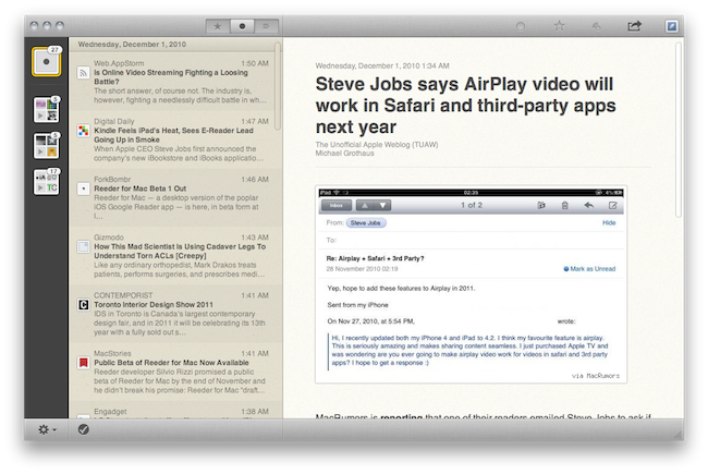
Reeder for Mac beta is an iOS app that runs on a Mac. Or, it’s a Mac app that’s heavily influenced by iOS interaction methods, patterns and graphical elements. It’s a taste of Lion, the result of OS X hooking up with the iPad and, if you wish, a glimpse at what’s coming next for OS X in general. Reeder for Mac is a huge bet on something we’ve only been given a sneak peek of. But all things considered, it’s a first beta that helped kicking my ugly Google Reader in the browser habit.
Reeder for Mac is slick, sexy, fast and comes with a lot of sharing features – but where does it stand in the current OS X panorama? Is it a Mac app that’s heavily influenced by iOS in a good way or a disgusting cocktail made of bad design decisions? This is the question that’s going around on Twitter since the release of the beta last night. That’s what I’m hearing design gurus and bloggers say about the app: it breaks too many of Apple’s interface guidelines, this can’t be good. The problem being that Rizzi unified window controls (the “traffic lights”) and sharing buttons in a top toolbar, which is textured. Yes, Reeder for Mac has a texture on OS X default gray toolbar. Is this a “bad” design decision? It sure is unusual. Will the average user care about this change? Absolutely not. He’s going to say it’s cool. And personally, I have to say it is a really cool effect.
More than the top toolbar though, I’d like to focus on Reeder’s way of navigating between folders and feeds.
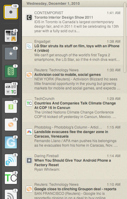
On the iPad and iPhone, you navigate between screens containing your Google Reader folders and sources. You’re given a few options in the settings to customize the way the app behaves with folders, but the whole system is pretty intuitive and natural overall. On the Mac, Rizzi took quite a different approach: he put sources as favicons inside little square folders in a left sidebar. Such a sidebar is new on OS X: it’s narrow and tall, almost as if it was meant for touch input while, actually, you’re using a mouse or a trackpad with a cursor on screen. This is where the criticism towards Reeder for Mac comes from: navigating between folders and feeds in that sidebar is nearly impossible – some people say. I don’t think it’s “impossible”, it’s just different and, being this a first beta version, Rizzi simply needs more feedback to adjust a few things.
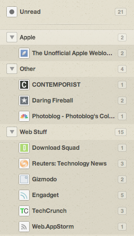
Those folders are admittedly a little too small for the average eye, and they don’t let you take a quick glimpse at every subscription inside them. Instead, a folder gives you a preview of the first 3 feeds residing inside it via favicons, then there’s a fourth icon to expand the folder and reveal all the favicons from, you guessed it, all your sources. The animations are cool and smooth. My main complaint is that favicons are too small in the default folder visualization, so maybe all that Rizzi has to do is make those folders a little bigger. That’s it. The implementation is nice and very “visual” for the non-geek user who’s used to remembering favicons for their favorite websites. If you don’t like favicons anyway, you can resize the sidebar to activate a simpler list view. I hope Rizzi will make this animation smoother and more fluid in the next versions.
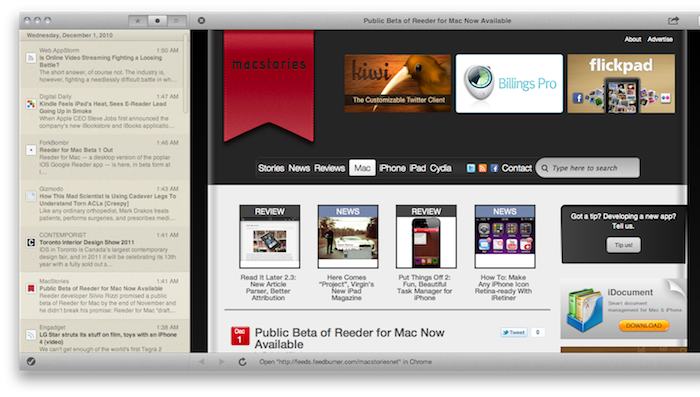
So toolbar and folders aside, what else are people saying about this app? Some don’t like the fact that Reeder for Mac automatically loads web pages in the background as it eats too much bandwidth. I think this is genius, but let me explain. Most users worldwide now have access to fast, or at least decent, DSL connections. What Reeder for Mac does is simple: as you’re scrolling through your unread items list and you click on something you’re interested in, the app opens the feed view on the right panel. Pretty standard. But what happens once the feed view kicks in is noteworthy: the app starts loading the associated “web view” (the original webpage for the article) in the background so that, if you’ll ever need to visit the original source in its web counterpart, the transition will be immediate. Indeed, if you spend a couple of seconds in the feed view and then you click on the headline to open the original website, the left sidebar will slide out of the screen and you’ll be left with a web view on the right, and the unread items list on the left. Really nice in my opinion.
If you click on another unread item while the web view is on, the app will jump back to the default 3-panel interface. There’s also a big close button in the toolbar to dismiss the web view. Share buttons persist in the top toolbar even if the web view is on.
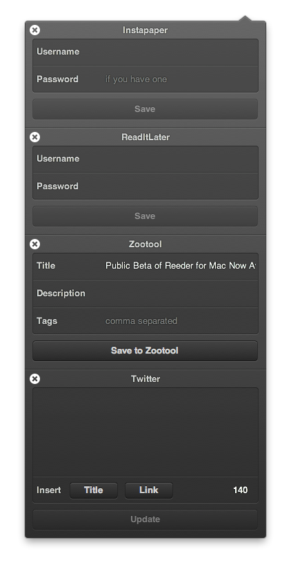
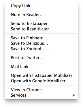
Speaking of which, Reeder’s implementation of sharing functionalities is inspired by iOS, once again. You can set your send-to services in the preferences, and choose whether you’d like to have an icon for that in the toolbar or not. If you leave a service “enabled”, you’ll be able to access it using a contextual right-click menu.
Things get a lot more interesting in the toolbar, though. The popup menu style is dark and translucent, iOS-like, but what’s really particular here is that if you keep clicking on different services to share a specific item, those services will stack on each other in the same popup menu. Strange, and nice at the same time. Animations, again, are state-of-the-art of Mac elegance. I just don’t get why Rizzi decided to put a second favicon in the top toolbar, considering that clicking on it does nothing. The contextual menu can be activated on the unread item list in the mid-panel, but there’s no way to act on the folders in the sidebar through a right click. To mark all items as read, just hit the button in the bottom toolbar (which guess what, will open an iOS-like popup). I don’t like the fact that even after marking all items as read, you can’t close the feed view for an item in the right panel. Actually, there’s no way to deselect an item in the list view at all. This needs to be fixed.
Reeder is very fast at retrieving unread items, just like its iPhone and iPad brothers. To refresh subscriptions you just have to hit “R” inside the app (I’d like to have a system-wide shortcut for Reeder), and you can set refreshing intervals in the preferences. I’d like to see a 1-minute option in there, too. In the preferences, you can also decide which items need to be synced (starred, shared, notes and so on) and the appearance of the unread count. In fact, you can choose from a standard badge on the dock icon or an unread count in the dock icon. Yes, Reeder’s icon can change accordingly to how many items are waiting for you. I think that’s sweet, although some users say it’s difficult to spot the unread count in there. I have no problems with that.
One last thing I’d like to focus on is keyboard shortcut support. The app allows you to easily move up / down in the list of items using the “j” and “k” keys (pretty much like in several other Google online services), jump between starred, unread and shared items and quickly toggle the sidebar or open a link in the system’s default browser. While this is all great, I would really appreciate a “Send to Instapaper” shortcut or at least the possibility to set up your own sharing shortcuts in the preferences.
Overall, Reeder for Mac “Draft 1” is an already solid and full-featured application that’s easily becoming my new favorite desktop RSS reader. Thanks to an innovative, sometimes questionable but definitely improvable, mix of iOS-like elements and more Mac native functionalities such as keyboard shortcuts or the live-updating dock icon, thanks to an amazingly fast engine and a polished UI that makes it easy to skim through articles and folders – Reeder allowed me to close that Google Reader tab which was constantly open in the browser. For someone who depends on Google Reader on a daily basis, that’s a pretty big deal.
So much for RSS being dead, Reeder for Mac is alive and kicking ass. And it’s a first beta.


