Imprint for iOS is designed to make shopping easy and enjoyable, which is a good thing because I can’t stand shopping, especially for clothes. I’d much rather order clothes online and have them show up on my doorstep than go to the mall. The trouble is, clothes shopping on the web is usually a mixed bag. Many sites do a poor job of describing and photographing what they sell, making it hard to know what you’re ordering, which leads to returns. Other sites have overly complex and tedious checkout processes, requiring what sometimes feels like page after page data entry that fails if you don’t enter information exactly as the site expects.
Need, which offers hand-picked collections of clothing, accessories, and other items like coffee and books, is different. I’ve been a customer of Need since Matt Alexander launched it in late 2013. Through a combination of excellent photography, quality writing, and attention to customer service, Need has provided a superior shopping experience on the web from the beginning.
Today, Need relaunched and rebranded its website as Imprint and released a companion iOS app by the same name. Imprint for iOS is a delight to use. Imprint’s browsing and shopping experience is faster, easier, and more fluid than other iOS shopping apps, exhibiting the same degree of care and attention to detail that has made me a happy customer of its predecessor, Need, from the beginning.
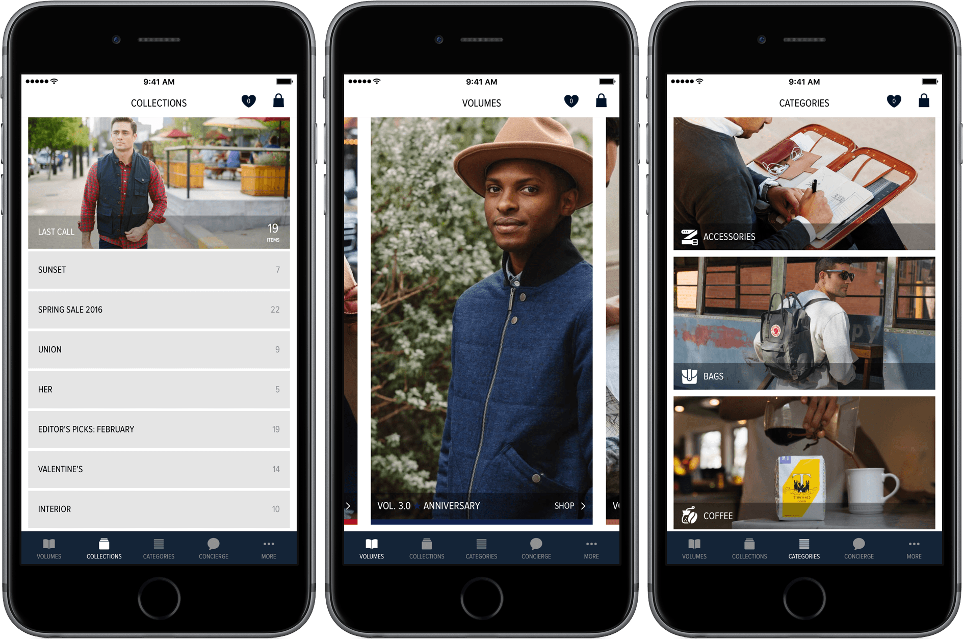
Imprint combines a traditional tab bar-style app with unique gesture-based navigation that makes browsing its products a pleasure. You can start browsing Imprint’s store from any of the first three tabs - Volumes, which are released monthly, Collections, which are smaller and released weekly, and Categories, which collect the items offered in Volumes and Collections according to type, like footwear, shirts, and literature.
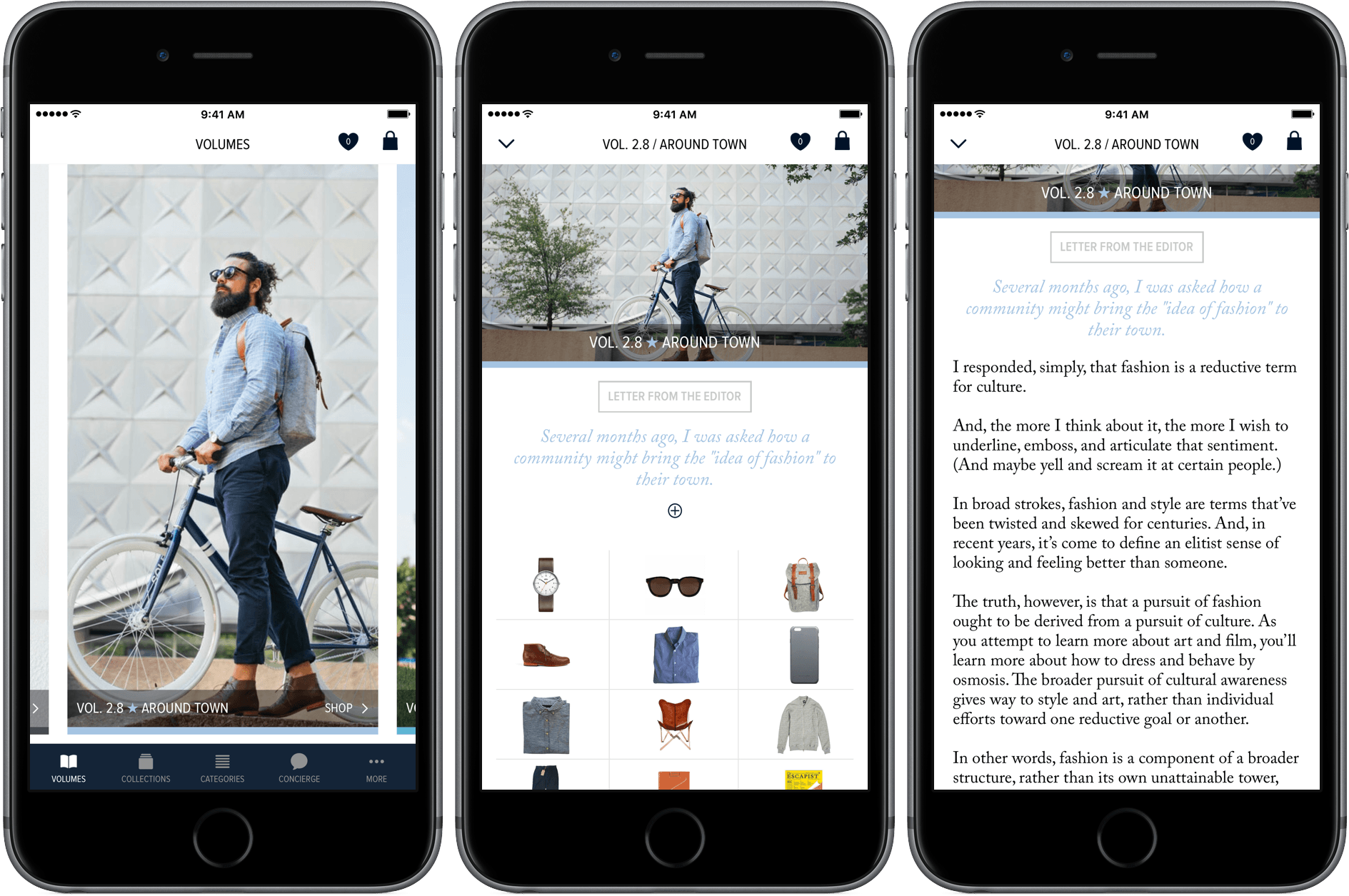
Navigating Volumes and Collections is unlike many similarly structured iOS apps, but it’s an interaction model that works especially well with Imprint. Tapping the Volume tab displays a nearly full-screen image illustrating that particular volume. You can swipe left and right to view other Volumes. Tapping a particular Volume opens that Volume, or you can accomplish the same thing by swiping up.
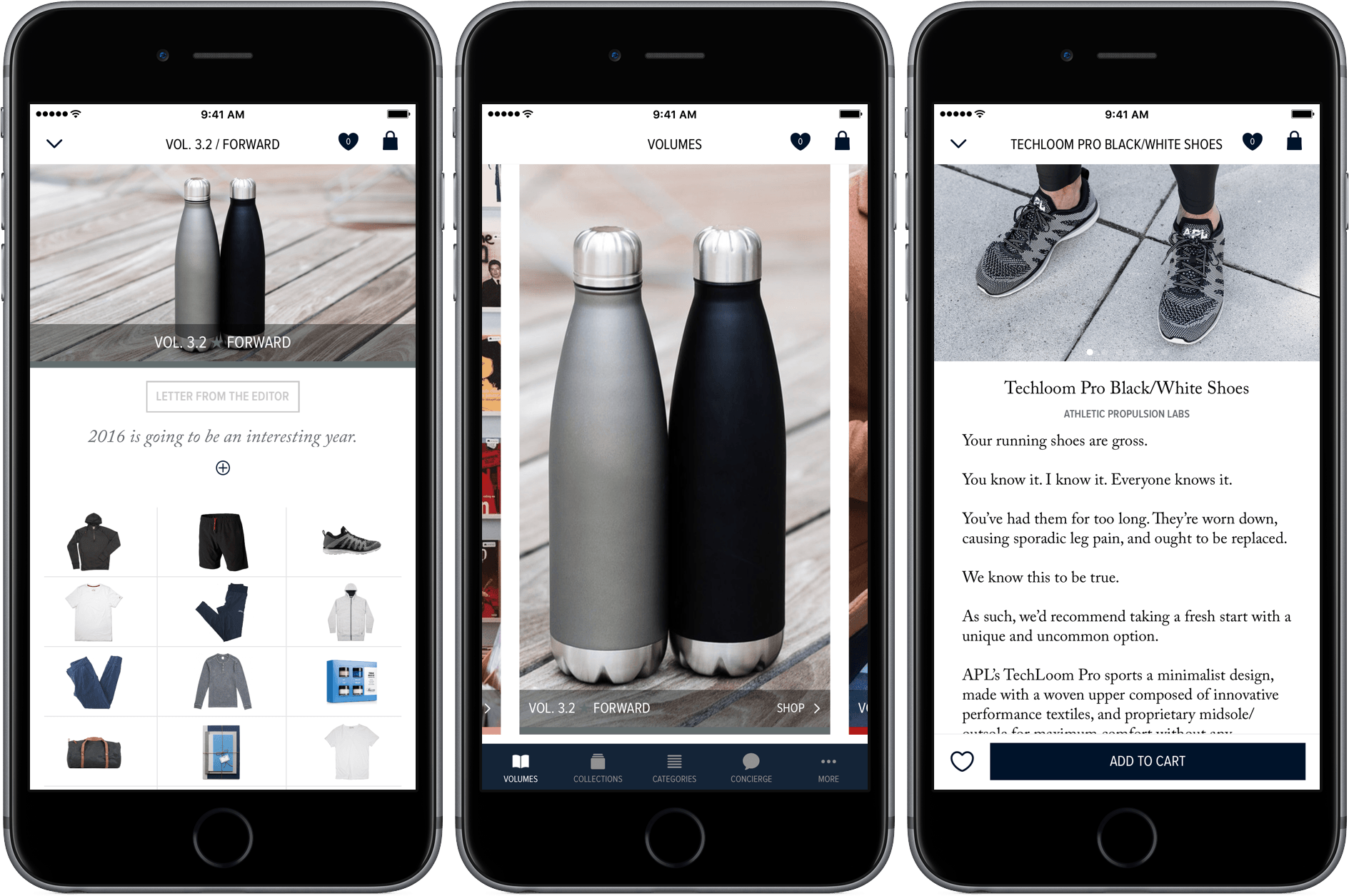
Once you are in a Volume, there is a preview image at the top, a short description that can be expanded by tapping the ‘+’ button to reveal a more in-depth discussion of the Volume, and thumbnails of everything for sale. Swiping left and right takes you from one Volume to the next. To see a particular item tap its thumbnail. You can navigate among the items in that Volume by swiping left and right. To move back up a level, swipe down. Imprint’s unique navigation model adds a dimension and sense of layered depth that surprised me at first, but I quickly acclimated and appreciated it for the fluidity that it added to moving around the app.
The top level of Collections is organized differently. Instead of the nearly full screen images found in Volumes that you can swipe through horizontally, Collections include a small image of the most recent Collection, followed by a series of buttons with the names of available Collections. I like the visual richness of the way Volumes are presented and would prefer that Collections did the same, both from an aesthetic perspective and the consistency of customers’ experience, but I also recognize that the difference serves as a way of visually distinguishing Collections from Volumes and Categories.
The detail view of each item is where Imprint really shines with eloquent descriptions that give you a real feel for each item and multiple photographs showcasing it in use. To access the photo collections for an item, tap on the image preview at the top of the detail view. The photo expands to fill the screen in landscape orientation where you can swipe between each of the images. Landscape is the best way to view Imprint’s photography, but I do wish that the app didn’t force you to view the photos in that orientation because it’s disruptive to the experience when the rest of the app operates in portrait orientation only. Instead, I would prefer that the slide show open with smaller, letter-boxed images that I could swipe through in portrait mode and see in larger form by rotating my iPhone when I want to do so.
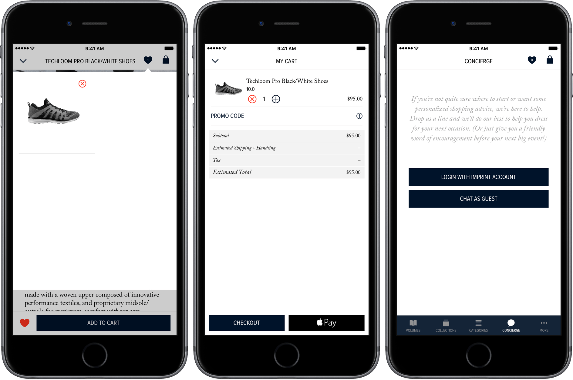
You can also favorite and share items from the detail view. Favorites and your shopping cart are available from everywhere in the app. Tapping the heart button opens a popover with a grid of thumbnails of each of your favorites. Sharing opens a share sheet, from which you can send the name and URL for the item on the Imprint website.
At the bottom of every item’s detail page is an ‘Add to Cart’ button. An especially nice touch is that if you tap the ‘Add to Cart’ button before selecting a size or other necessary option, the detail page scrolls to where you need to select the option and wiggles it back and forth a few times to get your attention.
The remaining two tabs in Imprint are Concierge and More. Concierge is a chat client that you can use to get purchase suggestions from Imprint. It even lets you upload a photo to do things like get advice on items that would work well with something you already own. More lets you manage various app settings like turning on notifications and accessing support documentation.
The other highlight of Imprint for me was the purchasing experience, which was probably the easiest I’ve experienced in any app. To test their process out, I ordered a pair of Techbloom Pro running shoes from Volume 3.2. Imprint uses Apple Pay, which by itself substantially eases the checkout process, but you can also check out with a credit card by taking a picture of your card, which is clever. But beyond just Apple Pay, Imprint has eliminated the need for existing Imprint customers to log into their accounts by automatically matching orders with accounts. New customers can set up an account using the checkout details they input at checkout. The result is a smooth checkout process that is unparalleled. I ordered my shoes on Saturday, April 2nd using Apple Pay, they arrived the morning of Wednesday, April 6th, and are amazingly comfortable.
The greatest shortcoming of Imprint is on the iPad. As with the iPhone, Imprint works in portrait orientation only, which means it cannot realistically be used if connected to a Smart Keyboard and doesn’t support Slide Over or Split View. This is a shame because the photography and narrative style of Imprint lends itself to the iPad’s larger screen. Fortunately, Imprint is working on improving the iPad experience of its app in a future update.
At the heart of innovation is the combination of existing technologies in new and better ways that result in a superior experience, which is precisely what Imprint delivers. Far too often shopping apps amount to little more than a shrunken version of a website that requires too much vertical scrolling to navigate. It’s no small feat to make browsing a large collection of items as simple and fluid as Imprint has through it’s clever combination of horizontal and vertical swiping. That combined with the effortless checkout process makes Imprint’s iOS app the primary way I will shop with Imprint in the future.
Imprint is available as a free download on the App Store. As a bonus for iOS users, Imprint is running an iOS-exclusive Mystery Box promotion that coincides with the launch of the app.


