In my review of Readability for iOS, I wrote:
I think there are various important points to stress: the Instapaper app has been around for years now, and with the recent 4.0 update it solidified the strong feature set offered by Arment which, quite honestly, is still unsurpassed. Put simply: you can’t do all the things you’re able to do in Instapaper with the new Readability app. So, if you’re really used to Instapaper’s pagination settings, Friends discovery, sharing options and app integrations, you might want to consider staying with Instapaper.
I am one of those users that, for a number of reasons, are glad to stay with Instapaper. When it comes to my reading list, I invested too much time in building a personal archive of articles I enjoyed that I feel uncomfortable switching, after years of usage, to another service. That was the most difficult part of writing my Readability review: to be able to take an objective and balanced look at the app – which, again, I believe is a very good one – while knowing that I would stick with Instapaper. But it’s okay: unlike some people, I don’t see competitors as “enemies”, and healthy competition ultimately leads to more innovation. Omitting the inelegant words of other people that only show a lack of grace when it comes to respecting your competitors, I think Readability and Instapaper can coexist. And as I wrote, I do hope that Readability can figure out a better way to manage its payment platform for publishers. I like and use Instapaper, and in my perfect vision of the software scene everyone would just work hard silently and strive to one-up a competitor, with class.
Last night, Marco Arment released a 4.1 update to Instapaper. You can find it on the App Store, and the app also comes with Retina assets for the new iPad, if you got one yesterday. Perhaps more importantly, at least for me, Instapaper 4.1 adds a series of improvements and design refinements that only make an already fantastic 4.0 version even better.
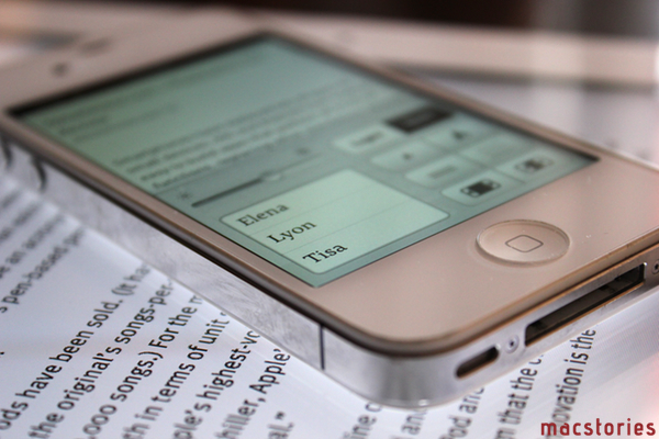
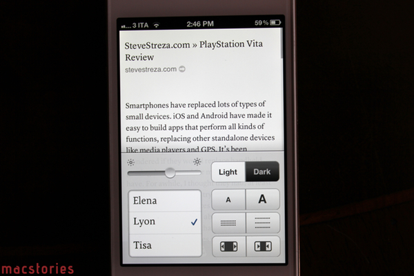
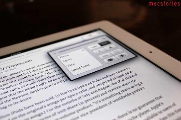
In the Readability review, I praised the custom fonts used by the developers to render body text. I am no typography expert, but I had grown tired of reading with Georgia in Instapaper, and Readability’s Vitesse and Sentinel – for as much as type experts will dismiss my claims as heresy – felt like a breath of fresh air to me. Sure enough, I know Marco had been working on licensing the fonts he wanted in Instapaper for quite some time, and Instapaper 4.1 shows these results. The following six fonts (three serifs, three sans-serifs) are now available in Instapaper:
Currently, these new fonts coexist with the existing ones (Verdana, Georgia, Helvetica, Hoefler Text, Palatino, Baskerville) in the app’s font-picking menu, and Marco says he may hide the old ones behind an option in a future update. Indeed, I can say I love the new fonts provided in Instapaper. They look amazingly sharp on the 4S’ Retina display, and I can’t wait to see them in action on the new iPad. For now, I like to use FF Meta on the iPhone, and Elena on the iPad. I have always liked my iPhone’s Instapaper with sans-serif typefaces for some reason.
There are three more features I like in the new Instapaper. Full-screen mode, like in iBooks, gets rid of all UI chrome and only presents what matters: text. There is an option to disable this functionality in the Settings (like in iBooks, you can activate it with a tap on screen), and I hope it will be further refined in a future update as there are some bugs (see) – I also wish Marco will consider an option to leave this on by default. Keep in mind that once in full-screen, you can’t tap on the iOS status bar to scroll to the top, because there is no status bar.
Gestures now allow you to go back to the reading list without tapping buttons. In scrolling mode, you can go back with a swipe to the right; in pagination mode, you can just page past the beginning or end of an article. I have my Instapaper set to scrolling mode, and I like the sliding animation on the iPhone better (after a swipe to the right).
Twilight Sepia is another design tweak that leverages Instapaper’s existing automatic dark mode based on time zones to progressively tint the screen with a sepia tone in the early evening hours. I don’t use this feature, but it sounds like a very smart implementation.
Instapaper was already an excellent app and service, and with version 4.1 and the new bookmarklet Marco has been busy making great improvements lately. As usual, it comes down to what you want from a read later app, and Instapaper works for me. Get it from the App Store.
(The new typefaces in Instapaper 4.1. From the top: Elena, Lyon, Tisa, Ideal Sans, Meta, Proxima Nova. Click for full size.)


