I love that there are so many excellent choices of RSS readers on iPhone and iPad. Currently, my favorite in terms of iOS and iPadOS 14 feature adoption is lire, an RSS client that is packed with power user features. With the latest update, the app has been relaunched on the App Store, which means it’s a new purchase, with excellent support for the iPad’s new three-column design and widgets.
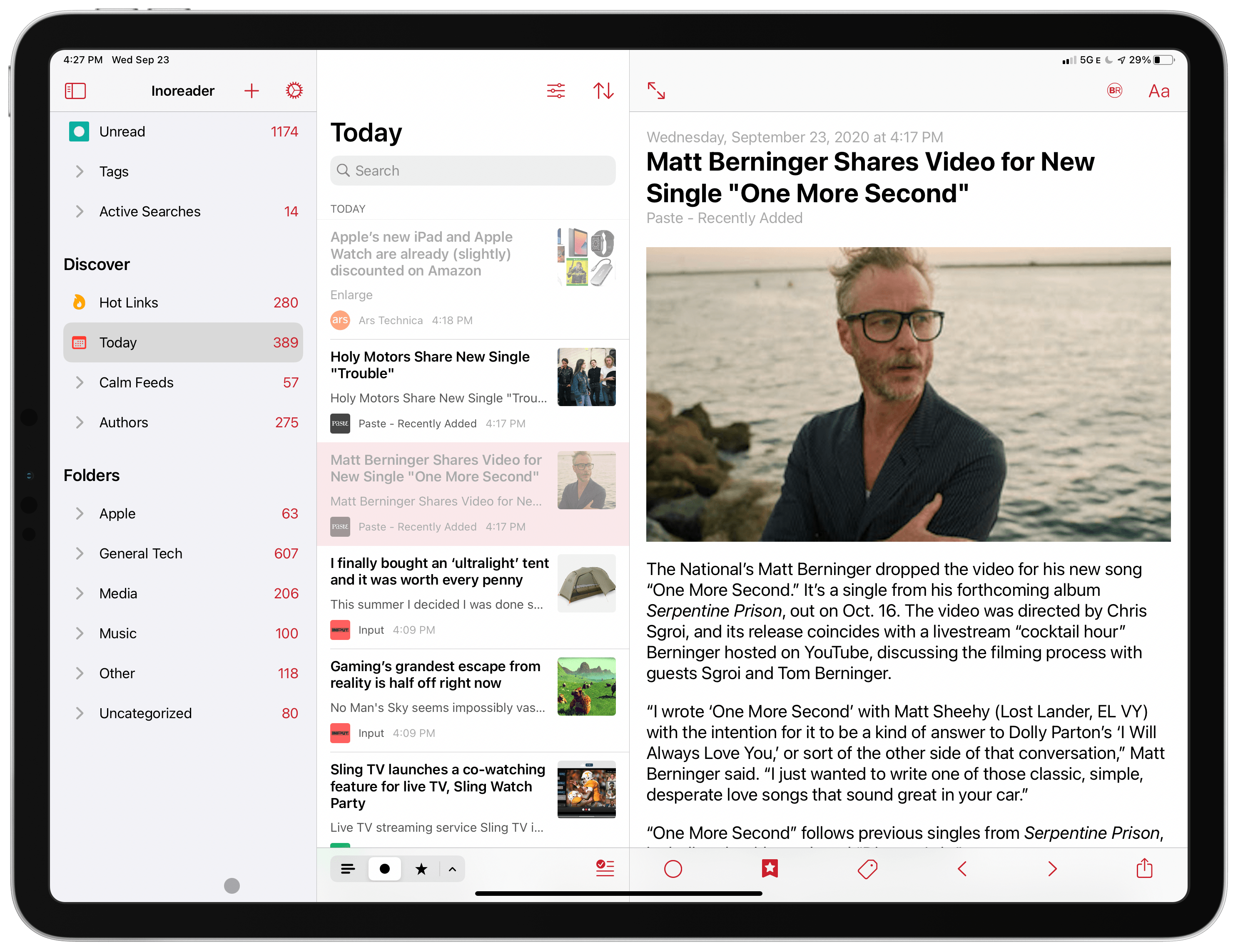
RSS readers are perfect for the iPad’s new three-column design. Lire’s left pane includes numerous ways to navigate your feeds, the center pane lists your articles, and the right pane displays each article. The first two columns can be hidden so you can focus on what you’re reading.
Lire supports multiple RSS sync services or can be used in a standalone mode. I use Inoreader to sync my feeds and appreciate that lire supports the service’s tagging and Active Search features. The top section of the left panel allows me to browse all the articles in my feed as well as tagged items and Active Searches that I set up in Inoreader’s web app. I’m especially happy that Active Searches are supported because it lets me focus on a subset of topics that I’m researching, like the upcoming update to macOS.
The second section in lire’s left panel is Discover, which collects special feeds created by lire from the feeds you follow, including:
- Hot Links – frequently cited links
- Linked List – link posts from your feeds
- Recent (called Today if set to display one day of posts) – the articles published within a user-defined period
- Calm Feeds – posts from feeds that don’t publish often
- Authors – your feeds reorganized by the people that wrote the posts
The final section is Folders. I use folders to organize most of my feeds by topic. It’s a loose tool that lets me quickly bypass certain topics when I don’t have time for them.
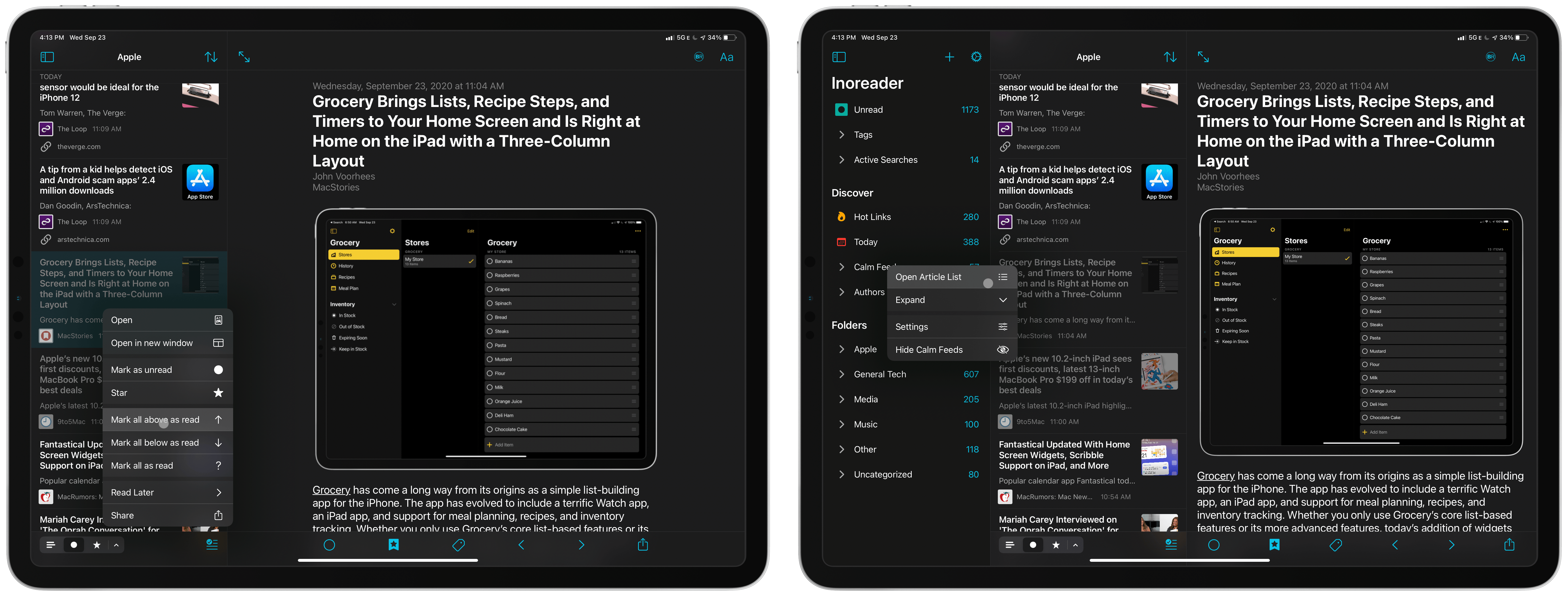
The subheadings beneath each of the main three sections in the left sidebar can be expanded and collapsed. For example, that lets me tap on the Apple folder and view its contents without viewing the names of the individual feeds. That’s a big space saver because I don’t dip into my RSS feeds by publication very often. However, I’d like to be able to collapse the top-level headers too for those times when I don’t want to browse by any of the five sections under Discover, for example. It’s a minor point, but with a lot of feeds, the more I can control what I see onscreen, the better.
Most of the time though, I select a folder, collapse the left panel, and scan the headlines tapping on the stories I want to read. The article list can be grouped by date or subscription and sorted by date and latest to the oldest or the other way around. At the top of the list is a search bar, and at the bottom there are controls for filtering the article view, so it displays all, unread, starred, or any of six other combinations. There’s also a button to mark all articles in the section you’re reading as read, and swiping left and right across an article in the list reveals two customizable actions in each direction.
For focused reading, you can hide both columns on concentrate on one article at a time. In this view, it’s easy to get back to the first two columns by swiping in from the left edge of the iPad or using a two-finger swipe across the toolbar if you’re using a trackpad.
In the article pane, lire lets you change the font, margins, text size, line spacing, and more by tapping the ‘Aa’ button in the toolbar. Along the bottom of the article view are a series of action buttons for marking individual articles as read or unread, sharing the article, moving forward or backward through your articles, tagging, and a toolbar shortcut, which is my favorite button. The toolbar shortcut can be customized in lire’s settings to show one of several services or other actions. For example, you can set it up to star or unstar a story, or send it to Safari Reading List, Instapaper, Pocket, Pinboard, my personal pick, GoodLinks, and others.
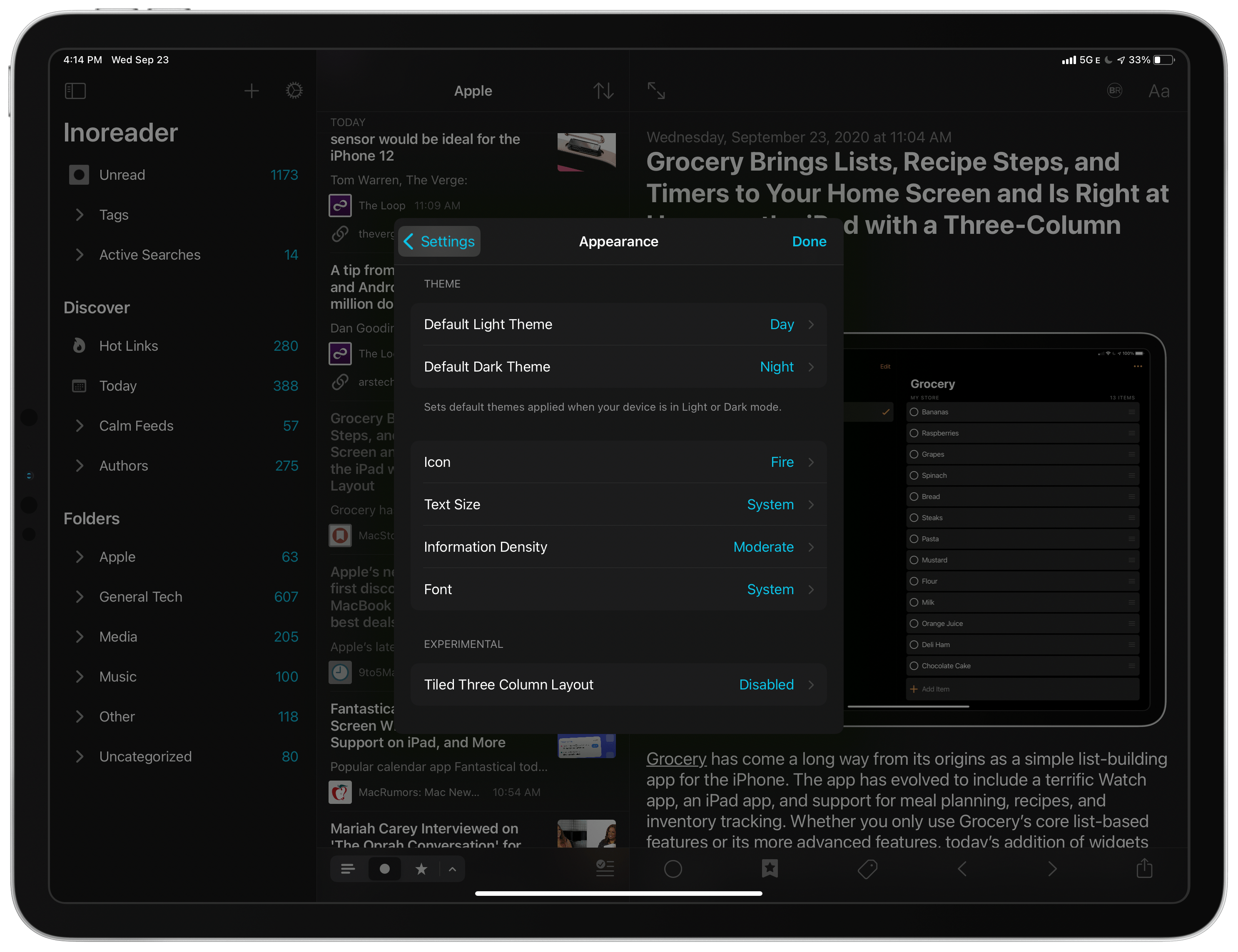
There are too many settings for touring them all, but like any good power user RSS client, lire gives you a lot of control. You can set your sync service here and adjust sound settings, badging, appearance, the Discover section, sorting, article-specific settings, and more. It’s worth poking around in settings when you first set up lire and then revisiting them after you’ve used the app for a while to see if there’s anything else you’d like to change.
That’s a lot of functionality packed into a single app, but with a little time spent setting it up the way you like, lire is a fantastic way to read RSS. Better yet, with the ability to hide the left and middle panes and collapse sections in the left sidebar, you can sweep away the complexity and focus on nothing but reading as the toolbars disappear when you scroll an article, which is also a setting that can be turned on and off. Combined with extensive keyboard shortcut and gesture support, I can work my way through hundreds of headlines quickly, finding the handful I want to read carefully.
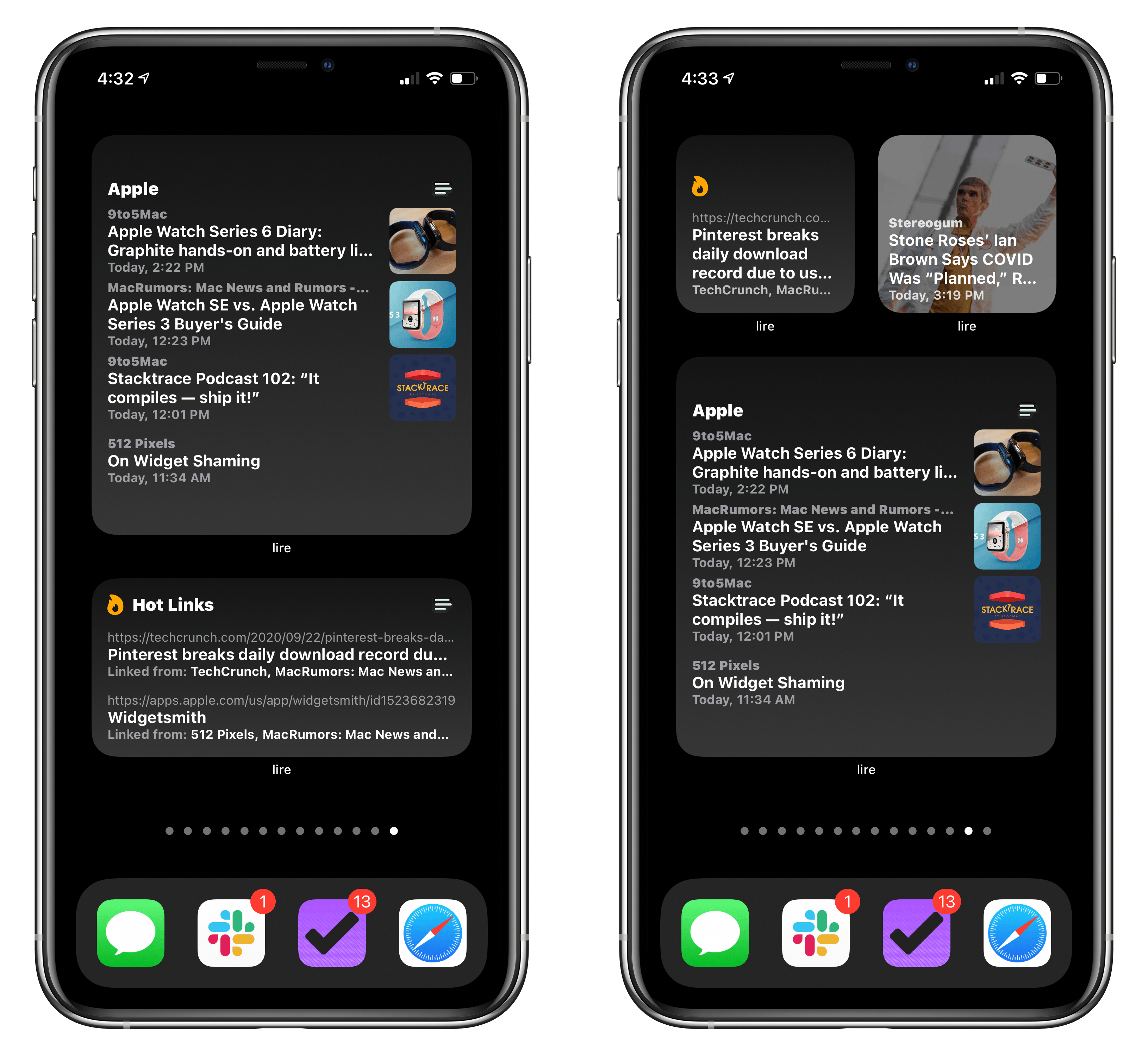
For those times when I’m busy, I’ve found that lire’s new widgets are a great resource. There are two types: Hot Links and Articles, which come in all three widget sizes. I don’t use the Hot Links section of Discover much because most stories that blow up online grab my attention via Twitter first. However, I like the idea of having a way to see those links on my Home Screen instead. Twitter is an important research tool, but it can also be a distraction, so having somewhere else to quickly find top stories is a plus.
My favorite widget, though, is lire’s Articles widget, which displays a highly-customizable article list. You can pick the source for the list, its status (any, read, and starred), and its style (any or linked). You can also add a title search term to further refine the list. What’s more, the source can be a folder, feed, your Calm Feeds, or an individual author.
With a list of articles, even the large widget feels small, which is why the level of customization in lire is so important. Another touch I like is that you can tap the title of the widget to go directly to that section of the app or tap an article that open that article instead. Currently, I’ve got the large version of the widget set up to display unread articles in my Apple folder.
There’s never been a better time to be a fan of RSS. Not only are there terrific options on iOS and iPadOS, but there are new choices on the Mac now too, including lire, which I reviewed last fall and is among my favorite Mac Catalyst apps. With the advent of Optimized for Mac, I’m looking forward to where lire’s developers take the Mac version next. In the meantime, though, I highly recommend trying the latest update to the iPhone and iPad version of lire.


