I have a confession: I’m not a big mind map guy. I know Federico uses a mind map for his iOS review each year, and lots of other people love visualizing their thoughts that way too, but mind maps have never really clicked for me – at least not on computers.
Up until recently, whenever I needed to do a brain dump and get my thoughts better organized, I would often turn to pen, paper, and a hand-drawn mind map. It’s an odd habit, since I shun paper for digital tools in every other case I can think of. Yet this one holdout remained.
My main problem with digital mind maps is that they have always felt unnatural. When using a traditional computer, moving and clicking via trackpad was cumbersome for me; with a format as creatively freeing as a mind map, it seems especially important to have freeform input methods. Even on devices like the iPad though, while touch input certainly helped remove a barrier, there was still always something missing in my view. Digital mind mapping still wasn’t quite right.
MindNode 5 on iOS fixes that.
MindNode has long been one of the premier mind mapping apps for Mac and iOS, and its version 5 is a huge update that, for me at least, centers around two main changes: a streamlined, intuitive user interface, and the adoption of drag and drop support. There’s a lot more to this update than those two things, with plenty of goodies that die-hard MindNode fans will appreciate, but for users like me – those dissatisfied with digital mind mapping, or even inexperienced at it altogether – the most important changes are those that make the app more approachable, and the new UI and drag and drop certainly do that.
User Interface
Have you ever used an app that you simply never felt at home with? Maybe the layout was confusing, the icons didn’t make clear what actions they activated or menus they held, and everything left you feeling a bit lost. It’s a frustrating experience. There are apps I’ve used a hundred times that still throw me with ambiguous or misleading buttons and menus. I wish those apps’ designers would take a long, hard look at MindNode 5 and learn from it.
MindNode 4 wasn’t among the worst offenders in the confusing UI department, but it certainly wasn’t my favorite app to navigate. Very few icons were recognizable standbys employed by other iOS apps, and the layout of certain menus never felt intuitive to me. But I have to applaud the team at IdeasOnCanvas for their work on MindNode 5, because design-wise it truly feels like a whole new app – in the best way.
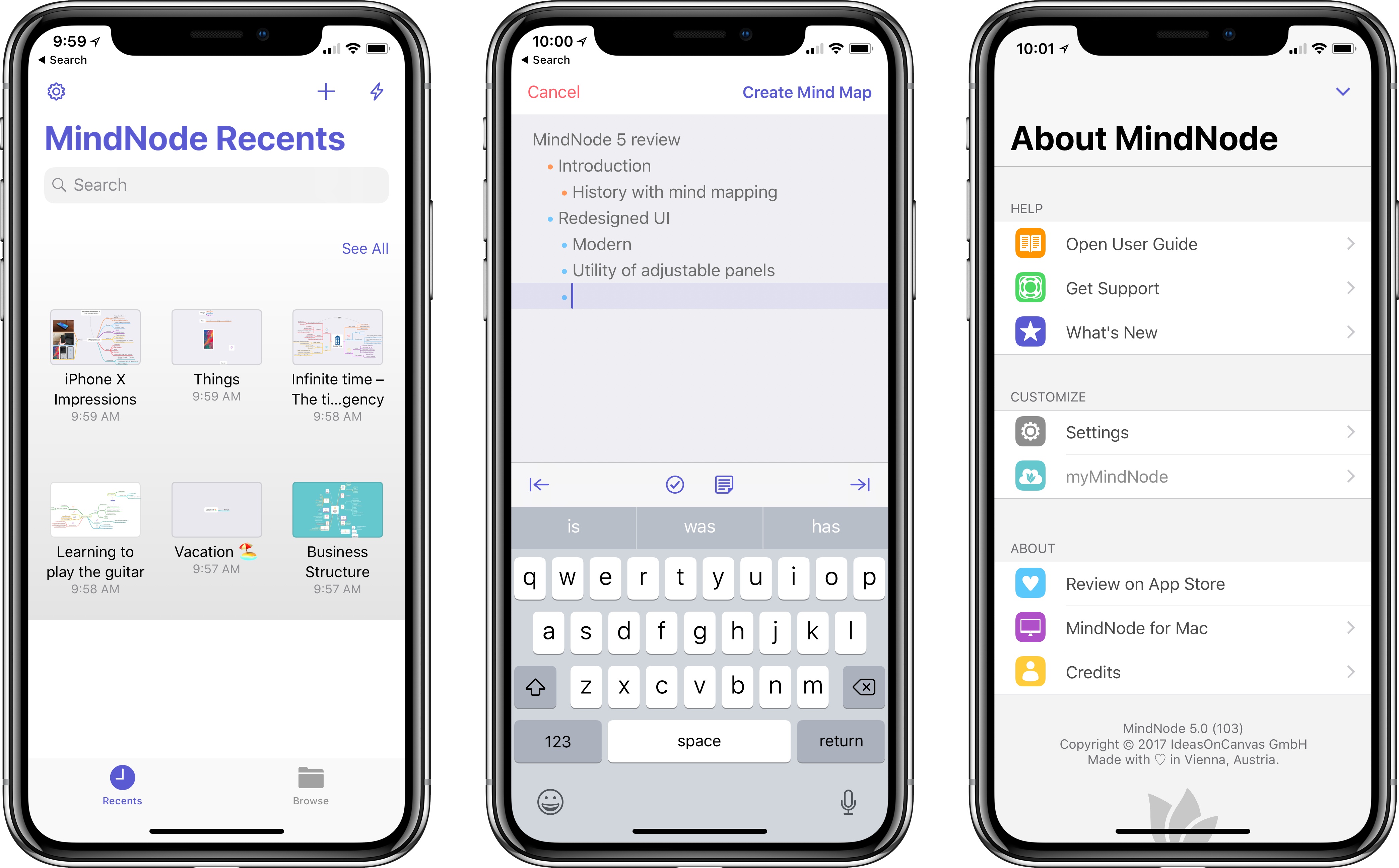
MindNode 5’s transformation greets you when you first open the app, because it has implemented iOS 11’s document browser capability for integrating directly with the Files app. The document browser carries the same look and feel of Files, with a few small differences: indigo is used as an accent color, and there are buttons for the settings menu, for creating a new mind map, and for opening Quick Entry mode. The latter option is a new feature: it lets you put your thoughts down in outline form, then when you’re done, that outline is automatically converted into a new mind map. Depending on what type of project or issue I’m brainstorming, often I’ll prefer to brain dump via a written outline, so this tool has been a great add for me.
Outside of Apple’s iWork suite, MindNode is the first major app I’ve noticed that adopts iOS 11’s document browser, which is a little surprising. I understand why this change would take some time to implement, but we now sit almost six months past WWDC, when developers first gained access to iOS 11 APIs – I would have expected more apps to be on board by now. Perhaps it’s still just too soon to judge the document browser’s long-term success, but it’s disappointing to see so little movement among apps to this point.
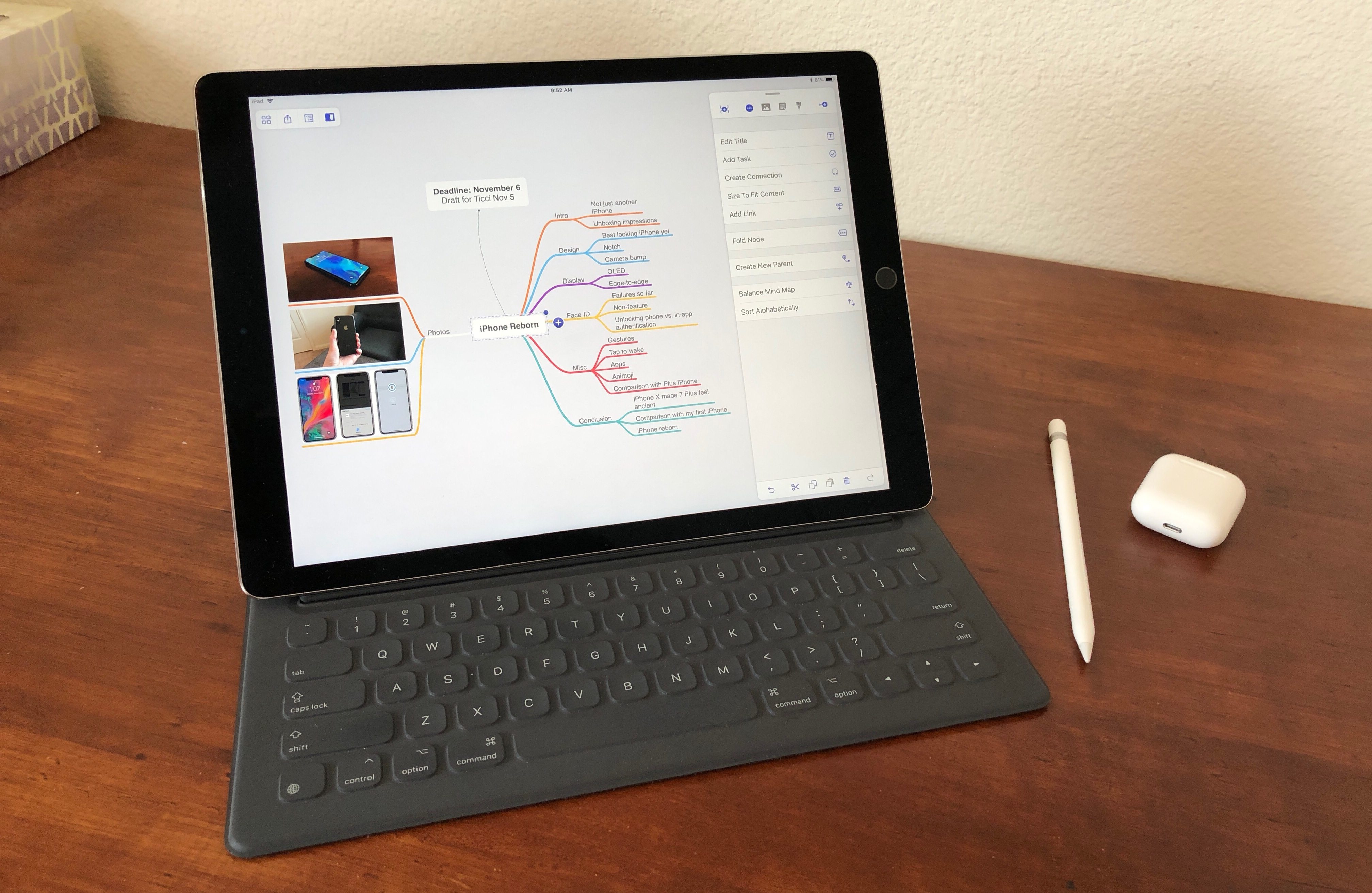
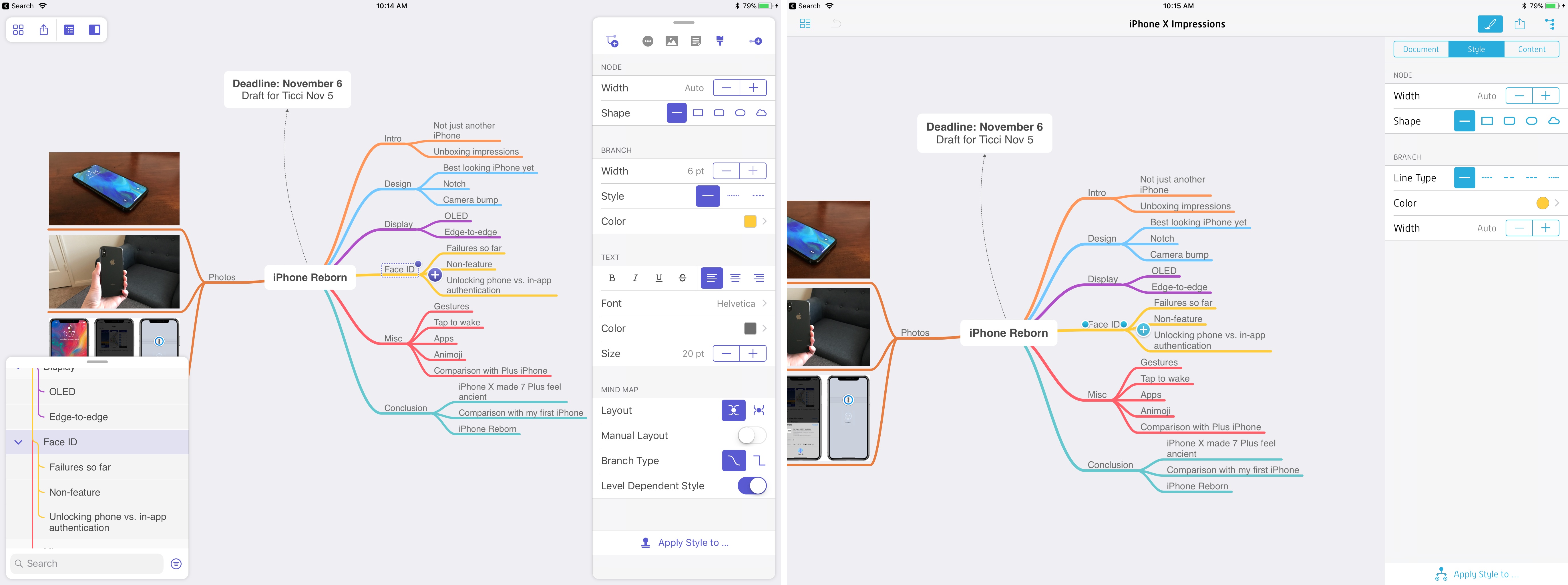
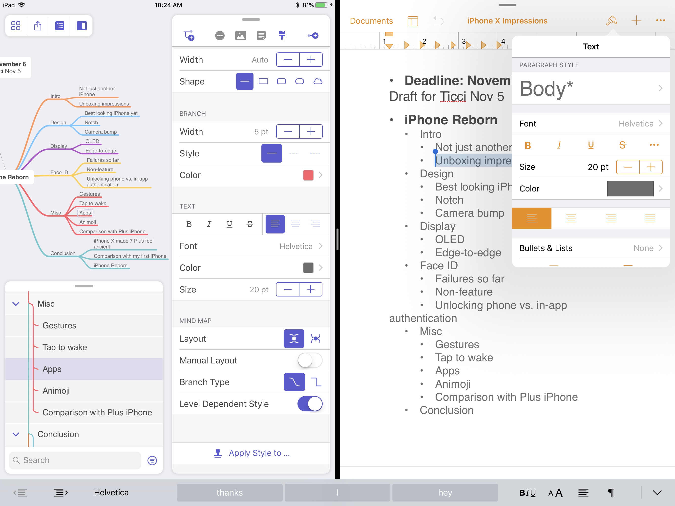
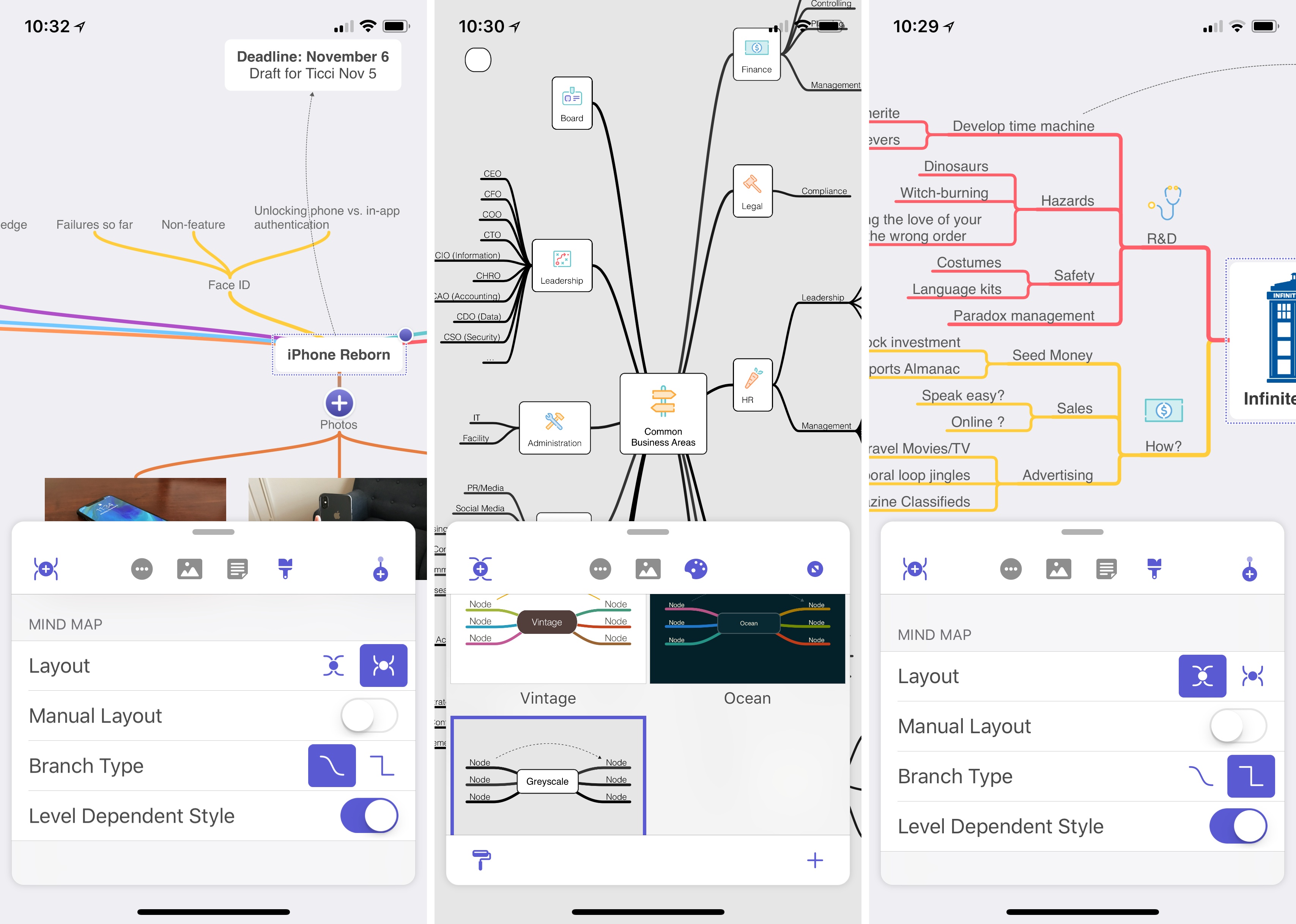
MindNode 5 differs from its predecessor not just when selecting documents, but when viewing them too. While your mind map itself will look the same (outside of some theme tweaks), the assortment of tools at your disposal have been reorganized and presented in a markedly better format. Replacing MindNode 4’s fixed navigation bar and optional sidebar are a pair of adjustable panels: a main actions panel and an outline panel. These are joined by a compact, floating pane in the top-left corner containing options to open the document browser, load sharing options, and show or hide panels.
The outline panel is fairly straightfoward, working largely the same as in MindNode 4 with a few notable improvements. Notes attached to nodes can now be displayed right within the outline, which was impossible in MindNode 4. Also, tasks can be marked complete inside the outline, so you no longer need to select a node to complete its task.
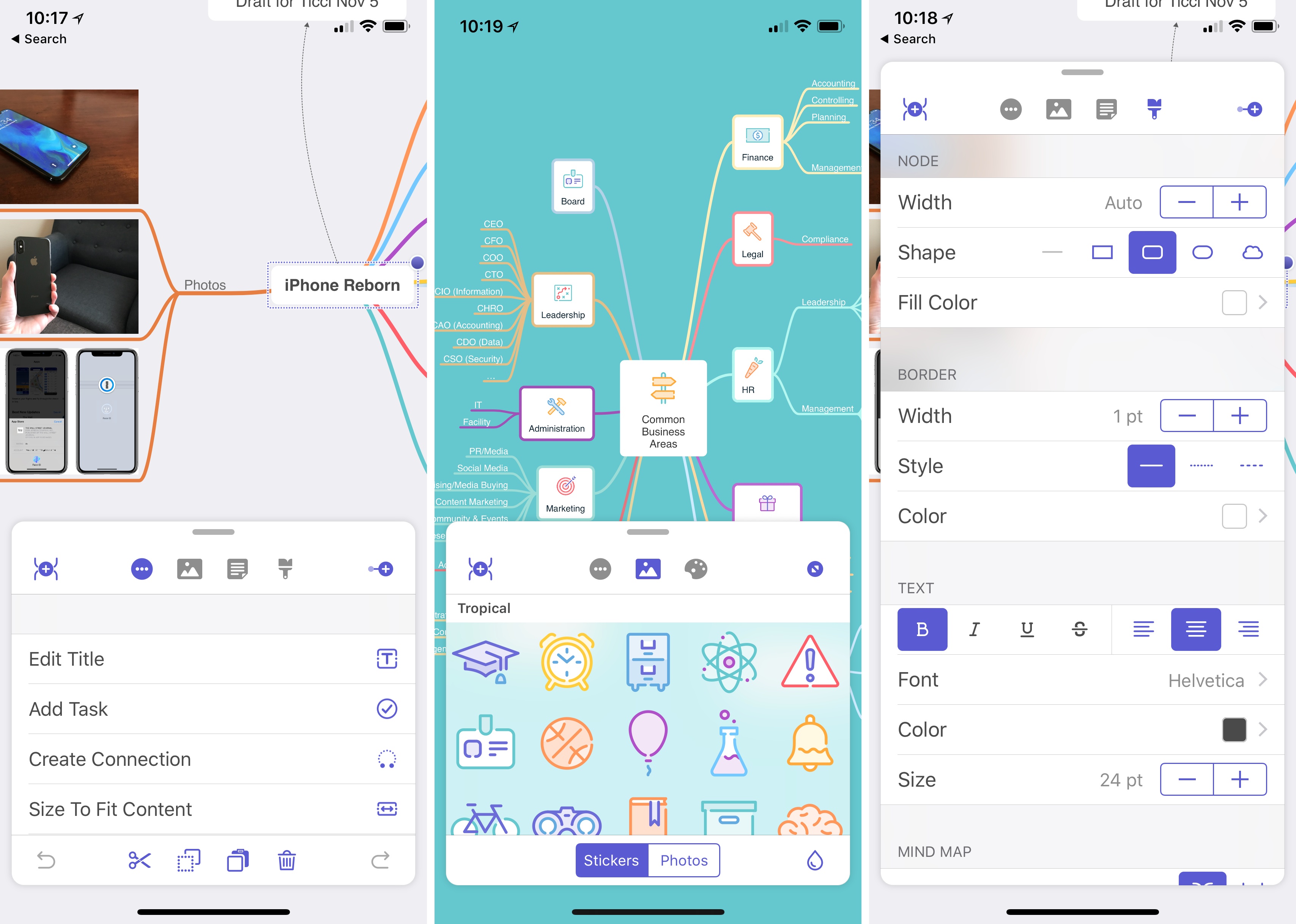
MindNode’s actions panel is the more interesting one; it houses practically all the controls you’ll use when working in a mind map, without feeling overly crowded or confusing at all. I think this is due to two main factors, one of which is the panel’s mixing of both dynamic and static buttons.
Depending on whether a node is currently selected or not, the actions panel will change slightly to offer a different set of options. If nothing’s selected, you’ll be able to alter your map’s theme, access view controls, or choose from stickers or photos to add to your map. The latter menu remains when a node is selected, and it’s joined by a notes screen, style sheet, and other node-specific controls. So the actions panel changes depending on which menu is selected, and depending on if a node is selected or not.
Normally this dynamic behavior could be disorienting, but it’s not here, and I think that’s thanks to the static portions of the actions panel. Regardless of which viewing state you’re in, the panel’s top and bottom rows often remain consistent. The top always has a button for adding new nodes in its left corner, while the bottom contains the same tools for like menus. For example, the first menu contains the same cut, copy, paste, trash, and undo/redo controls whether a node is selected or not; the image menu contains the same bottom-row controls in both modes as well. These upper and lower rows act as bookends for the more dynamic middle portion of the panel, and help anchor users in a familiar state, no matter how the rest of the panel may change.
The second reason MindNode’s actions panel works well is something I’ve already mentioned: the clear, informative icons. This may seem like a small detail, but its overall impact is huge. Icons in the panel clearly represent certain things, with little ambiguity, and controls housed in each menu are a natural fit with the icon that represents them. The note screen is represented by a note, stickers and photos by a standard place photo, styles by a paintbrush (as popularly seen in iWork), and on the pairings go. Even the one seemingly random icon – a circle containing three dots – is perfect because of what it represents: a random assortment of controls that don’t quite fit in any other category. Thanks to the icons I’m never confused about which menu I’m accessing – the actions panel feels like it works for me, rather than me having to work to find what I need.
As I mentioned, MindNode’s two main panels are adjustable – they can be resized to a few set levels by dragging the grabber at the top of each panel. In my use this detail has proven a key point in the panels’ success.
The flexibility of MindNode’s panels means that when you want to focus entirely on your mind map, you can either shrink extraneous panels, or hide them entirely. But when you need them again, they can be adjusted to just the right size with ease or a single tap can restore them on-screen. The system works so well, I’ve started imagining what it would be like if other document-based apps followed suit.
iOS apps like Apple’s Pages currently work best when running solo on a large iPad Pro canvas. Put the app in Split View and suddenly menus begin covering up your document – a problem that grows worse the less space you dedicate to Pages in your Split View. Try to edit a document on iPhone, and menus are likely to obscure your entire workspace. In the majority of situations, it’s simply not a great setup.
I understand why this is a hard problem to solve. iOS apps need to adapt to a huge variety of screen sizes – from 4” to 5.8” on iPhone and 7.9” to 12.9” on iPad – and finding an interface that scales well across the spectrum is tough. It’s common for apps to optimize for one ideal size on each iOS device and not feel as right on other sizes. Also, UI elements frequently get shuffled around between devices so they’re in one place on iPad, and another entirely on iPhone – offering a confusing, inconsistent experience. But with adjustable panels, you get the same experience regardless of device, and panels can be resized as you choose to provide the best fit for your current screen.
When I’m working with a full 12.9” of screen real estate, I can have panels expanded to their full heights without feeling in any way short on space. But as I adjust canvas size – whether by working in Split View, or on my iPhone – I can adjust panels to just the right size too. This flexibility means you get the right setup regardless of context – all while the app’s controls retain a consistent look and location.
One last aspect of MindNode 5’s UI worth mentioning is the new fullscreen mode. In addition to all the flexibility of the panel-based system, there’s now the option to remove panels from the screen altogether so you can view your map free from distraction. You can activate fullscreen mode from the top-right corner of the actions panel when no nodes are selected.
Drag and Drop
As I said earlier, the way computer-based mind mapping typically works always felt janky to me. I’m not against the concept of digital mind mapping, it’s more a matter of execution. And while the iPad has seemed like the most natural digital platform for mind mapping, even there too many friction points have historically cluttered up the process of building and managing a map.
In MindNode 4 and earlier, for example, simple tasks like adding images or text to nodes couldn’t be done in the most natural way – by picking those things up by hand and dropping them where you wanted. Instead you had to, in the case of images, tap one to have it appear in a random place in your map. With text from outside sources, or when moving text from node to node, text selection and copy/paste was the best way to go. These interaction methods weren’t bad per se, but they weren’t as natural as I thought they should have been. MindNode’s development team isn’t really at fault for these things – they did the best they could with system restrictions, and I know many people loved the way the app worked before. But for me, the whole thing never quite felt right.
Enter drag and drop.
If you’re an iPad power user, you know how big an update iOS 11 was, with drag and drop leading the charge. I’ve used and reviewed lots of apps that benefit immensely from drag and drop support, but I don’t know that there’s an app category better suited for this feature than mind mapping. Mind maps are built for natural touch interaction, so it’s no surprise that by adopting iOS 11’s systemwide drag and drop features, MindNode became the app I always wanted.
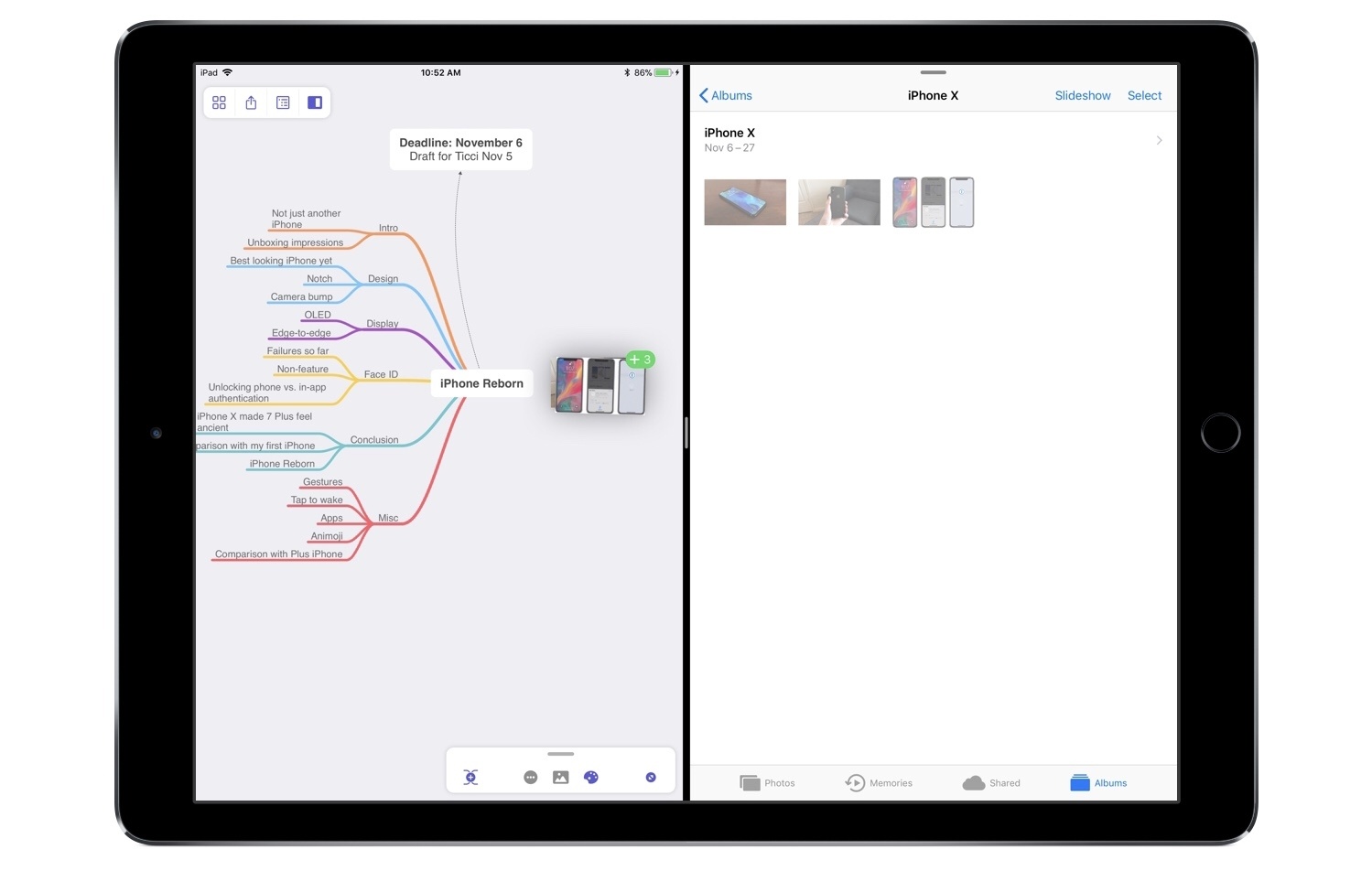
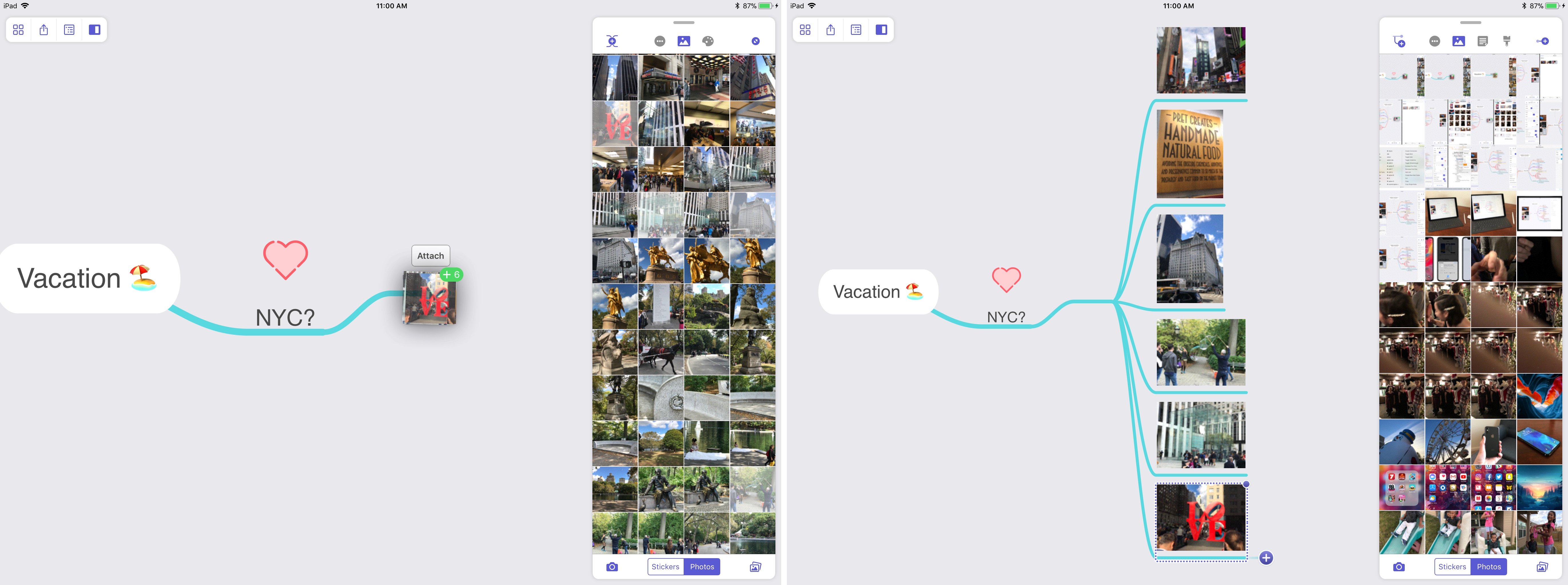
Drag and drop is implemented here in a way that simply makes sense. If you drag content from MindNode’s actions panel or an external source, and that content is eligible to be added to your mind map, you’ll see a green plus button to indicate it’s safe to drop. Dropping items into a blank area of your map will make them standalone nodes, not connected to anything, but you can also drop on to an existing line, or an existing node. Dropping on a line will, as you’d probably expect, add the item(s) to that point on the line, whereas dropping on a node merges the content with the node itself. It’s easy to tell what’s going to happen when you drop content thanks to an Attach badge that appears when hovering over either a line or a node that dropped items will attach to. This simple indicator is the kind of visual aid that many apps with early drag and drop support failed to implement, leaving it unclear what would happen with dropped content. The Attach badge was present in MindNode 4 for in-app drag and drop, and it’s a natural fit here for drag and drop of all kinds.
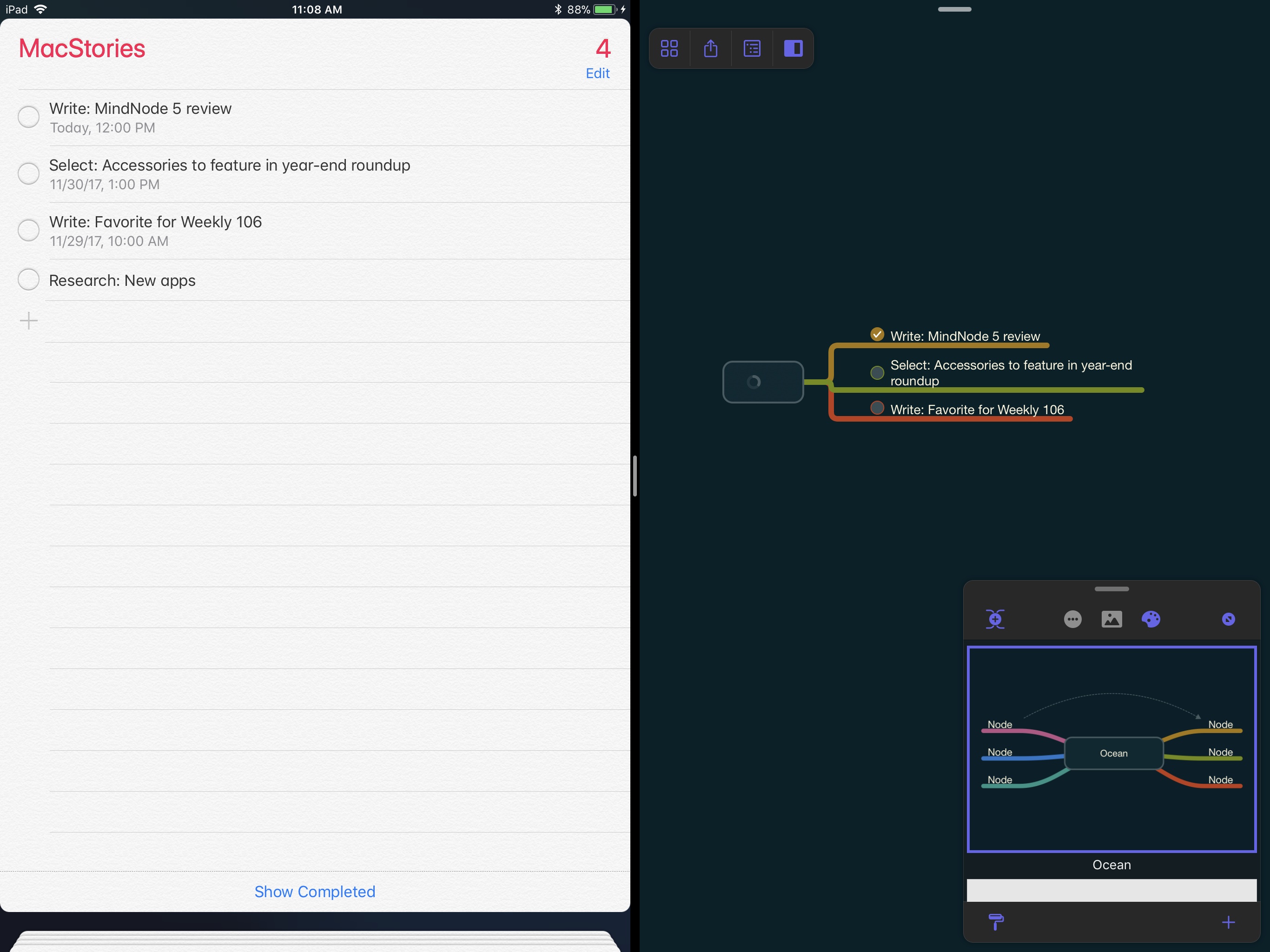
The ability to drag content from other apps and drop it into your mind map feels so right. A mind map is a seemingly endless canvas, and now in MindNode that canvas doubles as a landing place for content from other apps. Find a photo that’s a good fit for the project you’ve been mapping? Just drop it in. Have some notes you want to keep close at hand? No problem. MindNode offers support for dropping images, text, and even Reminders. You can also drop a URL, but unfortunately only in text fields. In the future I’d love to see support expanded to include the option to drop a URL anywhere, and add common files like PDFs, that way I can keep all reference materials in my mind maps.
Because it’s so easy to drag and drop content, even after it’s already in your map, you don’t need to know exactly where a new item fits in your map’s structure before you drop it. Just drop it on the open canvas, and later on you can pick it up and attach it to an existing node, or line, or do whatever works best for you. This option existed in MindNode 4, but it suffered from pre-iOS 11 workflows of using share sheets or file pickers to import content from external sources.
The way MindNode 5 works with drag and drop makes clear how mind mapping apps were made for this feature. And fortunately, despite being unable to receive content from external apps, all of the in-app drag and drop goodness on iPad made its way to the iPhone too, so no matter your iOS device, the interaction paradigms remain consistent.
Everything Else
MindNode 5’s redesigned UI and drag and drop are easily the most important aspects of the app to me, but there are several other features in this release that long-time mind mappers will appreciate.
Layout and Display Options: Map making and viewing is now more flexible than ever before thanks to a few changes. In the creation department, you can now have maps with a vertical layout rather than horizontal; vertical maps can grow from either top to bottom or bottom to top. One nice aspect of this change is that you can mix and match maps of different orientations inside the same document, rather than being restricted to one orientation at a time. In the realm of cosmetic improvements, there are several new themes in MindNode 5, plus a new option to use orthogonal branches, which give your mind map a more professional look. While I like the more playful feel of the classic, rounded branches, orthogonal branches are a sharp alternative that I think many users will appreciate.
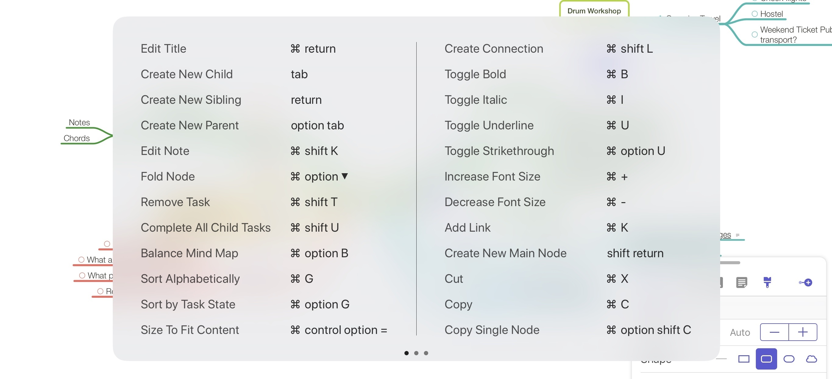
Keyboard Shortcuts: MindNode 4 already included a healthy set of keyboard shortcuts, but with version 5 the number of options appears to have doubled. I’ve never seen an app offer three full pages of shortcuts before.
Gestures: The only thing easier to remember than keyboard shortcuts is gestures, and MindNode 5 adds a couple handy ones. You can tap the screen with two fingers to perform an undo action, and tap with three fingers for redo.
Widget: It’s very basic, but MindNode now offers a widget you can use for quickly creating a new mind map or entering Quick Entry mode.
My history with MindNode is simple: it’s an app I’ve always appreciated, but never stuck with. Its beautiful design and polished feel led me to try it out several times, but those tries were always short-lived – every time I went back to pen and paper for mind mapping.
With MindNode 5, this is the first time I think digital mind mapping may stick.
The app’s newfound appeal is largely due to the thoughtful, more accessible user interface and the advent of drag and drop, but I don’t want to undersell MindNode 5’s other new features. Quick Entry, for example, serves as a brilliant way to quickly empty a head full of thoughts in a format I’m familiar with: written outlines. I love being able to think in outline form, then with the tap of a button get rewarded with a beautiful, well-structured mind map. It makes me much more likely to go to MindNode first when it’s brainstorming time.
I know not everyone has the same history with mind maps as me. Many have used and loved them on computers of all kinds for years. For Mac users, for example, there’s plenty about MindNode 5 to appreciate: the app’s modern design and increased flexibility in layout and display options, like with vertical layouts and orthogonal branches, make this a solid update. Longtime mind mapping fans will find MindNode 5 to offer more of what they already appreciate. There’s plenty for longtime users to get excited about, even if we’re ultimately excited about different things.
While I know my prior mind mapping experience isn’t shared by all others, I also would bet it’s not exclusive to me.
For users who resonate with my feelings on computer-based mind mapping, MindNode 5 is worth a legitimate second shot for the format. Its elegant, intuitive interface, paired with drag and drop support, have fundamentally changed the app for me. And while it’s too early to say if the app will finally supplant my pen and paper workflow, I’m optimistic it will.
MindNode 5 is a fresh, modern revision to mind mapping that feels right at home on iPad. It’s the app I always thought it should be.
MindNode 5 is available on the iOS App Store as a free download, with a one-time In-App Purchase to unlock editing capabilities. The In-App Purchase is $14.99 for new users, or $9.99 for owners of MindNode 4. On the Mac, MindNode 5 is also a free download, and its In-App Purchase is $39.99 for new users, and $14.99 for owners of MindNode 2.


