The Web 2.0 era saw the consolidation of 3 different kinds of website: social websites (which include communication tools like Twitter and bigger networks like Facebook), collaborational websites (Google Docs, Wave) and online backup solutions. Not exactly a “websites”, when people started browsing more and basically doing more stuff with their computers, the need of a virtual, remote yet secure backup solution seemed pretty much obvious. I mentioned many times what I think it’s the best app to effortlessly store up to 2GB of data for free, Dropbox, and I’ve also written a post about 40 creative uses of Dropbox. That post basically talked about many different ways of using Dropbox not only to store simple backups of files and folders, but how you can use it to synchronize applications libraries and, for example, browser bookmarks across multiple Macs. But wouldn’t it be great to have a built-in, Apple -like solution to do that instead of setting up a lot of little tricks and hacks?
As a second post for the “It could be a Mac app” series today I’ll talk about MobileMe: I’ll take a look at the pros and cons of Apple’s web interface for its sync & backup tool, the actual usability of the webapp and why you should even consider of making a Fluid app out of it.
MobileMe is a web application / service that enables you to keep your Mac, iPhone and PC in perfect sync. MobileMe can push emails, contacts and calendars: it can also work as a full featured web app which lets you access those mails, contacts and calendars through a web interface. In a nutshell, MobileMe is a sync tool + online storage tool. I wanted to clarify it as many people still don’t have idea of what MobileMe offers - and what doesn’t. In this article I won’t go into the details of how you have to setup the service across all your devices, I’ll just focus on the web interface available at me.com.
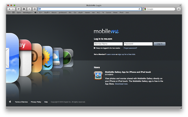
Once you’ve set up a free trial account you can head over me.com to start using the MobileMe webapp. The login page is awesome, showing a good attention to details (iPhone applications icons on the left side, latest news right under the login form) and nice colors. Log in with your credentials (you can tell MobileMe to remember you for 2 weeks, useful. The login page is compatible with 1Password) and here you go, you’re ready to start using the application.
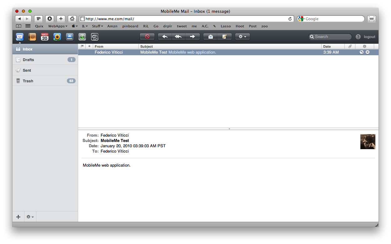
You can play around with a lot of Preferences indeed, but you can decide to start using it even without adjusting anything. The application is organized in 7 tabs (Mail, Contacts, Calendars, Gallery, iDisk, Find My iPhone, Settings) which are the icons you can see in the top toolbar. The toolbar is probably the element that makes MobileMe stay consistent in all the “sections” of the app, as it’s always there: it uses the same buttons design in Mail, Contacts, etc and definitely makes the userfeel comfortable. Like every good and well designed Mac application , MobileMe is easy to use and intuitive; it supports many tricks like QuickLook for photos (we’ll see this later, anyway) and shares many design principles with both iPhone OS and Mac OS X. It’s a good mix actually, which - combined with its dark and matte overall look - makes it stand out from the crowd of webapps and proves that Apple is indeed able to design and develop applications for the web. That said, let’s take a look at the features.
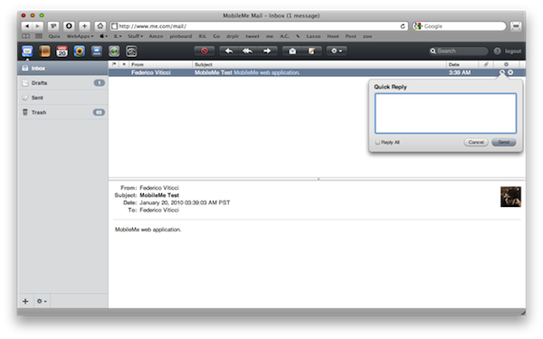
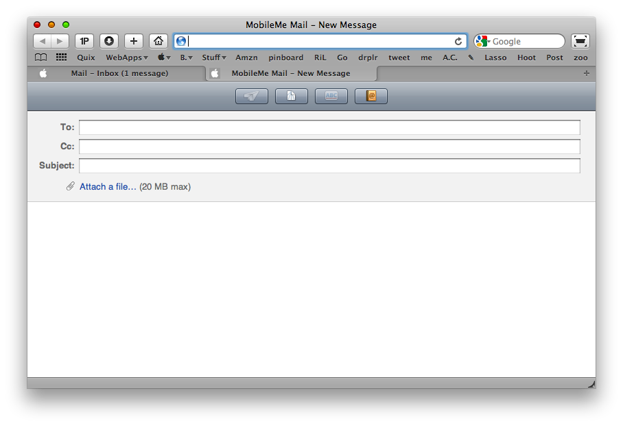
Mail is very simple and straightforward. There’s a left sidebar that lets you navigate through the inbox, drafts, sent messages and trash. You can create new folders with the + button on the bottom bar and erase mails / manage folders with the gear icon. What’s great about the email management in me.com is what you can do with messages and the actions that MobileMe lets you perform in a few clicks or via keyboard shortcuts. You can reply, reply to all, mark as flagged or unread, move to a folder and obviously trash a message. You can either use the gear-like icon in the toolbar or the keyboard shortcuts that come built in into MobileMe. Another thing I like very much is the “Quick Reply” feature, which opens a small and cute popup box from where you can reply to a selected message. As for the compose window, you can choose a contact from you me.com Address Book or attach a file from your computer, up to 20MB. Other features include the possibility to set up aliases (requires a full MobileMe subscription), encode messages in UTF-8 and check mail from an external POP account.
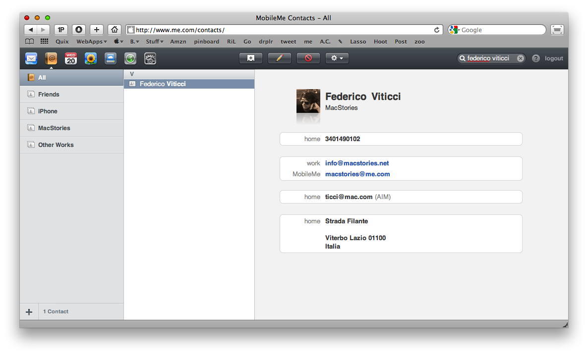
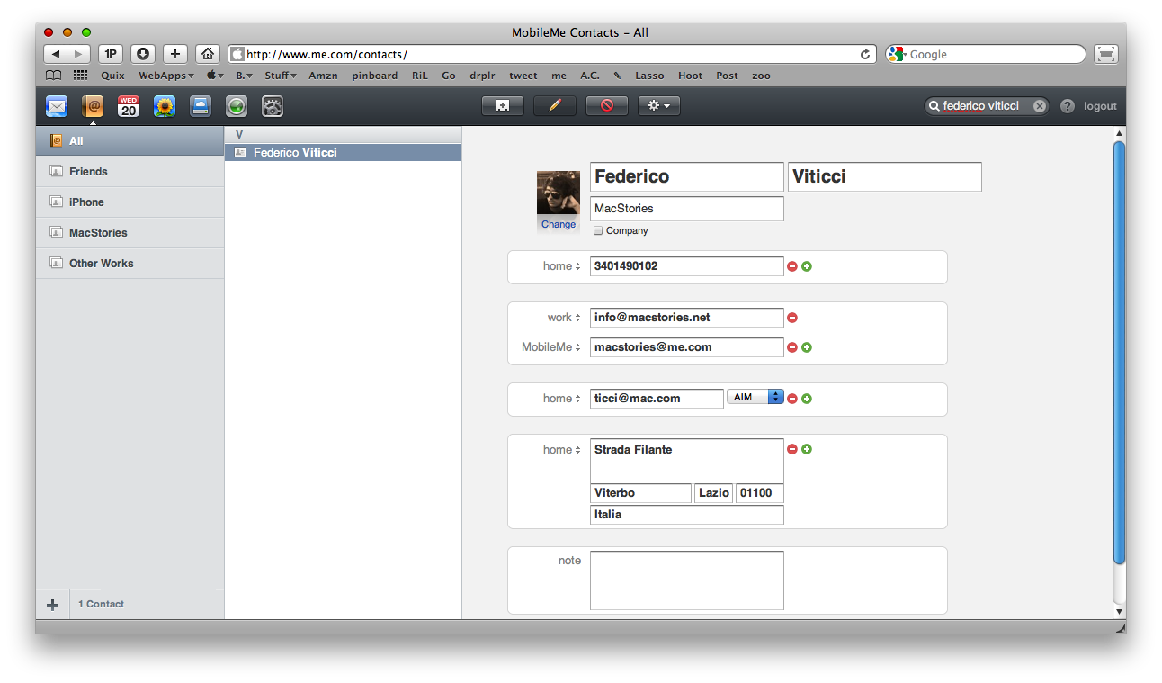
Speaking of contacts, the online Address Book is very well done and I seriously prefer it to the Mac OS X one. You can see your groups in the sidebar and add new ones with the usual + button. The interface is organized in 3 panes, pretty much like Address Book, but the UI is more refined and takes some elements from iPhone OS, like the “A,B,C,D,E, etc” cells in the mid panel or the single contact view. You can edit an existing contact, add a new one, import and export Vcards and set up custom settings like “Sort by” and “Automatically format phone numbers”.
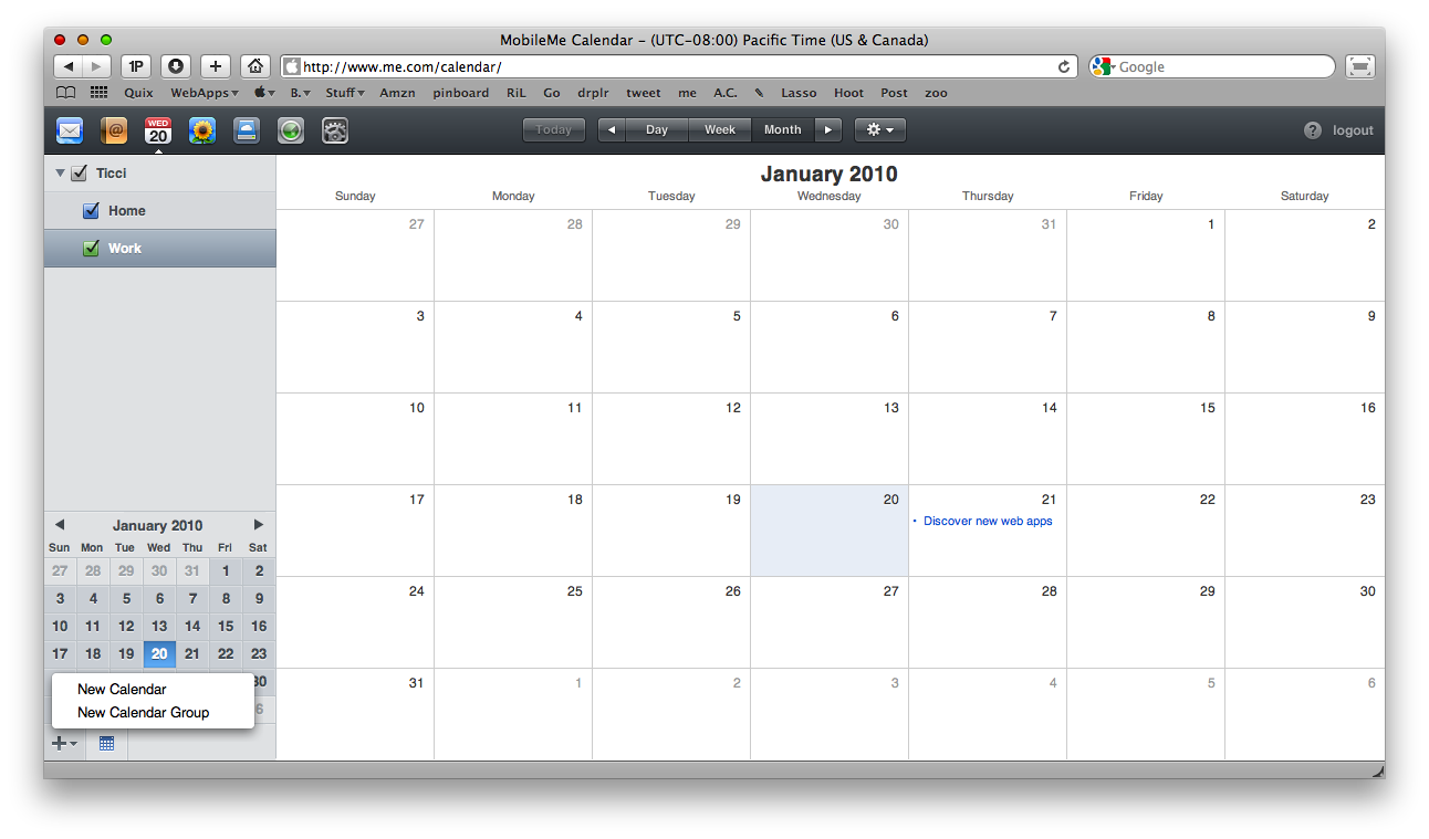
Then there’s the Calendar integration. I don’t use iCal that much on my Mac, so the push calendar feature isn’t that useful to me. I must admit anyway that the MobileMe calendar is a perfect transposition of iCal.app: there are Calendars and Calendar Groups, To Do’s and the possibility to view the calendar by day, week or month. You can change the Calendar info at your personal preference and set up a lot of other stuff in the Preferences. I’m sure those of you who use iCal will surely love MobileMe integration.
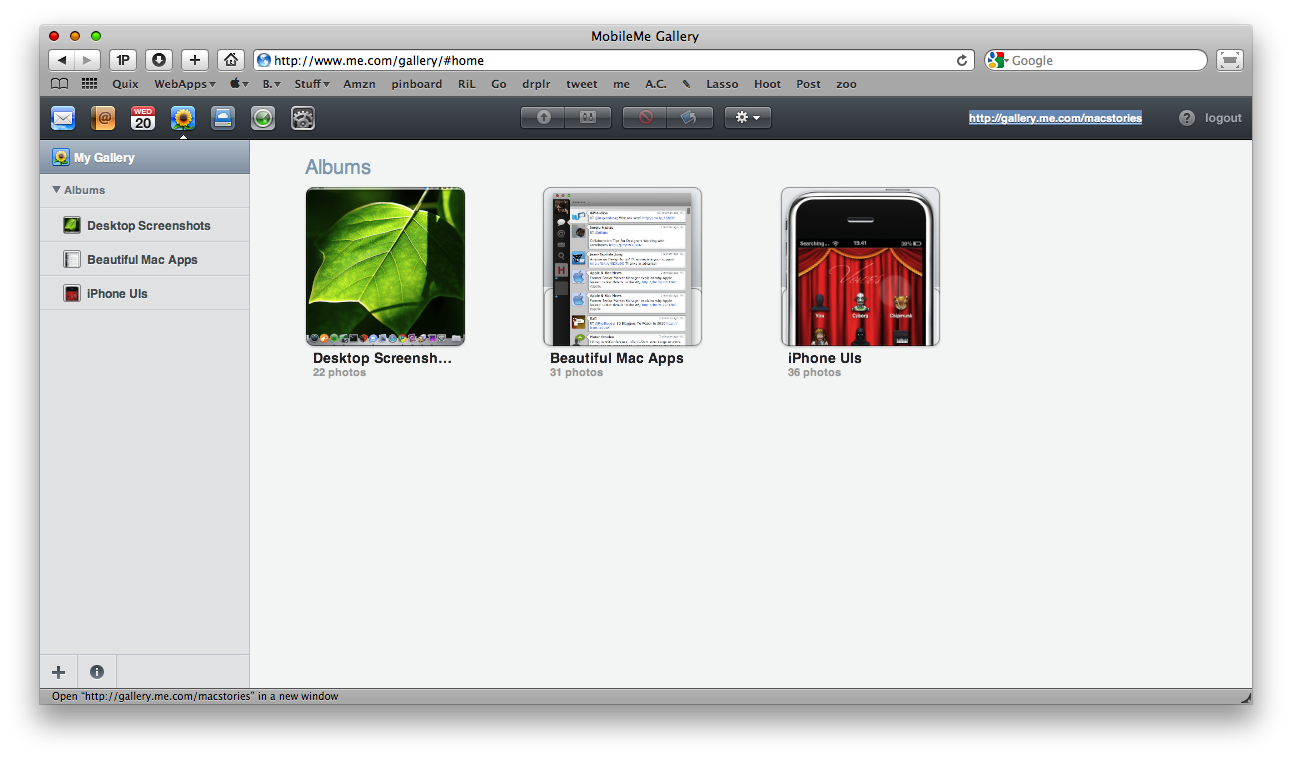
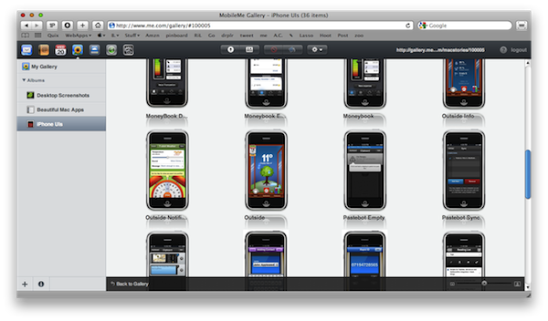
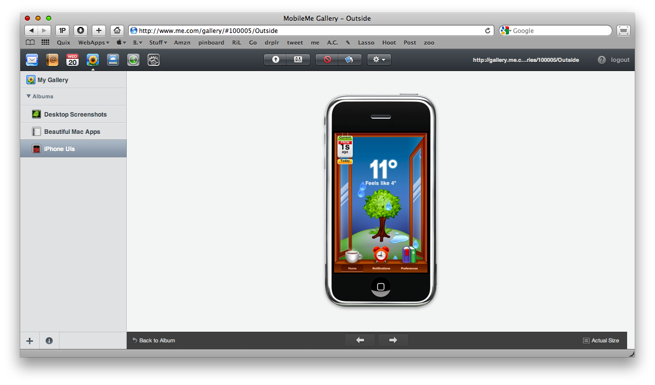
Next is Gallery. MobileMe’s gallery feature is one of the most discussed topics about Apple’s online application, due to the recently released iPhone companion app. Gallery is awesome, powered by a delicious pixel-perfect interface design and it’s really useful. Maybe one the things I use most on MobileMe. You can create albums from the sidebar and rename them . To upload something just press the upload button in the top toolbar and another page will open allowing you to choose some files from your computer. The overall uploading process is smooth and fast. Once you’ve uploaded some stuff in your galleries it’s time to customize them a little bit. First, you can choose to allow the download of the entire photo album, the upload from the web browser or via email. A great feature if you plan to make your MobileMe galleries public, like I did for MacStories screenshots galleries. If you double click on a gallery thumbnail you can visualize all the photos inside it; to view a photo at full screen you can hit the spacebar to enlarge it - just like you do on Mac OS X for Quicklook. The animations are fast and beautiful. Overall, the gallery is one of the things I like most about MobileMe and the sharing features make it stand out from any other solution I’ve tried so far. Thumbs up.
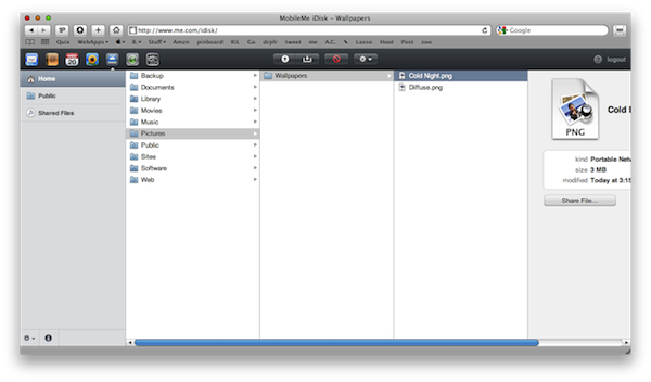
As I’m approaching the end of this MobileMe review, I should mention two last features that Apple implemented in the web interface: Find My iPhone and iDisk. While Find My iPhone should be pretty clear to everyone (it’s the service that lets you remotely locate and lock your iPhone in case someone stole it from you. See the official page for more info) the iDisk needs a little bit of in-depth coverage. The web UI of iDisk uses the Finder-like column view and displays all your files and folders as columns. You can horizontally navigate through them as you open folders and sub-folders. You can rename, share and download files, but you can’t preview them. Guess it’s coming in the future updates. Anyway, I use the iDisk app on a daily bases and it’s slowly replacing Dropbox in my workflow. Sure it needs to be polished a little bit, especially on Mac OS X, but it’s a great addition nonetheless.
All in all, MobileMe is a great service, which comes with a beautiful and powerful web application but that often gets criticized by press and users. MobileMe was very unstable and buggy when it was first released, but things have got a lot better and it’s fair to say that now MobileMe is the perfect tool for people who need an easy way to sync and backup everything across multiple computers and devices. Moreover - and I can say this because I’m using it - MobileMe puts Dropbox to shame when it comes to effortless and automatic synchronizations of contacts, calendars and mail. The disk storage works fine too. Don’t listen to those Windows users who ramble about MobileMe, because they’re all wrong. The webapp feels great, is well designed and I’m definitely making a Fluid app out of it.
Besides, I’m looking forward to what Apple has in store for MobileMe in 2010. You should give it a try.


