Loren Brichter is working on Tweetie 2 for Mac, but it’s not that every developer out there is sitting at his desk waiting for the Atebits guy to ship his newest creation. Absolutely not, as almost a new Twitter client is released every day (yeah, according to Wikipedia) and guess what - a good 95% is pure shit. But fortunately, every once in a while a good client comes along and tries to persuade Mac users to stop using Tweetie 1.x, and approach a new experience.
Nambu for Mac has been around for a while now, but some weeks ago I heard that there was a 2.0 version floating around, and it was a closed beta. I got accepted into the private testing group and had the chance to try the app. Today Nambu has decided to open the gates of the beta version, which is now available for download for everyone.
Here are my impressions so far.
Nambu supports a lot of services, and being the new account screen the first you’ll see when you fire up the application, it’s worth to mention that you can not only access Twitter, but Facebook, Instapaper, Tr.im, Bit.ly and others as well. For the sake of this review, I’ll focus on the Twitter aspect of Nambu, which is the reason why it became so popular.
Once you’ve entered your Twitter credentials (username and password, no OAuth) you’ll be ready to go; but first, I think you’d like to set up some settings and trust me, there are plenty of them. You can click on the Notifications tab to customize every little bit out of how Nambu uses Growl notifications, meaning that you can opt to receive notifications and sounds for every new tweet, mention, direct message or tweet you send. A nice addition I haven’t seen in many other clients is the possibility to enable Growl only when Nambu is in the background. The General tab (weirdly placed at the rightmost corner of the Preferences window) contains a lot of stuff that enables you to change the behavior of the app: you can adjust username and font sizes, turn the status bar icon on / off, select your preferred syntax for quoting tweets (I’ll just say this: /via @) and change the options for marking tweets as seen. I’m very happy with the Preferences Nambu 2.0 provides, as you never know what an user likes from Twitter and providing a good set of options is the best thing a developer can do.
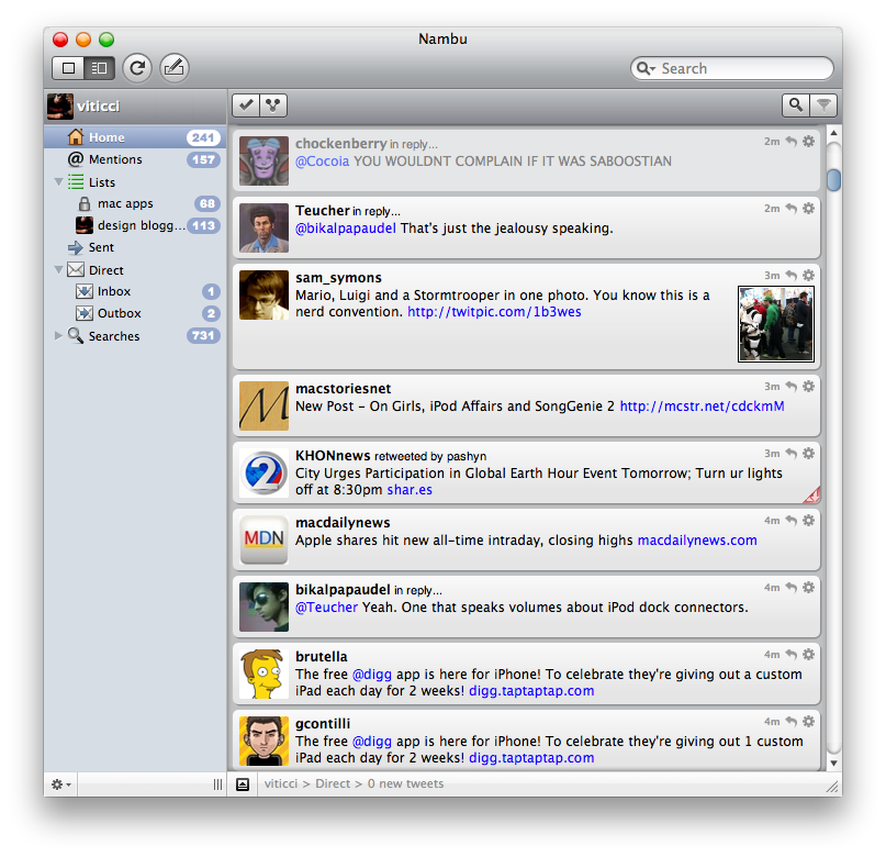
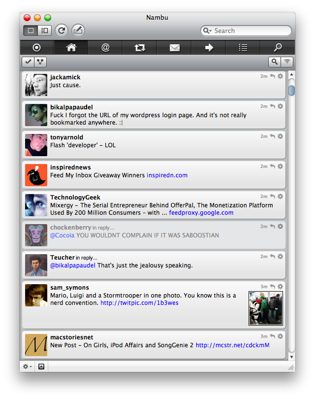
Now, let’s move to the actual tweeting part. Nambu lets you choose between two different views: outline and combined. Outline (which I don’t use) displays a sidebar on the left which allows you quickly navigate through the timeline, replies, messages and stuff. Very Mail and Finder-like, but still I prefer the combined view, that could be defined as a “Tweetie-like navigation bar placed on the top”. Indeed, you get this neat black bar that lets you do the same stuff Outline does, but I think the realization is prettier and easier to understand for the user. Overall, I like this bar.
The timeline view is what really pisses me off, put simply. And you know what the problem is? It’s not as intuitive, fast, clear and elegant as Tweetie’s one. Seriously, what’s wrong with developers who can’t realize a client as elegant as Loren’s one? Don’t get me wrong, Nambu is nice, but the timeline is inferior to Tweetie, period. And being it the place where you’ll spend most of your time in (I mean, you’re not always adjust preferences. If so, you seriously need a shrinker) you can guess how important the thing is. Sure, you can do a lot of stuff. Pay attention, a lot. You can retweet, quote, translate, fave, block, follow: all the things you can do on Twitter.com, plus some additions and the obvious convenience of a right-click context menu (also available by clicking on the gear icon next to each tweet). Not to mention lists, searches, trends - there’s everything.
Problem is, the navigation is flawed. Or, there’s no navigation at all. The way Tweetie seamlessly allows you to read a tweet, see the author’s profile, check his fave’d tweets and - why not - see the conversation he had with @gruber…you can forget about it. There’s no user navigation. There’s no “flow” in Nambu and this makes it feel like a 1.0 generation app, the one you can find on MacUpdate.com for free and that it was last updated 10 months ago. No threaded DMs, no double-click on tweets to show the conversation. It seems like the developers have a creepy addiction to buttons and menus, forcing you to continuosly break the user experience by having to find the proper command to perform an action.
Nambu could have been a good app, even better than Echofon, I think.But as the days go by and yet another Twitter client fails at delivering an experience not even near to Tweetie’s one, I’m starting to think that Loren teamed up with George Orwell’s Big Brother back then to control our minds and make us love Tweetie. And if it ain’t so, I guess Tweetie is just a better app.


