Over the weekends, I usually spend a bit of my free time browsing the App Store and AppShopper, looking for new apps to try on my iPhone and iPad. Sometime I find interesting new things to test; sometimes I find great apps. Other times – but this is a very rare exception – I find really great apps I can’t stop using. This is the case with Portal Browser for iPhone.
I have been trying a lot of alternative browsers for iOS over the past months, as you may have noticed. Thanks to tweaks available in Cydia, I also installed several modifications to make Apple’s Safari a better, faster, more functional browser. Still, testing new browsers from third party developers has become one of my favorite “work hobbies”, as I believe there’s great room for experimentation and innovation in a mobile app to browse the Internet. I do believe we have only scratched the surface with mobile browsers on iOS and Android which, if you think about it, haven’t done much besides porting the desktop experience to a smaller screen. Portal for iPhone is the first step towards a much better approach to mobile browsing, entirely based on touch interactions, features and menus developed with the iPhone in mind. Don’t get me wrong: Safari is an excellent browser. But Portal, which is sold at $1.99 in the App Store, is more than the usual alternative: it’s a completely different take on mobile browsing.
Portal is built upon the simple concept that a mobile browser, due to a device’s screen limitation, needs to run in full-screen mode. Even if most websites nowadays come with iPhone-optimized layouts, it’s still important to be able to get a large overview on a webpage without losing space to toolbars, menus and buttons. The problem with full-screen mode, in fact, is that it’s been difficult for developers to find a way to increase available screen space without sacrificing the aforementioned toolbars, which are usually placed both at the top and bottom to provide the only way to activate several browser-related functionalities – I’m talking about the “back and forward” buttons, tabs access, bookmarks, and so forth. How do you offer a great feature set, an intuitive UI and more reading space at the same time? By thinking out of the rules, and the standards. By trying to establish new concepts and navigation schemes, breaking the conventions set by Apple itself. That’s a bold statement. But if you know you can do better, it’s worth trying.
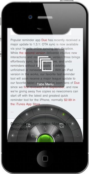
Portal is a full-screen browser app with controls accessible through a single button that can be expanded to reveal its functionalities in a wheel-like interface. This button and the consequent interface that comes from it is entirely navigable via touch input, or better: by sliding your finger across its sections. The “Portal button” sits at the bottom of the screen and can be hidden with a shake of your iPhone to achieve real full-screen mode with no visible interface elements. The button is already unobtrusive and minimal, but if you want you can hide it completely and invoke it at any time. Portal for iPhone revolves around this button and the features it will give you access to. The circular interface that opens as you tap and hold the button initially reminded me of Tapbots’ Convertbot, but just because of its shape: it works differently than Convertbot and does a lot of stuff without cluttering the app in any way. On the initial tap, the button will expand to reveal three main menus: Tabs, Navigation and Actions. To move to one of these menus, and the sub-sections inside them, you just have to slide your finger. So if you opened the button menu and you want to go to a new URL, slide your finger to Navigation and again to “Goto URL”. If you want to run a Google search, it’s Navigation -> Search Web. Above these two functions, there’s a third level to access standard actions like “reload” and “next page”. Once you get used to this control scheme, you’ll find yourself moving your finger to the “Goto URL” menu in seconds, remembering the exact position on screen without even looking. Same applies for Google Search and reload – it feels very intuitive. And if you’re not sure you’re doing it right, Portal also features a heads-up display with the name of the functionality you’re about to activate. The cool thing is, Portal’s innovative menu doesn’t work with the usual “point & tap” pattern, it’s based on “slide and lift your finger”. As you can guess, having this menu placed at the bottom of the screen makes it incredibly easy to use the app with one hand. Does it break conventions? It sure does. Does it feel natural, easy to use and, above all, useful? Definitely.
Visualizing open pages or, as most browsers call them, “tabs” works under the same principle. Tap on the app’s button, slide to Tabs and a series of dots on the upper level represents the number of pages you have open in the background. The second level features two buttons to close the current tab or close all pages – quite handy to kill an entire browsing session. Portal, however, can only keep 8 pages open at once. Why? When I installed the app and started testing it, I noticed something really strange: Portal wasn’t reloading pages as I switched between them. See, most iOS browsers, due to RAM limitations, are forced to “kill pages” open in the background and reload them again when you switch back to them. It gives you the illusion to have “an open tab”, but in fact you’re just reloading a web page. This doesn’t happen in Portal, and at first I didn’t know why. So I shot an email to the developers, and they confirmed there’s some code trickery going behind the scenes that makes sure Portal can provide “instant switching” between open tabs. The result is amazing: scrolling position is maintained, the page doesn’t reload, everything is displayed as you left it. There are no waiting times, you can start tapping and scrolling around right away. I believe this is some kind of advanced caching limited to a maximum of 8 pages, but then again – think of it as “instant on” for webpages in a mobile browser. It works extremely well, and I didn’t experience a single crash or glitch when testing at the app with 8 open tabs.
The design of Portal’s arc menu is gorgeous and comes with “sci-fi” sound effects that can be disabled in the Settings. I think they’re pretty cool and also provide immediate feedback when moving across sections, so I left them on. The animations are equally impressive and manage to give the feeling you’re playing around with a “browser of the future”. See the promo videos embedded below.
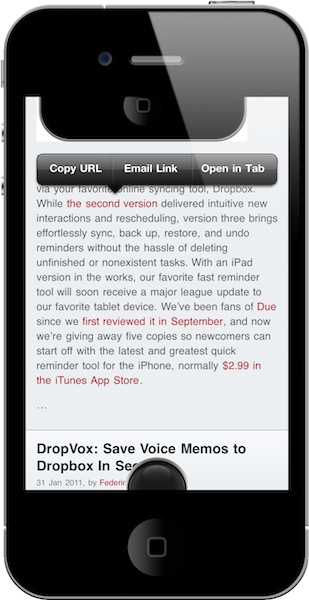
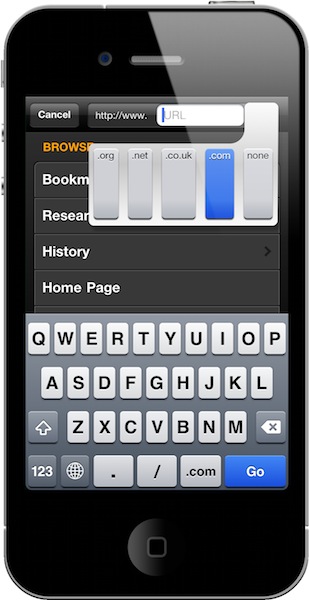
Portal is full of other details and features I’d like to mention. First off, the developers implemented a custom popup menu (the same you’ve gotten used to see with copy & paste) that changes its behavior whether you’re selecting a link or an image. The menu includes options like Copy URL, email link, open in a new tab, view image. In the same way, the Light Pillar devs made the address bar and the “new tab page” custom, too: the Goto URL option, for instance, allows you to only write down the name of a website as both “http://www.” and “.com” are pre-populated with two buttons. Tap on these buttons, and you can switch to simple “www.” or other domains like “.net” and “.org”. Most of the times you’ll only need to worry about writing the name of a website and hitting Go. If you prefer to enter addresses manually, write “www.google.com” and the address bar will behave like a standard one with no prefix / postfix functionality.
The address bar also searches as you type inside your bookmarks and history, so that you get a quick way to jump back to a website you previously visited. This can be enabled / disabled in the Settings. If you don’t feel like typing at all, you can open your bookmarks, history, research topics (more on this later) and home page from below the address bar. Web searches are laid out in a pretty neat way: when you slide over to Search in the Portal button menu, the browser will open a new window with a variety of websites like Google, Bing, Youtube, Wikipedia, Amazon and Apple.com. Select a search provider, type your search and you’ll be taken to that website. You can add your own search providers in the application’s preferences. Other interesting features I’ve found in Portal include support for AirPrint, Find in Page and application-wide Email URL, all stored inside the “Actions” arc menu. I can’t help but mention that the “Find in Page” feature uses cross-hairs to pinpoint results. That’s kind of useless, but it looks great.
The settings of Portal allow you to entirely customize the way the browser works. You can manage bookmarks and add new folders; manage research topics and share them via email; clear your browsing data (cache, cookies) and set a different user agent; specify the behavior for when the app is connecting to a website (I disabled the “Connecting” screen and left the Portal button as status indicator) and choose a “New Tab” screen. There’s so much stuff to tweak I can’t even list everything here. But I do want to cover two more aspects of this app that truly impressed me: user profiles and research topics. Profiles let you set up multiple identities (including a stealth mode) that can carry different settings and bookmarks. You can, for example, create a “work” profile with the homepage set to Techmeme.com and some work-related bookmarks and a “3G” profile that won’t load images while you’re on the go, to save bandwith. Each profile can have any kind of setting you want, and that’s really, really useful – especially for the 3G thing I mentioned above. Another feature that depends on user profiles is “research”, which is Light Pillar’s fancy way of calling pre-selected searches that highlight specific words you create in the preferences. Say I’m looking for more information on the Jawbone JAMBOX portable speaker: I can create a new “JAMBOX” topic in the settings, assign the words “jawbone”, “jambox”, “portable” and “speaker” to it and start browsing the web. Every time I stumble upon one of those terms related to the JAMBOX, Portal will highlight them in a different color for visual assistance. You can then move a webpage to your research and even set a relevance for future reference.
Like I said at the beginning of this article, I have tried several alternative browsers for the iPhone and iPad. Many of them surprised me and disappointed me, some of them impressed me with their UIs and feature sets. But none of them – and I mean it – got me the way Portal did. It’s a solid application with a beautiful interface design, a stunning set of functionalities and, above all, a level of creativity and willingness to innovate I haven’t seen anywhere else.
Portal is revolutionary because it disrupts the mobile browsing scene. It is the alternative browser for iPhone. And this is a first version of the app, so it can only get better from here. Portal is available at $1.99 in the App Store.
Now I want an iPad version.


