MacStories readers know that my favorite Google Reader client these days is Mr. Reader, especially after an update that added a “services menu” to the app, substantially increasing its interoperability with other apps. However, I’ve also been a fan of Reader X as a companion Google Reader app. A year after its original release in February 2012, developer Wolfgang Augustin released Reader X 2.0, which is a solid update that adds several new functionalities while building upon the original concept of the app.
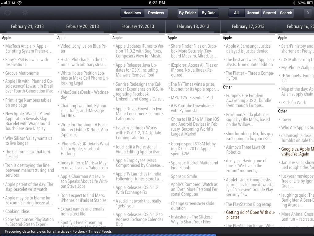
The idea behind Reader X 2.0 is that you can browse articles in your Google Reader account as a “wallpaper of news”. Forget the usual sidebar/folder/content pattern: headlines are the main content area of Reader X, which puts the focus on browsing several articles at once rather than having to check every few minutes to mark as unread and “get the count to 0”. You can do that if you want, but it’s not what Reader X wants to focus on.
Reader X comes with two modes to preview articles (headlines and previews) and two sorting options (by date and by folder). In headline mode, only article titles will be showed, whilst previews will also display the first image of a post. I prefer headline mode because I don’t think the small thumbnails of previews are useful to my workflows, and because I like the simpler visualization of hundreds of headlines at once.
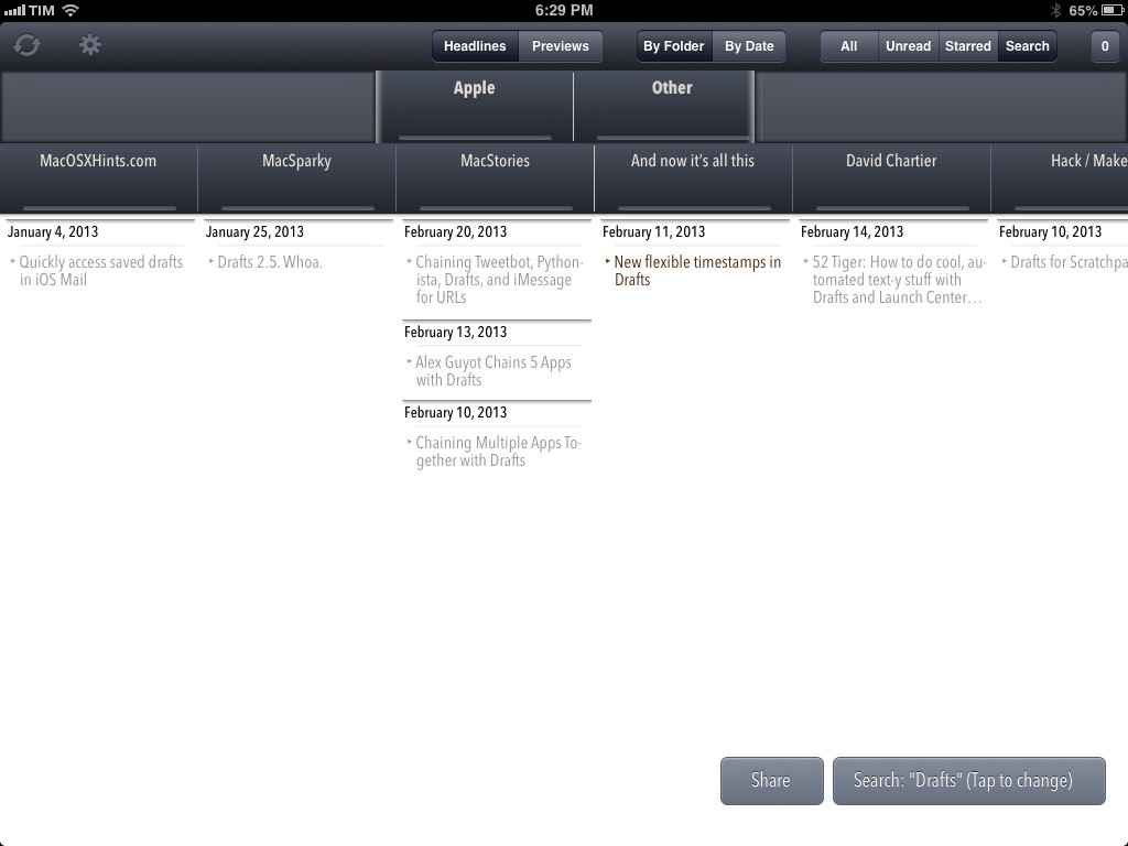
When you’re sorting articles, you can “dive into” specific sections: in the date view, you can scroll horizontally to get a reverse chronological wallpaper of articles and you can tap on a single day to dive into it and view only articles for that day. In folder view, the app shows a Fantastical-like loupe for top-level Google Reader folders (mine are: Apple, Software, Other) that you can swipe horizontally to show the length of the folder based on the feeds it contains, which are also displayed below.
As you can guess, you can dive into a specific feed and show all articles that Google Reader is keeping for that website. It sounds more complex than it actually is, but still – I prefer to browse with headline mode/by date in order to obtain the kind of layout pictured in the screenshot above. I don’t use it on a regular basis, but I believe the loupe/feed stripe is a unique idea other users will like.
Asides from modes, views, and dive-ins, Reader X can also switch between All, Unread, and Starred items – and this is where the app got really interesting for me. Firstly, I have developed a habit of starring articles that I find useful or want to reference in the future, and setting Reader X to Headlines/Date/Starred gives me a handy, easy-to-scan visualization of all my starred items from newest to oldest. Second, as I mentioned above, keeping the app to Headlines/Date/All gives me, on the other hand, a chronological account of every item that has appeared in my Google Reader account in the past months, every day.
This can be extremely useful with the Search feature Wolfgang built into the app: because article titles are stored in the app, you can fire up a new search to look for a keyword that you remember appeared in November in your RSS feeds.
Reader X’s search is a great tool for research purposes: once you’ve found articles that match your search criteria, you can send them via email (formatted as HTML) or copy them in plain text formatted with timestamps and source links in Markdown. If only I had an iPad app to better process Markdown text, the search feature would be even better.1
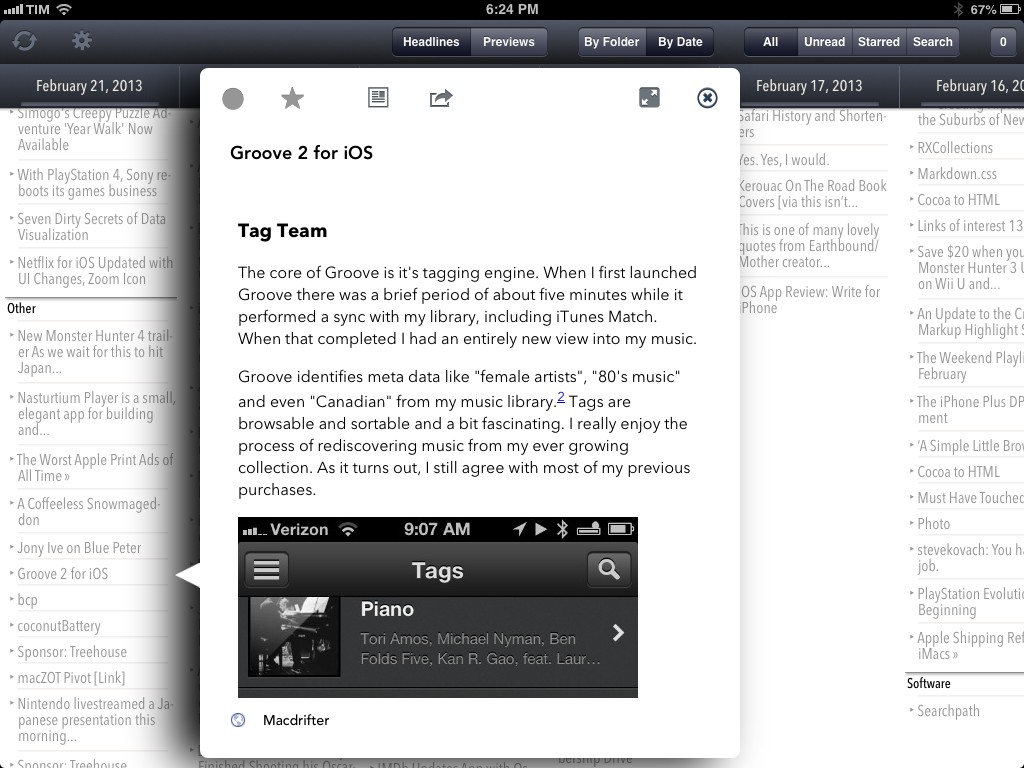
Like in the previous version of Reader X, articles can be read inside a popover or through a web view. In the popover, there are buttons to star an article, mark it as read/unread, share it, or view it through a “mobilizer” such as Instapaper’s one. The sharing menu supports a bunch of services (including Twitter and Facebook) and has support for Google Chrome with x-callback-url, but alas it’s not configurable.
One thing you’ll notice about the popover is that you can’t just tap anywhere on the screen to dismiss it: you’ll have to tap the “x” icon or the headline it came from to close it. While I understand the choice, I still think it can be a little disorienting considering how the majority of iOS apps lets you tap anywhere to close a popover.2
Reader X’s most useful feature can also be its biggest annoyance in some occasions. Reader X tries to fetch hundreds of Google Reader entries, but because of the way other Google Reader clients mark items as read in the Google Reader API, you may actually find that some articles you thought you read aren’t displayed in Reader X. The developer has tried to consider all the possible scenarios and Google Reader bugs, but, at least in my account, there are still some days that should show articles, but that are empty in the app. Also, because of how the app leverages iOS 6’s UICollectionView to build the “wallpaper of news”, performances can be a little slow or glitchy at times. For instance, the app isn’t as fast as Mr. Reader or Reeder when doing the initial sync: alongside syncing, the app will also “prepare views” for feeds, folders, and all the other views and modes I mentioned above. This “preparing status” is indicated in the app, and there are options to “optimize the database” and turn off specific views in the Settings, but I still experience the occasional crash or “lag” when scrolling very quickly to, say, get from November 2012 to February 2013. I believe this is more a limitation of iOS 6 itself than the developer’s fault, but the user isn’t supposed to know that.3
In spite of some flaws (that I think could be fixed/improved in the next update), Reader X 2.0 remains my favorite companion to the Google Reader client that I check every 10 minutes. Reader X can be used as a standalone Google Reader client, but, in my workflow, it would lack the fast syncing and inter-app communication capabilities of Mr. Reader.
Instead, I see Reader X as the Google Reader app that I use when I want to see an entire day’s (or week’s) worth of news in an interface that is not a simple vertical list. I’m a big fan of Reader X’s various views and the dive-in functionality is particularly handy for date-based browsing. Also, I am considering ways to automate the Markdown text processed by the app’s Search feature – another addition that I’ve come to rely on.
Reader X 2.0 is available at $2.99 on the App Store.
- Unfortunately, the app’s search doesn’t support any kind of operator for more-specific filters and ranges; furthermore, you can’t select whether results should match your exact query or not, so searching for “Python” will also show results containing “Pythonista”. ↩︎
- It was done in order to allow the user to tap other headlines while a popover is already shown to switch between articles. ↩︎
- Other stuff that should be fixed includes a couple of typos here and there, blurry images on non-Retina iPads in the tutorial screen, and a bug with the white theme (which I use and prefer) randomly switching to the sepia one when scrolling quickly. I also don’t like the new icon. ↩︎


