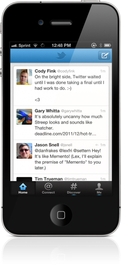
That gorgeous app up above? That’s the next-generation Twitter app. Twitter 4.0 melds Twitter’s brand new web experience with your mobile phone, making it easier to discover and share information that matters most to you. Conversations, your activity feed, stories and trends have now been given focus in four new tabs that make Twitter more accessible than ever before.
What’s New with the #NewNewTwitter for iPhone?
Twitter 4.0 is a complete redesign of the previous generation Twitter apps. The interface is simply pleasant. Gone is the aging UI and pinstripes reminiscent from iOS’ early days. In its place you won’t find any clever embroidery or mishmash of textures. Instead, muted yet colorful blues, grays and blacks offer a soft appeal. Sharp tabs and action buttons are eye-catching and provide direction. Twitter’s new iPhone stylings are very inviting.
And how cute is the feathered quill pen for composing messages or the birdhouse for reading your timeline? Details!
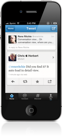
If you don’t first notice the named tabs, you might notice the removal of the swipe-to-reveal tools gesture that was introduced with Tweetie. The love—hate relationship with Twitter’s focus on simplicity begins here for many. A single tap replaces a single swipe. The tweet details view reveals the reply, retweet, star, and action buttons you’re familiar with. Interestingly, you will also see replies, retweets, favorites, inline pictures, and where the tweet fits into a conversation where applicable.
Is the tweet part of an ongoing conversation? Above the tweet you’ll find the tweets replied-to. Below the tweet you’ll see responses to the tweet from fellow Twitter users. Context!
If you think a tweet is garbage, you can promptly delete it by selecting your tweet and tapping on the trashcan. You can also undo a retweet by trashing it as well.
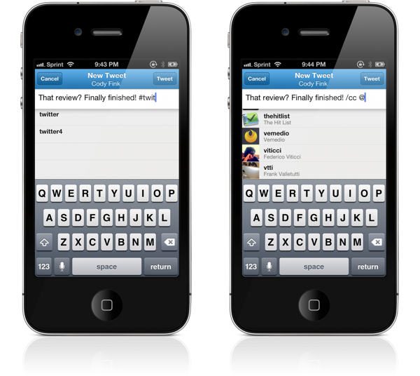
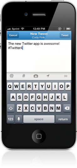
Composing a tweet? Simply tap on the quill pen at the top right of the interface (the feathered quill pen changes to a pencil when composing a direct message). Above the keyboard you’ll find @username and #hashtag symbols to mention someone you follow or choose from a popular hashtag. As you type an @username or #hashtag, the compose window will help autocomplete your entry. You’re given the choice to take a photo or choose one from your library, which will be uploaded to Twitter’s service by default (this can be changed in the settings). Optionally, you can add your current location to tweets by tapping on the navigation marker.
Mentions and activity around users that interact with you are now found in the Connect tab. The Connect tab displays interactions and traditional mentions. Interactions are very similar to mentions except they show retweets and favorites in realtime (similar to the Activity Streams that were recently rolled out). The user search at the top will quickly find tweets about a @username you might see on a news channel, in a magazine, on a billboard, or on a store advertisement. If it’s not apparent yet, the new Twitter is bringing all sorts of useful information into the foreground.
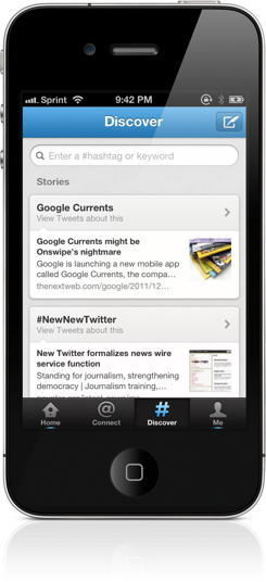
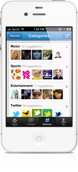
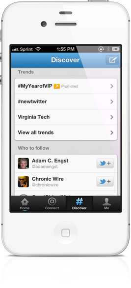
Perhaps the biggest change revolves around how Twitter handles Stories and Trends. A new Discover tab puts Stories around popular topics you might be interested in front and center. (Shout out to The Next Web for being in one of my Stories for Google Currents!) Popular local Trends on the other hand are revealed as you scroll down. A “Who to follow” section helps new Twitter users unearth interesting people related to the persons and topics they already follow. Also of interest could be Categories, which brings forward big names who fit into interests such as Music and Sports.
The Discovery tab, integrating keyword and #hashtag searching, looks like it will give Twitter the opportunity to promote, advertise, and help Twitter users connect with their favorite brands. I’ll talk about why I think this is a good asset a little later in the review.
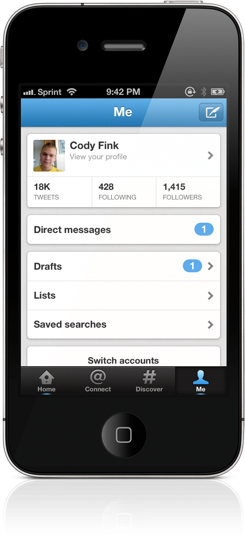
The Me tab is all about you, providing access to your profile, Direct messages, Drafts, Lists, and Saved searches. Direct messages haven’t changed much (although swiping to delete individual messages looks funny). Lots of Twitter for iPhone users lament the Direct messages change as it’s no longer available as a tab, but you’ll find a shortcut in the Gestures section of this review that avoids the extra tap.
Viewing your profile opens up the option to edit your profile information. As before, you can edit your name, website, location, and bio information. A small bug: long bios may look squished in the profile editor.
Back in the Me tab, Saved Drafts contain your incomplete tweets. If you compose a tweet and decide to cancel before you finish, you’ll have the option to save a draft or to save the tweet to Birdhouse if it’s installed. A numerical indicator lets you know how many Drafts and Direct messages are waiting for you.
Lists and Saved Searches are self explanatory. However, adding users to a list and creating saved searches are currently unsupported in the app. It is worth mentioning that in the case of Lists, you can also view which lists followers have made you a member of (instead of just the lists you’ve created).
In the Settings you’ll find you can tweak notifications (including only being notified about mentions from people you follow) and whether you want to be notified about Direct messages. You can choose various image and video services from most of the major players except CloudApp. Instapaper and Read It Later services are integrated, and I’d love to see Twitter add Readability in a future update. Image quality and sound effects can be adjusted as well.
Gestures for Power-Users
As with previous versions of Twitter, there are gestures that have been included as shortcuts to commonly used actions.
- Swiping up on the Me tab will bring up Direct Messages. Boom!
- Swiping left from the Me tab will bring up your Accounts.
- Tapping on a title when composing a tweet lets you switch accounts on the fly.
- When navigating, tapping on the tab you’re in brings you back to where you started.
- Tapping on a tab again takes you to the top!
#LetsFly! Twitter is for Everyone
Taking away and changing features is always going to upset users, but the new Twitter packs in a lot of impressive features that are thoughtfully implemented. Take the tweet details view for example. All in one space exists a conversation thread, replies to a tweet, and who retweeted it or marked it as a favorite. Amazingly none of this looks cluttered.
Maybe conversation threads aren’t perfect yet. There were times when Twitter 4.0 wouldn’t load the entire conversation or catch it at all. But when it works it’s excellent. Keep in mind Twitter 4.0 is the first iteration of the #NewNewTwitter; it’s not like Twitter can’t or won’t be improved.
The Connect tab smartly filters between mentions and interactions, resolving the need for separate favorite or retweet views. It’s those kinds of things that interest me — shortening navigation and condensing information as much as possible while keeping the experience user friendly. The thing I appreciate about this version of Twitter is that I never feel lost or disinterested in the app. There’s this consistent feeling of flow and moving forward.
Then there’s the Discover tab. It’s become the center of discussion in a lot of conversations, with many leaning on the idea that it only exists to push Twitter’s promoted tweets. Honestly, I think the intentions are good natured.
“People don’t care about trending topics.” Not exactly. Power-users don’t care about trending topics. The #dickbar was upsetting (speaking for myself) not because of the trending topics themselves, but because it was out of place and intrusive. I don’t think the Discover tab is close to being the same thing. The majority of Twitter users actively engage and contribute to trending topics all of the time. Even if the topics aren’t always related to important real world events (sometimes they are nonsense and offense), the fact is trending topics reveal what people on Twitter are currently talking about.
“Power-users were the early adopters. Shouldn’t the focus be on them?” Look at how big Twitter has gotten in the past couple of years. You can’t turn on a news channel without seeing an @username or a #hashtag. Public media organizations are asking their audiences to engage with them online. People are joining Twitter all the time and I think the big question for them is, “What do I get out of this?” The Discover tab is an answer to that question. Twitter is trying to eliminate that initial feeling of being lost. It’s for users who are discovering that Twitter is much more than sharing status updates. It is really about consuming and finding information you’re interested in. Surely it remains to be seen if Discover is the right solution, but I think it’s a step in the right direction.
“I want choice! I don’t want to see the Discover tab!” I think there is an expectation that Twitter’s official app should have the most useful features out of all the apps in the ecosystem. Twitter should set the bar and bring new ideas to their platform, but it has to be careful not to alienate the majority of its users. So what you’re going to see is an app like this: something that’s in-between the minimalist features of Twitterrific or Twittelator Neue and power-user friendly apps like Echofon or Tweetbot. Twitter is providing the features it feels are core to their experience. With the 4.0 update, I think Twitter has introduced some compelling ideas, while retaining its appeal for casual Twitter users.
Twitter’s ecosystem extends beyond Twitter itself. Power-users should seek out third party apps because Twitter didn’t build the app for you. Twitter was built with everyone in mind.
Discover is supposed to get better over time. Depending on where you’re located, who you follow, or what topics you find interest in, Discover aims to offer suggestions around those things. Even as a seasoned Twitter user, I found some of the “Who to follow” suggestions relevant to my interests. For example, what tech geek reading this blog wouldn’t want @coudal or @khoi as suggestions? Discover brought up Stories related to Google Currents and #NewNewTwitter. It’s too soon to tell, but everything so far seems to be on par with what I would want to read about. Imagine how useful this utility will be for newcomers who’ve only begun to follow their friends and a few of their idols? They’ll always be connected to new or relevant people and Stories. Twitter wants to keep new users engaged, and this is how they’re doing it.
Twitter is All Grown Up
Twitter 4.0 is Twitter in its purest form. This says a lot about what you’ll find in the app and on the updated website as it rolls out in the coming weeks. There is finally the much needed congruency that was absent between web apps and the native Twitter apps. That makes me really happy — my biggest complaint about Twitter has been addressed with this update.
The core Twitter experience hasn’t changed. We get anxious when services we love stray from the beaten path, but Twitter mediates the needs of its existing users with those of new users by simplifying the underlying conventions we’re familiar with. In return, power-users are given new gestures and conversation threads that just magically appear with tweets we want to address. New users are easily introduced to the @username and #hashtag concepts with Connect and Discover. Twitter 4.0 was made for everyone. The #NewNewTwitter is Twitter grown up.
You can download Twitter 4.0 for the iPhone from the App Store.


