As a lover of great interfaces, I’m constantly searching for developers who are passionate about displaying common content in new, attractive ways. This is sometimes easier (when it comes to photography or written content for example) but in some cases it can be very difficult and exhausting. Over the years I recognized that this is especially true for stock information and data. There is not much less sexy than linear diagrams and percentage data. You need a very good taste and, even more importantly, a perfect sense for balancing information and design in data visualization to create a functional and exiting product in this area. The developers at Visible Market Inc. definitely meet these requirements when you look at their app StockTouch for iPad.
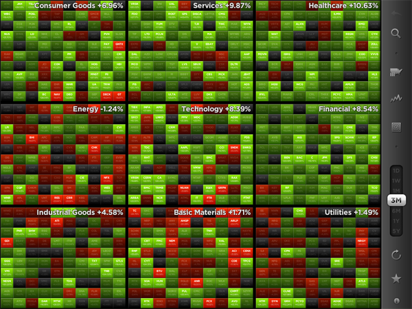
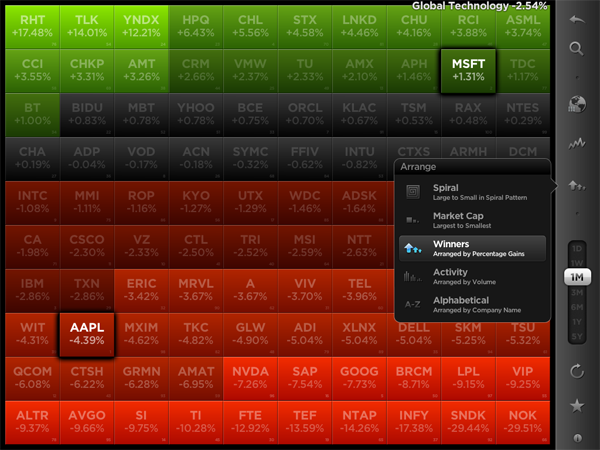
The app displays the stock value information of the Top 100 companies from 9 industrial sectors (e.g.: technology, energy or health care). You can display their percentaged price change, volume and price change relative to the S&P 500 or the average change of the sector they belong to. Additionally, you can search for specific stocks and set them as favorites, which are then subtly highlighted. To filter this information even more you are able to choose between their global or U.S. value and arrange them in 5 different ways (in a top/low spiral, largest to smallest market cap etc.) — which brings us straight to the app’s concept of data visualization.
All these features and filter possibilities are integrated into a sidebar and get visible via pop up windows if you touch the respective pictogram. The actual stock data occupies the rest of the screen. The app’s main window presents you all 9 sectors in commensurate rectangles, which are headlined with the sector description and its overall percentaged change. StockTouch works with visual layers. By pinching or tapping one of the sectors, it zooms in and you can take a look at the sector’s “member companies” and their overall change within the set timeframe — again presented in a field of rectangles containing the different companies and their current stock value or change.
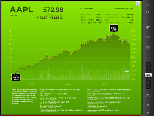
To visually underline the current value and its position in the respective sector, positive change is signalized with different shades of green; more or less stagnating stock prices are black and those falling can be identified by their red background colors. This intelligent and subtle use of colors makes it very easy to quickly analyze the overall changes of a sector, the stock market in general and, to a certain extent, also encourages the user to dive deeper into the information StockTouch has to offer, embodied by the third layer: the line chart of a single company’s stock value, available by tapping on a single stock within a sector.
The style of displaying the course of a single stock shows the second immense quality of StockTouch: its perfect use of visual and especially typographic hierarchy. Again, the background color indicates the general direction of the stock value’s course; but the real innovative solution in this part of StockTouch is the way the related numbers and information are organized and presented. At the top, using white space and different font opacity, the relevant data like the current stock value or the company’s position within its sector are easy to identify and read. Below the chart you get a short description of the company’s profile and the possibility to check several current newspaper articles about it which can be opened in an integrated (not very beautiful) web browser. But overall, the whole interface is modern, unique and intuitive at the same time.
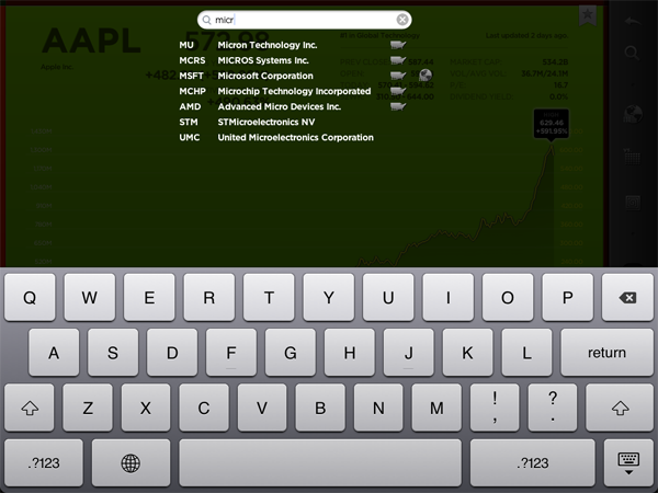
Concerning the overall UX of StockTouch I think there are some small lacks in intuitive use though. For example, it is not possible to swipe left or right to move to another sector or company: you always need to zoom out completely, and then select the information you want to check. Furthermore, although the search feature is performing very fast, the results are listed way too small and you often unintentionally tap the wrong stock (which definitely can be avoided on a screen that large). StockTouch also features unobtrusive sound design while browsing through the stock data, but although I personally like the sound effects very much, the developers should at least have provided the option to turn them off — which is not the case here. In fact, the app does not offer any preferences at all, a move which surprised me bit, to be honest.
But nevertheless I became a fan of StockTouch immediately after firing it up for the first time. It is the product of a deep love for good design and unique and interesting data visualization. I absolutely recommend it to anyone who seeks for an easy way to monitor the stock market and has a taste for good interface development. StockTouch is available on the App Store as an universal app for $4.99.


