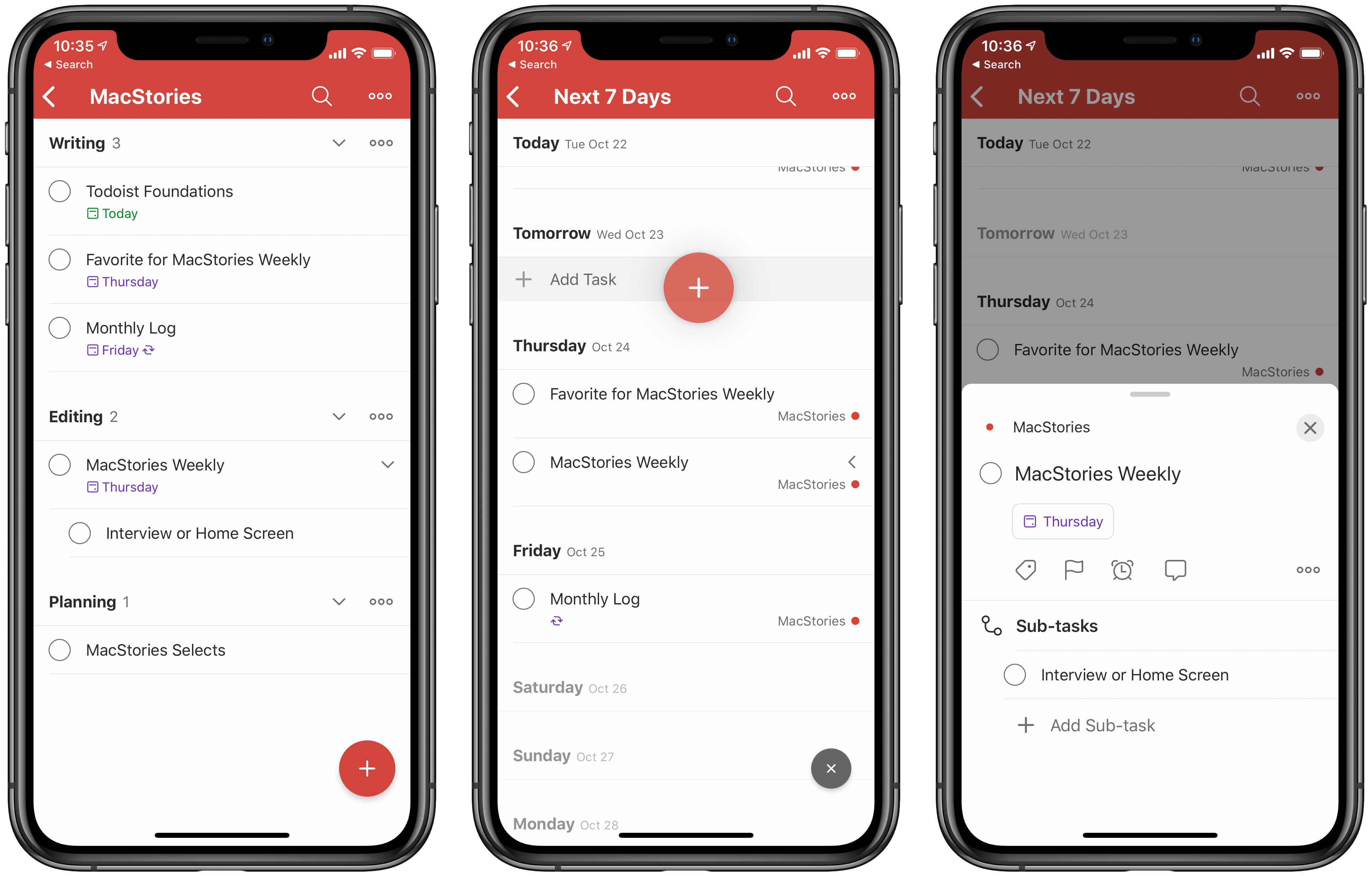
Today Todoist has launched a major update across all platforms under the branding Todoist Foundations. That name implies a complete ground-up revision to the app, and while that’s accurate in terms of under-the-hood code changes, from a user-facing standpoint this is still the Todoist you know, but with a variety of new features: project sections, a dynamic add button, new task and sub-task views, and more. Todoist’s team also says that Foundations lays the necessary coding groundwork for more substantial features that are coming in the future, such as Boards and an Upcoming View.
Todoist didn’t need a big rethinking, but what it did stand to benefit from was design enhancements and streamlining that makes everything quicker, easier to use, and more flexible, and that’s exactly what this release brings. If you haven’t tried Todoist in a while, Todoist Foundations is a compelling reason to give the task manager another try.
Sections
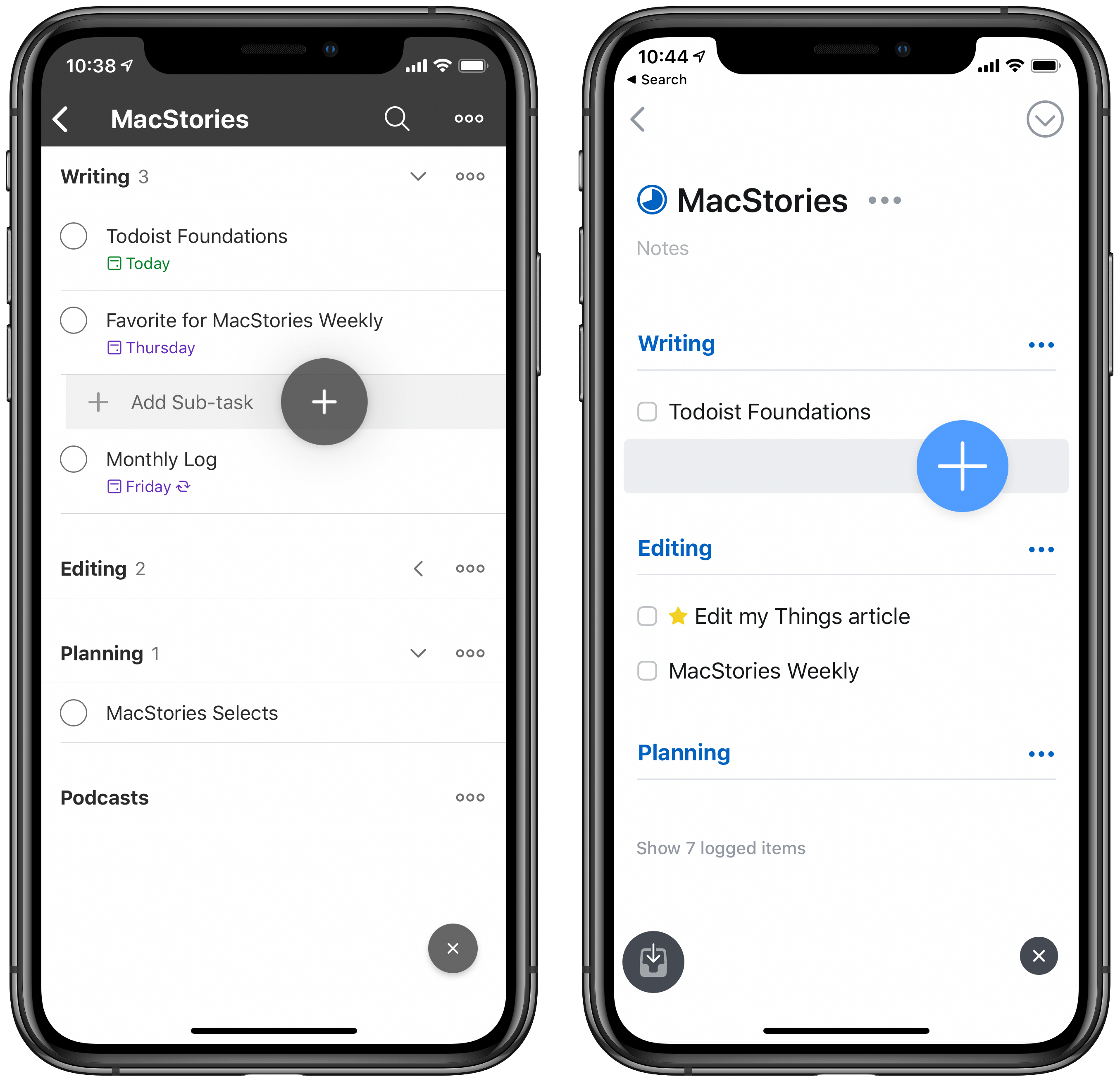
One of my favorite additions to Things when its big version 3 update launched was that you could add headings to your projects, enabling a new level of task organization. Sections are Todoist’s take on the same concept, but with one added bonus to them.
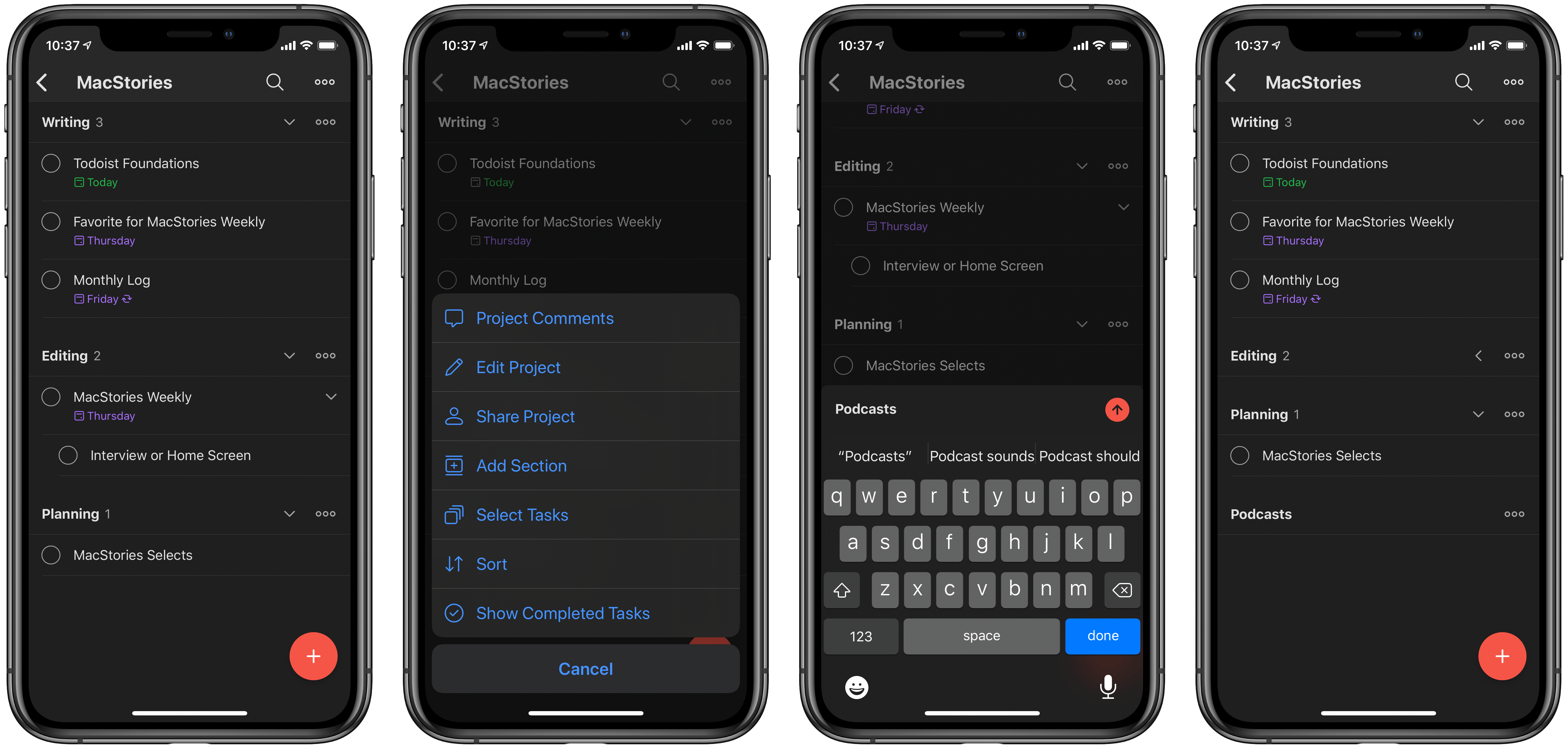
When viewing any project in Todoist, tapping the triple-dot icon will reveal the option to add a section to that project. Sections can be reordered within a project via drag and drop, and you can drag and drop your tasks too as an easy way to sort them under a given section. Like in Things, sections are strictly a visual organization aid, they don’t actually impact a task’s metadata; this means, for example, that when viewing a task inside the Today or Next 7 Days lists, you won’t see any information about which section a task is sorted under, only the project it’s assigned to. Personally, I would have appreciated an option to see section information from within those other pages too, but even without that sections remain a valuable tool inside project views.
Though sections largely serve the same purpose as Things’ headings, they offer one functional benefit you won’t find in Things: they can be collapsed or expanded. Every section includes an arrow you can tap to either show or hide the tasks it contains. I’ve found this a key addition so you can see only the tasks you want to focus on at any given time. If, for example, you create sections for a project based on the different ordered stages that need to be tackled, it could be a significant focus aid to hide future stages while keeping them close at hand for reference.
Dynamic Add Button
Also clearly inspired by Things 3, the button for adding new tasks in Todoist can now be picked up and dropped into the exact place you want that task in your list or project. I find this especially handy in the Next 7 Days list, where the Dynamic Add button is an easy way to assign new tasks to a specific due date, but it also works great in projects, especially in conjunction with the new sections feature.
Just as sections add one useful enhancement over their Things equivalent, Todoist’s Dynamic Add button offers one nice ability not found in Things: you can use it to create both tasks and sub-tasks. When adding a task to a project, you can drop the button in an indented position under another task to see that it will be dropped as a new sub-task. Oddly, this only currently works inside projects and the Inbox, not in the Today and Next 7 Days views, but I hope that changes in a future update.
New Task Views
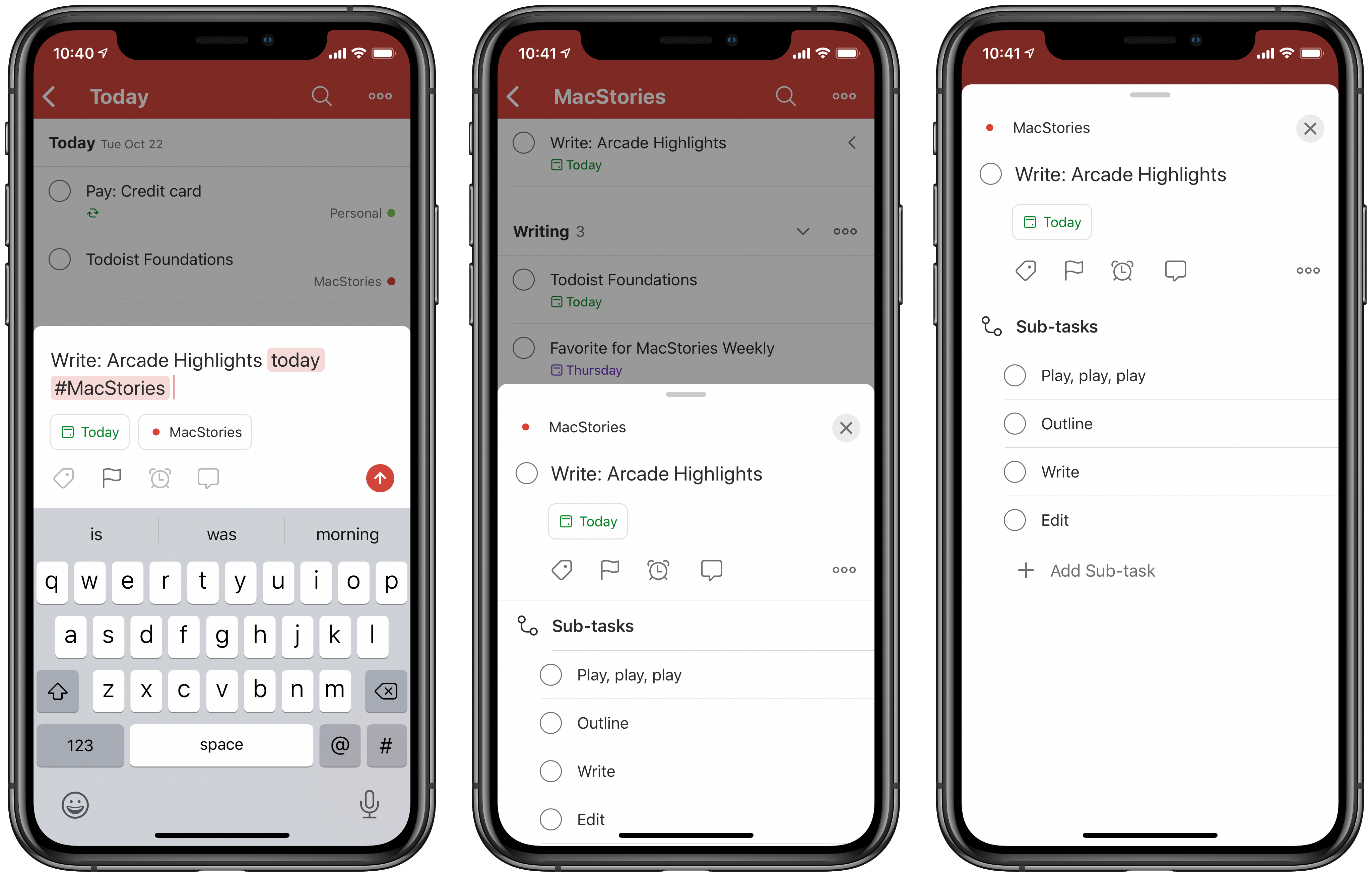
Todoist has newly improved views for two key task screens. When creating a task, the redesigned Quick Add view makes date and project more prominent than before, while still offering access to other options like flags, comments, and labels. For existing tasks, tapping them loads a fresh task view which pops up from the bottom of the screen on iPhone as a modal card, while on iPad it slides in from the right side of the screen. Like the Quick Add view, the updated task view makes key metadata more prominent and everything easier to understand; it also features a dedicated Sub-task section, where you can add and view all sub-tasks associated with that task. I really like what Todoist has done with its new task views: by emphasizing the most important options via design adjustments, they’ve made each view simpler to use while simultaneously, in the case of the new sub-tasks section, adding new functionality.
Shared Labels
Todoist has long offered an excellent shared projects feature for collaboration, and now the app will apply that functionality to labels too. Whenever a task in one of your shared projects has a label added to it, you’ll see that label in a new Shared section of your labels list. This makes it easy to keep track of which labels are your own, and which were set by your colleagues.
What’s Missing?
I’m intrigued by the promised Upcoming View and Boards option, but on the more immediate horizon I’m hoping Todoist’s team has iOS 13 feature adoption at the top of its priority list. It’s not uncommon for Todoist to take some time to gain new iOS system features because the app is cross-platform, spanning Android, Windows, the web, and more. However, I’m disappointed that in today’s major release there’s still no support for system dark mode on iOS, not to mention advanced iPad functionality like multiwindow. Todoist does offer its own native dark theme, but it’s not currently integrated with your device’s system setting. Hopefully before larger projects like Boards debut, Todoist can at least begin getting up to speed with iOS’ new features.
Todoist Foundations is proof that the task manager was modern enough already to not need a major revamp, but in the areas that could use refinements, Todoist’s team has done an excellent job. The under-the-hood codebase improvements have also made a notable difference to the app’s performance – it runs quicker and smoother than ever before, though it’s not like it was a speed slouch previously.
By drawing inspiration from other modern task managers, adding key enhancements while simultaneously making everything speedier than before, Todoist has set itself up for a strong future. While I hope iOS 13 feature adoption will come before long, despite its absence the synchronized rollout of Todoist Foundations across a variety of platforms – iPhone, iPad, Mac, the web, and even Windows and Android – makes this an especially impressive release.
If you ever work on non-Apple devices, I can’t think of a better cross-platform solution to recommend. But even if you’re all-in on Apple, Todoist’s powerful functionality in a clean, minimalistic design makes it a strong contender to be your go-to task manager.
Todoist is available as a free download on the App Store.


