The Metro flavor — that recognizable blend of Swiss minimalism and Segoe typography — is still, by far, one of the most intriguing design languages to be employed. Perhaps Microsoft’s edgy futurist appeal will wear off as Windows 8 PCs and tablets normalize the trend of text driven interfaces, but the current novelty of Metro driven applications continues to leave us entranced and occasionally optimistic about the future of UI design. In stark contrast to skeuomorphic or icon driven designs of iOS and Android families, one has to wonder if Microsoft’s modern brainchild could find itself comfortably at home when integrated with other platforms and without clashing with the native’s traditional mechanisms of in-app navigation and interaction.
The now defunct Zune brand never made an appearance on iOS, and for good reason, but Ender Labs’ Track 8 trendy reimplementation of the Windows Phone 7 music player on the iPad had left us considering if both the aesthetic and function of a Metro designed application could be capitalized on iOS. Track 8 intentionally ignores the conventions of iOS, extending Microsoft’s interface onto the dimension of Apple’s touchscreen displays.
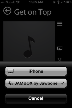
Originally conceived for the iPad, Track 8’s second version (yes, 2.0) delivers a few important enhancements. An AirPlay button is now built into the app, presenting itself only when an AirPlay device is available above the shuffle and continuous playback buttons on the Now Playing Screen. Per navigation, a navigational gripe is resolved thanks to the inclusion of a long press on the back button to return to the main menu. Additionally, artist backgrounds can be restricted to downloading only over Wi-Fi via a toggle in the settings. While all of these additions, especially the long press, greatly improve the Track 8 user experience, it is the app’s Universal signification that denotes the 2.0 convention and Track 8’s appearance on the iPhone.
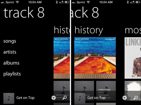
Track 8 isn’t the first Metro styled media player for the iPhone, but I do think Track 8’s strict focus on music is more appealing as separate apps already handle video and podcasting duties. Faithful to Microsoft’s representation of their music player, a vertical list of text for artists, albums, songs, and playlists filters leads into groupings of tiles (album artwork) that provide shortcuts for recently listened-to albums or your most-played music that’s been in heavy rotation. My fondness for Metro aside, the History and Most Played groupings are solely responsible for letting Track 8 replace the default Music app on my iPhone.
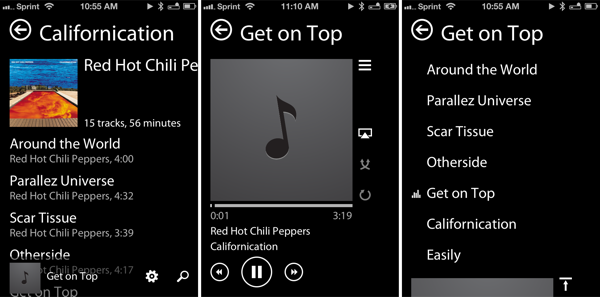
Reformatted for the smaller display, Track 8’s presentation on the iPhone differentiates itself from the iPad app with its portrait orientation. Metro may be in stark contrast to iOS apps in design, yet navigating, searching, or changing settings never felt like a chore. Track 8 does an excellent job of presenting itself in such a way where most (if not all) functions are clearly displayed. The interface might be largely text driven, but the conventions of navigation or player controls aren’t lost in translation. Besides, iOS concepts aren’t devoid in Track 8 — tapping the status bar for example jumps you to the top of a list.
As with Clear, Track 8 makes use of colored (and customizable) elements to signify something you can tap on. Whether it’s album artwork or lettering next to artist names, mostly everything shown on the display can be interacted with in some way. Artist backgrounds provide a bit of flair, although the customizable backgrounds, especially when simply black or white, give a more significant meaning to what’s on the display. The Metro convention lends itself to discovery, as text and album artwork peeking from the sides of the display indicate an opportunity to be pulled closer. Maybe I’m comfortable (and maybe even too forgiving) with Track 8’s grandiosity, but I’m inclined to believe that Metro can and does work intuitively on an ecosystem it clearly doesn’t belong on.
I should add that Track 8 satisfies my requirements for a music player — it hits all of the right buttons as far as what the app provides and what it doesn’t. It’s a music player that includes all of the right sections: songs, artists, albums, and playlists are all you need. Most importantly, I’m not kicked out a tab I don’t want to be in when an album ends (in the Music app, you’re exited to the Albums tab even if you started in the Artists tab). The hierarchy in how information is organized makes sense to me. Per my preference, artist, album, and track names scroll fluidly in lists when their length extends past the edge of the display (you have to tap and hold in the Music app). I’ll reiterate that the album grids under History and Most Played are incredibly useful.
Perhaps the most clever implementation in Track 8 is the inclusion of an opaque mini-player at the bottom of the display. Otherwise empty and unnoticeable (providing a space for settings and search icons), this area fills with album artwork and scrolling text when music is playing. Always present, I think the mini-player (in my opinion) is a much better alternative to the Now Playing button found in other music and podcast apps.
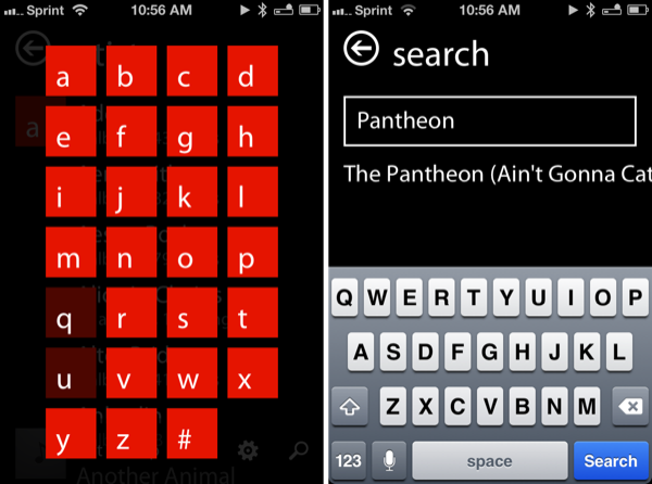
While Track 8 has become my music player of choice, there is room for improvement in a couple of key areas if they can be addressed. Search is only useful if you’re looking for songs. For example, inputting “Bastion” into the search box left me with a blank display — the soundtrack wasn’t found. However, entering “Pantheon” will bring up the album’s ending track. Perhaps searching for, and segmenting, albums, artists, and songs into a view would make search more universally useful. Search performance could be improved upon as well.
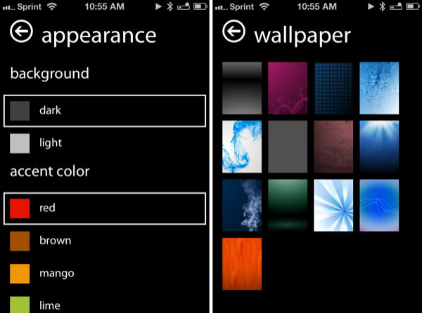
As far as settings go, Track 8 does a good job of keeping it simple. I’m personally not a fan of the included wallpapers (nor do I understand why they’re there), but I think it would be more useful if users could upload their own. Concerning imagery, Track 8 doesn’t display a lot of my album artwork. More often than not, artwork will show up in the mini-player, but not in other views such as the Now Playing Screen.
What made Track 8 great on the iPad was made even better on the iPhone — it’s great that the music player I quickly became accustomed to on the tablet is now available from my pocket. As Federico said in the iPad review, Track 8 doesn’t want to be an iOS app by design, but I’ll say that it does want to be your next music player. It is a little bit of a surprise to me that Track 8 was so widely accepted by the iOS community, but as I came to find out, it was for good reason. Track 8’s foundation might be in Metro, but its application on iOS is certainly deserving of some respect — Ender Labs picked out all of the right elements and successfully applied it to iOS. Some might say it’s a copy of Microsoft’s music app — I’ll call it a quality reinterpretation for iOS.
Users who have the iPad application can simply download the iPhone version from their Purchases through the App Store for free. If you’re just learning about Track 8 or simply interested in the Metro stylings, you can grab it from the App Store for only $1.99.


