There have only been two great Twitter apps for iPad since 2010: Loren Brichter’s Twitter, and the original Tweetbot for iPad.
As I reminisced last year in my look at the state of Twitter clients, iOS apps for Twitter are no longer the welcoming, crowded design playground they once were. Developing a Twitter client used to be an exercise in taste and restraint – a test for designers and developers who sought to combine the complex networking of Twitter with a minimalist, nimble approach best suited for a smartphone. Twitter reclaimed their keys to the playground when they began offering “guidance” on the “best opportunities” available to third-party developers. Four years into that shift, no major change appears to be in sight.
For this reason, I’d argue that while the iPhone witnessed the rise of dozens of great Twitter clients in their heyday, the iPad’s 2010 debut played against its chances to receive an equal number of Twitter apps specifically and tastefully designed for the device. Less than a year after the original iPad’s launch (and the Tweetie acquisition), Twitter advised developers to stop building clients that replicated the core Twitter experience; a year later, they started enforcing the 100,000-token limit that drove some developers out of business. Not exactly the best conditions to create a Twitter client for a brand new platform.
Largely because of the economic realities of Twitter clients, few developers ever invested in a Twitter app for iPad that wasn’t a cost-effective adaptation of its iPhone counterpart. Many took the easy route, scaling up their iPhone interfaces to fit a larger screen with no meaningful alteration to take advantage of new possibilities. Functionally, that was mostly okay, and to this day some very good Twitter apps for iPad still resemble their iPhone versions. And yet, I’ve always felt like most companies had ever nailed Twitter clients for a 10-inch multitouch display.
With two exceptions. The original Twitter for iPad, developed by Tweetie creator and pull-to-refresh inventor Loren Brichter, showed a company at the top of their iOS game, with a unique reinterpretation of Twitter for the iPad’s canvas. The app employed swipes and taps for material interactions that treated the timeline as a stack of cards, with panels you could open and move around to peek at different sets of information. I was in love with the app, and I still think it goes down in software history as one of the finest examples of iPad app design. Until Twitter ruined it and sucked all the genius out of it, the original Twitter for iPad was a true iPad app.
And then came Tweetbot. While Twitter stalled innovation in their iPad app, Tapbots doubled down and brought everything that power users appreciated in Tweetbot for iPhone and reimagined it for the iPad. The result was a powerful Twitter client that wasn’t afraid to experiment with the big screen: Tweetbot for iPad featured a flexible sidebar for different orientations, tabs in profile views, popovers, and other thoughtful touches that showed how an iPhone client could be reshaped in the transition to the tablet. Tapbots could have done more, but Tweetbot for iPad raised the bar for Twitter clients for iPad in early 2012.
Three years later, that bar’s still there, a bit dusty and lonely, pondering a sad state of affairs. Tweetbot is no longer the champion of Twitter clients for iPad, having skipped an entire generation of iOS design and new Twitter features. Tweetbot for iPad is, effectively, two years behind other apps on iOS, which, due to how things turned out at Twitter, haven’t been able to do much anyway. On the other hand, Twitter for iPad – long ignored by the company – has emerged again with a stretched-up iPhone layout presented in the name of “consistency”. It’s a grim landscape, devoid of the excitement and curiosity that surrounded Twitter clients five years ago.
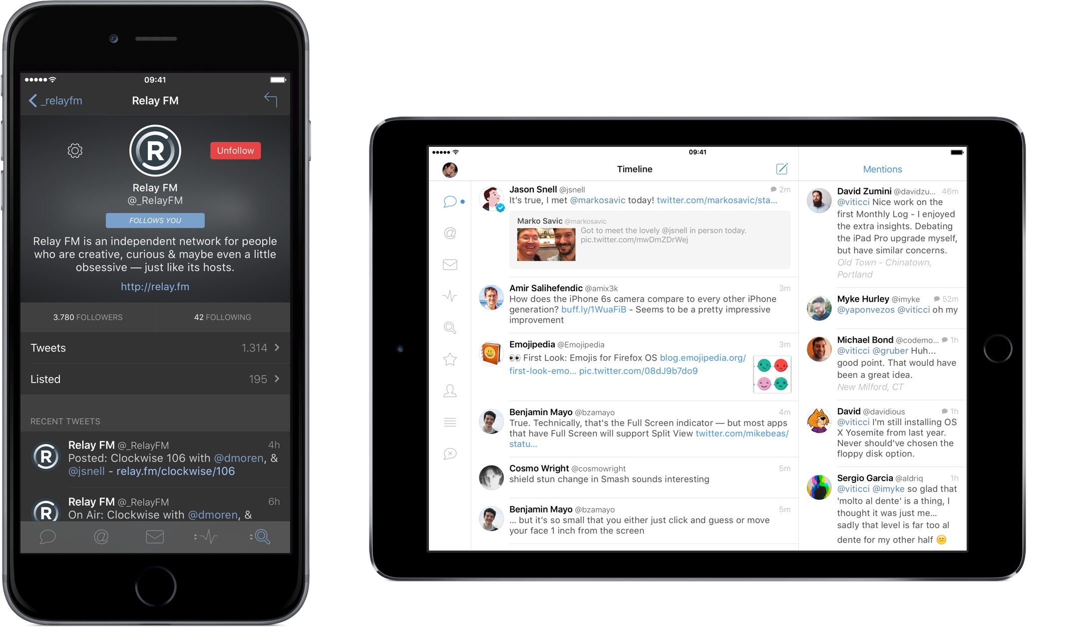
Tweetbot 4 wants to bring that excitement back. Long overdue and launching today on the App Store at $4.99 (regular price will be $9.99), Tweetbot 4 is a Universal app that builds upon the foundation of Tweetbot 3 for iPhone with several refinements and welcome additions.
In the process, Tweetbot 4 offers a dramatic overhaul of the iPad app, bringing a new vision for a Twitter client that’s unlike anything I’ve tried on the iPad before.
Tweetbot for iPad
The tension of the iPad graduating from single-purpose utility to portable computer is stronger than ever in iOS 9. Tweetbot 4 fits right into this discussion with a redesigned app that leverages the bigger screen to see more at once and interact with multiple pieces of the Twitter timeline at the same time.
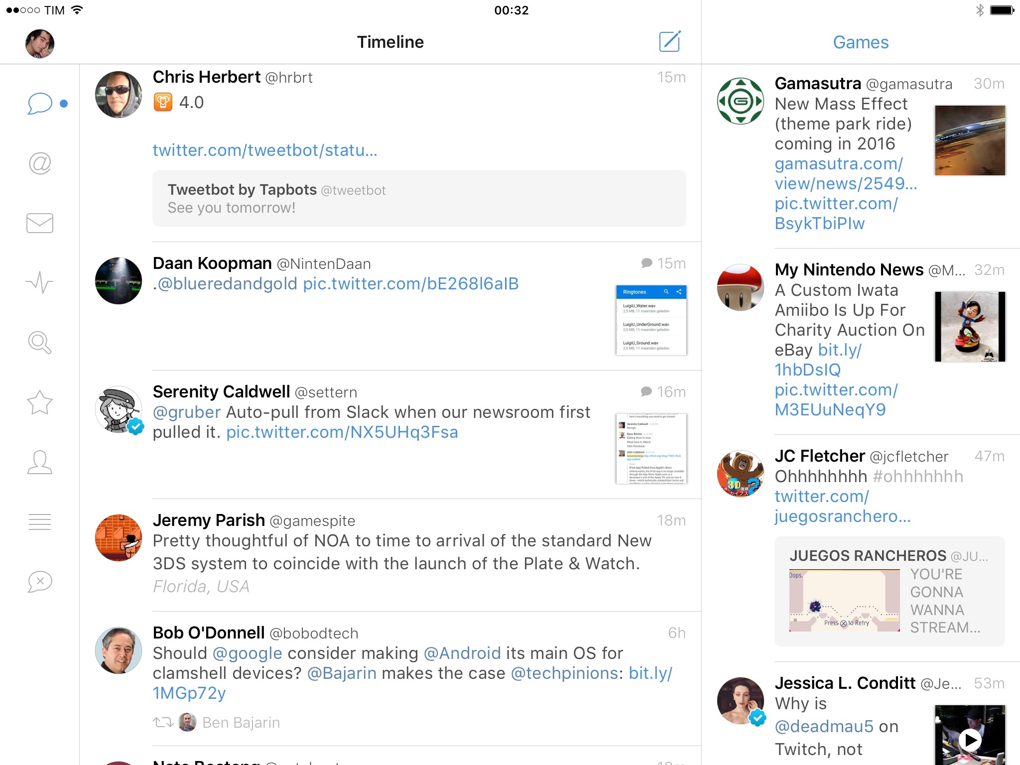
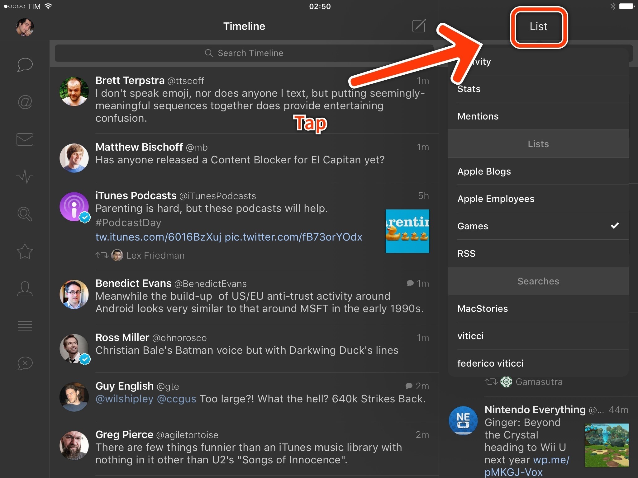
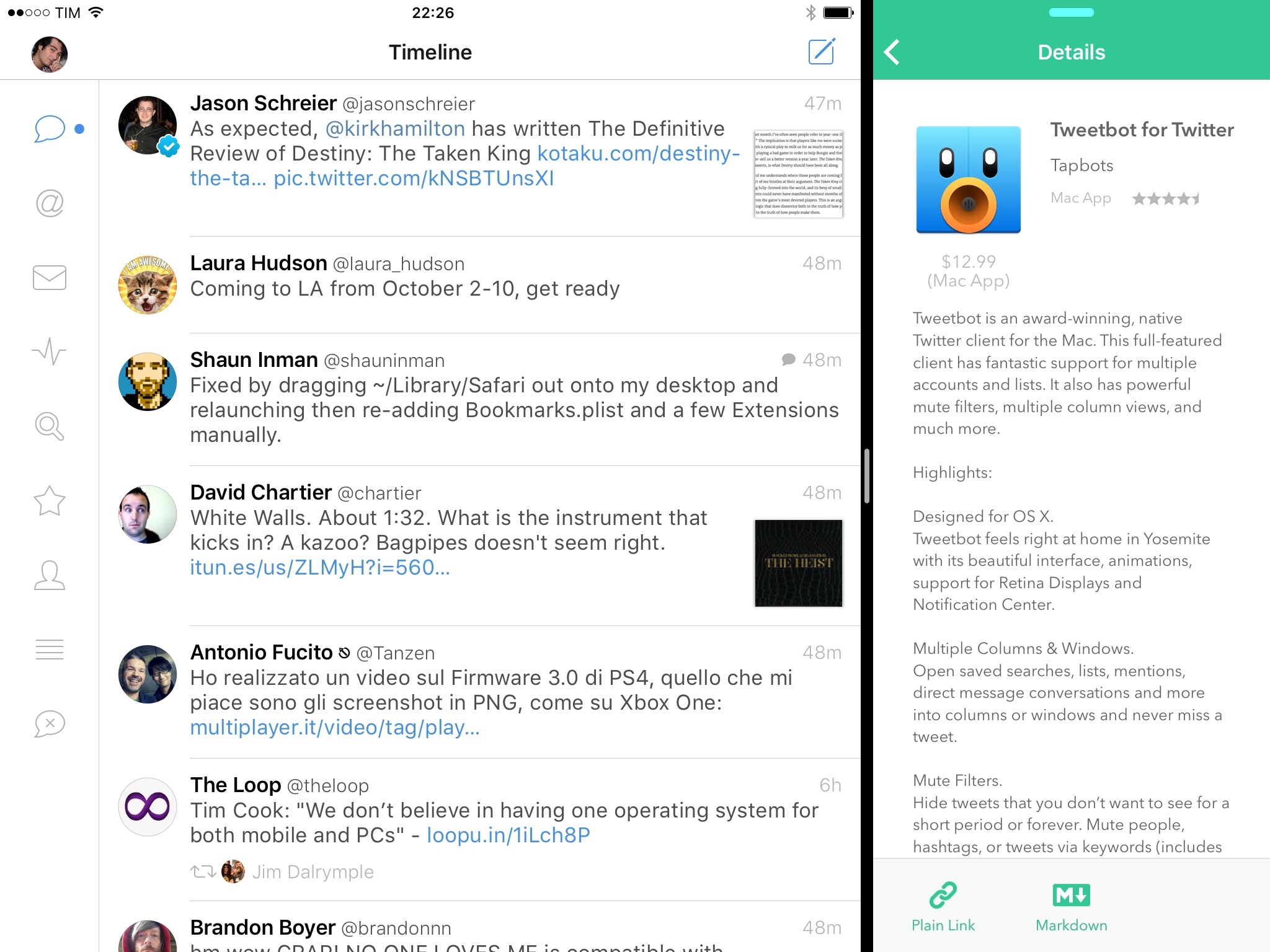
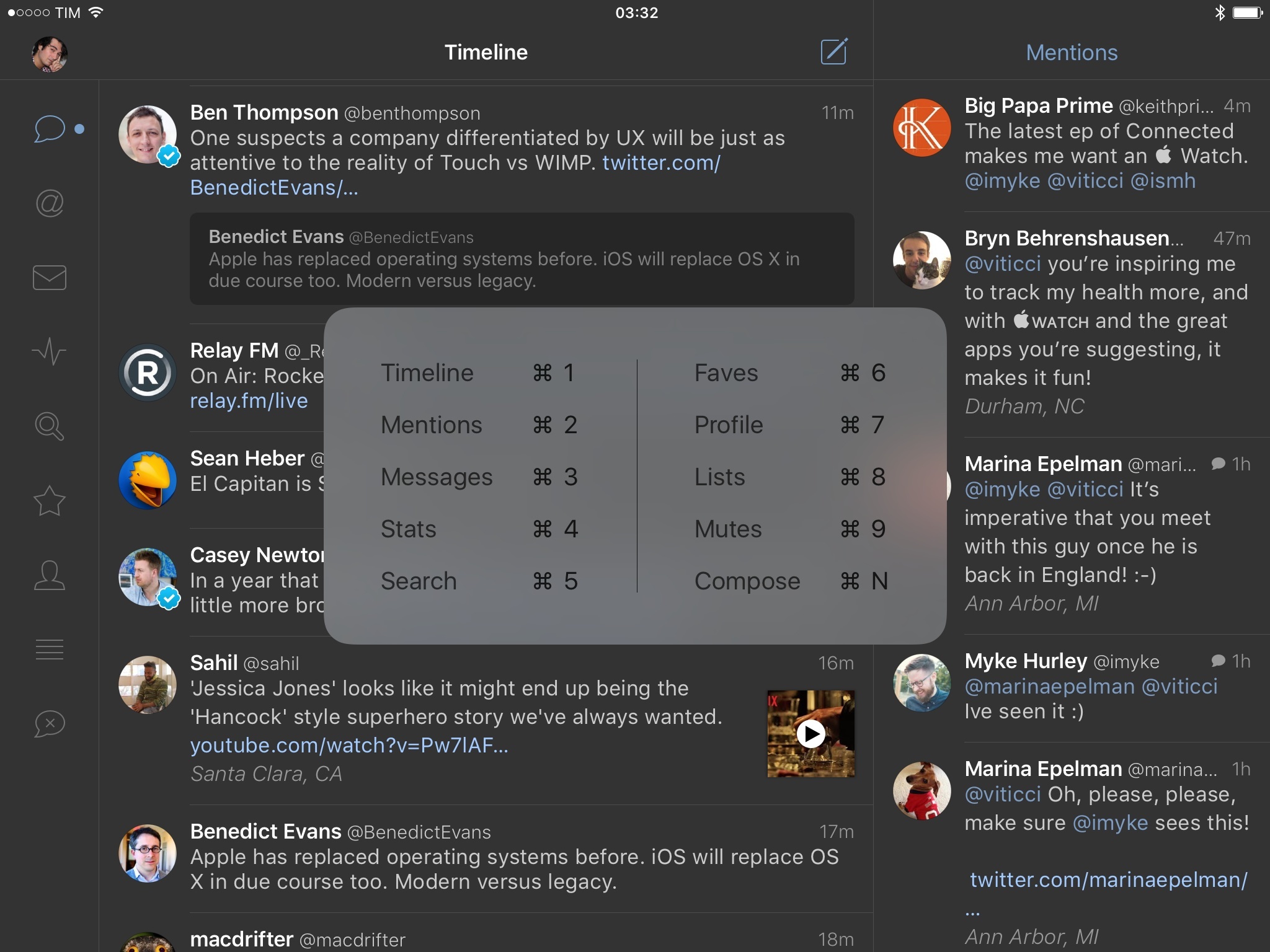
The most notable change in Tweetbot 4 for iPad is a new column view that puts a second column on the right side of the screen in landscape mode. Based on Tapbots’ previous work on OS X, the second column allows you to pin views, lists, and searches for the current account to the right. The column is fully interactive and it lets you move across different sections at any time with one tap.
Column view is enabled by default in landscape mode (it can’t be turned off), and it’s automatically hidden in portrait. Visually, the app borrows from Tweetbot 3, the old Tweetbot for iPad, and Tweetbot for Mac to provide a mix of an iPhone-like interface with a fixed sidebar on the left to move between sections of your account (like Tweetbot 2 for iPad) that, however, only shows icons instead of larger tabs with labels (like Tweetbot for Mac).
From a visual standpoint, Tweetbot for iPad is in line with Tapbots’ redesign of Tweetbot 3 for iOS 7, with light and dark themes that have been refined for iOS 9 and the same set of basic interactions for tweets in the timeline. Like on the iPhone, you can tap tweets to reveal an action drawer; tweets, links, user avatars, and other elements can be long-pressed to open the share sheet or more contextual options. The basics of the app are unchanged from Tweetbot 3, and there are no new settings to learn.
To change the section shown in the column view in landscape, you can tap the button in the view’s title bar. When scrolling the column, you’ll be able to tap above the button in the title bar to go back to the top; this can be hard to do if you don’t tap precisely over the button.
Tweetbot’s new column view feels like Split View for Tweetbot itself, limited to a subset of sections. Like Apple’s take on iPad multitasking, the main view and column view are independent from each other in terms of interaction: you can swipe both simultaneously, and scrolling will remain smooth and locked at 60 FPS in both views on the iPad Air 2. From a technical perspective, Paul Haddad’s work on the column view results in good performance and no hiccups.
Design-wise, the column view has posed an interesting conundrum for Mark Jardine, who’s managed to make its look and function fit with the rest of the app – with some reservations.
Due to size constraints, the column view can’t show the action drawer when tapping tweets, and you won’t be able to swipe left to open the detail view for a tweet either. The former is easy to understand: there isn’t enough horizontal space to fit action buttons. I can speculate on the latter, but I believe Tapbots disabled the gesture to avoid potential conflicts with the Slide Over activation gesture, which is also performed in the same direction from the same side of the screen.
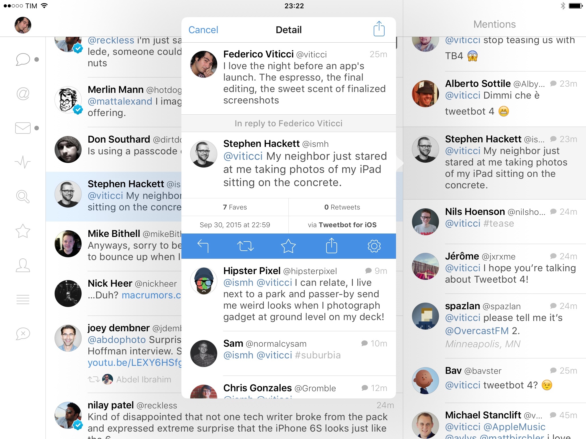
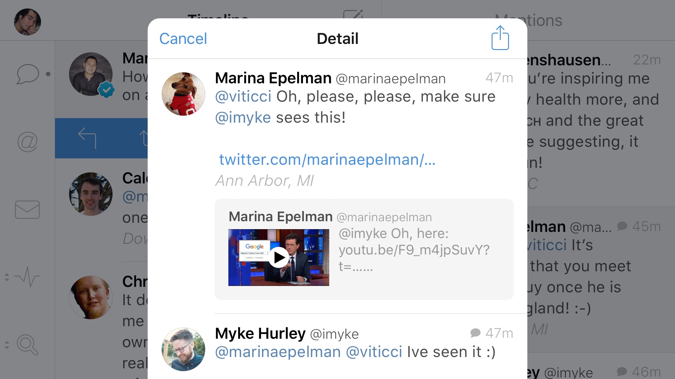
Thus, Tapbots has incorporated the action drawer and swipe left gesture in a single tap that opens a popover for the tweet’s detail view. This way, you can tap on a tweet in the column once to get a popup that packs the tweet, conversation, replies, and actions all together. The same applies to profile pictures, usernames, and hashtags tapped from the column view: they will open as popovers with one tap.
I like the idea of using popovers to avoid having navigation in the narrow column view, and I think it’s a clever way to use the iPad’s screen and to make it easy to get in and out of tweets quickly. I’ve only been confused by having to switch interaction model when moving from the column to the popover: in the column, tweets can’t be swiped to the left, but you’ll have to do that in the popover if you want to open a detail view for a tweet.
Instinctively, I find myself occasionally swiping instead of tapping (and vice versa) when I’m dealing with tweets and popovers from the column view. It’s quite telling that, like the iPad itself, Tweetbot is now dealing with increased complexity and cognitive load in its transition from full-screen content to split layouts. I almost wish there was a setting to always open detail views with one tap from any timeline.
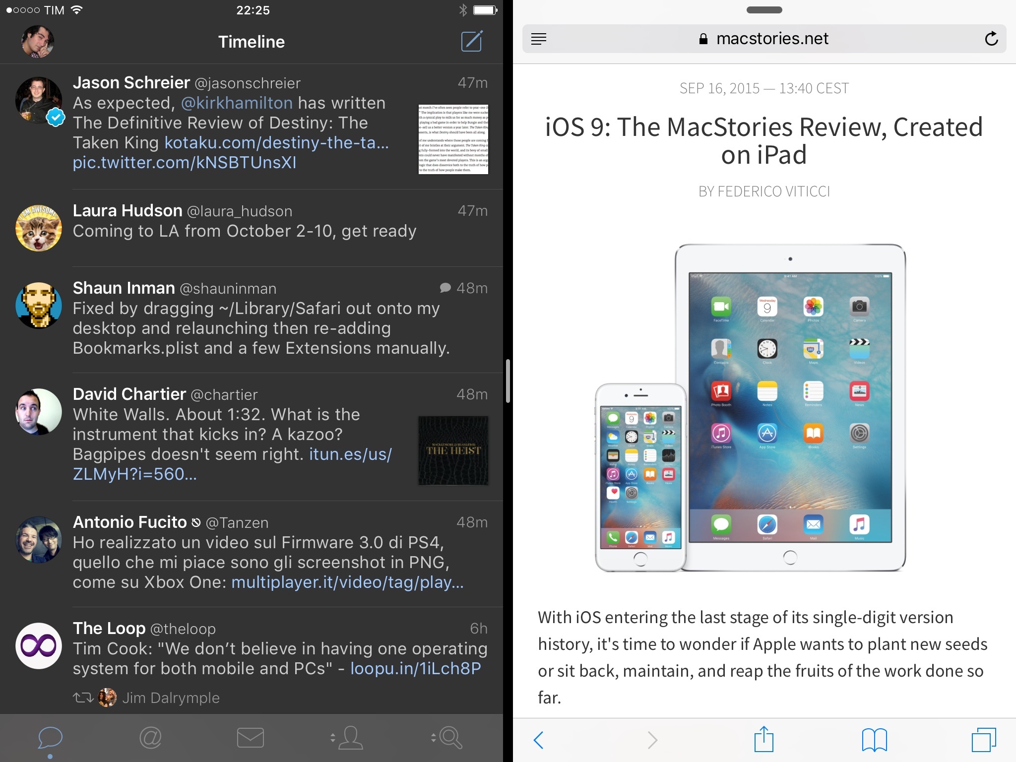
It’s also been interesting to observe how Tapbots rebuilt Tweetbot to react to the new multitasking environment of iOS 9. Tweetbot supports Slide Over: this allows you to open the app in a compact layout which is reminiscent of the iPhone version in that it puts tabs at the bottom and you can long-press them to switch views. In Slide Over, Tweetbot is exactly like its iPhone counterpart, with a taller timeline.
In Split View, the app doesn’t show the second column despite the (possible) space of the 75/25 layout.1 The app switches from tabs on the left to tabs at the bottom when moving to the 50/50 Split View layout. Column view is never available when entering Split View with Tweetbot, and I believe this is the right decision for version 1.0 to not make the app too complex.
Column view isn’t perfect. Non-list or search columns are limited to mentions, stats, and activity; I would have also liked to be able to pin favorites and direct messages to the right side of the screen. I fave a lot of tweets on a daily basis, and I’d enjoy the ability to view them while keeping an eye on my streaming timeline on the left. It seems strange to me that Tapbots didn’t consider the use case for DMs as a column next to the timeline.
Secondly – and this could be a deal-breaker for those who like Twitter clients with multiple columns – the column can’t display sections from other accounts. You’re limited to views from the currently selected account, which, for some people, could hinder the potential usefulness of column view.
I understand why: because the same views are also available on the left, it would be more useful to load up a section from another account on the right. This way, you could monitor mentions to your blog’s account while you’re using your personal account, for example. There would be another increase in complexity when picking sections from other accounts in the column view, but it seems like the next logical step.
Lastly – and I’m mostly nitpicking here – the popover for tweets selected from column view doesn’t always open next to the selected tweet. In most cases, popovers don’t supersede the tweet they’ve been activated from: they’ll be shown on the left side of the tweet, so you’ll retain the context of what’s happening in the popover in relation to the column’s timeline. However, selecting the first or last tweet in column view makes the popover cover the entire column – an issue that should be fixed in a future update.
Despite its limitations and understandable growing pains2, the sheer utility of column view has deeply changed how I use Twitter on my iPad. I tend to use the iPad in portrait mode constantly, but because I spend a lot of time on Twitter discovering links and talking to readers, column view has made me rethink my usage of the iPad in landscape.
With Tweetbot 4, I’ve been using my iPad in landscape more frequently, pinning mentions or the activity stream to the right so I can dive into conversations on one side and stay on top of my timeline on the other.
My favorite use of column view is scrolling mentions in two directions: I can scroll to the bottom and check out old mentions on the right, and stay pinned to the top and keep going with recent replies on the left. This has helped me engage with more readers and be more timely in my response as I can move quickly across different sets of mentions.
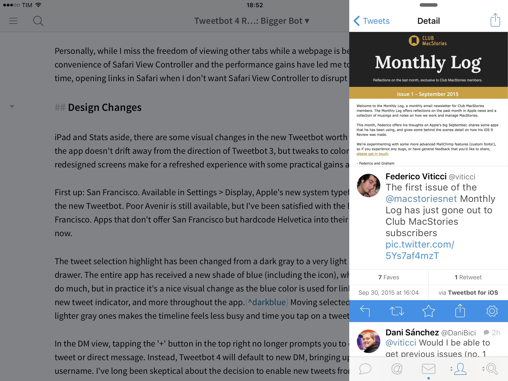
Slide Over Tweetbot. The perfect way to check on those sweet, sweet faves while you’re supposed to be working. (Thankfully, my boss is a very reasonable guy.)
Combined with Picture in Picture, I’ve been using Tweetbot while reading my timeline, monitoring mentions, and watching videos – a testament to iOS 9’s multitasking prowess but also proof of Tapbots’ apt work. Tweetbot is excellent in Split View: keeping my timeline next to Slack and Safari lets me follow breaking news and team updates, saving me the time I would normally spend switching back and forth between Twitter and other apps.
Tweetbot 4 is a must-have for Twitter power users who work from an iPad. The utility of column view is clear: once you see what Tapbots has done with the iPad’s screen, comparing it to Twitter’s prodigy of wastefulness is not even funny. Column view has redefined my idea of what a Twitter client should be capable of doing on the iPad, and I’m curious to see how it’ll evolve.
Some will ask for a way to turn off column view. Personally, I wish I could use it in portrait mode, too.3
iPhone 6 Plus Landscape Mode
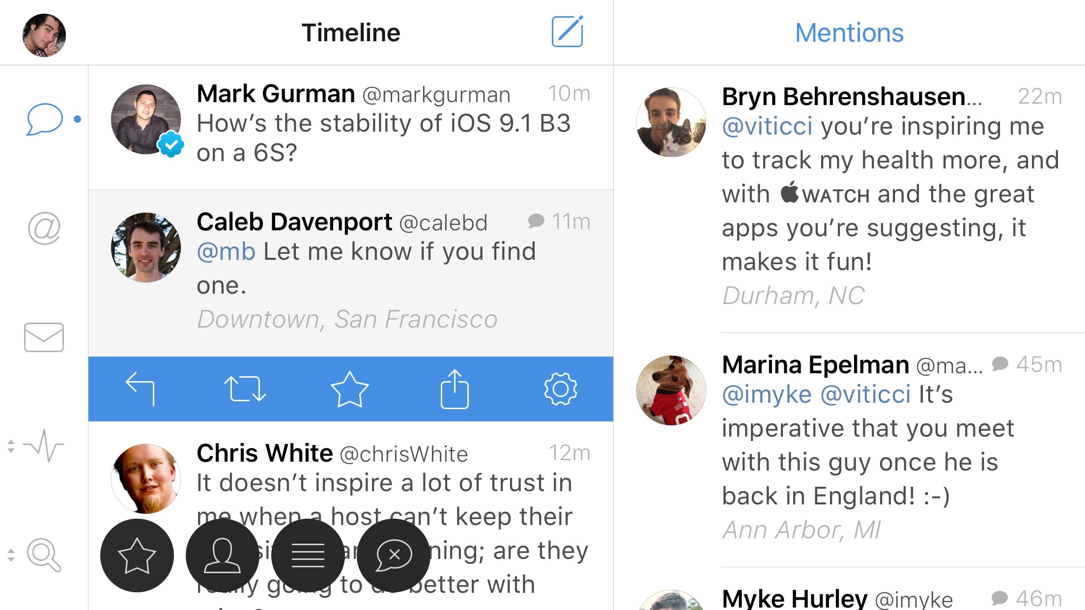
Column view is best experienced on Tweetbot for iPad, but it’s not exclusive to the device. iPhone 6 Plus owners will be able to use column view in landscape mode, which, like on the iPad, puts a second timeline on the right with a popover to switch sections at the top.4
Tapbots had to accept some trade-offs with column view on the 6 Plus. Screen height is the biggest compromise here, with Tweetbot displaying 2-3 tweets in the column view due to limited vertical space. Popovers have also been replaced by modal popups that take over the app in the middle of the screen: their behavior is the same as on the iPad, but they hide the main view and column underneath.
I haven’t used column view on my 6 Plus much for two reasons: when I need to go through lots of links and mentions I just grab my iPad; and, I don’t use landscape mode on the 6 Plus much anyway. But, there have been a couple of occasions in which I couldn’t use my iPad and I had time to browse mentions in column view; in spite of the limited size, I appreciated the ability to pin a second column on the iPhone.
A nice detail that I have to mention: in landscape mode, tabs rotate with the app and are displayed in a sidebar on the left. You can tap & hold them to show the contextual menu for other views, which will animate horizontally instead of vertically.
Keyboard Shortcuts
With iOS 9, Tapbots has added support for external keyboard shortcuts in Tweetbot for iPad. The feature is based on the OS’ improved keyboard integration and Discoverability, which displays available shortcuts based on the view you’re in with a translucent cheat sheet.
There are two sets of shortcuts in Tweetbot 4. In the main view, you can cycle through sections with Command-1/9 (like in the Mac app) and open the compose screen with Command-N. When in compose mode, you can send a tweet with Command-Return or dismiss it with Command-ESC.
Alas, that’s about it for keyboard shortcuts in Tweetbot. You can’t scroll the timeline without touching the screen, and there’s no concept of tweet selection with associated actions.
It would have been nice to interact with the app from the keyboard to select tweets and reply or share with shortcuts. I like that I can change sections and send tweets without lifting my fingers off the keyboard, but I wish Tapbots had done a little more in this regard (such as supporting actions and share when in a Detail view).5
Stats and Activity Views
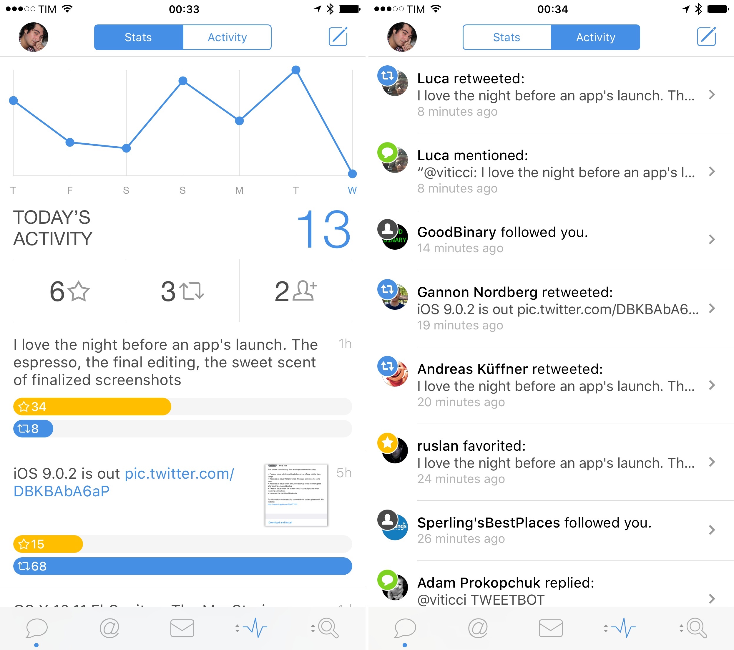
Tweetbot 4 offers two new views to keep track of interactions with your tweets. Called Stats and Activity, these views are bundled in the same page and you can switch between them with a segmented control in the title bar.
Activity is reminiscent of Twitter’s own Notifications tab: it lists every mention, follow, fave, quote, and retweet you’ve received from newest to oldest, and it updates in real time on Wi-Fi. Each interaction is marked with a different icon in the stream, and tapping an item will take you to the relevant user profile or tweet. If you’re looking for a way to view interactions with your tweets in a unified timeline, the Activity stream is a handy addition, and I was surprised to see that Tapbots was able to aggregate quoted tweets as well.
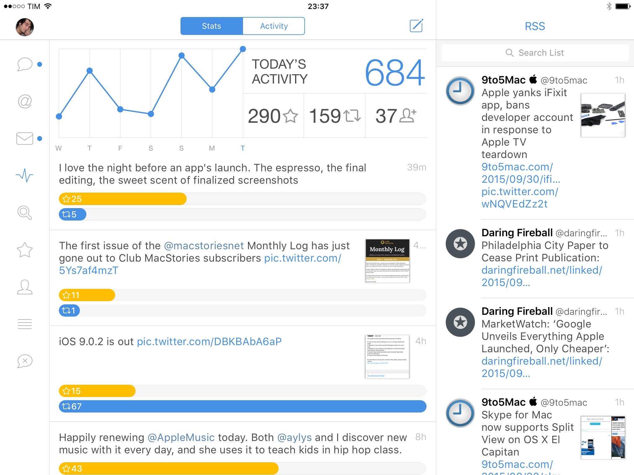
I’ve been more interested in the Stats screen, though. In this page, you’ll get a weekly chart of your daily activity on Twitter with separate counts for faves, retweets, and new followers for the current day. A big, blue ‘Today’ number shows a count of everything reported in the Activity stream since midnight local time, and tweets that have recently received faves and retweets are displayed at the bottom in a scrollable timeline.
I try not to obsess over Twitter stats and followers, but I enjoy the occasional report on how my tweets are doing and if people are responding well to them. The Stats dashboard doesn’t surface all the data that is available with individual tweet statistics in the Twitter app, but it provides the kind of unified visualization that is missing from the official client and which tracks easy-to-understand metrics such as faves and RTs.
The chart, while unable to display data points for individual days, is a nice way to get a visual breakdown of your activity for the past week. One issue I have with it, though, is that it’s not clear what Today means unless you know that it sums up all items from the Activity stream. Also, I would have expected to be able to tap on the followers count to see everyone who’s started following me, but tapping that number does nothing. Once Tapbots resolves these issues, I wouldn’t mind having access to monthly and yearly stats collected from Tweetbot, too.
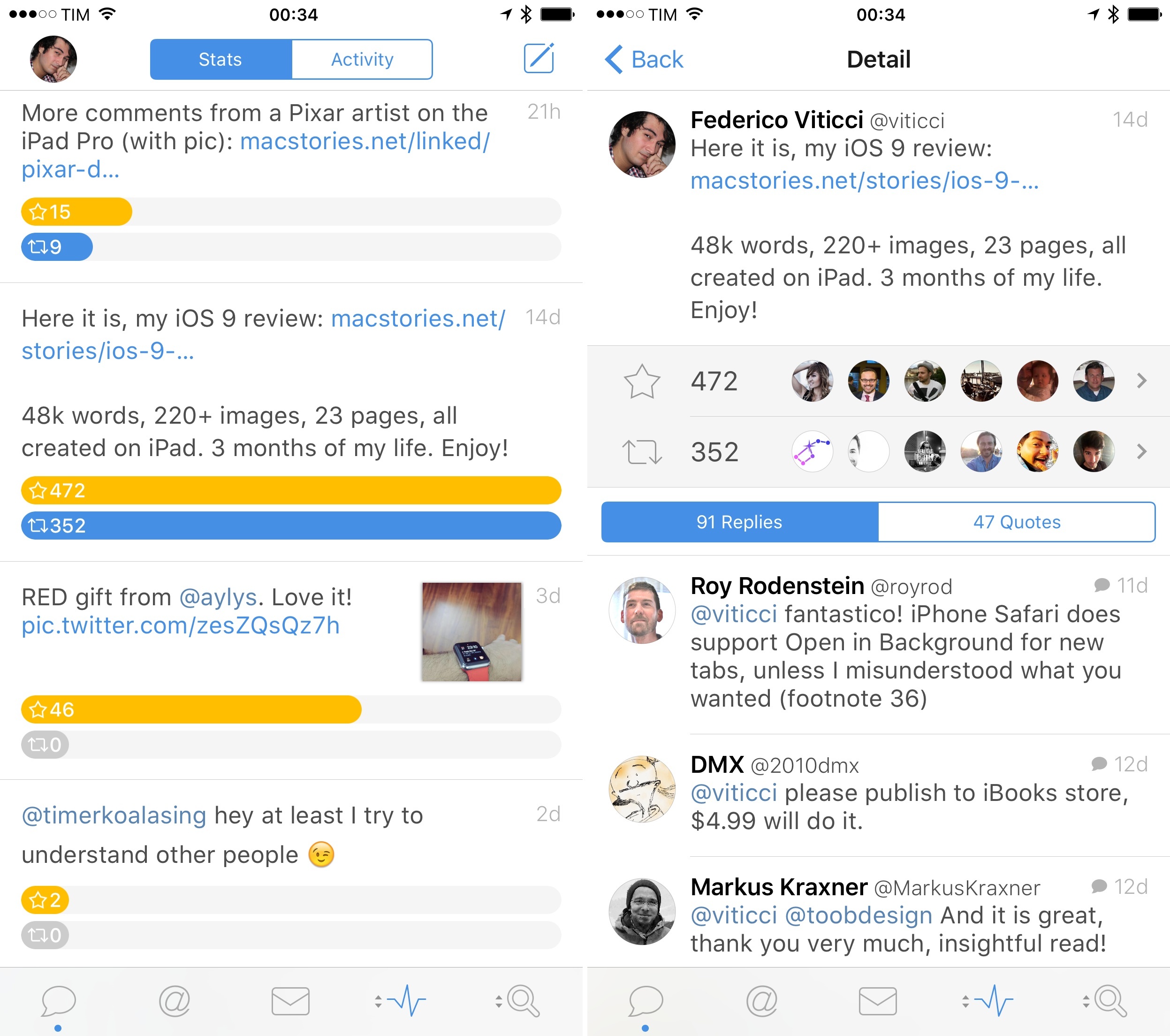
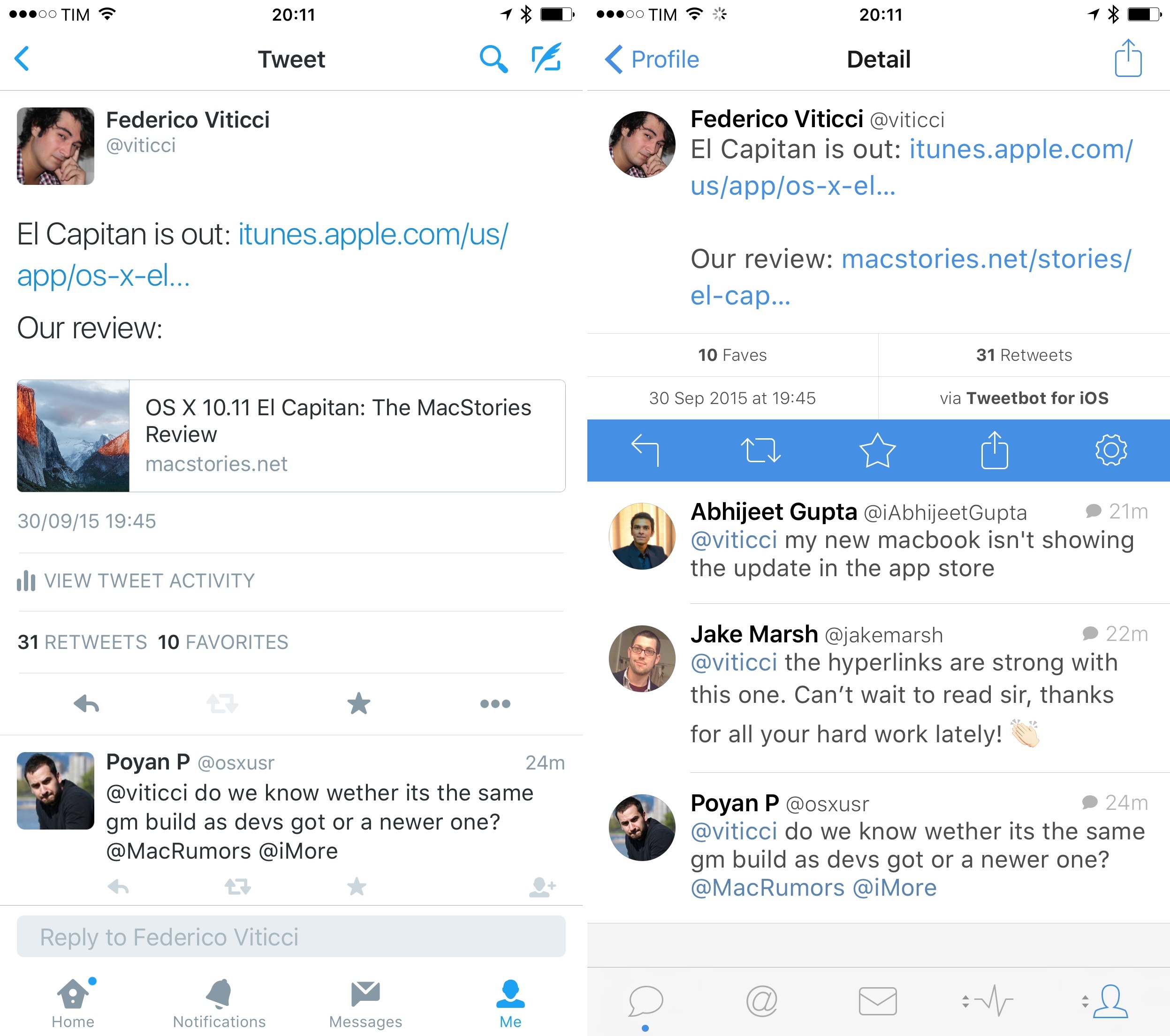
The detail view for tweets listed in the Stats screen is interesting. Tap on one of your tweets, and Tweetbot will show another count for faves and retweets with profile pictures of users who have favorited or retweeted your tweet, plus a list of replies and quotes with tabs at the bottom. I like how information is broken down in this view: retweets and faves are the counts I care about the most, and, thanks to the Twitter API, Tweetbot gives me access to the same counts I see in the official Twitter app with the ability to view all users who have interacted with a tweet.
Replies and Quotes are a handy addition, as I can easily separate mentions from quotes and check how people have commented on my tweets without having to search for them. The Twitter app doesn’t have an option for replies and quotes tied to the original tweet; Twitterrific shows counts, but they’re not tappable, and the app doesn’t offer a reply/quote breakdown either.
As a result, the Stats page in Tweetbot 4 is my new favorite way to check Twitter statistics that matter to me. Faves and retweets are the universal counts that everyone understands; unlike the clicks and “engagements” reported by the official app, they’re not specific to any client and they’re fairly indicative of a tweet’s popularity.6
From a design standpoint, Tapbots has done a good job at logically grouping stats together with tweets, providing a simple yet effective dashboard that looks great and sums up a week’s activity nicely.7 Despite some minor problems, I’m happy that Tapbots has been able to pull this off with the Twitter API, and I’ve found myself checking out the Stats page on a regular basis.
Safari View Controller
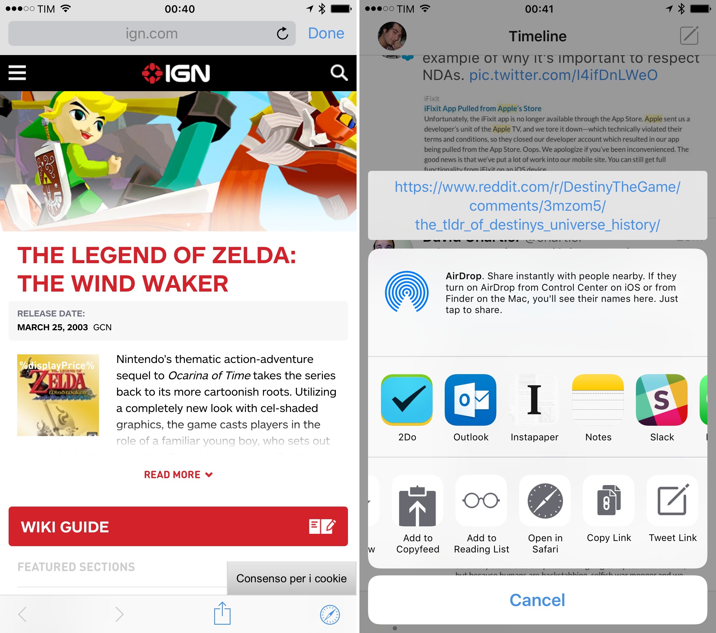
This won’t come as a surprise, but Tweetbot 4 adds support for iOS 9’s Safari View Controller to open links inside the app with an in-app browser based on Safari. Safari View Controller can be enabled by going to Settings > Browser and toggling ‘Open in Tweetbot’.
I’m a fan of Safari View Controller, and I have enabled it in every app that supports it on iOS 9. The speed and usability advantages of Safari View Controller trump any custom browser I’ve tried, and I value the ability to open webpages with the same set of options (such as Reader and Content Blockers) that I’d normally get in Safari.
There’s a disclaimer, though. By enabling Safari View Controller in Tweetbot, you lose the ability to open a webpage in one of the app’s tabs and continue browsing Twitter in other tabs. As I wrote in my review of Tweetbot 3:
Now, whenever you follow a link, a web view will be opened and confined to the tab it’s been launched from. If you open a link from your timeline, you can switch to the Mentions tab and do something else; if you open a link from a DM, you can go back to the timeline and read tweets while the page is loading.
Due to Safari View Controller’s modal behavior that takes over in full-screen on any view underneath, this is no longer possible if you set in-app Safari as a browser option. It’s a necessary compromise to enable Safari View Controller integration in Tweetbot, and there’s nothing Tapbots can do about the system API.
I somewhat miss the navigation freedom granted by the old in-app browser, but the convenience of Safari View Controller and its performance gains have led me to use it all the time, opening links in Safari when I don’t want Safari View Controller to disrupt the view I’m looking at.8
Design Changes
iPad app and Stats page aside, there are some visual changes in the new Tweetbot worth noting. For the most part, the app doesn’t drift away from the direction of Tweetbot 3; tweaks to color highlights and other redesigned screens make for a refreshed UI with some practical advantages as well.
First up: San Francisco. Available in Settings > Display, Apple’s new system typeface is the default option in Tweetbot 4. Avenir is still available, but I’ve been satisfied with the look and readability of San Francisco.9
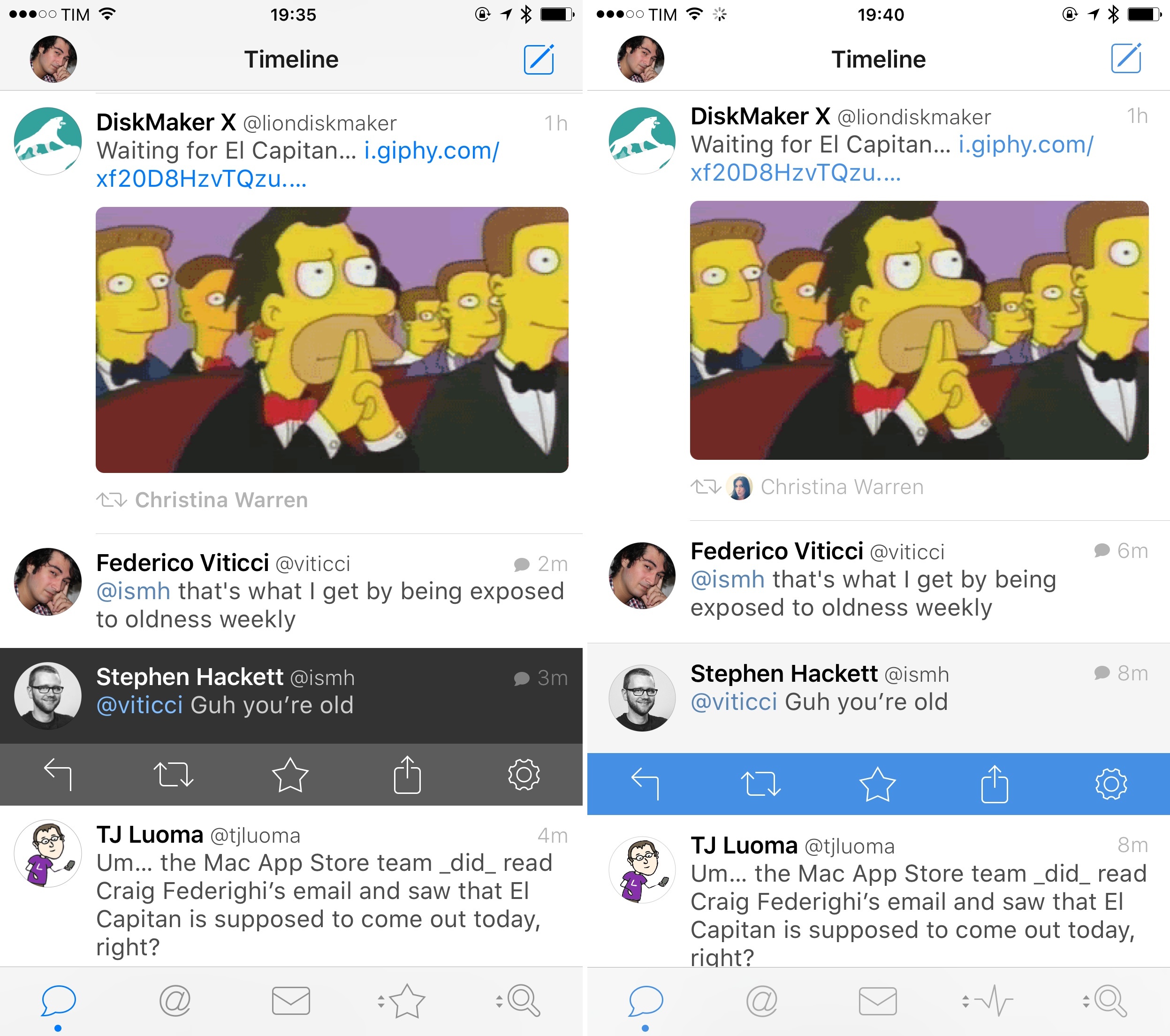
The tweet selection highlight has been changed from a dark gray to a very light gray with a blue action drawer. The entire app has received a new shade of blue (including the icon); it’s a nice visual change as the blue color is used for links, in-app banners, usernames, the new tweet indicator, and more.10~
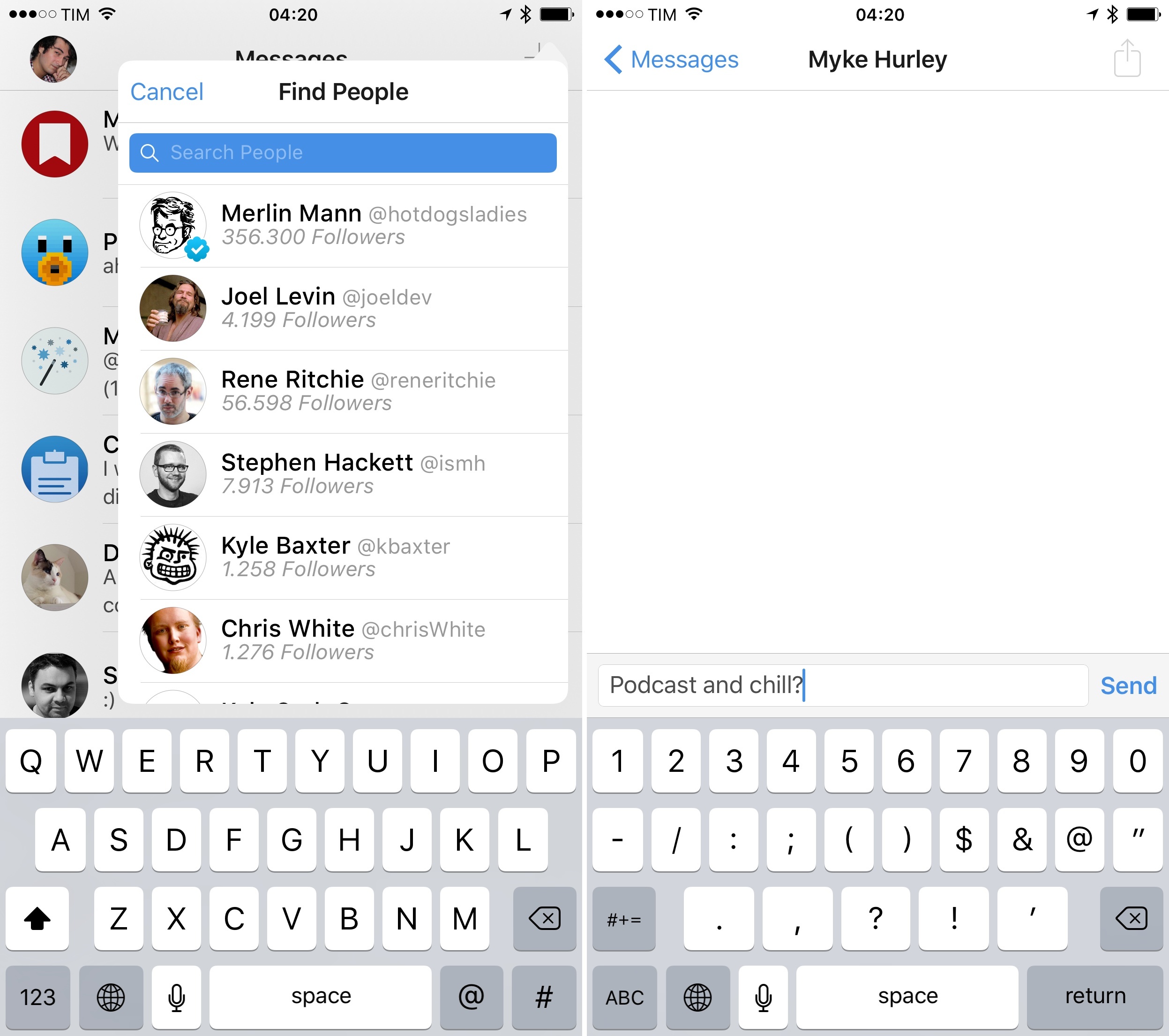
In the DM view, tapping the ‘+’ button in the top right no longer prompts you to choose between a new tweet or direct message. Instead, Tweetbot 4 will default to a new DM, bringing up a popover to search among your followers.
I’ve long been skeptical about the decision to enable new tweets from the DM screen with a prompt, and I think the new behavior is more limited but also more pragmatic than the old one.
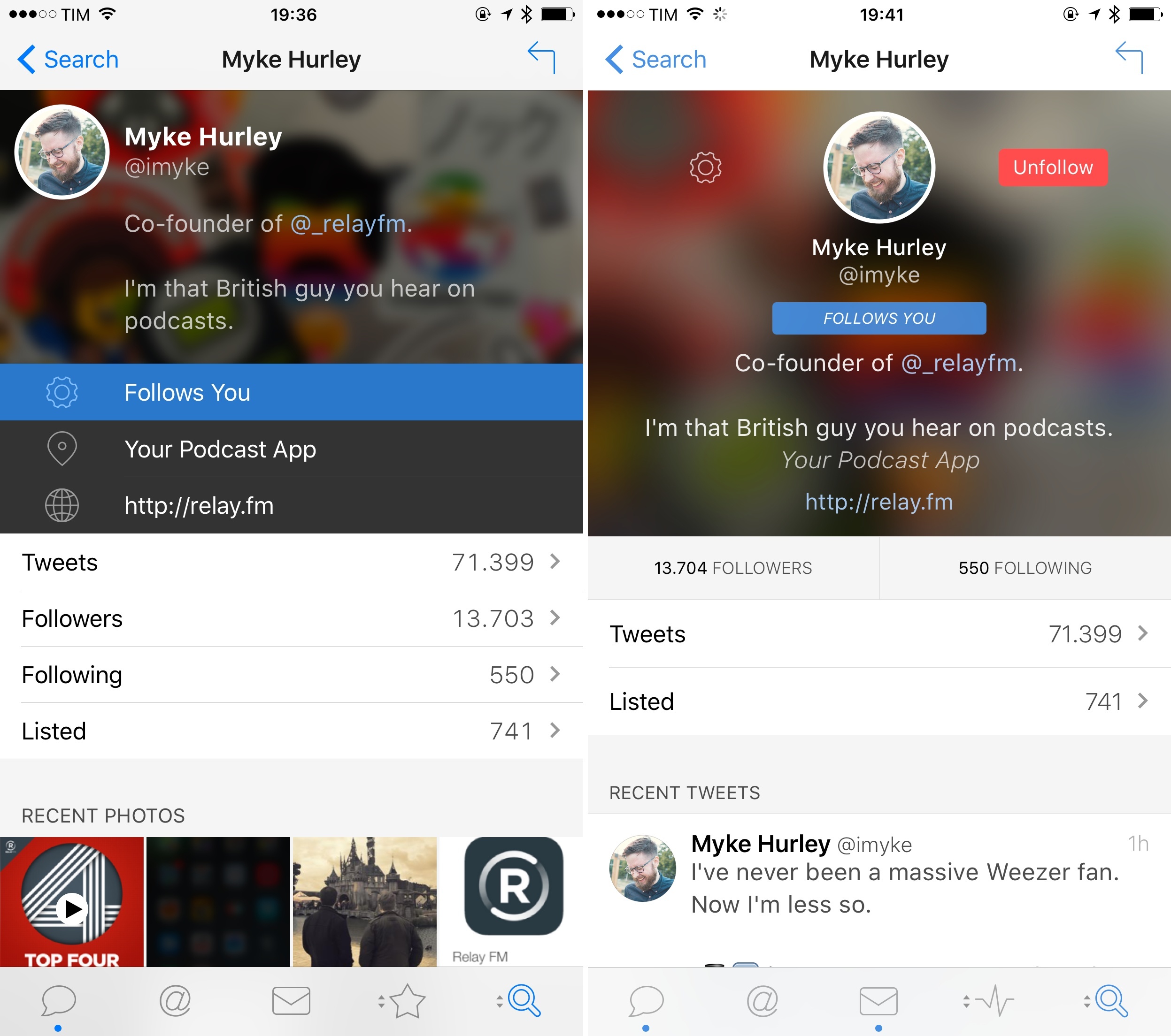
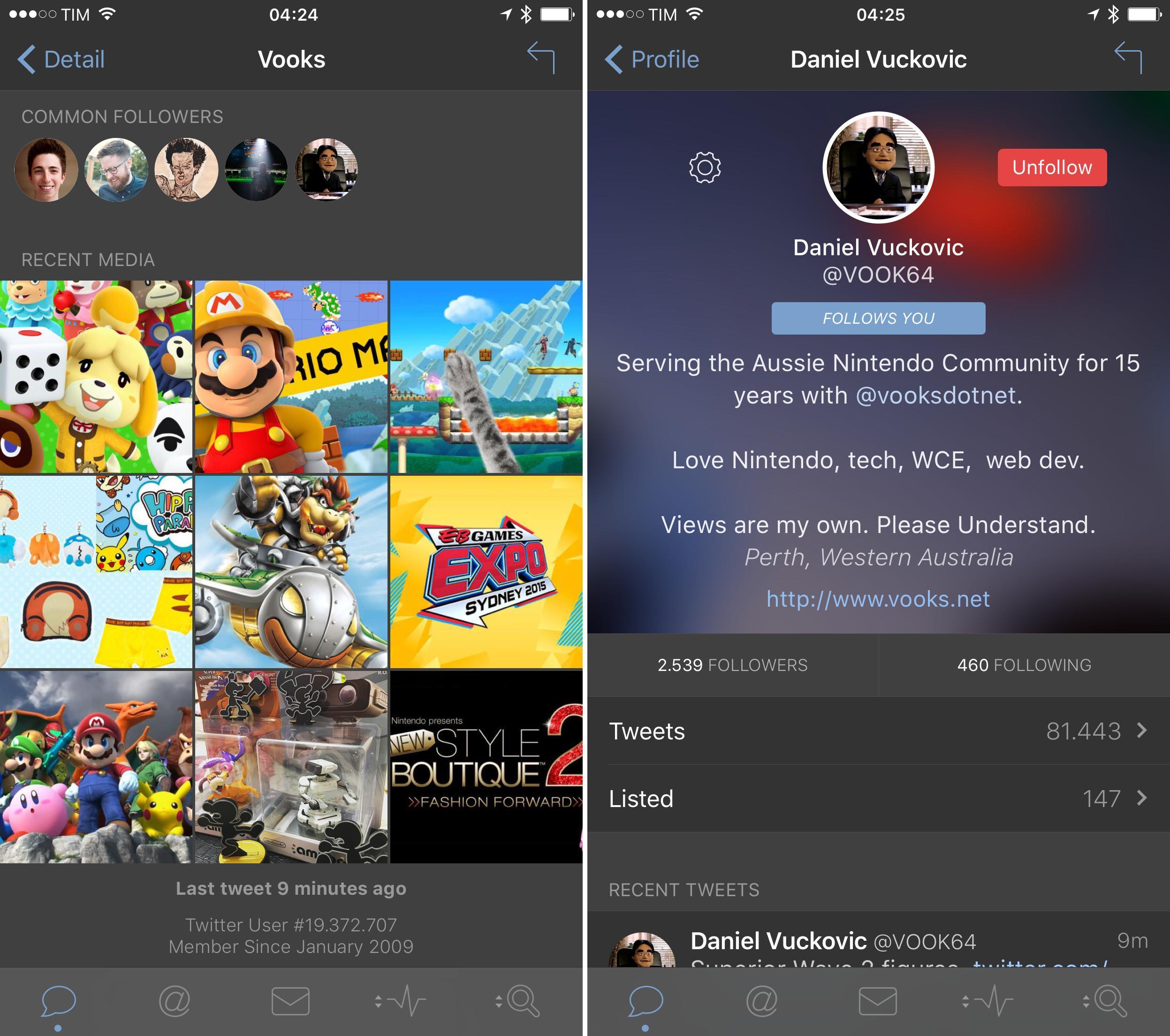
User profiles are perhaps the biggest design change in Tweetbot 4. Following version 2.0 for OS X, profile pictures and bios are now centered on top of a blurred cover photo (you can still swipe down to view it). Followers and Following lists have become tabs below the user bio and above the ‘Tweets’ and ‘Listed’ buttons. Displayed between tabs at the top and Recent Media at the bottom, Recent Tweets show a user’s latest tweets that aren’t replies to someone else. This is a good way to get a quick understanding of what someone tweets about without scrolling all of their tweets and mentions.
Tapbots must have been thinking about the process of following new users as well: towards the bottom of profiles for users you’re not following, you’ll see a group of Common Followers – users you follow that already follow the user you’re viewing. I’m more likely to follow someone if people I trust are already following that user, and I think this is another minor but handy addition that surfaces interesting data in the app.
Detail View
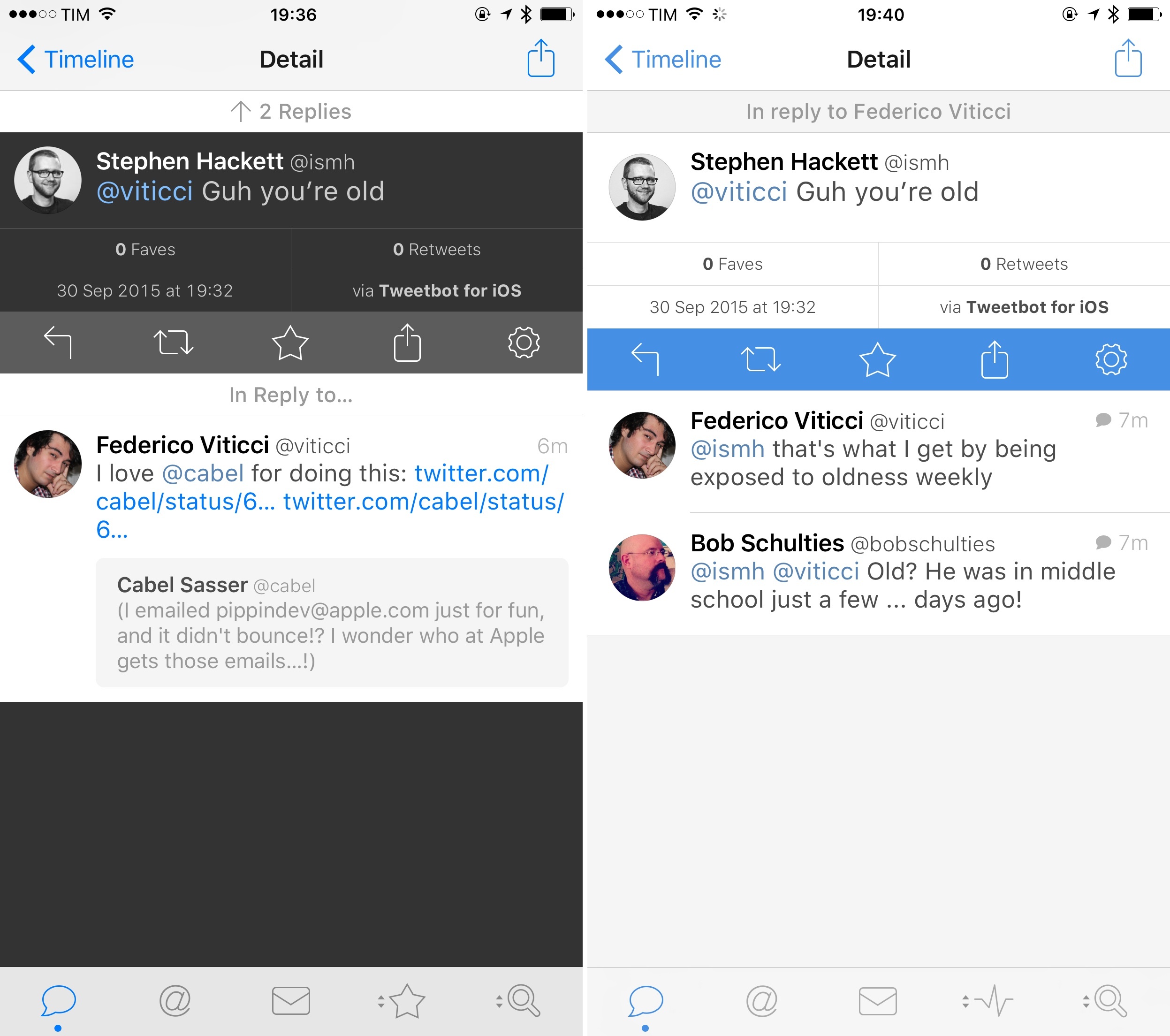
Tweetbot 4 has a redesigned tweet detail view: fave and RT counts are still available above the tweet’s date and client information, but conversations are arranged to be more in line with the official Twitter app.
In the new app, the original tweet a mention is in reply to is displayed above the tweet and hidden by default, so you’ll need to swipe down to view the preceding tweet and conversation. Then, subsequent replies to a tweet are loaded at the bottom of a tweet in reverse chronological order from newest to oldest. This is a departure from Tweetbot’s old reply and conversation UI, and I have to say I’m glad Taptbots borrowed this from Twitter’s more logical thread interface.
Even if it breaks the spatiality of the Twitter timeline (where new tweets are always at the top), having past conversations sit on top of the currently viewed tweet makes more sense from a messaging UI perspective. In modern messaging conventions, old conversations are above and new texts come in below them. By swiping up to view the original tweet and conversation, you’re performing the same gesture you’d typically perform in Messages or Slack to view older conversations.
Replies to the tweet in the lower half of the screen, on the other hand, reverse the spatiality of conversations by showing old replies at the bottom and the newest ones at the top (Twitter keeps the opposite order in their app). The thinking here is that, when viewing a tweet, you want to see the latest replies and reactions to it without scrolling to the bottom to see what’s new. While I wasn’t sure about this decision at first, it has grown on me in the past few weeks of using Tweetbot, especially to check replies to my tweets. I prefer to see the latest comments first (because that’s what I might have missed) and older ones further down the list (as I’m more likely to have already seen them).
New Compose
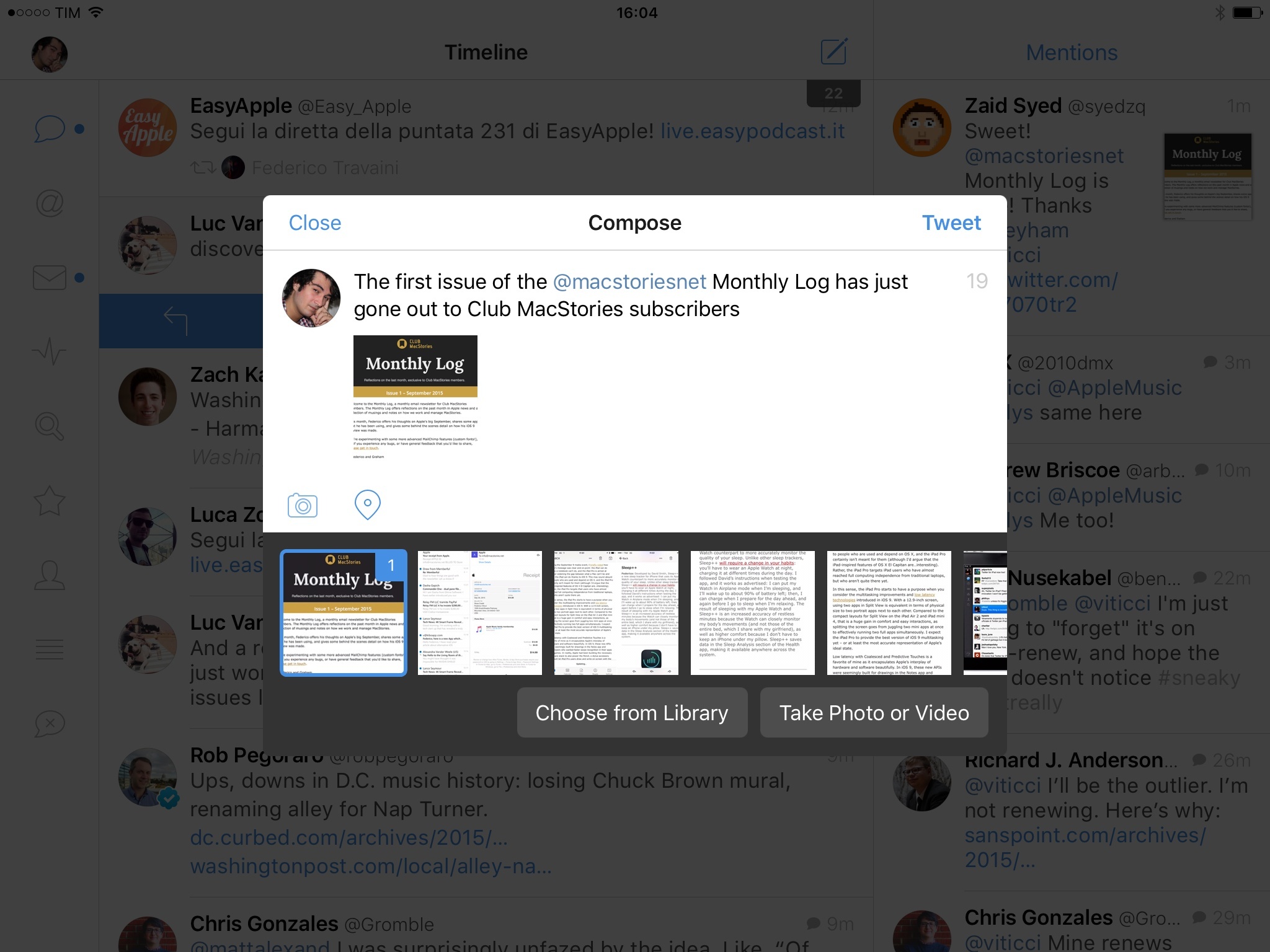
The compose window has also been reworked in Tweetbot 4 with a revamped media picker and a UI refresh. It now opens as a pane in front of the timeline on the iPhone and as a floating popup on the iPad.11
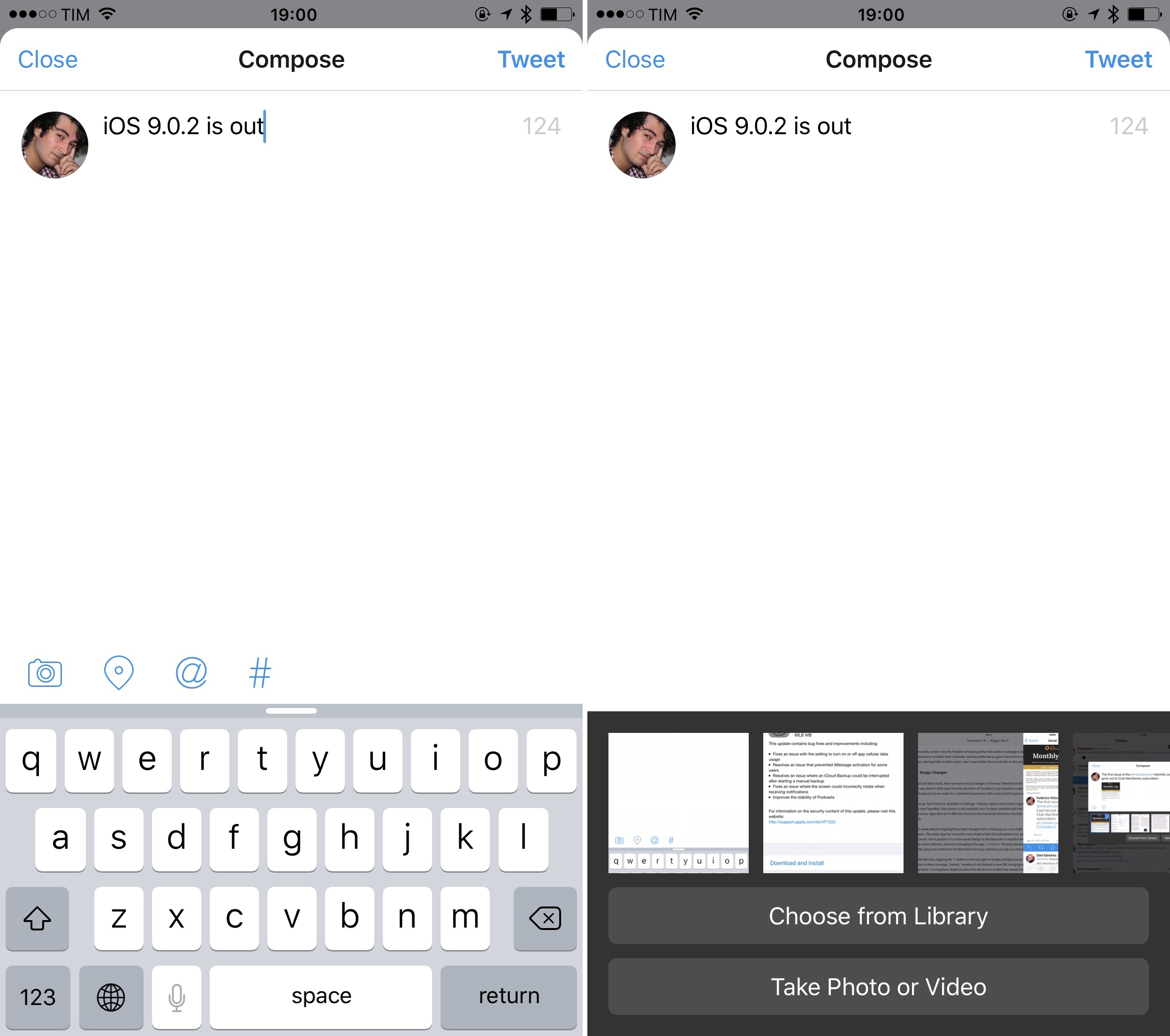
This new design fits with the idea of layers in a post-iOS 7 world, but, surprisingly, it cannot be pulled down with a swipe to be dismissed.
You can still attach location data, pick usernames, and choose hashtags from this screen, with Tweetbot taking care of highlighting text properly. The big change is the new media picker, which opens as a scrollable tray of recent items from your photo library that you can tap to quickly attach them to a tweet.
I like the media picker as it’s modeled after the one in Messages in the way it facilitates picking recent items as opposed to manually opening the default photo picker every time. The animation effects used by Tapbots here are neat, with delightful bounces on selected images, a count on top of each item, and a media preview popping up in the compose field as you choose images and videos.
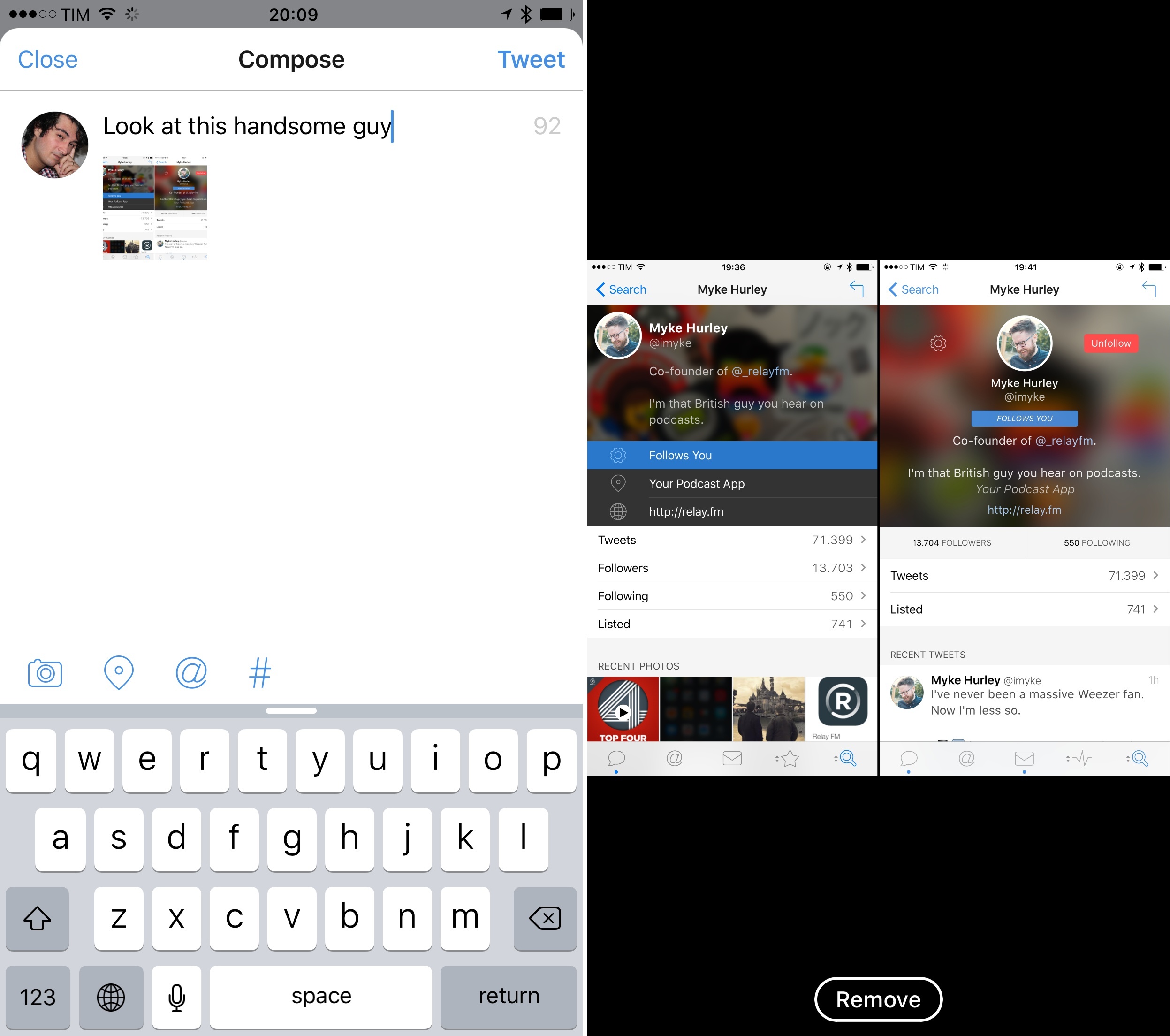
After attaching items to a tweet and going back to the keyboard (another cool transition), you can tap on the thumbnail previews to bring up a full-screen preview with a ‘Remove’ button at the bottom to discard an item. As with other media previews in the app, you can close the preview by throwing the image away with a swipe. Everything about the media picker in Tweetbot 4 is playful and polished, and it’s one of my favorite details of the app.
What’s Still Missing
Besides the (many) features that are exclusive to Twitter’s official app and that Tweebot can’t implement12, there are some things that I wish Tapbots had considered for version 4.0, but which aren’t available today.
Tweetbot 4.0 still doesn’t offer a share extension to share text and links from other apps via the share sheet. Apps like Linky have shown the benefits of a custom tweet sheet with more advanced options, and it’s too bad that to share content with Tweetbot, you’ll need to do so by opening the app.
There isn’t a Watch app yet, and while the obligation to have a Watch counterpart for every iOS app is debatable, I believe that Twitterrific has demonstrated how ample utility can be derived from a subset of tweeting functionalities on the wrist.13 Given Tweetbot 4’s support for actionable notifications14 and aggregated stats for tweets and users, it would have been nice to have some of this content and actions available on Apple Watch.
In terms of customization, Tweetbot for iPad comes with the same light and dark themes of the iPhone version, but personalization of the experience ends there. You can’t customize the left sidebar with icon shortcuts to specific lists or users, which leaves the area mostly empty in portrait mode.
Finally, while it didn’t directly affect me, Tweetbot 4.0 is launching without 3D Touch support on the iPhone 6s. This means that you won’t be able to launch app shortcuts from the Home screen or use peek & pop for links in the app. I hope that Tapbots will release an update to enable the feature in the iPhone app soon.
Bigger Bot
There’s a parallel between iOS 9 and Tweetbot 4. Like Apple’s latest iOS, the new Tweetbot brings a series of welcome refinements and smaller feature additions to the iPhone, with a much bigger change on the iPad that redefines the experience on the big screen.
Tapbots fundamentally understands the iPad platform better than Twitter does. Through the second column, popovers, and other interface adjustments, Tweetbot 4 makes the best use of the iPad’s screen since the original Twitter for iPad. And while Tapbots’ latest effort doesn’t have the revolutionary spirit of Loren Brichter’s iPad masterpiece, it shows a willingness to do more than simply adapting what worked for the iPhone.
Tweebot 4 is a nicer, faster Tweetbot in every way. That doesn’t change the fact, however, that what you’ll see in the app is a legacy Twitter, lacking the modern features and integrations of the official product. To get the full Twitter experience, you’ll need to keep the official app installed.
In this sense, Tweetbot 4 embraces its limitations and builds upon them, offering the kind of detail and features that Twitter – for different reasons – is ignoring or overcomplicating. Safari View Controller is a good example of what Tapbots has done that Twitter doesn’t want to do; the Stats screen, with its limited access to the Twitter API, provides a simple way to check on favorites, retweets, and new followers with a pretty chart – precisely what Twitter isn’t interested in doing for their app.
I’m an advocate of the modern Twitter, and I think their iOS app has more interesting options than most people tend to believe. But, thanks to its iPad app designed for power users and multitasking, Tweetbot 4 is making an offer I can’t refuse.
I switched back to Tweetbot weeks ago, and I’ve found it to be the best way to communicate and work with Twitter on my iPad in years. I’m not exaggerating it: if you work with Twitter on a daily basis from the iPad, Tweetbot 4 is the client you’ve been looking for.
I miss many of the features of Twitter’s app, such as fave and RT counts always displayed for every tweet in the timeline, cards, search, and one-tap access to conversations. But with the new iPad app, timeline sync, and improvements to the iPhone app, I’ve discovered a whole new Tweetbot that makes me more efficient at using Twitter every day.
Tweetbot 4 shows what a Twitter client for iPad should be. Three years ago, I wrote that Tweetbot for iPad was the better Twitter app I had been waiting for. Today, that is still the case.
Funny how history repeats itself.
Tweetbot 4 is available on the App Store.
- With a secondary app in compact mode with Split View in landscape, Tweetbot could probably show two iPhone-sized columns on the left. I understand why this is asking too much, though. ↩︎
- One more: scrolling position for a list in column view isn’t maintained when switching orientations. ↩︎
- If only there was a bigger iPad where this could be realized! ↩︎
- Landscape mode is also available to iPhone 6 owners, but without column view. ↩︎
- Similarly, Tapbots hasn’t added support for the Shortcut Bar on iPad to include additional shortcuts next to QuickType suggestions. ↩︎
- Unfortunately, Tweetbot still doesn’t show whether a user who faved or retweeted you also follows you. It’s all about validation. This stuff matters to Twitter narcissists. (The Twitter app does this well.) ↩︎
- One thing I don’t like and that Myke helped me notice: in the stats for individual tweets, what’s the scale for retweet and fave counts? Why does the RT bar fill up with, say, 95 retweets, but 7 fill double the space of 5? What’s the criteria behind the progress bar in these stats? For such a design-focused company as Tapbots, it’s a surprisingly odd aspect of the app. ↩︎
- Apps that don’t offer San Francisco but hardcode Helvetica into their UIs just look wrong to me now. ↩︎
- Tweetbot 4’s blue color is especially nice when combined with the dark theme. ↩︎
- One great detail: on the iPad, the compose box automatically expands vertically as you hit Return and add new lines to a tweet. ↩︎
- Such as: polls, cards, engagement stats, picture uploads in DMs, Universal Links, image editing filters, and user recommendations. ↩︎
- I used to check the Twitterrific Watch app for mentions several times each day before moving back to Tweetbot. ↩︎
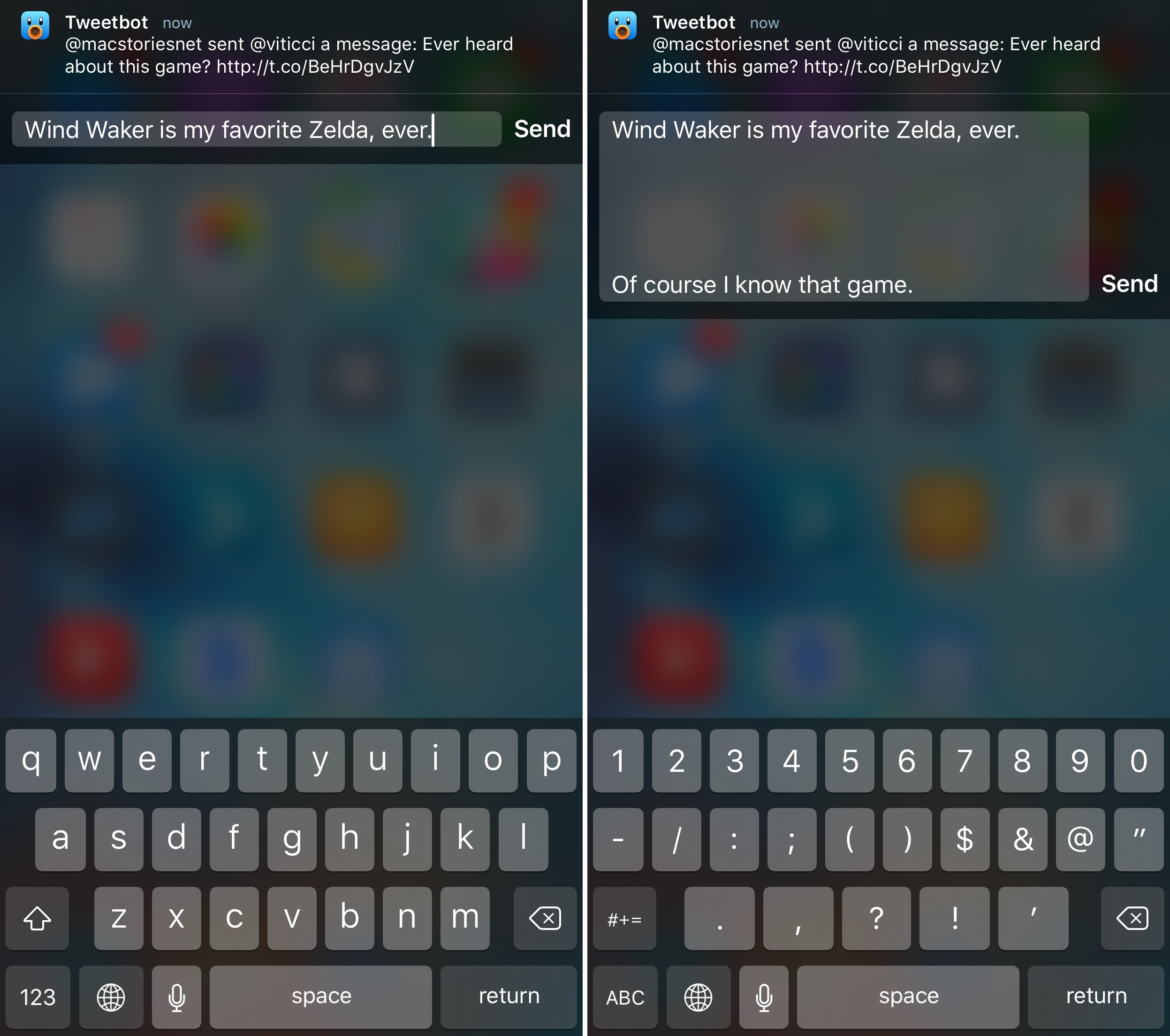
- As you can guess, you can reply to notifications directly from the notification itself. Quick reply works great for Tweetbot. ↩︎


