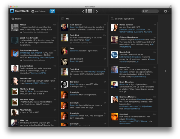
TweetDeck has always been looked up to as the power-user’s go-to Twitter app thanks to a huge feature set, its multi-column layout, quick filtering, and its availability across platforms thanks to Adobe Air. When Twitter acquired TweetDeck back in May, many questioned whether Twitter would continue to maintain the client, and whether Twitter would rebrand the app to better fit into their ecosystem. Yesterday, TweetDeck launched natively on Mac and Windows, bringing with it a brand new experience in-line with #NewNewTwitter’s focus. Like Twitter, it’s another big change many will have a hard time adjusting to.
Most of my day is spent on a Macintosh. That other part of my day is spent on Windows (which I don’t mind). While I just switched to Echofon’s excellent Windows Beta, my primary Twitter tool was TweetDeck for a long time. I understand lots of people were very comfortable with the Air app: they understood all the icons and where to find that blasted reply-all action that was hidden in a menu. Personally, I didn’t like using TweetDeck. I could care less about the Air part — a gaming computer isn’t going to flinch at that. Air is okay on Desktops. I simply found the interface confusing and cluttered.
TweetDeck’s native update resolves the problem I’ve always had. The interface is much more user friendly than before. While I don’t like the new icon, and while arguably the native app isn’t really native, TweetDeck at least looks familiar on the surface. If we look closer, we’ll find that a lot has changed under the hood.
TweetDeck users are not going to like this update. Here’s just a sample of what’s been removed:
- Inline image previews
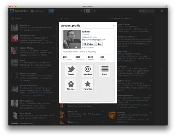
- Quick profiles
- Narrow columns
- Single column view
- Foursquare and LinkedIn account integration
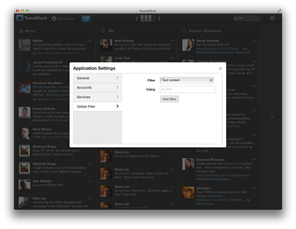
- In-column filtering (relocated to settings)
- Interface tweaking
- Several image and link services
Maybe it is a lot simpler than than the old TweetDeck, but at least it is significantly easier to use. To favorite a tweet in the old TweetDeck, you had to select the action in a menu. Now you can just click the star on a tweet. The reply arrow finally responds to everyone mentioned in the tweet. And the retweet button no longer looks like that weird forward arrow. The settings are simpler and easy to navigate. The redeeming quality is that doing Twitter-things with TweetDeck is much more intuitive.
TweetDeck was the definitive power-user’s app. Now, it’s just a multi-column Twitter app that can schedule tweets.
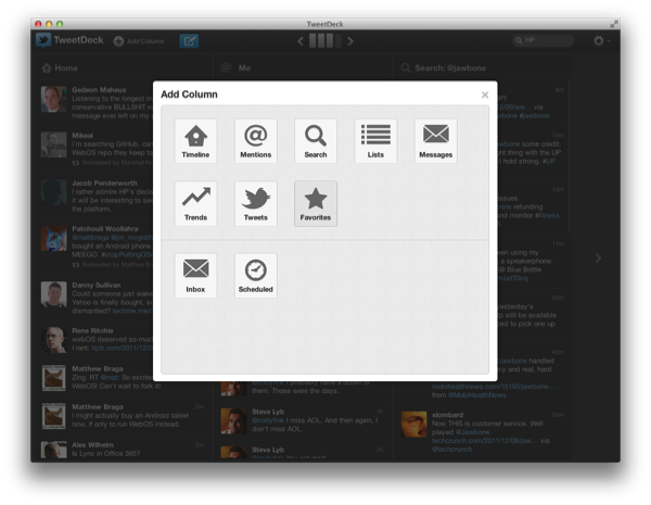
I can get past the looks of TweetDeck knowing where it came from. I don’t mind the white pop-overs. I think those big buttons are really friendly. But there are a lot of quirks to iron out in the meantime. Retweets will show up multiple times in your timeline if its retweeted by multiple people (other apps do a better job of consolidating this info). Columns can’t be resized, and navigating between them feels clunky and outdated. TweetDeck’s old sync system is still in place, and a TweetDeck account is required to use the app (before you could simply log-in with Twitter and avoid signing up for TweetDeck). Notifications don’t take advantage of Growl. The compose button, while friendly and meaningful, does look out of place in the toolbar.
TweetDeck has been greatly reduced in functionality, and I’m not sure what its purpose is if it remains this way. It’s still super useful for keeping a bunch of search columns bundled together, but the features that made it desirable for power-users have been completely removed or relocated in the app. Mostly it’s the former instead of the latter. I can understand why non-Twitter account integration has been pulled, but I don’t understand the need to obviate the tools that made TweetDeck desirable for managing Twitter.
TweetDeck was redesigned with me in mind. But if I’m going to be completely honest, I know I wasn’t the original audience for TweetDeck. The people who use TweetDeck on a daily basis are going to be disappointed, and I would recommend that they stay away from the update.
But if you’re new to TweetDeck, I think you’ll like what you see if what you desire a multi-column Twitter client. TweetDeck is by far better at streaming multiple timelines in realtime than many other Twitter apps. It does the best job as a fullscreen Twitter app on your Mac, and it doesn’t require Air or Silverlight. TweetDeck isn’t the TweetDeck it used to be, but it is as approachable as Twitter, and I think looking forward the simplicity will matter above all else. Unfortunately that means TweetDeck will alienate a lot of their fans in the process. The focus has changed, and TweetDeck has been rebuilt for the mainstream.
You can give TweetDeck a shot for free on the Mac App Store.


