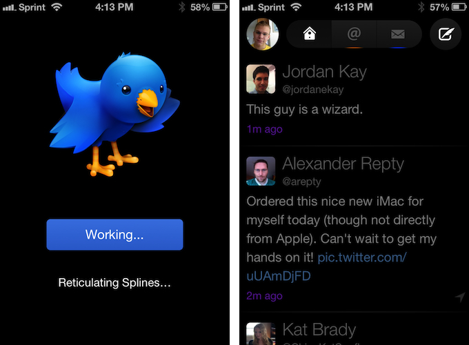
Twitterrific 5. It’s been fun to watch Twitter’s reaction to an app that I, and other writers, wanted to surprise the world with. Alas, it was bound to leak, unsurprisingly by Apple’s Japanese App Store. The Iconfactory’s latest iteration of their famed Twitter client is shockingly different isn’t it? The same gut reactions I watched unfold on Twitter could not better describe the same gut reactions I had when I first saw just how striking the new interface is.
Sharing the first pic of Twitterrific 5 with my coworkers resulted in an immediate, “Wow.” After a few more screenshots, “That looks like a Windows 8 app. Like Track 8.” It’s an absolutely fair assessment. And it’s one I’ve seen echoed on Twitter as I watched the tweets scroll by. Thankfully, Twitterrific 5 is as much of an iOS app as it ever was. No text hangs off the screen — no “CTURES” as Federico and I will joke.
Twitterrific 5 presents itself dressed in black with Helvetica accents and familiar shades of orange and blue for mentions and messages. It’s both instantly recognizable and obviously different. In contrast to colored entries and standard rectangular iOS elements, it is typography, floating buttons, and rounded corners that are pervasive in the new Twitterrific.
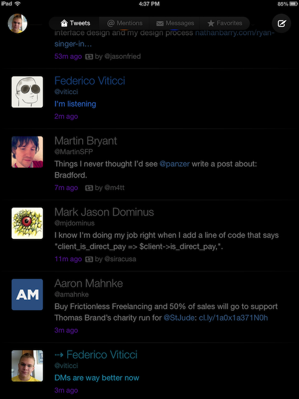
No longer buried behind a back button on the iPhone, All Tweets, Mentions, and Messages have been grouped above your Twitter feed in a simple row. On the iPhone, Favorites are tucked underneath your avatar, whereas Favorites are added to the row of buttons on the iPad. Reintroducing these controls above the timeline on the iPhone (Twitterrific 2 had a tab bar) makes sense once you realize that the unified timeline can be turned off, and that visual simplicity is maintained in the landscape orientation on the iPad. As an additional benefit, tweets are no longer squished between a compose bar and a title bar, increasing the number of tweets and the amount of text that can be displayed on your iPhone. Largely, it’s made possible as pull-to-refresh replaces a refresh button. For more visual simplicity, pulling the Twitter feed up and down with two fingers will hide and unhide the status bar.
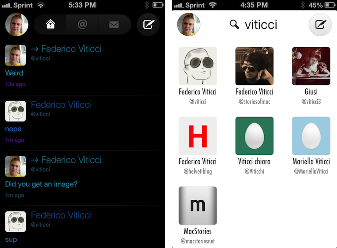
For me, the vastly improved Message view alone is worth the upgrade. The Messages view in particular no longer unifies sent and received messages in a single stream. Individuals you message are appropriately separated and organized. Although, you still have to clumsily tweet with the d @username syntax to send someone a message (or you can visit their profile and tap the message icon). While initiating messages isn’t obvious, replying to messages is much easier.
Composing tweets should be familiar to previous Twitterrific users. A tweet sheet slides into view, letting you attach photos and your location information, and auto completing usernames as you type. This is the only spot in Twitterrific where I noticed some performance hitches. As the app completed usernames, it sometimes would hang as I backspaced. Tapping and holding on the camera icon, as a convenient shortcut, attaches the last photo taken.
All of the usual action sheets you’d expect to appear when tapping on tweets still exist. Tapping on tweets reveals actions for replying, retweeting, or favoriting, while ellipses hide actions such as translating tweets or retweeting with a comment. Tapping and holding on tweets let you copy a tweet or a link to it, while doing the same for links brings up actions such as sending the URL to Pocket. Two new gestures added to Twitterrific let you swipe right to reply to a tweet, and swipe left to see replies. Alternately, tapping on the conversation icon brings up a view where you can see what someone replied to and the replies that follow. As far as locations go, they aren’t shown directly on the timeline — they’re hidden behind a small navigation icon (which I think is another great feature and something that Twitter should do themselves).
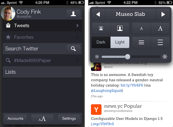
Tapping on your avatar reveals a panel with saved searches, your Twitter lists, additional accounts, themes, and settings. The slate panel, which can be pinned in the landscape orientation on the iPad, is convenient to access and feels nifty. It slides into view underneath your avatar and is dismissed quickly when you tap your avatar or the done button. As a shortcut, tapping and holding on your avatar lets you quickly switch accounts.
Perhaps Twitterrific 5’s coolest feature is its people search. When searching for a person, either by real name or user name, the results are displayed as avatars. This makes finding a person’s Twitter account, such as Federico’s, simple and easy. Generic search results on the other hand are just as you’d expect. (Grids of avatars can also be seen when viewing who you or someone else is following and followers.)
Twitterrific 5 is devoid of settings. You can choose how to sync (iCloud or Tweet Marker), where it scrolls to when you enter the app, and a few other items like whether to sound notifications or present a unified timeline, but there’s no choice in image or video upload service, no choice in short links, nor is there a place to enter credentials for a read later service. In fact, when I wanted to save a link, Twitterrific knew Pocket was on my device, offered to open it, made the authorization and returned me to my feed. I never had to enter my username or password.
As with previous versions of Twitterrific, there are no banner notifications, nor is there streaming (although the developers have mentioned they aren’t against adding it). Gap detection still feels limited, as tweets are only loaded in groups of 50 at a time. Twitterrific differentiates itself in this way, by being a water cooler instead of a fire hose. Oddly, there aren’t any shortcuts for blocking or reporting spam. Lists cannot be made from the app. And if you care about it, there’s no way to view trends.
Themes are core to Twitterrific 5. It’s where you’ll choose your font, such as Helvetica, Proxima Nova, Signika, Museo Slab, and Calluna. It’s where you’ll adjust font size and line spacing. It’s where you’ll make avatars bigger and smaller, switch to a dark or light background, and adjust display brightness. If you don’t like how Twitterrific 5 appears in screenshots, you can certainly customize it to a fair extent. For light and dark backgrounds, however, I wish the Dark Theme at Night setting was based on your actual local sunset and sunrise like Instapaper (currently it changes at 7:00am and 7:00pm).
While the interface might be clean and more modern, there’s a ton of charm in Twitterrific 5 as there’s always been. The pull-to-refresh indicator is Ollie hatching out of an egg. Animations look good. There is a quick and appropriate responsiveness to the taps you make. It’s a simple, solid Twitter app. The developers definitely went the extra mile in delivering that extra bit of polish.
It may be completely redesigned, but the core tenets that Twitterrific were founded upon remain in 5. Twitterrific has always been opinionated, decidedly simple, and never wanted to compete for your attention. And at its heart, Twitterrific 5 is still a Twitter app built with the same passion The Iconfactory builds into all of their apps. Twitterrific 5 is simply a better Twitterrific.
Twitterrific 5 is a new app in the App Store and available for $2.99 (50% off at launch).


