iOS and iPadOS 13 have been in users’ hands for several weeks now, and with the abundance of new capabilities those releases brought has come a wealth of third-party app updates. System dark mode has been adopted not just by indie developers, but also major social media apps; multiwindow has empowered users to work more flexibly on the iPad; context menus have introduced a new layer of functionality to both iPhone and iPad; and of course, Shortcuts is now simultaneously more powerful and more user friendly in iOS 13, unlocking possibilities that are only beginning to be explored.
We’ve covered a lot of the best app updates for iOS and iPadOS 13 in individual articles and through our Club MacStories newsletter, but today the MacStories team has a roundup to share of several other noteworthy app debuts and updates of late.
Fiery Feeds
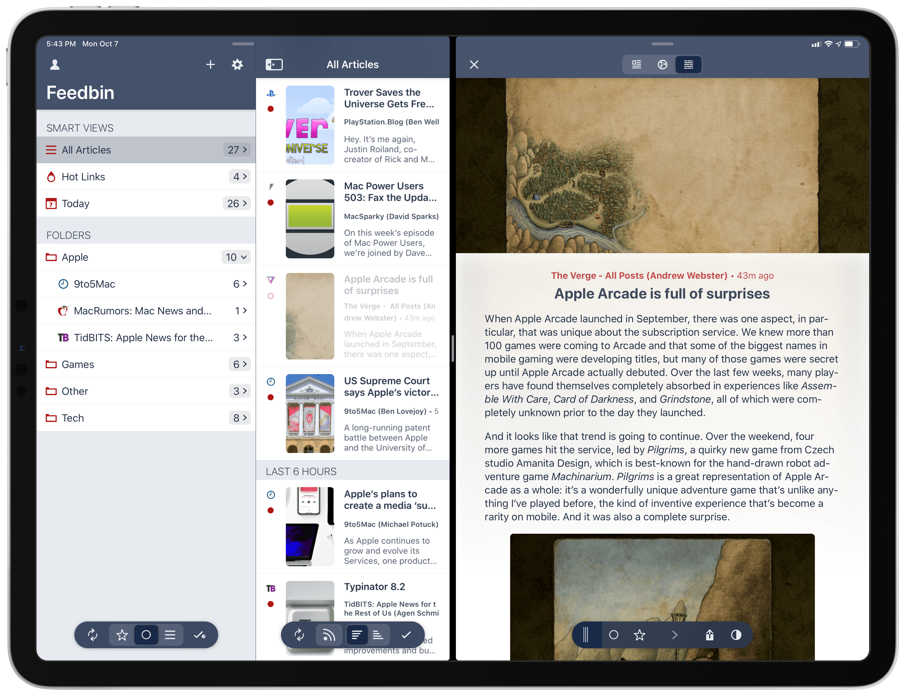
Federico: We last took a look at Fiery Feeds earlier this year, when Ryan covered the ability to set up the popular RSS client with an iCloud account, as well as its Notes-inspired three-pane view and miscellaneous additions. With iOS and iPadOS 13, Fiery Feeds received a massive update that further cements the app’s role as the premier RSS app for iPhone and iPad.
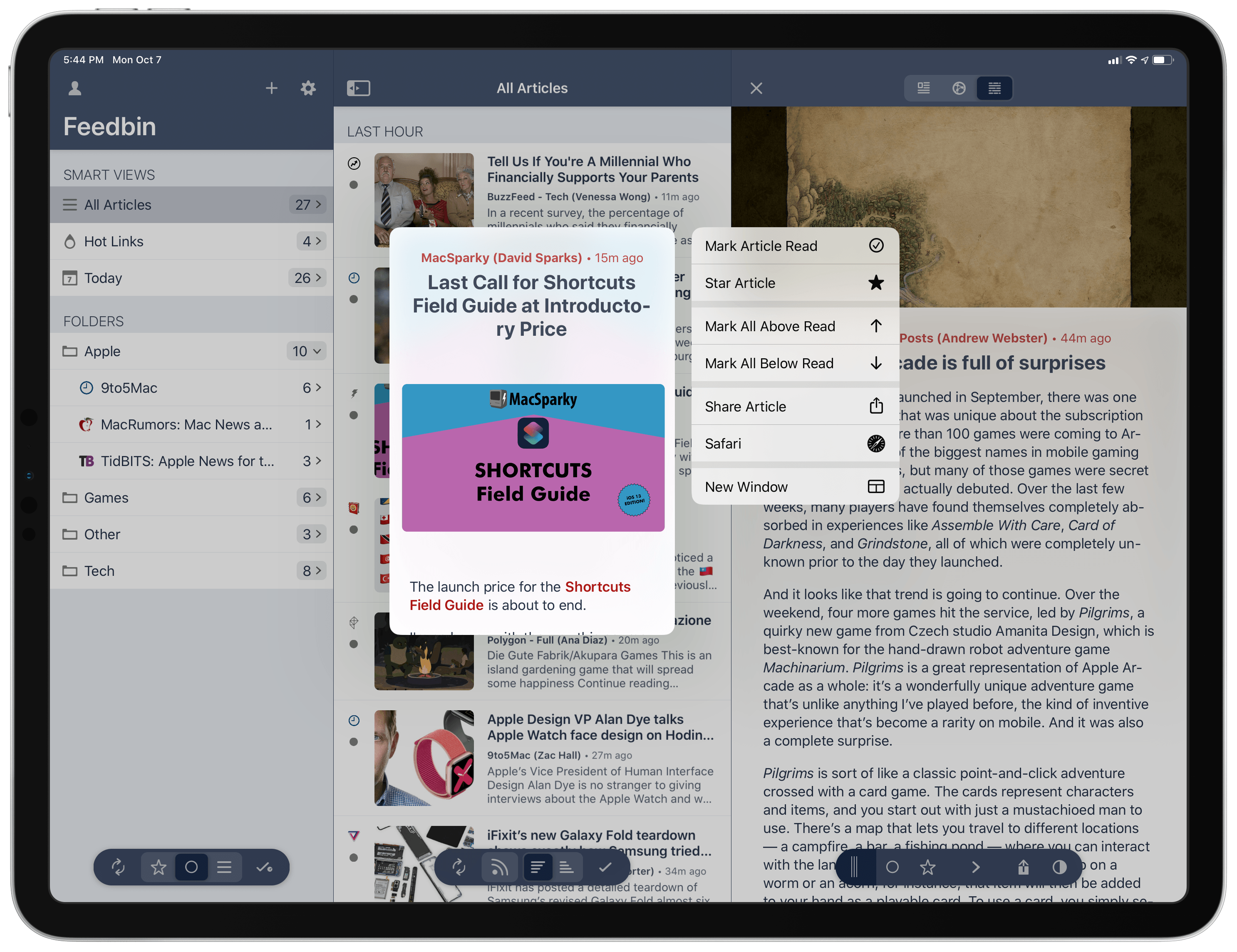
The big news in the latest version of Fiery Feeds is its adoption of multiwindowing in iPadOS. As I detailed in the latest issue of our newsletter, MacStories Weekly, you can now open articles in new windows from Fiery Feeds in two ways: you can open the article view of an individual story as its own window (either by using drag and drop or context menus from the article list), or long-press on a story’s headline to open it as a new Safari window. Furthermore, as you may expect from an app that supports iPadOS multiwindowing, you can always open the Exposé view and create a new primary Fiery Feeds window from there – which is my favorite workaround to create standalone views for individual websites or folders. I’ve been taking advantage of multiple windows in Fiery Feeds to catch up on unread articles more quickly and with more flexibility than ever before; I like how, with just a few swipes, I can now open multiple stories as Safari windows in Slide Over, where I can flip through and close them once I’m done reading.
In the realm of other iOS and iPadOS 13 updates, Fiery Feeds can now respect the system’s dark appearance setting and makes great use of context menus to simplify interactions throughout the app (for instance: long-press a folder and mark articles contained inside it as read). If you visit Expert Settings ⇾ General (long-press the gear icon to open Expert Settings inside the app), you can even enable article previews for context menus.
There’s a bunch of other new features worth checking out in the app’s changelog for version 2.3, but I want to call out its extensive integration with Shortcuts: thanks to parameters, Fiery Feeds can now offer actions to subscribe to a new feed’s URL in a specific account, save links for later, fetch article attributes, and more. I’m going to share at least one custom Fiery Feeds shortcut in this week’s installment of the Shortcuts Corner; RSS automation is something I’ve been thinking about a lot lately, and Fiery Feeds’ integration with Shortcuts is opening up some fascinating possibilities.
Quickness
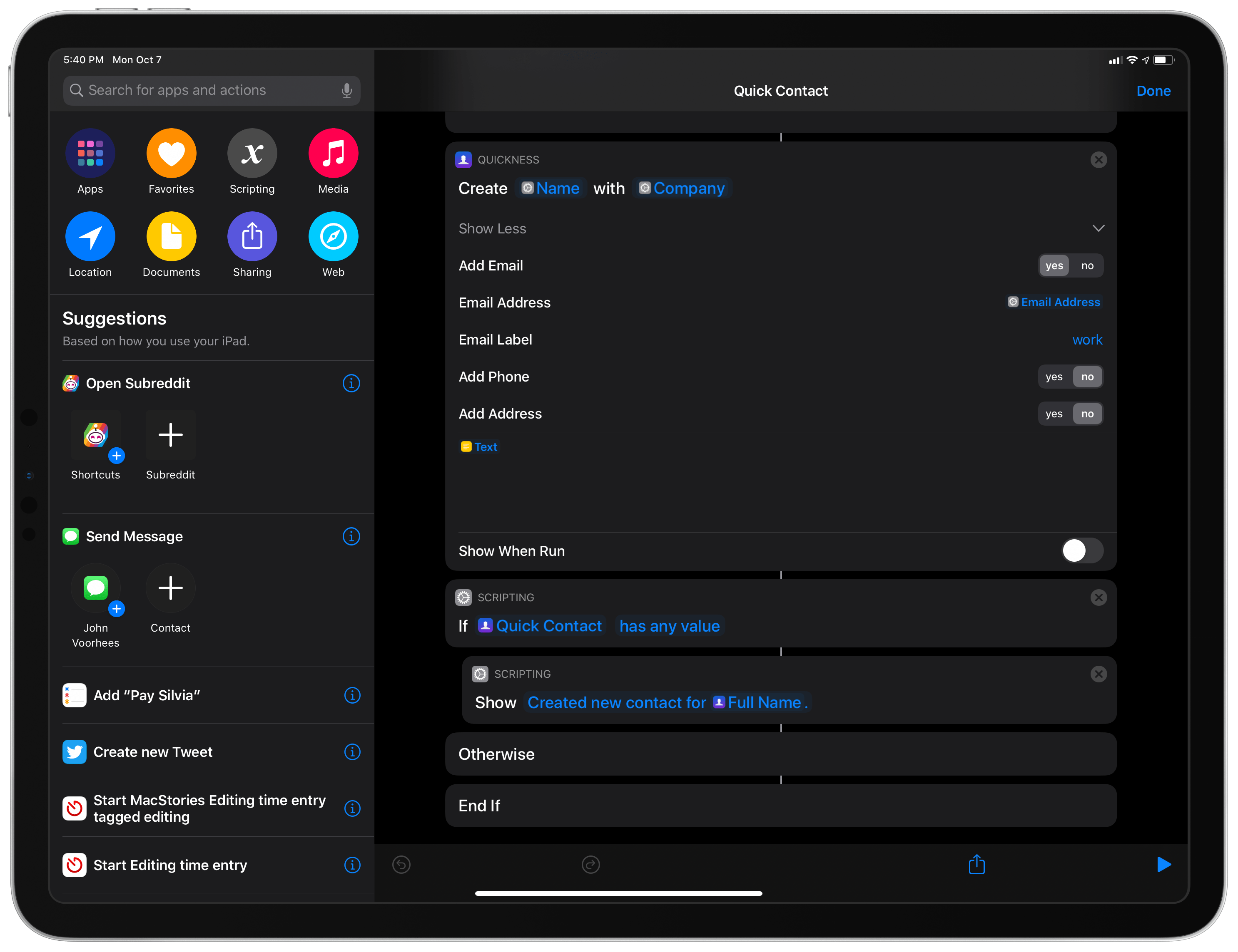
Federico: Shortcuts has long offered the ability to integrate with Apple’s Contacts app and framework but, much to my surprise, it still doesn’t come with native actions to create new contacts. This is where Quickness, a new utility by developer Zulfiqar Shah, comes in: thanks to parameters and conversational shortcuts, Quickness can expose native actions to create new contacts from the Shortcuts app or Siri with support for specific fields such as company name, email address, street address, social usernames, and more.
Quickness is precisely what I had in mind when I argued how, thanks to parameters, third-party apps can extend Shortcuts and Siri via actions that are just as native and deeply integrated as the ones built by Apple. The app is based on a deceptively simple idea: by default, you can’t create new contacts using Shortcuts or voice interactions in Shortcuts; with the actions installed by Quickness, you can. When used in the Shortcuts app, Quickness’ ‘Create Contact’ action contains parameters that can be filled with plain text or other variables such as dates and URLs. In another custom shortcut I’ll share later this week, you’ll see how I was able to put together a custom contact creation flow that combines Shortcuts’ native ‘Ask for Input’ actions with Quickness’ action to let you quickly add new contacts without having to use the Contacts app’s clunky UI.
If you don’t want to use the Shortcuts app to create new contacts, you can also run Quickness’ actions inside Siri with a custom phrase. When running in conversational mode, Siri will resolve each parameter (such as contact name or address) by asking you different questions, to which you can respond in natural language as if you were having a conversation with the assistant. It’s not often that I find myself creating new contacts on my devices, but Quickness solves a glaring omission of Shortcuts and Siri with a technically remarkable solution that is flexible and customizable. I plan to build more custom shortcuts based on Quickness in the future.
Streaks 5
John: Streaks is a task manager and tracking app for forming new habits that we’ve covered since its earliest days on MacStories. I’ve remarked on it before, but what has always impressed me most about Streaks is Crunchy Bagel’s ability to maintain the app’s elegant design while adding more powerful features with each iteration. Version 5.0, which adds support for iOS and iPadOS 13 features along with other functionality, is no different.
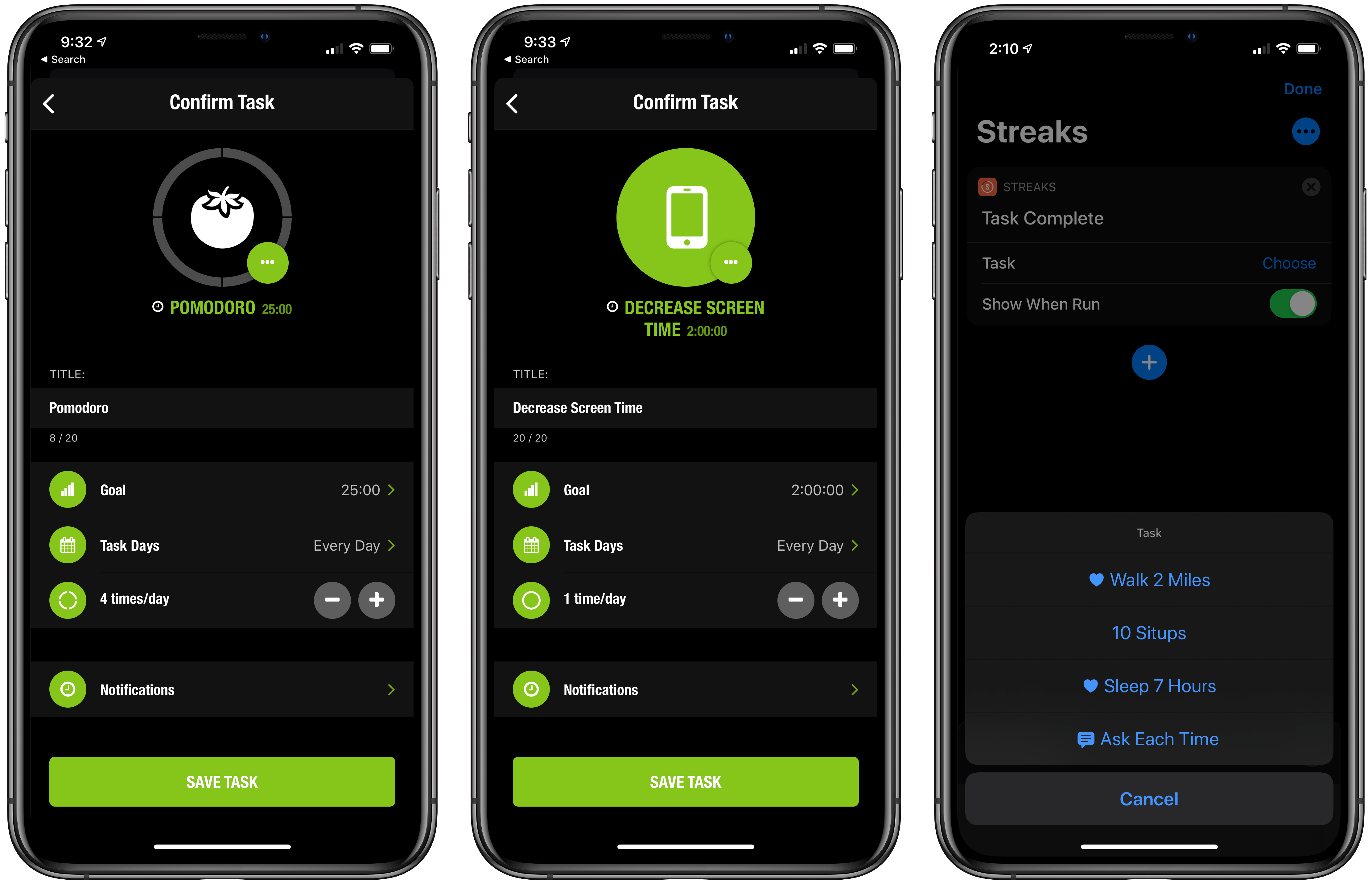
Timers were a new feature added with version 4 of Streaks which eliminated the need to use a separate timer app for habits like reading or exercising a certain amount of time each day. With version 5, Streaks adds repeating and negative timers. One of the best examples of this sort of task is a Pomodoro timer, which has been built into the update. With it, you can pick how many times you want to work for an uninterrupted period of time, starting a countdown timer each time you start working. When you reach your goal, your task will be marked as complete. There are negative timers too, which mean instead of being completed upon reaching a specific time, the timer remains completed until time runs out.
Negative tasks are also more flexible. Before, if you wanted to create a negative task like ‘don’t eat candy,’ you had to pick specific days for the task. Now, however, you can set up a negative task for a certain number of days per week, and as long as there is time remaining to complete the task, and you do, you won’t break your streak.
New iOS and iPadOS 13 features include a dark mode toggle that allows users to switch to dark mode based on the system setting, or manually. There are also new Shortcuts actions that allow for prompts. For example, Streaks’ ‘Task Complete’ action can be set up to require you to choose which task has been completed. The same option has been added for missed tasks, and when timers are started or stopped. Streaks can also pass data about tasks to another action now. That means you could log each task completed to a text file or Numbers spreadsheet, for instance.
Streaks adds a host of other new features too, including:
- New dual-color themes that add a total of 24 new combinations from which to choose
- Support for more tasks in the app’s Today widget, bringing the total to 12
- A field in tasks for URLs that can be used to visit a website associated with a task you’ve created
- The ability to lock the app with Face ID
- The addition of toothbrushing and flossing tracking that syncs with Apple’s Health app
Streaks isn’t an app I use throughout the year, but I find that when I’m trying to get started with a new habit – whether it’s reading more, eating right, exercising, or something else – it’s more effective than my day-to-day task manager. If I add aspirational habits into my regular task manager, they just get lost among my personal and work to-dos. With Streaks, I have a purpose-built app that’s specifically designed for forming or breaking habits, which I’ve found works far better than an ordinary task management system.
Prizmo Go
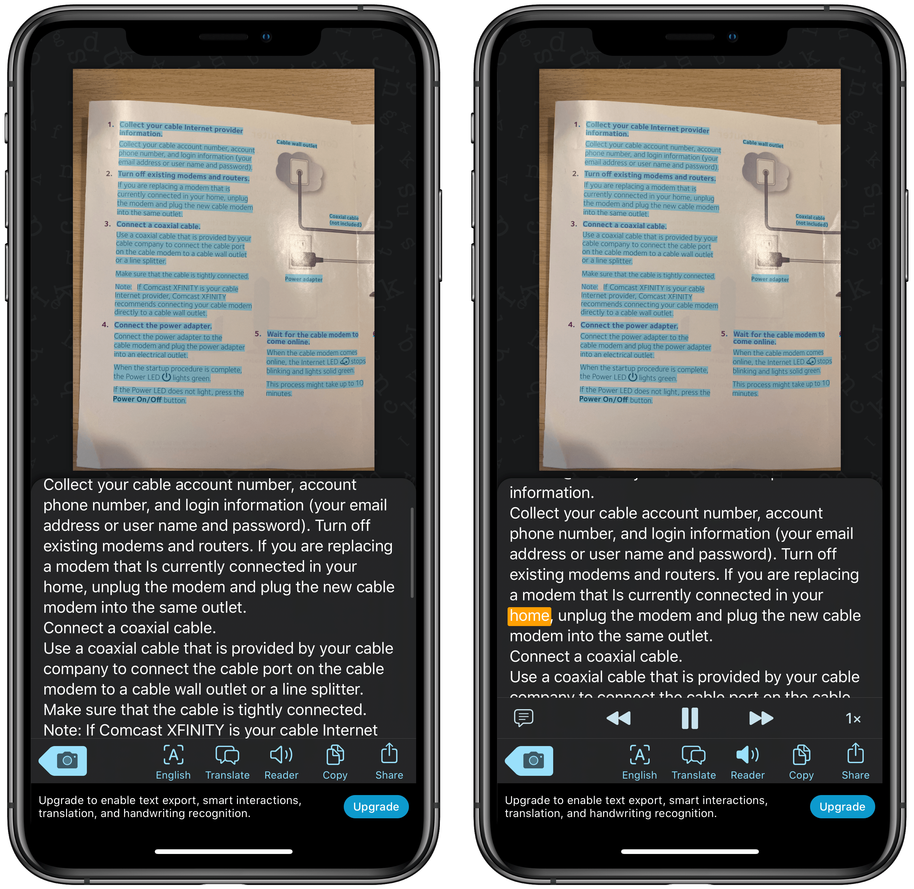
John: Not long ago, I reviewed Prizmo from Creaceed, an excellent iOS and iPadOS scanning app. The similarly named Prizmo Go works a little differently. Instead of being focused on scanning and managing documents, the app is all about capturing text and using it elsewhere.
Using the app is simple. You simply point its camera viewfinder at text and Prizmo Go performs OCR, letting you export the resulting text to other apps. With iOS 13, Prizmo Go’s functionality has been extended. Like the recent update to Prizmo, the app can detect page orientation automatically using a machine learning-based process that will fix any sideways or upside-down images. Prizmo Go has also improved its handling of text that is curved, such as when you take a picture of an open book or magazine.
Prizmo Go adopts Apple’s new OCR technology too, which is available for converting to English language text if you’ve purchased the app’s Export Pack In-App Purchase or Premium Plan subscription. Prizmo Go offers cloud-based OCR with its subscription, but for sensitive data, Apple’s OCR is a good choice because it works well and happens locally.
OCR of text is also available via Prizmo Go’s Shortcuts action that can use an image from the clipboard and convert it into text in a long list of languages either on-device or in the cloud. The app includes simple ‘Add to Siri’ actions to copy text to the clipboard and read text aloud too.
Prizmo Go’s update also includes support for Apple’s Voice Control accessibility feature, dark mode, which follows the system setting, and new icons based on the SF Symbols glyph set that was added with iOS 13.
Snapping a photo of text is handy when you find something you want to keep, but being able to pull the text from an image and use it in an app opens up much wider possibilities. Whether it’s text from an app that isn’t selectable or a book or magazine you come across with information you want to share with someone, having access to the underlying text makes Prizmo Go a valuable tool to have on your iPhone.
Allegory
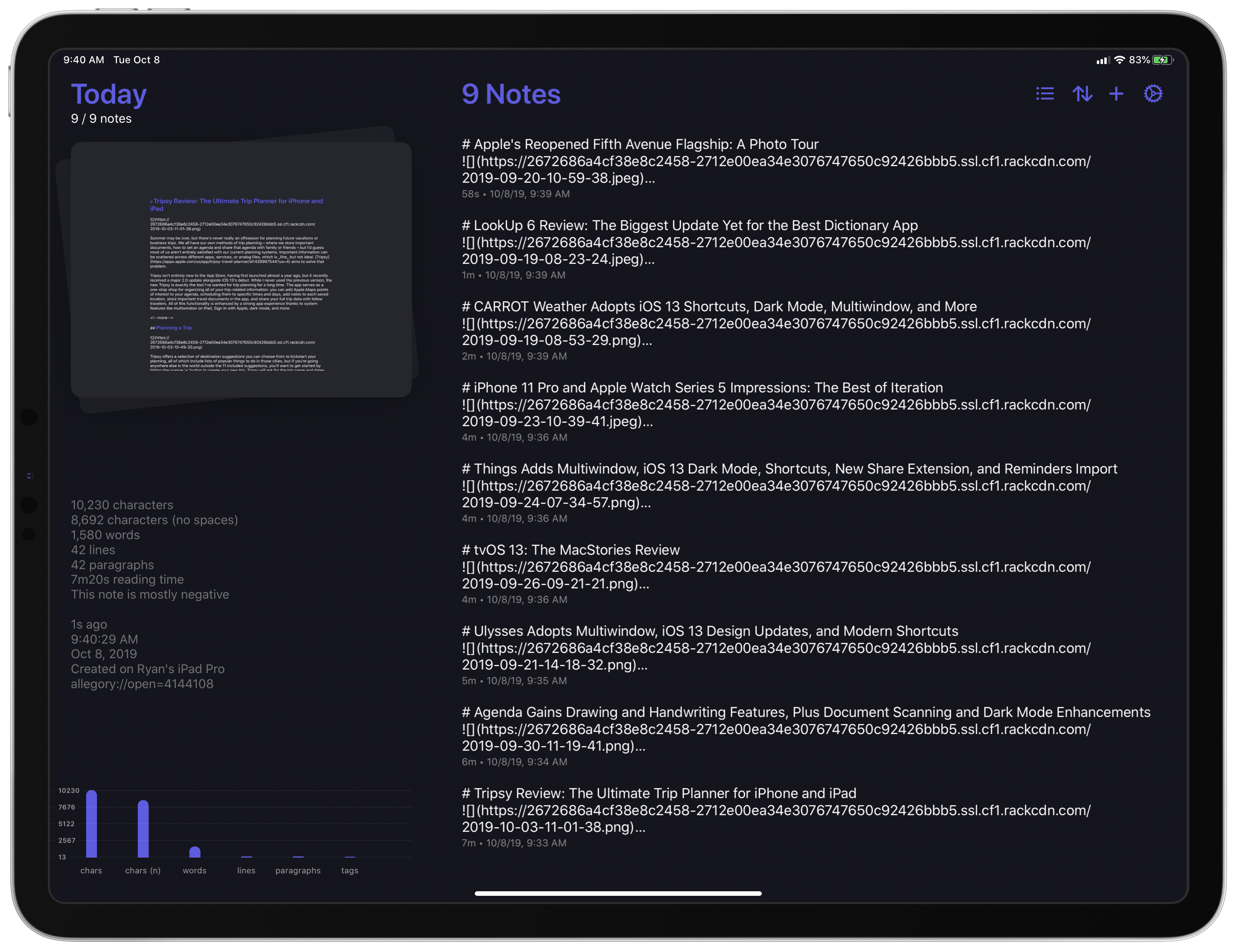
Ryan: Allegory is a brand new note taking app that launched alongside iOS 13. The closest comparison I can make is that Allegory is a lot like Bear: both apps focus on note-taking, offer Markdown support, and feature a variety of export and customization options to choose from.
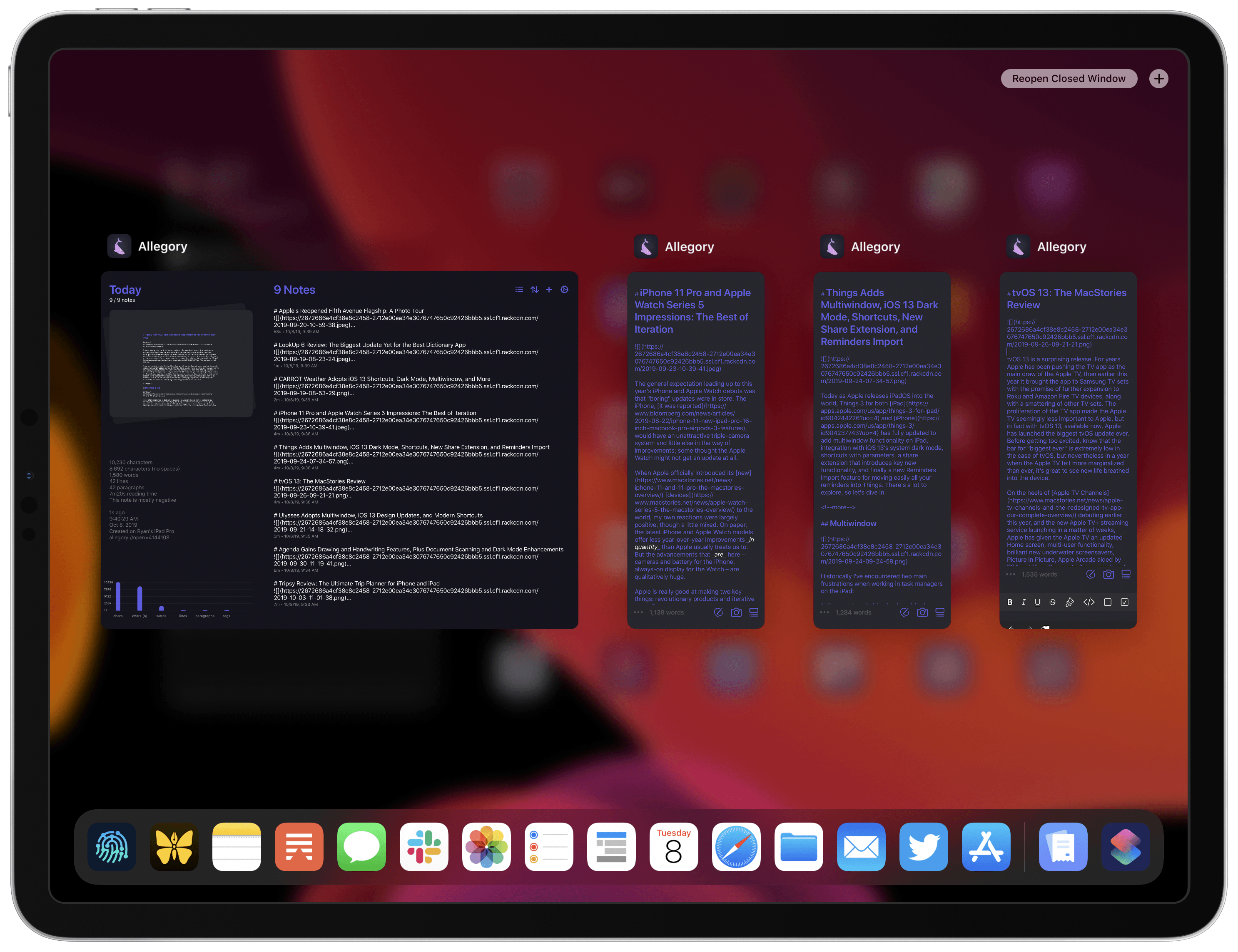
Since it debuted at the same time as iOS 13, it’s no surprise that Allegory also takes great advantage of the most modern OS technologies Apple provides on its platforms. Multiwindow on iPadOS is made easy in Allegory because you can simply drag notes out of your note list to open them as new windows. The app includes light and dark modes that follow iOS 13’s system appearance setting. Context menus are integrated throughout Allegory, offering a handful of key actions when long-pressing in your note list or the stack in the app’s Today section. Document scanning is available, enabling you to scan files that then, thanks to Apple’s VisionKit framework, make their text searchable in the app. PencilKit is employed to power Allegory’s drawing tools, custom haptics are available on modern iPhones, SF Symbols are sprinkled throughout the app, and there’s an independent Apple Watch app too.
Allegory’s array of modern features is impressive, but a feature list is only as good as the uses it enables. What I personally appreciate most about Allegory is its flexibility on the iPad, my favorite platform. The ability to easily create multiple windows for different notes is great, but so too are the app’s minimalist editor and extensive keyboard shortcuts. One of the things that first drew me to the iPad was the additional focus it helped provide. When you have a single app on-screen, or even if you have a couple paired in Split View, you can focus so much better than when using a Mac with windows all over the screen. Allegory’s minimalist editor aligns with that emphasis on focus and almost entirely gets out of the way so you can keep the task of writing front of mind; the few tools that are available on-screen strike a nice balance between utility and simplicity. The minimalist editor is complemented by a healthy roster of keyboard shortcuts which enable adding different content types without lifting your hands from the keyboard. My favorite option is that there’s a separate keyboard shortcut for every export type the app offers, so Command-2 exports in Markdown, Command-3 in PDF, and so on. I haven’t seen such a simple, convenient export method before, and now I want it in all writing apps.
Spend Stack
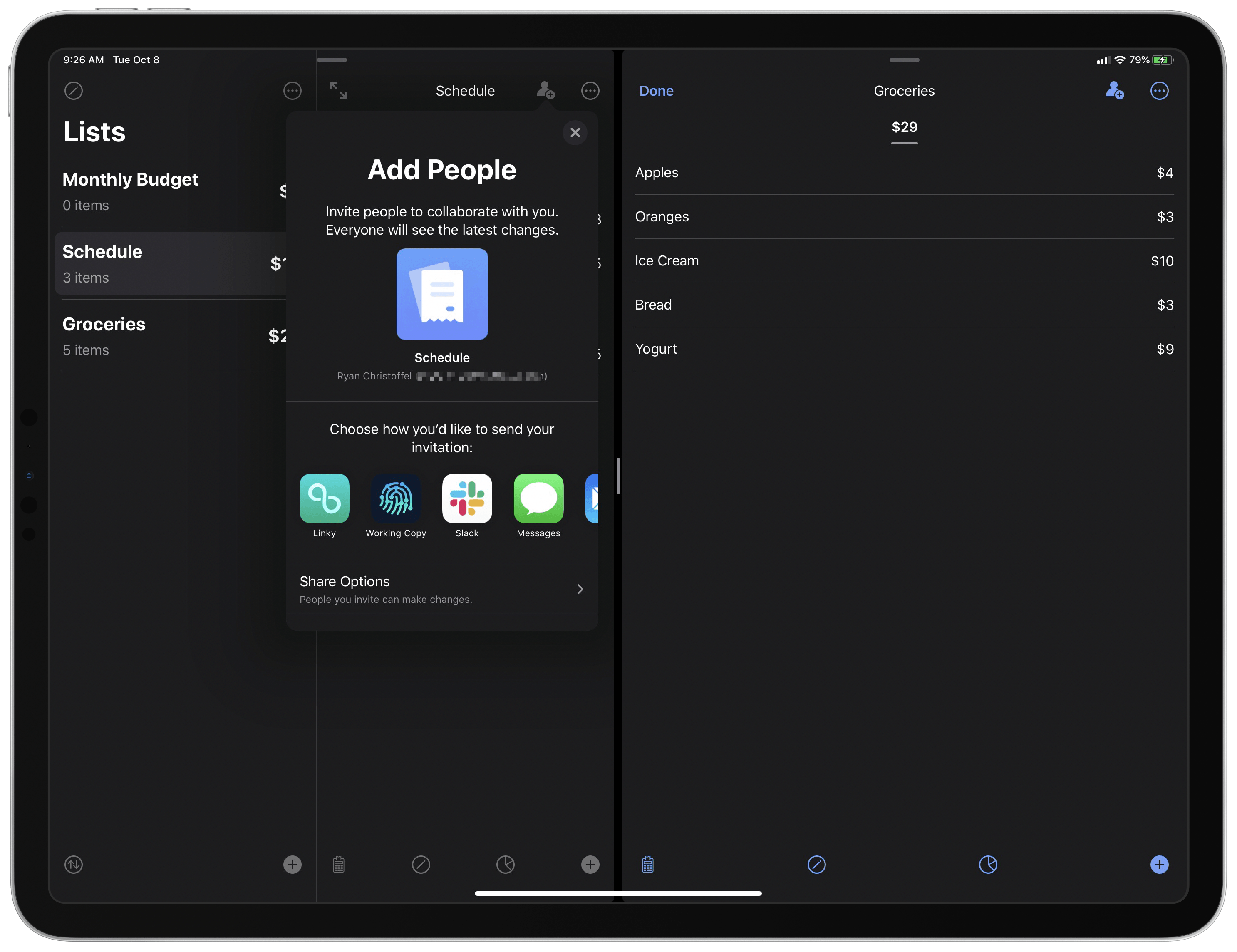
Ryan: Spend Stack, like Allegory, is another relatively new app. Though it didn’t launch alongside iOS 13, it’s still only been available on the App Store for a few short months; nevertheless, the app recently launched a strong update adding support for several new system features.
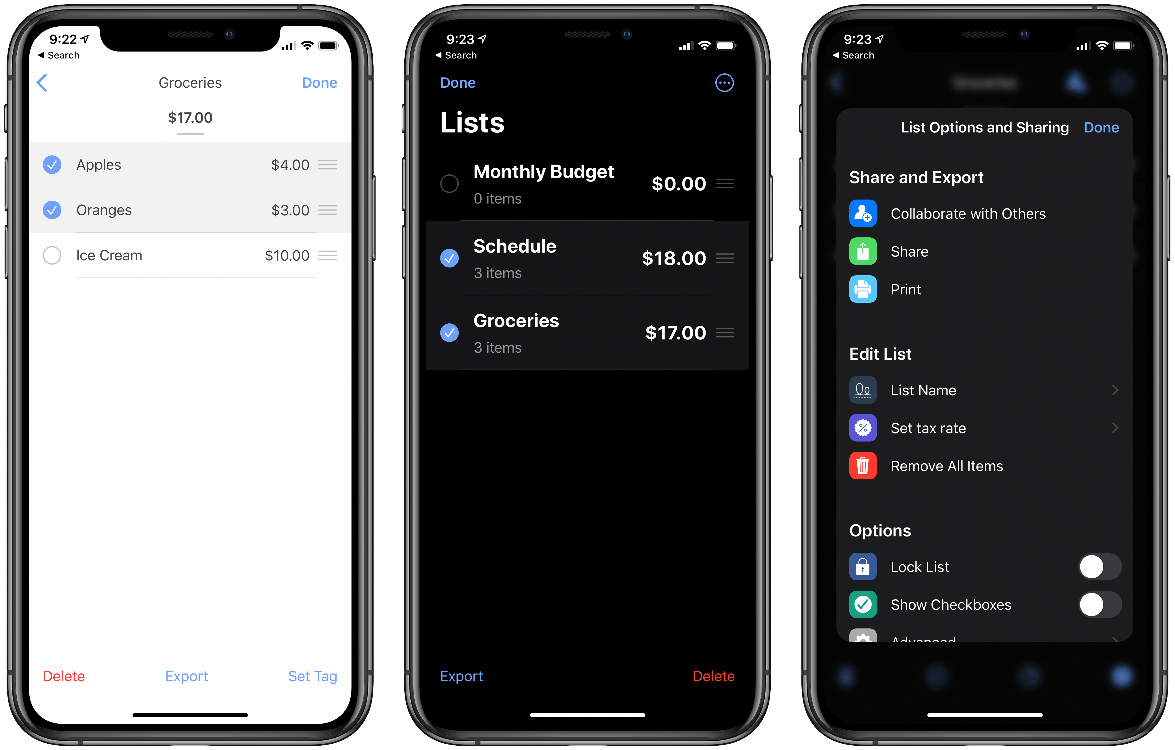
Since the app’s so new and you may be unfamiliar with it, here’s a quick primer on Spend Stack: fundamentally, the app serves as an intuitive way to track and calculate monetary costs through simple lists. The UX is similar to perhaps the most popular list app on iOS: Reminders. You can create as many lists as you’d like in Spend Stack, used for tracking different items, then add items to those lists just like you might create new tasks in Reminders. There’s one key difference though: rather than offering task manager-like parameters for your items, you associate a monetary value to each item. Spend Stack automatically adds all listed items’ values/costs and presents their sum total; if you need something more complex than simple addition, the app can also automatically account for sales tax, discounts, prices by weight, and more. There’s a lot of flexibility inherent to the list-based system, enabling Spend Stack to work well for a variety of finance-based needs such as budgets, shopping lists, and more.
On iOS 13 Spend Stack offers an attractive dark mode, which integrates with iOS’ system setting and pairs especially well with the app’s accent colors. Another iOS 13 feature, which fits especially well with the app’s list identity, is a new gesture for quick item selection. If you drag with two fingers over either your lists in the sidebar or the items inside a list, anything you drag over will instantly become selected, making it easy to perform bulk actions on your selections.
Multiwindow is supported in Spend Stack when running iPadOS, so each of your lists can be viewed as its own standalone window, or paired across various spaces with other apps in Split View. You can create a new window simply by dragging a list out of the sidebar, or by long-pressing a list to open a context menu, which provides an ‘Open in New Window’ option. One last iOS 13 change is that Spend Stack has adopted Apple’s SF Symbols for use throughout the app, so the icons you’ll see look very familiar and unified with Apple’s first-party offerings.
Developers had a lot to work on all summer long, and as a result there are surely still a lot of developers who remain diligently working to implement all the possibilities enabled by iOS and iPadOS 13. As more apps continue adopting these latest system features, Apple users can begin moving forward with integrating these changes into their everyday use of the iPhone and iPad. It’s exciting seeing how each app evolves through updates, but what comes next is the long-lasting impact: considering how our own workflows can evolve as a result.


