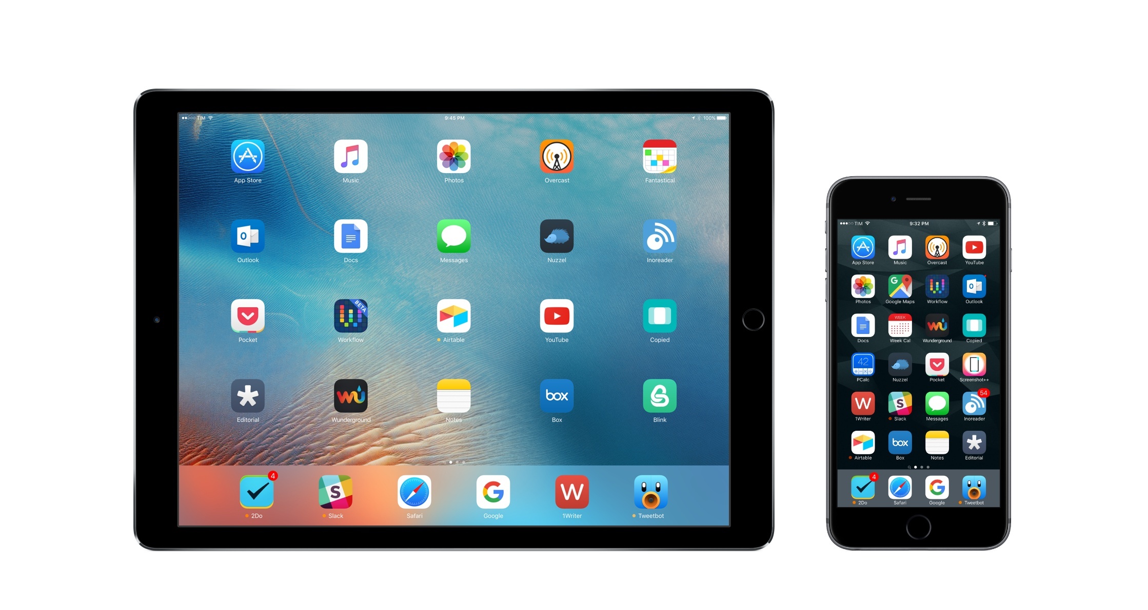
Every year around this time, after compiling a list of my must-have apps and thinking about the goals I want to achieve in the next 12 months, I like to get started on the upcoming season of writing by reassessing some of the ways I get work done. Change never stops: rather than getting stuck in my own ways and refusing to embrace it, I feed my curiosity by entertaining the possibility of better tools for my trade.
Plus, it’s always fun to spend a couple of weeks trying a bunch of apps and new services, seeing what works and should be explored further.
While this has become a new-year tradition, I’ve only written about it once – four years ago, when I was just getting started on the “iPad as a computer” idea. With 2016 and the transition to primary computer finally complete, I thought it’d be appropriate to publish a similar article again – if anything, for future reference.1
The apps below aren’t my new must-haves. They are alternatives or additions to my current must-haves that I’m considering out of intellectual curiosity for now. I’m not ready to fully endorse them, but I like some aspects of them. Most of them aren’t new, but they’ve received redesigns or feature updates that piqued my interest again.
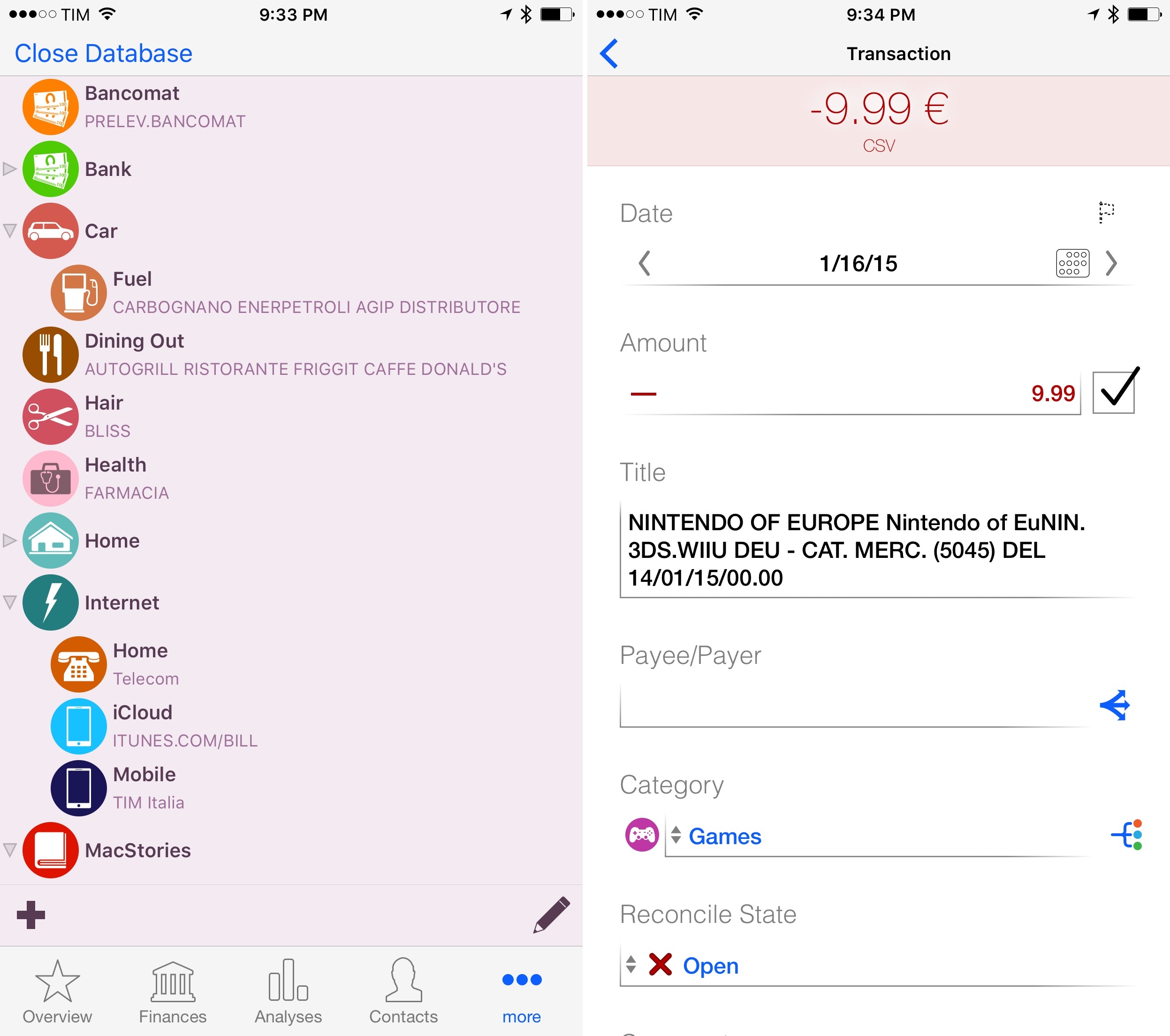
iFinance. January is the month when I have to finalize revenues and expenses for the past year and send everything to my accountant for tax purposes. I’ve tried several apps and systems to manage my personal finances and business accounting, but every year I end up going back to a spreadsheet and my bank’s terrible website. Living in Italy, I can’t access popular services like Mint or banks such as Simple, and my Italian bank doesn’t support direct access – which means I can’t take advantage of direct integration between third-party solutions like MoneyWiz or iBank. Over the years, I’ve tried apps that promised an effortless workflow for personal and professional accounting, but none of them supported multiple currencies or my specific needs.
A key requirement for me is taking 30 minutes out of my early Saturday afternoon to download CSV files from my bank for all transactions from the past week and import them into a finance manager app. I don’t trust myself to keep track of transactions manually; I only trust myself to make a note of cash transactions, which are becoming more and more infrequent in my life. I want everything else that goes on in my bank accounts to be imported and categorized automatically. After tweeting about this, I was pointed by a few readers to iFinance – and I think I may have found the app that works like I want to.
iFinance is the only finance app I know of that can automatically categorize transactions from imported CSV files based on keywords directly on iOS. The last part is essential to my workflow: I know that other apps exist that can do this on the Mac, but I want to be able to do it on my iPad and iPhone. iFinance (which has a Mac version, too) lets you assign keywords to categories, so every time you import multiple transactions via a file, the app will assign them to a category that matches the keywords contained in the title.
This has worked beautifully in my tests. I have set up dozens of categories and sub-categories for recurring statements in my bank account, imported a year’s worth of data via a CSV file on my iPad Pro, and iFinance parsed every transaction and categorized it in about a minute. I don’t see why I can’t do this with data for the past 7 years and have a complete database of my financial records in iFinance instead of my bank’s website. In iFinance, I can create charts and reports for individual categories, time periods, and other parameters, which enable me to better visualize my expenses and income.
iFinance doesn’t support direct PayPal integration and the app hasn’t been updated for the iPad Pro and iOS 9 multitasking yet, but I can accept these limitations for now and hope for updates to roll in soon. I’m going to continue adding information to my spreadsheet because that’s always going to work and my accountant requires it, but I could see iFinance working out well for me in the long term.
Wunderlist. Fed up with the limitations and issues of the Reminders app on iOS (slow card-based interface and daily sync issues above all), my girlfriend and I recently created Wunderlist accounts for the both of us and set up a few shared lists for shopping and house tasks. We were never completely satisfied with Reminders’ design and performance, but we also didn’t want to switch to a third-party service because of the inherent friction of using an app that isn’t built into iOS. However, after an episode where our shopping list disappeared in iCloud just when we needed it, we realized it was too much. Wunderlist is fast, sync is rock-solid, and the interface is cleaner and more structured than Reminders. Best of all, my girlfriend can now directly assign tasks to me so I know I won’t have any excuses to forget about them. The “best” is sarcastic.
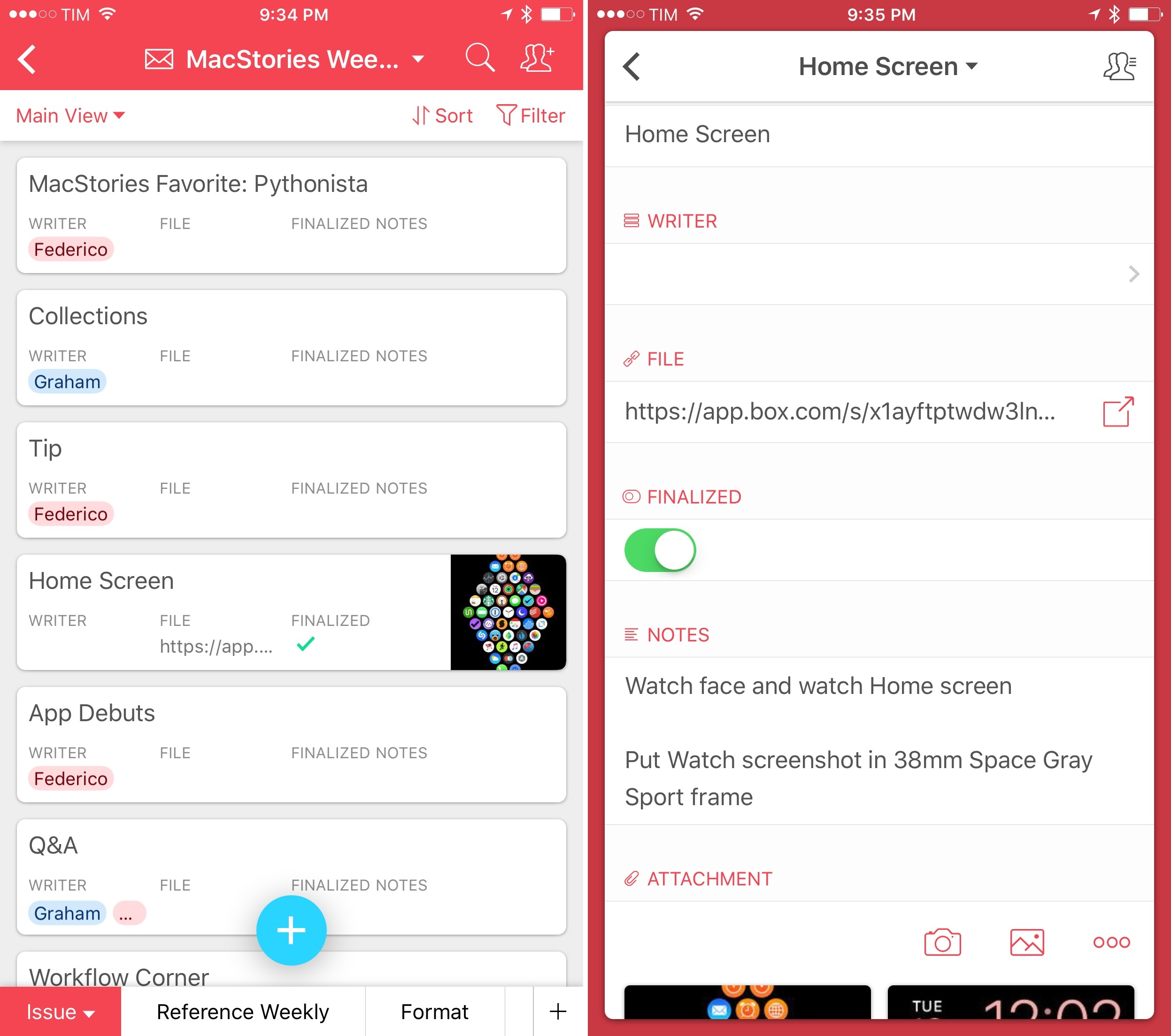
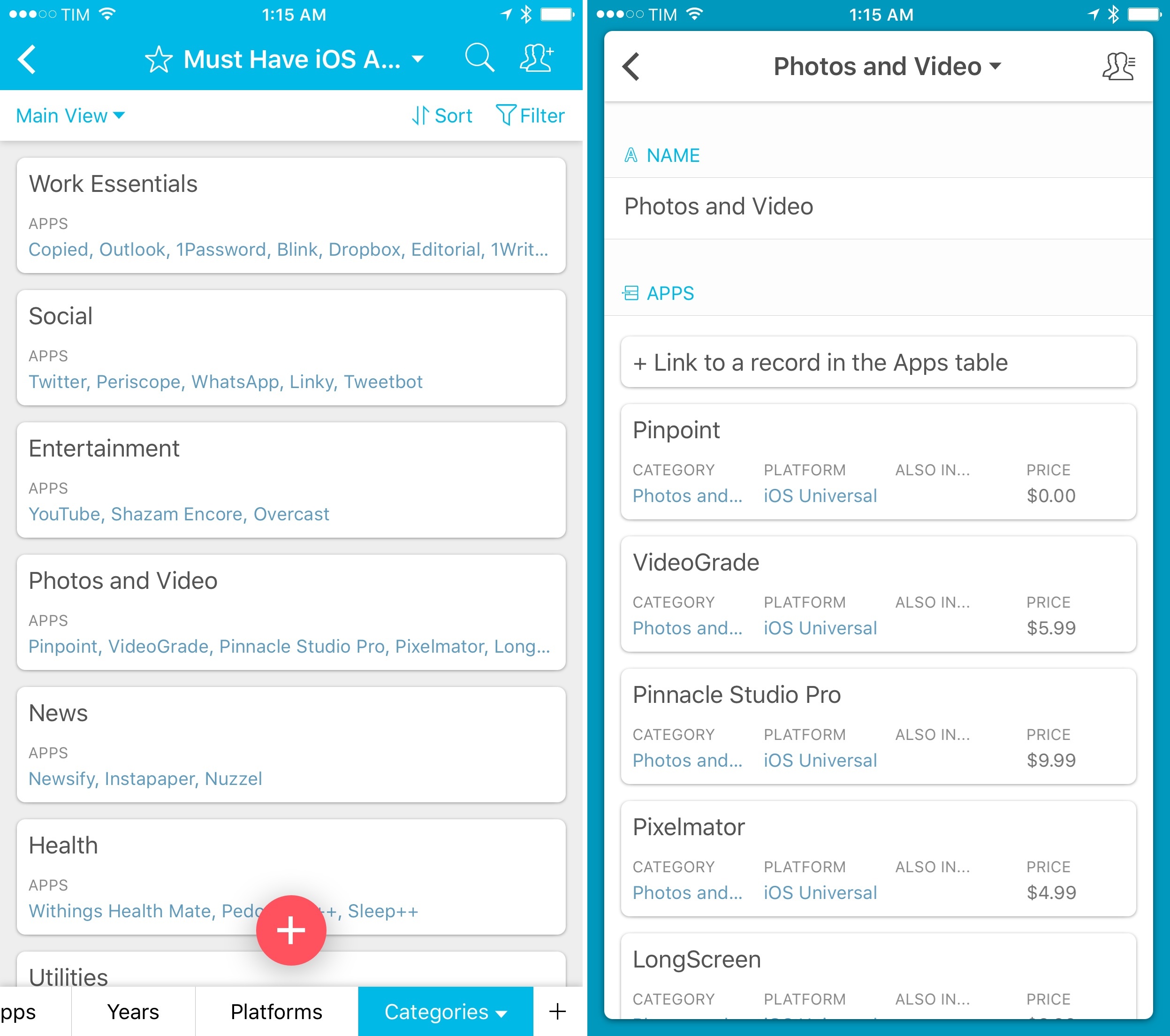
Airtable. I don’t remember how I discovered Airtable in December, but I’m glad it showed up on my radar. Airtable is a mix of a modern take on the spreadsheet and a visual database to organize records of different types of information. On the desktop, Airtable’s web app is reminiscent of a classic spreadsheet, with columns and rows to organize any type of text or numbers with a traditional hierarchy. On the iPhone, Airtable completely reimagines the layout of the spreadsheet by turning rows into standalone items that open a panel when you want to view fields contained inside them. It’s tricky to describe at first, but after trying it for a couple of minutes a few weeks back, Airtable clicked for me.
What makes Airtable special is that there are different types of fields you can enter for records in a base (short of “database” in Airtable), and each one of them has been designed with an eye for touch interaction. You can enter text labels, icons, links that open in Safari, and attachments from the photo library or external services. You can add date fields, On and Off toggles, barcodes, phone numbers, and even prompts for multiple options. All of these are also available in the spreadsheet view on the web. The design and ease of use of Airtable are top notch and they make creating spreadsheets that behave like databases a pleasure on the iPhone, which I can’t say for similar apps. I’ve barely scratched the surface of creating linked records and filtering views to present specific subsets of records, though both features came in handy when putting together my annual must-have app list (which this year started as a base in Airtable).
I’ve been using Airtable to collaborate on lists of apps with my coworkers and to assemble our weekly newsletter material. Its highly visual approach is working like nothing else ever has for me. I can’t wait for an iPad app.
Crowdfire. I found this app thanks to an Apple feature on the App Store, and while it offers a lot of social functionalities I don’t want (such as automatically greeting new followers with direct messages2 or following back new followers), it has three options I like.
The first one is the ability to check the relationship between two Twitter users – to see if two users follow each other. Second, Crowdfire can poll your Twitter account and find users you follow who don’t follow you back. Last – and this is something I’ve been looking to try for quite a while – you can easily unfollow accounts who have been inactive for 1 to 6 months. The last two modes have been particularly useful to cull my following list and unfollow Twitter accounts who haven’t tweeted in a long time, which has allowed me to go back to following ~800 users instead of over a thousand. I plan to keep Crowdfire installed and leverage its unfollow tools over the next few months to regain control of my following list.
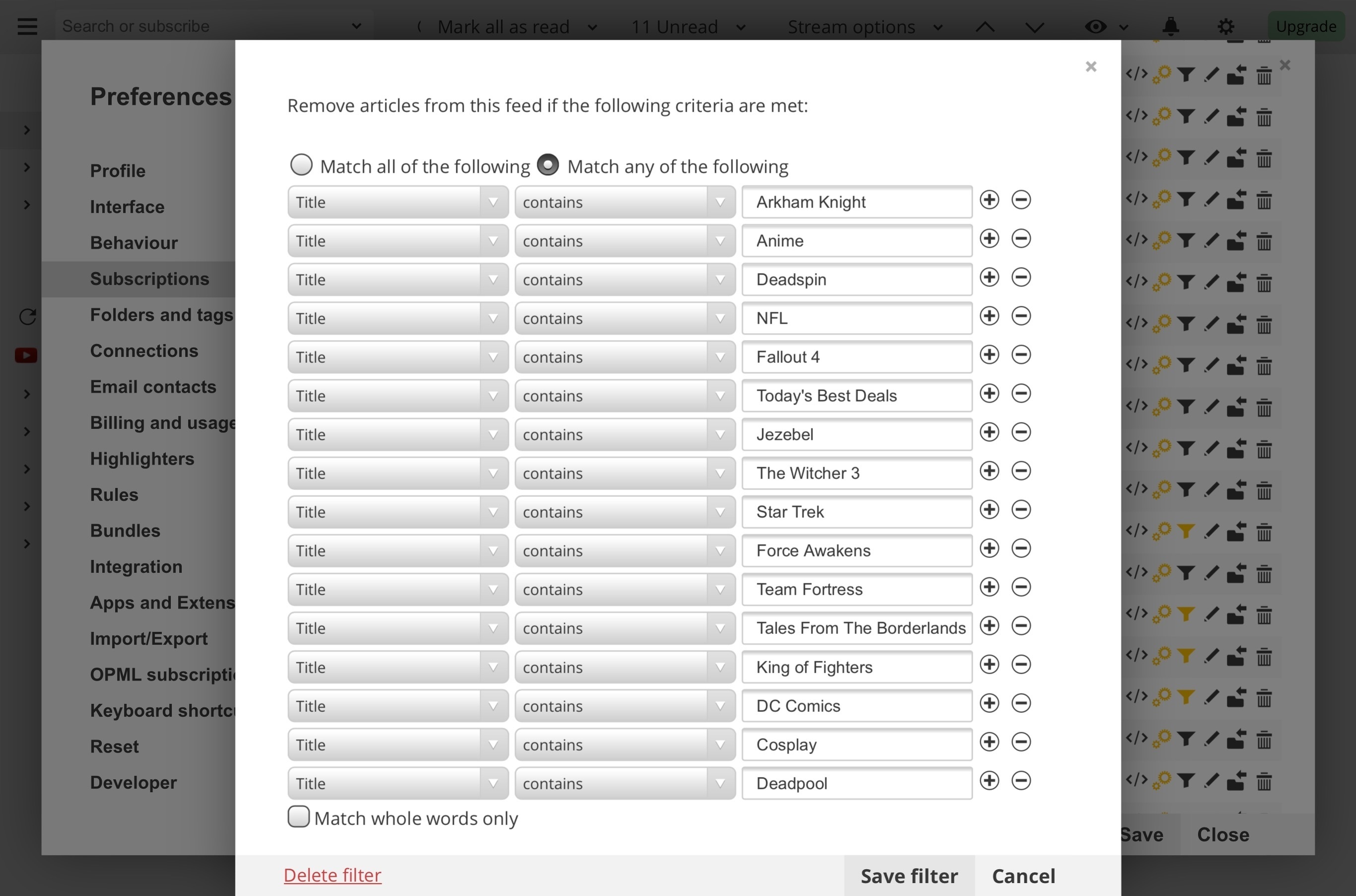
Inoreader. Recommended to me by a MacStories reader, Inoreader bills itself as the RSS service for power users, and I’m surprised I didn’t pay attention to it before. Think of Inoreader as a supercharged NewsBlur (which already brings a ton of advanced functionality to the table). You can create filters for keywords contained in titles and body text, with a management interface on the web to see all your filters and copy them across subscriptions. You can create saved searches for topics (in my case, “iOS” and “Apple” articles) and browse a filtered stream of headlines that only contain those keywords. You can highlight keywords with different colors so you can see keywords that interest you at a glance, and, of course, there is full text search for all articles in your subscriptions.
On the iOS side, the app hasn’t received iPad Pro support and the features available on the desktop web app haven’t been brought to mobile devices yet (such as filter creation or custom actions). However, the app is well done, stable, it supports Safari View Controller, and it’s got a pull-down gesture you can use when reading an article to load the full text for truncated feeds, which I’m enjoying a lot.
Inoreader has dozens of functionalities and menus to customize – for instance, I’ve only recently discovered the ability to create rules (I can automate my Inoreader to send articles matching a keyword to our Slack-based news aggregator) and email tags, which I combined with Gmail to send newsletters I receive every day (Above Avalon and Stratechery, but you can do this with Club MacStories emails, too) to a tag in Inoreader, so I can read those emails alongside other articles. Inoreader may end up being my favorite power user surprise of the year, but I’d like to see more love and features put into the iOS client.
If anything, Inoreader is further proof of the innovation happening in the RSS space thanks to Google Reader’s demise and the sustainability of subscription-powered business models. And also the fact that, with so many solid options, I can’t seem to settle with a single RSS service yet.
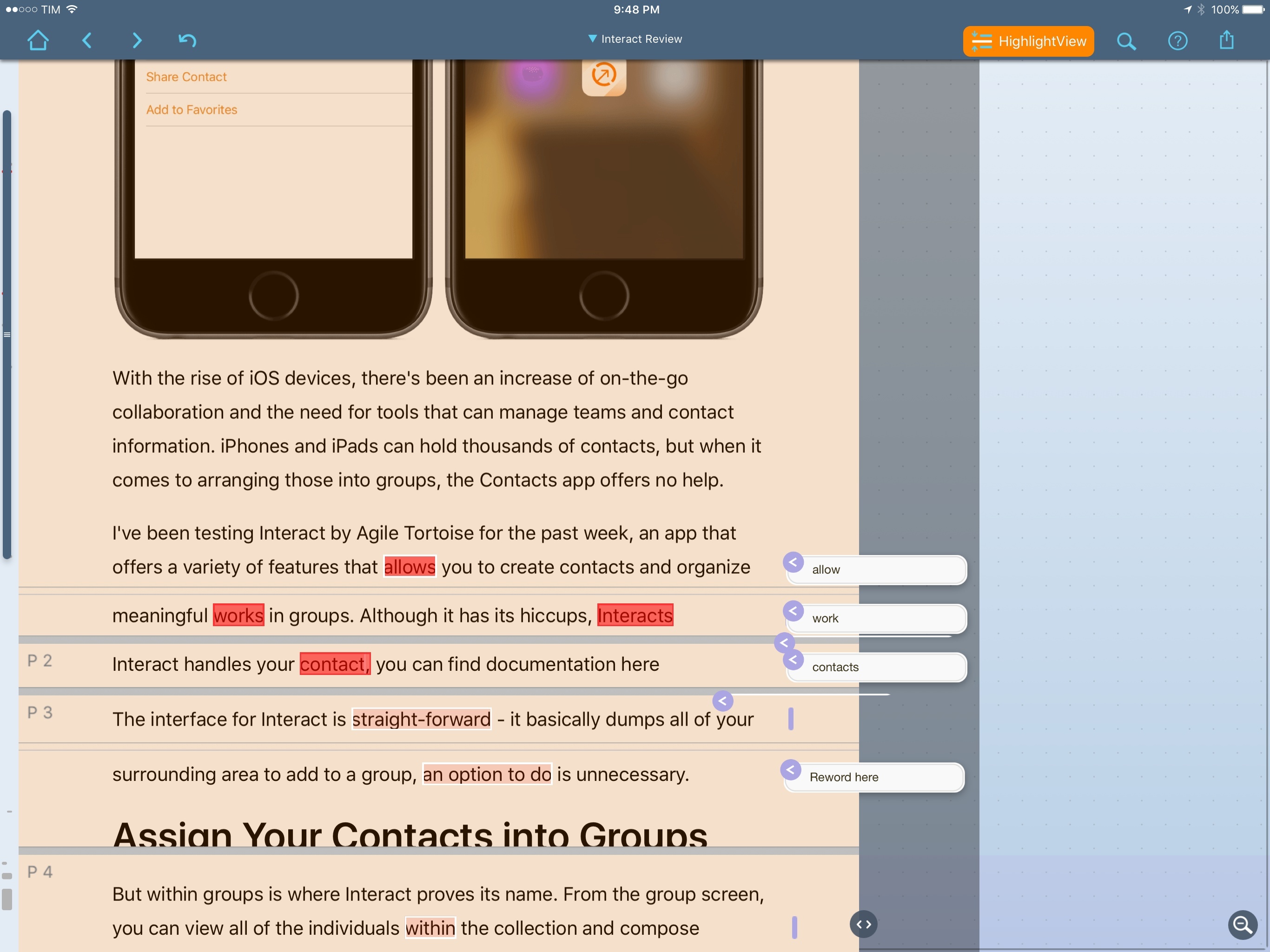
LiquidText. Another app I discovered with Apple’s Best of 2015 App Store feature at the end of the year, LiquidText is one of the most innovative takes on document annotations I’ve seen on the iPad.
LiquidText can annotate PDF documents (and webpages converted to PDF in-app), but unlike the traditional way of viewing annotations, LiquidText lets you zoom and pinch a document to bring highlights and comments closer together, which is ideal for viewing a summary of highlights and comments while hiding everything else. Like Airtable, it can be tricky to describe what LiquidText does (from this standpoint, it was smart of the developers to include lots of mini video tutorials to explain features inside the app), but, after taking it for a spin with the rest of the MacStories team, I can say I’m a fan.
There’s something about LiquidText that’s uniquely tactile and fun. As the name implies, text isn’t statically held in place in a document – whether it’s a highlight, a comment, or multiple comments woven together, you can move text around and view connections with the kind of direct manipulation that makes sense in the age of multitouch. I’ve had several “aha” moments when using LiquidText to proof articles from MacStories writers lately, and I want to work on bigger research topics with this app going forward. I’d like to have an iPhone version and support for Markdown documents, though.
Google. I installed Google’s mobile app last year after disappointing results with iOS 9’s Intelligence features and time-to-leave notifications for my calendar. Unlike Apple’s Calendar and Maps apps, Google (paired with Google Calendar and location history) is able to accurately predict when I’ll have to leave to arrive on time for my next event – not too soon like Apple Calendar wants me to, and not on the verge of being unacceptably late. Just right. In my experience, Google’s alerts have done a wonderful job at calculating traffic for my most visited areas around Viterbo and Rome, sending me notifications that were based on current weather conditions, time of the day, road problems, and other variables.
Speaking of location history: after trying a handful of apps to continuously track my location and build a log of my driving times and movements (such as Passenger), I’ve found Google’s location history to be the most reliable one despite occasional hiccups. I just wish there was a native mobile app for location history instead of having to use a web app with clumsy desktop hover controls.
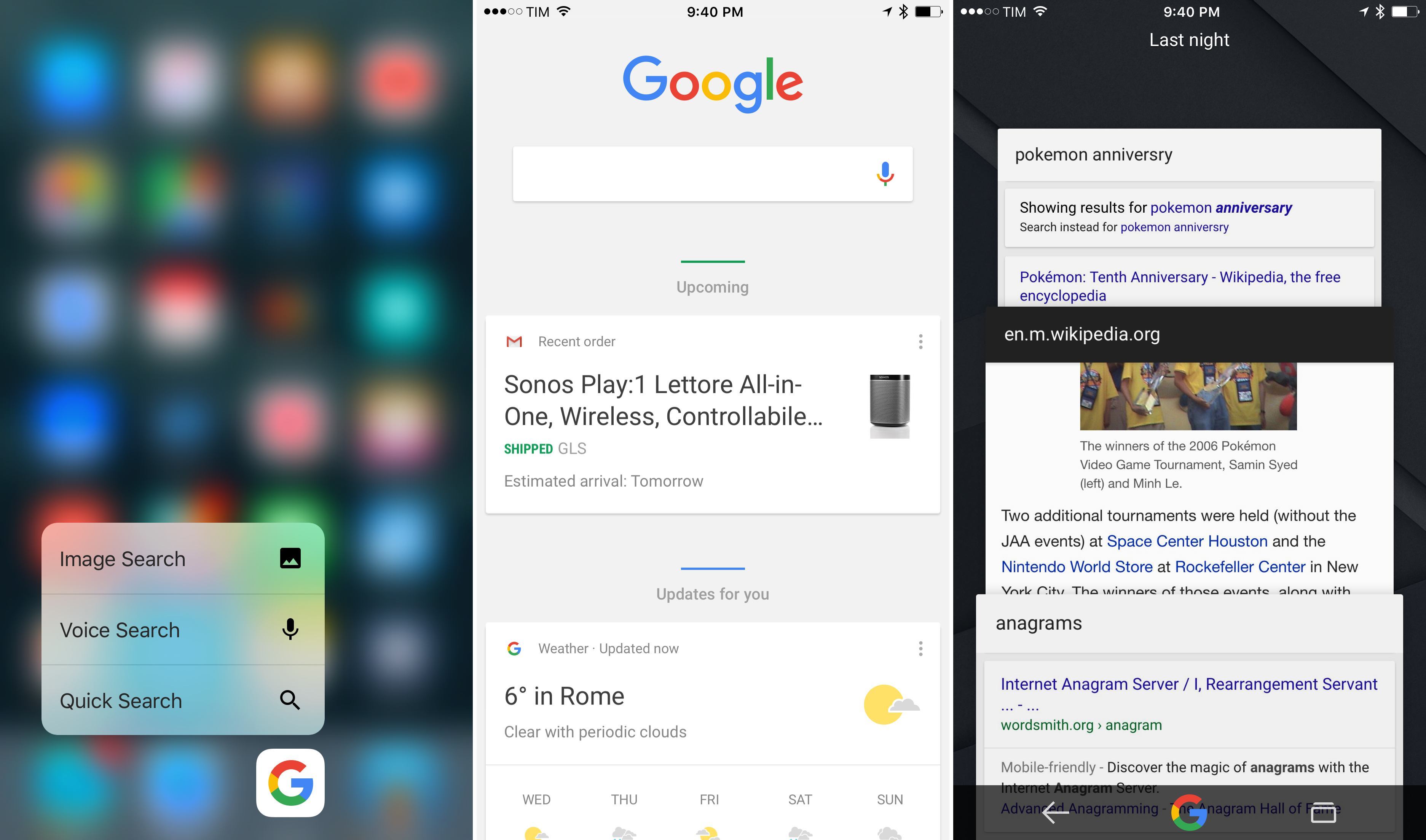
In addition to alerts and location history, Google has gained a spot in my dock because of 3D Touch on the iPhone 6s. With a light press, I can bring up shortcuts for image, voice, and quick search; while I could start a Google search by pressing the Safari icon and typing into a new tab, search suggestions in the Google app are faster, nicer to look at, and they include more of my search history with indicators for queries I’ve already searched for.
There’s a lot to like in the Google app for search alone. A persistent Google button at the bottom makes it easy to dismiss the current tab and start searching for something else (the button is also easier to reach than Safari’s address bar). The app’s tab view shows dates for pages that have been left open, and those that haven’t been used in two days are automatically cleared for you, avoiding the annoyance of cleaning up dozens of tabs on a regular basis.
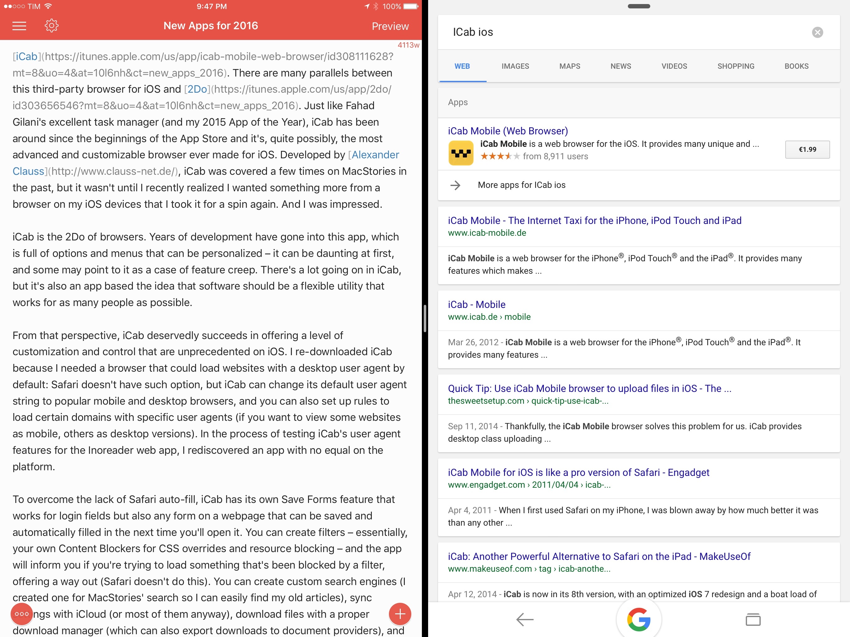
I’ve been using the Google app on both the iPhone and iPad Pro; on the latter, the ability to pin the app in Split View, search, copy a link, then tap the Google app to start another search lets me insert links in 1Writer quickly.
I don’t plan on using Google as a replacement to Safari: the lack of peek previews, Content Blockers, webpage selections for action extensions, and integration with Safari View Controller makes the Google app a bad fit for my everyday browsing. But, as a dedicated search utility/location history tool/time-to-leave alert system, Google is nice to keep around. I was a fan years ago, and I’m glad I revisited it.3
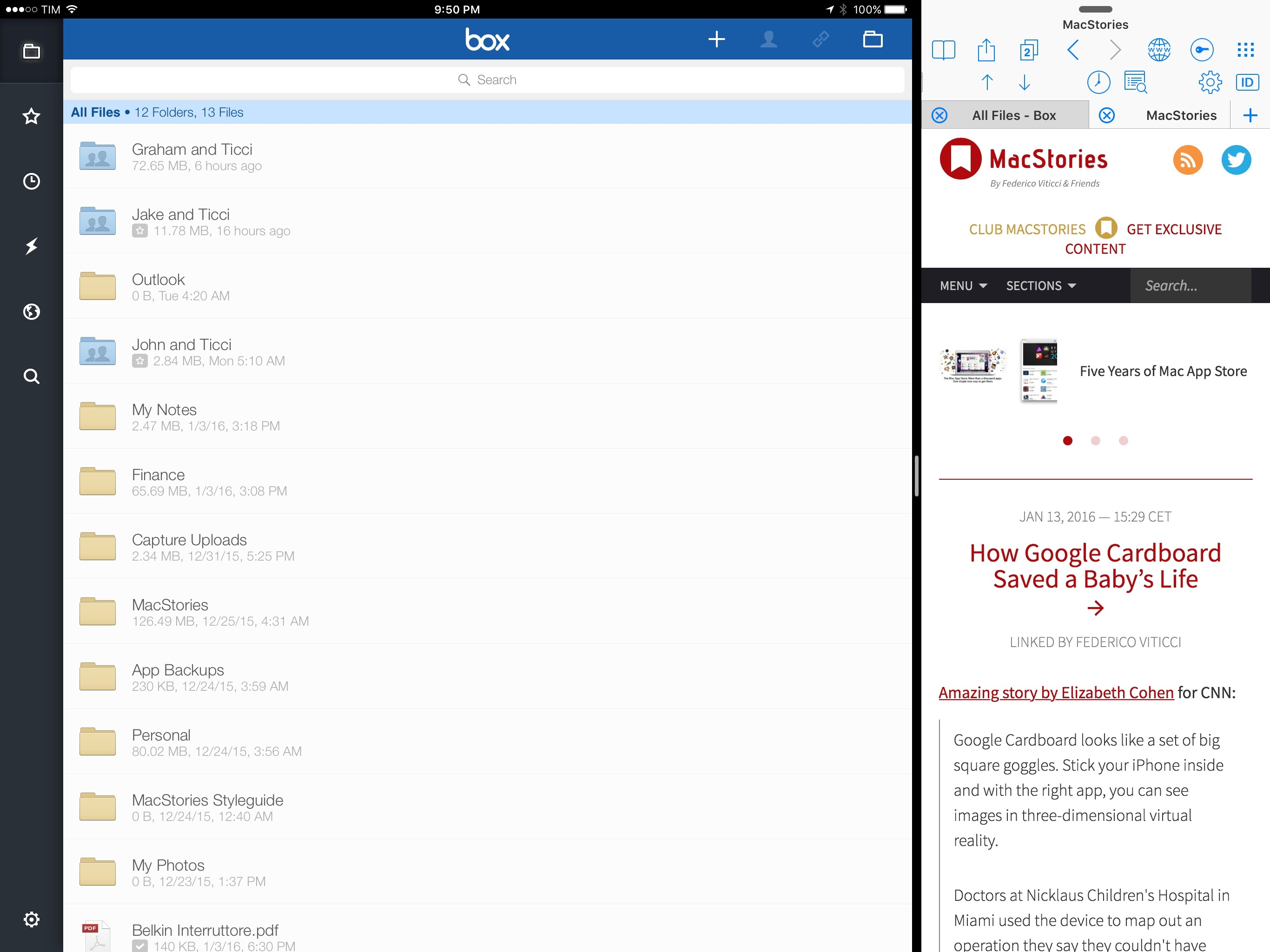
Box. A few months ago, I started looking at options for cloud storage of files and documents for teams. After trying all the popular suspects – Dropbox, OneDrive, Box, Google Drive – my decision came down to Box and Dropbox. Given factors such as cost, collaboration features, admin controls, and integration with Microsoft apps, I chose Box.
Box isn’t often mentioned by the general tech press that’s more attuned to Dropbox – I had never tried Box either before I realized I needed deeper collaboration features. I’ve been a happy Dropbox user for years and I don’t see Dropbox going away as the de-facto third-party sync solution for many apps. After trying Box for the past month, though, I like a lot of what I see for collaboration with other users in a small team. Links to files can be generated with rules for access and you can set up notifications to alert you when new files are added to a shared folder. You can leave comments on files or create Box Notes, which are like lightweight Google Docs that can live inside Box folders. Versioning is done well and you can view an Updates dashboard to catch up on every change in your account quickly. There’s excellent integration with Office on iOS and Outlook, not to mention compatibility with hundreds of other iOS apps.
For a lot of apps, I’ll have to continue using Dropbox sync. But to manage my files and collaborate with team members, I’m going to be using Box in 2016. I’m looking forward to their upcoming redesign.
Word and Excel. I’m bundling these two apps as I started using them in the past month as part of my Office 365 subscription. While Office gets a bad rap among Apple users, the iOS apps are actually solid, frequently updated, and integrated with cloud services. More importantly, there’s always been something I “get” with the UI of Word and Excel, but I can’t say the same about Apple’s iWork apps. Perhaps it’s the way layout tools are arranged in the ribbon interface or how you create formulas in Excel or how you insert media and format text in Word, but I can pick up Office for iOS and start using it without having to figure out its quirks like I have in iWork.
I’m currently using Word to put together a styleguide for MacStories (a long-term document I want to finish in the first half of the year) and I’m running my business’ financial information through various spreadsheets in Excel. I appreciate how Office apps are integrated with Box through a document provider that supports Open mode (changes are saved back to the Box document provider as you make changes in Office), and Microsoft’s commitment to building a solid iOS portfolio is showing with great iPad Pro support.
iCab. There are many parallels between this third-party browser for iOS and 2Do. Just like Fahad Gilani’s excellent task manager (and my 2015 App of the Year), iCab has been around since the beginnings of the App Store and it’s, quite possibly, the most advanced and customizable browser ever made for iOS. Developed by Alexander Clauss, iCab was covered a few times on MacStories in the past, but it wasn’t until I recently realized I wanted something more from a browser on my iOS devices that I took it for a spin again. And I was impressed.
iCab is the 2Do of browsers. Years of development have gone into this app, which is full of options and menus that can be personalized – it can be daunting at first, and some may point to it as a case of feature creep. There’s a lot going on in iCab, but it’s also an app based the idea that software should be a flexible utility that works for as many people as possible.
From that perspective, iCab deservedly succeeds in offering a level of customization and control that are unprecedented on iOS. I re-downloaded iCab because I needed a browser that could load websites with a desktop user agent by default: Safari doesn’t have such option, but iCab can change its default user agent string to popular mobile and desktop browsers, and you can also set up rules to load certain domains with specific user agents (if you want to view some websites as mobile, others as desktop versions). In the process of testing iCab’s user agent features for the Inoreader web app, I rediscovered an app with no equal on the platform.
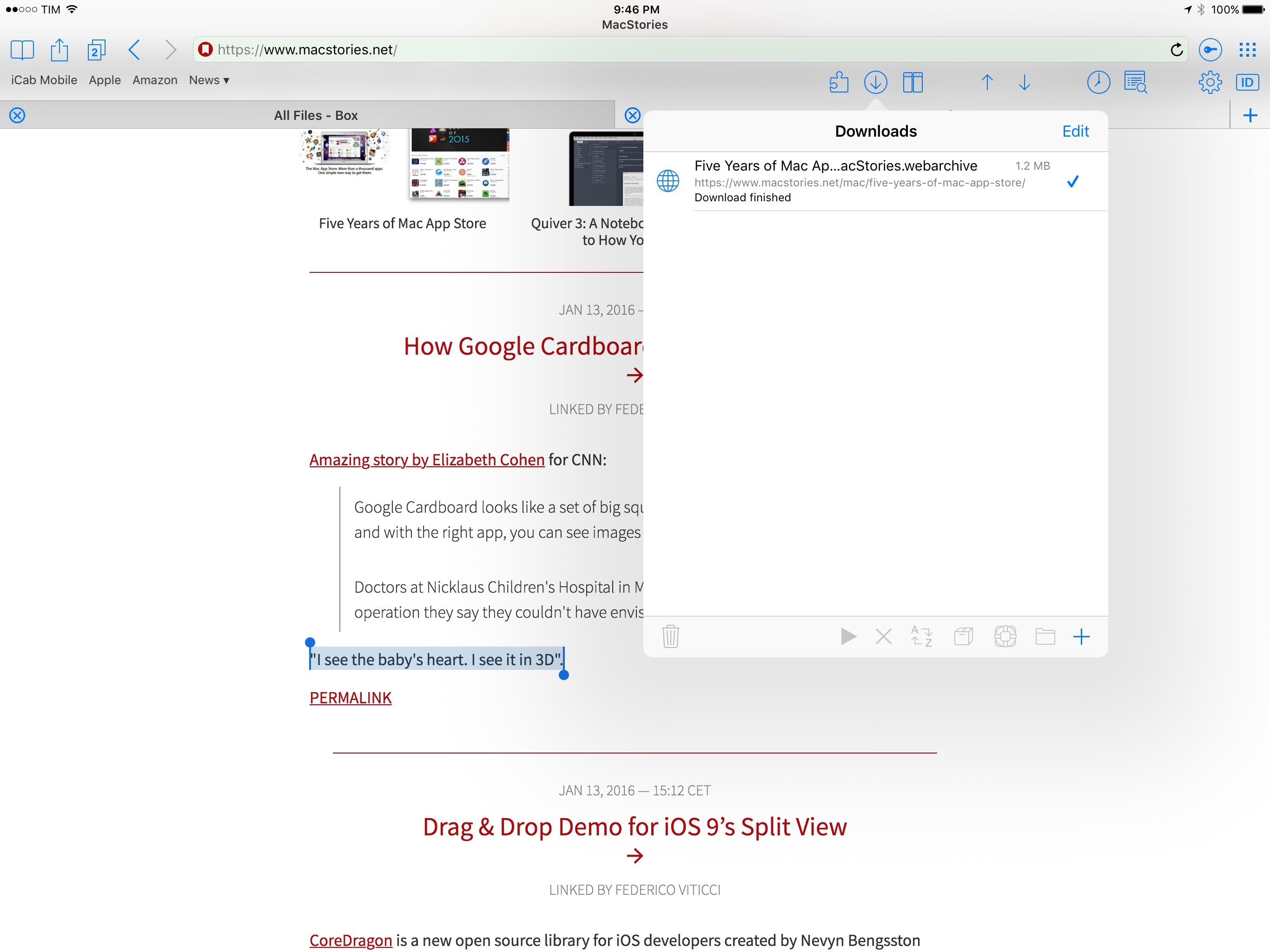
To overcome the lack of Safari auto-fill, iCab has its own Save Forms feature that works for login fields but also any form on a webpage that can be saved and automatically filled in the next time you’ll open it. You can create filters – essentially, your own Content Blockers for CSS overrides and resource blocking – and the app will inform you if you’re trying to load something that’s been blocked by a filter, offering a way out (Safari doesn’t do this). You can create custom search engines (I created one for MacStories’ search so I can easily find my old articles), sync settings with iCloud (or most of them anyway), download files with a proper download manager (which can also export downloads to document providers), and you can customize almost anything you can think of – from toolbar icons to contextual menus, bookmarks, gesture shortcuts, and more. You can even watch YouTube videos and use a custom Picture in Picture button to continue watching them anywhere on iOS.
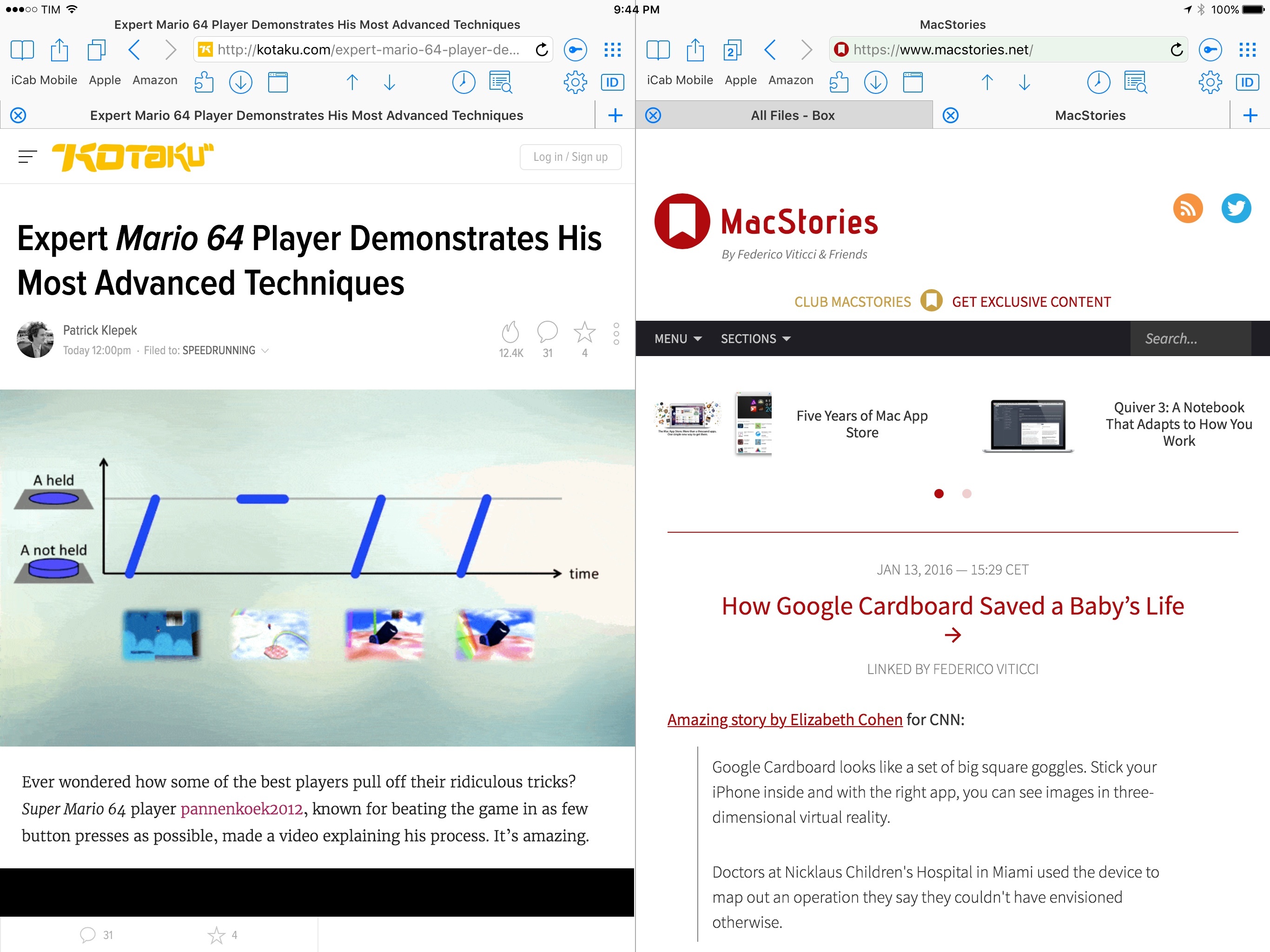
Perhaps the highlight of my iCab rediscovery is twin browser mode: available only on the iPad, this option lets you view two webpages side by side, splitting the browser in two “windows”, each retaining its own set of tabs and access to bookmarks and share menus. Twin Browser mode has, in my tests, been particularly useful when researching topics for MacStories and my podcasts, allowing me to check out more sources at once while highlighting and saving notes for later. iCab’s twin mode is perhaps the strongest case in favor of a more capable Split View in the future where apps could also split their own UIs in two.
I’m not going to stop using Safari as my default browser on iOS, for the same reasons I mentioned about Google’s app. But, I’m going to enjoy using iCab as a sidekick to Safari, leveraging its seemingly infinite feature set to build a research browser tailored to my needs. If you’ve been looking for a powerful, highly customizable iOS browser, iCab deserves another look.
Over the course of the year, I plan to revisit a few of these apps and services individually, delving deeper into their functionalities and my workflow. And, as usual, we’ll see which apps can stay and which ones will be gone by December.
- I don’t want to do this again in 2020, though. See you next year. ↩︎
- Never do it. Never. Just no. It’s creepy. ↩︎
- A note on Google Now: while I’ve been impressed with the location history and alerts (I’ve seen the app recommend a suggested location on its own, for instance, after it noticed I was spending a lot of time there), everything else has mostly been a letdown. I never tap on any of the recommended stories to read more. I don’t understand how the Apps & Websites integrations are supposed to be working: I see the option in my preferences and I am using some services configured with my Google accounts, but I don’t get any card from them in Google Now on iOS. I was only surprised by cards in Google Now when I landed in London and San Francisco last year: the app automatically brought up exchange rates, weather, and other relevant city information, which was pretty cool. ↩︎


