When iOS 12 launches this fall, it will introduce a newly redesigned iBooks app simply named Books. Though the reading experience in Books is largely the same as before, the rest of the app is drastically different, offering the biggest app redesign on iOS since last year’s App Store.
Modern design is a clear centerpiece of Books, but the app also includes new features, big and small, that make it feel all-new. From tools that borrow from Goodreads, to more robust collections, to dark mode, and much more. There’s a lot to explore here, so let’s dive in.
Design
Apple Books is the latest in a line of updated and newly debuted media apps that Apple has produced recently. Apple Music set the initial trajectory with its redesign in 2016; its look and feel was adopted by Apple’s new TV app later that year, then redesigned Podcasts and App Store apps in 2017. iBooks was Apple’s only major media app to not yet score a new look, so it was only a matter of time before that changed. iBooks getting a redesign was no surprise; however, the extent of that redesign took me completely by surprise.
Apple could have easily taken the look of apps like Music and Podcasts and slapped it on Books, and it would have been fine. The company did nothing of the sort, though; instead, Apple Books offers one of the most drastic departures from existing iOS design norms available on the platform.
It all begins with a serif variation of Apple’s San Francisco font. You might not think a header font tweak could make much of a difference, but it truly does. It doesn’t just look different from Apple’s media apps – it’s distinct from every other first-party iOS app. Books’ hallmark new typeface fits perfectly with the app’s theme, honoring literary tradition and showing a different side to Apple design.
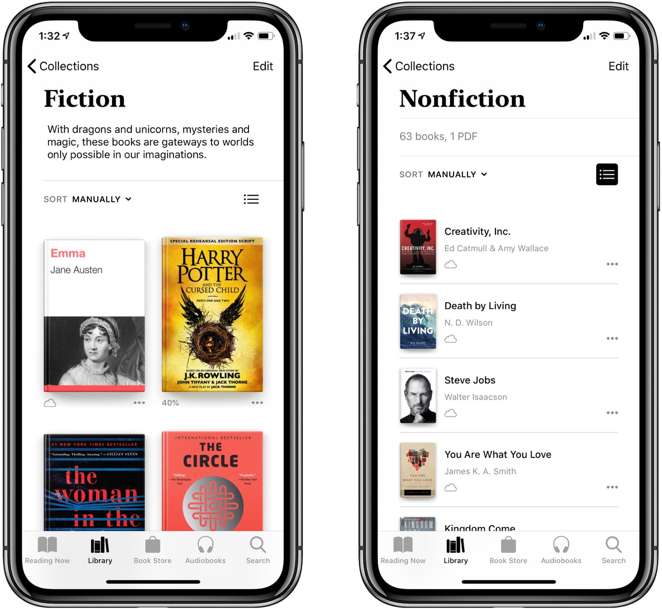
The other major design highlights in Books are similarly distinct in our post-iOS 7 world. Skeuomorphism is present app-wide in the way book covers look. Unlike in recent versions of iBooks, the cover of each book isn’t simply a flat image; instead, there’s now a skeuomorphic effect on the left edge of each book cover that denotes a spine. This design recalls the earliest days of iBooks’ life, where imitation spines were prominent. Another detail present in those early days and resurrected here is the heavy use of shadows to create a sense of depth. Every book in the new Books app is haloed by a shadow that makes it pop off the screen, providing the illusion that you can just pick it up to start reading.
Books’ design isn’t entirely foreign to other iOS apps – there are some similarities, such as the abundant use of white space – but overall its differences far outweigh any commonalities. And those differences prove that there’s still plenty of room to expand the accepted design norms on iOS.
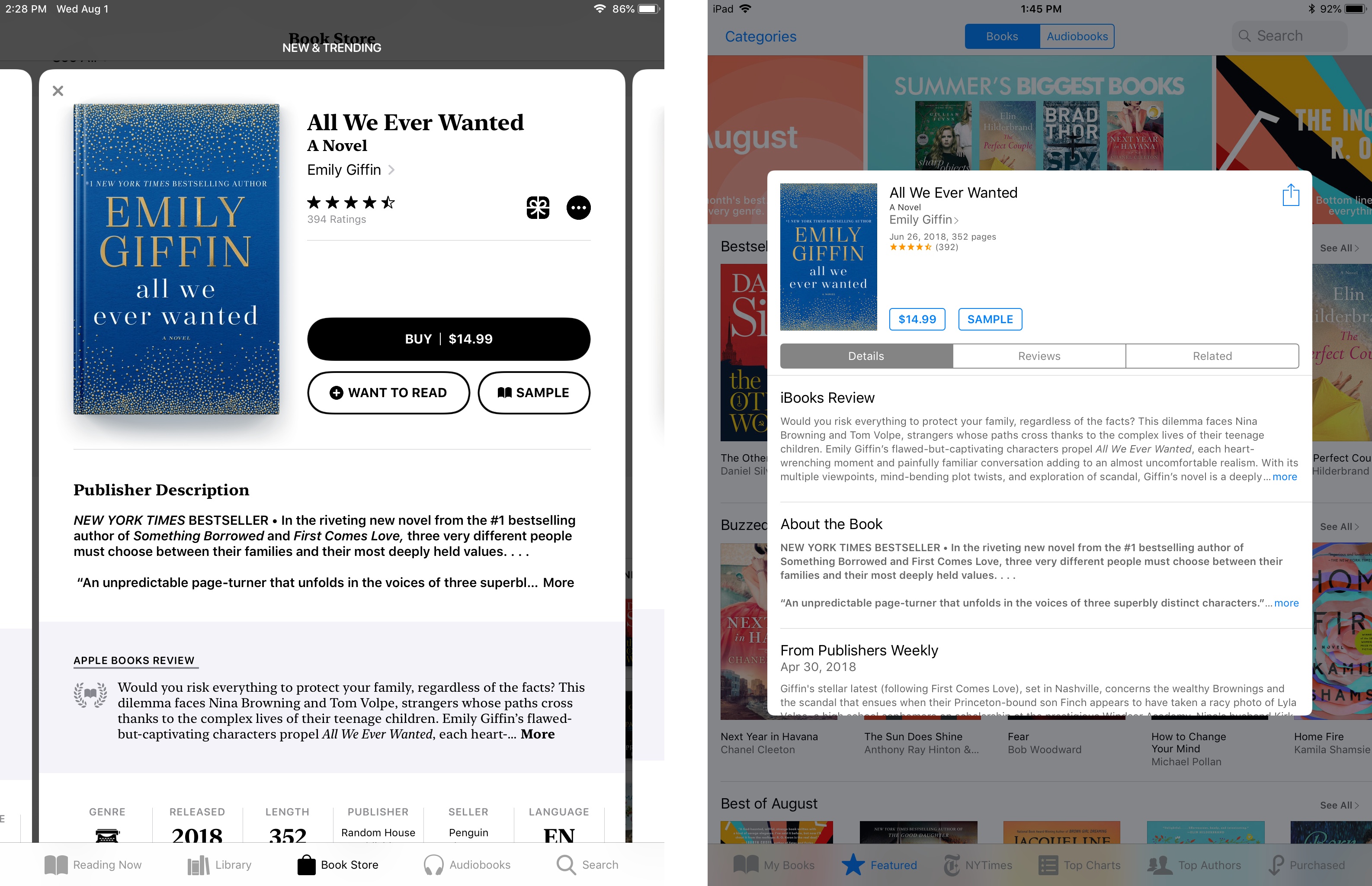
The detail view for book listings has an entirely new look. Title information now pops into view in the form of a modal card that can be scrolled through, or swiped down on to dismiss – perfect for one-handed iPhone use. These cards contain all the same information as before – ratings, reviews from Apple’s editorial team and Books users, publisher descriptions, length, genre, and related titles. In iBooks this information was split into three separate panels, while here it’s all in one place. Also, in iBooks different information types tended to all look the same, making for a bland visual experience; the new design, however, calls attention to each distinct data element, inviting you to engage with it all.
Structure
While Books’ visuals may differ greatly from Apple’s other media apps, its navigation tabs follow the pattern established by apps like TV and Podcasts.
Reading Now
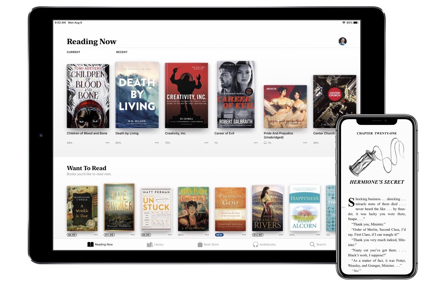
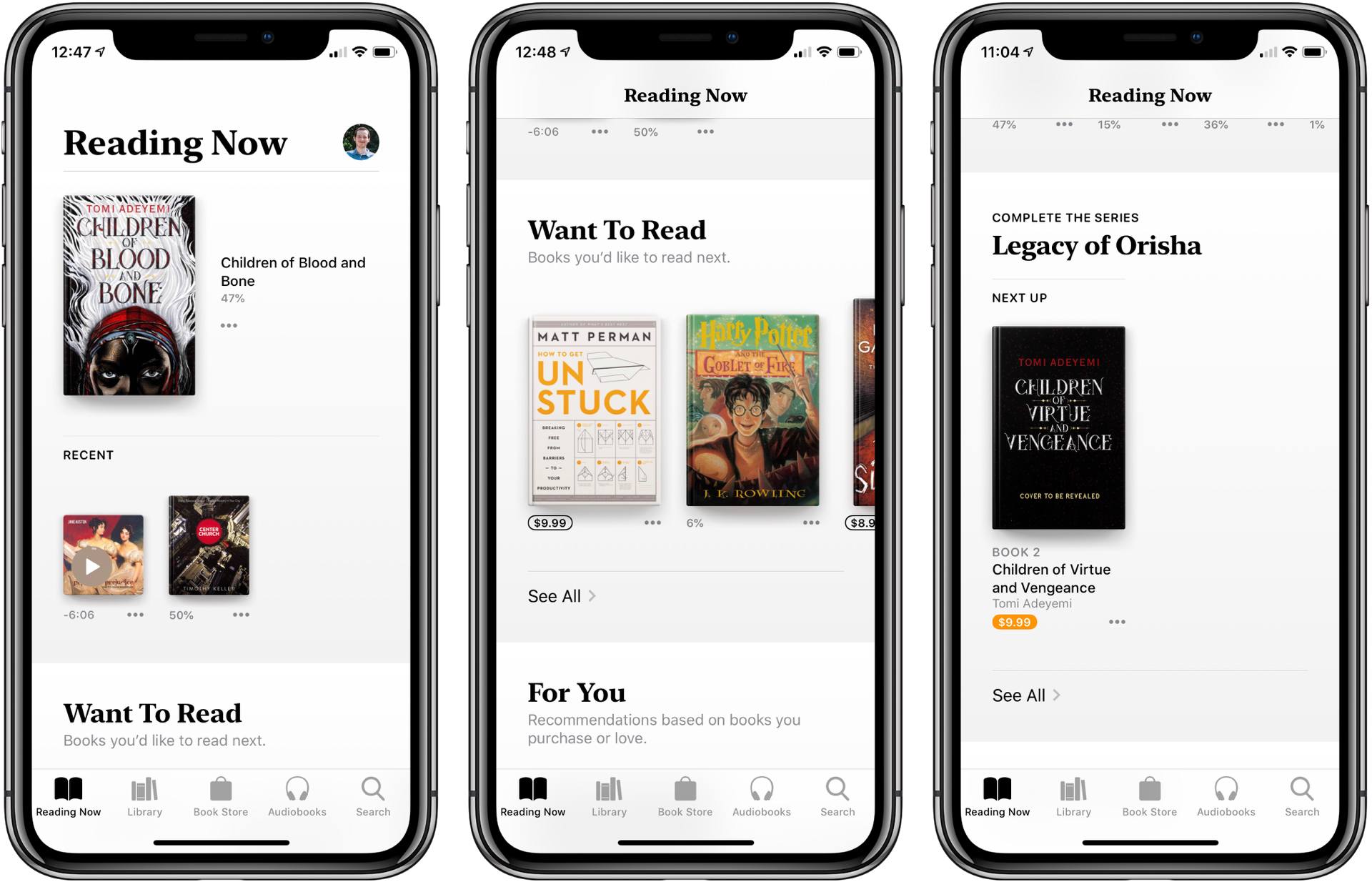
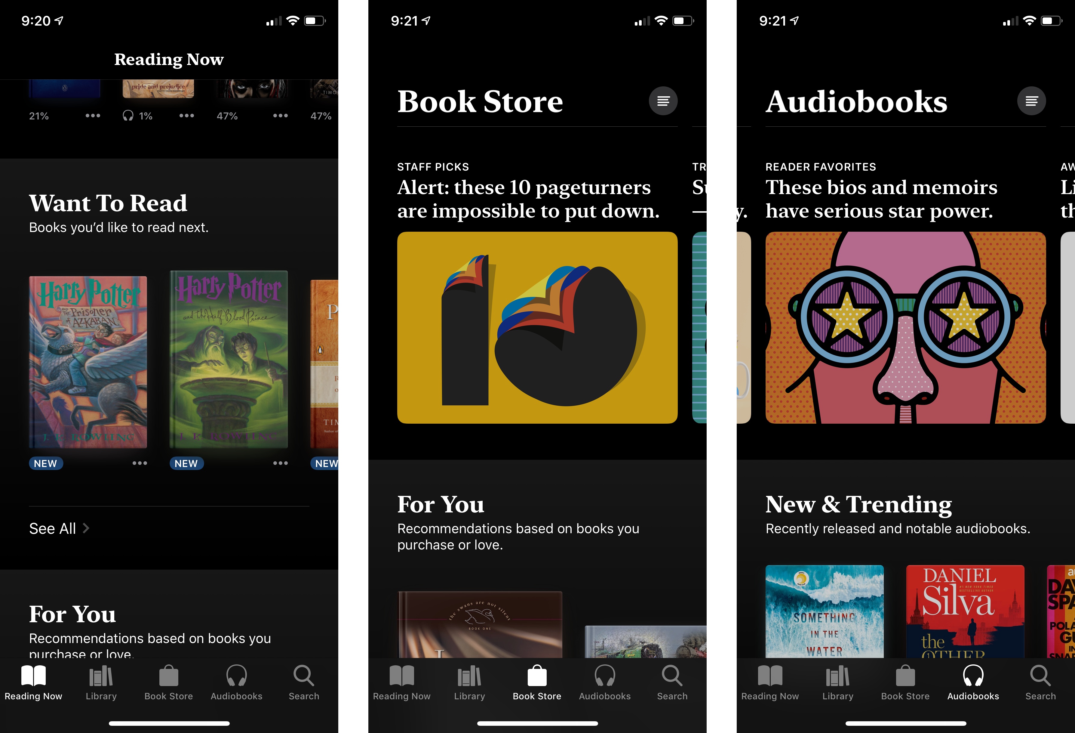
Just like Listen Now in Podcasts and Watch Now in TV, Reading Now is the main place you’ll spend your time in Books. It contains all the titles you’re currently reading, plus books you want to read (more on that in a moment), and some collections of recommended titles to check out. During the beta cycle, these recommended titles have fallen under two categories for me: a themed collection curated by Apple’s editorial team, and a For You section containing books related to those I’ve already purchased or loved (like in Apple Music, you can now love or dislike titles).
A few other quick details about Reading Now: whenever you purchase a new book, it goes straight to your Want to Read section. Like before, the book is marked ‘New’ until you start reading it, but fortunately the redesigned tag for purchased titles is less obtrusive than before – in iBooks I would aggressively clear the ‘New’ designation as soon as possible, but with the subtler design I don’t feel that impulse anymore.
Throughout the new Books app, including in the Reading Now tab, sections of books are presented as horizontally-scrolling lists, similar to the way iOS 11’s App Store is laid out. This makes it easy to navigate different areas of the app without having to travel far.
Library
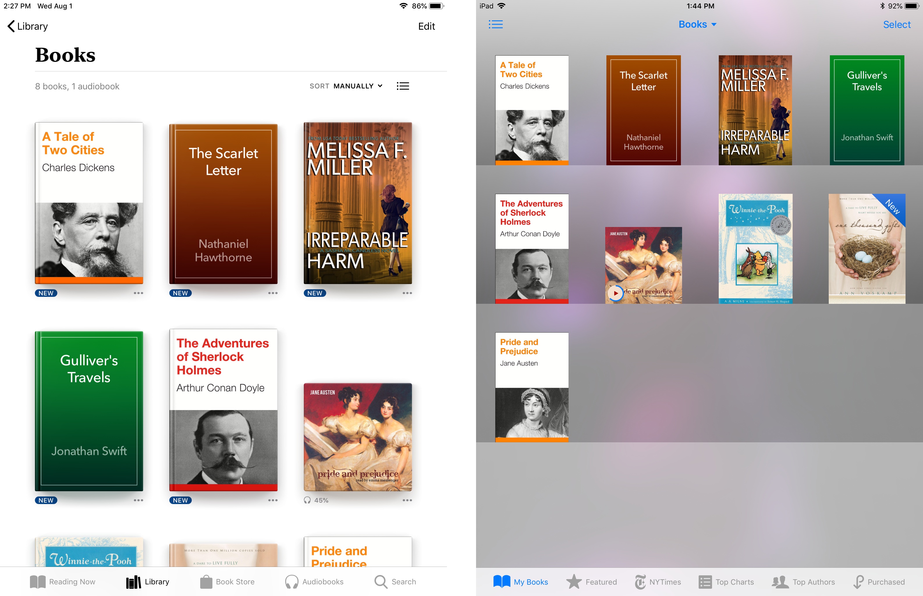
Library is the new version of the My Books tab, and it’s one of the places that’s seen the least amount of change in iOS 12. Like before, you can see your full collection of books either in a grid layout or a list, except now you have sorting options no matter which view you use – iBooks only let you modify sort type in list view. Books can be sorted manually, which employs drag and drop, or by title, author, or how recent they are. Also, as was true in iBooks, Library enables creating your own custom collections to sort books into.
Book Store
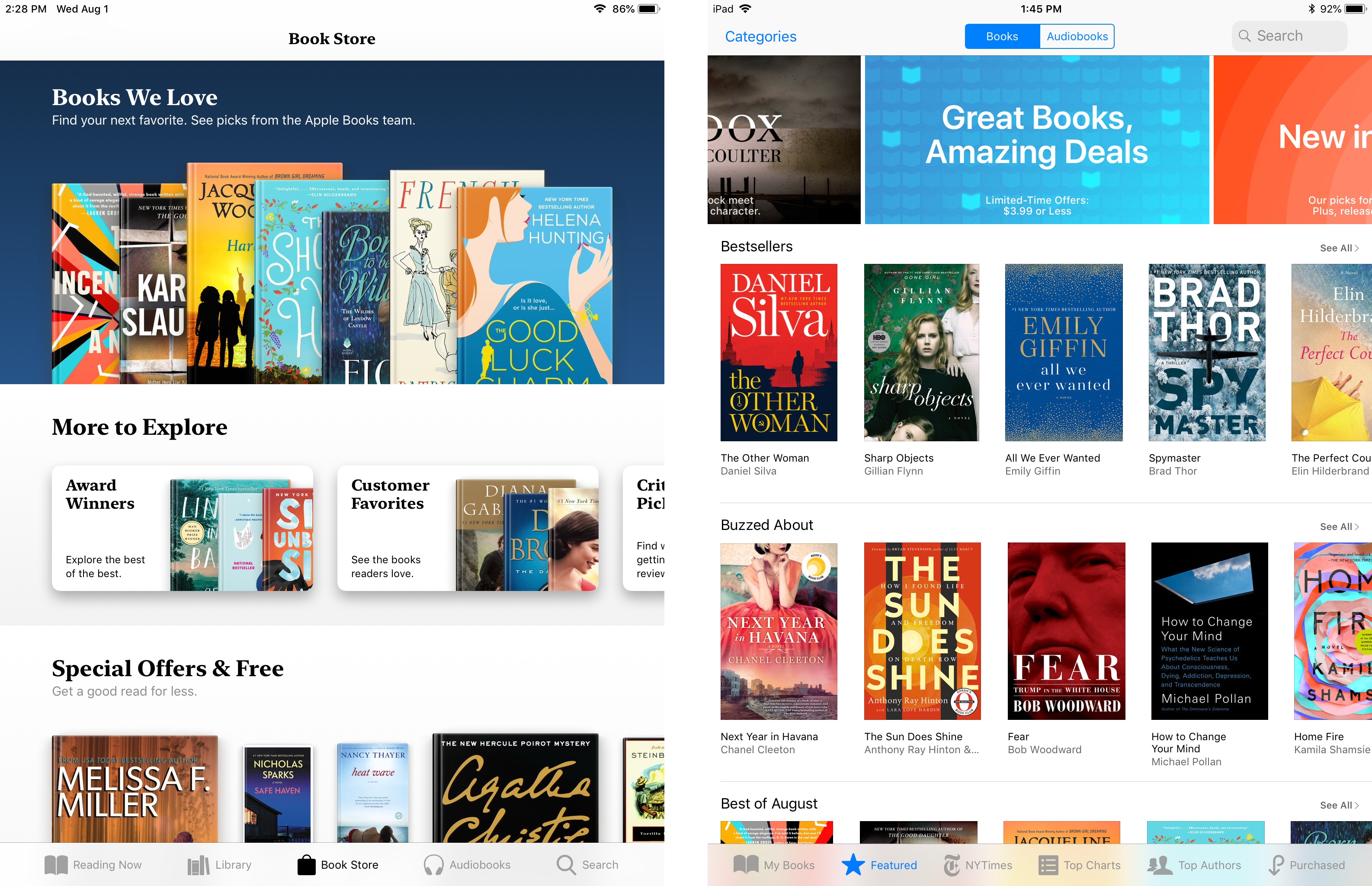
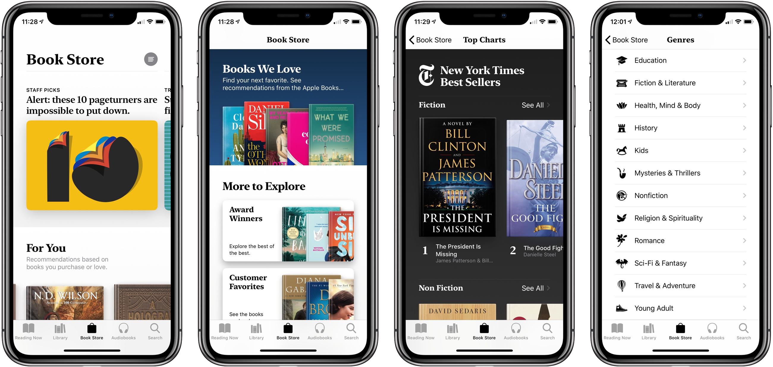
Rather than dividing the store into different tabs like iBooks did, previously-divided sections like featured titles and top charts are all contained in the new Book Store tab. More Apple-curated collections can be found here than ever before, and the app uses beautiful visuals both for collections and different sections to present an attractive storefront. Genre pages now include their own Apple-featured collections, and following the design trend of the App Store, each genre has its own custom icon – I’m especially partial to the nonfiction icon signaling ‘No unicorns allowed.’
As if Apple’s beefed up crop of editorial collections wasn’t enough, Book Store now also hosts a For You section, which is an expanded version of what’s present in Reading Now. For You contains a new Weekly Top 5 feature, highlighting five titles per week that Books’ algorithms think you’ll love. Inside For You you’ll also find suggested new authors to check out, unread books from authors you already love, and book recommendations based on your purchase history.
Audiobooks
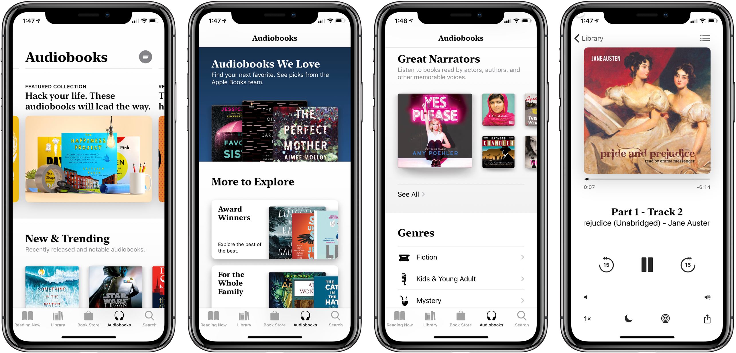
In the new Books app, audiobooks get their own dedicated storefront and tab. While audiobooks you own will still live alongside other books in Reading Now and Library, when you want to find something new to listen to, the Audiobooks tab is the place to go. Like Book Store, the Audiobooks tab is littered with curated collections of recommended books. Some of these are ported from Book Store, but most are audiobook-specific, like the ones titled Great Narrators and Long Books for Roadtrips.
Search
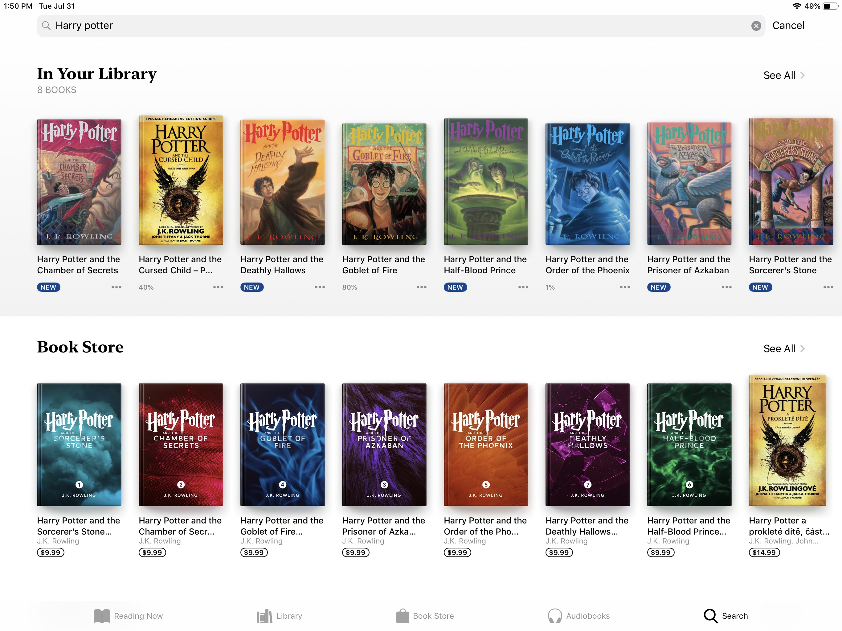
Search now has its own dedicated tab, which features both trending searches as well as searches you’ve performed recently. Start typing in the search box and results from your own library will slide in across the top, with results from the Book Store and Audiobooks storefronts placed underneath.
Reading Tracker
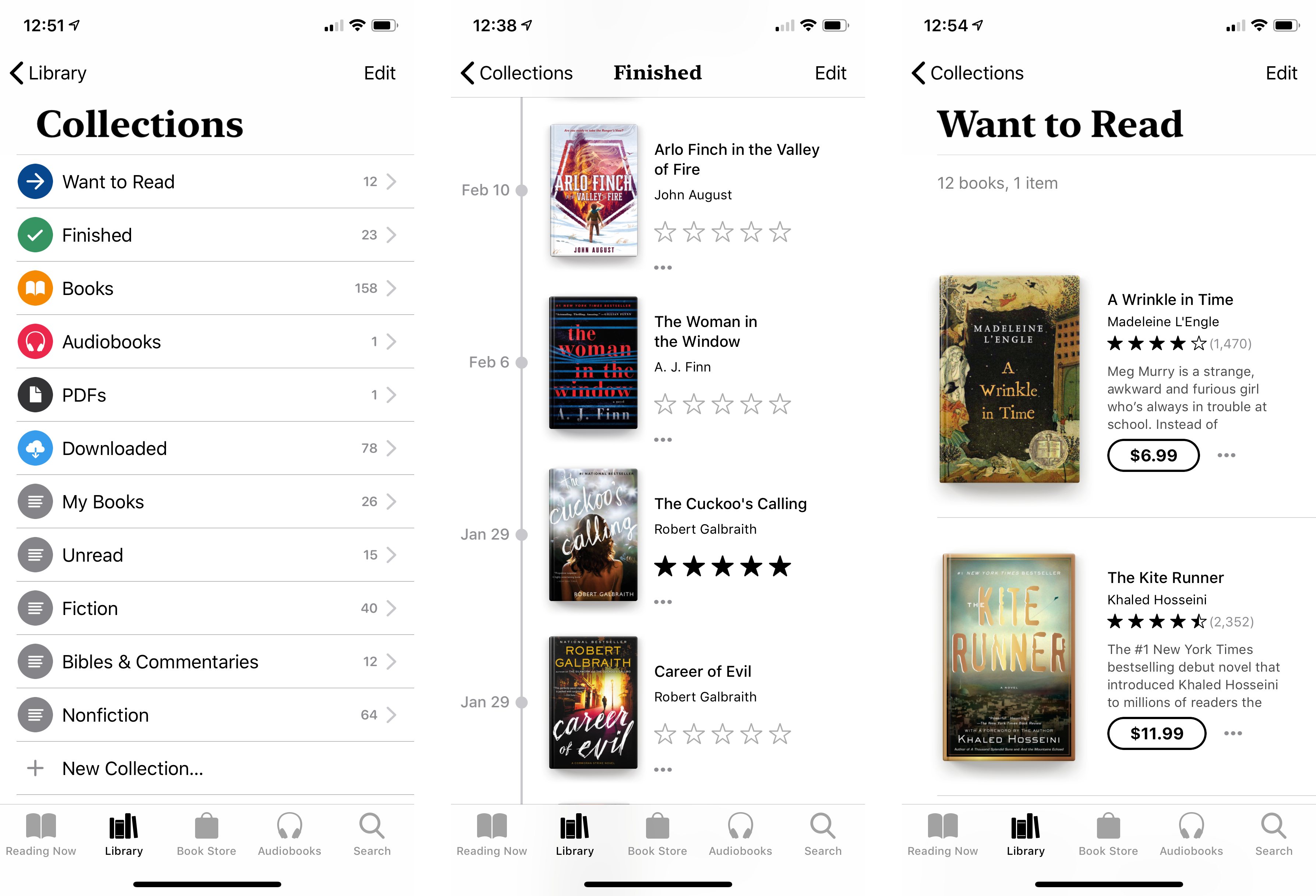
The most significant feature addition to Books is a Goodreads-style system for tracking your reading history and titles you want to read. Books’ implementation of this system is simple, taking the existing collections feature and creating two auto-generated collections with special benefits: Finished and Want to Read.
Whenever you’ve made it most of the way through a book, you’ll see a ‘Finished’ button to mark it complete, and it’s added to the Finished collection; alternatively, you can hit the ellipsis next to any title to open a menu that includes the option ‘Mark as Finished.’ This menu is the same way you add a book to your Want to Read queue; as I mentioned earlier, your Want to Read titles are displayed in the Reading Now section of the app, or you can access them from your Library.
People use Goodreads as a record, both of which books they’ve read in the recent past, and of which books they want to read next. Books’ new features serve both of those purposes well – visiting the Finished collection in your library displays a chronological, dated timeline of books you’ve recently completed, and Want to Read is conveniently located right where you’d want it: just below the assortment of books you’re currently reading.
One of the nice things about Goodreads is that it’s platform-agnostic. Despite the fact that Amazon now owns the service, and has created special integrations with Kindle, you can still track books of any medium in Goodreads – whether you’re reading a paper book, listening to an audiobook, or reading within Kindle or Apple Books. When Apple first showed off the revamped Books app, I feared that its features to mark titles ‘Finished’ or ‘Want to Read’ would be exclusive to titles in your Apple Books library. Fortunately, that’s not the case.
Any book or audiobook, whether you own it or not, can be given the ‘Finished’ and ‘Want to Read’ designations – provided the title’s available in the Books app’s stores. This should cover nearly any book you’d read or want to read, but I have occasionally discovered that some obscure titles are not available inside Apple Books, and thus nothing can be done with them there. But for the most part, whether you read something on paper, or in Kindle or Audible, you can still mark the title ‘Finished’ in Apple Books, or save it in ‘Want to Read,’ despite ultimately reading it elsewhere.
One thing Goodreads offers that Apple Books does not is a social component. An Apple Music-style social sharing feature would be a nice fit for Books, but there’s nothing of the sort here. If you’re like me and use Goodreads for reference purposes rather than as a social network, that may be fine by you, but it’s worth considering.
Another detail to consider if you’re thinking about replacing Goodreads is that Apple Books offers less fine-grained controls over how ‘Finished’ books are saved. In Goodreads you can modify the date a title was completed, but Books doesn’t provide that option. I’ve found this particularly troublesome because currently, in the beta version of Books, marking a title from the Book Store as complete assigns it a random finish date I have no control over. Even if that bug wasn’t present, though, it’d be nice to be able to essentially import my reading history from Goodreads by manually selecting the dates I finished past books.
Everything Else New
True Black Reading Mode. The reading experience in Books is entirely unchanged from iBooks, save one key exception: the app’s dark reading theme is now true black on the iPhone X’s OLED display. It looks gorgeous, and offers battery savings to boot.
More Robust Collections. User-created collections are very much an optional feature that most users will never take advantage of; however, if you do use them, Books introduces a few nice enhancements. First, you can now add a custom description to accompany each collection. Simply open a collection, hit the Edit button, then a description field will appear near the top of the screen. Second, just as any title from the Book Store can be added to your Finished or Want to Read collections, you can also now add unpurchased titles to any other collection in your library. And finally, view type and sorting method are collection-specific, so you can have one collection remain in list view, with custom sorting, while the other parts of your library are in grid view with a different sort type; in iBooks, view changes would persist app-wide. Here’s hoping the Books team can share their code with the Files team before long, as I’d love to have different views and sorting types for different folders in Files.
Dark Mode. Distinct from Books’ true black reading mode, the app now also includes a dark mode for the entire non-reading interface. Based on the ambient lighting in the room, Books will automatically switch to using a dark mode app-wide when the environment suits it. It looks beautiful, and I hope Books becomes just the first of many apps to offer dark modes in the future.
Book Samples. In iBooks, downloading a book sample would save it to your library, but that is no longer the case. Now when you open a sample from a book’s detail page, the sample opens immediately where you are, and when you close the sample, you’ll land right back on the detail page again.
Drag and Drop. In Books for iPad, you can use drag and drop to move titles from any Apple-recommended collections into your Want to Read queue in Reading Now, or into any other collection you’d like inside Library. This works particularly well when Apple recommends a title in Reading Now that you want to check out, and with a quick drag you can drop it into the Want to Read section just above.
Books also includes support for cross-app drag and drop. Dropping a title from the Book Store into a text-based app provides an iTunes link to that book, while dropping a book that you own provides the book’s title and author. And if you want to add external files to Books, like a PDF or ePub, you can drop them in using drag and drop.
From its design to the myriad of feature improvements, it’s clear that Apple Books was crafted by people who love reading. None but avid readers would beef up the likely-underutilized collections feature, nor create such a useful Reading Now hub, nor go to the trouble of designing an app that feels so unique.
Apple left alone what needed to be left alone – namely, the reading experience – while leaving no stone unturned in improving the rest of the app. The finished product is impressive.
Books is a love letter to readers. And just like last year’s new App Store, it proves once again that fresh, unique app design is alive and well at Apple.


