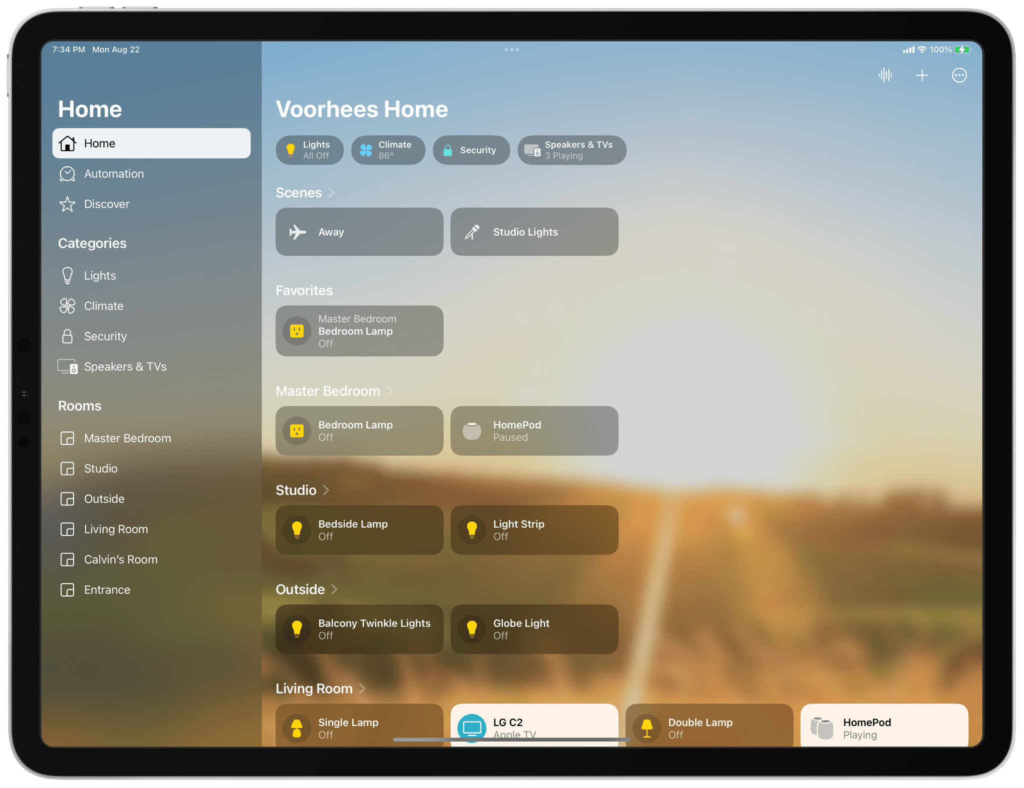
I’ve spent a lot of time in the Home app since moving to North Carolina. I moved right after WWDC, so I’ve disassembled, reassembled, and reconfigured my home automation setup, all in the midst of testing the latest iOS, iPadOS, macOS, and watchOS betas. What I’ve learned is that the Home app’s new design is much better for navigating a large collection of smart devices than before, but the app’s changes don’t go far enough. The app’s automation options are still too rudimentary, which limits what you can accomplish with them. Still, the update is an important one worth exploring because it promises to relieve a lot of the past frustration with the Home app.
One question that’s fair to ask about Home’s redesign is: Why now? The app’s big, chunky square tiles have been a feature of the app since the start and criticized just as long. The issues that I suspect have spurred the change are two-fold. First, the square tiles of the app’s previous design were too uniform, making it hard to distinguish one device from another. Second, they wasted space. That was less of a concern on a Mac or bigger iPad, but no matter which iPhone you used, Home could never display more than a handful of devices. Both issues have been problematic for a while, but with the Matter standard poised to bring more devices into the Home app, the issues were bound to get even worse without a redesign.
Since Home was first released, Apple has tweaked the iconography available in Home and added a row of status buttons along the top of the app, but the big space-wasting tiles endured. That led me to control my HomeKit devices with Siri most of the time. That’s not a bad way to control devices, but it’s not as reliable as tapping a button. Plus, the app is just more convenient than Siri in many situations, like when I’m already using my iPhone for something else or when it’s early in the morning, and my family is still asleep. That’s why I was so glad to see Apple rethink how Home uses valuable screen space and the way devices are organized.
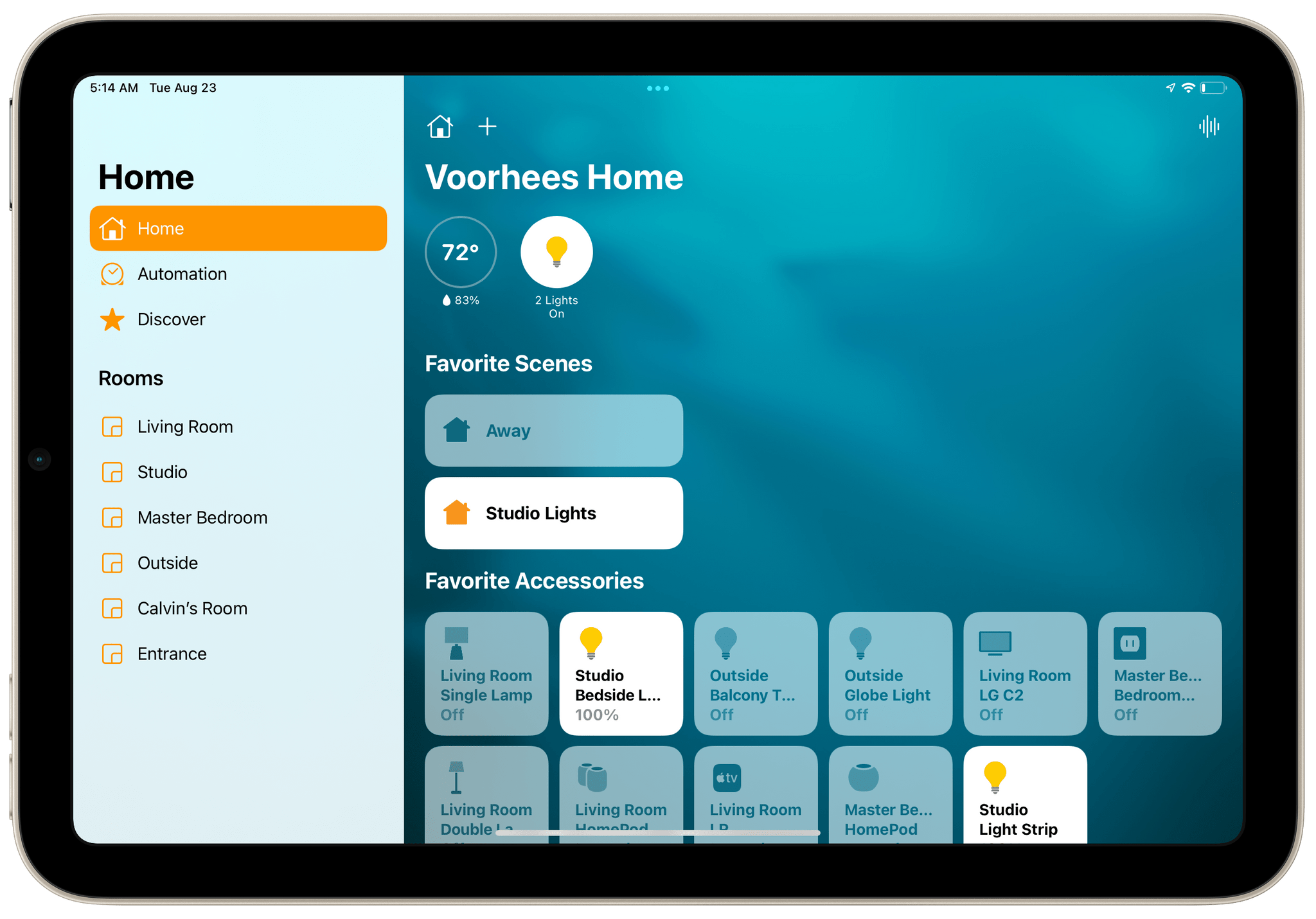
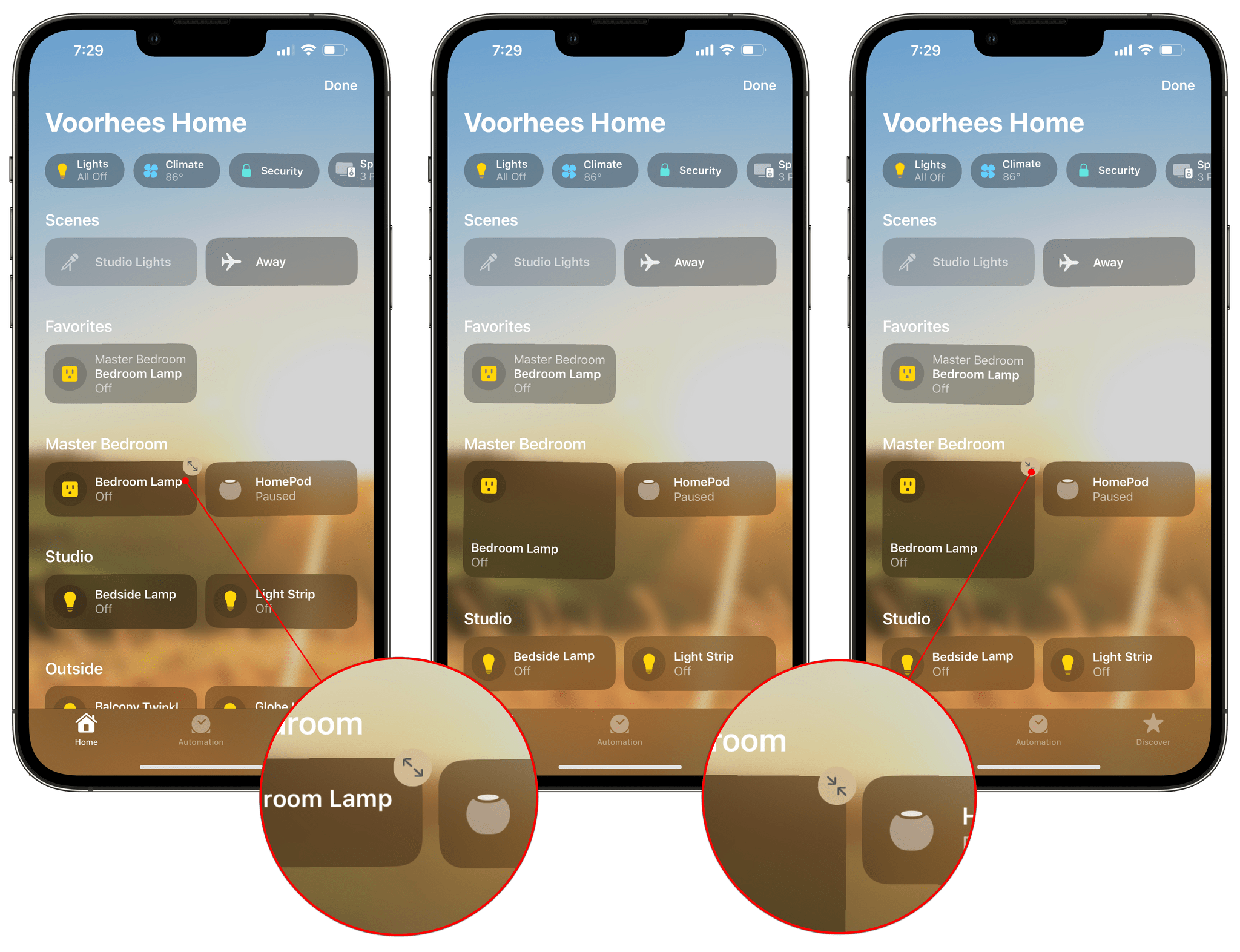
With the release of iOS and iPadOS 16 and macOS Ventura, we’ll all finally have the option of using smaller rectangular tiles in Home. Bigger tiles aren’t gone, although they’re landscape-oriented rectangles now instead of squares. The bigger tiles can still be activated if you want them, but I suspect anyone with more than a few smart home devices will quickly gravitate to the smaller version. The new tiles make better use of color to help distinguish devices from each other too. It’s just one change of many made to Home’s design, but it’s one that has single-handedly made the iPhone version of the app useful to me again, which I really appreciate.
To change the size of a tile on the iPhone or iPad, you need to enter ‘Edit Home View’ mode, which you can do by long-pressing on a tile and choosing that option or picking it from the More menu button in the top right corner of the screen. Next, tap a tile, and a double-arrow button will appear in the corner of the tile that toggles it between short and taller rectangles. The process is a little different on the Mac, where you need to right-click on a tile and pick Show as Large Tile or Show as Small Tile. I can’t think of a good reason the two methods of managing tiles are different on the Mac, but they are.
Changes made on one device sync quickly and reliably across all devices, which I like when it comes to the order of tiles. However, I’m not sure it’s the right call when it comes to tile size. On my Mac and iPad Pro’s larger screens, I have plenty of screen space and would be more likely to use larger tiles, especially since those devices are used farther from my face. However, because I use Home primarily on my iPhone, I’ve got small rectangles everywhere instead. It’s not a disaster, but I’d like more individual control over how each device is set up.
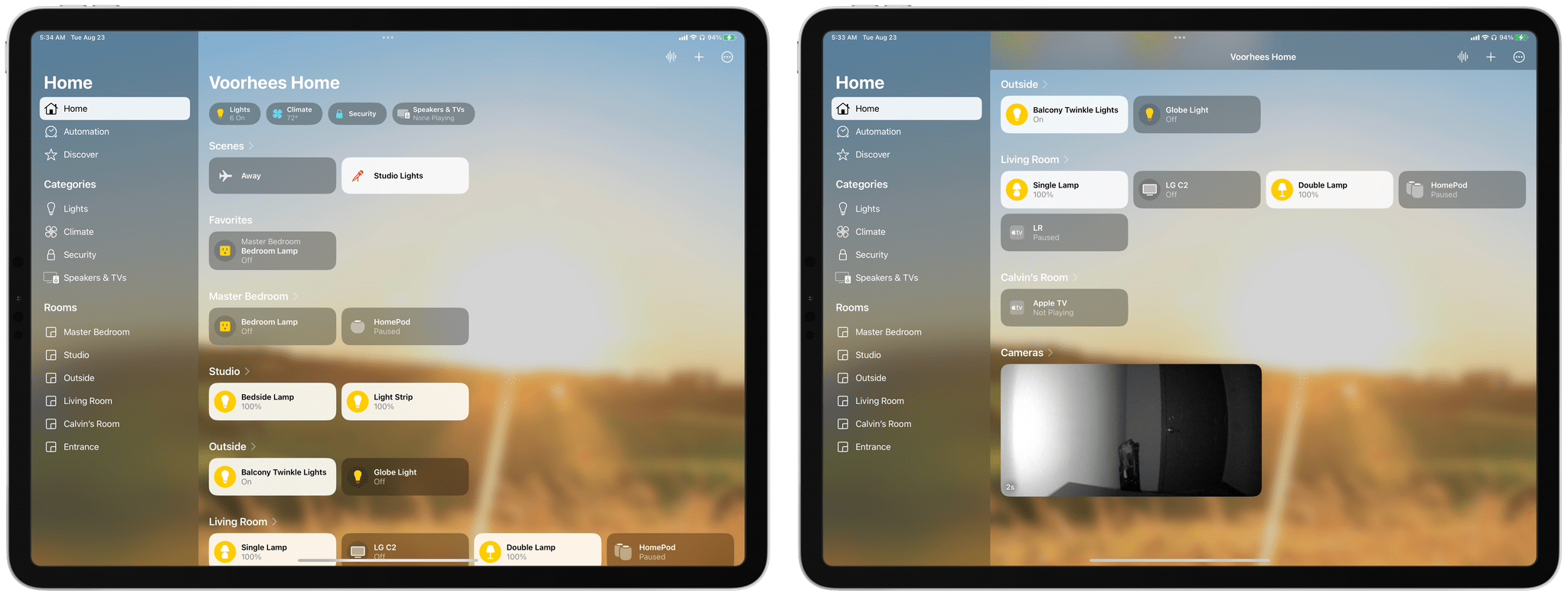
The Home tab has been expanded to include links to device categories, favorites, scenes, and every room, all of which can be reorganized to your liking.
On iOS and iPadOS 15 and macOS Monterey, the Home app’s Home tab included sensor data, favorite scenes and accessories, plus camera feeds. These are all available in iOS and iPadOS 16, as well as macOS Ventura, but so too are accessories organized by room and a live grid of any cameras you have. Better yet, rooms can be reordered in the main UI, which is mirrored in the iPad and Mac’s sidebar, and syncs across devices. It’s a level of customization that makes the Home tab far more useful, allowing users to match it to the way they use their devices.
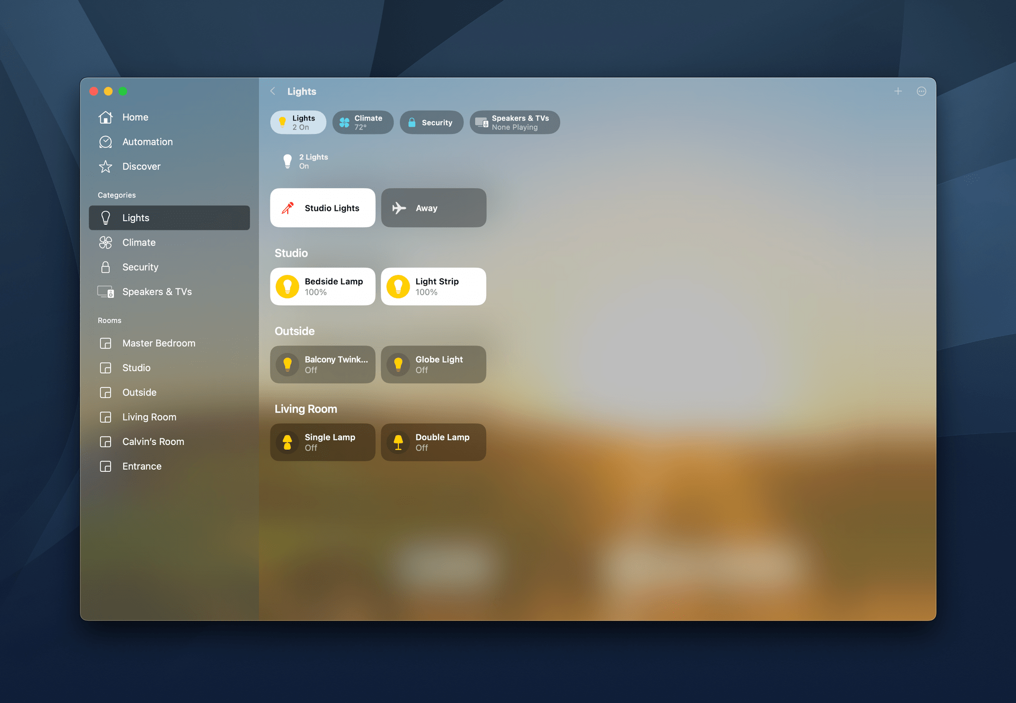
Another positive change to Home’s UI is that devices can be viewed by category now. On the iPhone, iPad, and Mac, the buttons along the top of the Home screen include categories like Lights, Climate, Security, and Speakers & TVs. Another category coming this fall, which you won’t see in my screenshots is Water because I don’t have any devices in that category. Tapping on a category blurs out the Home tab, overlaying it with the accessories in that category, organized by room in some cases. On the iPad and Mac, categories of devices can also be accessed from the app’s sidebar.
From a design standpoint, it’s a little odd that Categories appear as an overlay on top of the Home tab no matter what part of the app’s UI you start in, but I suppose the rationale is that it’s an alternate view of what’s in the Home view. Honestly, sometimes it’s best not to think about these things too hard, but it’s what I do, so there you have it.
Despite some minor design quirks, the overall effect of the changes to Home are positive. The UI is much better for managing a large collection of devices without a lot of scrolling or swiping between rooms. That’s a problem that has grown in recent years as people bought more and more HomeKit devices and one that will only get worse when Matter makes devices that weren’t previously compatible with HomeKit work with the Home app.
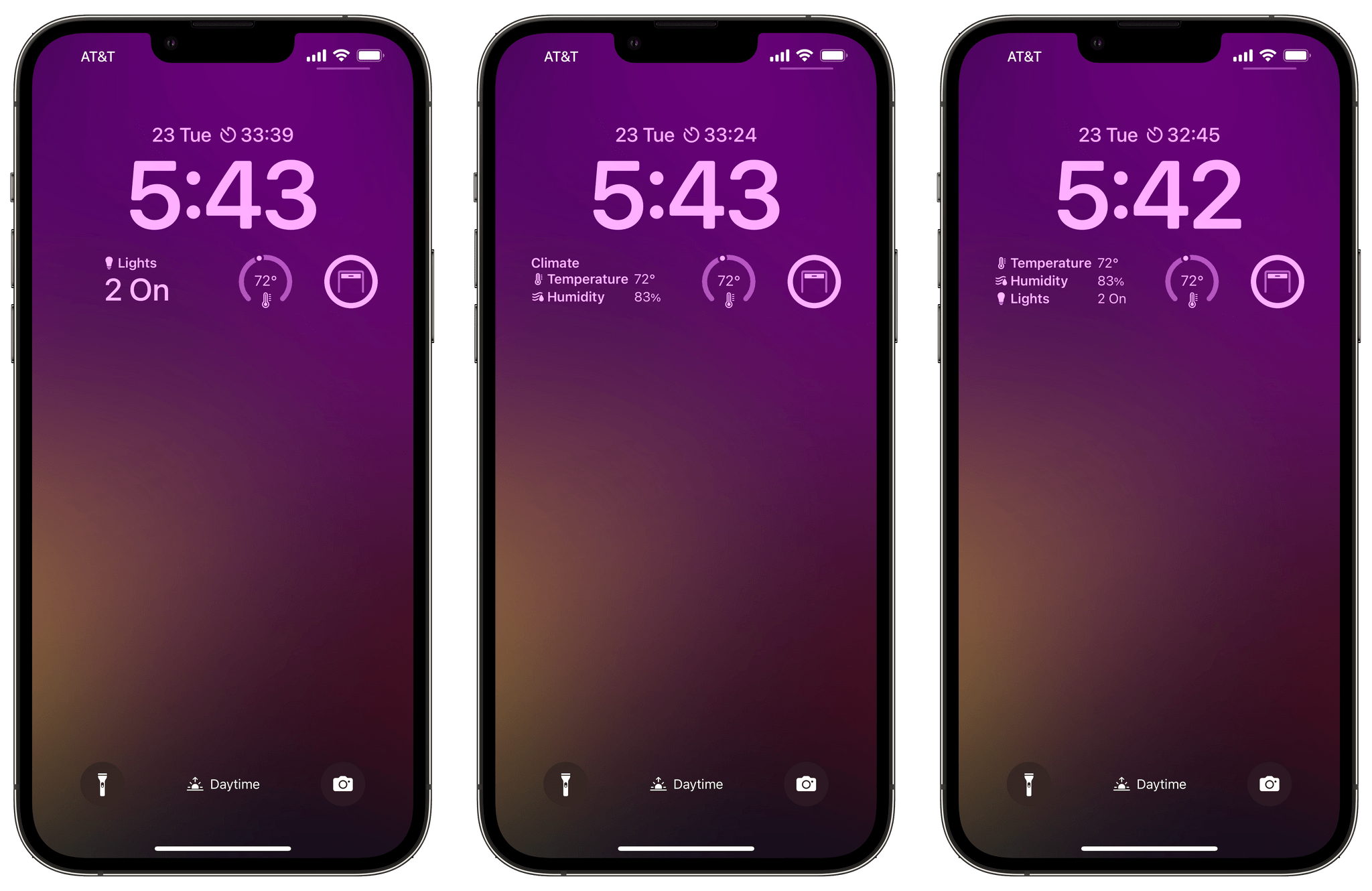
Home is one of the Apple system apps that offers Lock Screen widgets, including:
- Summary
- Climate
- Climate Sensor
- Security
- Security Accessory
- Lights
Summary combines information for multiple devices. In my case, that’s my Eve Weather sensor and how many lights are turned on. Climate reports the temperature and humidity from the Eve sensor, while Climate Sensor is limited to the temperature. Tapping on either climate widget opens Home to the detail view of that sensor. I don’t currently have any security devices installed, except for a camera, which shows up in the security device category in Home, but doesn’t seem to work with Apple’s Lock Screen widgets. Finally, the Lights widget tells me which lights are on in my home.
What I really want that’s missing from Home’s Lock Screen widgets is a small circular widget that turns off my bedside light as I put my iPhone on its charger before I go to sleep. Unfortunately, controlling individual devices isn’t possible with Home’s widgets, which feels like a missed opportunity.
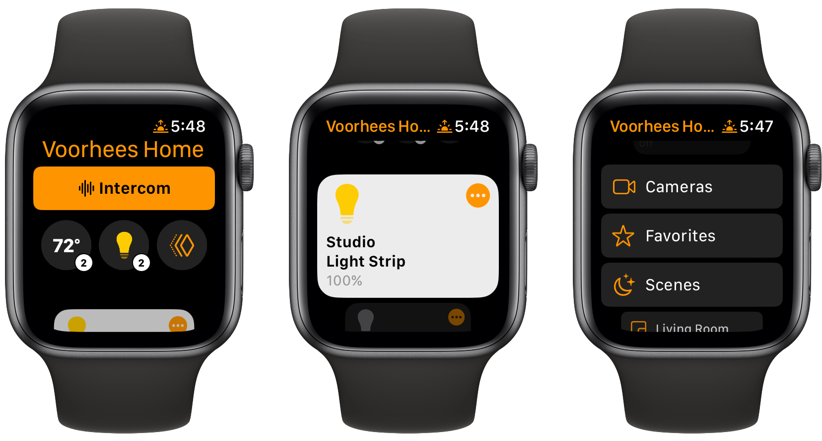
If you were hoping for a watchOS 9 update to make its version of the Home app more useable, you’ll be disappointed in the fall. Intercom and sensor buttons are followed by tiles for frequently used devices, Cameras, Favorites, Scenes, and each of your rooms. The trouble is the tile sizes can’t be adjusted, and each still takes up a full Watch screen of space. With watchOS 9, you can, however, invite other household members like your kids to your home, which will let them control devices and receive notifications from an Apple Watch if they have one.
Before wrapping up this preview of the Home app, it’s worth mentioning another untouched area of the app: Automations. With more devices becoming available in the Home app with Matter, I’d hoped we would see more ways to control them through automation. Instead, we’ve still got the same limited set of conditions that act as triggers along with a subset of Shortcuts actions. As a result, you’ll quickly run into roadblocks if you want to string multiple device conditions together before triggering an automation. The subset of actions available make it hard to turn automations into more sophisticated shortcuts too.
Perhaps an expansion of automation options will come later. Matter support is not yet available in Home and Apple has also said that Home’s underlying architecture will be updated later to support more devices efficiently. That would be a great time to expand Home’s automation system too.
The lack of progress with Home’s automation support is disappointing and points to a bigger issue. This year’s design changes to Home are a step in the right direction, which I expect will make a big difference to many users. However, the design changes don’t address the bigger picture questions about Apple’s home strategy. The Home app can control HomeKit devices, and later this fall, it will work with Matter devices too. Apple makes HomePods and Apple TVs, both of which offer Siri support and serve as hubs for those devices. However, unless the underlying technologies exist to allow Home and Siri to do more with smart home devices through automation, it’s hard to see Apple as a frontrunner in the race to manage the smart home. In the end, an improved design only goes so far.
You can also follow our 2022 Summer OS Preview Series through our dedicated hub, or subscribe to its RSS feed.


