As a part of the MacStories Apps Tree event (where you’ll find a huge giveaway worth $10.000 of 300 Mac and iPhone apps licenses), I thought it would be nice to hear the voice of Mac developers about the steps that go into desigining and developing an application for Mac OS X.
This is the first guest post by Pieter Omvlee, developer of Fontcase. Fontcase is a beautiful font manager that enables the users to manage a font library with elegance. Read my review if you missed it.
Enjoy!
Fontcase’ UI during early development
Ever since Fontcase launched I wanted to write about the design progress behind it but I never really got around to do it. So when I was asked by Federico to write something about Mac software design and development, this old topic immediately jumped to mind. Now with a firm deadline set, I’ve at last tried to write this article.
Some Background
Fontcase is being developed and maintained by Bohemian Coding, and it’s original UI was designed together with Laurent Baumann. What I’m explaining below is the result of ideas constantly going back and forth between us. We saved all the mockups we did from day one and and looking back, versions of the application in early form looked completely different compared to how it is today. I find this change quite fascinating.
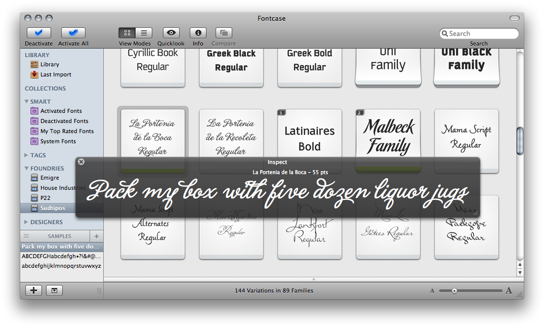
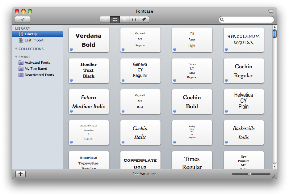
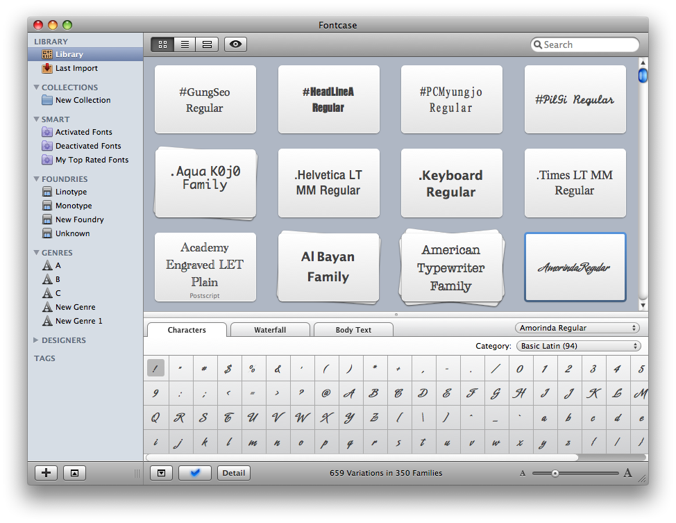
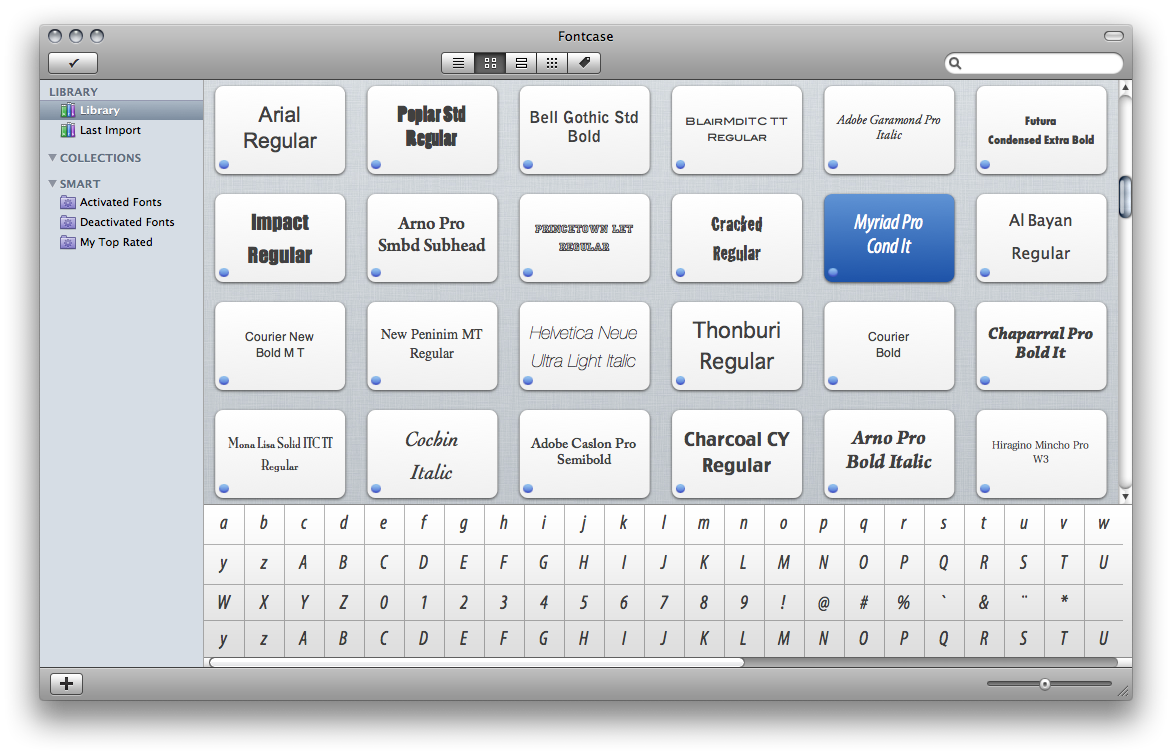
Let’s start with a nice screenshot of the current UI, to put things in perspective:
Keeping it simple and intuitive
The most important criteria for everything we did was that it should feel like a real mac app; we wanted it to be like an iPhoto for your fonts. (We did not want to compare it with iTunes because we found it was cluttered. Nowadays I find iPhoto quite unintuitive too, but that’s a whole other story.)
Step 1: Beautiful, but impractical
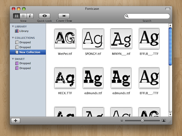
The first mockup was almost like a finder window in icon view. We had collections on the left and a few buttons in the toolbar, but that was it.
This mockup however already had this problem with which we would struggle for a long time: we really wanted to do a one-window concept, but we couldn’t find a way to display both the Source List, the collections, a usable preview and font info in one window. It would either get too crowded or too confusing. Below you can see a one-window concept we played with for quite some time:
The user would select some fonts and clicking on ‘details’ would show the details; the metadata and a preview of the font. The first mockup Laurent did was a bit inconsistent and far from practical, but it looked absolutely fantastic. Maybe calling it art is an exaggeration, but you’ll get the point:
There was of course no real preview, which is quite essential when talking about fonts. We did want to add a preview and we also thought seeing characters up close was important. A waterfall view is something no font manager can go without and inspired by Aperture Laurent came up with the mockups below. They were definitely a cool ideas.
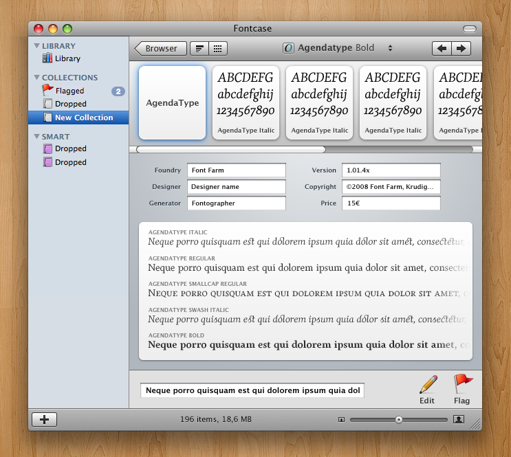
We then realized that when previewing fonts, one probably wants to inspect multiple weights of the same font, and have an easy way to switch between them. The icon view from earlier was grabbed an put above the previous view. After this change the UI began to get crowded.
Another problem was that there was simply not enough for the preview; the preview needed to be wider instead of higher, and all this resulted in the screenshot below:
After this we decided that we were not going in the right direction. The main problem is that this UI combined preview and metadata, leaving not enough room for either of them. We could not decide on how to display the info and the previews but we did know the main view needed some work, so we continued with that first. It turned out later that all this previous UI-work work would be thrown out in favor of the icon view but because its UI was quite unique I did want to share this with you.
Step 2: Back to basics
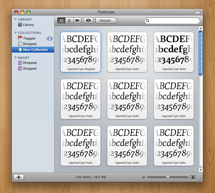
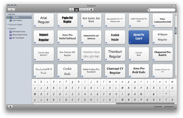
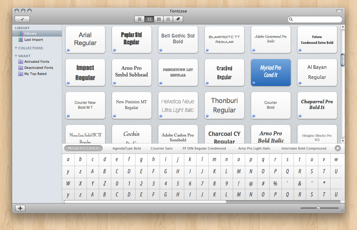
The screenshot below is the first mockup Laurent created that looks already quite a bit like the application in its current form. The blue dots were supposed to distinguish activated from non-activated fonts, and the little checkmark-button on the left in the toolbar has been there ever since. Note that we used a regular toolbar as opposed to the previous screenshot where we tried to be creative.
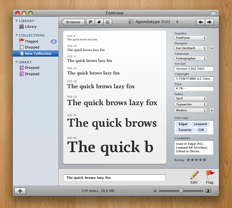
We liked the simplicity of this view and quickly realized this would be where people would spend the most time and where they would want to see proper previews of the selected fonts without switching to another view instead. Thus the pane on the bottom was added which we still have today, albeit in a slightly different form. I remarked early on the importance of a waterfall-view and that was added too.
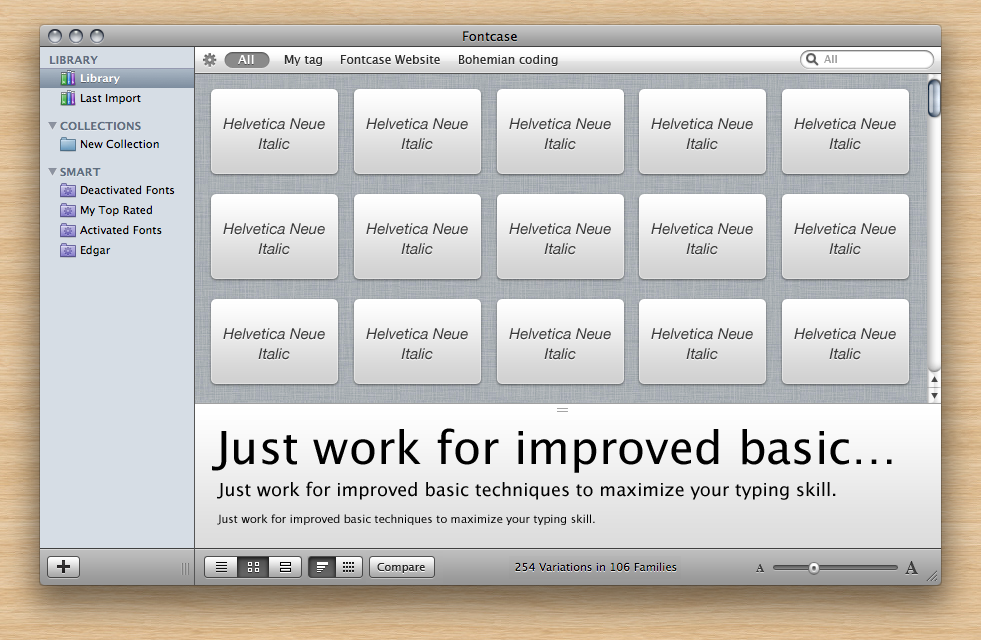
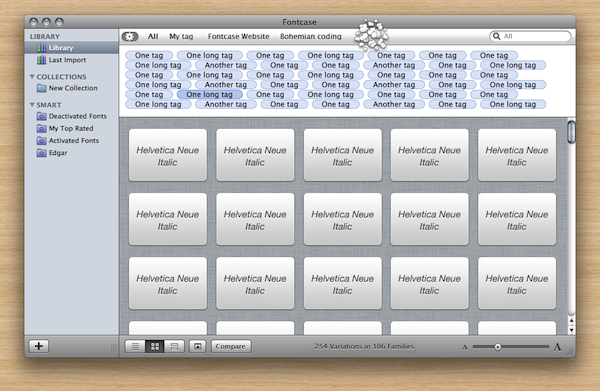
I’m going too fast here though. Between the first and second screenshot above we see the toolbar has moved to the bottom of the screen and a tag-bar was added on the top - another attempt to make metadata more important.
A little sidetrack: Inspired by Things.app
At some point there was a completely functional tab bar on the top of the window which could easily be customized. I believe we wanted to mimic the tab bar used in Things.app which we really liked. In fact it was coded and completely functional until much later when we decided to throw it all out again.
We did that because we realized we had a lot of space left in the sidebar where we could actually put all this metadata, just like regular collections. The idea came from the way the data model was laid out, but it made the hitherto quite empty sidebar more important and allowed us to throw out a redundant UI element. Note that fonts can be dragged to foundries/genres in the sidebar to tag them as such.
The screenshot above shows how customizing the tab bar would have worked and the screenshot next to it shows the metadata in the sidebar. Note that I am jumping through mockups and skipping several intermediate versions. If I would try to explain them all, we’d be here for quite some time to come.
Also observe how the last screenshot already looks almost identical to the current version, save some customization in the grid view - which until the last minute, we were never completely satisfied with and the toolbar which was moved back on top.
Examining Multiple Selections in Detail
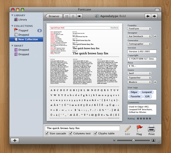
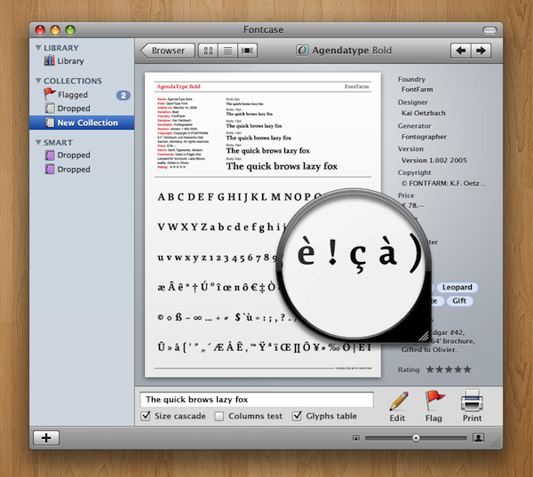
So far we’ve stepped through the more general progress, skipping several interesting chapters. Below I will explain our reasoning and all the mockups about one such topic in full detail. Let me call in remembrance the simple glyph view we can up with earlier:
The question of course was how we should handle multiple selection in this new pane on the bottom and, by extension, how the user should compare multiple fonts. In quick succession I’m going to show the mockups that we created and the reasons we discarded all of them in the end.
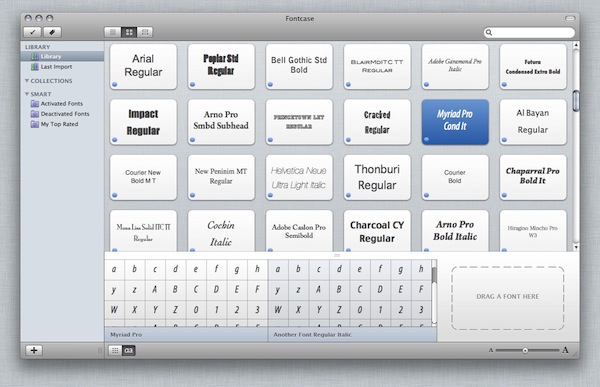
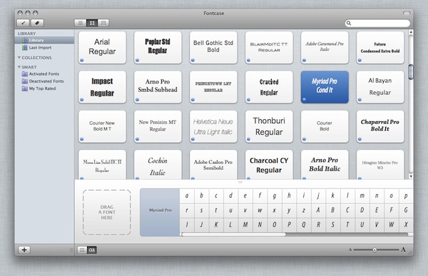
Our first attempt was an obvious one, we just split the area in multiple columns. The problem was what should happen when more fonts were selected; should we scroll horizontally as well as vertically? This was clearly undesired; we would get too much scrollbars in a small view, and the window in total.
The next attempt suffered from the same problem but at least here a font only occupied one row so it would be easy to compare a single character between the selected fonts:
A nice mockup that worked well with multiple selection, but not with seeing them at the same time is the screenshot below. I think it’s a nifty solution, but we decided in the end a popup was more logical and less crowded:
We then realized that one might select multiple fonts for a number of reasons, many not related to comparing the fonts. Selecting multiple fonts to activate them, create a new collection from them or to tag them are just a few examples where one isn’t interested in having the UI crowded.
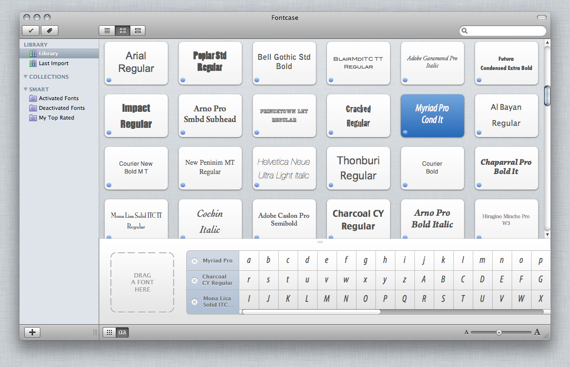
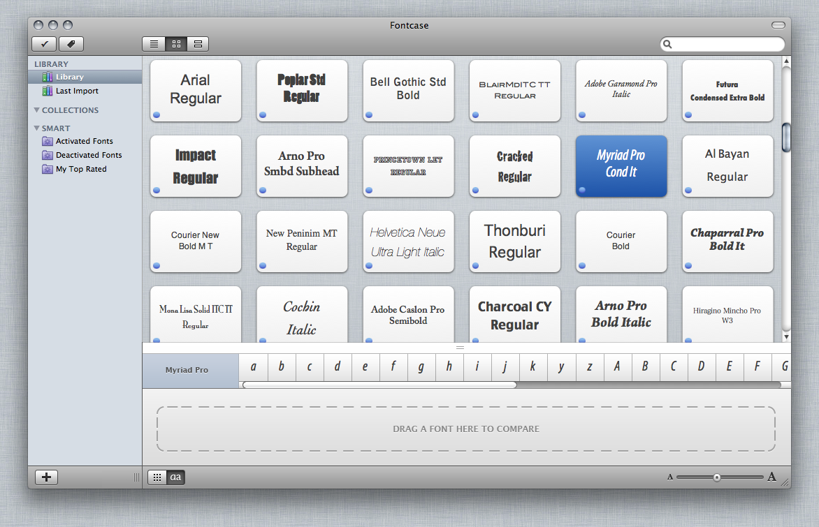
Still the idea of comparing fonts seemed a good one and have many uses. So what if we made the bottom pane not work through multiple selection but by dragging fonts to it to compare? In that case, people could drag a font to it, scroll further searching for other fonts, drag another font and continue to build a selection of similar fonts to compare.
The first mockup that tried to visualize this and the multiple variations that followed in quick succession are shown below:
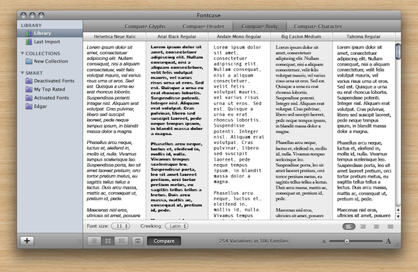
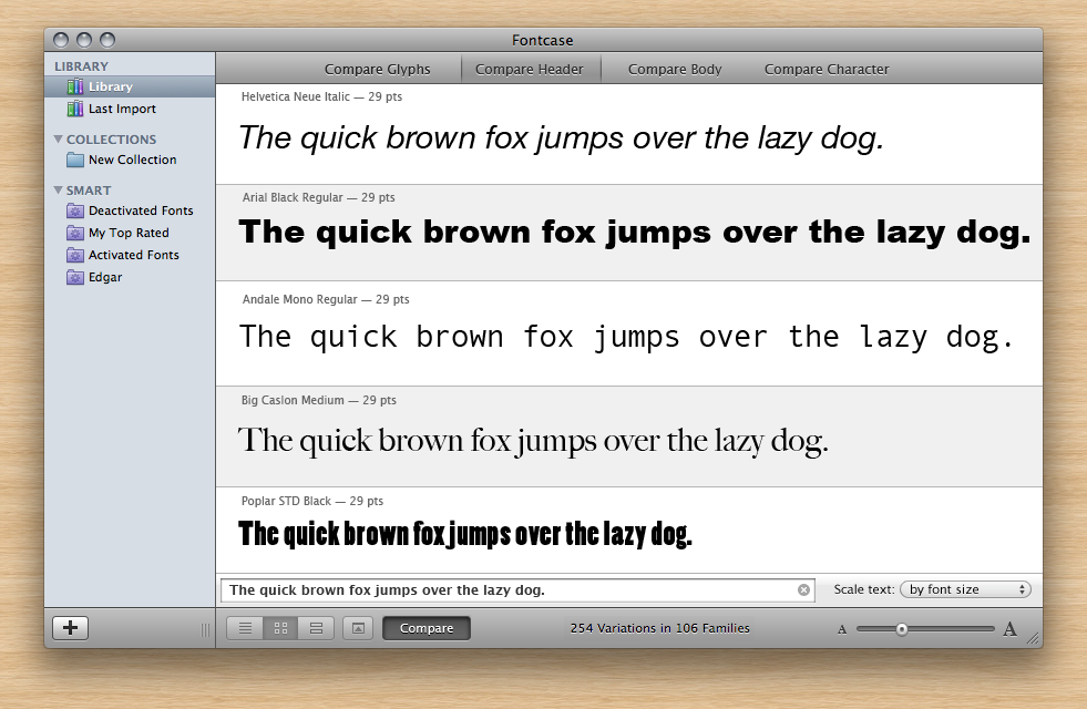
None of these seemed perfect, and by this time we thought comparing fonts using header text and body text was a good idea and thus the current compare pane was born and we decided to keep the glyph below the main view nice and simple:
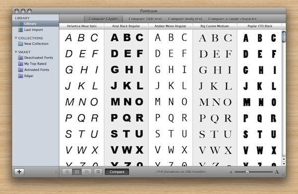
The three different ways of comparing fonts:
… and the glyph view extended with waterfall and body text:
Final
The example above about multiple selection is just one example of how we debated every element in the UI. I think however this article is already long enough so I won’t go into details on other topics.
I want to thank MacStories for giving me the opportunity to write this article on their website, and I hope you’ve enjoyed reading it. The work we put into the UI seems to have payed off because Apple was kind enough to honor Fontcase with an Apple Design Award during the last WWDC. Of course I encourage you to try Fontcase in its current form which can be downloaded from our website. bohemiancoding.com/fontcase


