App Changes
Before delving into the bigger enhancements to Messages, I want to touch upon changes to the app’s interface and some minor features.
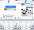
The conversation’s title bar has been redesigned to embed the recipient’s profile picture. Having a photo above a conversation helps identify the other person; the increase in title bar height is a trade-off worth accepting.
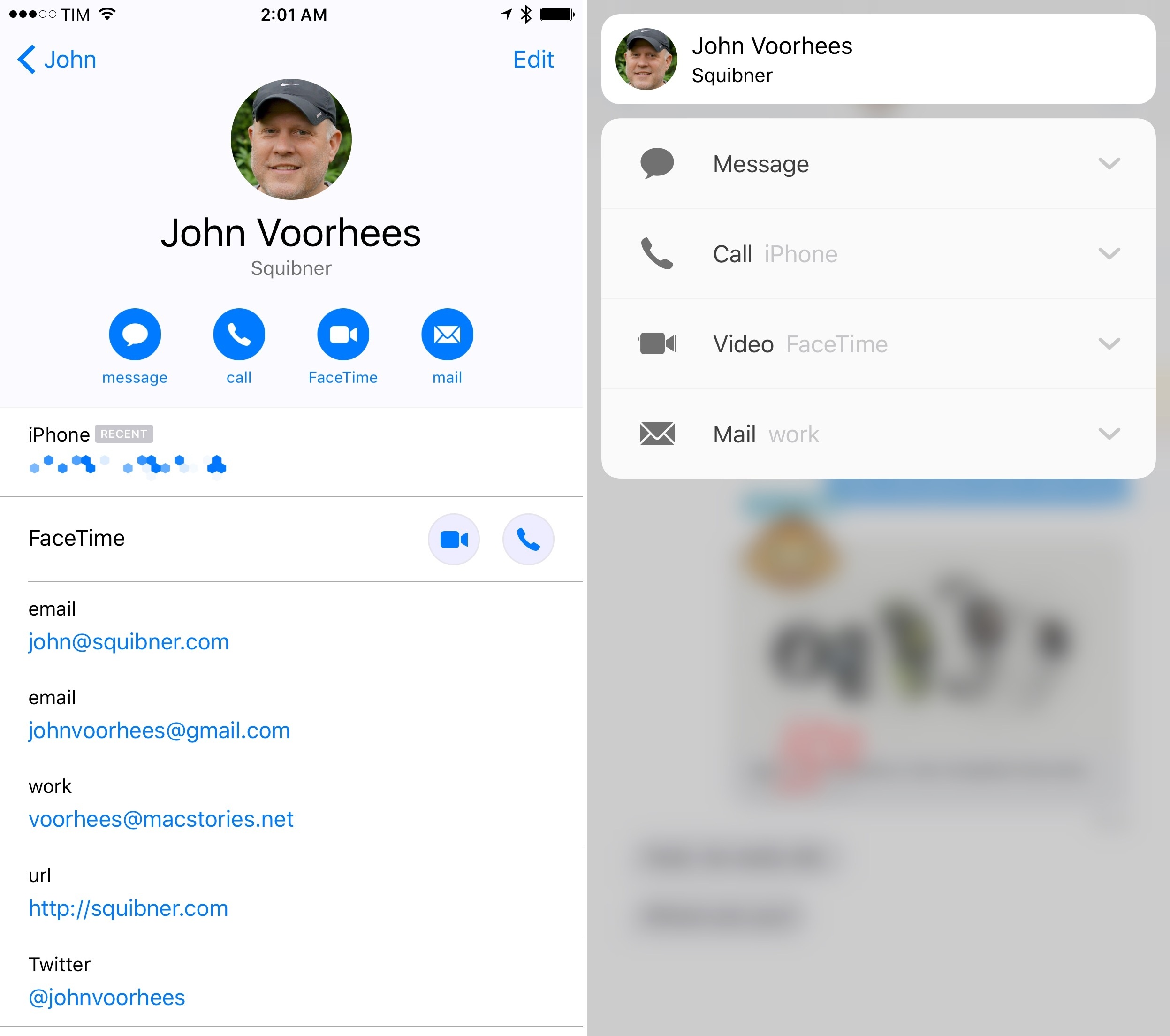
The profile picture can be tapped to open a person’s contact card; and, you can press it to bring up a 3D Touch menu – the same one available in Contacts and Phone with a list of shortcuts to get in touch with that person.
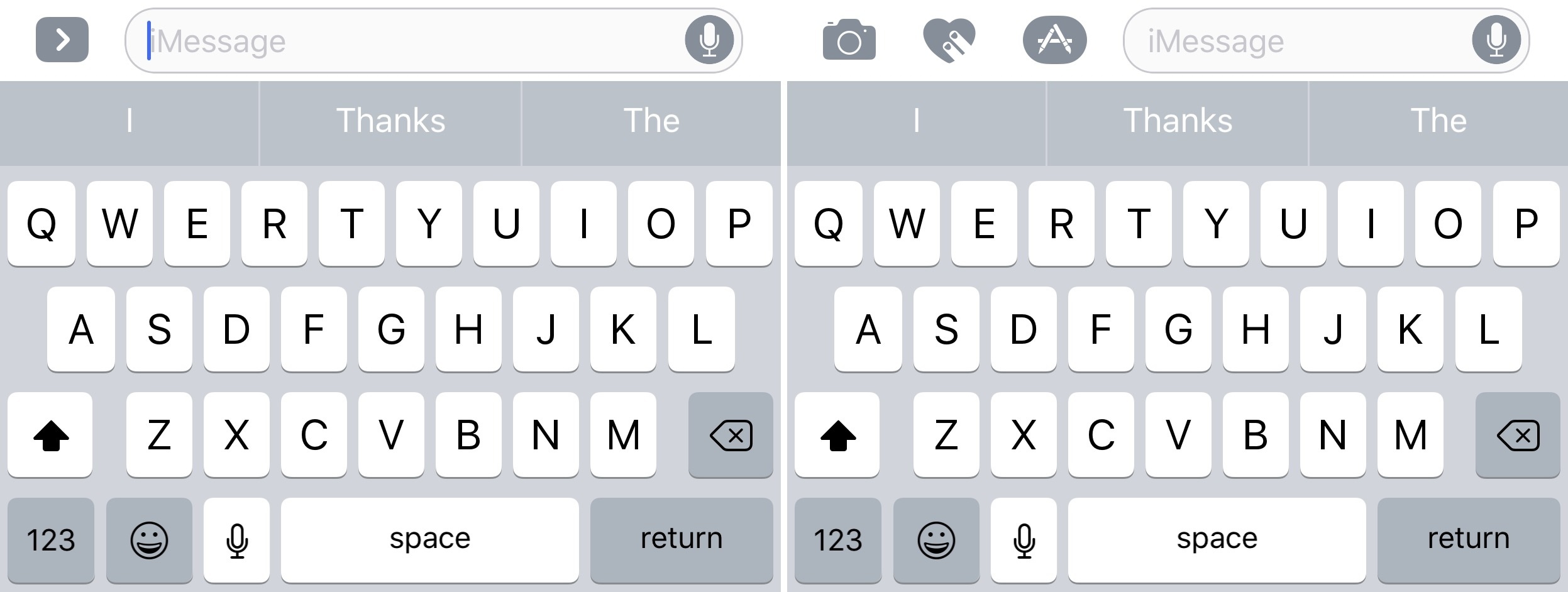
iOS 10 brings a new layout for the bottom conversation drawer. By default, a conversation opens with a narrow text field and three icons next to it – the camera, Digital Touch, and the iMessage app launcher. As you tap into the text field to reply to a message, the three icons collapse into a chevron that can be expanded without dismissing the keyboard.
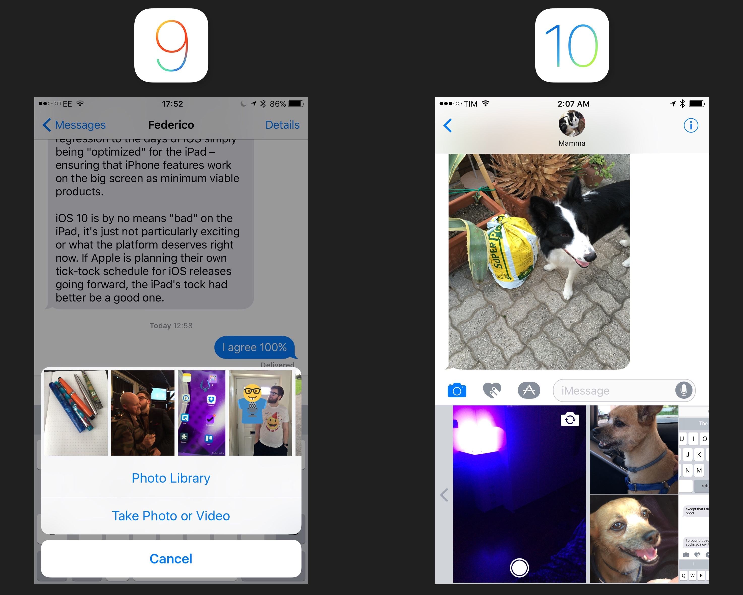
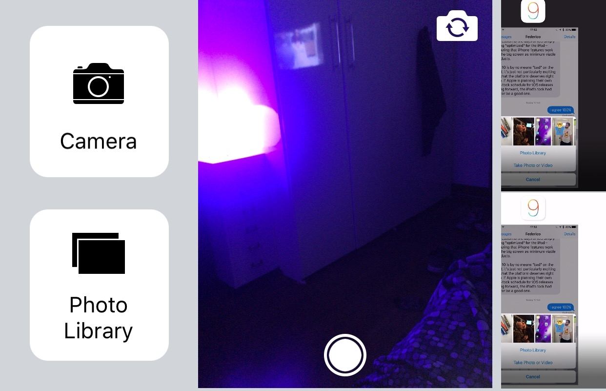
Apple has also redesigned how you can share pictures and videos. The new media picker consists of three parts: a live camera view to quickly take a picture; a scrollable grid of recent items from your library; and buttons to open the full camera interface or the photo library, accessed by swiping right.
The assumption is that, on iMessage, people tend to share their most recent pictures or take one just before sharing it. The live camera view can be used to snap a photo in a second (you don’t even have to tap on the shutter button to take it). Moving the camera and library buttons to the side (hiding them by default) has freed up space for recent pictures: you can see more of them thanks to a compact grid UI.
Some won’t like the extra swipe required to open the camera or library, but the live photo view makes it easier to take a picture and send it.
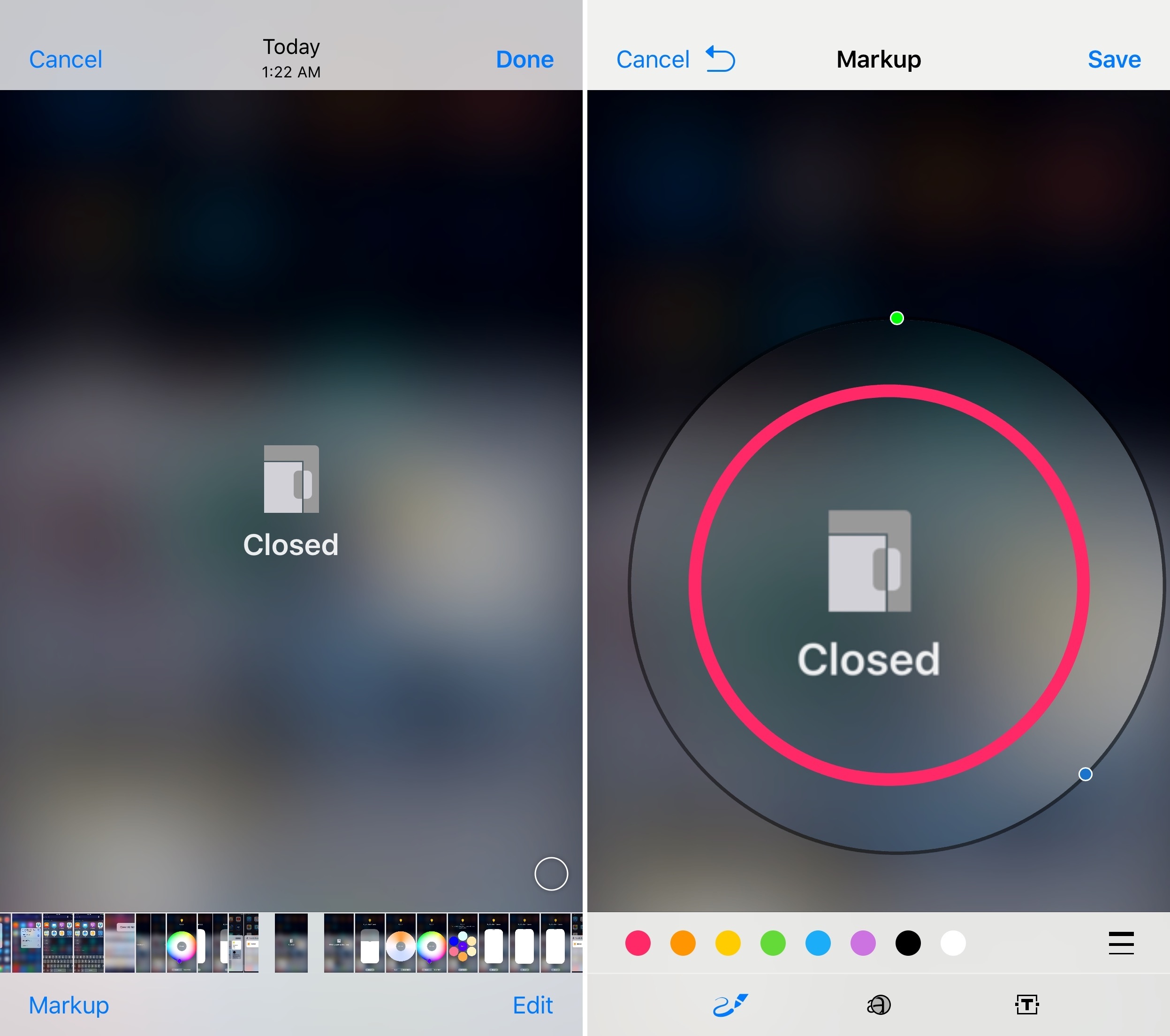
After picking or taking a picture, you can tap on the thumbnail in the compose field to preview it in full screen. You can also tap and hold a picture in the grid to enter the preview screen more quickly.13
Here, you have two options: you can edit a picture with the same tools of the Photos app (albeit without third-party app extensions) or use Markup to annotate it. You can tap on the Live Photo indicator to send a picture without the Live part, or press on it to preview the Live Photo.
Speaking of photos, iMessage now lets you send images at lower quality, likely to save on cellular usage. You can enable Low Quality Image Mode in Settings -> Messages.
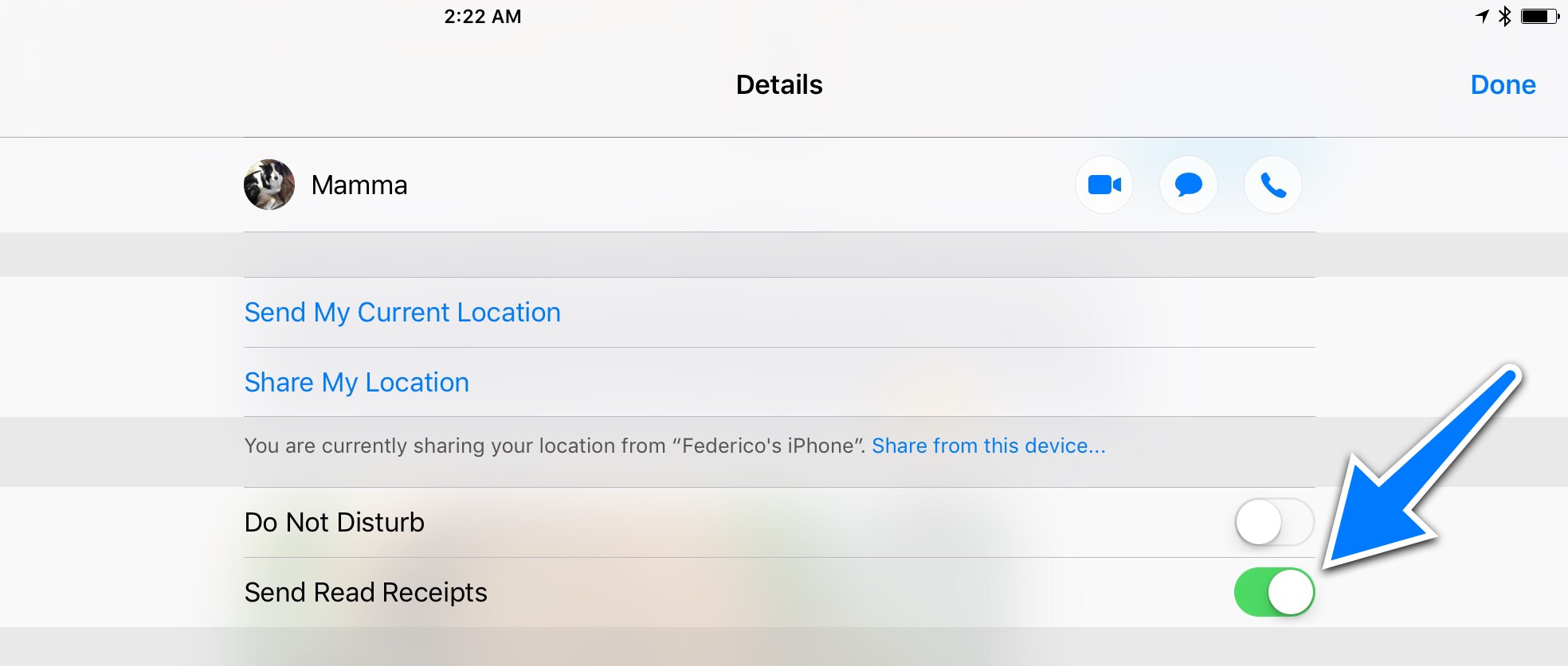
One of the oldest entries of my iOS wish lists is also being addressed in iOS 10: you can choose to enable read receipts on a per-conversation basis.
If you, like me, always keep read receipts turned off but would like to enable them for important threads, you can do so by tapping the ‘i’ button at the top of a conversation and then ‘Send Read Receipts’. The toggle matches the default you have in Settings and it can be overridden in each conversation.
Richer Conversations
While Messages may not look much different from iOS 9 on the surface, the core of the app – its conversation view – has been refreshed and expanded. iMessage conversations have received a host of new features in iOS 10, with a focus on rich previews and whimsical, fun interactions.
Links
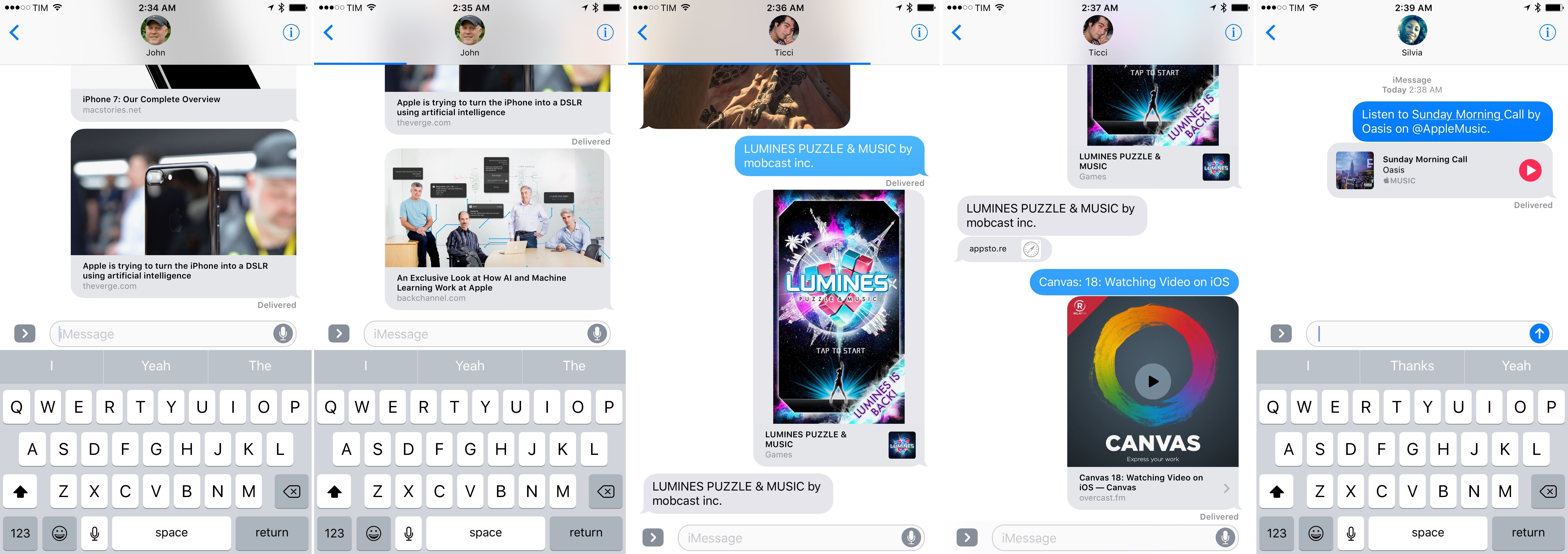
In its modernization of iMessage, Apple started from web links. After years of plain, tappable URLs, Messages is adopting rich link previews, which are inspired by iOS 9’s link snippets in Notes, but also more flexible and capable.
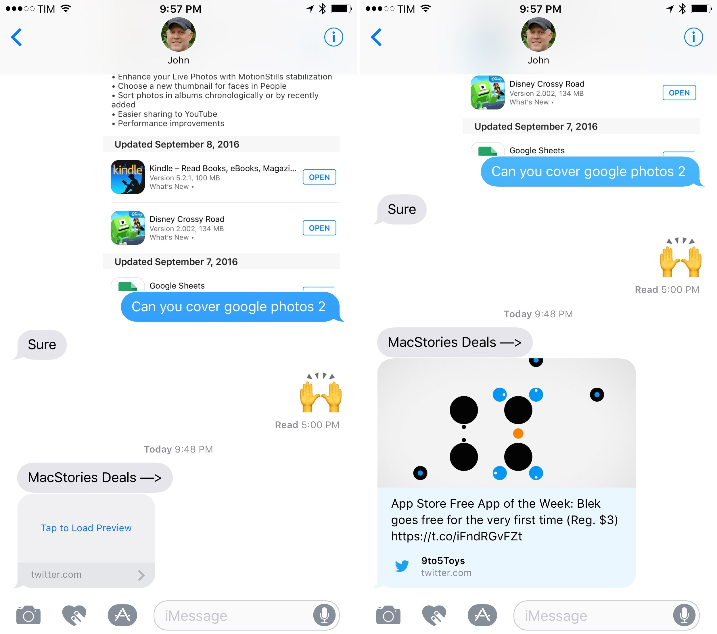
Rich links aren’t a special setting of the app: the first time you receive a link in an iMessage conversation in iOS 10, it’ll appear as ‘Tap for Preview’ button in the conversation. This is a one-time dialog to confirm you want to load links as rich previews instead of URLs, which also look different from iOS 9.
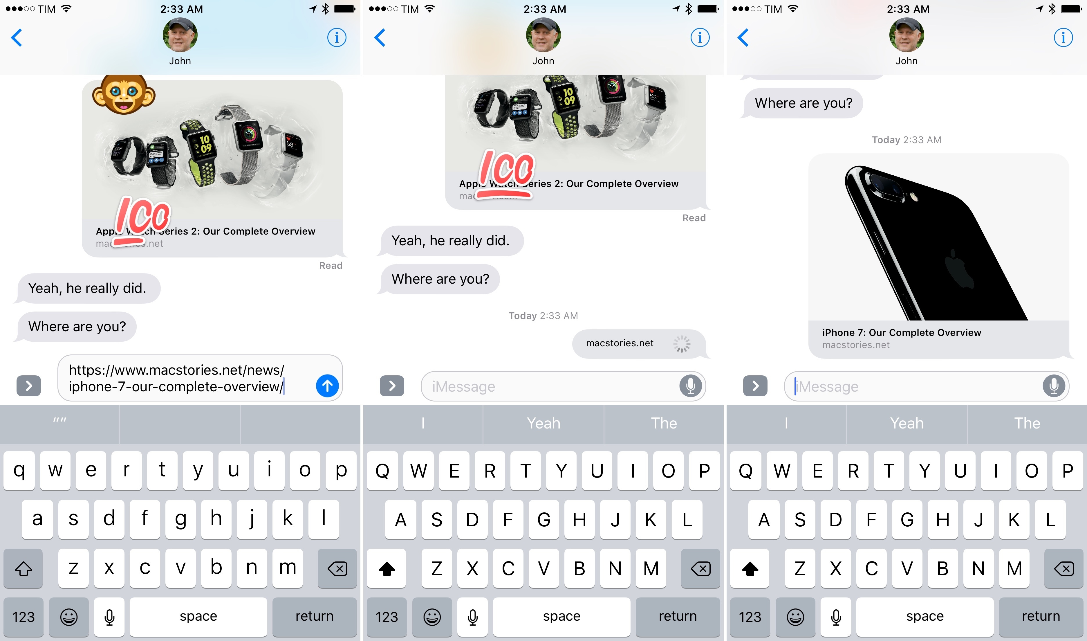
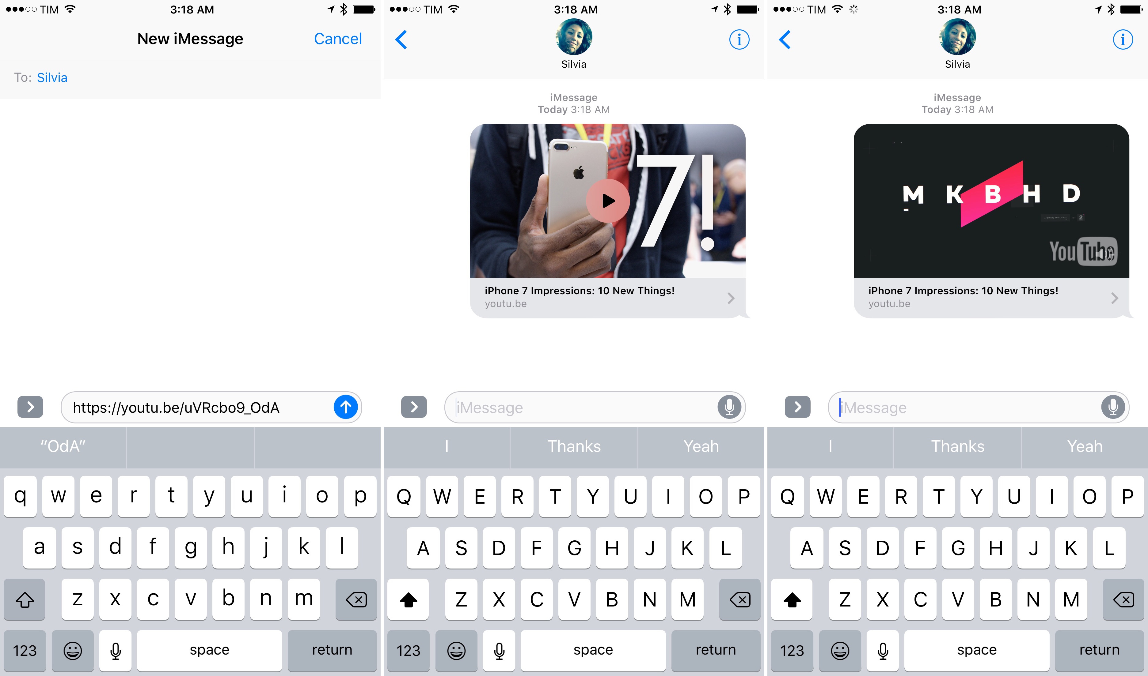
Like in Notes (and other services such as Slack and Facebook), rich previews use Open Graph meta tags to determine a link’s title, featured image, audio and video file, or description. A web crawler has been built into Messages: as soon as you send a link, the message’s bubble will show a spinner, and, depending on the speed of your Internet connection, it’ll expand into a rich message bubble after a second, within the conversation.
Rich link previews in Messages use the same technology Apple brought to Notes last year, but they’ve been designed differently. They’re message bubbles with a title and domain subtitle; the upper section, where the featured image of a link is, can grow taller than link snippets in Notes. Web articles tend to have rectangular image thumbnails; podcast episodes shared from overcast.fm are square; and links to iPhone apps shared from the App Store show a vertical screenshot.
Furthermore, the behavior of sharing links differs between Notes and Messages. Allow me to get a bit technical here.
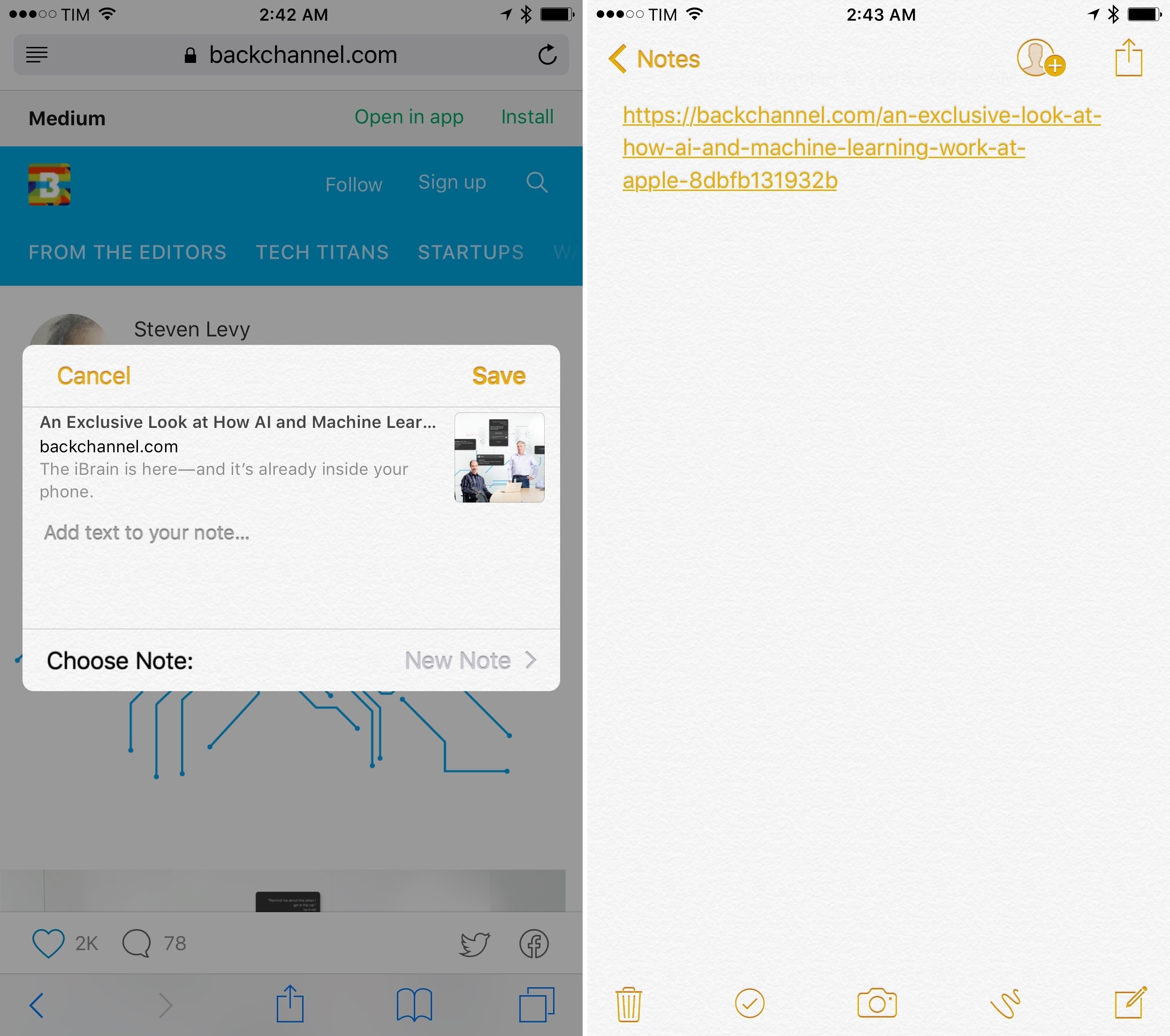
In Notes, only links captured from the share extension are expanded into rich previews; pasting text that contains a link into a note doesn’t turn the link into a rich preview.
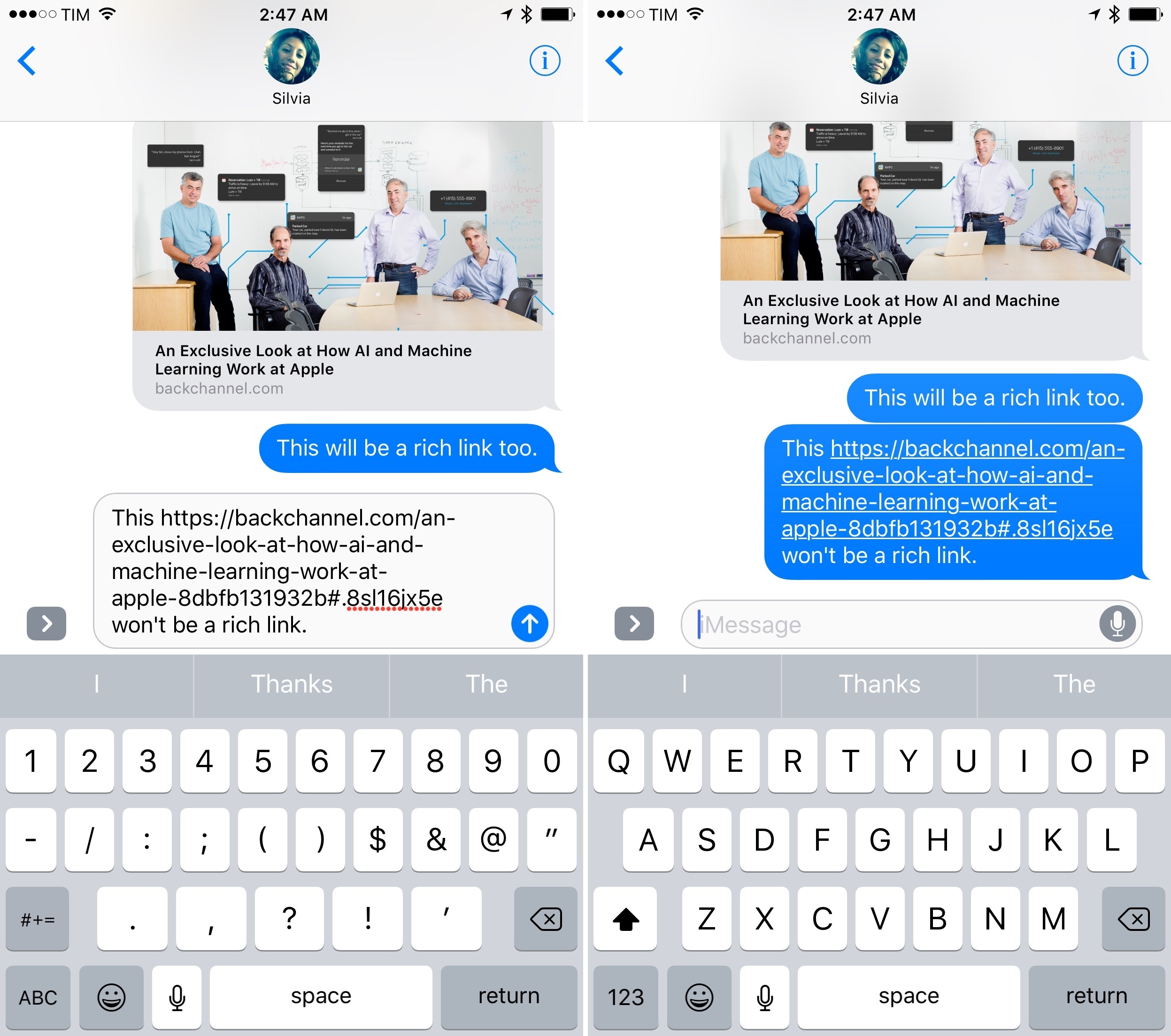
In Messages, both individual links and a string of text with a link will generate a rich preview. In the latter case, the link has to be either at the beginning or at the end of a sentence. Messages will break up that single string in two pieces: the link’s preview, and the string of text without the link. Even sending a picture and a link simultaneously will create two message bubbles – one for the image, another for the link.
The only instance where Messages will resort to the pre-iOS 10 behavior of a rich text (tappable) URL is when the link is surrounded by text:
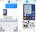
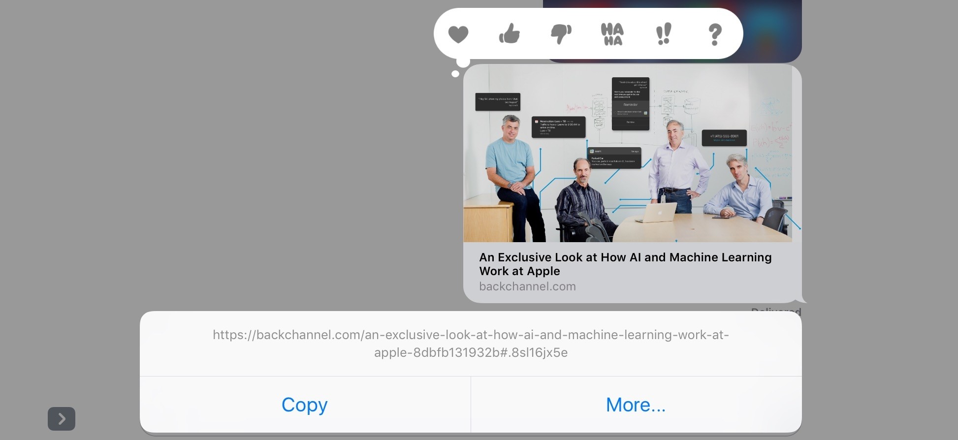
Unless a link is placed inside a sentence, iOS 10 will never show the full path to the URL – only the root domain. Whether meta tags can’t be crawled14 or if a link is successfully expanded, the URL will be hidden. If you need to see the full URL of a link in Messages, you can long-tap the link to show it in a contextual menu.
There are multiple types of link previews in iOS 10. The majority of websites with a social presence (including MacStories) have added support for Open Graph meta tags and Facebook/Twitter cards, and their links will appear with a featured image and a title. Alas, Apple hasn’t brought Safari View Controller support to Messages, which doesn’t make the experience of following links as seamless as it is on Facebook Messenger.
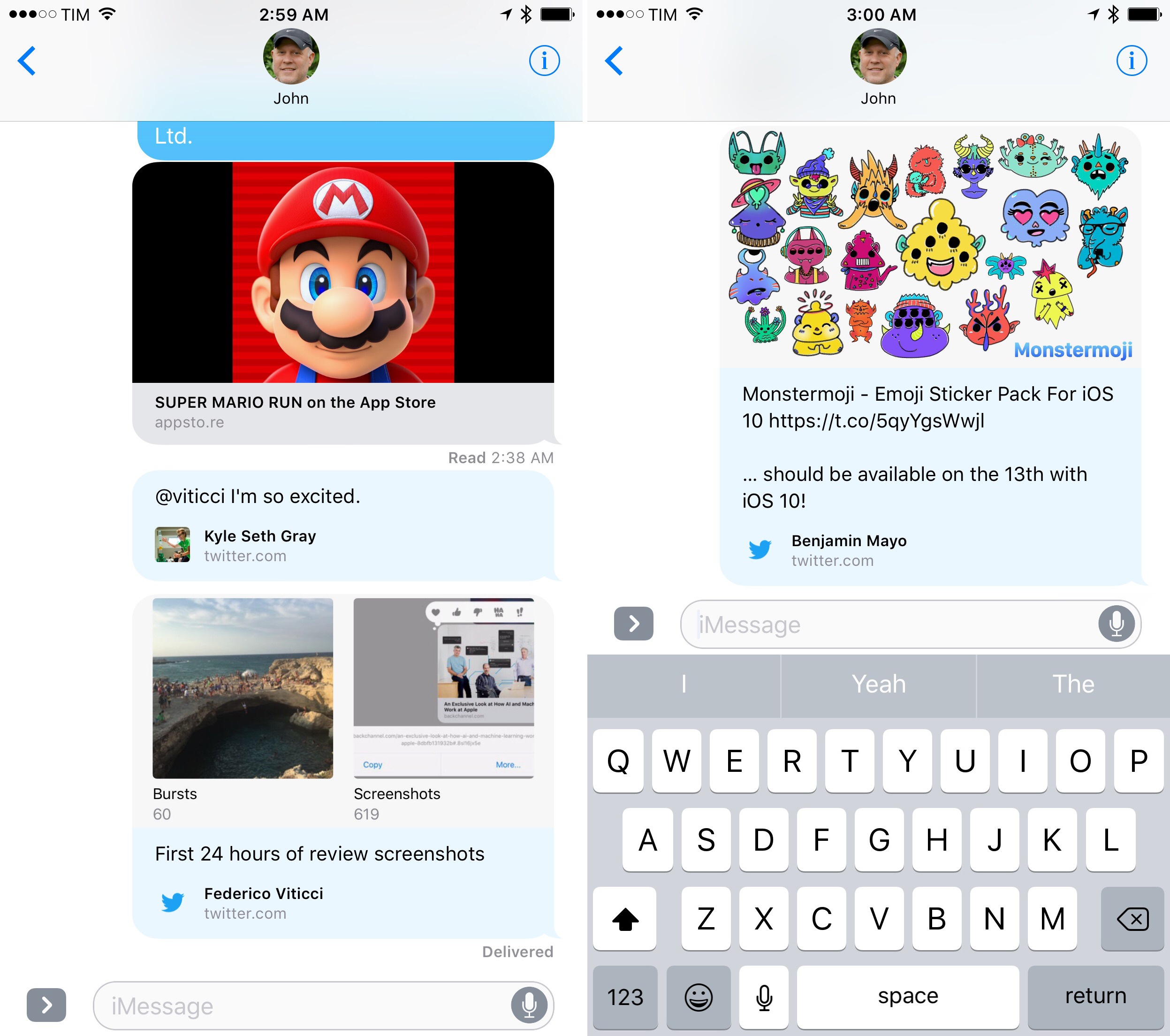
Twitter links have been nicely formatted by Apple: they have a special light blue background and they display a tweet’s text, username, media (except GIFs), and avatar.
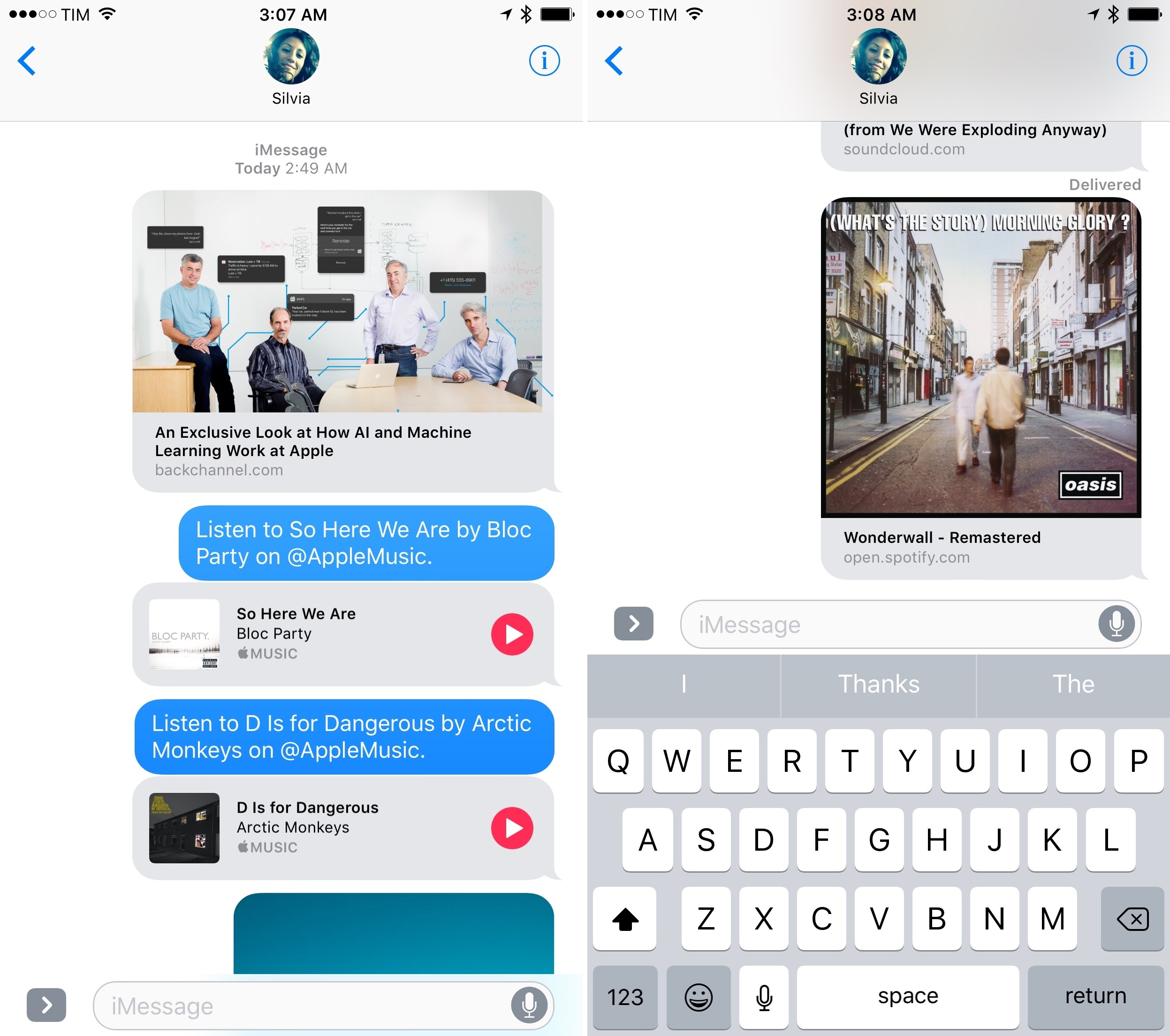
For Apple Music, the company has created a rich preview that, in addition to artwork, embeds a native play/pause button to listen to songs without leaving Messages. Unlike other web links, you can’t peek & pop Apple Music links, suggesting that it’s a custom implementation that uses an underlying URL to assemble a special message bubble.
Third-party companies can’t take advantage of this – both Spotify and SoundCloud links don’t have a playback UI and they’re treated as webpages with a featured image.
Other Apple apps with the ability to share links don’t fare as well as Apple Music. App Store and iTunes links show a title, an icon and screenshot, and app categories; you can’t install an app or watch a movie trailer inside Messages. Links to photo albums shared on iCloud.com don’t support rich previews in Messages, and shared notes only come with an icon and the title of a note.
YouTube links get expanded into a playable video preview that you can tap once to play, and tap again to pause. There are no additional controls (let alone a progress bar), but it’s great to be able to watch a YouTube clip inline without being yanked to the YouTube app.
Messages will even pause playback if you scroll down in the conversation, and resume it as you focus on the video again. It’s a nice touch.
Rich link previews embody the idea of stages of change and how Apple often adds functionality to iOS.
Users will see them as a new feature of Messages, which allows everyone in a thread to see a preview of the destination page. In some cases, message bubbles can even play media. I like how links get expanded inline; plain URLs in old iOS 9 message threads feel archaic already.
Link previews also build upon Apple’s work with Universal Links and adoption of open standards such as Open Graph and Schema.org for search. The same technologies Applebot and Spotlight have been using for years now power link previews in iMessage.
I’d like to see Apple open up link previews with more controls for developers in the future, but this is a solid start.

